- All templates
- Bar chart templates
- Product performance comparison chart
About this product performance comparison chart
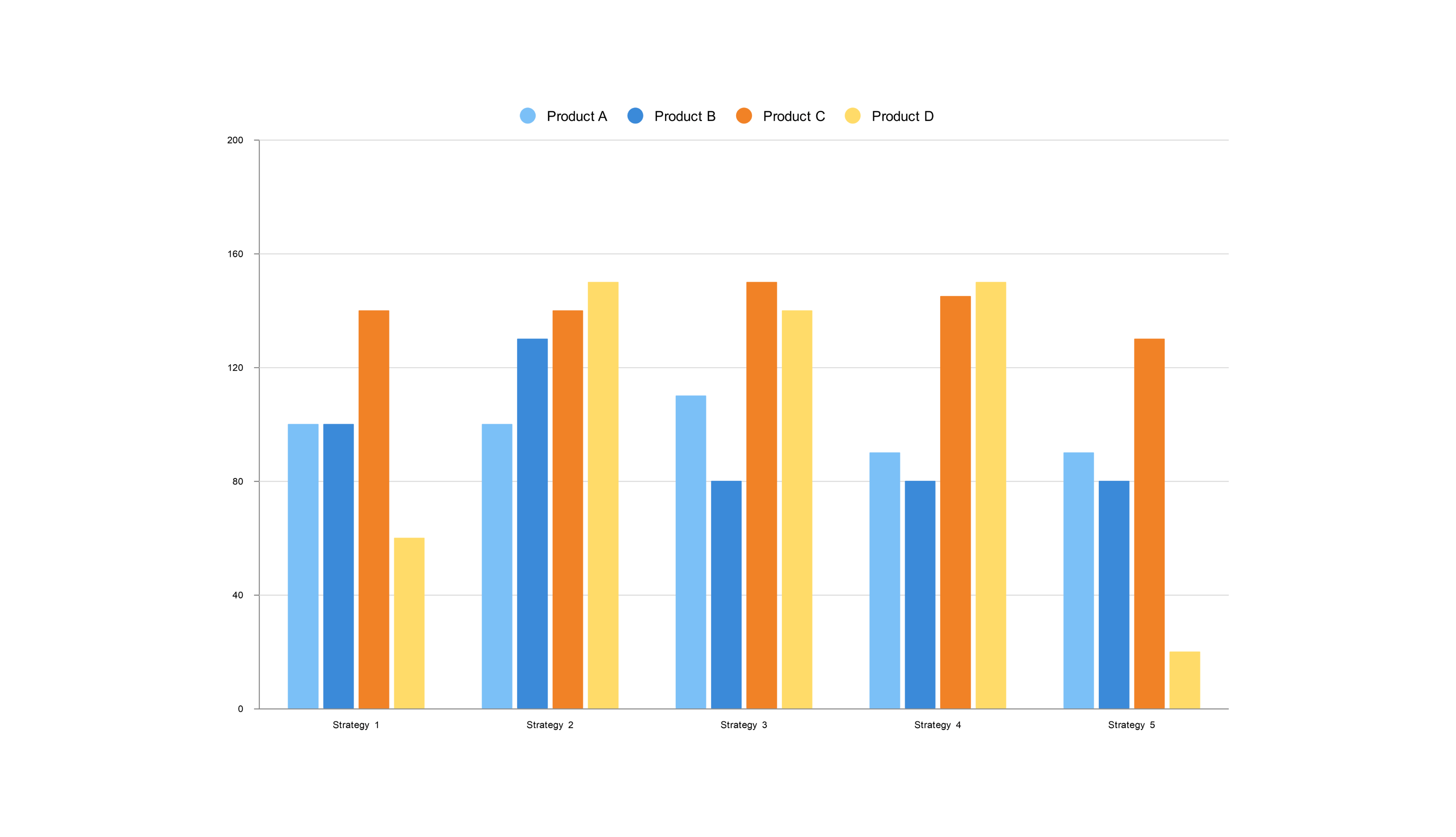
This customizable vertical bar chart template helps you compare how four products (A, B, C, and D) performed over two years. The colors make it easy to see the difference between This Year (red) and Last Year (yellow).
Product A still takes the lead, though it dipped a bit this year. C and B are next in line, with C showing some growth. While consistently the lowest performer, D made a significant jump this year.
It's perfect for businesses to track product trends and make intelligent decisions about production and marketing.
Related templates
Get started with EdrawMax today
Create 210 types of diagrams online for free.
Draw a diagram free Draw a diagram free Draw a diagram free Draw a diagram free Draw a diagram free


