


Pie charts are vital in data visualization, providing a clear and concise way to represent complex details. It divides data into segments within a circular framework. Pie charts are helpful for personal use, business analysis, and professional reporting. Keep reading to see 10 frequently used pie chart examples and how to create one using an all-in-one diagramming tool within minutes. By the end, you'll also learn some valuable tips for making pie charts.
Part 1. Pie Chart Examples
Explore some pie chart examples to understand how they work and what information they can show.
Pie Chart Example for Expense Breakdown
This chart shows the percentage of government spending on areas like labor, housing, international affairs, and agriculture. This pie chart example also suggests that health, social security, and defense have the largest pie chart slices. It is helpful when you want to see where the money is going and which areas get the most funding.

 below.
  below.
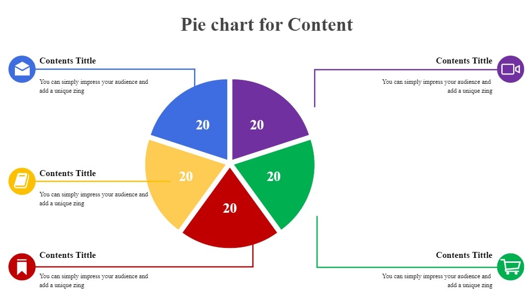
 Pie Chart Example for Proportional Distribution
This pie chart is a bit different – it's a blank template. However, pie charts like this can be advantageous for visualizing the division of things. You can imagine filling in the slices to represent different parts of something and see how they compare to each other.

Pie Chart Example for Internet Usage
Pie chart examples with data like this tell how people use the internet on different devices. Each slice represents various sources, like smartphones, laptops, computers, etc. Businesses may use this pie chart example to understand which devices their customers use the most to access their website or app. From there, they can optimize their website apps.

Pie Chart Example for Monthly Budgeting
In this chart, you can see how to divide a person's monthly budget. It shows the percentage of money allocated for personal savings, gas, insurance, and entertainment. This pie chart template also reveals the allocated budget for vital categories like car expenses, food, and housing. With this pie chart template, you can analyze your spending habits and see where most of your funds go each month.

Pie Chart Example for Market Share Analysis
Some pie chart examples emphasize slices with higher percentages, making them pop out more than others. It helps you understand how different companies or products share the market. For example, a technology company might use this chart to compare its market share with competitors in various product categories.

Pie Chart Example for Project Progress
This template shows how a project progresses over time using several pie charts. An arrow points to the following pie chart as the project moves forward. Each slice in each pie chart example may change, showing different aspects of the project's progress. Project managers may use these pie chart examples with explanations to see how far a project has come and what's left to be done.

Pie Chart Example for Website Traffic Sources
This blank pie chart is not a perfect circle; some slices are separated. You can use it to understand where the traffic to a website comes from. Each pie chart slice has data representing a different source, like search engines, social media, or direct visits. Here, online businesses can see which sources bring the most visitors to a website. Then, optimize their online marketing strategies accordingly.

Pie Chart Example for Demographic Breakdown and Survey Results
Some pie chart examples include legends for each color, indicating each slice's age group. It helps you understand survey results and the demographics of a group. For instance, it can show how many people in different age groups prefer a brand or activity.

Pie Chart Example for Resource Allocation
In this part, two pie charts with examples are placed side by side, each with legends for each color. These pie chart examples help you see the distribution of resources, like money or time. You can use them to compare the allocation between two different things, like two projects or two departments in a company. It's valuable for decision-makers for the effective distribution of company resources.

Pie Chart Example for Water Usage
This chart has legends for each slice, such as shower, toilet, sink, and others. It helps you understand how water is used in a community. Using this pie chart template, you can identify which activities consume the most water and find ways to conserve it. It includes reducing water usage during showers or fixing leaks.
Now that you have explored various pie chart exam ples and their uses, it's time to move on to learning how to create a pie chart. It's easier than you think. Plus, using a pie chart maker will make the process even smoother.

Part 2. How to Create Such a Pie Chart within Minutes?
Creating pie charts can be fun and easy with the help of Wondershare EdrawMax. Whether you're a beginner or a pro, you can easily get started with one of the free diagram maker’ massive templates, covering all types of diagrams for business, project management, and even software-related ones.
Key Features
EdrawMax is worth trying for several reasons:
- Free Version. EdrawMax offers a free version, making it accessible to everyone.
- Tons of Resources. Access a wide variety of templates, including free pie chart examples and other diagrams like data flow, swimlane, and BPMN.
- Easy and Collaborative. EdrawMax is easy to use and intuitive, allowing you to collaborate with others in real time.
- Supports Multiple File Formats. You can import and export files in different formats, such as Office, PDF, Visio, and graphics.
- Multi-Platform Compatibility. EdrawMax is accessible online through web browsers and available on Windows, macOS, Linux, iOS, and Android devices.
Step-by-Step Guide To Making a Pie Chart With EdrawMax
Follow these steps to create a pie chart using EdrawMax:
Step1
Download and install the app on your computer, and launch it.
Step2
Click the Basic drop-down menu, then select Graphs and Charts.
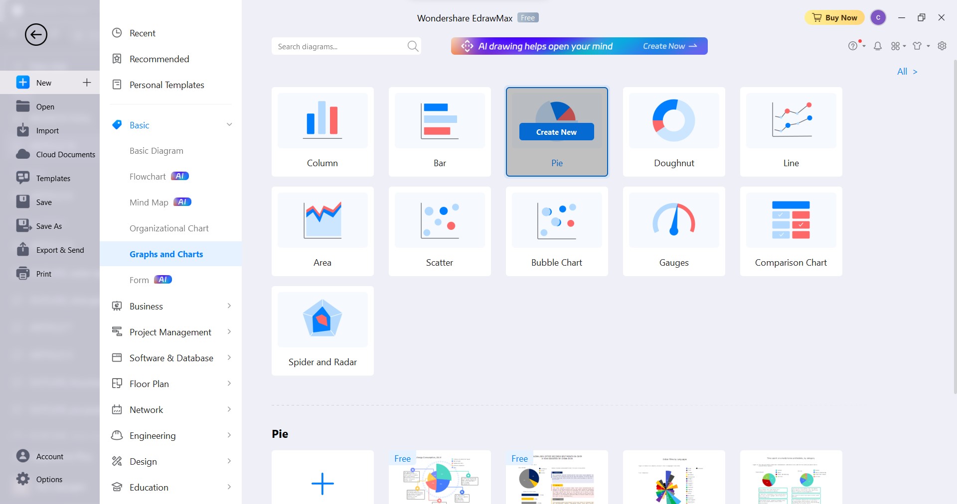
Step3
Select Pie and click Create New. You can also click Templates on the left-side navigation pane, search for pie chart examples, and choose one.
Step4
If you're starting with a blank pie chart template, drag and drop a pie chart onto the canvas. To do so, select a pie chart from the Pie and Doughnut Charts section on the left-side navigation pane.
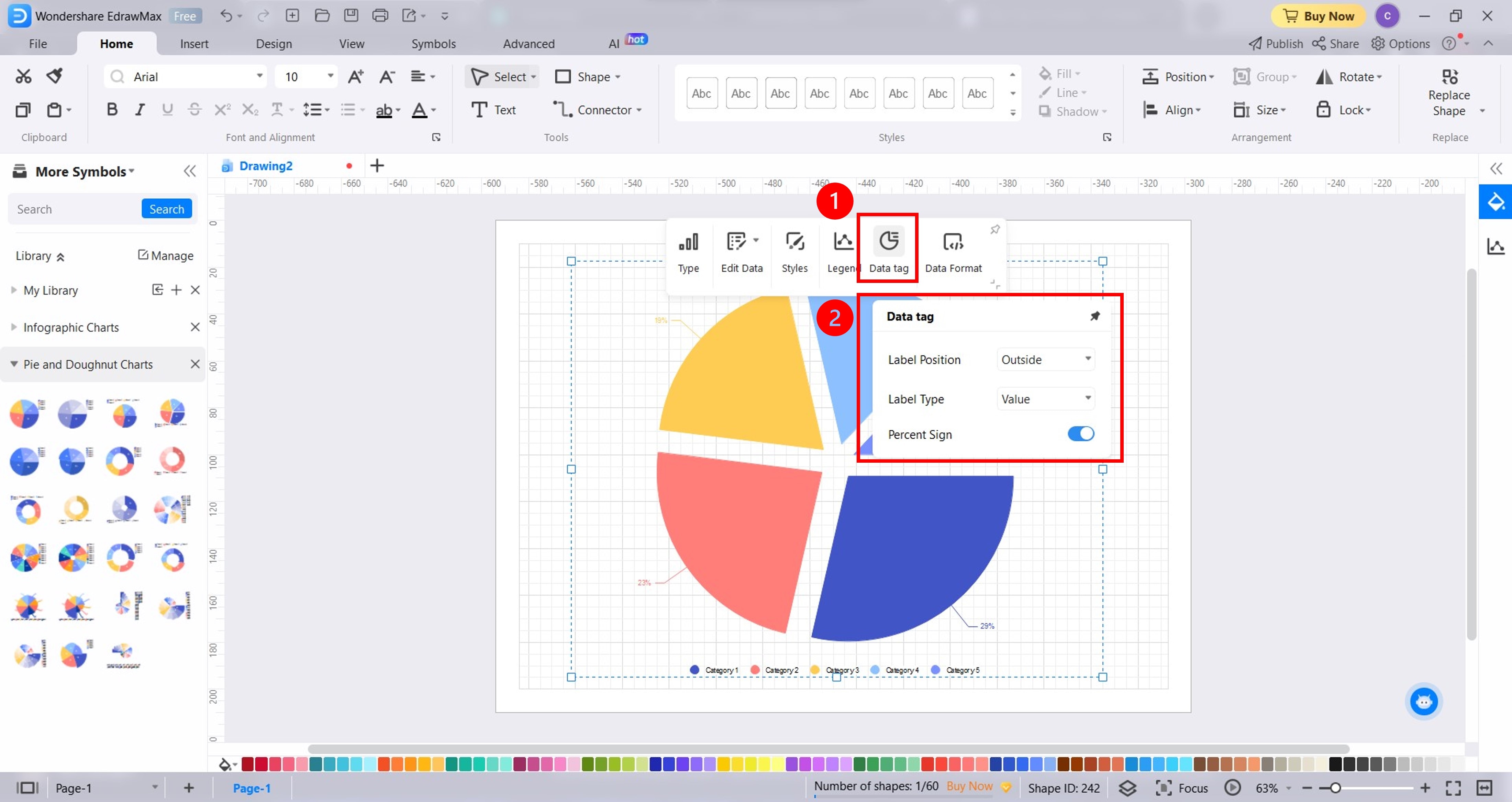
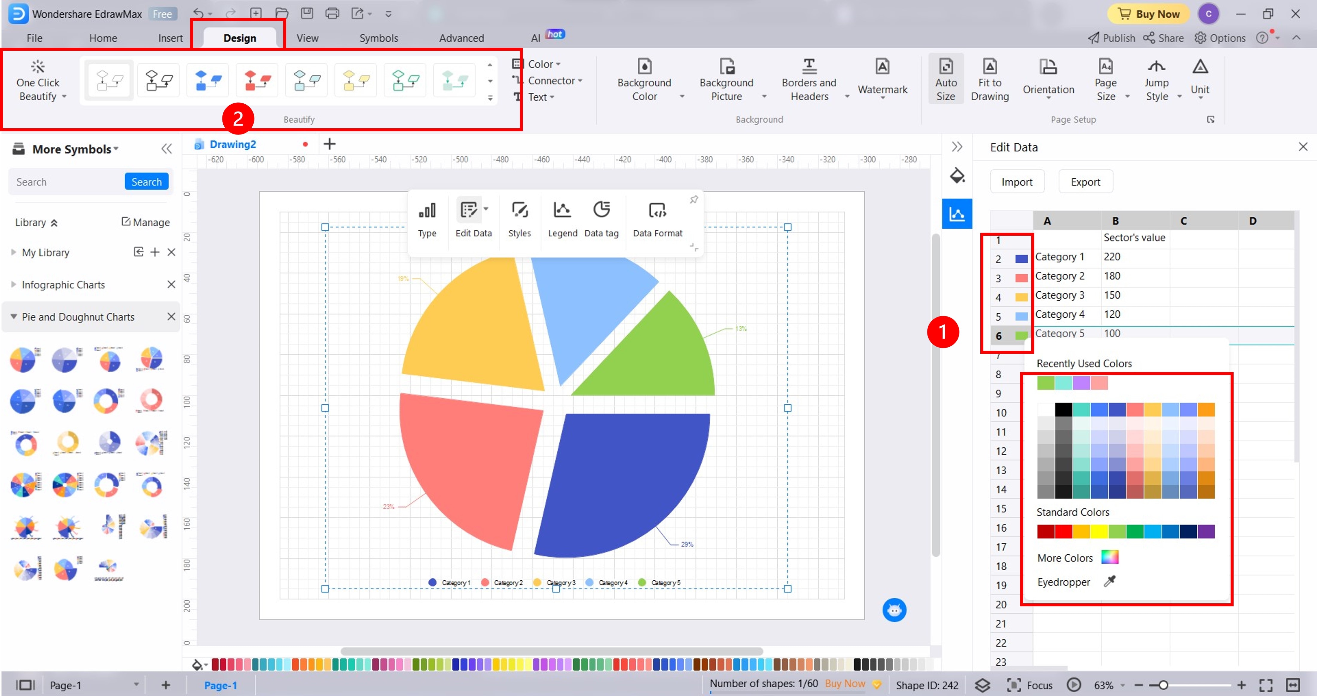
Step5Edit the pie chart contents
Edit Labels. Select the pie chart and click Data Tag from the floating toolbar. Adjust the label settings such as Label Position, Label Type, and Percent Sign.
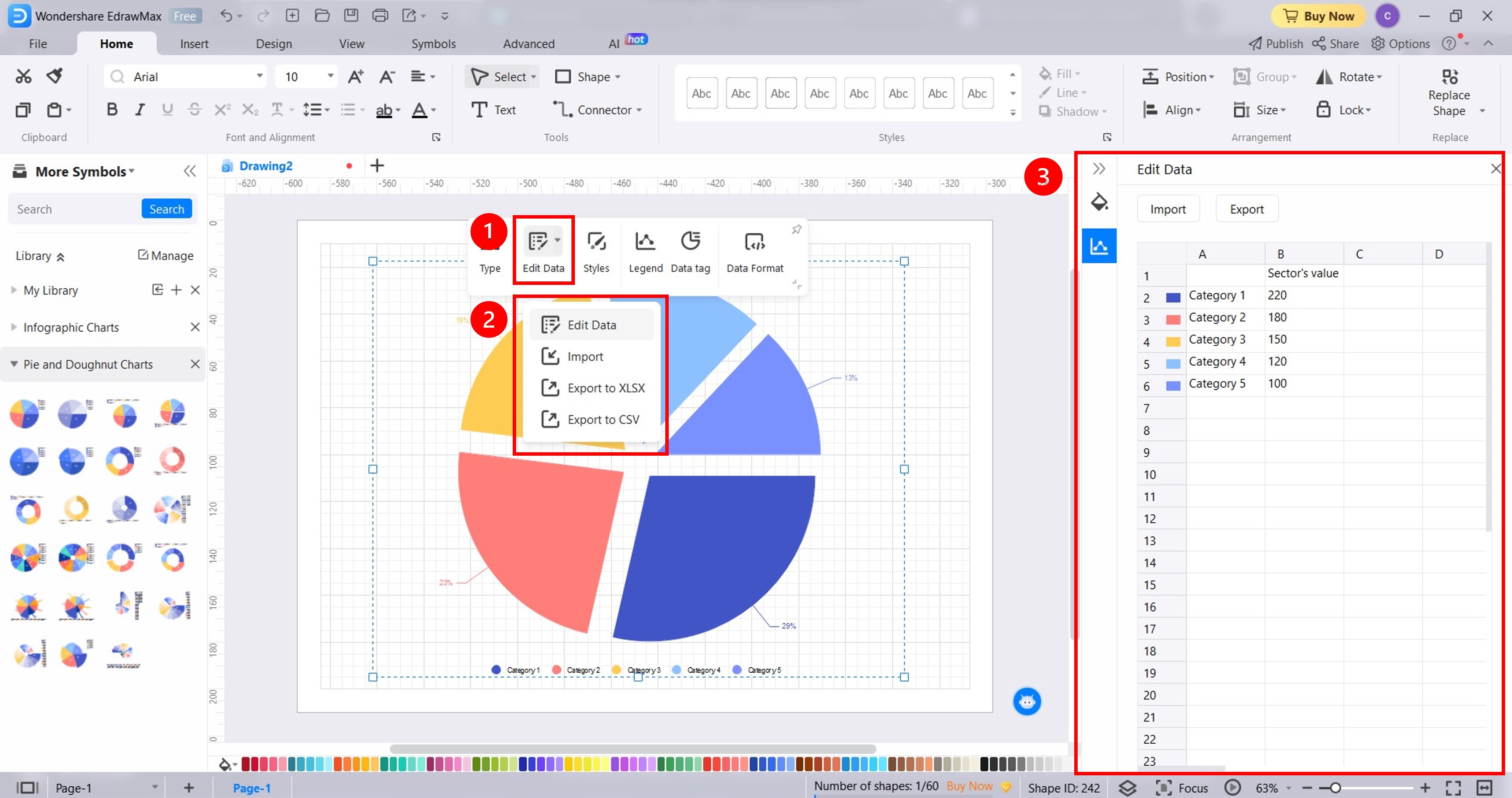
Edit or Add Data. Select the pie chart and click Edit Data drop-down list from the floating toolbar. Select Edit Data and make changes directly or import an Excel file.
Change Legend Colors. Click the color you want to change in the Edit Data pane, then select a color from the color palette menu. Another way is to go to Design > Beautify group in the upper navigation pane. From here, you can click One Click Beautify or select a theme.
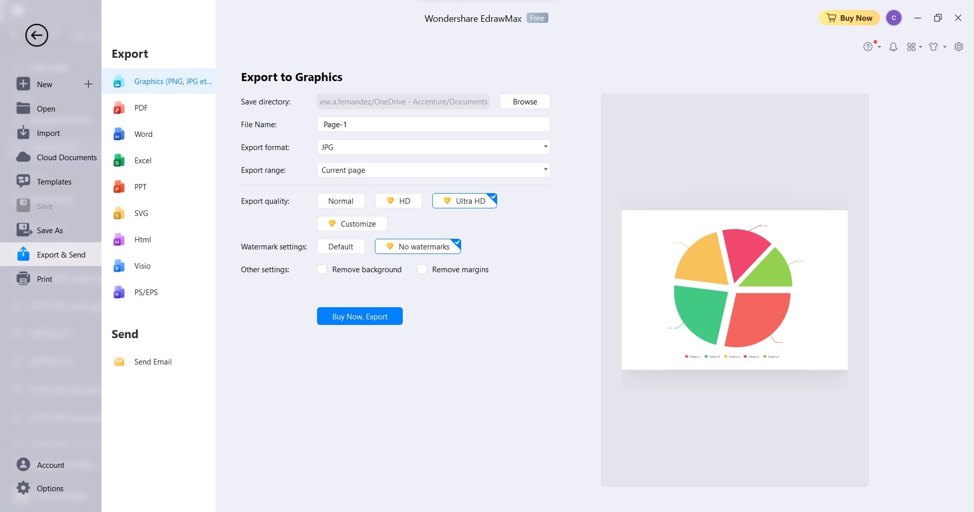
Step6
Once the pie chart is ready, go to File in the upper navigation pane, then click Export and Send. Choose the file format you want, and you're all set.
Part 3. How Do You Show Data on a Pie Chart? Tips and Best Practices
Now that you've learned how to create a pie chart, it's time to ensure the pie chart you create is as insightful as the pie chart examples with explanations earlier. These tips and best practices will guide you in presenting your data on a pie chart.
Ensure the Total Adds Up to 100%
The entire pie chart should represent 100%. Each slice symbolizes a part of the whole. Imagine discussing expenses: salaries, supplies, marketing, and more. When combined, the percentages should sum up to 100%.
Keep Categories Limited
An organized display is crucial. Aim to feature a reasonable number of slices, between 5 to 7. Too many categories can overwhelm a pie chart and might confuse your audience. Keeping pie chart slices manageable makes your data clear and understandable.
Emphasize Key Slices
Certain aspects stand out in any dataset, like highlighting critical points in a report. Consider enlarging or using distinctive colors to highlight significant pie chart slices. You will see in the previous pie chart examples with data that there are bigger, separated slices than the others. This technique draws attention to significant categories so your audience grasps the most essential details.
Use Clear Labels
With labels, pie charts can be more straightforward. As you see in the previous pie chart examples, each has labels to show what each part of the pie chart represents, like the names and percentages of categories. Ensure each label is concise and provides a straightforward explanation of each slice's display in your data.
Maintain Consistent Units
Consistency is key, as mixing units can lead to confusion. Stick to a single unit of measurement throughout your pie chart. If you choose percentages, maintain uniformity, and avoid incorporating numerical values or fractions.
Conclusion
Pie charts are a versatile and crucial tool for visualizing data, especially for organizations. These charts display data in slices of a circle, representing proportions. You can find and learn from pie chart examples with explanations online.
For making pie chart examples, consider using EdrawMax. It's an intuitive diagramming tool for making impactful pie charts. Give it a try for better data visualization.
AI Diagram Generator
Enter your prompt. Upload files if needed. Generate diagrams, charts, or slides instantly.


