


In an era dominated by data, the art of conveying information is more crucial than ever. Excel's column charts serve as a dynamic means of translating raw data into vivid, actionable insights. This guide on creating a column chart in Excel is designed to lead you through the process with grace, enabling you to wield the full potential of chart creation. Whether you're presenting to stakeholders or enhancing a report, these techniques will revolutionize your data narrative.
Contents of this article
What is a Column Chart?
A column chart is a visual representation of data using vertical bars. Each bar represents a category, and the height of the bar corresponds to the value it represents. It's an effective way to compare different categories and identify trends or patterns in the data at a glance.
Column charts are widely used in business reports, presentations, and academic studies. They provide a clear and concise way to convey information, making complex data more accessible to a broader audience. With just a quick glance, viewers can discern which categories are larger or smaller, aiding in decision-making processes.
Types of Column Charts
Understanding the various types of column chart in Excel allows you to choose the best representation for your specific data insights.
- Clustered Column Chart: The clustered column chart groups data in vertical columns side by side, making it easy to compare values within individual categories. Each category has its own set of columns, allowing for straightforward visual analysis.
- Stacked Column Chart: In a stacked column chart, data sets are stacked on top of one another, creating a cumulative visual. It helps illustrate the total and the contribution of each category to that total, enabling viewers to see both individual and collective values.
- 3D Column Chart Excel: The 3D column chart adds a three-dimensional effect to the traditional column chart, providing depth and perspective. While visually appealing, it's important to use this chart type judiciously, as it can sometimes make data interpretation more challenging compared to flat, 2D charts.
Steps to Create a Column Chart in Excel
Here are the steps for creating a column chart in excel:
Step 1: Launch Excel and enter your data into a spreadsheet. Ensure that you have clear headings for your categories and corresponding values.
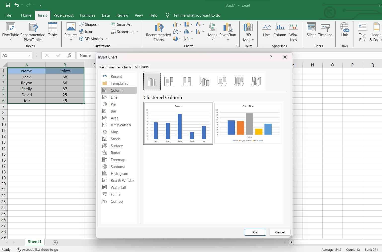
Step 2: Highlight the data you want to include in the chart. This selection will be the basis for your column chart.
Step 3: Within the "Insert" tab, find the "Charts" section. Click on the icon that represents 'Column Chart.' You'll see various column chart options. Choose a Clustered Column Chart from the list of options.
Step 4: Excel will generate a chart based on your selected data. You can customize it further by adding titles, and labels, changing colors, and adjusting other settings.
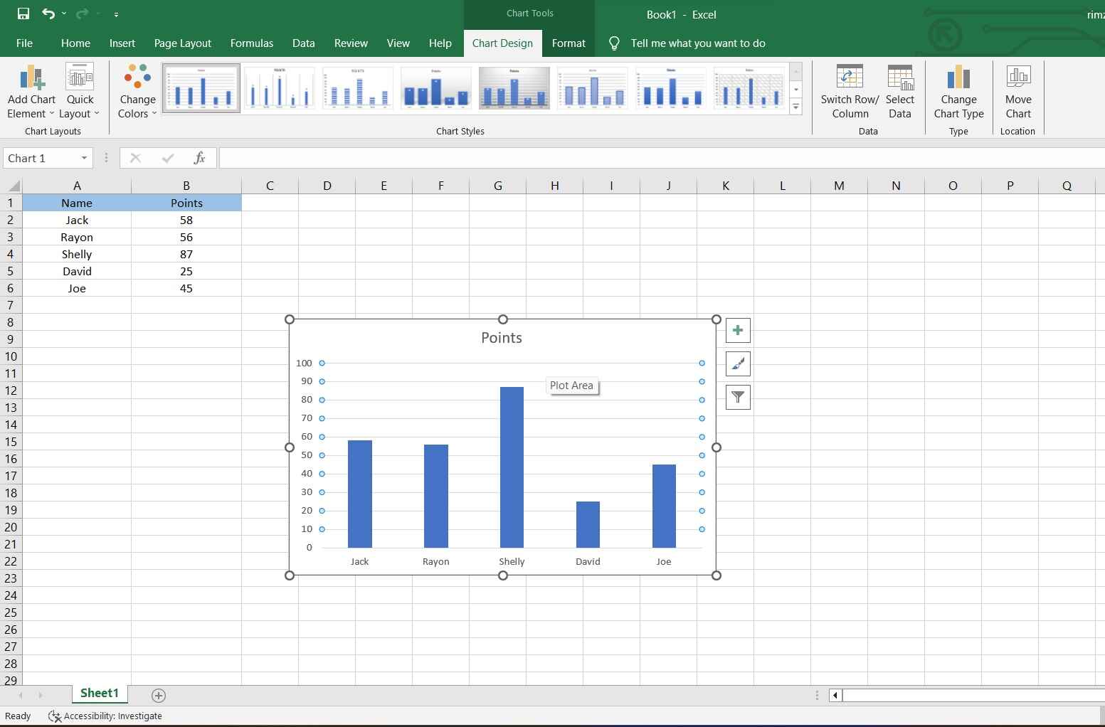
Step 5: Click on the chart to select it. Then, click and drag to move it to the desired location on your spreadsheet. You can also click and drag the corners or edges to resize it.
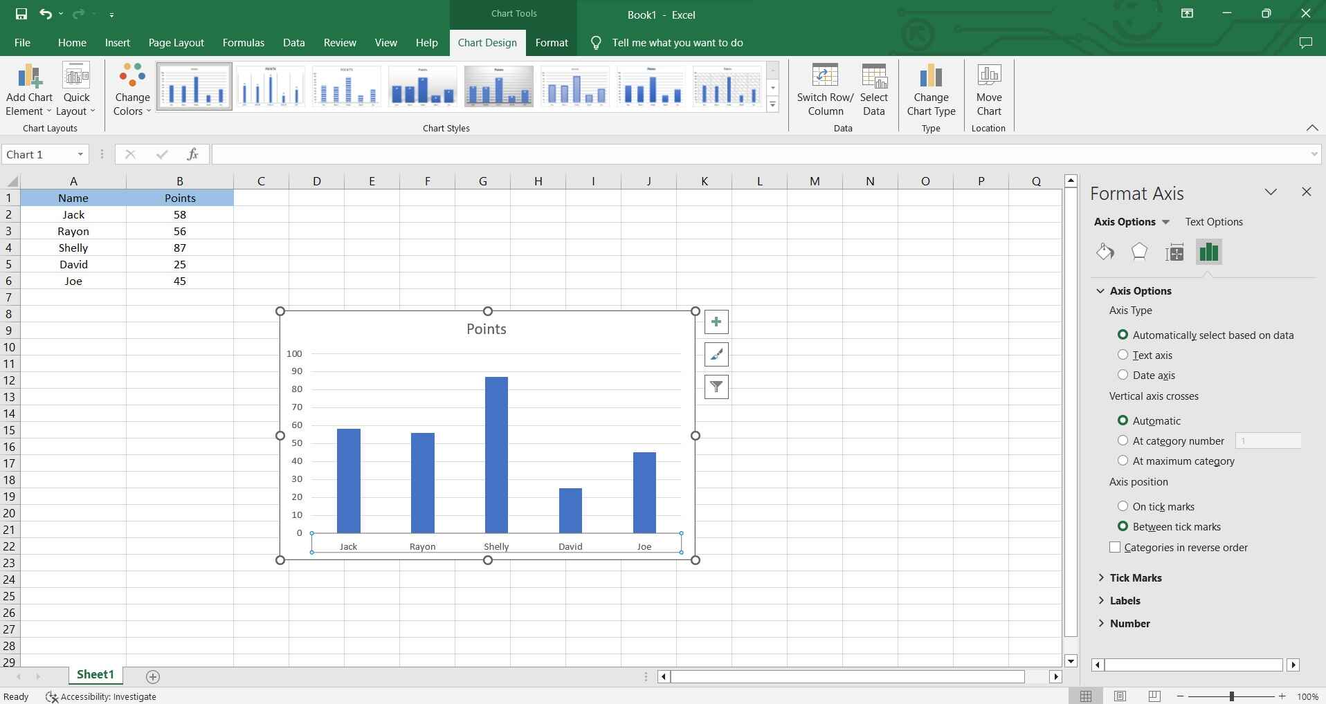
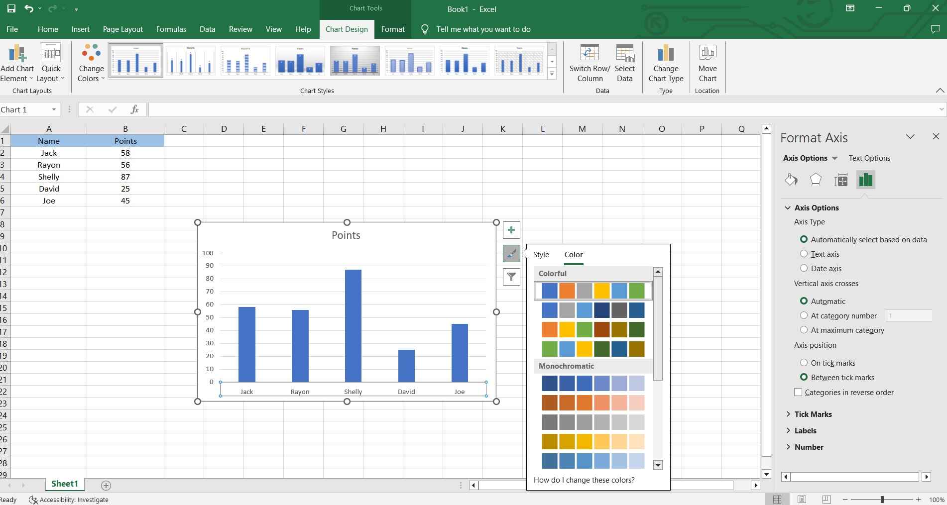
Step 6: Format your chart. Don't forget to save your Excel file to keep the changes and the newly created chart.
And that’s it! You've successfully created a column chart in Excel, effectively visualizing your data.
How to Create a Column Chart Easily with EdrawMax
Wondershare EdrawMax offers a superior solution for creating column charts compared to Excel for several reasons. First, EdrawMax boasts an intuitive and user-friendly interface, making it exceptionally easy for both beginners and experienced users to create visually appealing column charts.
While Excel primarily focuses on spreadsheet functionalities, EdrawMax is specifically designed for creating various types of visual diagrams, including column charts. This specialization results in more refined and flexible charting options.
Here are the steps to create a column chart using EdrawMax:
Step 1: Open the EdrawMax application on your computer. In the EdrawMax dashboard, click on the "Graphs and Charts" category in the template library. Then, choose the "Column Chart" template.

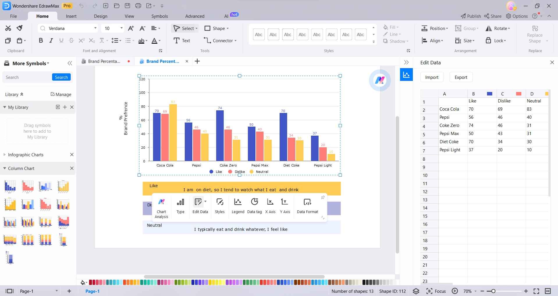
Step 2: Double-click on the columns in the template to input your own data. Alternatively, you can also import data from an Excel spreadsheet or manually enter it.
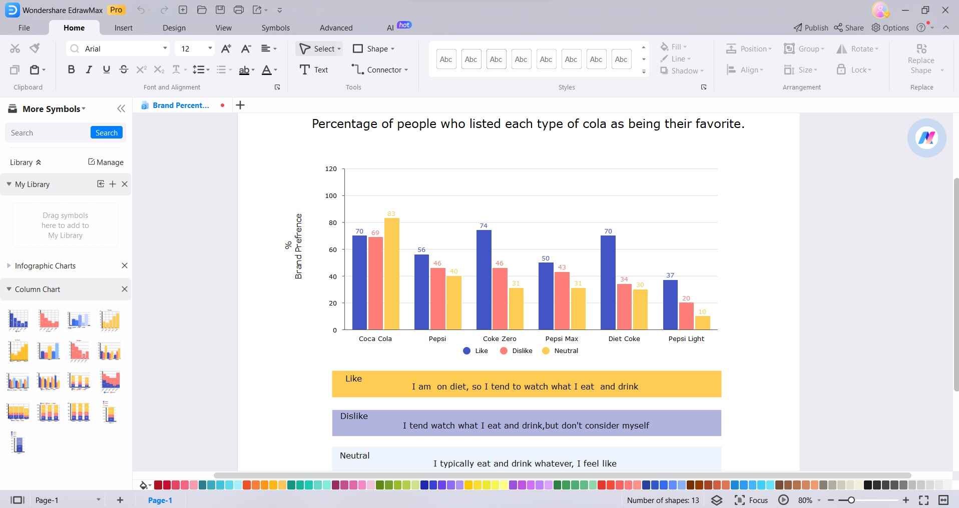
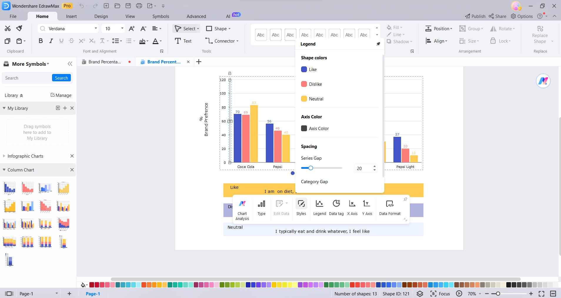
Step 3: With the chart selected, use the toolbar and formatting options to customize various elements such as labels, colors, axis titles, and gridlines.
Step 4: EdrawMax provides intuitive options to resize, reposition, and fine-tune the layout of your column chart to suit your preferences.
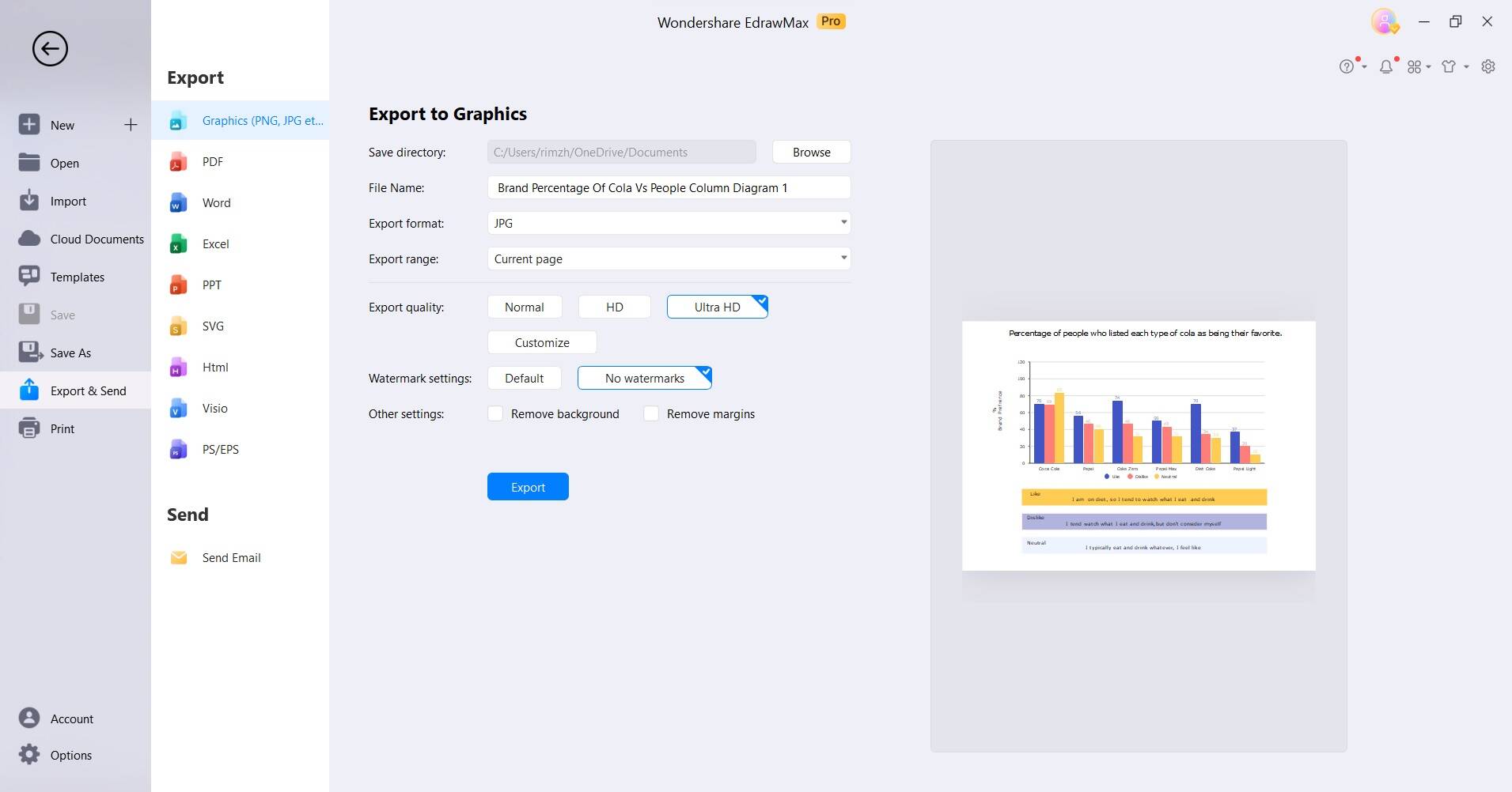
Step 5: Click on the "File" menu and select "Save" to save your chart to your desired location on your computer. EdrawMax enables you to export your column chart in various formats, including PNG, PDF, or even directly share it via email or social media. To do so, simply navigate to File> Export and Send.
By following these steps in EdrawMax, you can effortlessly create a professional-looking column chart with precise customization options and a user-friendly interface.
Optimal Tips to Create a Column Chart
To ensure an effective column chart, consider these optimal tips:
- Clear Data Organization: Arrange your data logically for easy interpretation.
- Choose Appropriate Chart Type: Select the column chart variant that best suits your data presentation needs.
- Label Axes Thoughtfully: Clearly label both the horizontal and vertical axes for context.
- Use Consistent Colors: Maintain a consistent color scheme for clarity and coherence.
- Limit Categories: Avoid overcrowding; focus on essential categories for a cleaner display.
- Add Titles and Descriptions: Provide concise titles and relevant descriptions for better understanding.
- Regularly Update Data: Keep your chart current to reflect the latest information.
Conclusion
In harnessing the potential of column charts, you've unlocked a dynamic tool for data representation. Remember, effective visualization hinges on thoughtful data organization, choice of chart type, and clear labeling. Consistency in color usage and judicious category selection are pivotal. Titles and descriptions offer vital context, while timely updates ensure relevance.
