


Creating pie charts in Power BI simplifies data visualization. This guide provides step-by-step instructions for beginners and those looking to improve their data presentation skills. Pie charts are effective tools for displaying proportions within datasets. Mastering them in Power BI enhances your ability to communicate insights clearly and make data-driven decisions.
Power BI's pie charts help you transform complex data into understandable insights. Our guide ensures you can create informative and visually appealing charts, facilitating better data analysis and communication with your audience.
In this article
How To Make a Pie Chart in Power BI?
Here are the steps on how to make a pie chart in Microsoft Power BI:
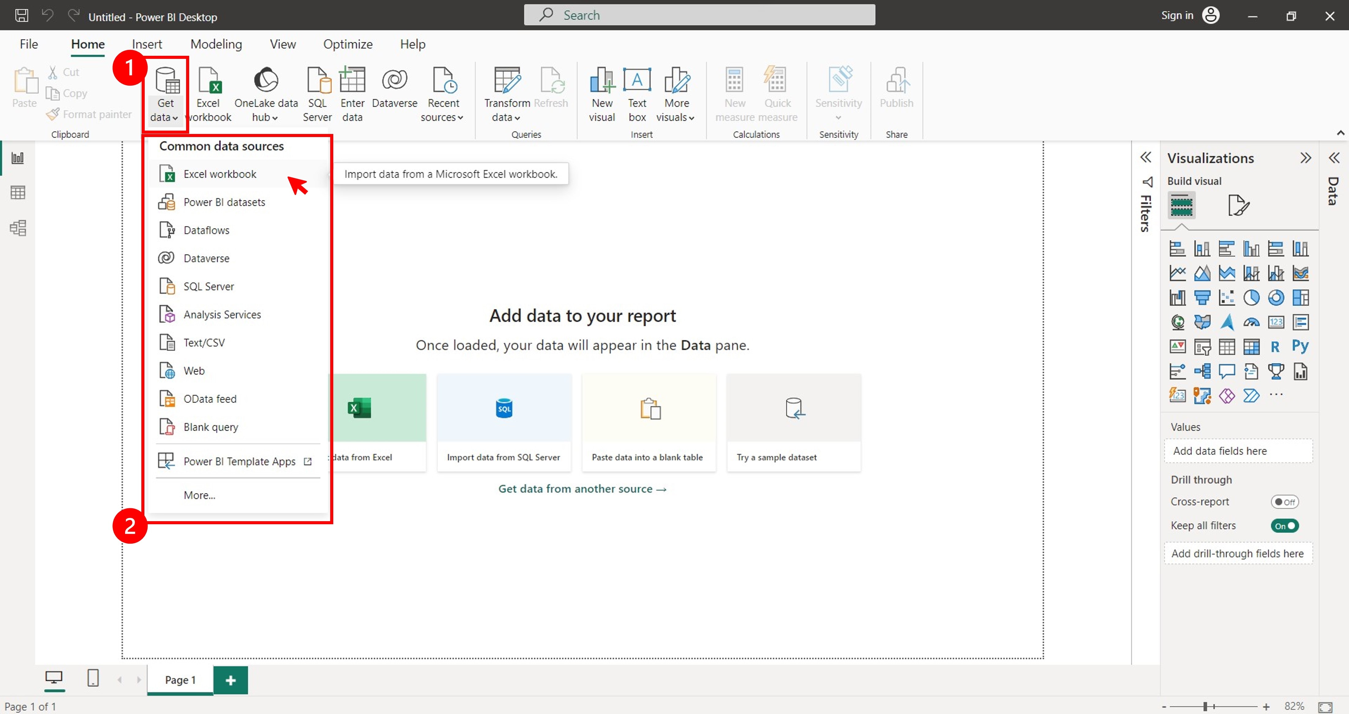
Step 1: Connect to your data source. To do this, select a data source from the Get Data drop-down list in the Home tab in the upper navigation pane. You can also click Enter data to start a new entry.
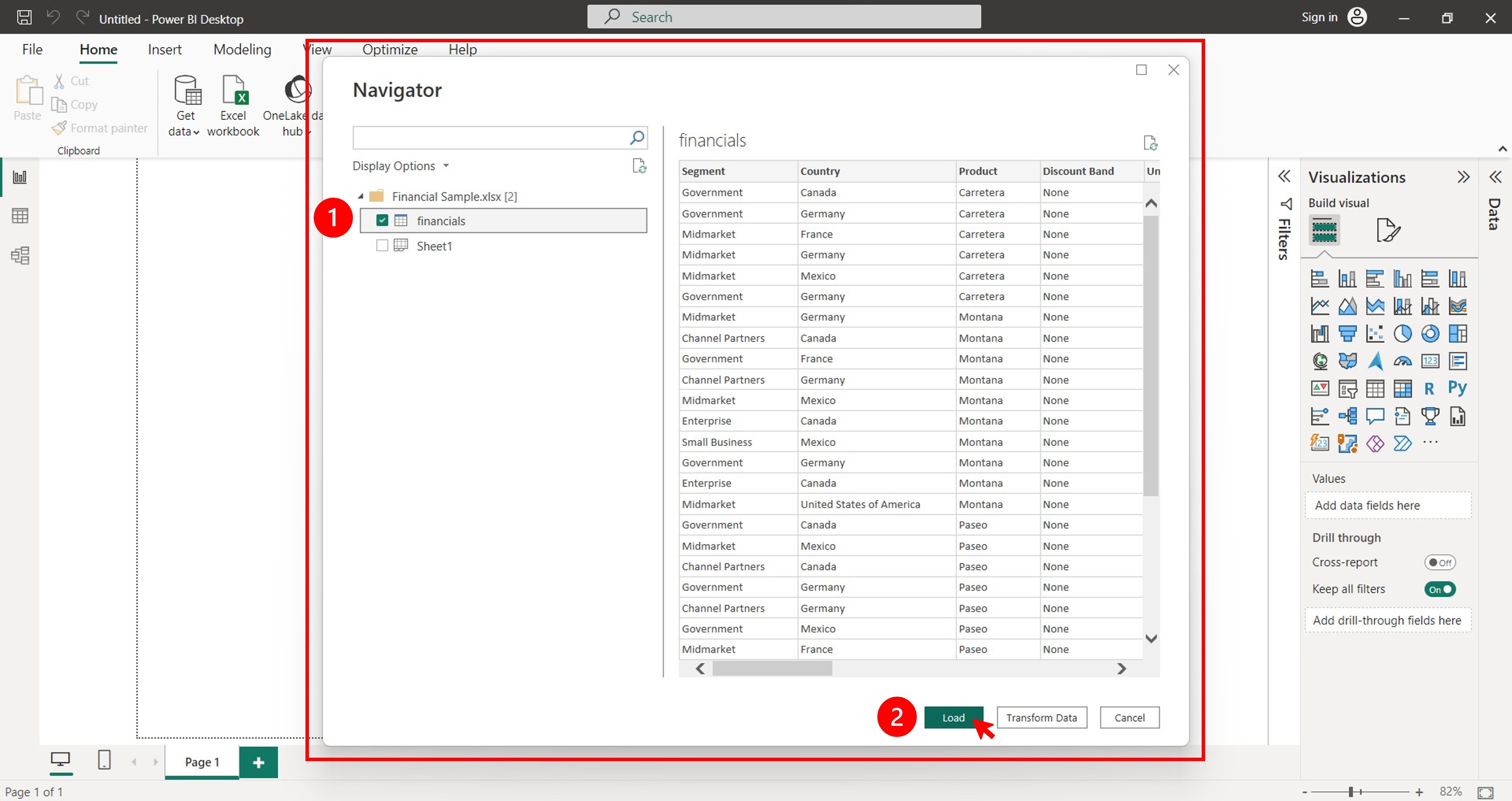
Step 2: Wait while the application connects to your data source. Once connected, select the sheets you want to import in the Navigator pop-up window and click Load.
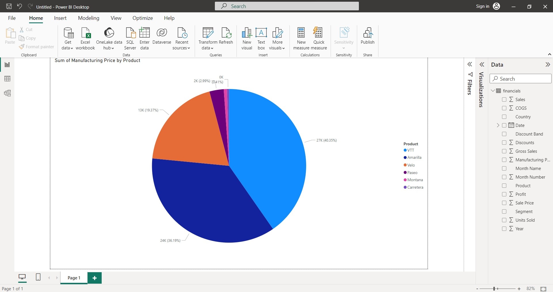
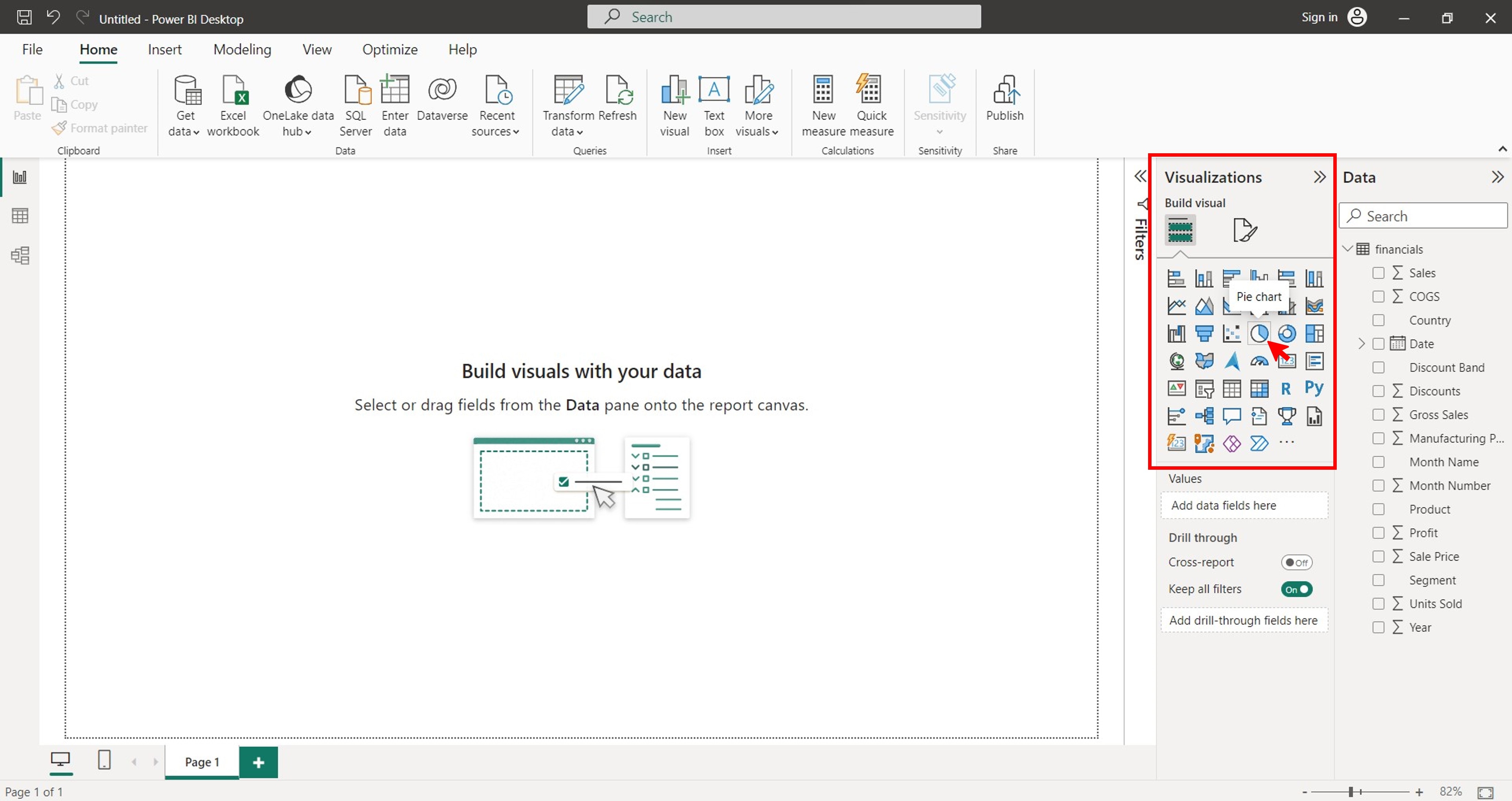
Step 3: In the Visualizations section in the left pane, click the Pie chart icon under the Build visual tab.
Step 4: Do the following from the Data section to the Build visual tab under the Visualizations section in the left pane.
Step 4a: Select or drag the data field you want to use for the legend to the Legend box.
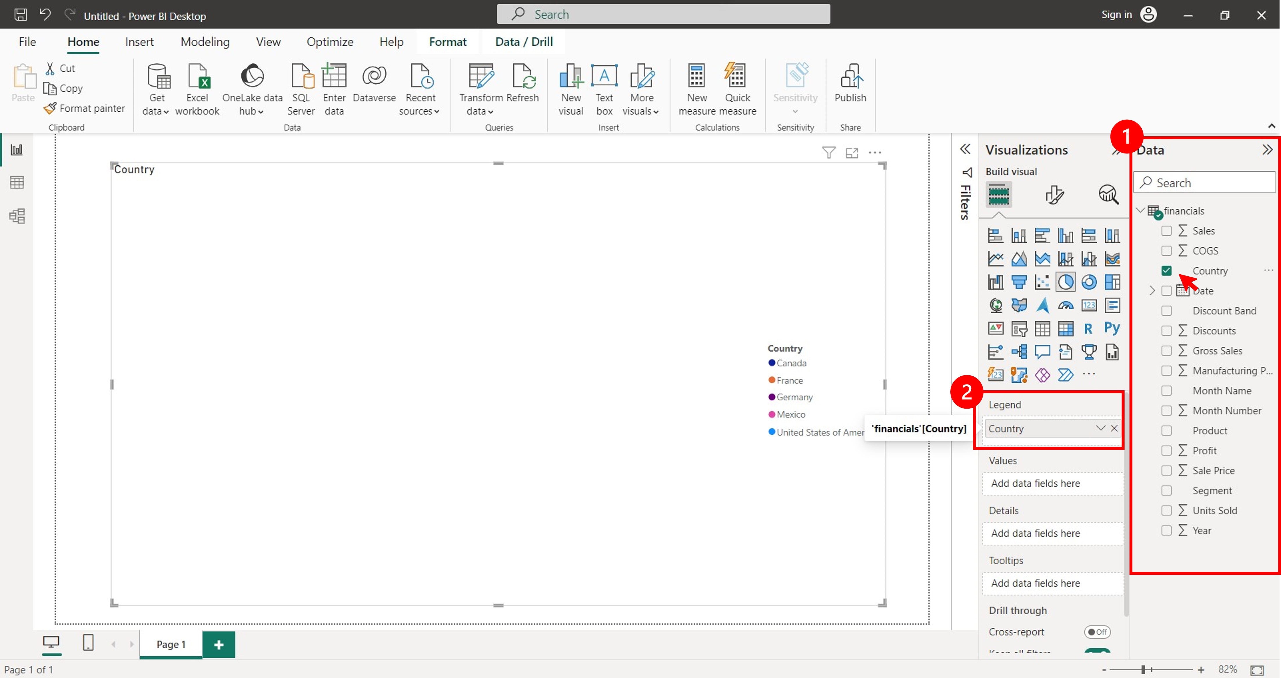
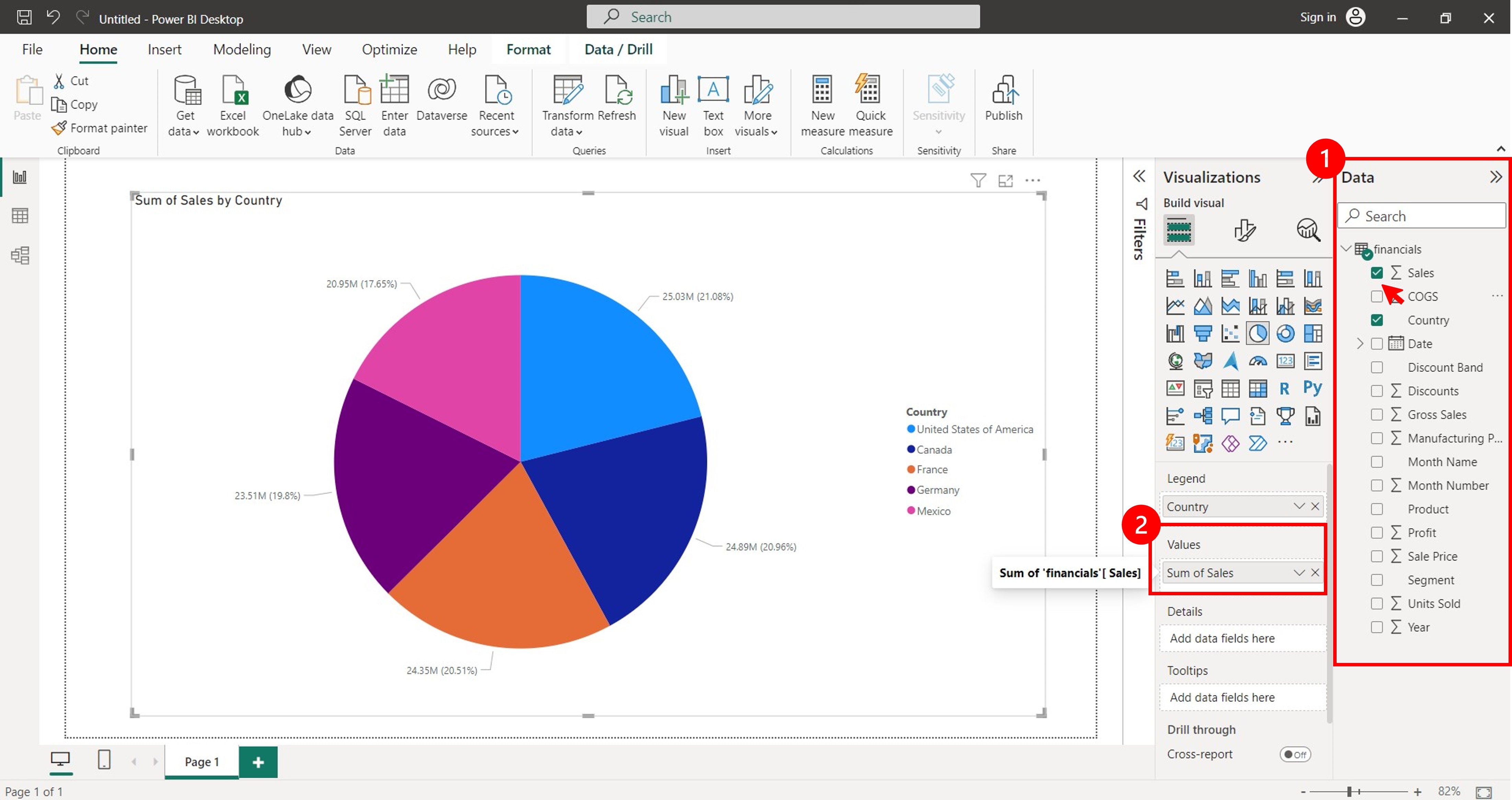
Step 4b: Select or drag the data field you want to use for the values to the Values box.
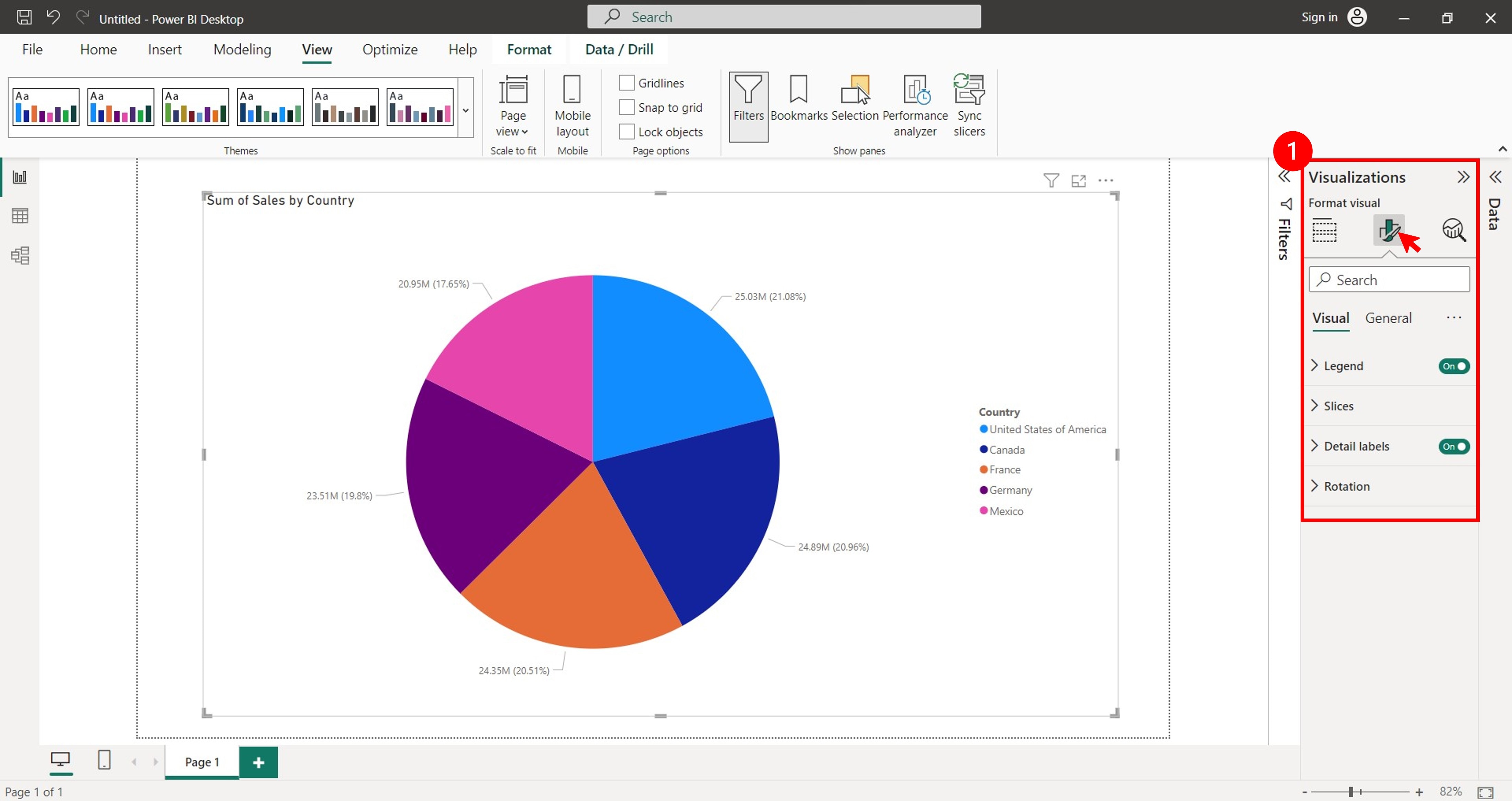
Step 5: To customize the pie chart, you can change the colors, labels, and other settings. To do this, first select the pie chart. Next, go to the Format Visual tab in the Visualizations section of the left pane.
Step 6: Select the customization options you want to change from the Legend, Slices, Detail labels, and Rotation drop-down lists.
Beginner's Better Alternative: Wondershare EdrawMax
Power BI is a powerful tool you can use for a variety of data visualization tasks. But it can also be complex and challenging to navigate for beginners. If you are looking for a user-friendly and versatile diagramming tool to create pie charts, then EdrawMax is a good alternative. The software has an intuitive interface and various features that allow you to create and design your pie charts within minutes.

Key Features
Here are some of the reasons why you might consider using EdrawMax to create pie charts for presentations:
- Pre-designed Templates for 210+ Types of Diagrams. EdrawMax is a diagramming tool that has templates for almost everything. Whether you need a pie chart, a mind map, a network diagram, a flowchart, or a floor plan, EdrawMax has professional-looking templates for you.
- Rich Templates. EdrawMax offers a vast array of ready-made templates with which you can easily get started and use after simple customization.
- Diverse Customization Options. EdrawMax has built-in features that allow you to customize your pie charts. You can change the colors, themes, labels, and other settings to make it look how you want.
- Various Export Formats. EdrawMax allows you to export your pie charts in several file formats, including Excel, Word, JPG, PPT, SVG, and more. This makes it easy to share your pie charts with others or embed them in your documents.
- Collaboration in Real Time. EdrawMax is also cloud-based software you can access anywhere with an internet connection. This tool makes collaboration with others easy while working on your pie chart presentations.
How To Easily Create a Pie Chart?
Such a convenient tool with a wide range of advantages can bring stunning pie charts to you in a few clicks. Follow these steps to learn how to create a pie chart online for free using EdrawMax.
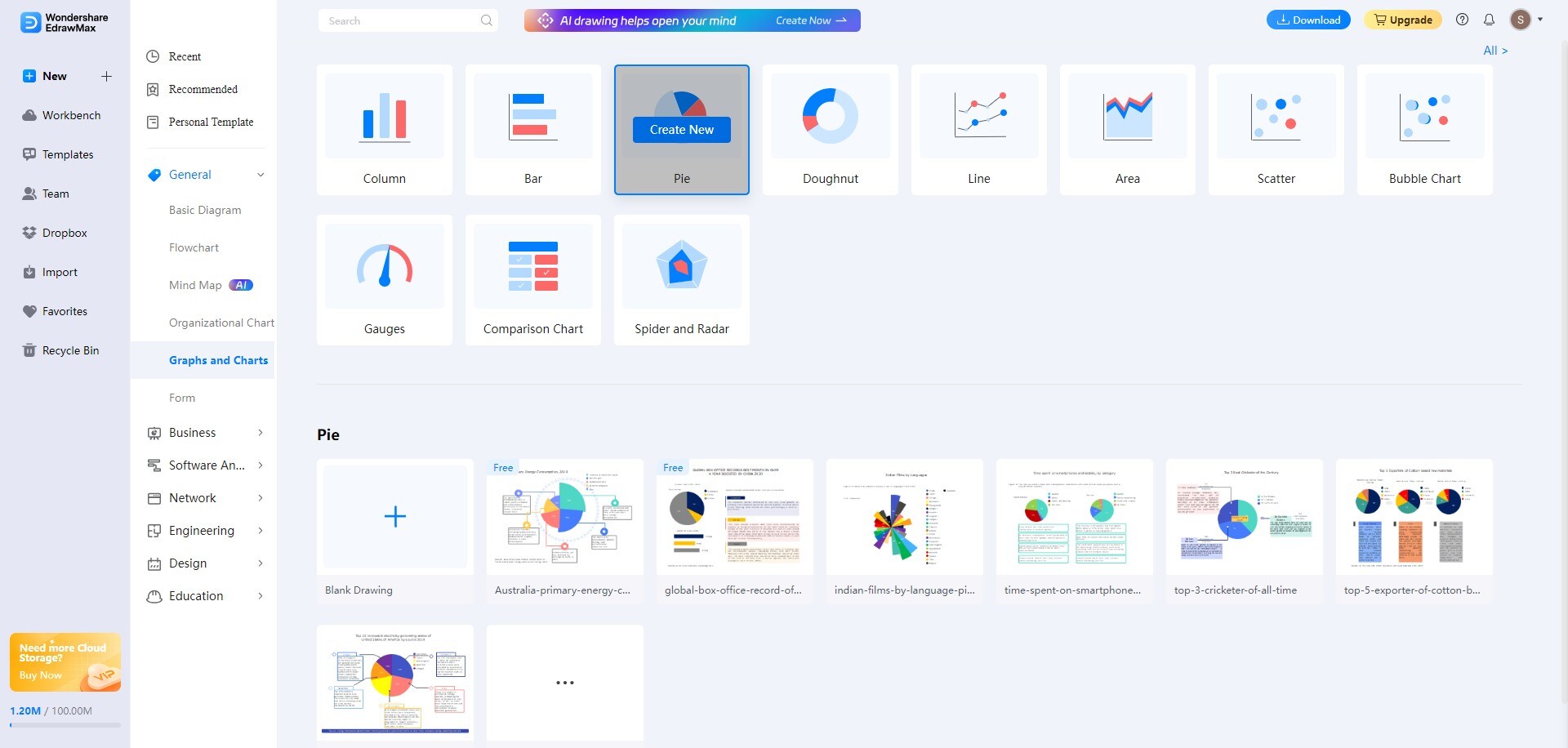
Step 1: Download, install, and launch EdrawMax or try it online. Log in with your Wondershare ID or an account on Google, Facebook, or Twitter.
Step 2: Choose General > Graphs and Charts, select Pie, and click Create New.
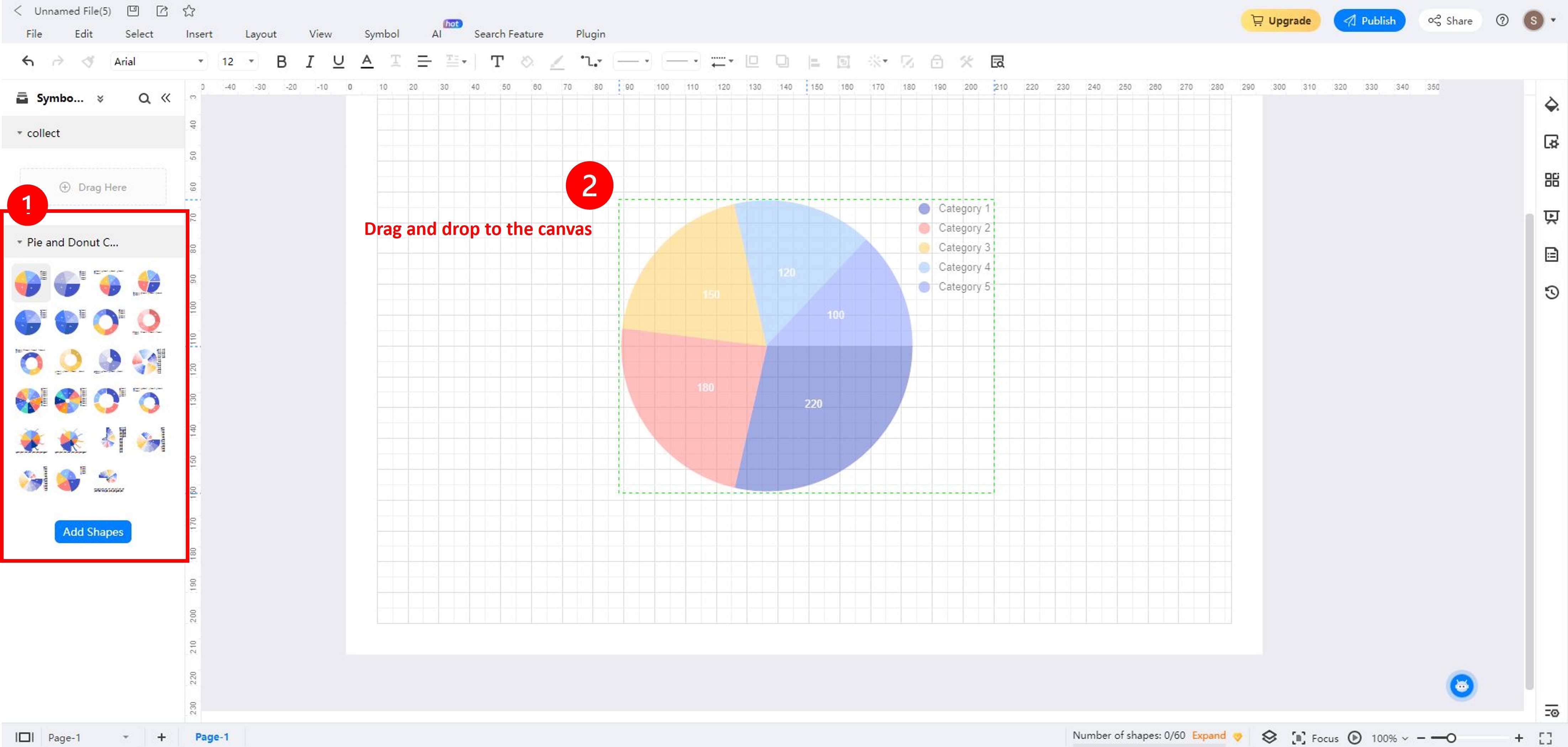
Step 3: Drag and drop a pie chart template to the canvas from the Symbol Library section on the right panel.
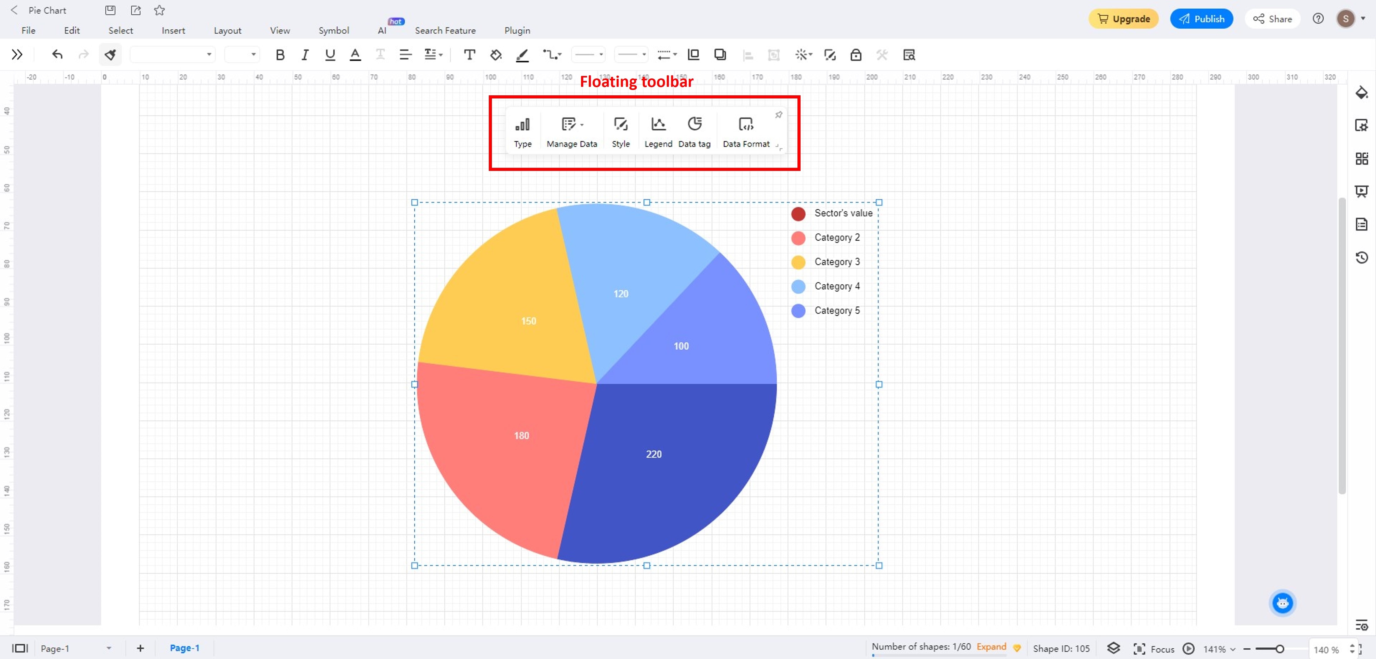
Step 4: Select the pie chart to open the floating toolbar. It contains options for editing data and customizing the pie chart.
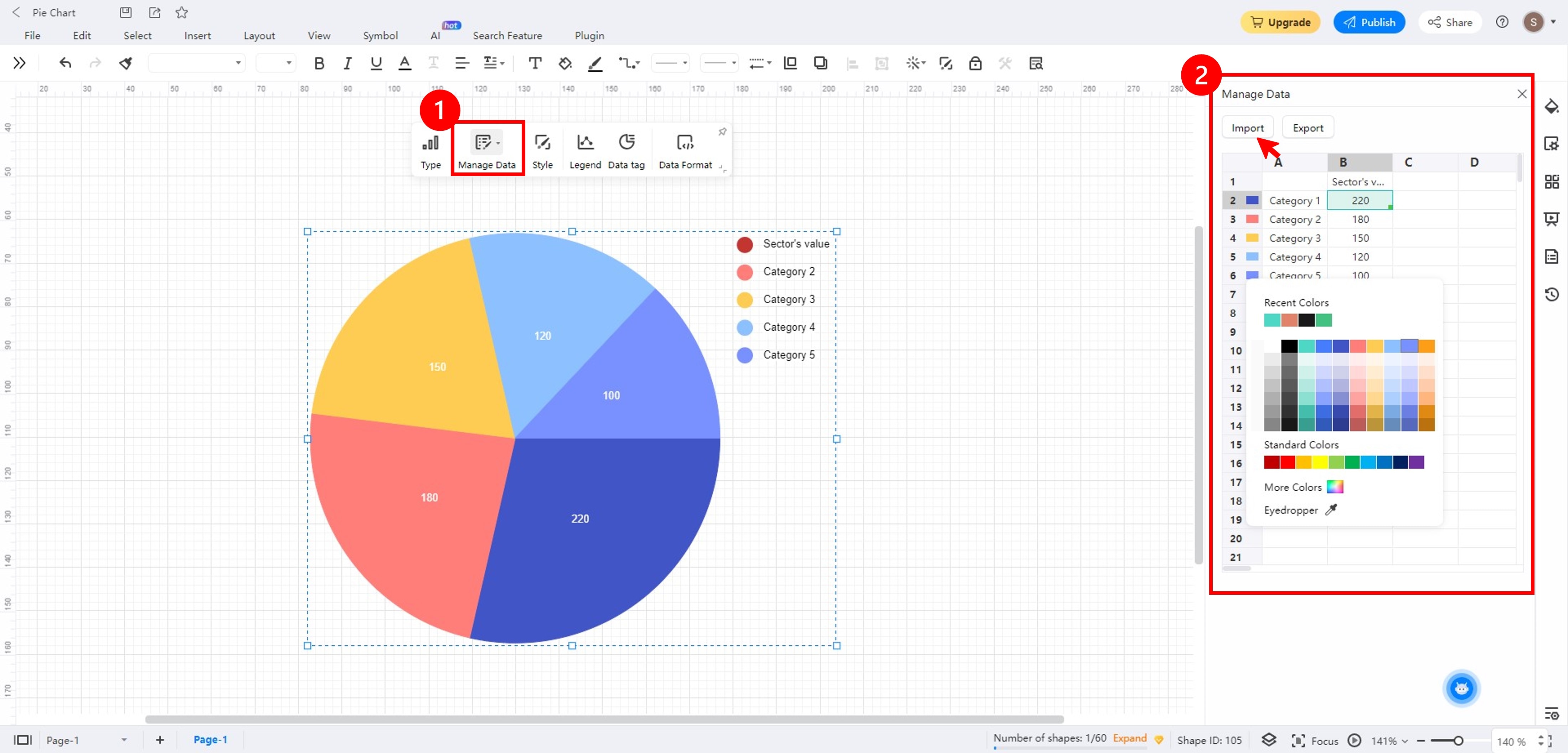
Step 4a: Click Manage Data in the floating toolbar. Click each field in the Manage Data section on the left panel to edit the legend color and data. You can also click Import to upload an Excel file from your local storage.
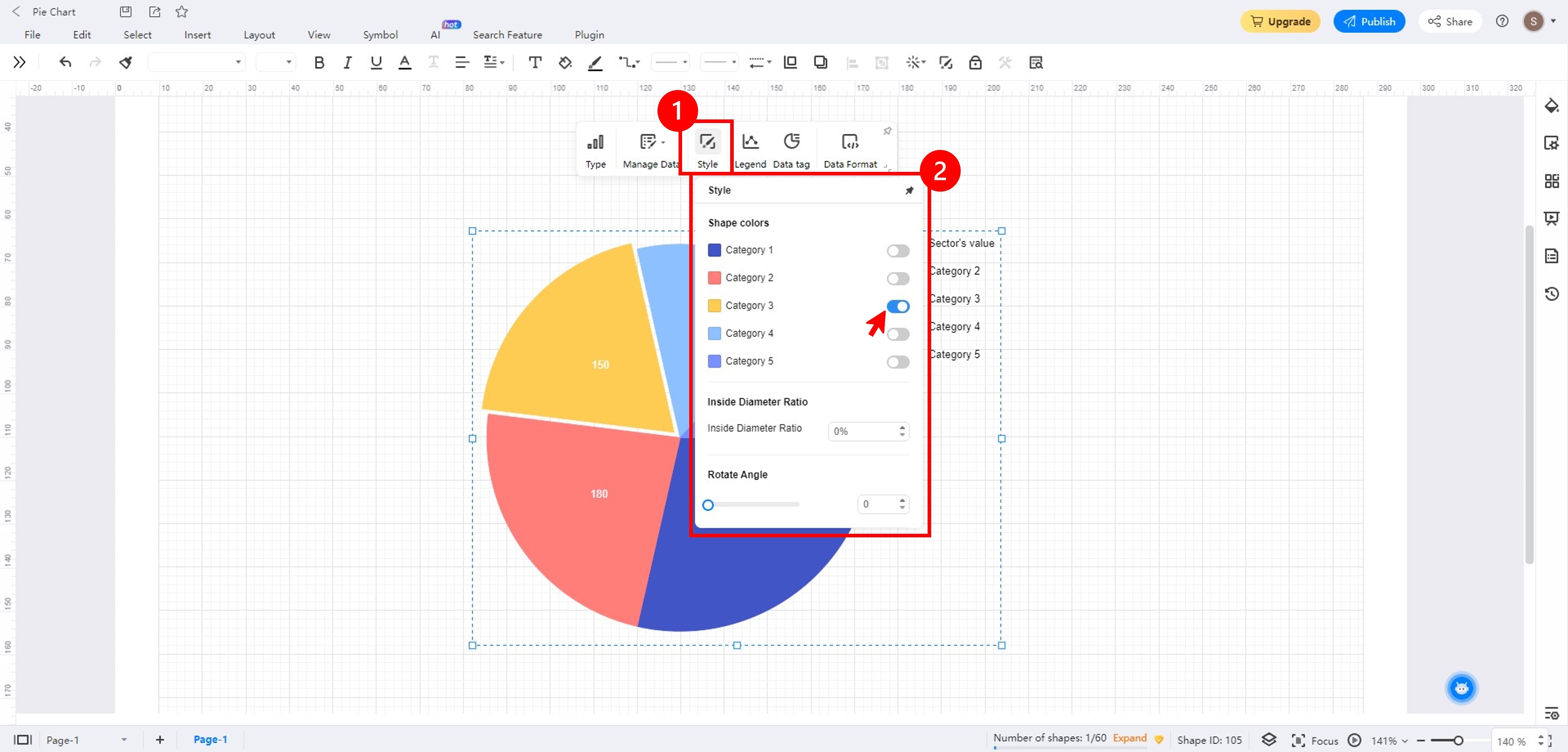
Step 4b: Click Style in the floating toolbar. Then, in the Style section, toggle on the Shape colors to create an exploded pie chart.
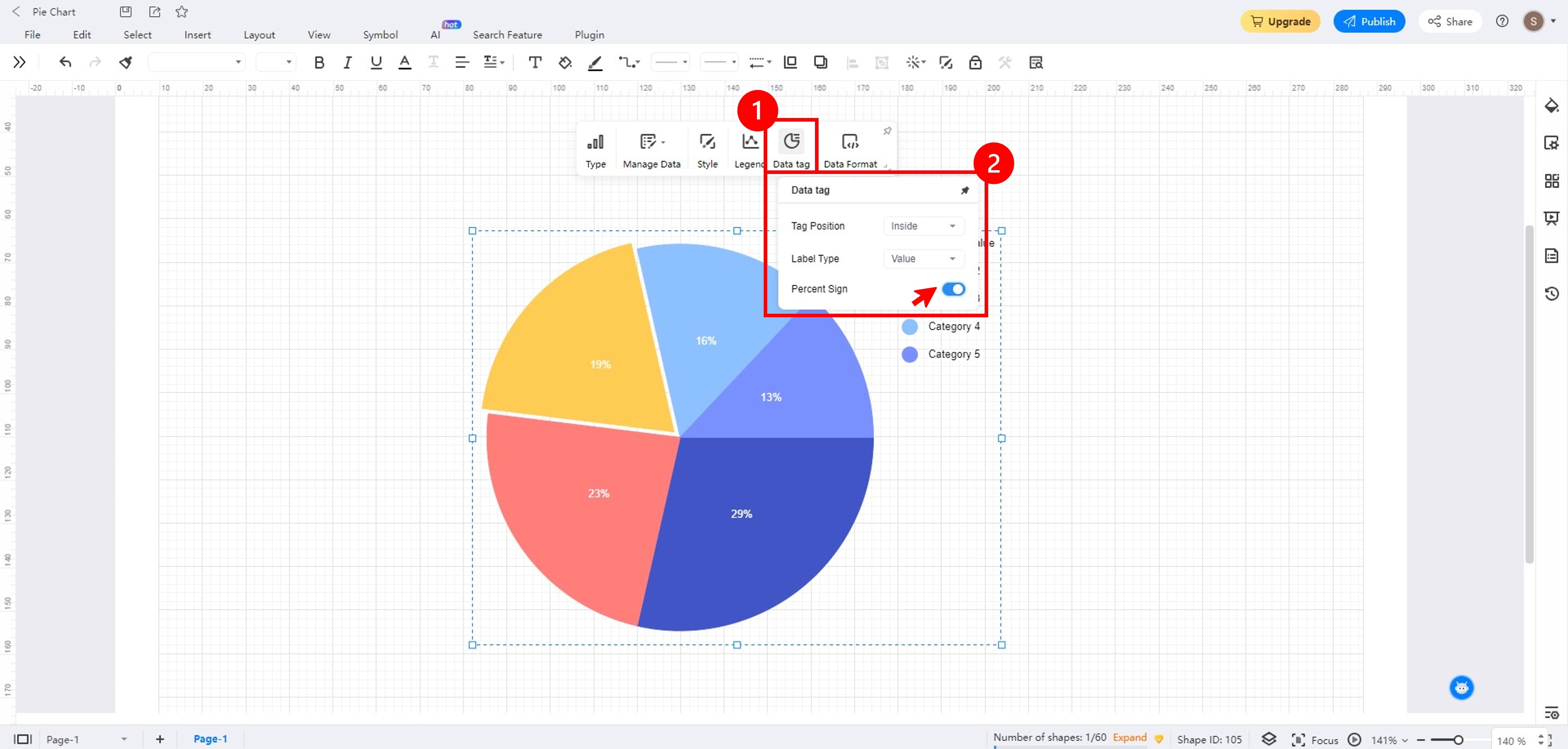
Step 4c: Click the Data tag in the floating toolbar. Here, you can change the Tag Position, Label Type, and show the Percent Sign.
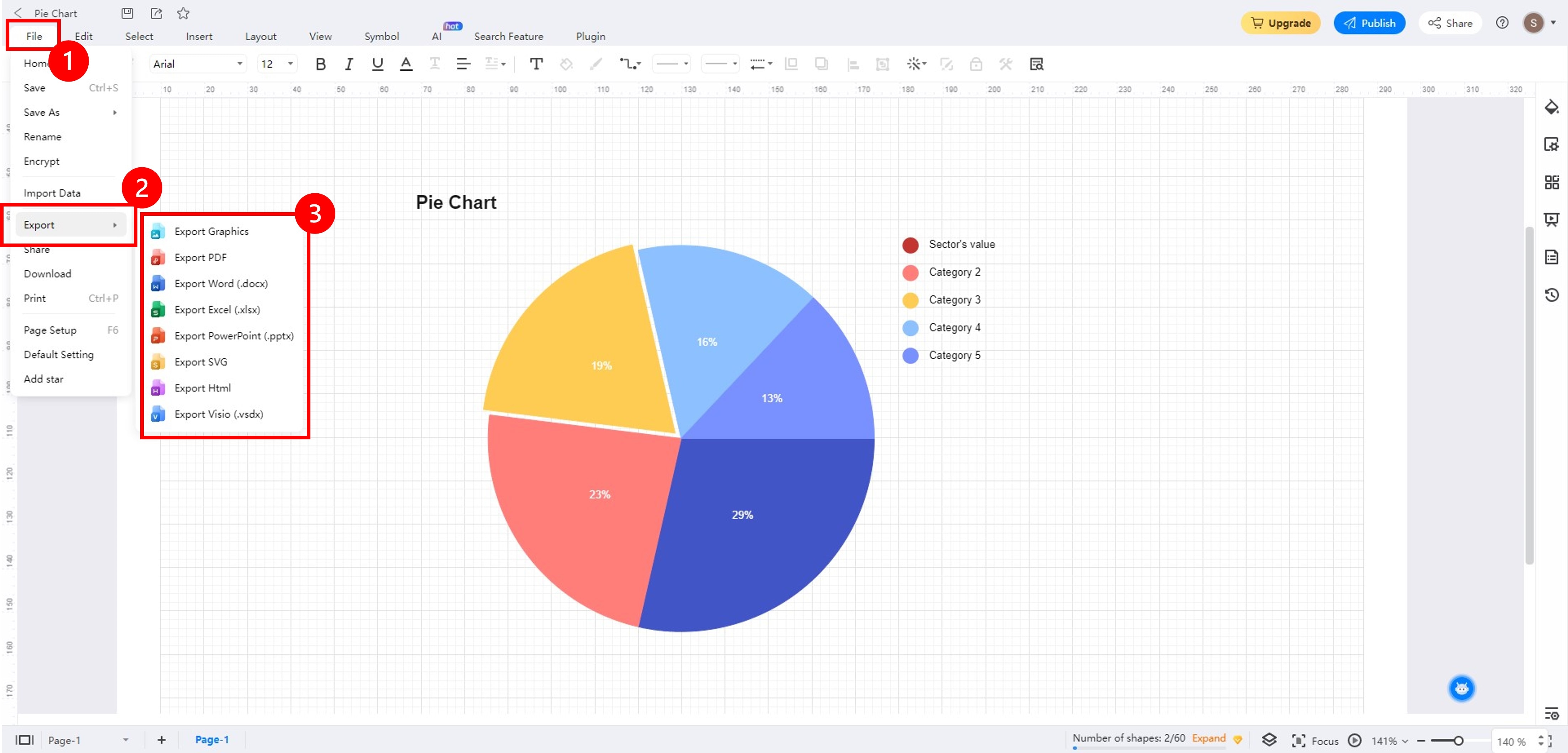
Step 5: Once done, go to File in the upper navigation and choose Export.
Free Pie Chart Templates
Templates can save you time when creating pie charts. You don't have to start from scratch since you can easily customize a template to create a pie chart report. EdrawMax offers a wide range of templates tailored to the needs of professionals, educators, and students. Check out the popular free, editable pie chart templates below to see for yourself.
Brand Interaction Across Social Media Platforms
You can use pie charts that help visualize how a brand's audience interacts across social media platforms. You can use this pie chart template to display the distribution of brand engagement. For instance, here are content likes, comments, and shares on platforms like Facebook, Instagram, Twitter, and more. It provides insights into which platforms are most effective for engaging the target audience, guiding marketers to allocate resources strategically.

 below.
 Sales by Salesperson
Here's an example of using a pie-of-pie chart to highlight small data slices. The pie-of-pie chart template breaks the smaller slices out of the main pie chart and displays them in a secondary pie chart. It makes it easier to see how big the smaller pie chart slices are and how they contribute to the whole.
For instance, the primary pie chart displays total sales data by product category. Then, the secondary pie chart breaks down sales by individual salesperson within a specific category. It would help to identify top performers and their impact on total sales.

Doughnut Chart
This pie chart template showcases the versatility of pie charts by introducing the concept of a doughnut chart. It is similar to a traditional pie chart but with a hole in the center. You can use it to represent part-to-whole relationships like a pie chart, but it can also include more data or labels in the central area.
Doughnut charts are visually appealing and allow for better center space utilization. You can use this donut chart template to include extra information while displaying data proportions.

Tips for Creating Pie Charts
Whether you choose to create a pie chart in Power BI or EdrawMax, you need to remember a few things. Factors such as colors, key data points, and formats can affect how you present your data in pie charts. Here are some tips to help you design effective and visually appealing pie charts in Power BI or other software.
Strategic Color Choices
The colors you choose for your pie chart should be easy to distinguish from each other. Avoid using pastel colors or colors that are too close together.
If you have a corporate brand, you may want to use the colors of your brands in your pie charts. It can help to create a cohesive look and feel for your presentations and reports. When you create a donut chart in Power BI or EdrawMax, you can also choose from their selection of themes.
Effective Label Placement
The labels for your pie chart should be easy to read and understand. Avoid placing labels too close to the edges of the pie chart or overlapping with other labels. When you create a pie chart in Power BI, you can put labels outside slices. In EdrawMax, you can change the tag position with one click.

Showcasing Key Data Points
If you create a pie chart in Power BI, direct attention to vital segments by incorporating visual cues. Techniques, like exploded slices, can emphasize crucial data. Don't forget to provide context and explanations for highlighted elements. Alternative diagramming tools like EdrawMax let you create exploded pie charts in one click for better insights.
Consistent Percentage Formatting
Whether you should use percent or whole numbers for pie charts depends on the specific data you are trying to visualize. If you are trying to show the relative proportions of different data points, then it is better to use percentages. Consistency is key, so use the same number of decimal places for all portions.
Conclusion
Now that you've learned how to make a pie chart in Power BI, you might have found it hard to navigate. Pie chart makers that are good for professional use offer customization options, flexibility, and accessibility. If you're a beginner, you may want to consider using an alternative diagramming tool.
EdrawMax is a powerful pie chart maker that seamlessly integrates the abovementioned principles. Also, its user-friendly interface, diverse templates, and advanced customization features make it an ideal diagramming tool for creating pie charts. With EdrawMax, you can improve your data storytelling and visual communication. Try it today and see how easy it is to create professional pie charts for your next presentation.
AI Diagram Generator
Enter your prompt. Upload files if needed. Generate diagrams, charts, or slides instantly.


