


As data-driven decision-making continues to be a cornerstone of modern business, mastering visualization tools like Power BI is essential. In this tutorial, we'll walk you through every step, from importing your data to customizing the finer details of your column chart in Power BI. Whether you're a seasoned analyst or just starting your data journey, this comprehensive guide will empower you to present insights with clarity and precision.
Contents of this article
What is a Column Chart?
A column chart visually represents data used to compare different categories or groups. It consists of vertical bars, each representing a category, with the height of the bar proportional to the value it represents. This makes it easy to see which categories have higher or lower values. Column charts are widely used in business and analytics to make complex data more understandable and to spot trends or patterns at a glance.
Types of Column Charts
Choosing the right type of column chart depends on the specific data you're working with and the insights you want to convey. Each type offers unique advantages for different visualization needs.
- Stacked Column Chart: In this chart, each column is divided into segments, with each segment representing a different sub-category. It's useful for showing the total and how it's divided into parts.
- Clustered Column Chart: This is the most common type. It displays each category as a separate cluster of columns.
- Radial Column Chart: This unique chart type displays data in a circular format, with each category represented by a segment of the circle's circumference. The length of each segment corresponds to the value it represents. It's useful for displaying data in a visually engaging way.
- Google Column Chart: This is a specific type of column chart provided by Google Charts API. It offers various customization options and interactive features, making it a popular choice for web-based data visualization.
- 3D Column Chart: Unlike traditional 2D column charts, this type adds depth to the columns, giving a three-dimensional appearance. It provides a visual perspective that can highlight data differently, though it's important to use it judiciously to avoid visual clutter.
- Grouped Column Chart: In a grouped column chart, multiple sets of data are grouped within each category. This allows for easy comparison between different groups.
How to Create a Column Chart in Power BI
Here are the steps to create a Power BI column chart:
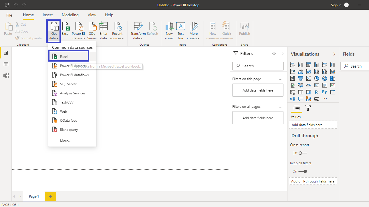
Step 1: Open Power BI Desktop on your computer. Click on the "Home" tab and select the data source you want to use. Connect to your data by selecting the appropriate connection method.
Step 2: Once connected, select the specific data you want to use and click “Connect" to import it into Power BI.
Step 3: Click on the "Report" view in the left-hand menu to start building your visualization. On the right-hand side, find the Visualizations pane. Click on the "Column Chart" icon, which looks like a set of vertical bars.
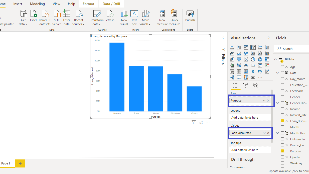
Step 4: In the Fields pane, choose the data fields you want to use for the chart. Drag and drop a field into the "Axis" well to define the categories (e.g., Product Names). Drag and drop another field into the "Values" well to specify the numerical values (e.g., Sales Amount).
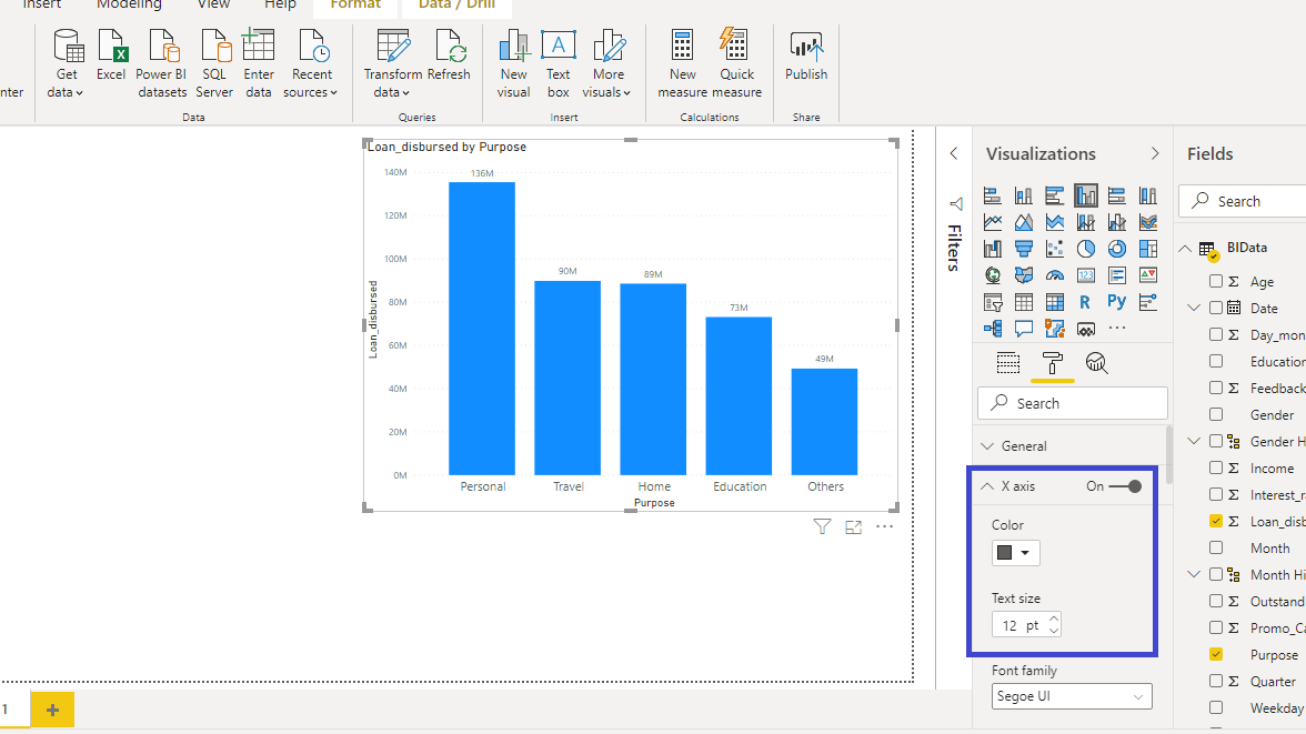
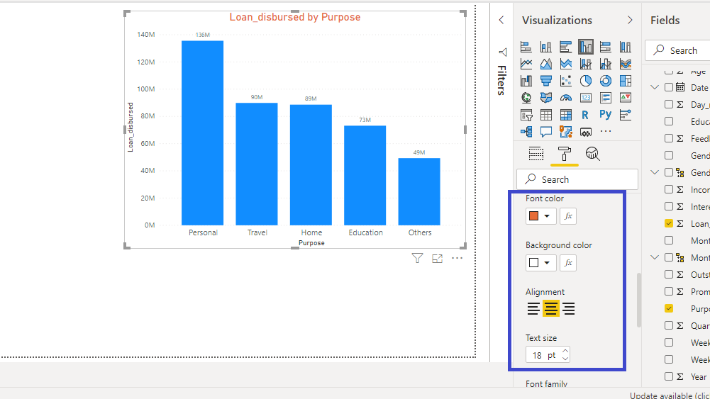
Step 5: Use the formatting options in the Visualizations pane to customize the appearance of your chart, including colors, fonts, and other visual elements.
Step 6: Once you're satisfied with the chart, save your Power BI file. If you want to share it, you can publish it to the Power BI service or export it in various formats.
Limitations of Power Bi:
While Power BI is a powerful tool for data visualization, it does have some limitations when it comes to creating column charts. Here are a few:
- Limited Chart Types: While Power BI offers a variety of visualization options, it may not have some specialized chart types that other tools provide. This can be a limitation if you require a specific chart type that is not available in Power BI.
- Complex Data Handling: Handling extremely large or complex datasets may sometimes lead to performance issues. Power BI may struggle with rendering column charts when dealing with massive amounts of data.
Create a Column Chart Easily with EdrawMax
Wondershare EdrawMax offers a distinct advantage over Power BI for crafting column charts due to its intuitive interface and comprehensive charting capabilities. Unlike Power BI, which is primarily designed for business analytics, EdrawMax specializes in creating a wide array of visually appealing charts with greater flexibility and customization options. This makes it an ideal choice for users seeking a dedicated and user-friendly platform for crafting precise and visually stunning column charts, especially when intricate design and detailed customization are paramount.
Creating a column chart in EdrawMax is straightforward. Here are the simple steps:
Step 1: Launch the EdrawMax software on your computer. In the EdrawMax interface, navigate to the "Graph and Charts" category on the left-hand side. Click on "Column Chart" to open a new canvas.

Step 2: Double-click on the columns to input your own data. You can also import data from external sources if needed.
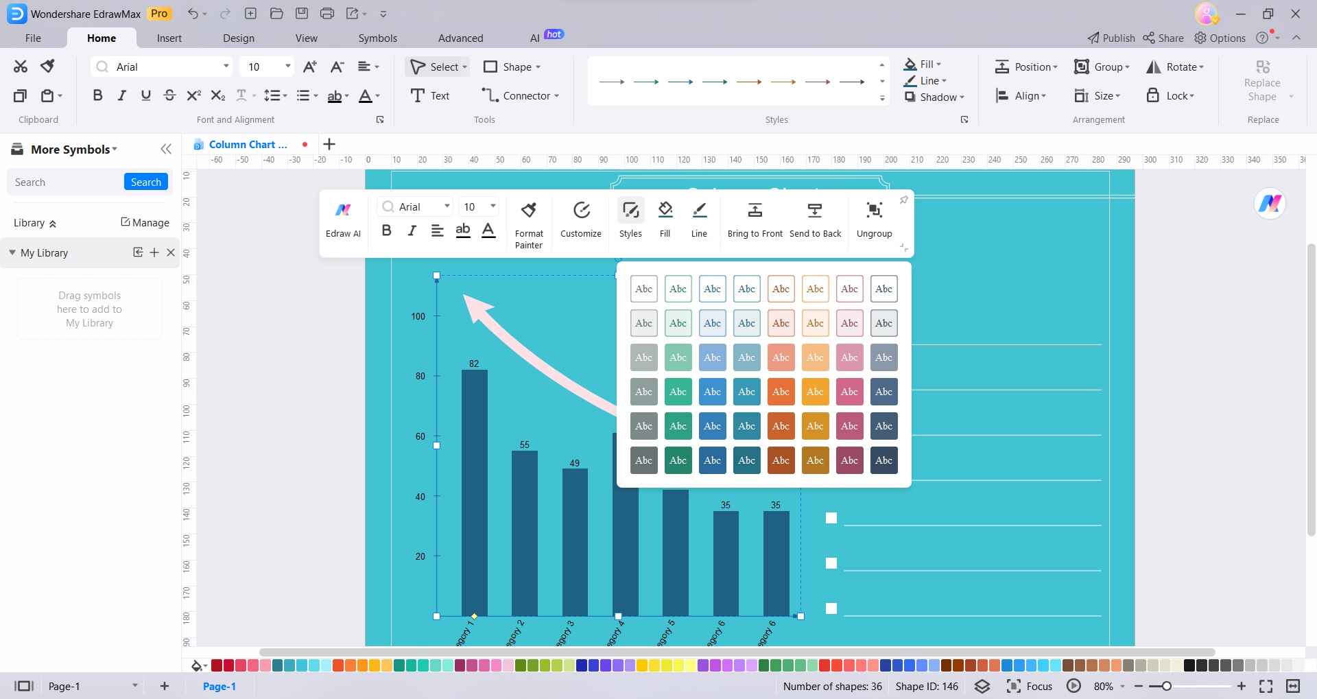
Step 3: Click on the elements of the chart to customize them. You can adjust colors, labels, titles, and other design elements to suit your preferences.
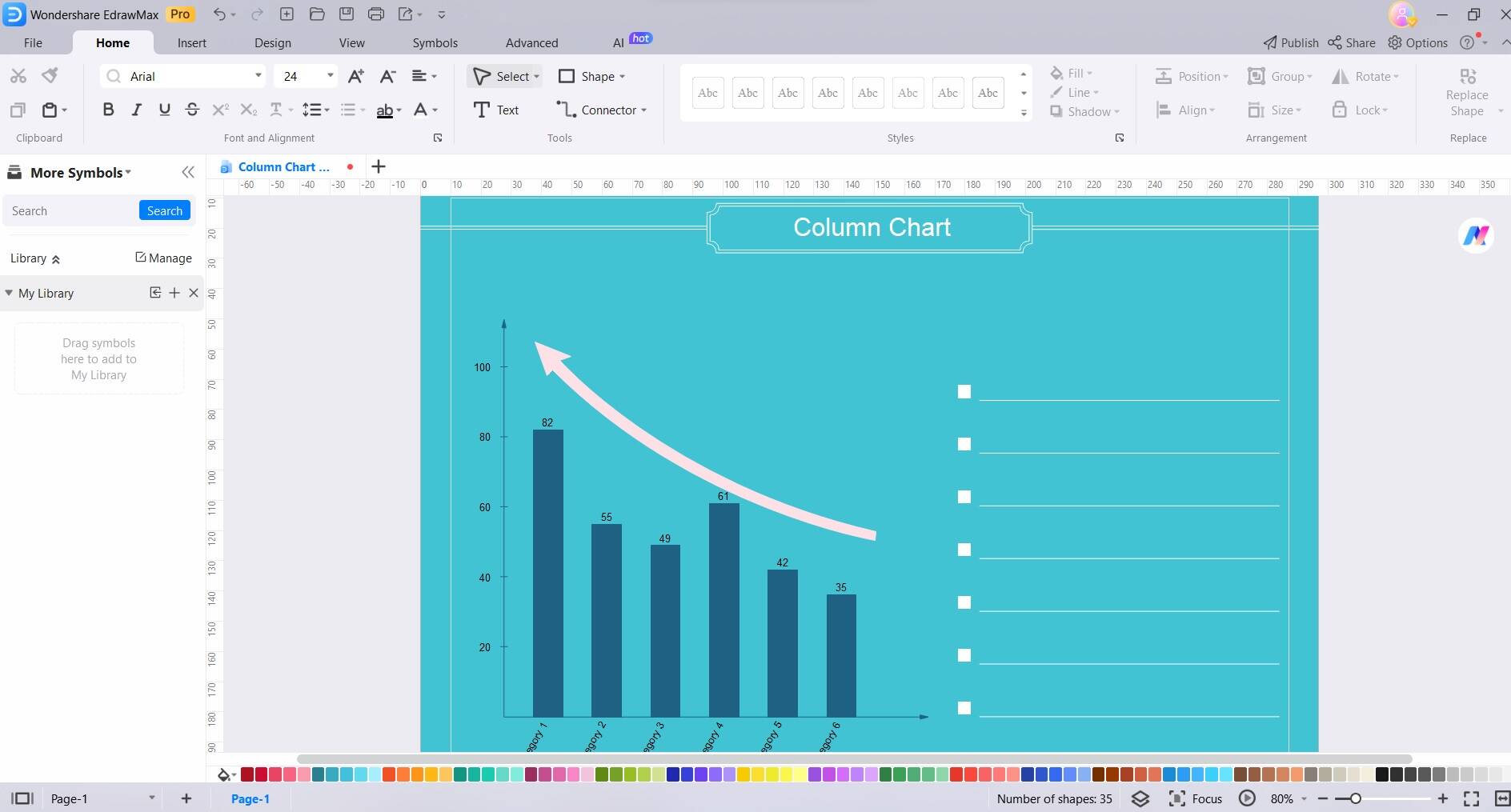
Step 4: Use the provided fields to add categories and values for your chart. EdrawMax allows for easy data input and manipulation
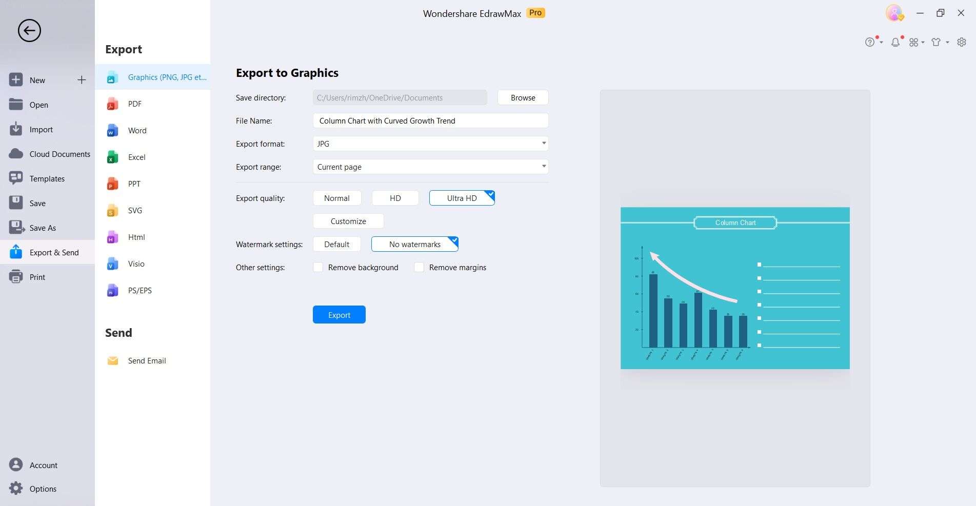
Step 5: Once satisfied with your column chart, save your work in a suitable file format. You can also export it in various formats for sharing or use in presentations.
By following these steps, you can create a column chart in EdrawMax with ease. The intuitive interface and customization options make it a user-friendly choice for crafting visually appealing charts.
Conclusion
In conclusion, becoming proficient in creating column charts is a valuable asset in data visualization. Whether leveraging Power BI for its analytical prowess or harnessing EdrawMax's intuitive design capabilities, both platforms offer distinct advantages. Power BI excels in complex analyses, while EdrawMax stands out with its user-friendly interface and customization options. The choice between the two depends on individual preferences and specific needs.
AI Diagram Generator
Enter your prompt. Upload files if needed. Generate diagrams, charts, or slides instantly.


