


Dive into the world of data visualization! This article will unravel the process of creating visually appealing pie charts using ggplot with the R programming language. With the simple step-by-step instructions and user-friendly language, you'll soon be crafting eye-catching pie charts like a pro.
And while you delve into this exciting journey, you may also want to explore EdrawMax. It's an option worth trying if you're seeking a simple but dedicated diagram maker. EdrawMax simplifies pie chart creation with its intuitive features. Give it a thought as you learn more about pie charts and data visualization – no pressure, just possibilities.
In this article
Part I. How To Create a Pie Chart in ggplot
Creating a pie chart using ggplot is simpler than you might think. Follow these easy steps, and you'll have your colorful chart ready to showcase your data!
Step1
Organize your data. Before you begin, make sure your data is set up. You'll need a list of categories and their corresponding values.
Step2
Load the ggplot library. First, you need to tell your computer that you will use the ggplot library. Use the code library(ggplot2).
Step3
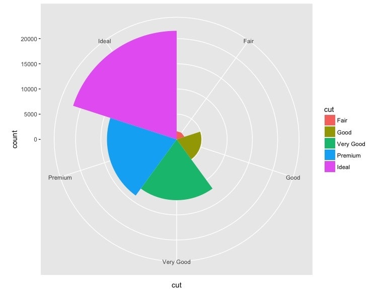
Now, it's time to create the pie chart. Use the geom_bar() function along with coord_polar() to transform a bar chart into a pie chart. The outcome could be better, but keep reading to know how to improve your pie chart.
Code:
* Replace "data" with your actual data frame
ggplot(data, aes(x = "", y = values, fill = categories)) +
  geom_bar(stat = "identity", width = 1) +
  coord_polar(theta = "y")
Step4
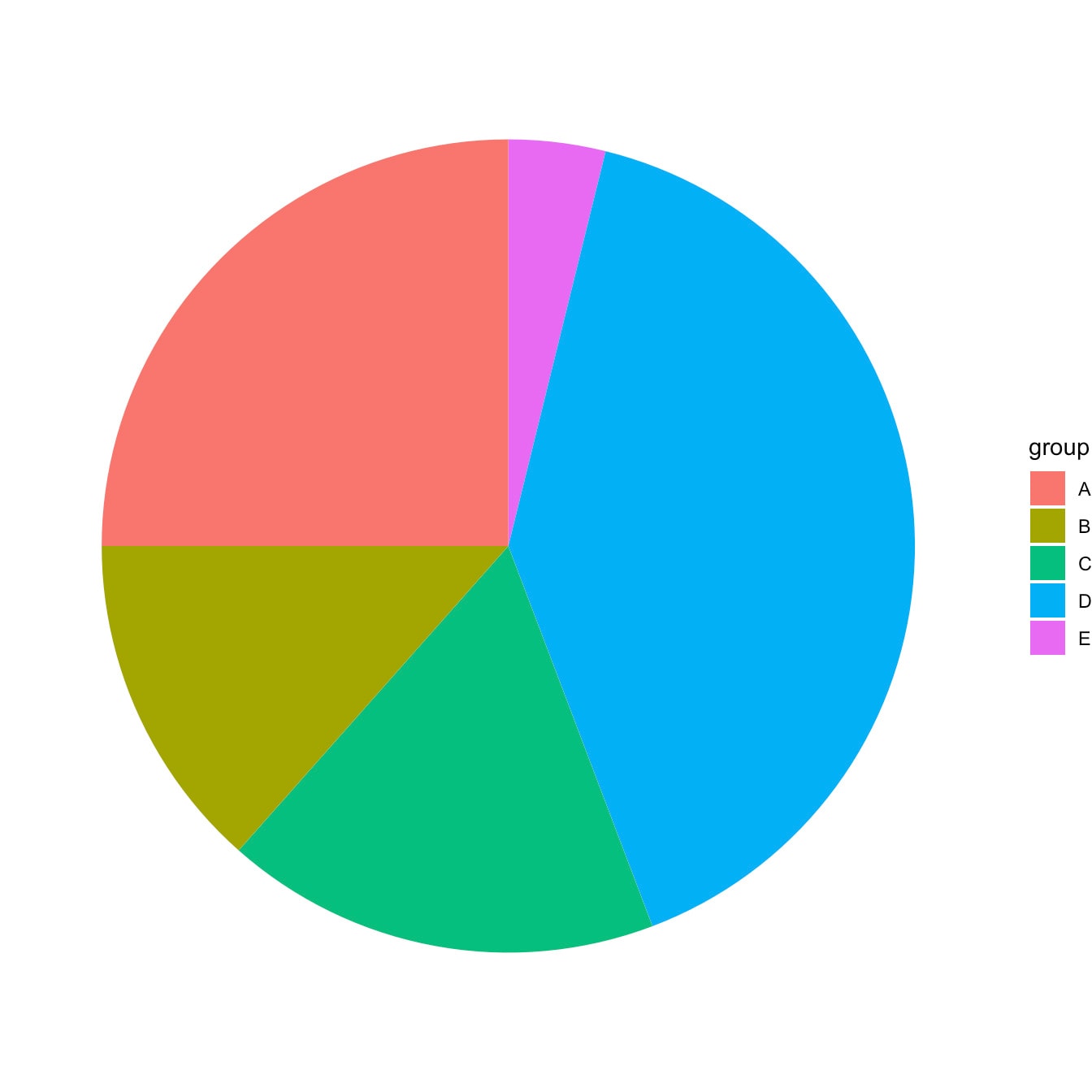
Want to make your pie chart stand out? Then add some flair! You can change colors, add labels, and even adjust the chart's appearance.
Code:
* Adding color
+ scale_fill_manual(values = c("#FF9999", "#66CCCC", "#FFCC99"))
* Adding labels
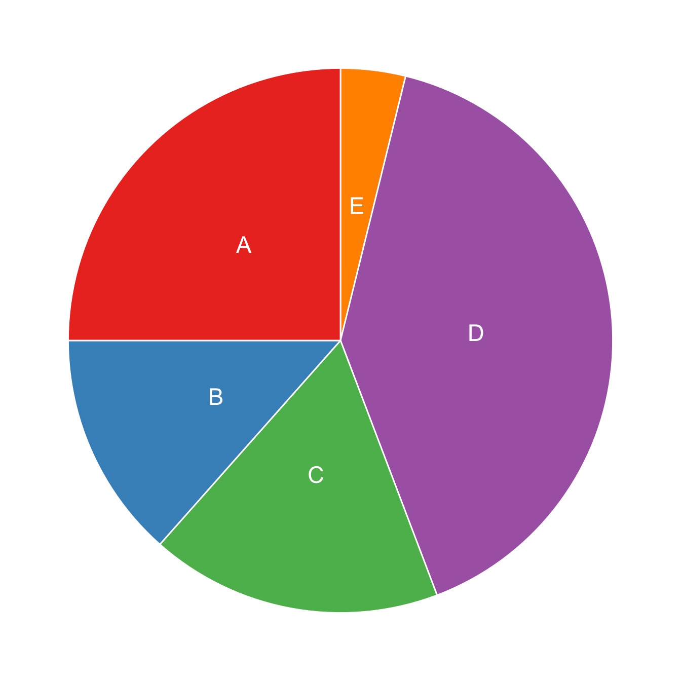
+ geom_text(aes(label = values), position = position_stack(vjust = 0.5))
* Removing labels for small slices
+ geom_text(aes(label = ifelse(values > threshold, values, "")))
* Changing the theme
+ theme_minimal()
Step5
Once you're happy with your chart, don't forget to save it!
Code:
  * Save your chart as an image file (replace "chart.png" with your preferred file name)
  ggsave("chart.png", width = 6, height = 6, dpi = 300)
Creating a pie chart using ggplot is a breeze with these steps. Now, you can present your data visually and engagingly! Remember, you're in control of your chart's colors, labels, and overall design. Have fun experimenting and let your data tell its story through visuals.
In the next part, this article will explore an alternative tool, EdrawMax, that can further simplify and amplify your pie chart creation process. Stay tuned!
Part II. Easier and Faster Alternative: Wondershare EdrawMax
Are you looking for a smoother way to create captivating pie charts? Say hello to EdrawMax, your creative ally for crafting visuals with ease. Let's explore why EdrawMax is a fantastic alternative to ggplot and learn how to whip up impressive pie charts effortlessly.

Why Choose EdrawMax Over ggplot?
EdrawMax simplifies the process of pie chart creation, making it accessible to everyone, regardless of your technical expertise. Here's why EdrawMax might be the solution you've been seeking:
- Intuitive Interface. Bid farewell to coding complexities. EdrawMax's drag-and-drop interface allows you to effortlessly place elements onto your canvas, transforming your ideas into polished visuals.
- Rich Templates. Even if you're not a design guru, EdrawMax has your back. Choose from various professionally designed pie chart templates catering to various industries and purposes.
- Customization at Your Fingertips. Adjust colors, labels, fonts, and styles according to your preferences. Make your pie chart align with your brand or project effortlessly.
- Effortless Sharing. Once your masterpiece is ready, exporting it is a breeze. Choose from multiple formats to suit your presentation or report needs.
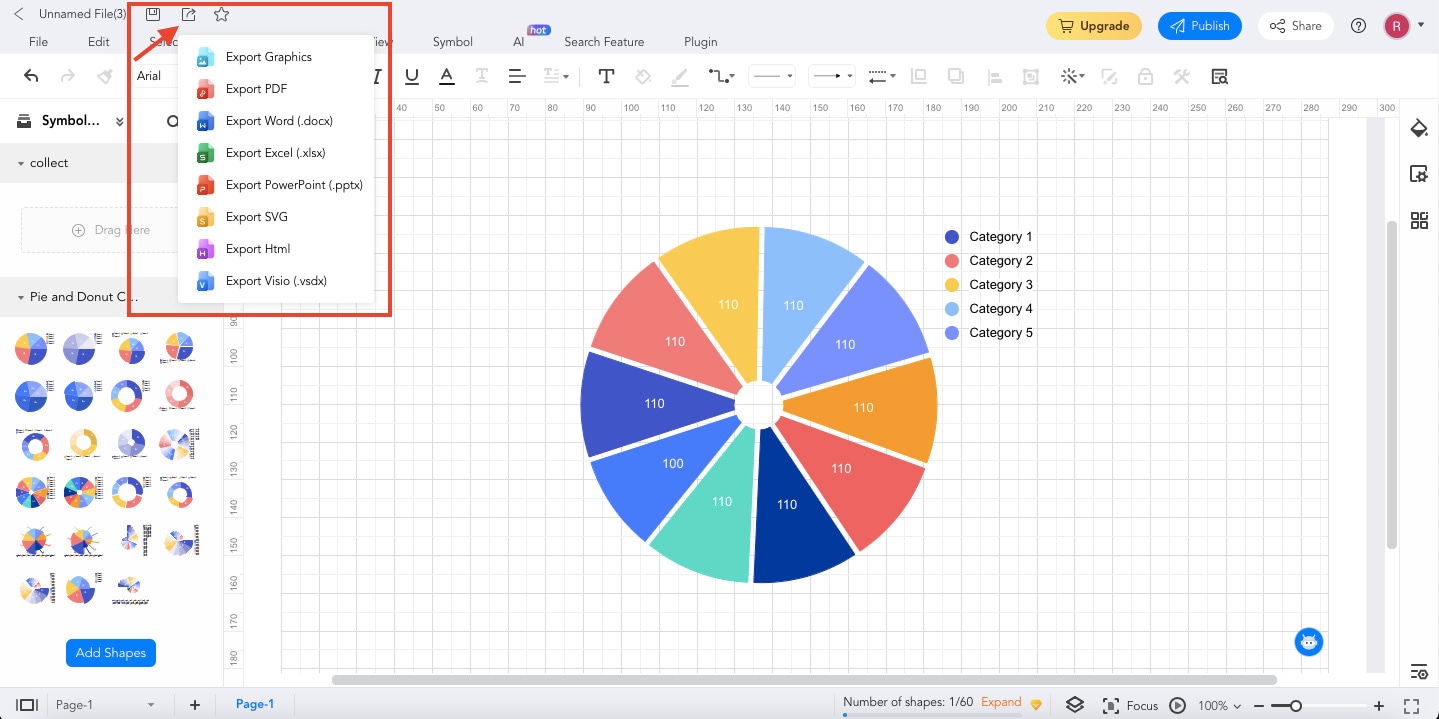
How to Create a Pie Chart With EdrawMax
Now that you're intrigued by the possibilities, let's create a pie chart using EdrawMax. The process is so straightforward that you'll wonder why you didn't try this sooner!
Step1
Download, install, and launch EdrawMax or try it online for free. Log in with an account of Google, Facebook, or Wondershare.
Step2
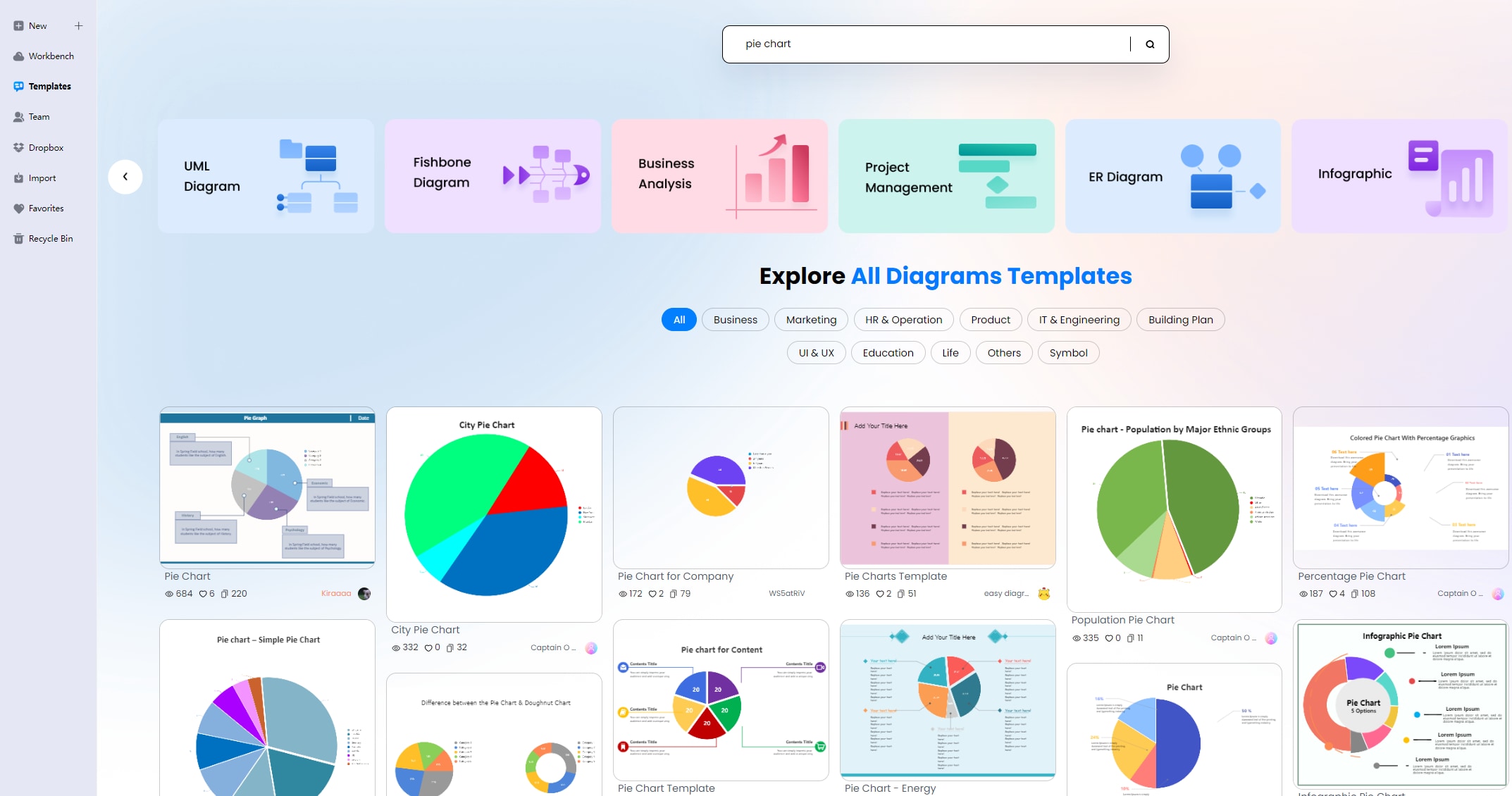
Navigate to New > Graphs and Charts section. Choose the Pie option, then click Create New.
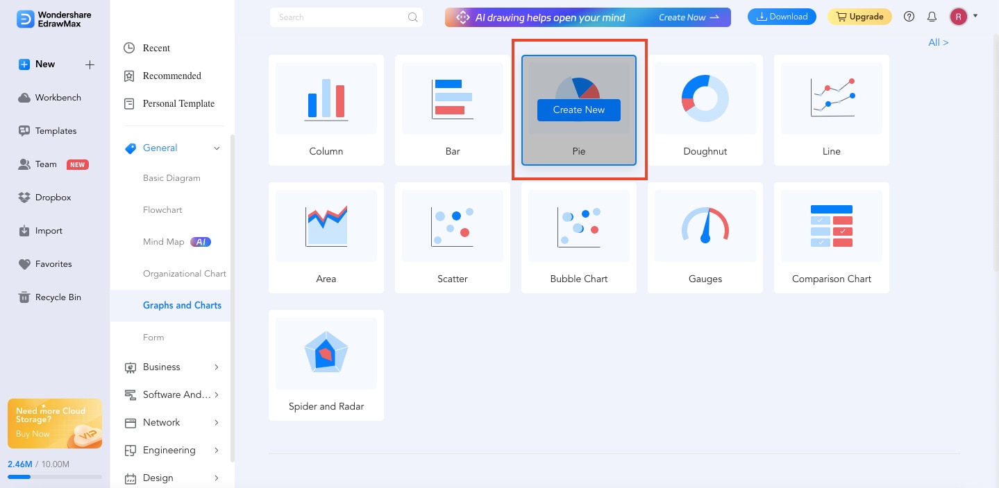
Alternatively, you can go to Templates, and search “Pie Chart” to use a ready-made template. This way is much faster.
Step3
EdrawMax offers countless symbols and elements that you can use at your disposal. Just use the drag-and-drop function to add your chosen elements to your chart. Place the slices, labels, and legend with ease.
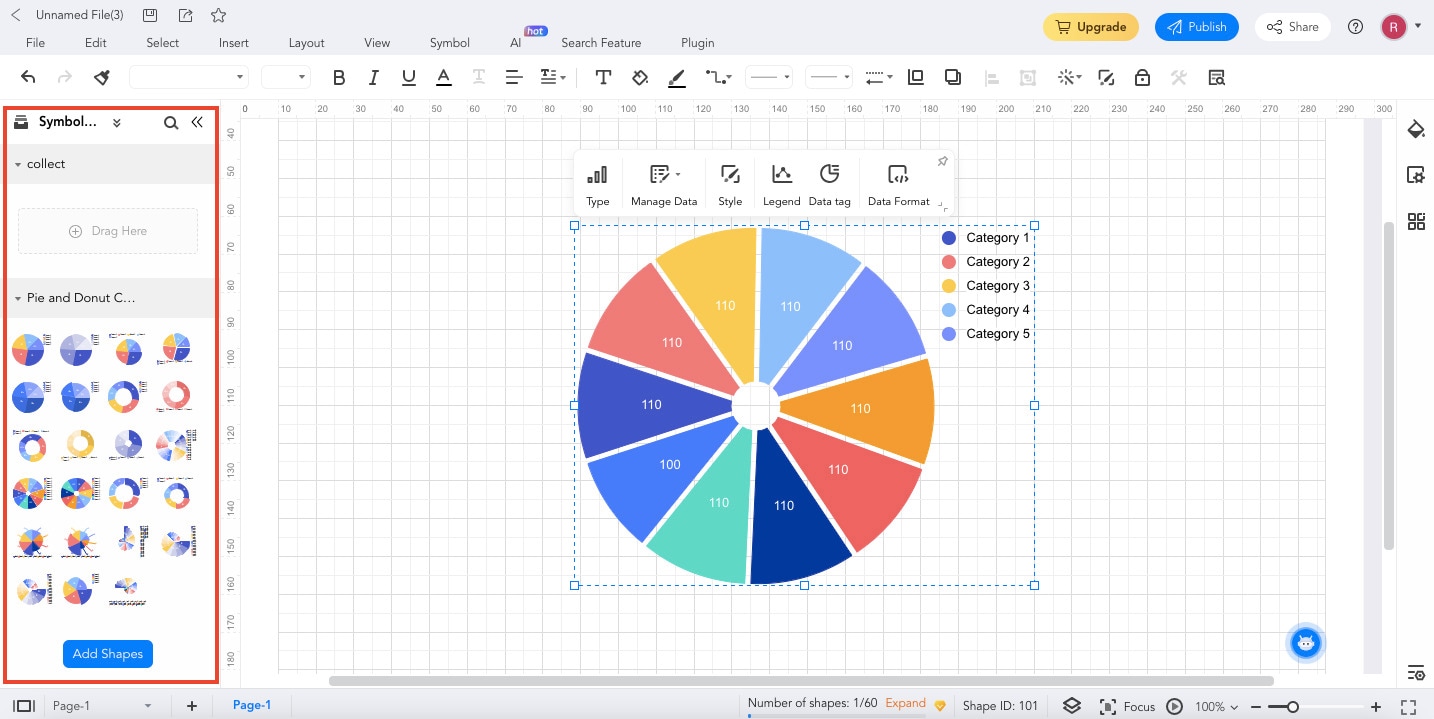
Step4
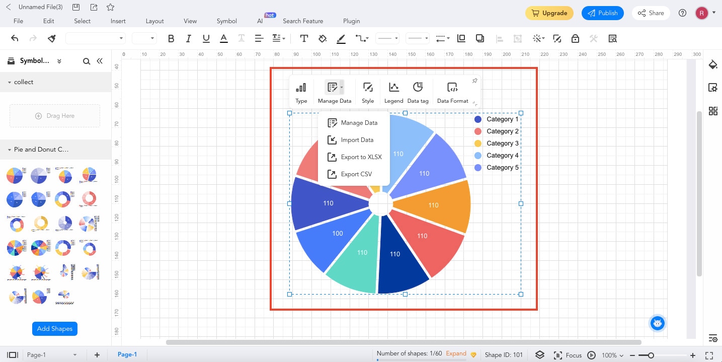
Input your data into the designated sections. You can even import your data from an outside source. Just click Manage Data to do this.
Step5
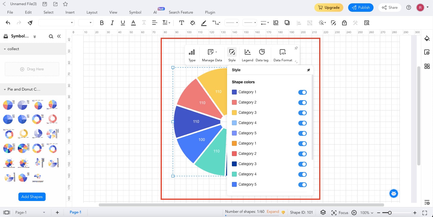
Personalize your chart to make it uniquely yours. Adjust colors, labels, and other design elements to match your vision. You may also use the Style function to customize the Shape colors of your chart.
Step6
Once you're satisfied with your pie chart, it's time to share your creation with the world. Export your chart in the format that suits your needs.
EdrawMax's user-friendly approach to pie chart creation transforms a potentially daunting task into an enjoyable experience. With its intuitive features and customizable options, EdrawMax empowers you to craft professional-looking visuals without a hitch.
In the next section, this article will take things further and introduce you to three highly popular pie chart templates from the EdrawMax Templates Community. These templates will surely kick-start your creative journey!
Part III: Three Pie Chart Templates from EdrawMax To Get You Started
Ready to transform your data into engaging visuals? EdrawMax offers a treasure trove of pie chart templates that cater to different scenarios. These templates not only simplify the creation process but also ensure that your data is presented in a clear and impactful way.
Pie Chart for Monthly Budgeting
Managing your finances becomes a breeze with the Monthly Budgeting Pie Chart template. This template allows you to visualize your income and expenses instantly. Easily categorize your spending – whether it's on bills, groceries, entertainment, or savings. This template will give you valuable insights into your financial habits and make informed decisions.

 below.
  below.
Pie Chart for Internet Usage
Curious about where your internet time goes? The Internet Usage Pie Chart template lets you visualize your online activities. Whether browsing, social media, streaming, or work-related tasks, this template helps you understand your digital habits. It's a great tool for managing your screen time and ensuring a healthy balance between online and offline activities.

Colorful Pie Chart with Percentage
The Percentage Pie Chart template is versatile for any situation where proportions matter. Whether you're representing survey results, project progress, or resource allocation, this template has you covered. With customizable segments, you can showcase various categories and their corresponding percentages clearly and concisely.

These templates offer a fantastic starting point for your data visualization journey. They simplify the process and enhance the impact of your data presentation. Remember, go ahead and explore these templates within EdrawMax. Tailor them to your needs, play with colors, and personalize labels to match your project's requirements. EdrawMax's pie chart templates make it effortless to turn data into insightful visuals.
Conclusion
n this data visualization journey, you've explored how to use ggplot to create a pie chart. You've learned the step-by-step instructions, demystifying the process and enabling you to transform data into compelling visuals.
But the journey didn't end there. This article also introduced EdrawMax, your creative alternative in the world of pie charts. With its user-friendly interface and versatile templates, EdrawMax takes the complexity out of chart creation. Visualizing your insights has always been challenging. Experience the convenience of EdrawMax firsthand.
[没有发现file]AI Diagram Generator
Enter your prompt. Upload files if needed. Generate diagrams, charts, or slides instantly.


