


Column charts display values with straight, vertical bars. Each bar represents a label, such as a product or a region. The height shows the value.
A column diagram uses a clear baseline and even spacing. It helps the eye compare heights. For that reason, column charts are among the most used data visualization tools lately.
If you ask what’s a column chart, it is just a set of upright bars on a shared baseline. You can make it with any online column chart maker in minutes.
In this guide, I'll explain everything about column charts and teach you how to build a column chart with EdrawMax, Word, and Excel.
In this article
When to Use Column Charts
Usage Scenarios
- When your audience needs to compare, not calculate. If people should walk away knowing which option is bigger, column charts deliver that instantly.
- When categories are distinct and labeled. Column graphs require clear separation.
- When you have 2 to 15 categories. Fewer than two makes a chart unnecessary. More than fifteen makes it crowded.
- When values are positive or mixed. Column charts handle positive numbers easily. They can show negative values too, with bars extending below the baseline.
- When change over equal intervals matters. Monthly sales, weekly sign-ups, quarterly revenue, and column diagrams show the progression.
- When presenting to groups. Column charts project well on screens.
Benefits of Using Column Charts
- Comparison becomes effortless. Your brain processes height differences faster than it reads numbers.
- Trends become visible. Arrange the bars by time and see if things are going up, down, or staying flat. Decisions get faster.
- Communication improves. Even people who don't work with data daily can understand the message. The format removes barriers.
- Flexibility is built in. You can show one data series or compare multiple series side by side. You can group bars or stack them.
Types of Column Charts
Here are some of the common variations of column diagrams.
Clustered Column Chart

- Bars are grouped by category.
- Use it to compare a few series side by side.
- Sales by region for three products.
Stacked Column Chart
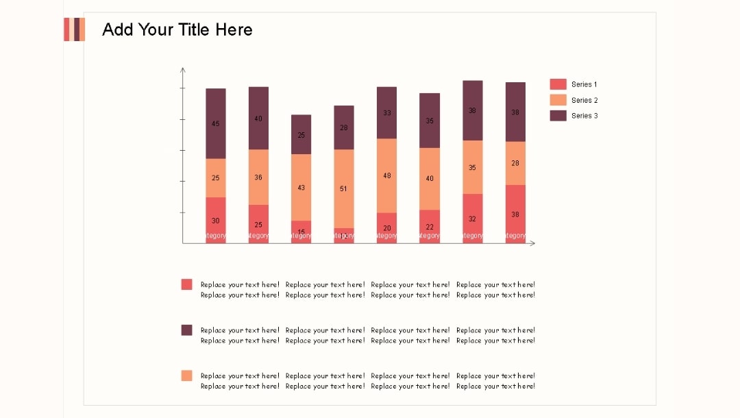
- One bar per category, split into parts.
- Shows the total and how each part adds to it.
- Good when the sum matters.
100% Stacked Column Chart
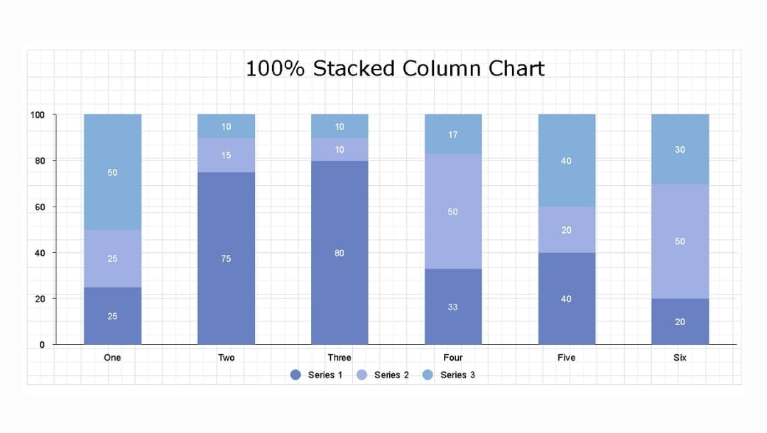
- All bars fill to 100%; each section shows only the share.
- Use when you compare shares across groups.
- Do not use it when actual totals matter more.
3D Column Chart
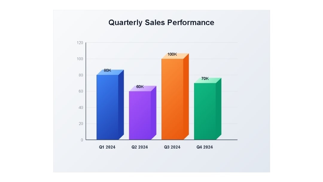
- Bars have a 3D look.
- Depth can hide real height, so read with care.
- Most teams avoid 3D for serious reports.
Clustered and Stacked Column Chart
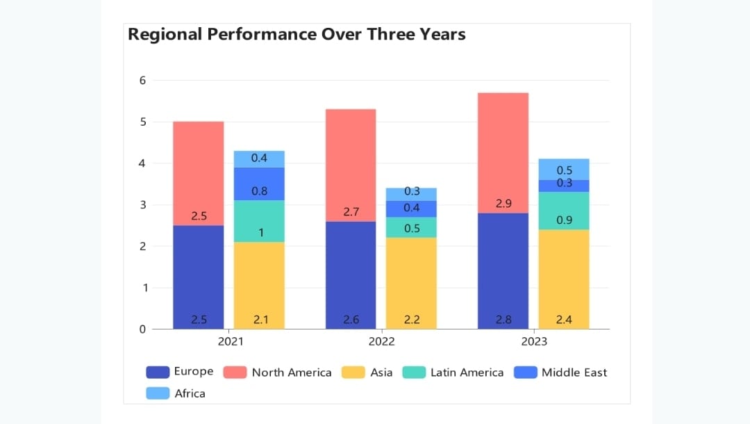
- Groups of stacked bars for each category.
- Fits data with subgroups inside each main group.
- Use only a few stacks and groups to stay clear.
Column Chart vs. Other Charts
Column Chart vs. Bar Chart
Bar Chart (Horizontal)
- Better when labels are long or there are many categories.
- Easier to read when you compare 15–20+ items.
- Try the online bar chart maker for free now
| Choose a Column Chart If | Choose a Bar Chart If |
| You want vertical comparisons and short labels. | You want readability for big or text-heavy datasets. |
Column Chart vs. Line Chart
Line Chart
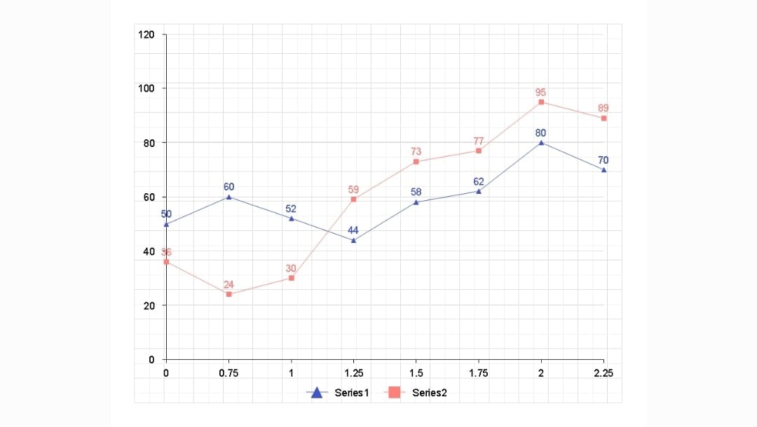
- Shows changes over time more clearly.
- Great for trends, patterns, growth, and dips.
| Choose a Column Chart If | Choose a Line Chart If |
| You need exact category comparison, not trends. | You want to see the direction of change (up/down). |
Column Chart vs. Area Chart
Area Chart
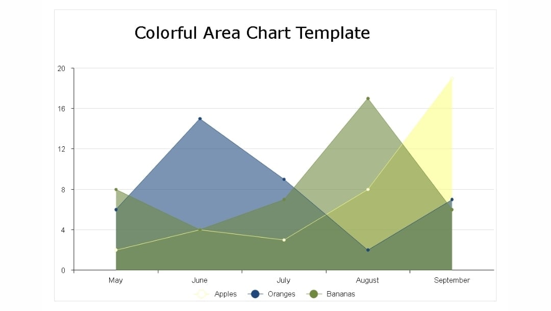
- Shows cumulative totals and trend magnitude.
- Highlights the “volume” of change.
| Choose a Column Chart If | Choose an Area Chart If |
| You want exact values for each category. | You care about totals growing or shrinking across time. |
Column Chart vs. Histogram
Histogram
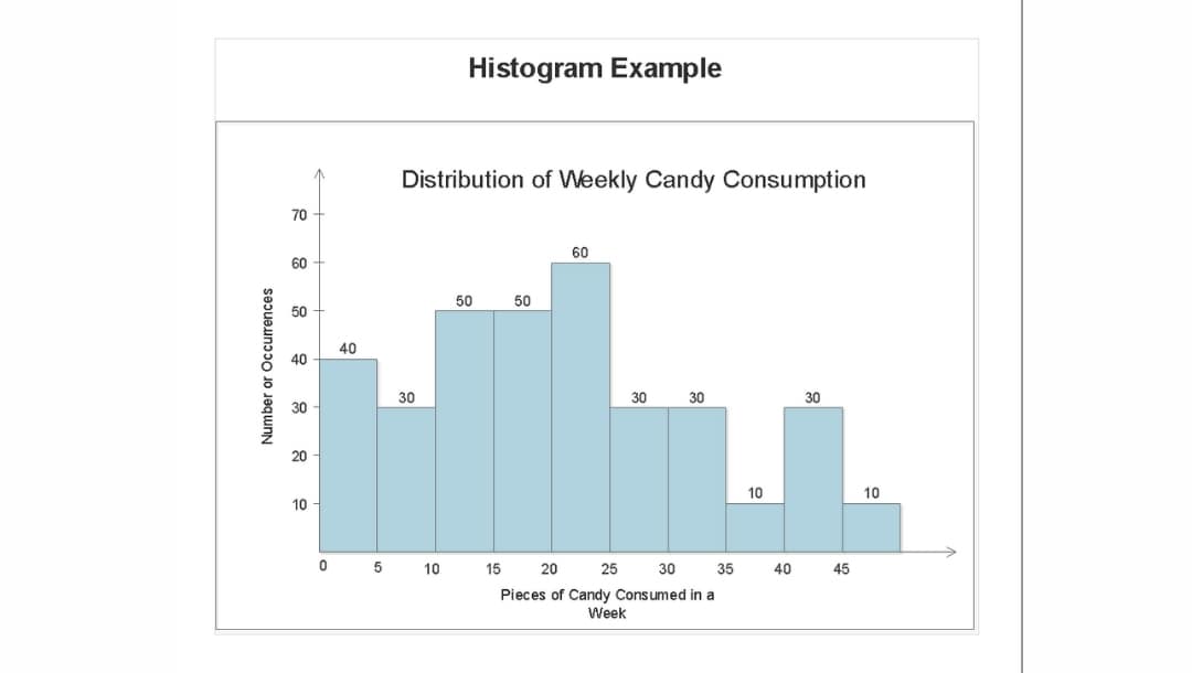
- Shows distribution of numeric data grouped into ranges (bins).
- Reveals patterns like skew, gaps, or clusters.
- Try the free online histogram generator for free now
| Choose a Column Chart If | Choose a Histogram If |
| Your categories are discrete (e.g., products, regions). | Your data is continuous (e.g., ages 0–10, 11–20). |
Column Chart vs. Pie Chart
Pie Chart
- Shows the percentage distribution of a whole.
- Harder to compare similar slices.
| Choose a Column Chart If | Choose a Pie Chart If |
| Small differences matter, and accuracy is important. | You want a quick visual showing parts of a whole. |
How to Create a Column Chart in Different Tools
Creating column charts varies by tool. Here’s how I build them quickly in EdrawMax, Word, and Excel, the best column graph makers:
Method 1: How to Create a Column Chart in EdrawMax
EdrawMax gives you templates, advanced customization tools, and multiple export options.
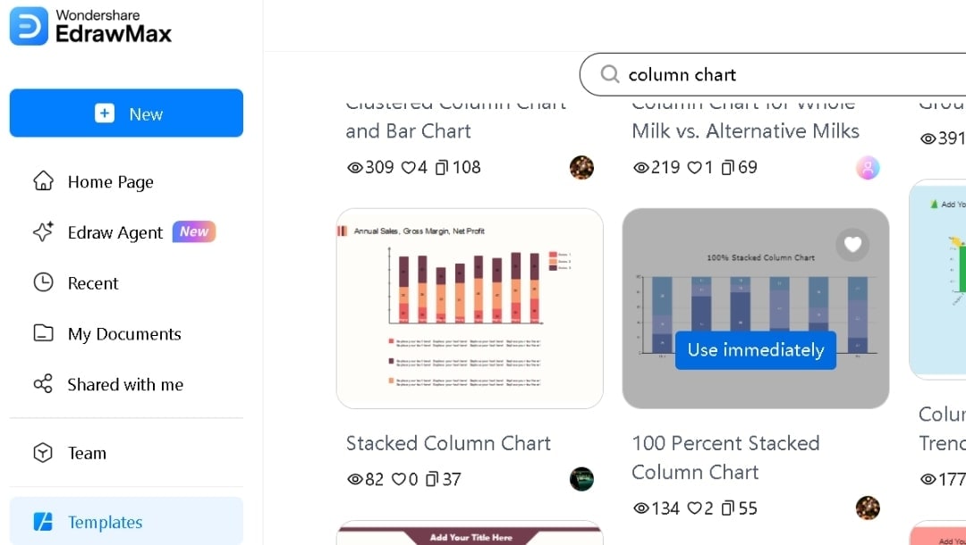
Step1 Pick a Column Chart Template
- Type "Column Chart" in the search bar of the template gallery in EdrawMax online, the free column chart maker.
- Browse the options and pick a layout that fits your data.
- Click Use Immediately to open it.
If you prefer full control, start with a blank canvas and drag a column chart from the Symbol Library.
Step2 Enter Your Data
- Select the chart and open Manage Data from the pop-up menu.
- Replace placeholder labels and values. The chart updates as you type.
- Place the categories in the first column and the values in the columns beside them.
If your data is in Excel, CSV, or Google Sheets, use the Import feature.

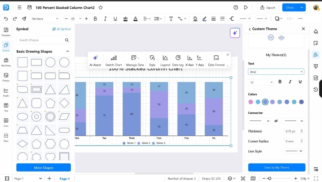
Step3 Personalize Your Column Chart
- Add required elements from the left-side Symbol Library.
- Recolor bars individually from the style option in the pop-up menu.
- You can also change the theme from the right side panel.
- Adjust text styling, font, color, etc., from the main bar menu.
- Switch chart type (clustered, stacked, or 3D) if needed.
- Turn on data labels.
- Adjust the Legend placement.
- Modify the axis, like the Y-axis scale.
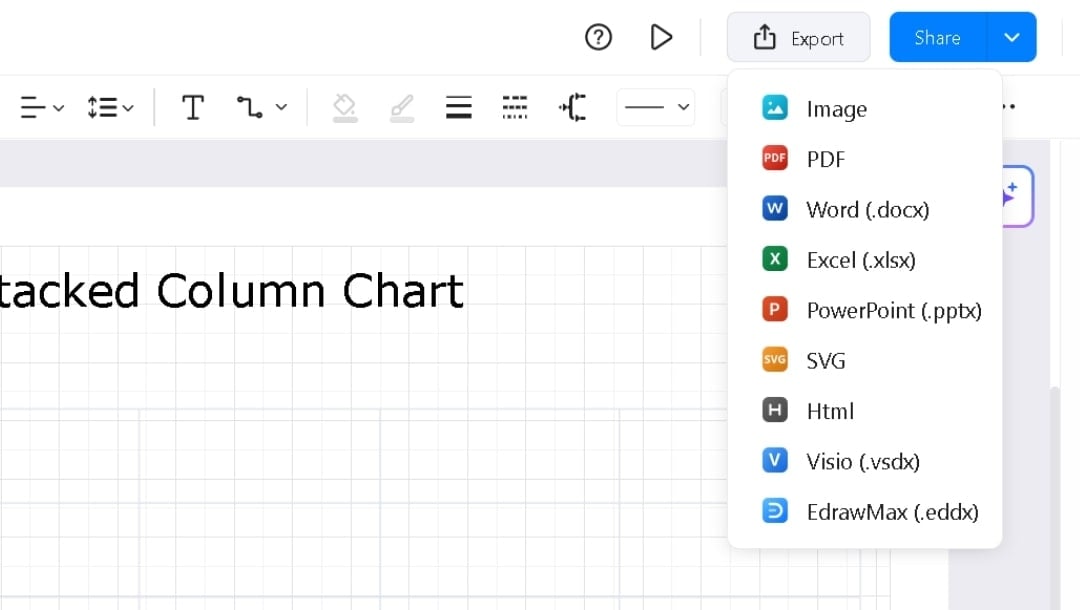
Step4 Export or Share
- Hit the Export button in the upper right corner.
- Choose the format from Image, PDF, SVG, PPTX, or DOCX.
- Set quality and download.
- Or click Share to create a link for live collaboration.
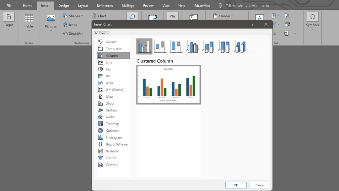
Method 2: How to Create a Column Chart in Word
Word uses Excel’s data engine while keeping the chart inside your document.
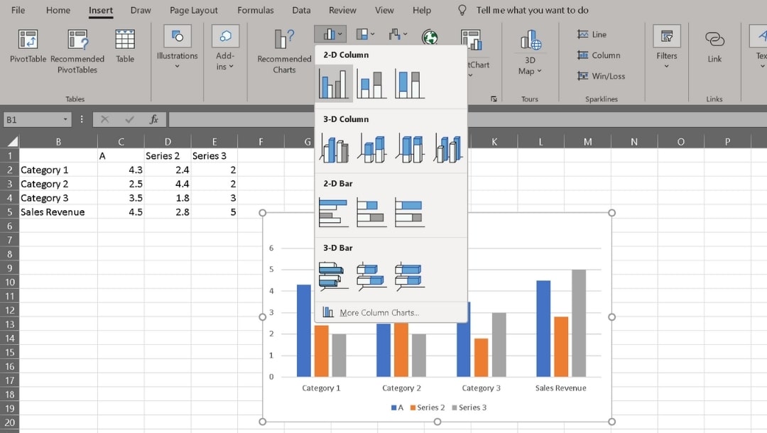
Step1 Insert a Column Chart
- Go to Insert → Chart after opening the page where you want to make it.
- Select Column, then choose a desired style, such as Clustered Column.
- Click OK to insert a sample chart in your document.
- Right beside the chart, it opens an Excel window to display the data.
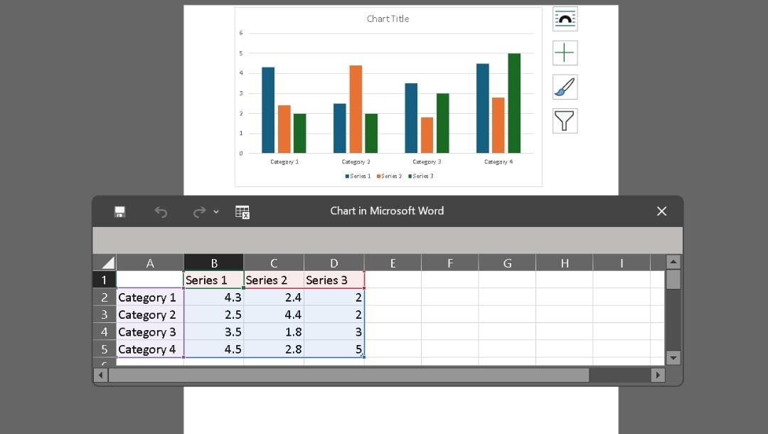
Step2 Edit Data in Excel
- Replace Category 1, 2, 3, and 4 with your labels.
- Add more rows and columns if needed.
- Rename the series to match what you want.
- Enter values and watch the chart update.
- Close the Excel window when done.
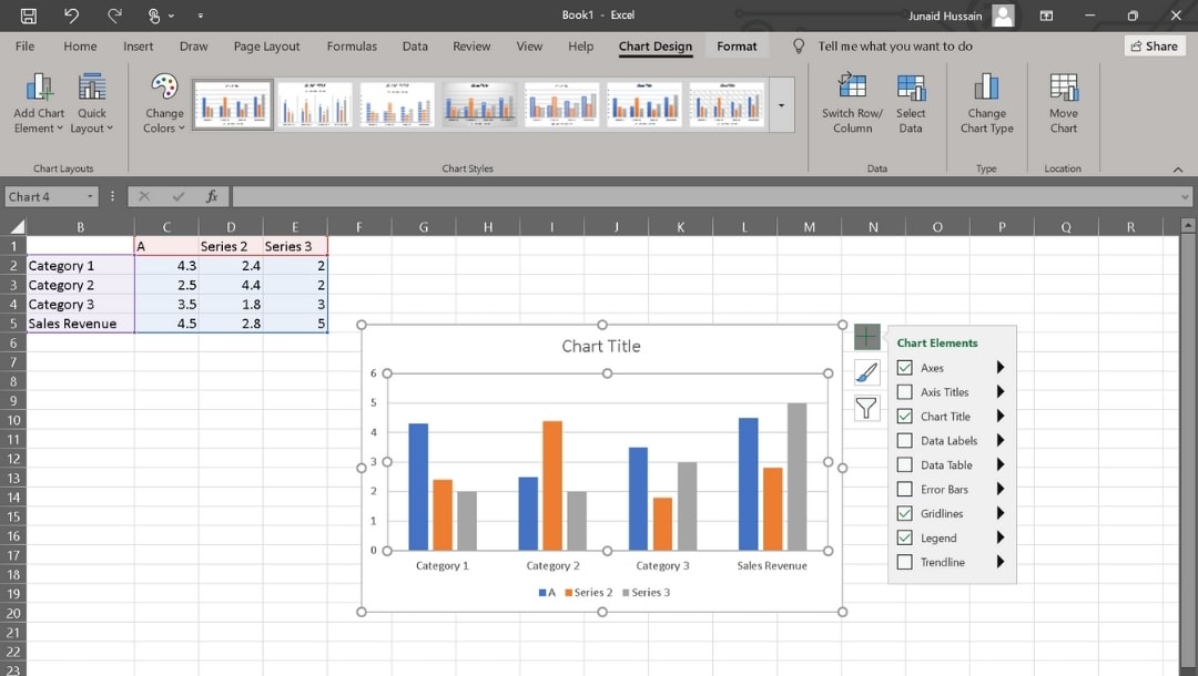
Step3 Format the Chart
- Use the Chart Design tab to:
- Add chart elements.
- Switch colors.
- Apply preset layouts or styles.
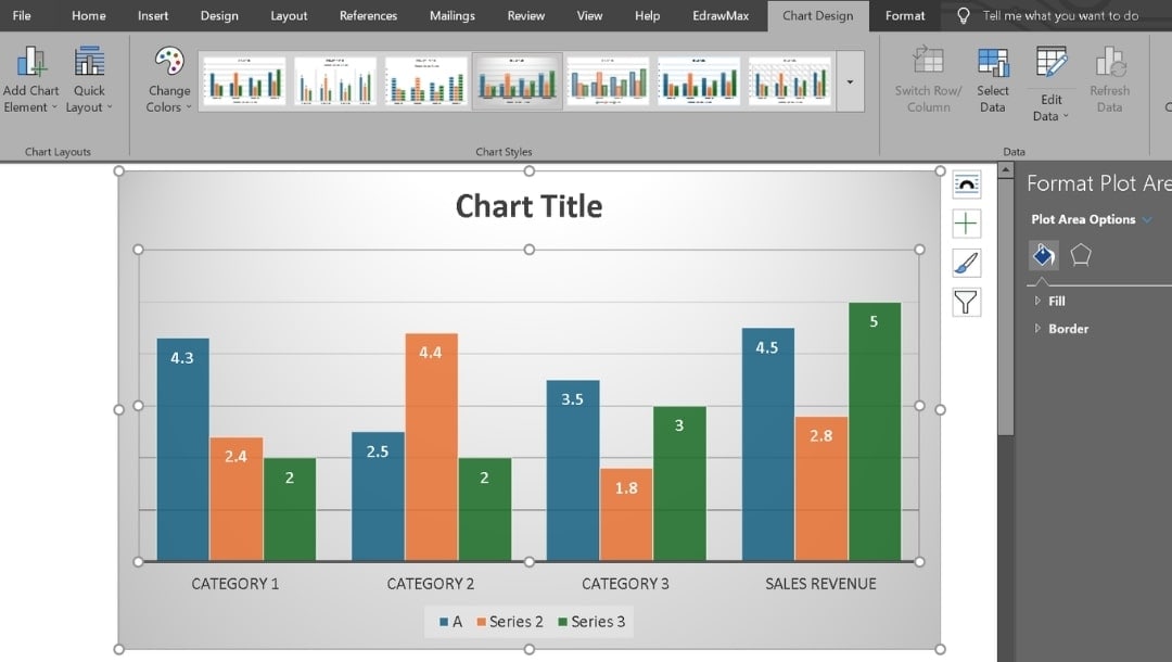
- Use the Format tab to:
- Change bar colors.
- Modify outlines.
- Adjust text styling.
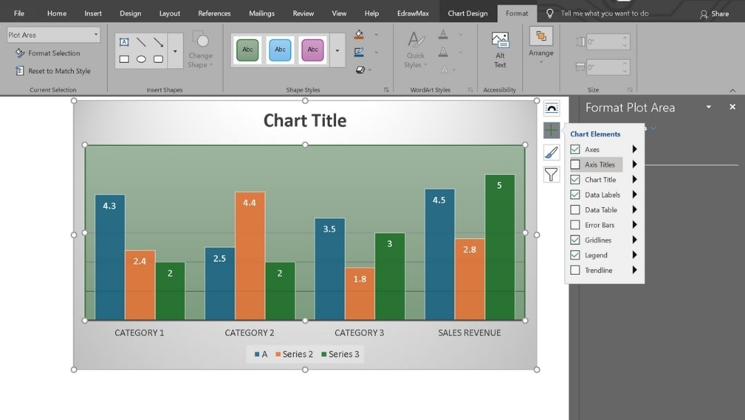
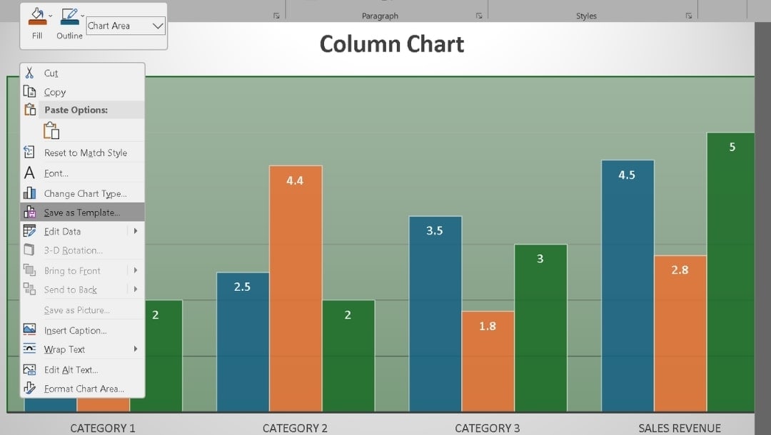
Step4 Add Title and Final Touches
- Click the Chart Title placeholder.
- Resize the chart or drag it to a new position.
- Right-click the chart, select Save as template, and explore other options as needed.
- Microsoft Word works well for polished reports where chart updates stay linked to the underlying data.
Method 3: Create a Column Chart in Excel
Excel builds charts directly from your spreadsheet.
Step1 Prepare Your Data and Insert the Chart
- Create columns for categories and values.
- Include headers.
- Keep the structure clean to avoid chart errors.
- Select all data (including headers).
- Pick a column chart layout from the Insert tab menu.
The chart appears on your sheet with Chart Tools enabled.
Step2 Customize the Column Chart and Save or Export It
- Use the same customization and workflow as in Word (Chart Design + Format tabs).
- In Excel, the options appear on the ribbon when the chart is selected.
Best Practices for Effective Column Charts
Prepare the Data
Use one unit across all bars. Normalize when base sizes differ. Keep categories unique, leave blanks for missing data, and organize everything in clear columns.
Set Scales and Axes
Start the Y-axis at zero. Use simple intervals. Avoid log scales; split charts if values spread too far. Add target lines when needed.
Label With Precision
State the unit once in the axis title. Keep labels short and wrap instead of rotating. Round numbers sensibly, use separators, and show only essential data labels.
Use Color With Purpose
Choose one base color and one highlight color. Keep meanings consistent. Skip gradients and 3D shapes until necessary.
Optimize Layout and Spacing
Limit categories to 5–12. Set gap width to about half the bar width. Use light gridlines. Put legends near the data or label directly.
Run Quality Checks
Verify stacked parts equal the total. Confirm negatives sit below zero. Keep series colors consistent. Compare the chart values to the source and flag any major outliers.
Use Your Chart Maker Wisely
Use templates for consistent design. EdrawMax also offers AI tools to quickly build column charts.
Last Words
Teams often choose column charts because they can quickly compare groups with little effort.
In reporting, they show the core message at a glance. Leaders can learn what leads, by how much, and how it has changed from before. That clarity speeds up decisions.
An online tool like EdrawMax simplifies creating column charts. Just pick a template, personalize it, and export it. You can make a free column chart and maintain transparent reporting.
FAQs
-
What are column charts best used for?
Choose a column chart when you want to show shifts over time or clearly compare items. Categories rest on the bottom line, and values climb up the side. -
How do you read a column chart?
To read a column chart, note the label at the bottom, then follow the column up. Match its height with the number on the side scale. That height tells you how much it represents, making comparisons simple. -
What data is best for column graphs?
Column graphs are suitable for data with only a few categories and one number per category. They highlight group differences and small shifts across short periods.
AI Diagram Generator
Enter your prompt. Upload files if needed. Generate diagrams, charts, or slides instantly.


