


A pie chart is a data visualization tool to represent parts of a whole using colorful sections. It helps compare data and show percentages of different categories. To make pie charts even better and faster, professionals use a pie graph maker like EdrawMax.
In this article, you'll explore a pie graph maker accessible online for comprehensive charts and diagrams. You'll also get tips at the end to make your pie charts stand out. But first, here are the steps on how you can manually draft a pie chart.
In this article
Part I. How Do You Create a Pie Chart?
Imagine you have data about the sales distribution of different products. A pie chart can help you showcase the proportions effectively. Here's how you can create a pie chart with percentages on paper.
1. Gather data
Start by collecting relevant data about the categories you want to display in the pie chart. For instance, if you're analyzing sales figures for different products, compile the sales data for each item.
2. Calculate percentages
Calculate the portion of overall sales that each product makes up. Divide the sales of each product by the total sales and multiply by 100. For instance, if Product A generates $10,000 out of $50,000 in total sales, the percentage would be ($10,000 / $50,000) * 100 = 20%.
3. Determine the angle
Pie chart slices represent a percentage. Calculate the angle for each slice by multiplying the percentage by 3.6. If Product A's percentage is 20%, the slice angle would be 20 * 3.6 = 72 degrees.
4. Draw the pie chart
Draw the circle on a piece of paper and divide it into slices according to the angles you calculated. The pie chart slice for Product A would be 72 degrees.

5. Label the chart
Label each slice with the name of the corresponding product. It helps your audience understand which part of the whole each pie chart slice represents, making your data presentation clear.
But, going through all these steps for creating a pie chart, such as calculating angles, can be time-consuming and prone to errors. It is where using a pie graph maker comes in. Such tools can help you create a pie chart saving you time and ensuring accuracy in your data representation. In the next section, discover how to use a pie graph maker online to create professional-looking pie charts effortlessly.
Part II. How Do You Make a Pie Chart Online? [Step-by-Step Guide]
Wondershare EdrawMax stands out as an excellent choice for a pie graph maker. With its intuitive, drag-and-drop interface, EdrawMax is easy for beginners and professionals to navigate. Also, it offers plenty of free pie chart templates and other diagrams tailored to various industries and needs.
Key Features
Here are some reasons why you should try this pie graph maker.
• Compatibility
You can work with different file formats, including Visio (VSSX), PowerPoint, Excel, Word, JPG, and more.
• Customization Options
Customize your pie chart with pre-built symbols, theme selection, AI design recommendations, and plugin features.
• Collaboration
Share your pie chart with your team for collaborative editing and even share it on social media.
• Online and Offline
EdrawMax works seamlessly online and offline, supporting several operating systems such as Windows, macOS, Linux, Android, and iOS.
Step-by-Step Guide to Making a Pie Chart With EdrawMax
Follow these instructions to use this pie graph maker online and create professional-looking pie charts with ease:
Step1
Download, install, and open Wondershare EdrawMax. Log in with Wondershare ID or an account of Google, Facebook, or Twitter.
Step2
Click Graphs and Charts under the General drop-down menu in the left navigation pane.
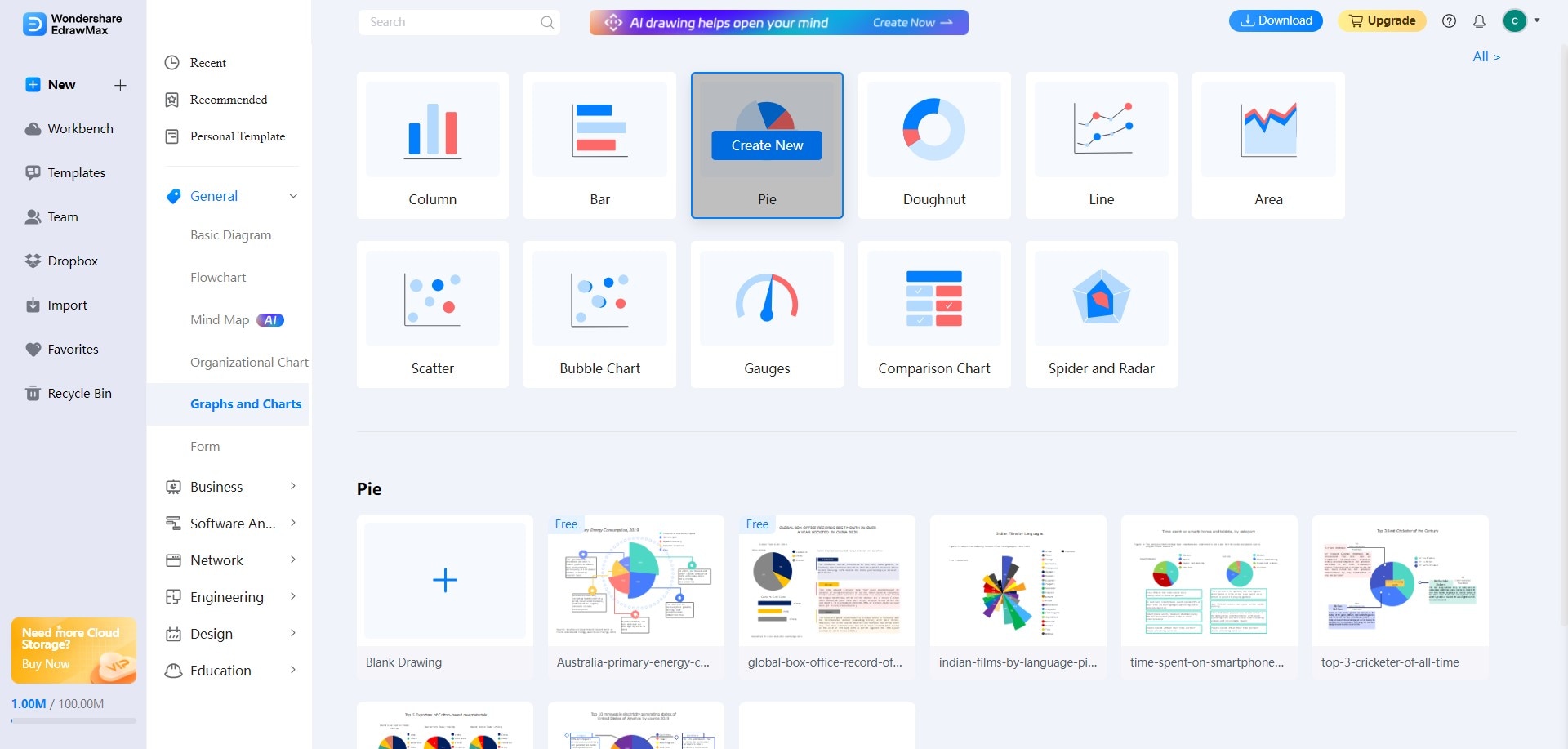
Step3
Select Pie and click Create New. You can also choose a free pie chart template below it. Click Use Now to select the template.
Step4
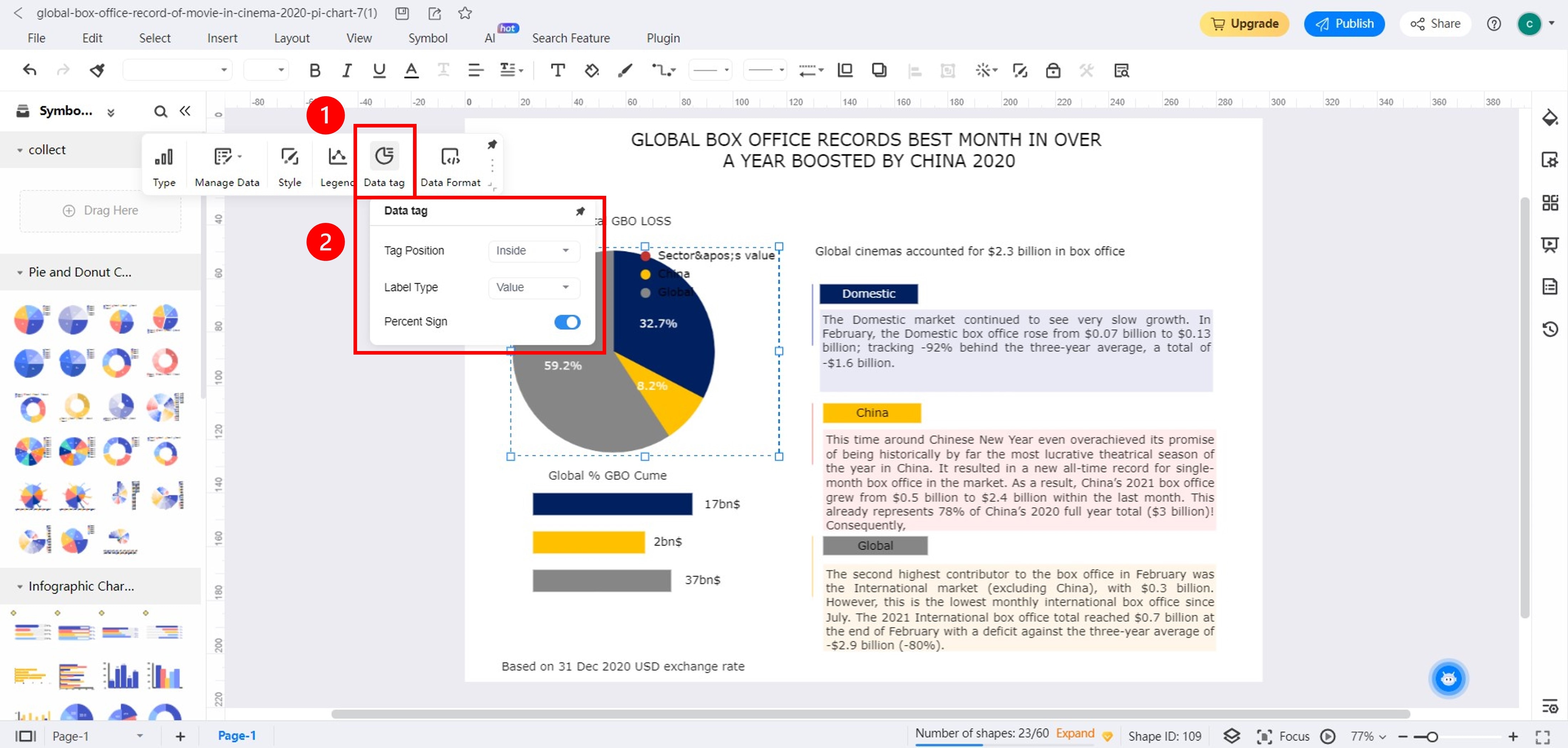
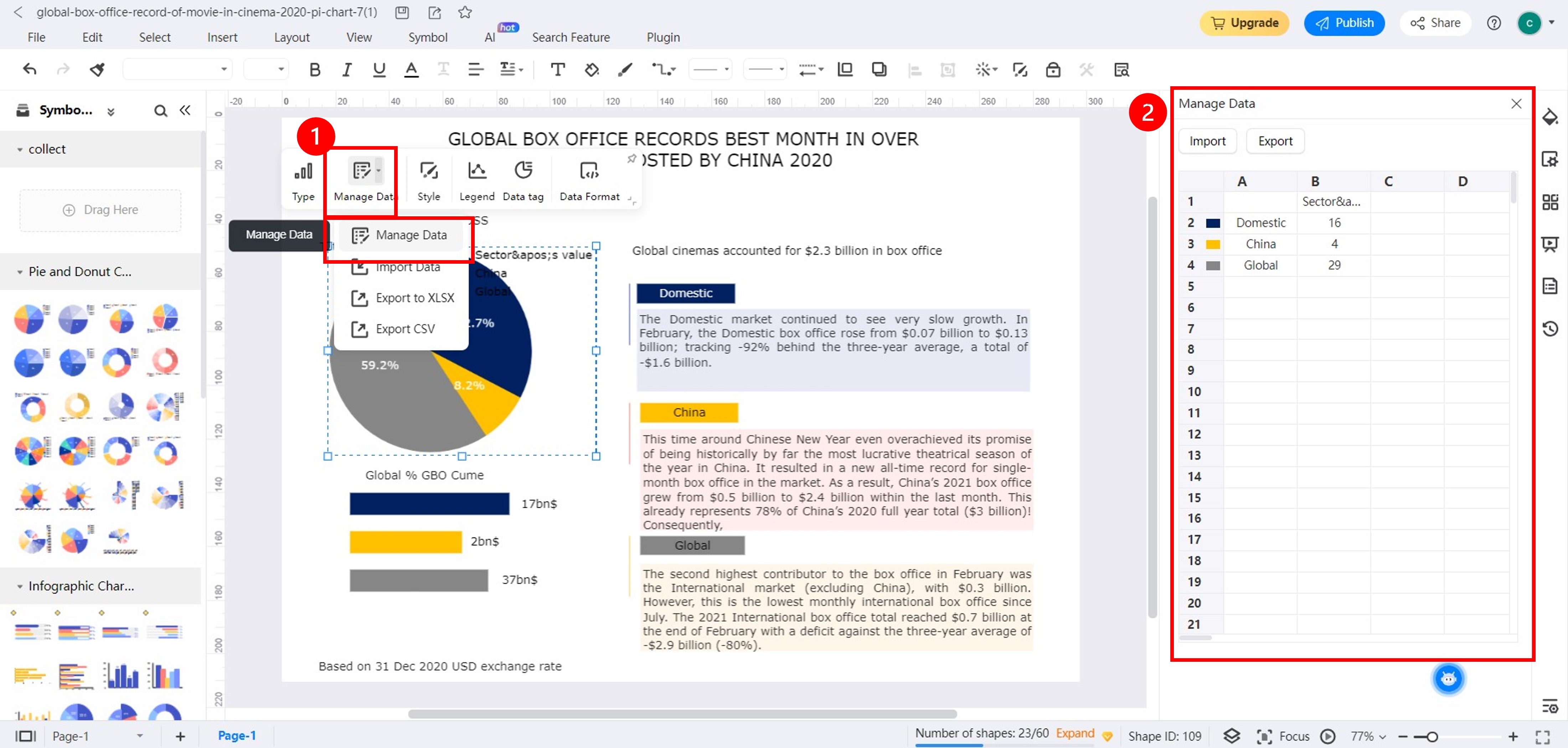
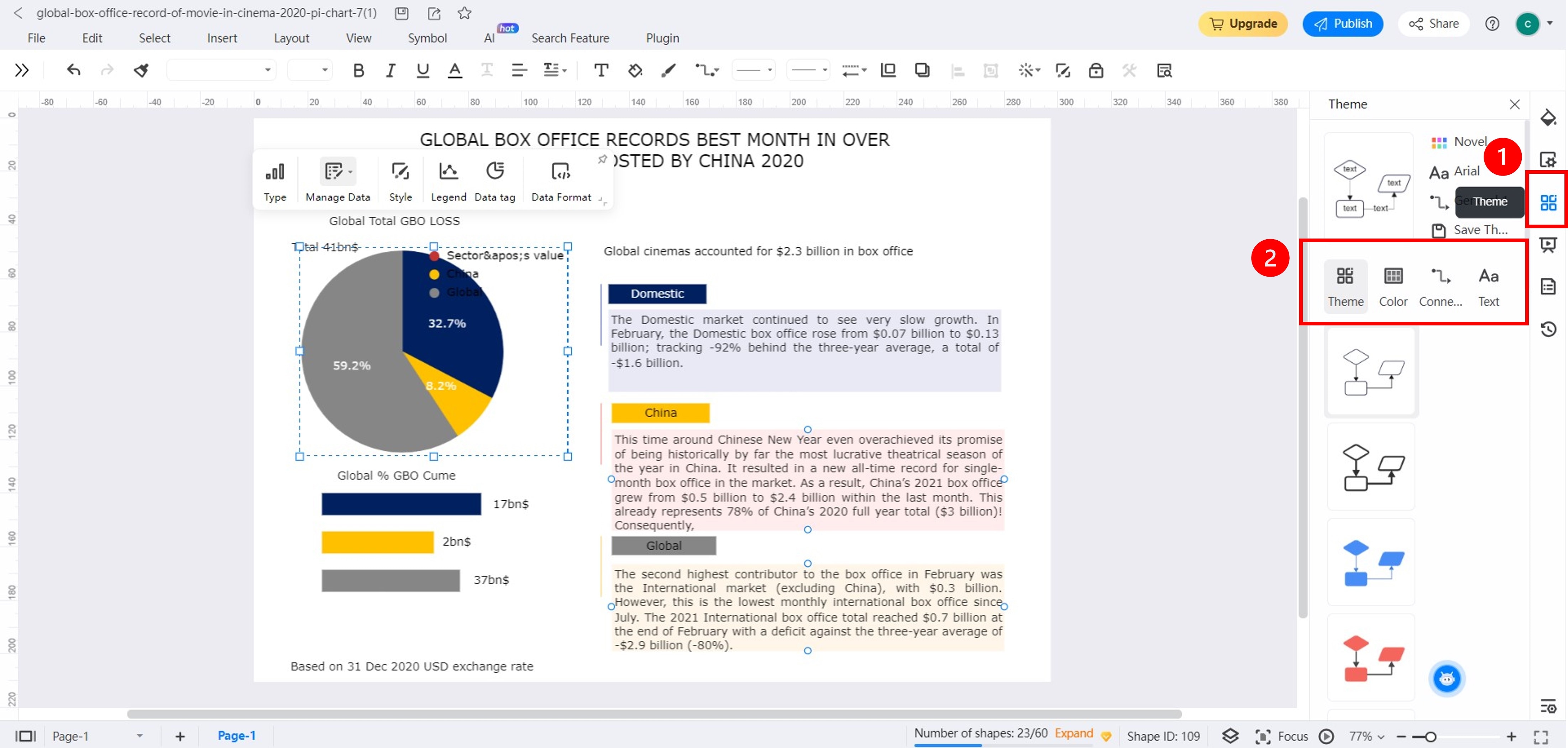
Customize your pie chart.
Change Labels: Select the pie chart and click Data Tag in the floating toolbar. Change the Tag Position, Label Type, and Percent Sign.
Edit Values: Select the pie chart in the canvas. Then click the Manage Data drop-down list in the floating toolbar and select Manage Data. Edit values and colors in the pie chart under the Manage Data in the left panel.
• Change Theme Color: Select the pie chart and click the Theme icon in the right navigation pane. Adjust Theme, Color, and Text fonts.
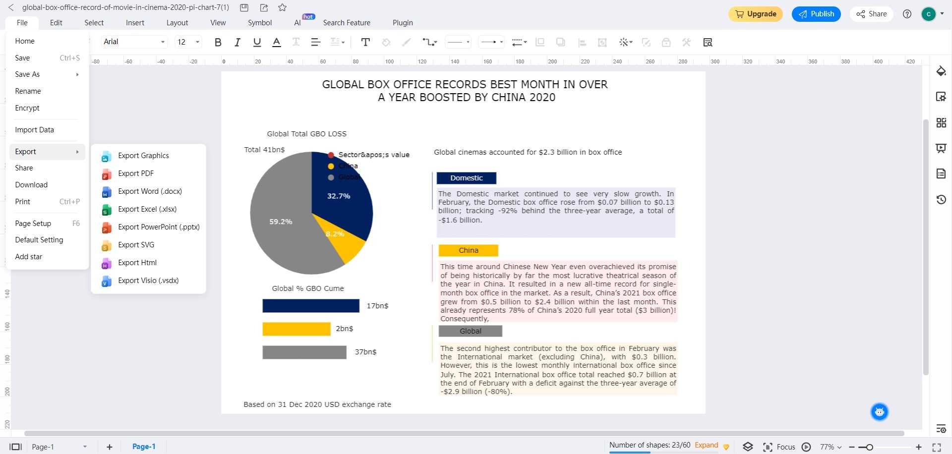
Step5
Once done, go to File > Export in the upper navigation pane and choose your preferred file format.
Part III. When To Use a Pie Chart in Data Visualization?
Now you're familiar with using a pie graph maker. In this section, you'll learn when to use pie charts to present business data.
Situations Where Using a Pie Chart Can Be Appropriate
Here are some scenarios when it's advisable to use a pie chart:
Limited Number of Categories
Pie charts work well when you have a small number of categories to represent. The simplicity of the pie chart helps display the distribution of data without overwhelming the viewer.
Proportional Data Representation
When you need to showcase how different parts contribute to a whole, a pie chart effectively displays the proportions and relative sizes of the categories.
Visualizing Percentages
Pie charts are intuitive for displaying percentages. They provide an easy-to-understand visual representation of how much each category contributes to the total.
When You Should be Cautious about Using a Pie Chart
Here are some scenarios when it's advisable to exercise caution when using a pie chart:

Comparing Many Categories
Pie charts become less effective when you have many categories to compare. Smaller differences in slice sizes can be challenging to distinguish accurately.
Ordered Data
Pie charts do not convey ordinal information well. For example, a bar chart might better show rankings in your data.
Negative Values
Pie charts are not designed to handle negative values, as they represent parts of a whole.
Showing Trends over Time or Data Groups
Pie charts are not optimal for displaying trends or making detailed comparisons. For instance, you want to showcase the revenue growth of your business over the past five years. A line graph can more accurately capture the upward or downward trends over time.
Complex Data Relationships
If your data involves complex relationships or interdependencies, pie charts might oversimplify the information, potentially leading to misinterpretation.
Part IV. Tips for Pie Chart Data Interpretation and Visualization
Pie graph makers are valuable tools for users to create and visualize data. These tips will guide you to interpret pie charts and make informed decisions.
Identify Category
Begin by identifying and labeling each category. This step lays the foundation for accurate interpretation. Ensure labels are concise yet descriptive, reflecting the data they represent.
Slice Size Significance
The size of each slice correlates with the proportion of data it represents. Larger pie chart slices show a more significant share. Assess these proportions to understand data distribution at a glance.
Color Coding Deliberation
Colors enhance visual appeal and aid differentiation in a pie chart. Select a color palette that remains consistent with your brand or presentation theme. A pie graph maker with a selection of palettes or color themes will be helpful for this.
Limit Slice Count
Overcrowded pie charts can confuse rather than clarify. Aim for a reasonable number of slices (usually 6-8) to avoid overwhelming stakeholders.
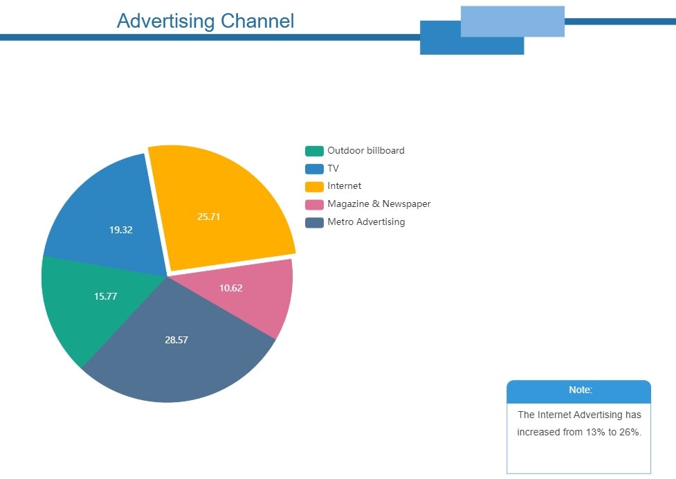
Exploded Slices for Emphasis
Consider pulling it out slightly from the center when a specific category requires emphasis. It draws attention to the segment, making it easier for stakeholders to understand its importance.
Data Labels and Percentages
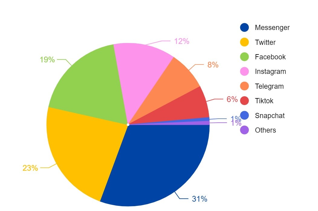
Include data labels and percentage values on each slice. It adds precision to interpretation, allowing stakeholders to grasp the share of each category. Choosing a pie graph maker that lets you change data labels in one click is helpful.
Legend Clarity
If using a legend, ensure it's clear and close to the chart. It should directly link categories to their labels, avoiding confusion about which color represents which category.
Narrative
Craft a narrative around your pie chart to guide stakeholders through the data. Explain the key takeaways, trends, and insights, ensuring that even those less familiar with data analysis can grasp it.
Conclusion
Using a pie graph maker online is better than drawing a pie chart on paper. It's convenient, easier, and lets you create professional-looking pie charts that impress everyone.
But how do you pick the best pie graph maker? Look for features like user-friendly tools, customization options, and the ability to create other diagrams too. For the ideal choice, check out EdrawMax. It's a pie graph maker online you're free to try. EdrawMax is perfect for professionals, businesses, and anyone who wants to make pie charts for data visualization.
AI Diagram Generator
Enter your prompt. Upload files if needed. Generate diagrams, charts, or slides instantly.


