


You’ve crunched the numbers, you've got the KPIs for five competing products, and now you’re just staring at a spreadsheet. How do you show, in one killer visual, which product is the champ and which is the one-trick pony? Bar charts feel clunky. A table is just... more numbers. This is the exact moment the radar chart was made for.
A radar chart—also known by cooler names like a spider chart or web chart—is perfect for comparing multiple variables at once. It’s ideal for performance reviews, feature comparisons, and spotting outliers at a glance. It instantly shows you the shape of performance, not just a list of scores. I once wasted an entire afternoon trying to force Excel to make a decent one before realizing there are way better tools out there.
To help you skip that frustration, we've tested the top radar chart creator platforms. We’ll break down the good, the bad, and the pricey for five leading tools, from diagramming powerhouses like EdrawMax to slick design apps. Let's find the one that makes your data pop.
In this article
How We Tested & Compared
We didn't just read feature lists. We got our hands dirty with a standard dataset: a mock performance review comparing team members on things like "Leadership," "Technical Skill," and "Teamwork." We scored each tool on a 5-point scale across these key areas:
| Criterion | Description | Why It Matters |
| Ease of Use | How intuitive is the interface? How fast can you make a basic chart? | Your time is valuable. You want to spend it analyzing data, not fighting with the UI to get a simple chart made. |
| Customization Depth | Can you control colors, fonts, axis labels, grid lines, and data point styles? | A great chart matches your brand and tells a clear story. That means you need control over the little details. |
| Data Integration | How easily can you import data from CSV, Excel, or just paste it in? | Manual data entry is a recipe for disaster and a total time sink. Smooth import is a must for any serious work. |
| Export & Sharing Options | What formats can you export (PNG, SVG, PDF)? How good are the sharing features? | Your chart is useless if you can't easily drop it in a report, share it with your boss, or print it without it looking blurry. |
| Pricing & Value | Is it worth the money? We looked at free plans, subscriptions, and overall bang for your buck. | Does the tool give you a good return on your investment? We're looking for that sweet spot between power and price. |
For each tool, we imported the same data, built a chart, and tried to customize it to match our brand guide. This hands-on approach showed us the real-world differences you'd never see on a pricing page. This dive into spider chart software is here to save you hours of trial and error.
The 5 Best Radar Chart Creators in 2024
EdrawMax: Best All-in-One Diagramming Tool
EdrawMax is a beast. It's not just a chart maker; it’s for flowcharts, mind maps, floor plans—you name it. And yes, it makes excellent radar charts.
- Ease of Use (4/5)
- Customization (5/5)
- Data Integration (4/5)
- Exporting (5/5)
- Pricing (3/5)
Pros:
- Massive Library: With over 280 diagram types, you're getting way more than just a chart tool. This is its biggest selling point. [[VERIFY: Is the number of diagram types still 280?]]
- Professional Templates: Its template collection is huge and well-designed, so you can get a pro-looking chart going in minutes.
- Strong Customization: You get total control over colors, line weights, axis labels, and data markers.
- Licensing Flexibility: It’s available on Windows, Mac, and Linux, and offers a perpetual license. In a world of endless subscriptions, that's a breath of fresh air.
Cons:
- Collaboration Lag: It doesn't have the slick, real-time collaboration of its web-based competitors.
- Interface Overwhelm: If you only need one simple chart, the interface can feel a bit crowded.
Pricing:
- Free Trial: Limited but good for a test run.
- Subscription: Around $99/year.
- Perpetual License: Around $179 for a one-time payment.
Ideal User: The business pro, educator, or student who needs a "Swiss Army knife" for all kinds of diagrams, not just radar charts. It's for the person who wants to buy a tool once and own it.
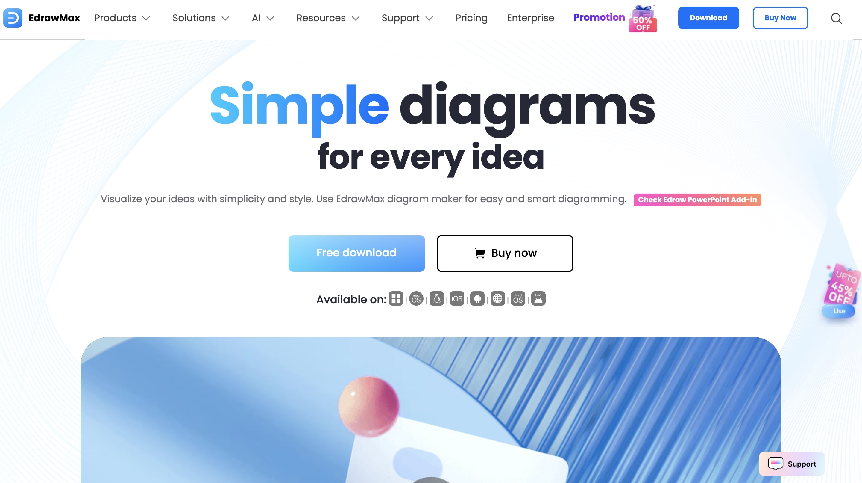
Lucidchart: Best for Team Collaboration
Lucidchart is a giant in the online diagramming world, and its real magic is making it dead simple for teams to work together.
- Ease of Use (5/5)
- Customization (4/5)
- Data Integration (4/5)
- Exporting (5/5)
- Pricing (3/5)
Pros:
- Exceptional Collaboration: This is its superpower. Real-time co-editing, comments, and version history make it the Google Docs of diagramming.
- Intuitive Interface: The web UI is clean, fast, and easy to learn. You can go from zero to a decent radar chart in no time.
- Seamless Integrations: It connects with pretty much everything: Confluence, Jira, G Suite, Microsoft Teams, you name it.
- Visio Compatibility: Great Visio import/export makes it a top pick for teams ditching Microsoft's old ecosystem.
Cons:
- Subscription Costs: The price can climb fast, especially for bigger teams. Yeah, this one’s a bit pricey—but so worth it if your team lives in its ecosystem.
- Template Variety: Has fewer niche diagram templates than a dedicated library like EdrawMax.
Pricing:
- Free Plan: Limited to 3 editable documents.
- Individual: Starts around $7.95/month.
- Team: Starts around $9.00/user/month.
Ideal User: Corporate teams, agile developers, and project managers who need to build and share diagrams without friction.
Canva: Best for Quick, Stylish Visuals
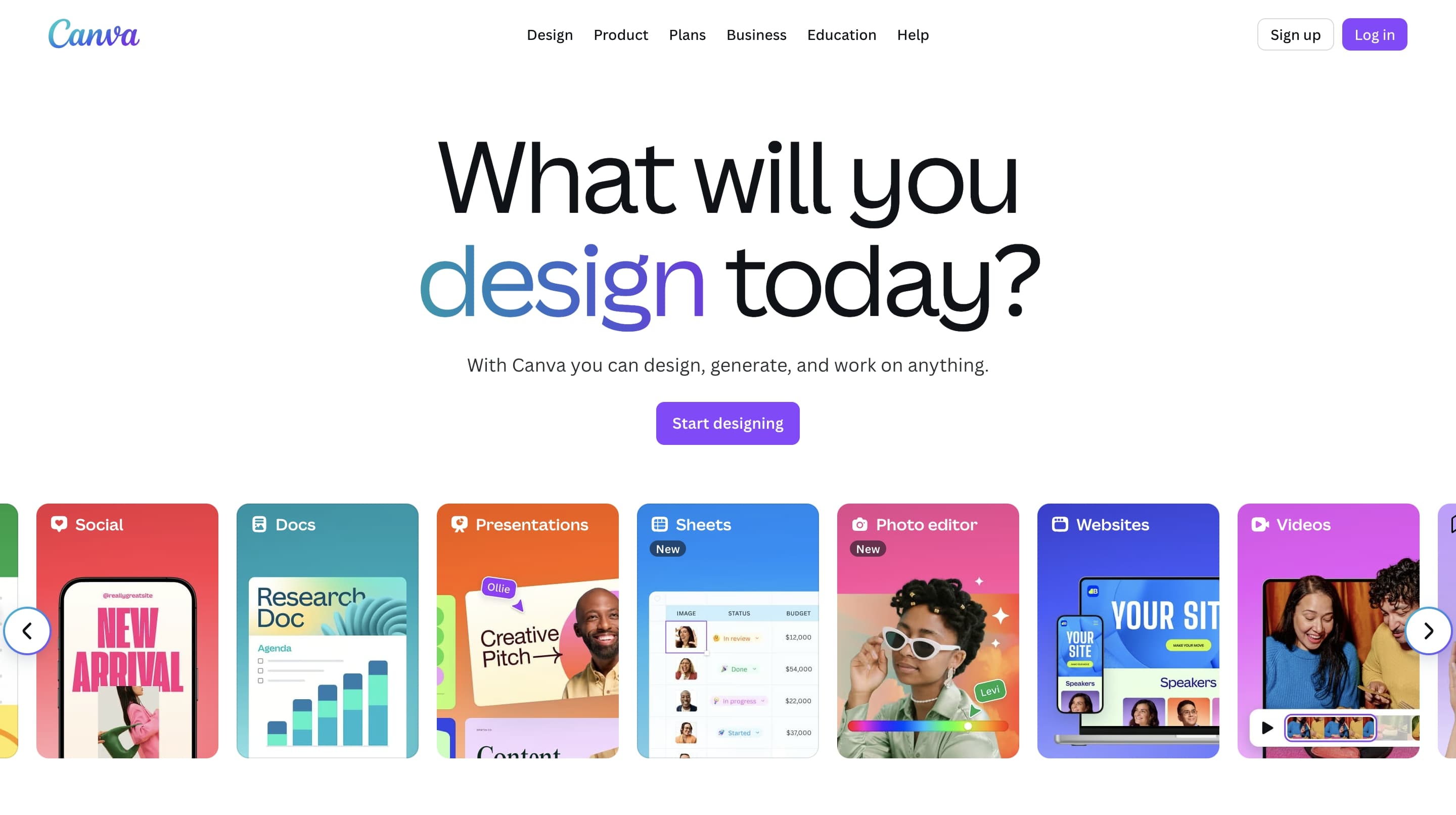
Canva made design accessible to everyone, and its chart tools follow that same idea. It’s all about speed and aesthetics over complex data work.
- Ease of Use (5/5)
- Customization (3/5)
- Data Integration (2/5)
- Exporting (4/5)
- Pricing (5/5)
Pros:
- Incredibly Easy to Use: The drag-and-drop interface is famously simple. If you can make a social media post, you can make a radar chart in Canva.
- Design Integration: In Canva, your chart is just one element you can drop into a presentation, infographic, or report. It's seamless. Honestly, their branding isn't my favorite, but the feature is undeniably useful.
- Vast Asset Library: You get access to a massive library of fonts, icons, and photos to make your chart look great.
Cons:
- Limited Data Handling: Data import is basic. It's really best for simple data you can type in by hand. Don't even think about uploading a big CSV file.
- Lacks Technical Depth: You have less control over things like axis scaling and gridlines compared to the more serious diagramming tools.
Pricing:
- Free Plan: Very generous, and it includes radar chart creation.
- Canva Pro: Around $12.99/month for brand kits and a much bigger asset library.
Ideal User: Marketers, social media managers, and anyone who needs a good-looking chart right now for a presentation without a steep learning curve. Don't let data purists scoff—sometimes presentation matters more than granular control.
Flourish: Best for Interactive Storytelling
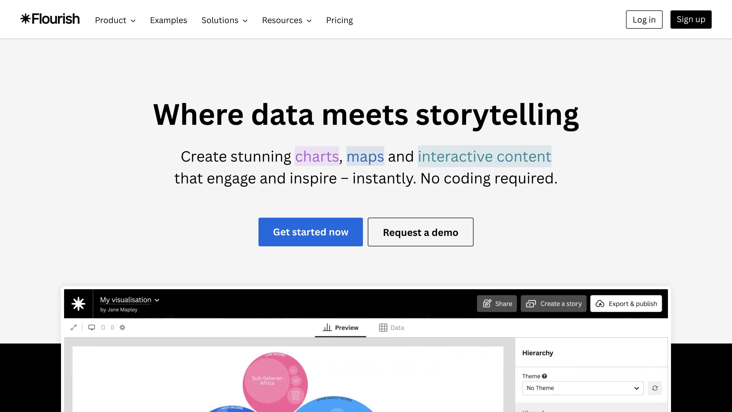
Flourish isn't just for making charts; it's for making charts that feel alive. It’s one of the best data visualization tools for creating dynamic, web-embeddable content.
- Ease of Use (3/5)
- Customization (5/5)
- Data Integration (4/5)
- Exporting (4/5)
- Pricing (2/5)
Pros:
- Stunning Interactivity: Creates beautiful, interactive radar charts that are perfect for embedding online. Viewers can hover over points and filter data.
- Creative Variations: Supports unique chart types like radial bar charts, which can sometimes be clearer for showing magnitudes.
- Storytelling Features: Lets you build "stories" that walk viewers through the data step-by-step.
- Good Data Import: Handles CSV and Excel files without any fuss.
Cons:
- Public by Default: The free version slaps "Made with Flourish" branding on your work and requires your data to be public. A dealbreaker for many.
- Learning Curve: Mastering its advanced animation and storytelling features takes more time than the simpler tools.
Pricing:
- Free: For public projects with Flourish branding.
- Personal/Business: Tiers for private projects start at a much higher price point. [[VERIFY: Get current personal/business pricing details]].
Ideal User: Journalists, data storytellers, and marketers who want to publish interactive charts on a website or blog to really engage an audience. Flourish charts just feel different—they turn a static image into an experience.
Bold BI: Best for Serious BI Dashboards
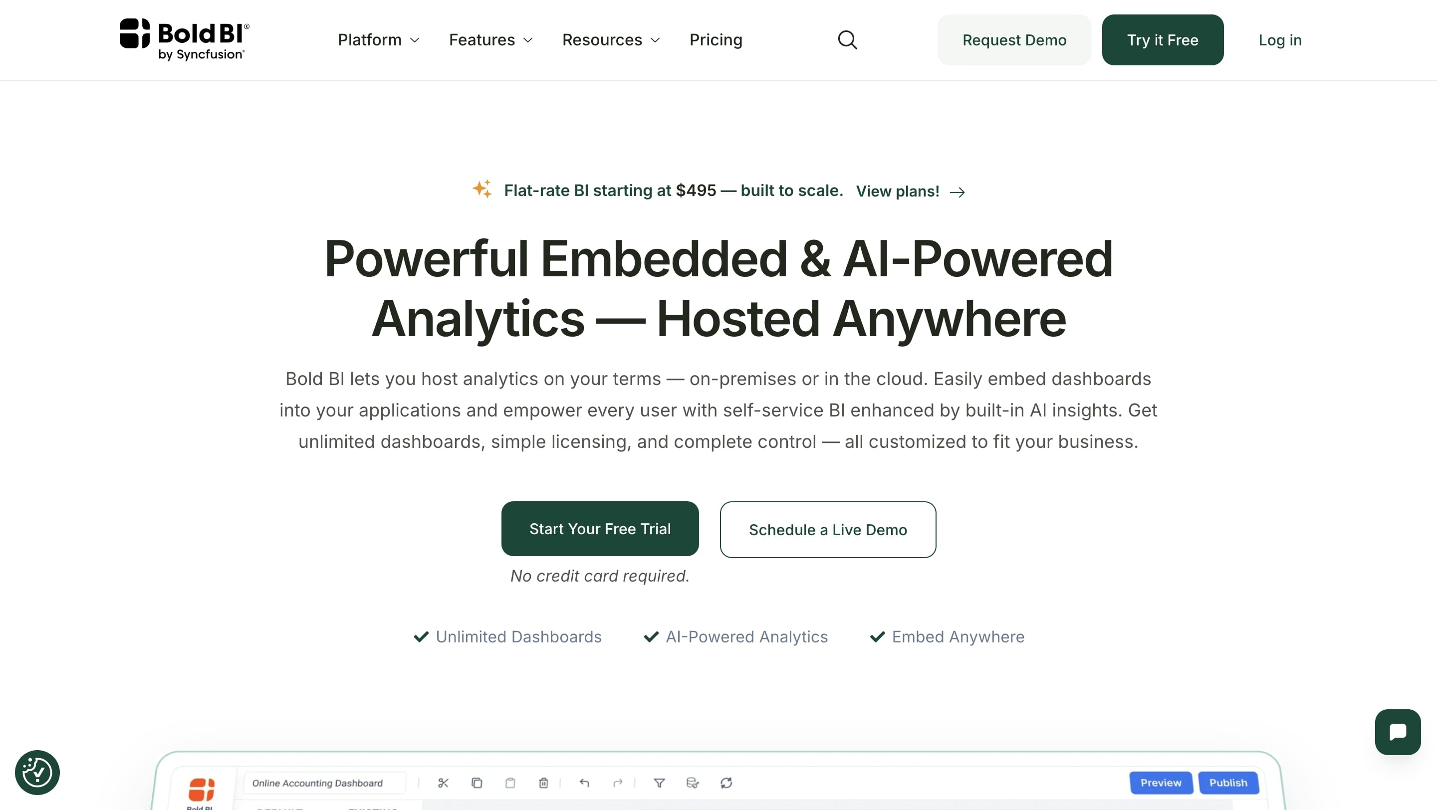
Bold BI is an enterprise-level solution for building big, comprehensive business intelligence dashboards. A radar chart here is just one piece of a much larger data puzzle.
- Ease of Use (2/5)
- Customization (4/5)
- Data Integration (5/5)
- Exporting (3/5)
- Pricing (1/5)
Pros:
- Powerful Data Integration: It’s built to connect to almost any data source (SQL databases, web services) and handle huge datasets.
- Built-in Normalization: Includes features to handle variables with different scales—a critical step that most other tools ignore.
- Dashboard-Native: It’s made to be embedded in a larger BI dashboard, not as a one-off graphic.
- Rich Interactivity: Provides excellent filtering, drill-downs, and tooltips that connect to the rest of the dashboard.
Cons:
- Massive Overkill: Using this for a single chart is like using a sledgehammer to crack a nut. It's a complex system, not a simple tool.
- Opaque Pricing: You have to call sales, and you can bet it's in a different league than the other tools here.
- Steep Learning Curve: This is a tool for data analysts and developers, not your average business user.
Pricing:
- Free Trial: Available to test the platform.
- Enterprise: Must contact sales.
Ideal User: The data scientist or BI analyst in a big company who needs to add a robust, data-connected spider chart software component to a real-time dashboard.
Pro Tips for Making Radar Charts That Don't Suck
Making a radar chart is easy. Making a good one takes a bit of thought. Avoid the common mistakes with these tips.
- Stick to the "Rule of 5s." Your chart is clearest with about 5-8 variables (axes) and no more than 4-5 data series (the colored shapes). Any more and you get a "plate of spaghetti"—a tangled mess where nothing is clear. If you have more to compare, make a grid of several small charts instead.
- Order Your Axes Logically. Don't just list variables alphabetically. Group related metrics together. For example, put "Leadership" and "Mentoring" next to each other. This helps the viewer see patterns in the shape itself. A bulge in one area of the chart now has a clear meaning.
- Normalize Your Data (This is the Big One!) This is the most critical and most often forgotten step. If you're charting "Years of Experience" (1-20) against "Teamwork" (1-5), the experience axis will dominate the chart and make the teamwork score look tiny, even if it's a perfect 5/5. You have to normalize all variables to a common scale (like 0-100) before you chart them. This ensures each variable contributes equally.
- Don't Mistake Area for Value Our eyes are easily fooled by area. A 20% increase in scores can result in a 44% increase in the polygon's area, which visually exaggerates the change. To avoid misleading people, use transparent fills (30-50% opacity) or just skip the fill color and use colored lines. This forces the eye to judge the points on the axes, not the overblown area.
- Use Color and Labels Wisely Sounds obvious, but it’s easy to mess up. Always use a clear legend. Use distinct colors. As mentioned, use transparency for filled areas. And make sure your axis labels are actually readable and not cut off by the edge of the chart.
So, Which Tool Should You Pick?
Choosing a radar chart creator isn't about finding the single "best" one, but the right one for your job. The best data visualization tools are the ones that fit your world.
Are you a marketer who needs a beautiful visual for a report, like, yesterday? Canva is your speed demon. A BI analyst embedding a chart in a live dashboard? Bold BI is your powerhouse. A project manager mapping out performance with your team in real time? Lucidchart is built for you.
The perfect tool is the one that slots into your workflow and helps you tell a clear, compelling story with your data.
So, which one are you leaning towards? Have you used any of these? Drop your experiences and favorite tools in the comments below!