Think Bigger From EdrawMax User Guide
Import Data to Create a Chart
Instead of starting with random shapes or manually creating all elements, EdrawMax allows you to import data directly and generate a chart of that data. Follow the steps below to create a chart using imported data.
Step ❶
- Open the EdrawMax application on your tablet.
Step ❷
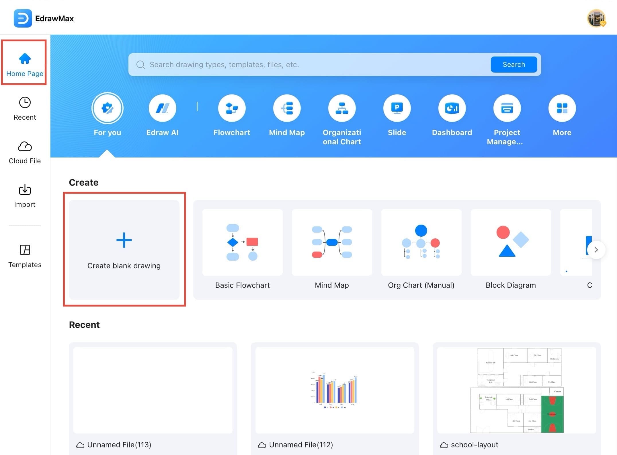
- From the Home Page, tap the Create blank drawing to start with a fresh canvas.
Step ❸
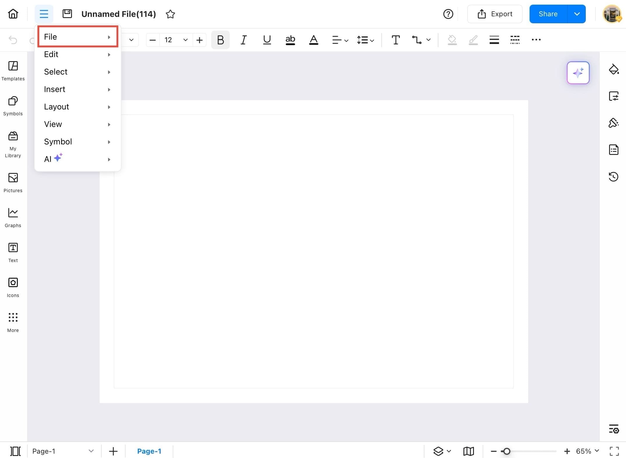
- Once the new blank file is open, tap the menu icon (three horizontal lines) on the top left of the canvas.
Step ❹
- From the dropdown menu, tap on File to access file-related options.
Step ❺
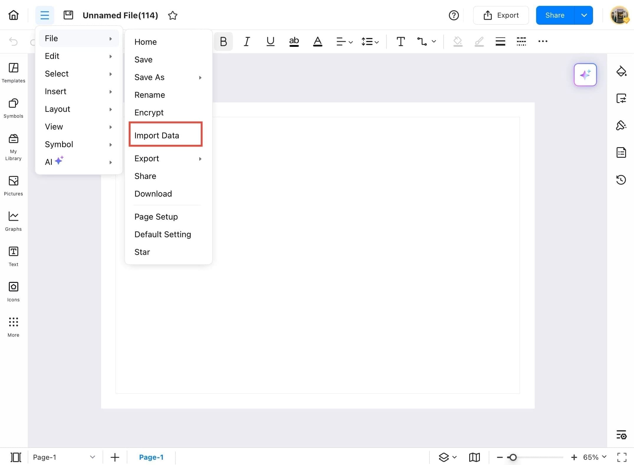
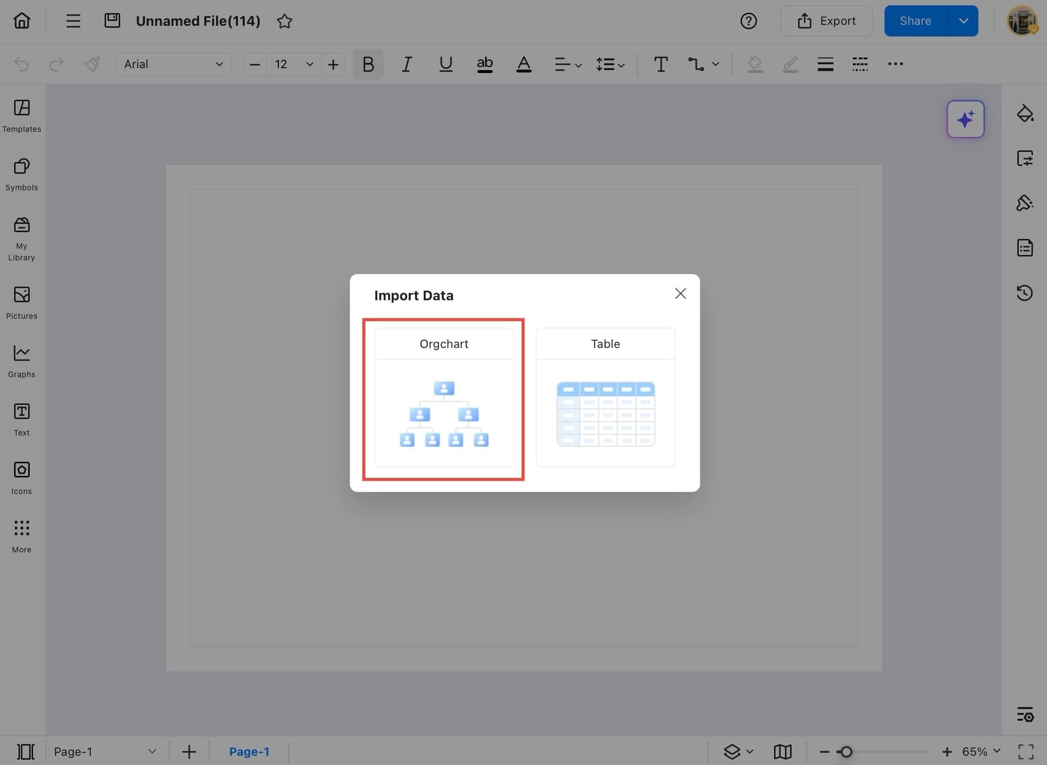
- In the File menu, tap Import Data to begin the data import process.
Step ❻
- On the Import Data pop up, select the OrgChart format to create a chart from structured table data.
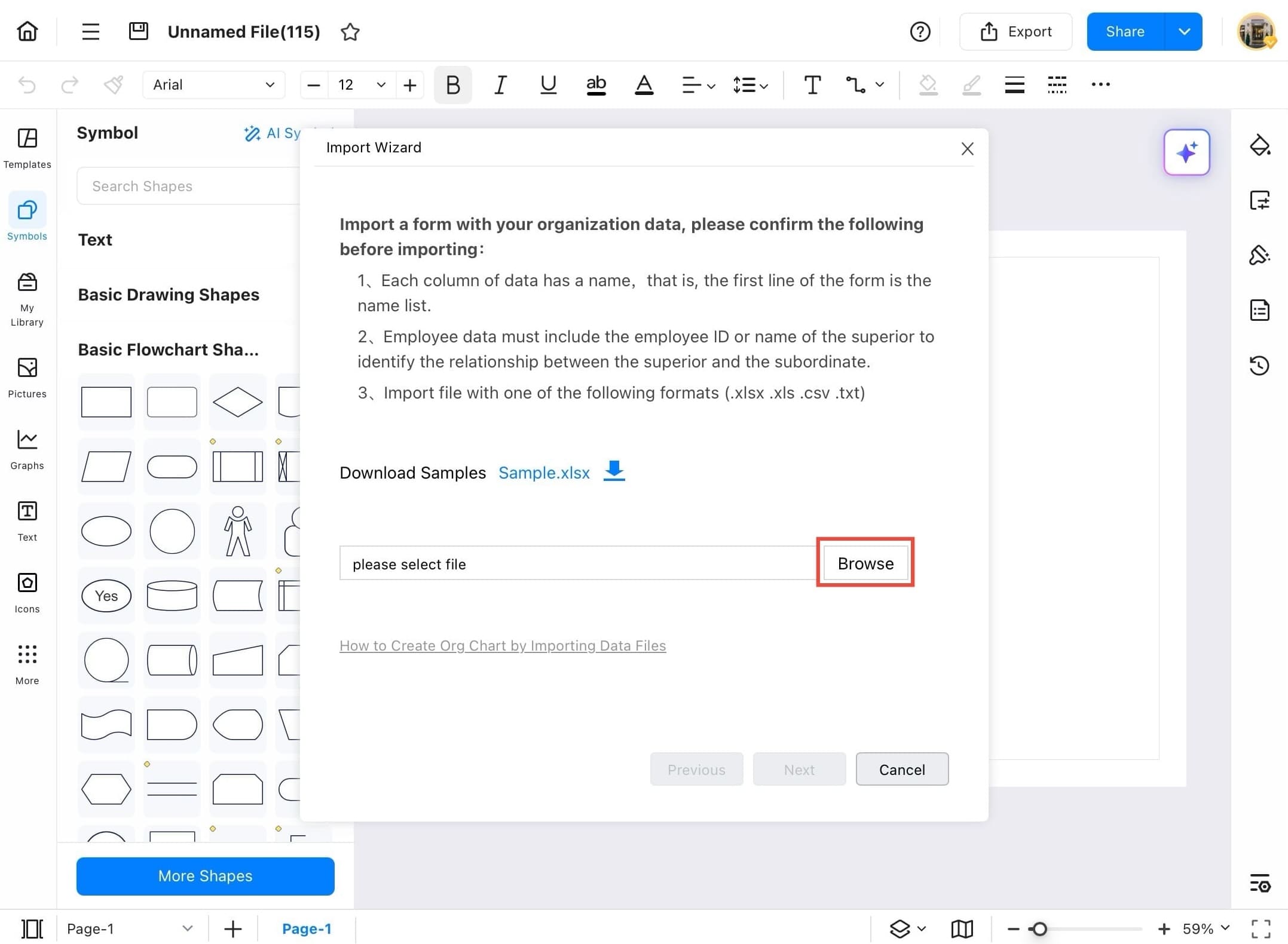
Step ❼
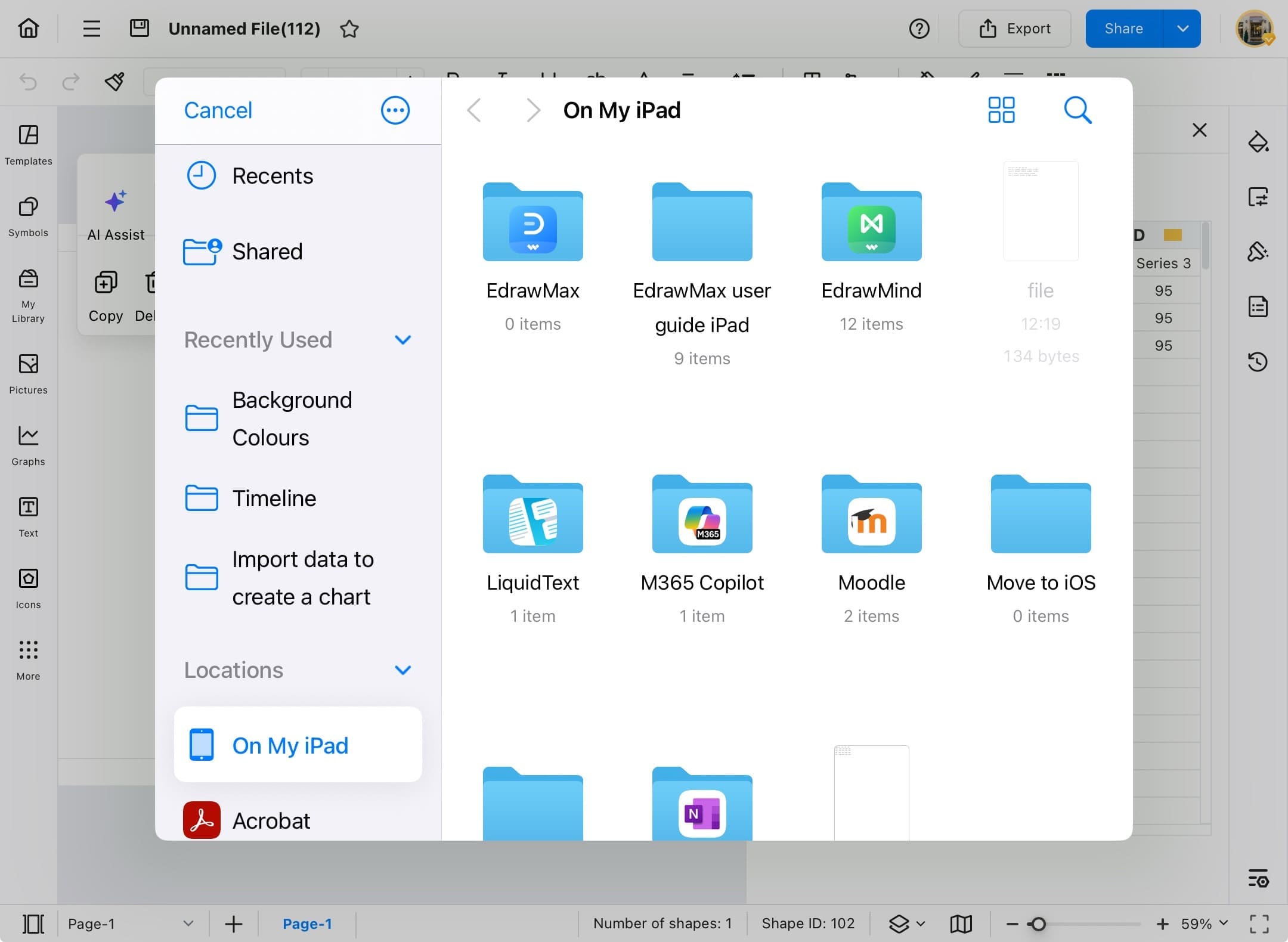
- Tap the Browse button to select and upload your data file.
- The file should be in one of the following formats: .xlsx, .xls, .csv, or .txt.
- You can also download a sample file to check the structure.
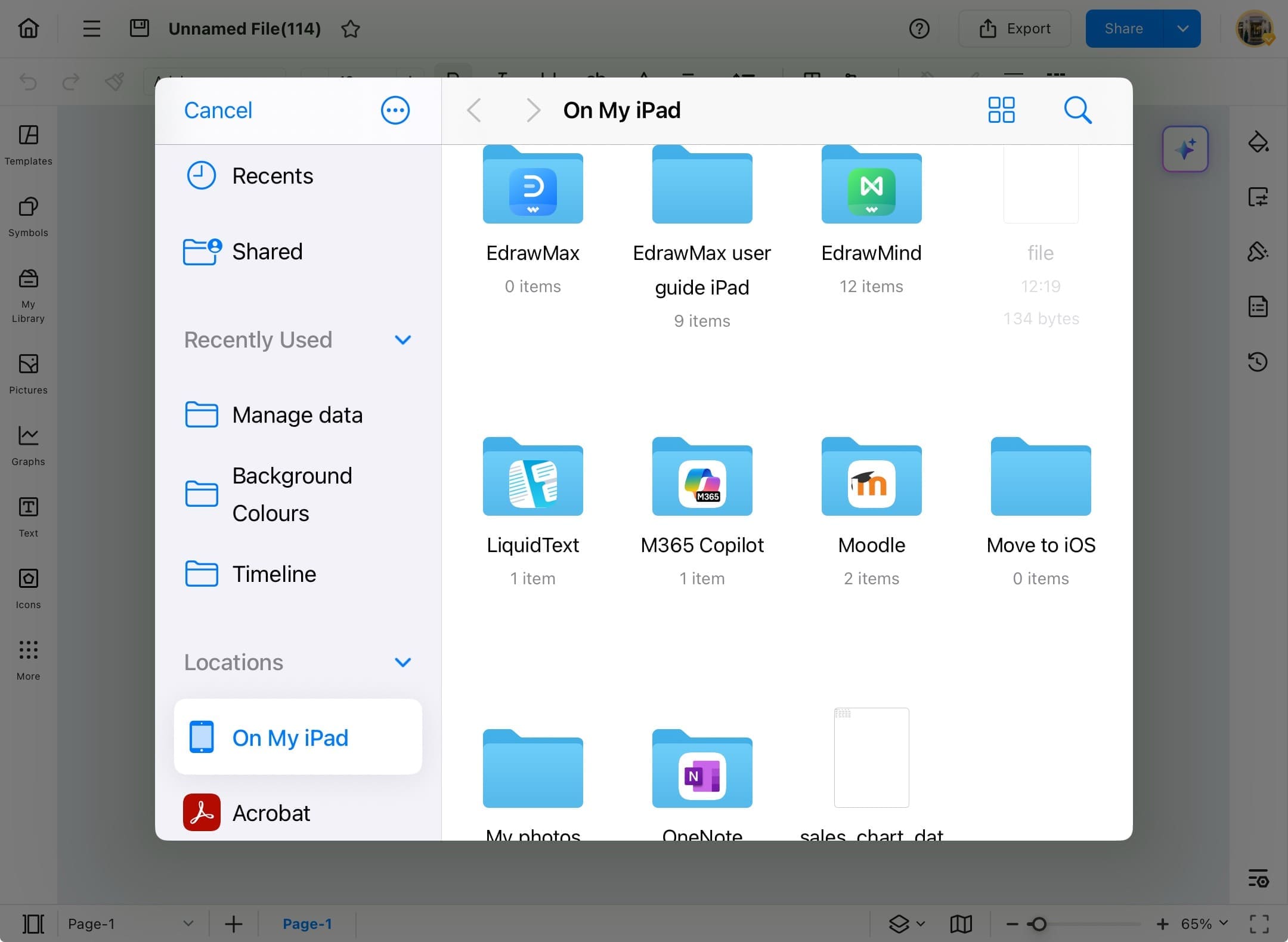
Step ❽
- Once you tap Browse, your device’s file manager will open.
- Locate and select the data file you want to import (e.g., .xlsx, .csv, etc.).
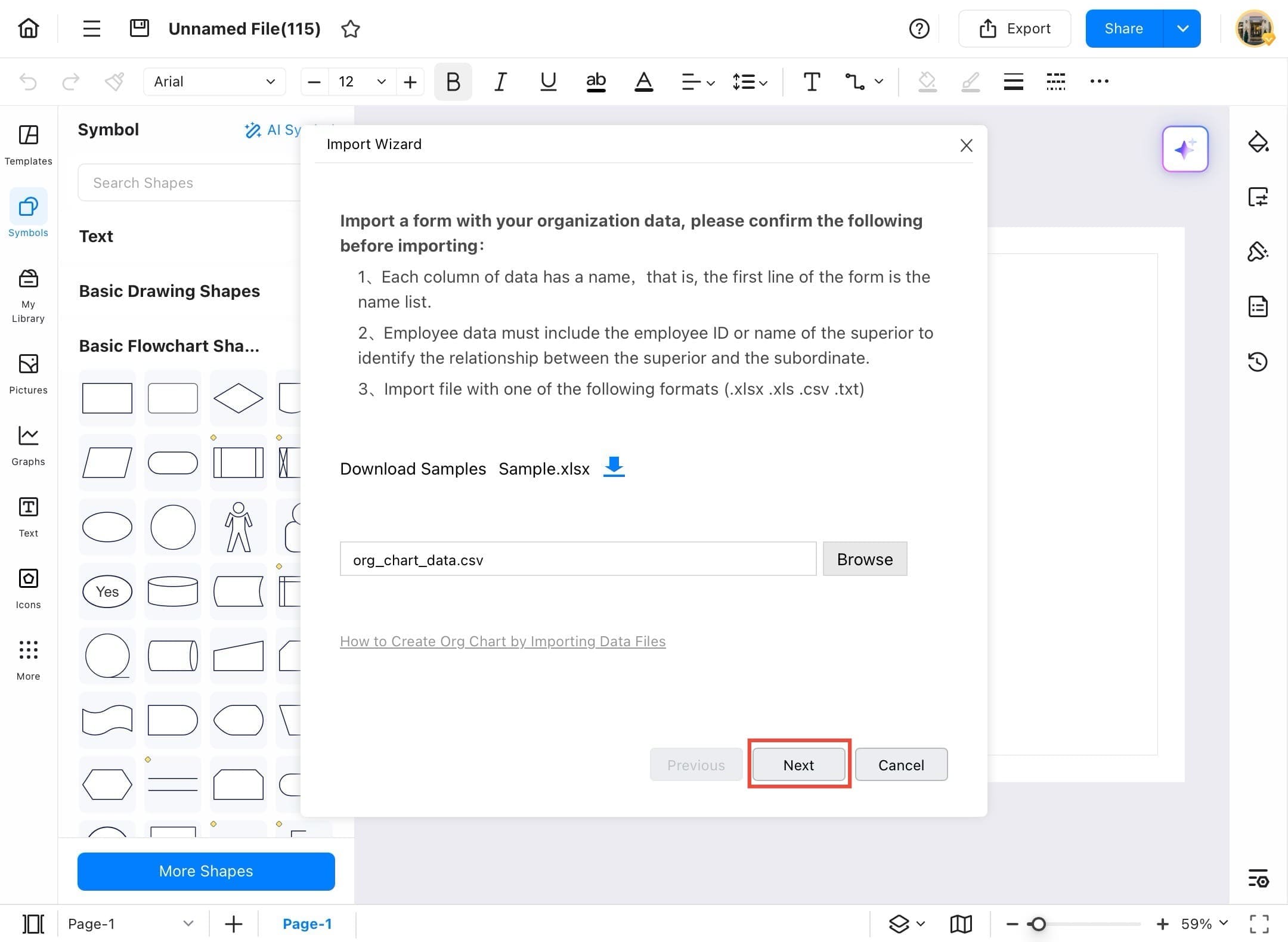
Step ❾
- After selecting the file, it will appear in the import field.
- Tap the Next button to proceed to the mapping screen.
Step ❿
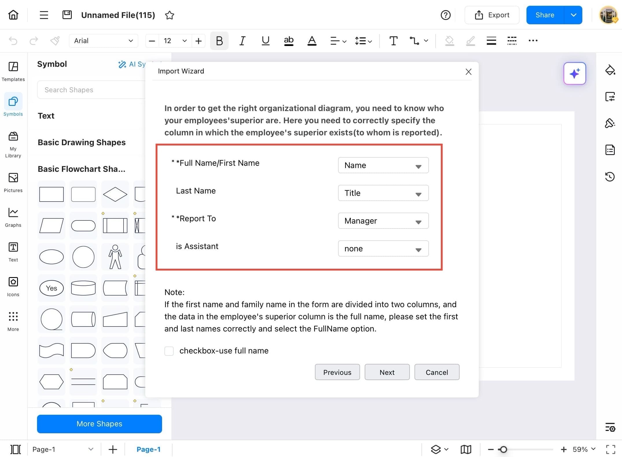
- Use the dropdown menus to map each data field correctly:
- Assign the correct column to Full Name/First Name
- Map Last Name, Report To, and Is Assistant accordingly
- Ensure the Report To field correctly reflects the supervisor or manager's name or ID.
Step ⓫
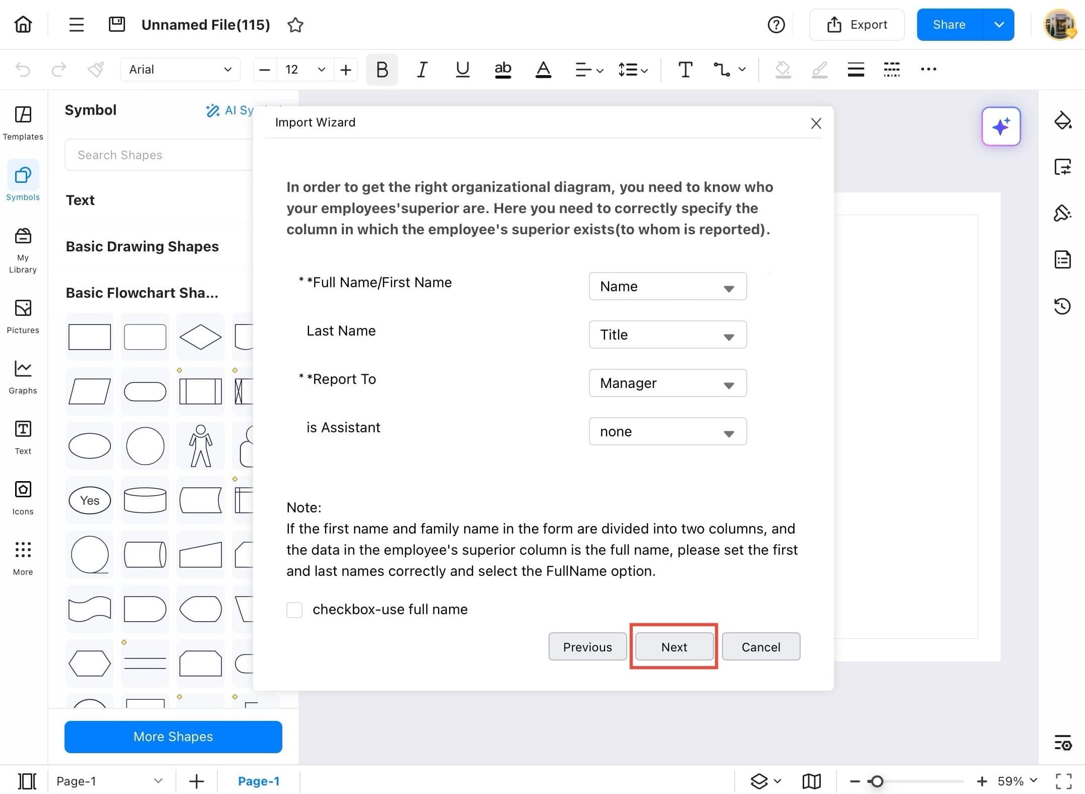
- Fill in the necessary fields for your org chart setup like “Full Name,” “Title,” and “Manager.”
- Once done, tap the Next button at the bottom.
Step ⓬
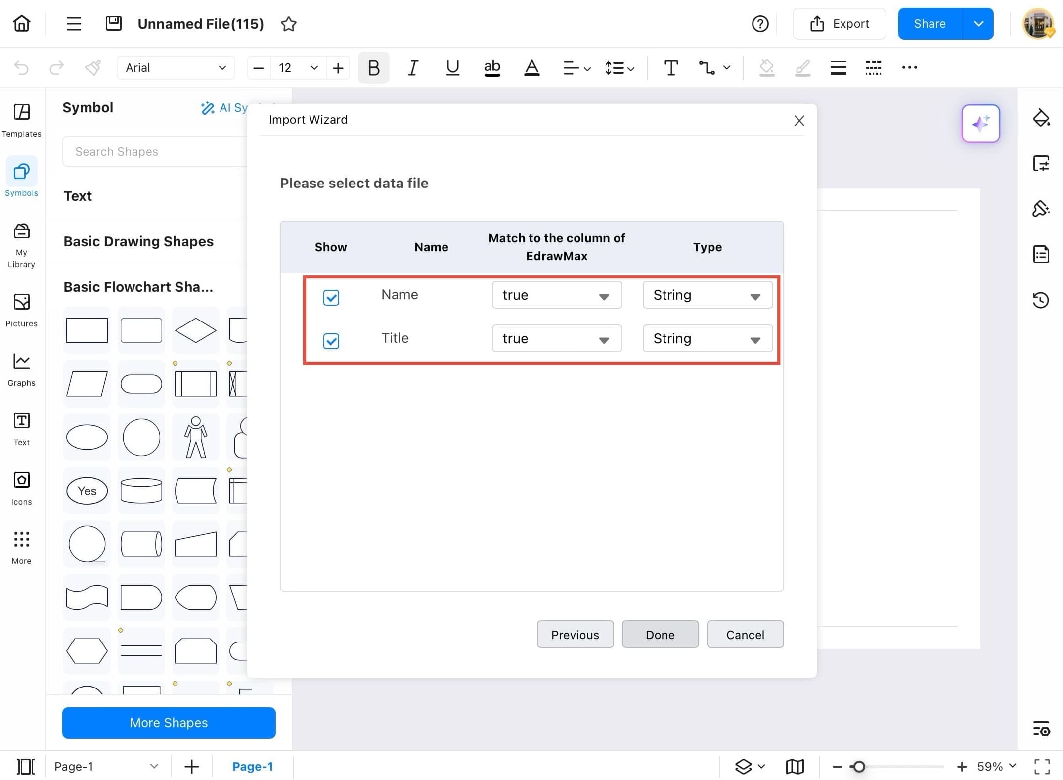
- Now you'll see a list of columns from your data.
- Tick the ones you want to include in the diagram.
- Make sure they are matched correctly with EdrawMax's columns.
Step ⓭
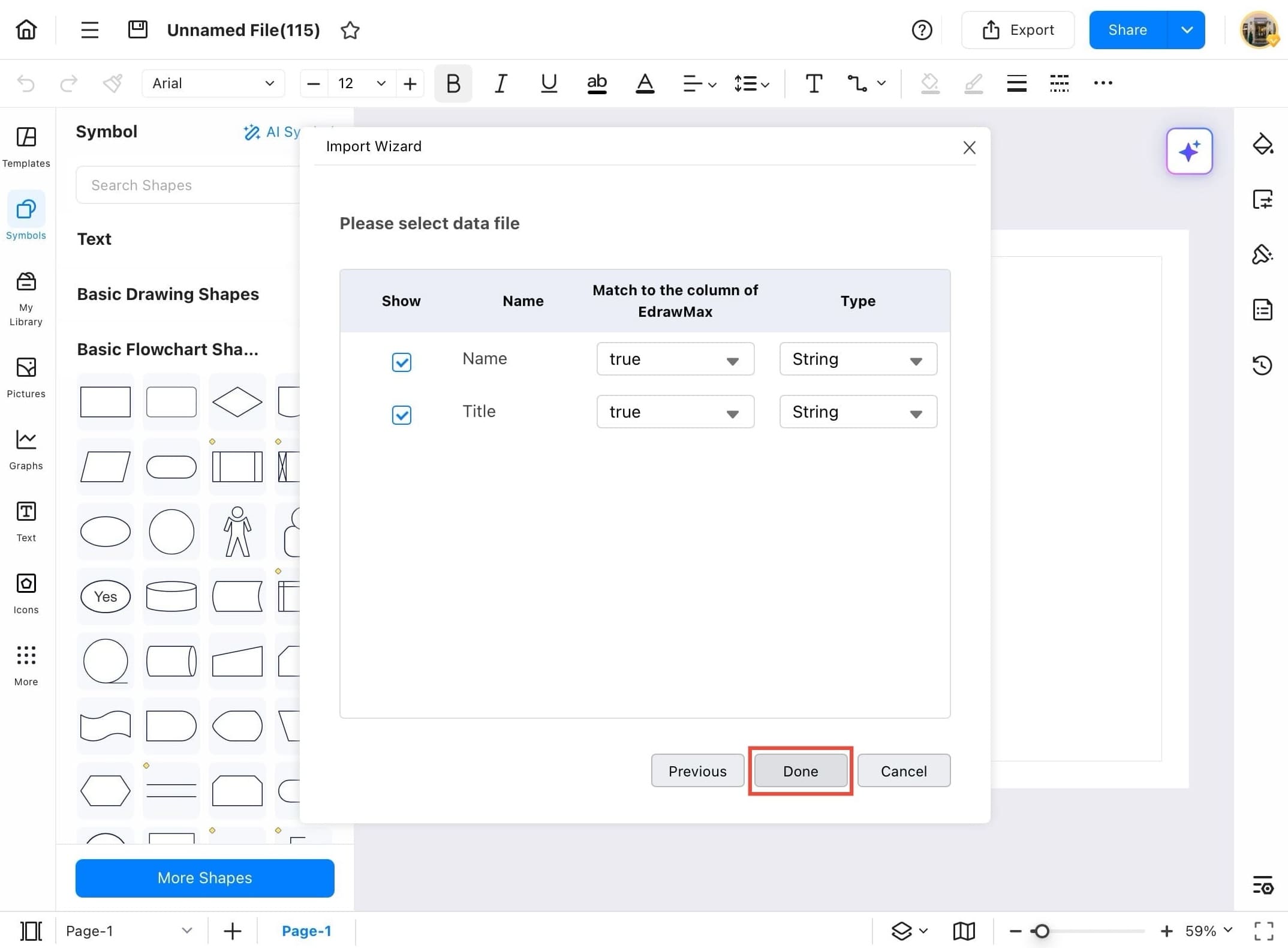
- After confirming your selections, tap the Done button to generate your diagram.
Step ⓮
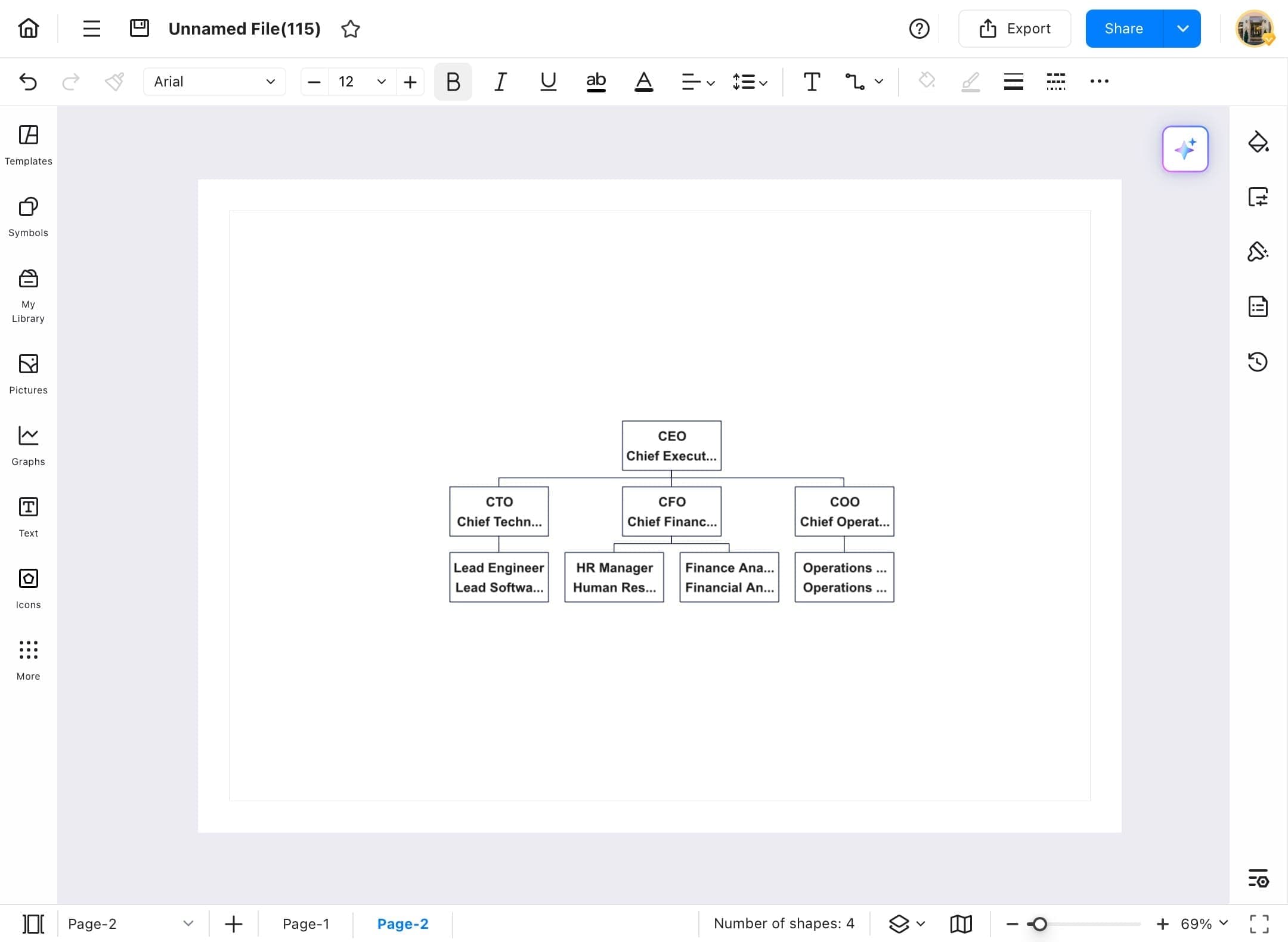
- Once your data is processed, EdrawMax will automatically generate a complete organizational chart based on your imported information.
Manage Data
Accurate data drives smarter decisions. In EdrawMax you can manage data within charts and diagrams for better control and accuracy. You can also edit, update, sort, or delete data entries directly in the built-in data editor. Follow the steps below to manage your data efficiently and keep your visuals up to date.
Step ❶
- Open EdrawMax on your tablet.
Step ❷
- From the left sidebar, tap Home Page.
- Then tap Create blank drawing from the options.

Step ❸
- After the blank canvas opens, tap the three-bar menu icon at the top left to manage settings and data options.
Step ❹
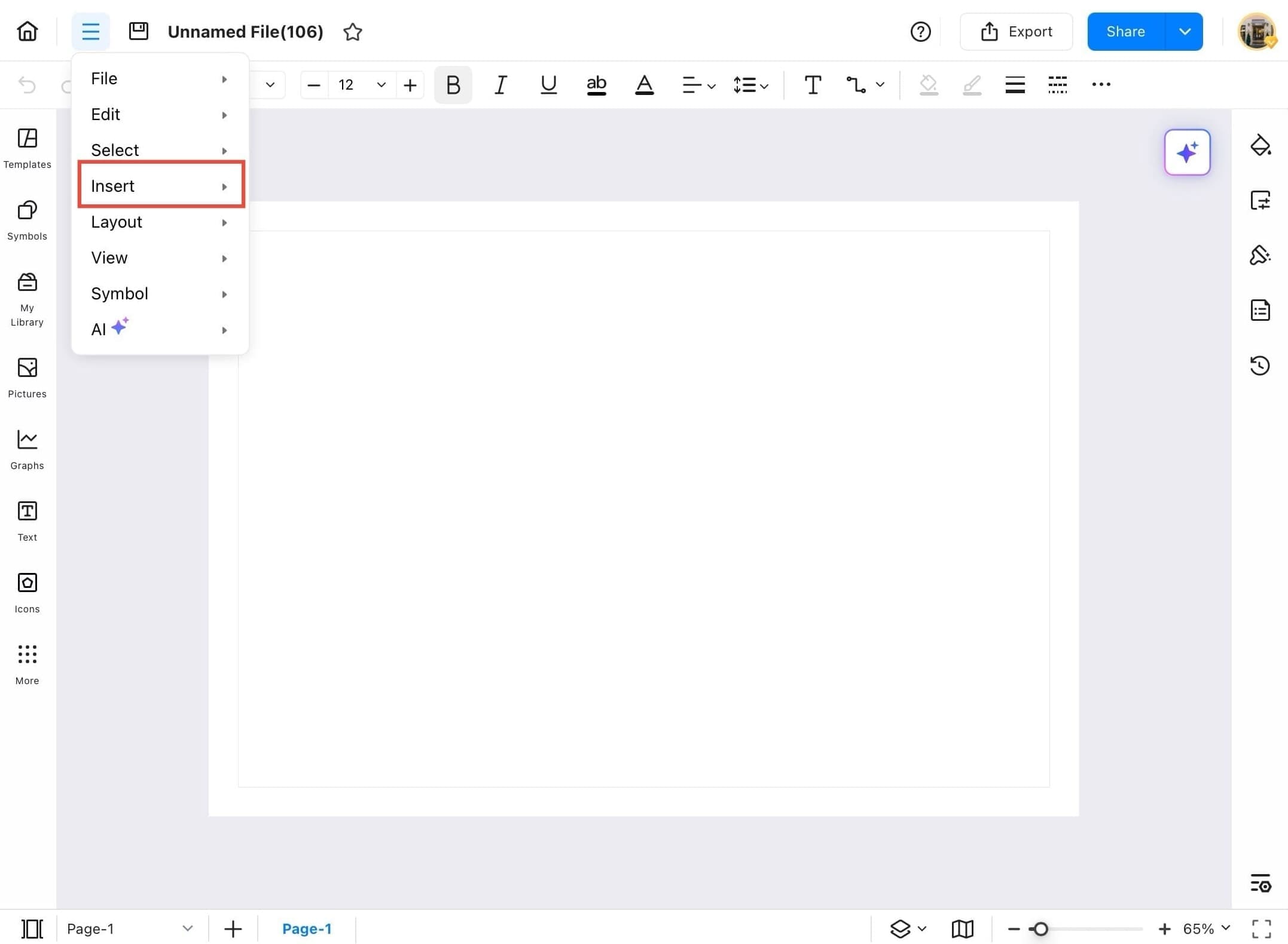
- Tap the menu icon on the top left.
- From the dropdown, select Insert.
Step ❺
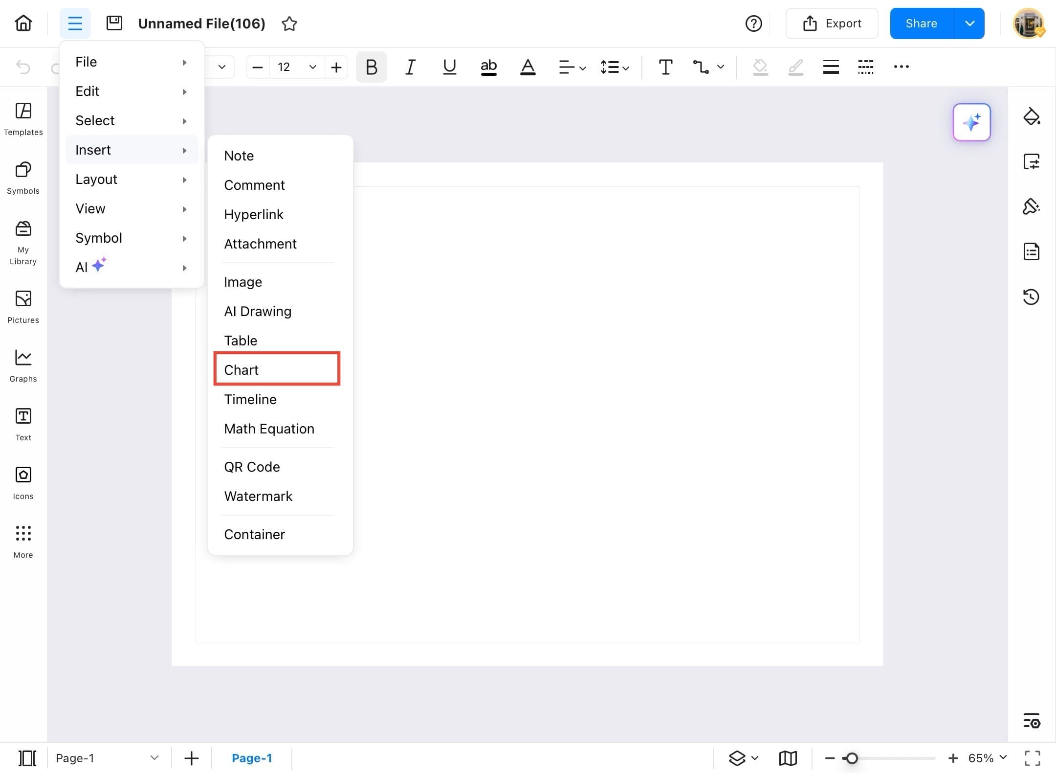
- From the Insert menu, choose Chart to bring up available chart types.
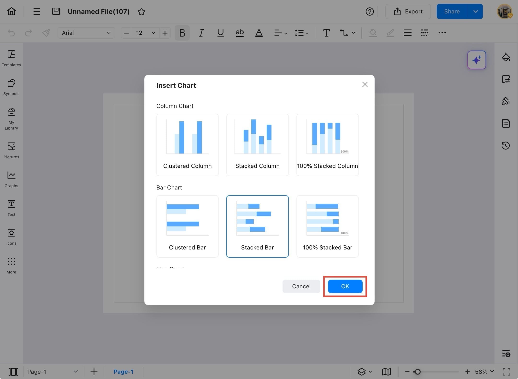
Step ❻
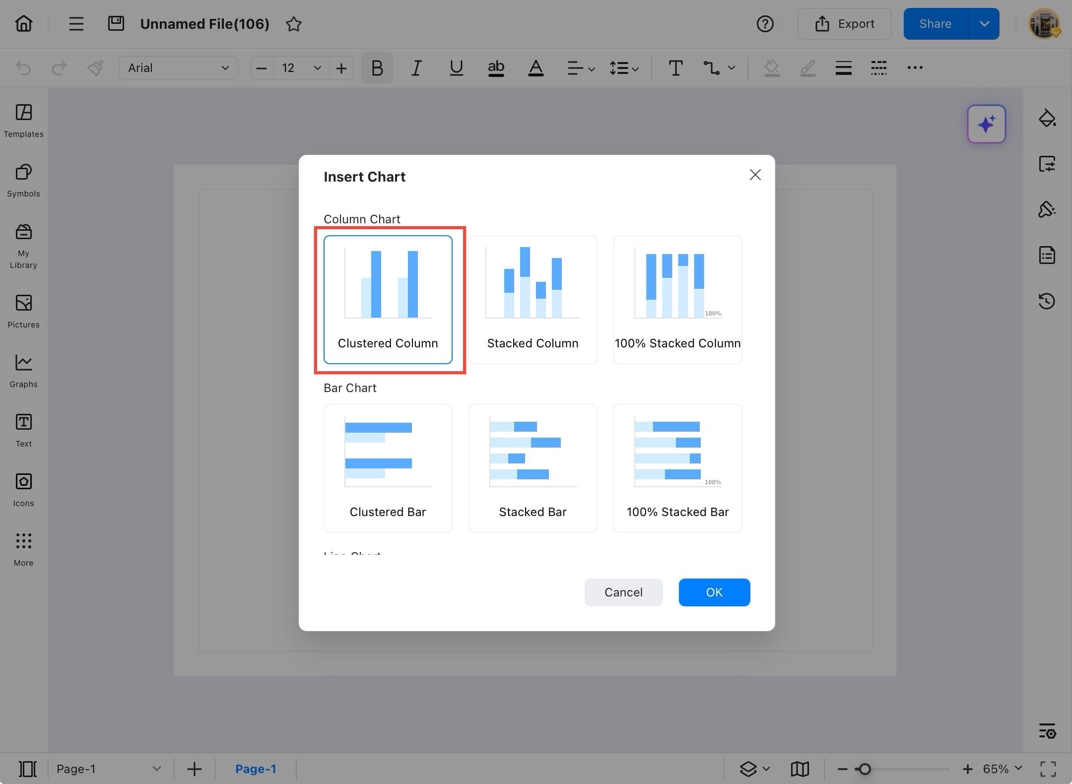
- In the Insert Chart window, select chart type from the list and tap OK.
Step ❼
- After selecting the chart type, tap the OK button to insert the chart into your canvas.
Step ❽
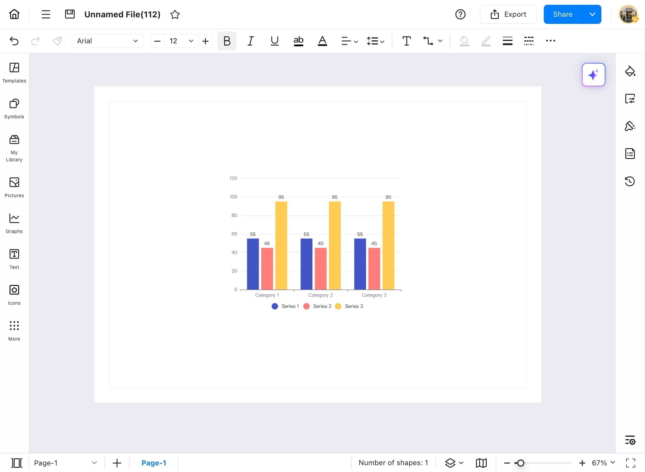
- Your chart will now appear on the drawing canvas with sample data.
Step ❾
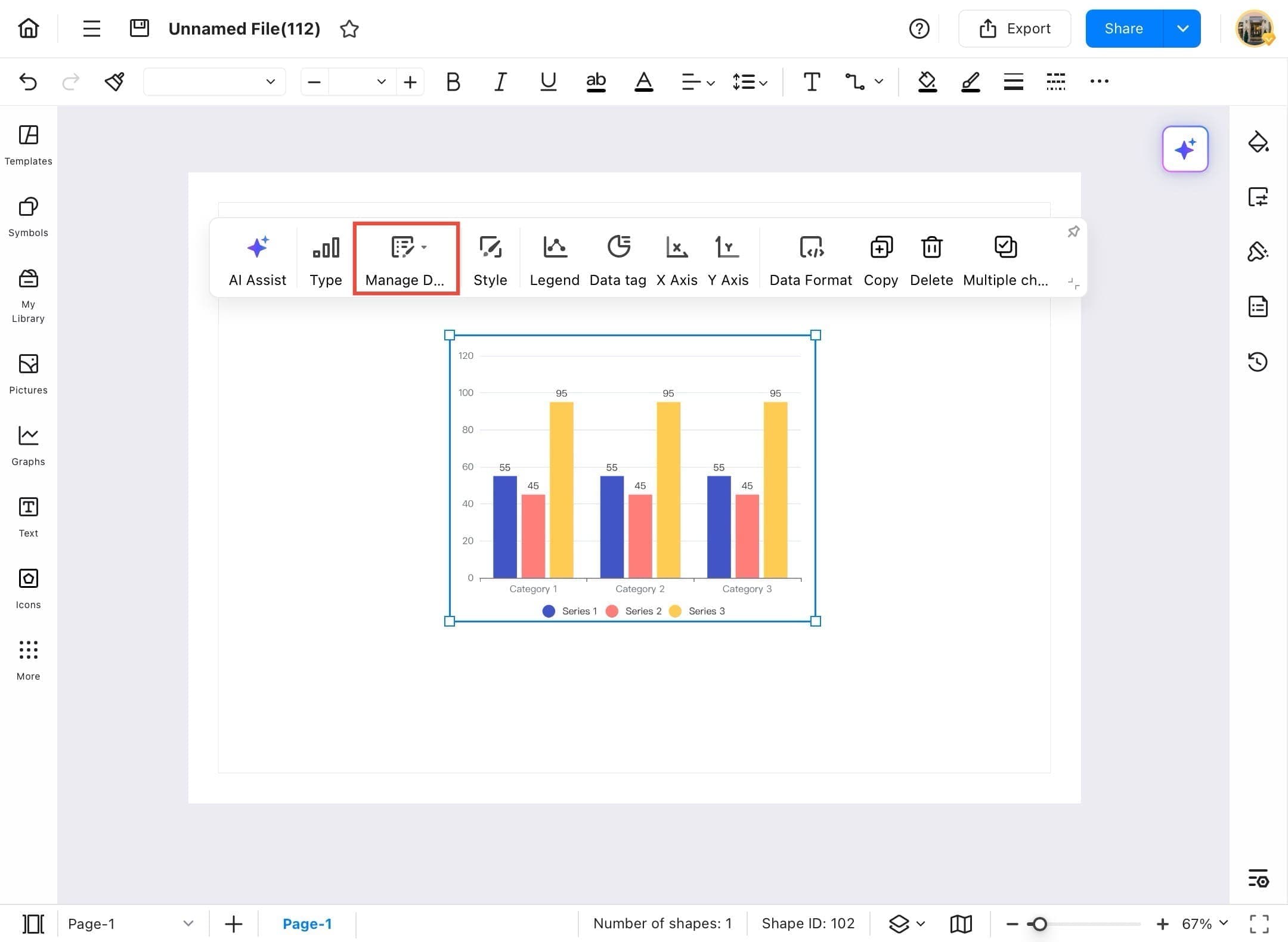
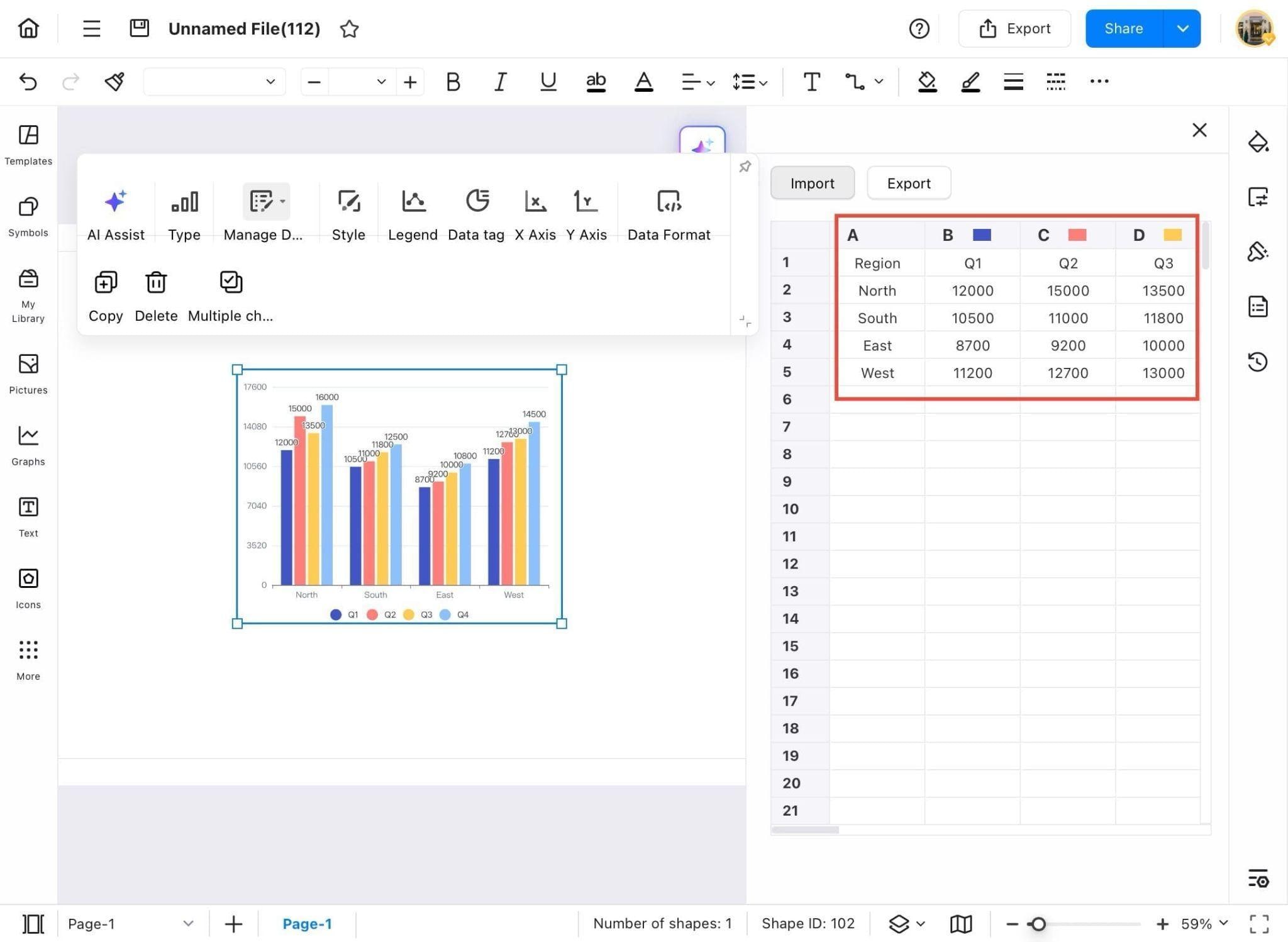
- To edit the chart’s data, tap on the chart to select it, then tap Manage Data from the top toolbar.
Step ❿
- To import your own data into the chart, tap the Import button located above the data table.
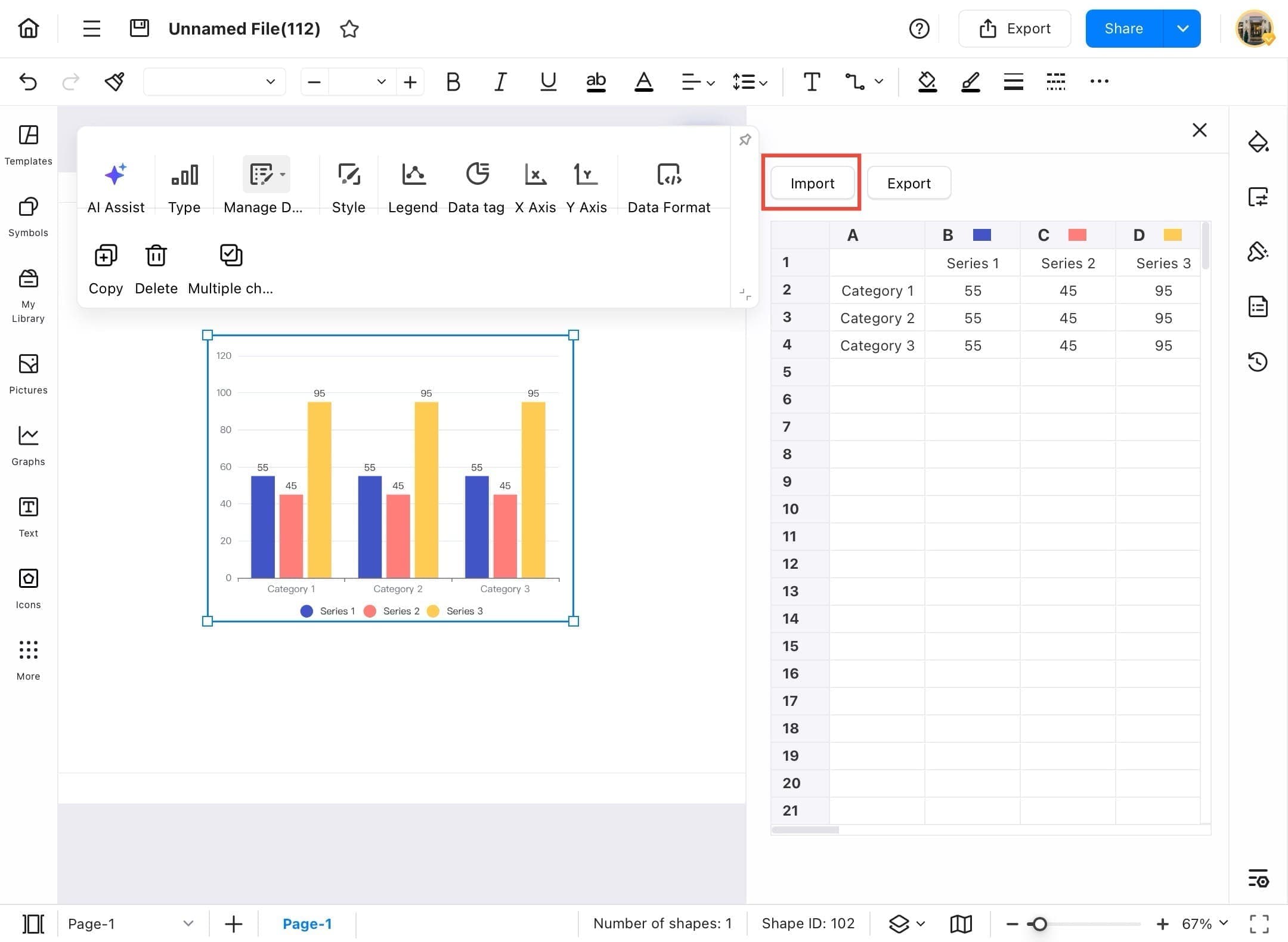
Step ⓫
- Browse your device’s storage (e.g., On My iPad) and select the file that contains the data you want to use.
Step ⓬
- After importing, the chart will update automatically to reflect your data.
Analyze Chart with AI
Not sure what your chart is saying? Let EdrawMax’s AI help. With built-in analysis tools, you can automatically interpret your chart’s data, detect patterns, and understand trends. Use the steps below to activate AI analysis and gain quick, data-backed insights.
Step ❶
- Launch EdrawMax on your tablet.
Step ❷
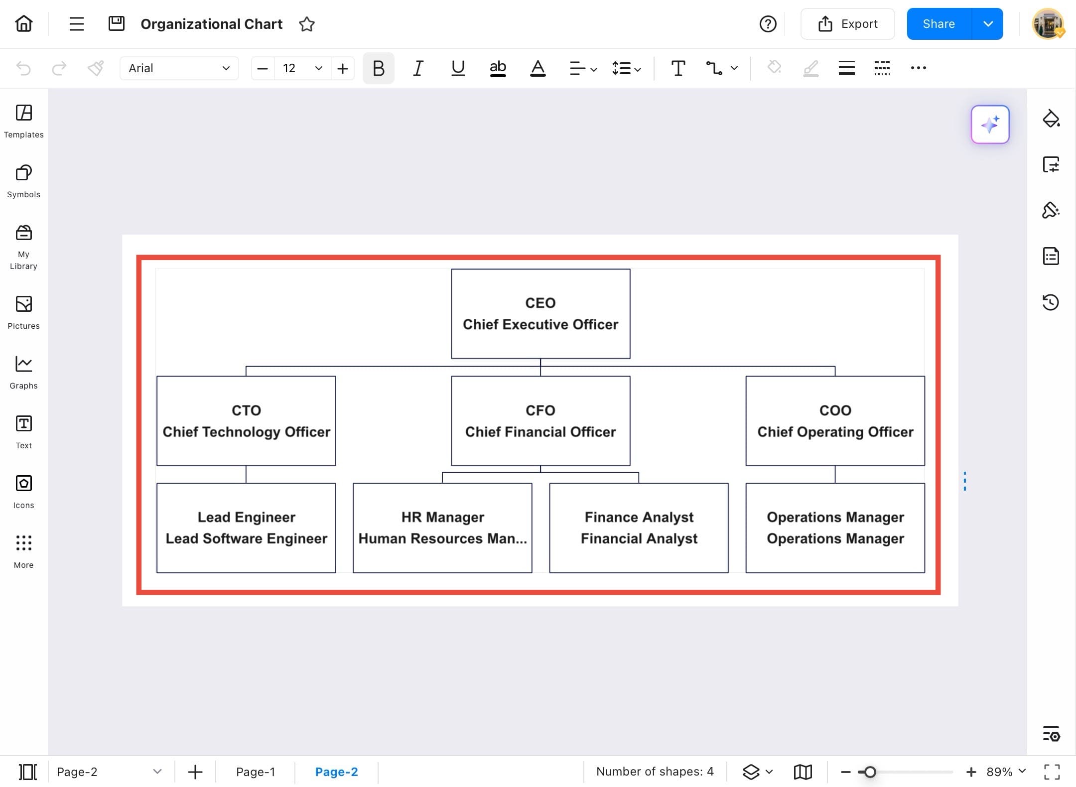
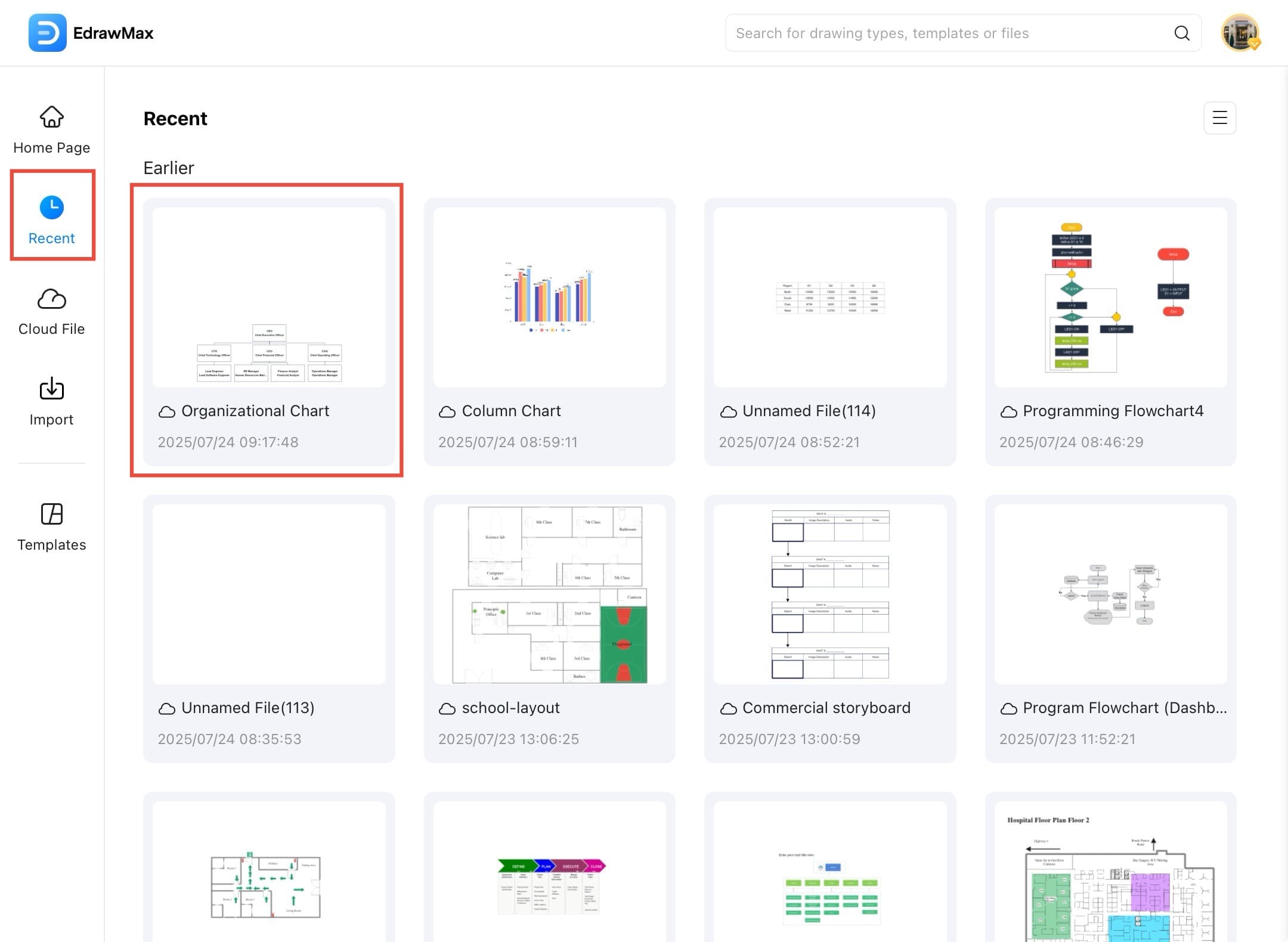
- Go to the Recent tab on the homepage and select your saved chart, such as an Organizational Chart.

Step ❸
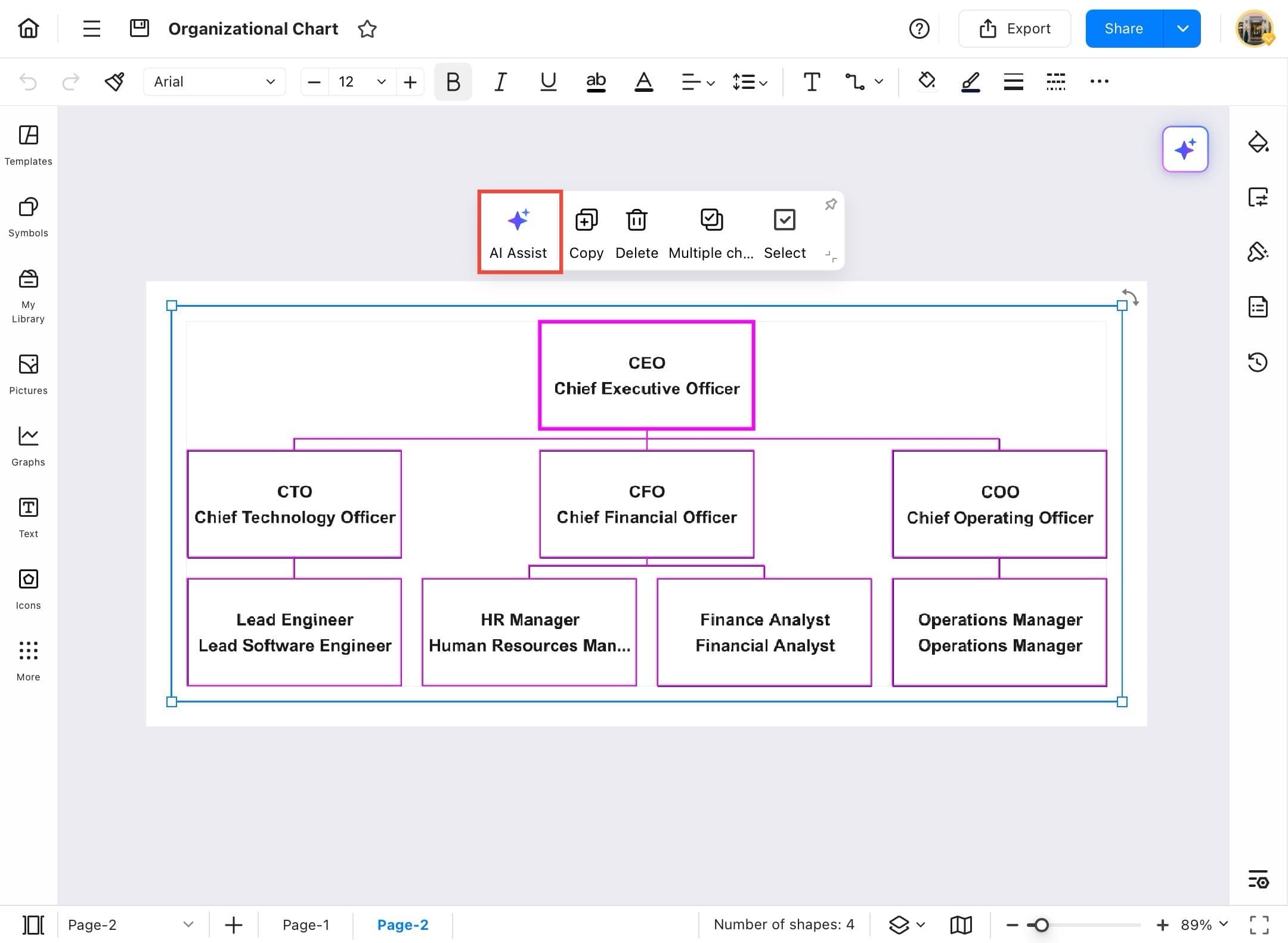
- Your chart will open in the editing area, select all its components.
Step ❹
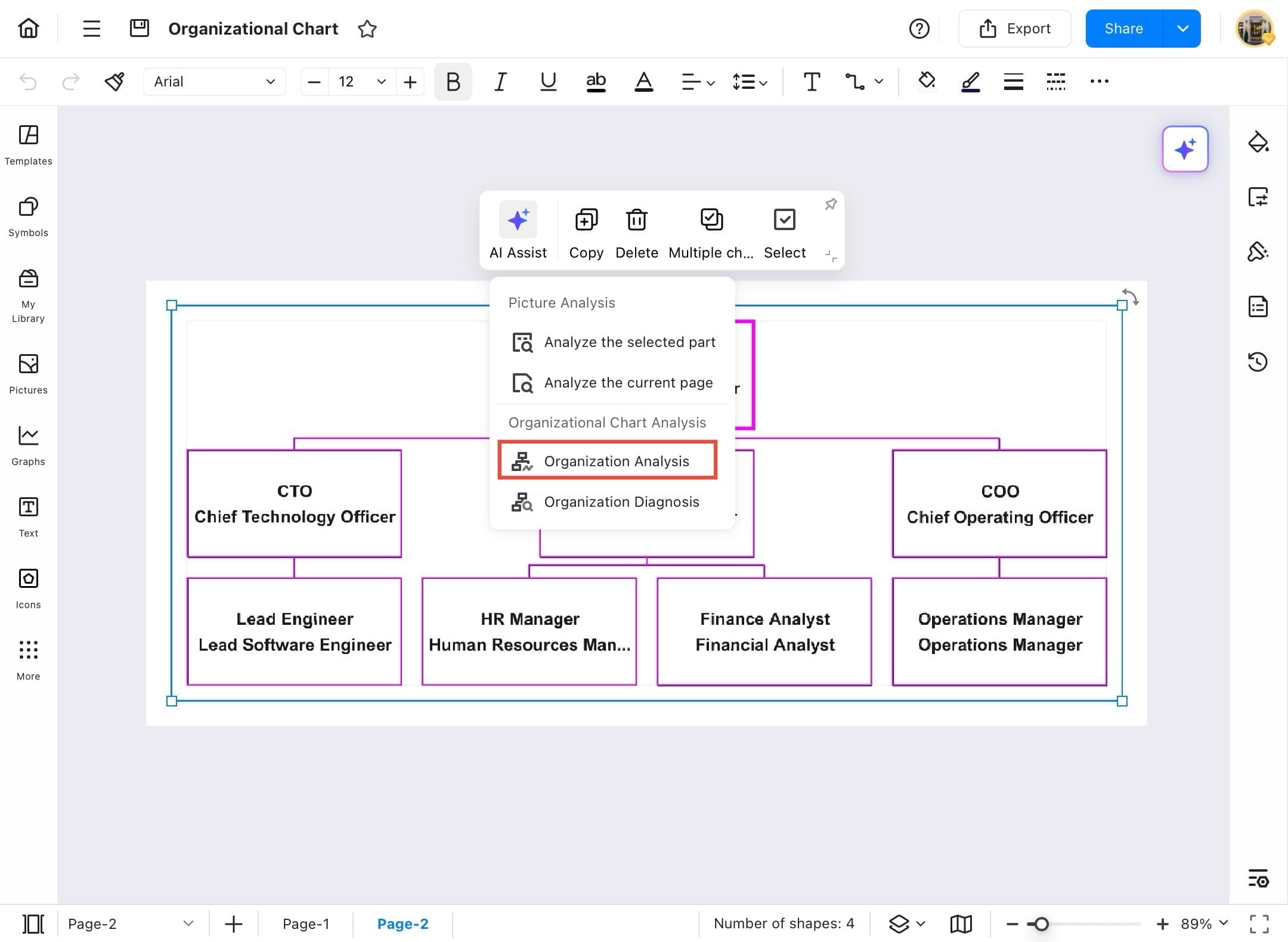
- Tap on the chart to activate it, then tap AI Assist in the top toolbar to begin analysis.
Step ❺
- Tap the chart, then select AI Assist > Organization Analysis from the dropdown options.
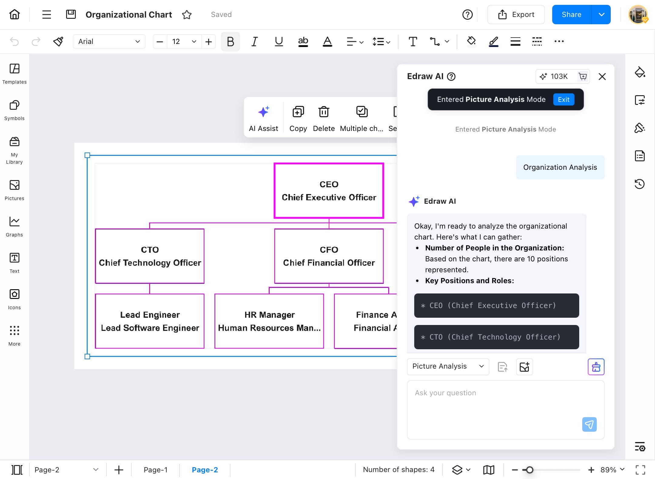
Step ❻
- The AI will provide an overview of the chart, highlighting key roles, hierarchy, and insights directly in a sidebar.
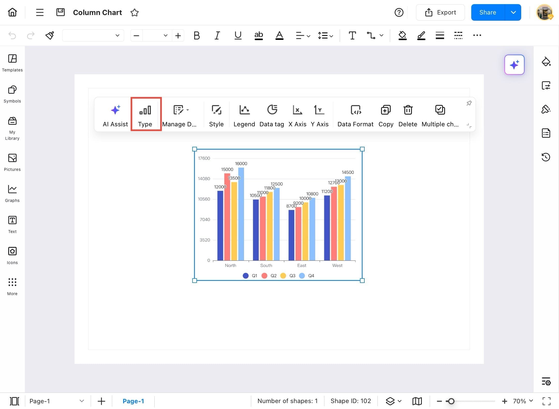
Change Chart Type
Presenting data effectively often means choosing the right chart type. EdrawMax lets you change chart types in just a few taps to better suit your message or audience. Use the following steps to explore and apply different chart formats to enhance clarity and impact.
Step ❶
- Start EdrawMax on your tablet.
Step ❷
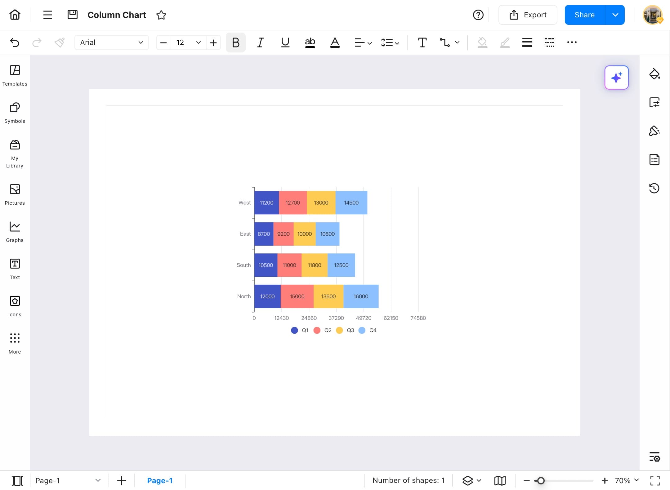
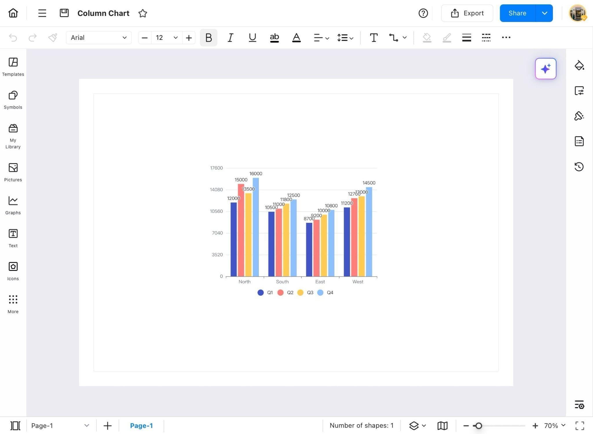
- From the Recent tab, open an existing chart, like a Column Chart to start editing its type.
Step ❷
- Your selected column chart will appear on the canvas, ready for editing.
Step ❸
- Tap on the chart, then select the Type icon from the chart toolbar at the top.
Step ❹
- From the dropdown, select your preferred chart style.
- In this case, a Bar Chart is selected.
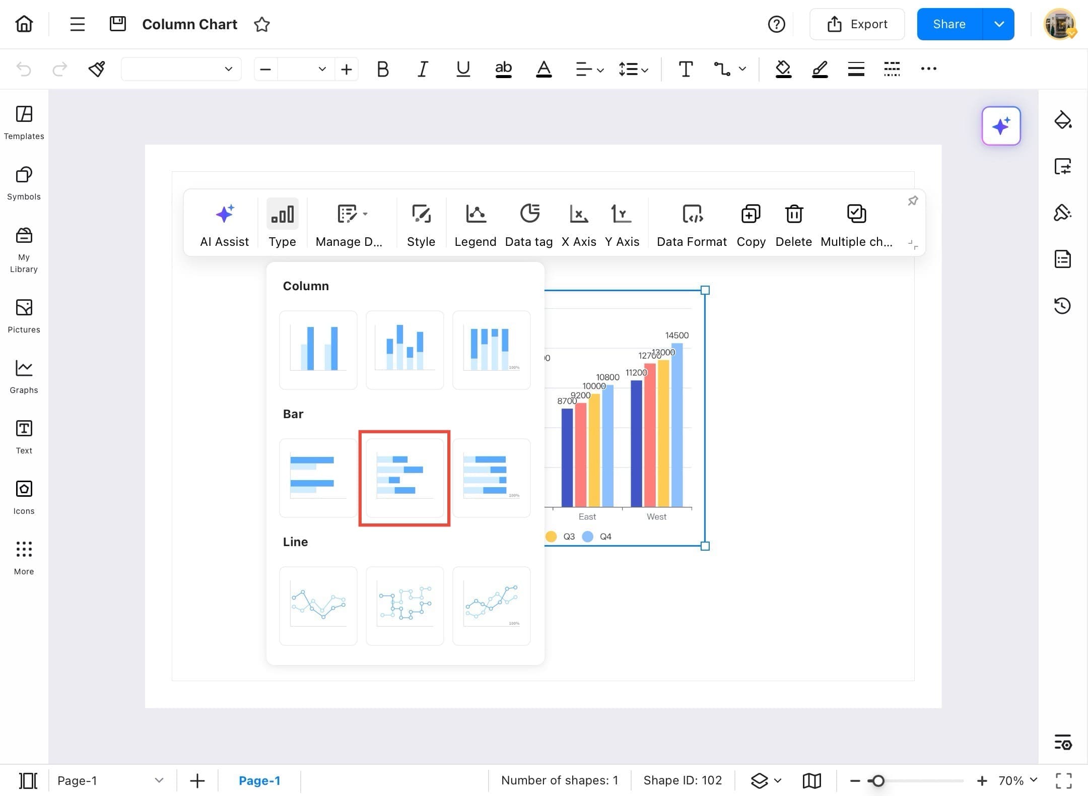
Step ❺
- The column chart is now converted into a bar chart, instantly updating the visualization format.