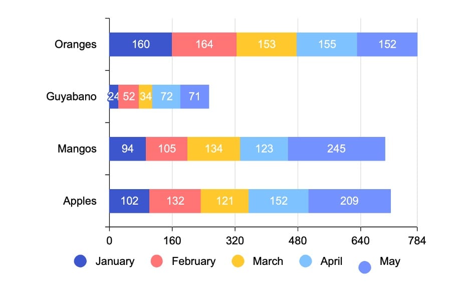
A stacked bar chart is vital for various data visualization needs, representing individual data points and cumulative totals. Whether you're tracking sales by product category or examining expense distributions, it's a go-to choice.
In this article, you'll explore stacked bar charts using Excel and EdrawMax, two powerful tools. Excel is renowned for its data processing capabilities, while EdrawMax offers a professional alternative with a free online version of numerous templates, symbols, and icons. Dive into these options to enhance your data visualization skills.
In this article
Part I. How To Create a Stacked Bar Chart With Excel
Microsoft Excel is a versatile spreadsheet software for data analysis, financial modeling, and project management. It's also handy for creating visual data representations, including stacked bar charts.
Here are the steps to create a stacked bar chart using Microsoft Excel:
Step 1: Begin by organizing your data. For a stacked bar chart, you'll typically have categories (like months or products) and subcategories (like different product segments or revenue sources). Ensure your data is well-structured, with each class and subcategory in separate columns.
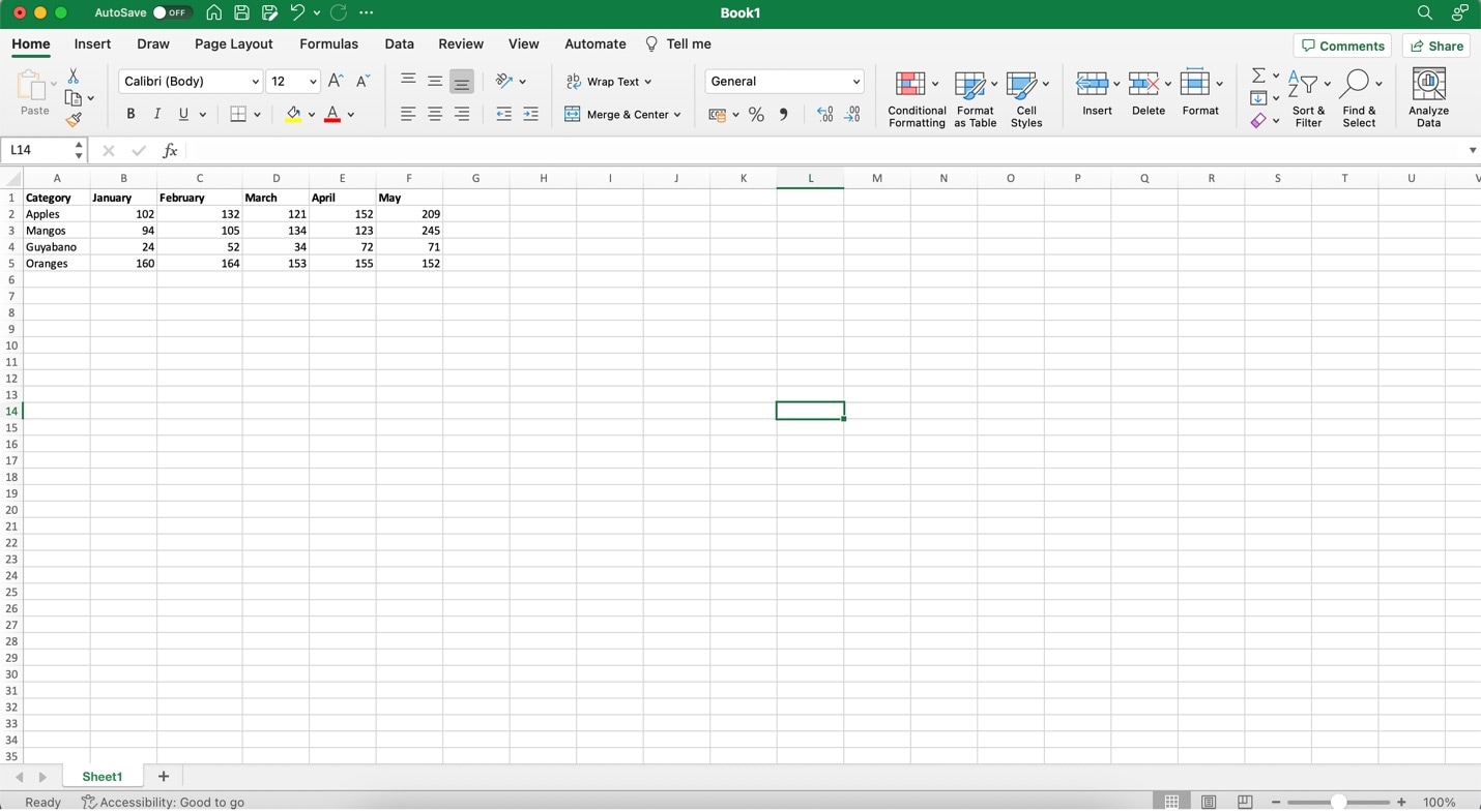
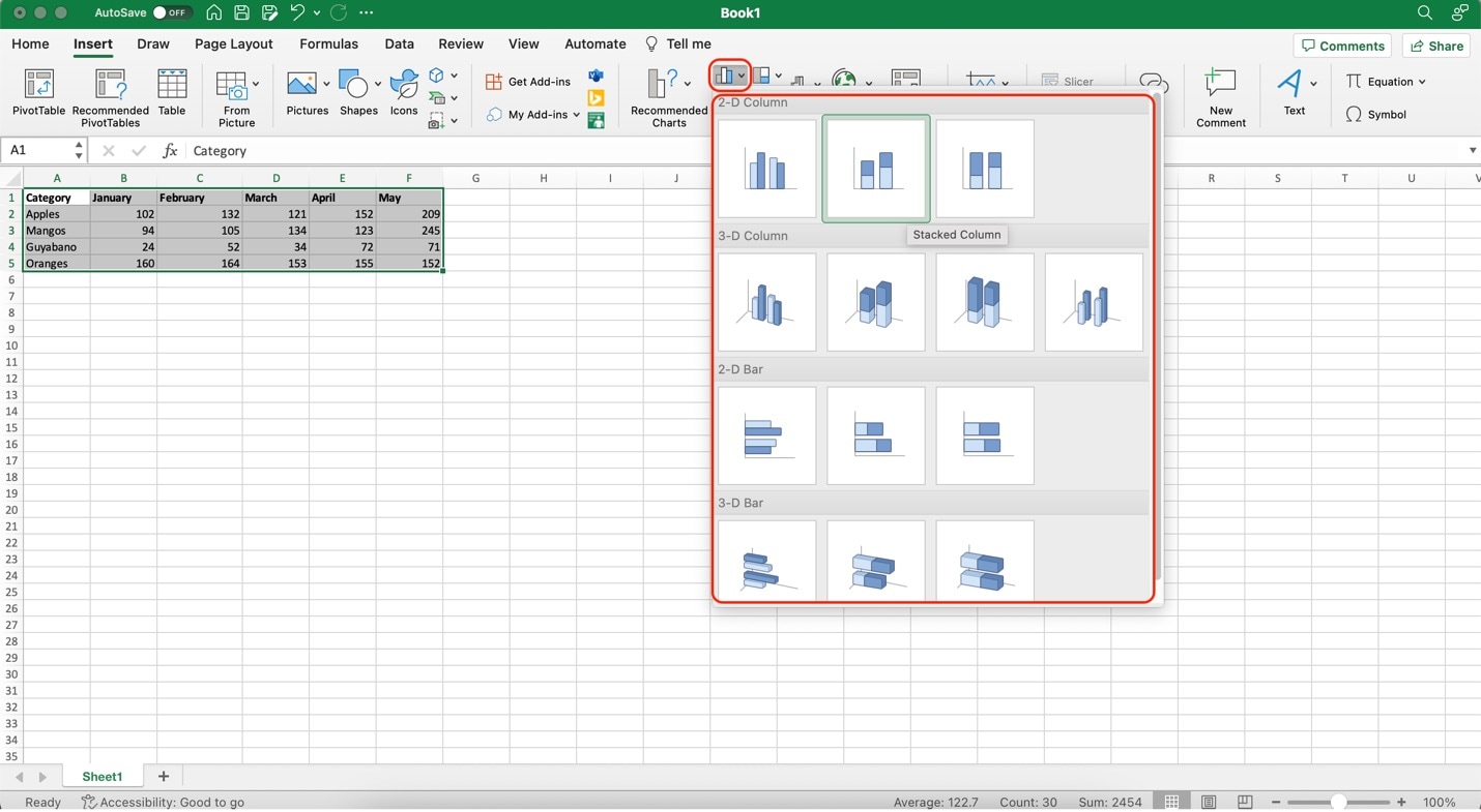
Step 2: Highlight the data you want to include in your chart. This should consist of the category labels and the values associated with each subcategory. Then, go to the Insert tab in Excel's ribbon at the top. In the Charts group, click Bar Chart. From the drop-down menu, select any of the Stacked Bar Chart examples.
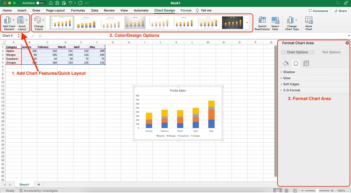
Step 3: Once your chart is inserted, you can customize it further. Right-click on various elements (bars, axis labels, legend) to format them. You can change colors, add data labels, and more. Here's a specific rundown of each of the features:
- Add Chart Features/Quick Layout. It provides several options to add elements or change the layout or chart/diagram type you're using. Use it if you want another chart type besides stacked bar charts.
- ColorDesign Options. These provide stock options to change the appearance of your stacked bar charts. They provide different color schemes.
- Format Chart Area. This menu provides customization options for each part of the stacked bar chart. You can change the chart's shadows, glows, edges, and 3D/2D format. You can also change the text formatting from here.
Creating a stacked bar chart in Excel is a powerful way to visually represent data with multiple categories and subcategories. It's a valuable tool for businesses, researchers, and analysts to showcase information effectively.
Part II. Creating a Professional Stacked Bar Chart With Wondershare EdrawMax
If you're looking for more advanced features, templates, and an efficient way to create stacked bar charts and other diagrams, consider exploring EdrawMax, a professional diagramming tool. It offers a free online version, numerous templates, symbols, and icons, saving time and enhancing your diagramming capabilities.

EdrawMax is not just another diagramming tool; it's a comprehensive solution designed to streamline your visual communication needs. This powerful software offers many advantages that make it an excellent alternative to Excel for creating Stacked Bar Charts:
- Professionalism. EdrawMax provides a polished and professional touch to your stacked bar charts, ensuring that your visuals convey information with clarity and impact.
- Ease of Use. With an intuitive interface, EdrawMax is user-friendly for beginners and experienced diagram creators. You can be something other than a design expert to craft impressive stacked bar charts.
- Diverse Templates. EdrawMax boasts a vast library of templates, including a wide selection of pre-made Stacked Bar Chart templates. This resource can save you time and inspire your creativity.
- Customization. EdrawMax allows for extensive customization. Tailor your Stacked Bar Chart to your specifications, adjusting colors, fonts, and styles to match your unique preferences or brand guidelines.
- Seamless Collaboration. Collaborate seamlessly with team members, clients, or colleagues across the office or worldwide. EdrawMax's real-time collaboration features enhance productivity.
- Cross-Platform Compatibility. EdrawMax is available on various platforms, including Windows and macOS, and as an online version. This flexibility ensures you can work on your projects anywhere, on any device.
- Advanced Features. Beyond stacked bar charts, EdrawMax offers a wide range of diagramming tools, making it a versatile solution for all your visual communication needs.
Create Your Own Stacked Bar Charts With EdrawMax
To cut the pleasantries short, it's best to show you how EdrawMax works as a diagramming tool for stacked bar charts. Follow the steps below to create your stacked bar charts with EdrawMax:
Step 1: Download and install EdrawMax. Log in with an account of Wonderhsare, Google, Facebook, or Twitter.
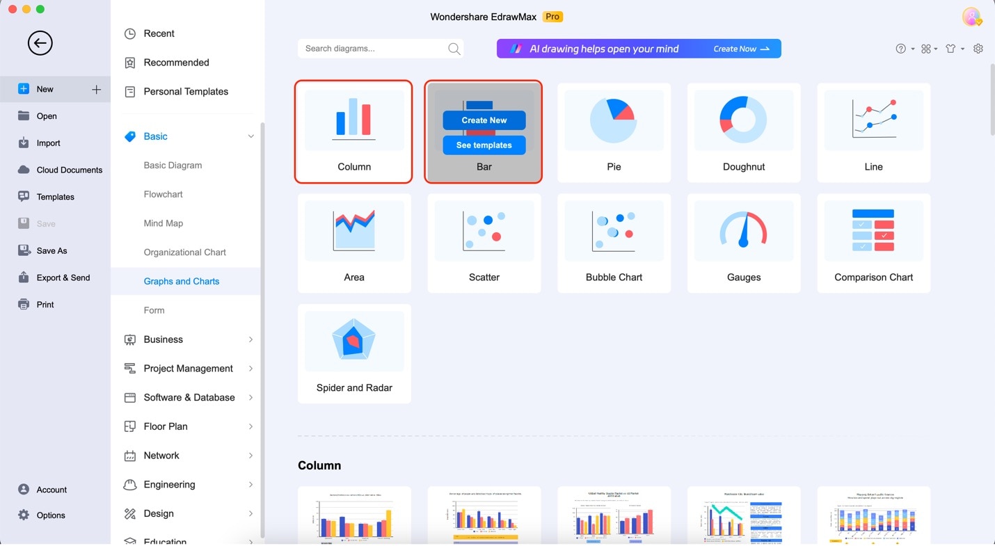
Step 2: Click Graphs and Charts under Basic on the app's home page. Then, click Bar or Column and then Create New.
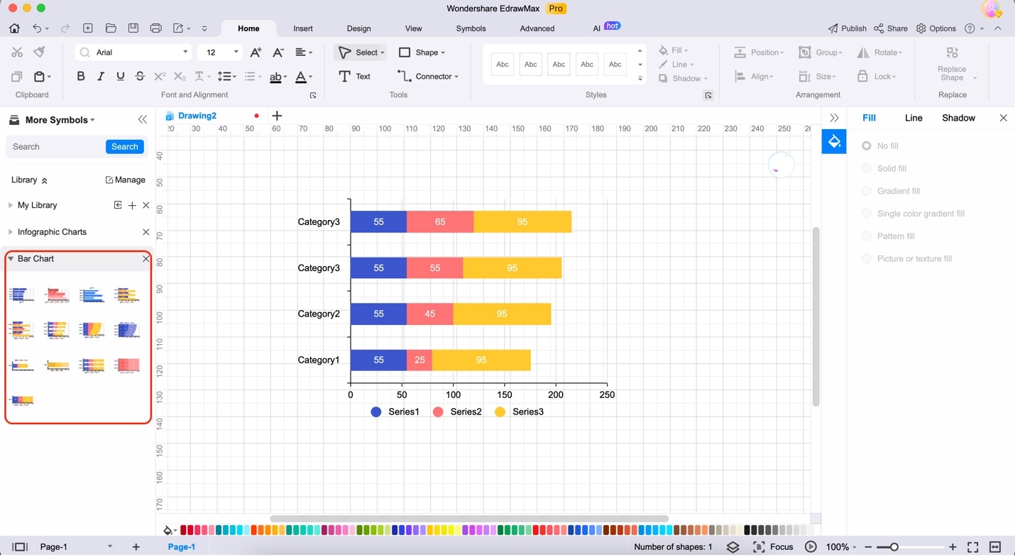
Step 3: Drag any stacked bar chart templates from the Elements Panel as highlighted below.
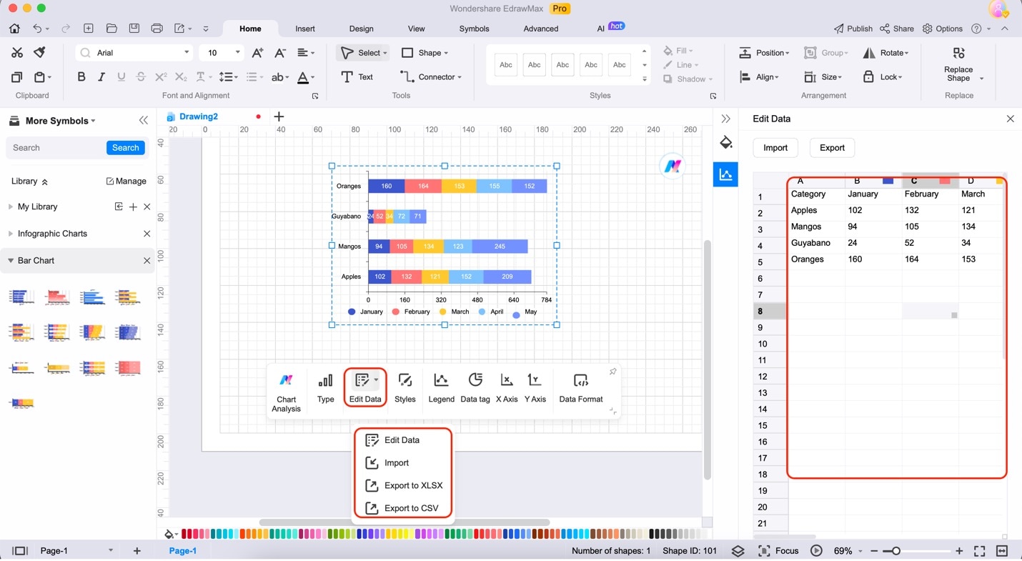
Step 4: Input your data by clicking the chart. Then, click Edit Data from the floating menu bar. Then, choose any of the data input options. Edit the data from the spreadsheet that will appear.
Part III. Tips When Creating Stacked Bar Charts
Teaching you how to create stacked bar charts with powerful tools was just the beginning. Of course, ensuring that the charts you create effectively convey your data is the key to impactful visual communication. Here are some valuable tips to elevate your Stacked Bar Charts to the next level:
- Data Accuracy. Before creating your stacked bar charts, ensure your data is accurate and up-to-date—garbage in, garbage out—precise data results in informative visuals.
- Appropriate Use. Stacked bar charts best display parts of a whole or compare data within the same category. Consider whether this chart type suits your data story.
- Color Choices. Opt for a color scheme that enhances readability and aligns with your brand or message. Keep it consistent and use color strategically to highlight critical information.
- Labels and Titles. Clearly label your axes, categories, and data points. A descriptive title adds context, making your chart more accessible.
- Legend Clarity. If you're using a legend, ensure it's straightforward to understand. Overcomplicated legends can confuse readers.
- Data Sorting. Arrange your data logically, whether by value, category, or time. This simplifies interpretation.
- Avoid Overcrowding. More data can make your stacked bar chart more straightforward. Consider breaking it into smaller, more digestible charts or other chart types.
- Annotations. Use text or arrows to add context or call attention to specific data points. Annotations can clarify complex charts.
- Accessibility. Design your stacked bar chart with accessibility in mind. Ensure it's comprehensible for all audiences, including those with visual impairments.
By implementing these tips, you'll create stacked bar charts that visualize your data and tell a compelling and insightful story.
Conclusion
In conclusion, stacked bar charts in Excel are invaluable tools for visually representing data, aiding in clear communication, and facilitating informed decision-making. While Excel is a convenient option, for more advanced and professional charting needs, consider harnessing the power of EdrawMax.
Its user-friendly interface, extensive template library, and advanced features make it an ideal choice. Elevate your data visualization game today by giving EdrawMax a try.