


A scatter correlation graph is a visual representation of the relationship between two variables. It displays data points as dots on a graph, with one variable represented on the x-axis and the other on the y-axis. The pattern of the dots can indicate the strength and direction of the correlation between the variables. Here, we will discuss about scatter graphs, the different types of scatter graph correlation, and more.
In this article
Part 1: Definition of Scatter Graphs
A scatter graph, also known as a scatter plot, is a type of mathematical diagram using Cartesian coordinates to display values for two variables for a set of data.
The data points are displayed as a collection of points, each having the value of one variable determining the position on the horizontal axis and the value of the other variable determining the position on the vertical axis.
Part 2: Different Types of Correlation
There are various types of correlation. These types of correlations can be represented effectively using scatter graphs and correlation.
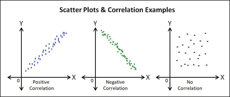
- Positive Correlation: A positive correlation exists when the values of one variable increase as the values of the other variable also increase. In other words, as one variable goes up, the other variable also goes up.
- Negative Correlation: A negative correlation occurs when the values of one variable increase as the values of the other variable decrease. In this case, as one variable goes up, the other variable goes down.
- Zero Correlation: Zero correlation, as the name suggests, indicates no relationship between the two variables. The values of one variable do not affect the values of the other variable.
Part 3: How to Analyze the Strength and Direction of Correlation
Analyzing the strength and direction of correlation is important. Following a few essential tips, this can be done with efficiency.
1. Calculate the Correlation Coefficient:
The correlation coefficient, often denoted as "r," is a statistical measure that indicates the strength and direction of the relationship between two variables. It ranges from -1 to 1, where -1 indicates a perfect negative correlation, 1 indicates a perfect positive correlation, and 0 indicates no correlation.
2. Visual Inspection of the Scatter Plot:
By visually examining the scatter plot, one can get a sense of the direction and strength of the correlation. If the points on the scatter plot form a clear pattern, it can indicate a strong correlation. The direction of the correlation can be determined by the slope of the pattern (positive or negative).
Part 4: Considerations When Interpreting Correlation Coefficients
Interpreting correlation coefficients requires some essential considerations. Doing this ensures that the interpretation is effective. Scatter graph correlation helps interpret correlation coefficients more effectively.
- Magnitude of the Correlation Coefficient: The magnitude of the correlation coefficient indicates the strength of the relationship between the variables. A coefficient close to 1 or -1 suggests a strong correlation, while a coefficient close to 0 suggests a weak correlation.
- Sign of the Correlation Coefficient: The sign of the correlation coefficient indicates the direction of the relationship. A positive coefficient indicates a positive correlation, a negative coefficient indicates a negative correlation, and a coefficient close to 0 indicates no correlation.
- Outliers and Influential Points: Outliers, or data points that lie far from the rest of the data, can have a significant impact on the correlation coefficient. It is important to identify and assess the influence of outliers on the correlation analysis.
- Non-Linear Relationships: The correlation coefficient measures the strength of a linear relationship between two variables. In cases where the relationship is non-linear, the correlation coefficient may not accurately represent the relationship.
- Causation vs. Correlation: It is crucial to remember that correlation does not imply causation. Even if two variables are strongly correlated, it does not necessarily mean that changes in one variable cause changes in the other variable.
Part 5: Create a Scatter Correlation Graph with EdrawMax
Wondershare EdrawMax is a powerful yet user-friendly data visualization tool that can be used to create scatter correlation graphs.
A scatter correlation graph allows us to visualize the relationship between two variables by plotting points on a scatter graph correlation. Additionally, the tool allows us to customize the data points, lines, labels and more to further emphasize the relationships and patterns. These are the steps to create a scatter correlation graph using the tool:
Step 1:
Begin by logging into your Wondershare EdrawMax account. Enter your login information and click on the login button to access the platform.

Step 2:
Once logged in, locate and click on the "New Document" icon in the upper left corner of the interface. This will open a blank canvas where you can design your scatter correlation graph.

Step 3:
Next, go to the left sidebar and select the "Templates" option. This will open the template gallery. Use the search field to enter "scatter correlation graph" and hit enter. Choose the template that best suits your requirements and click on it to open.

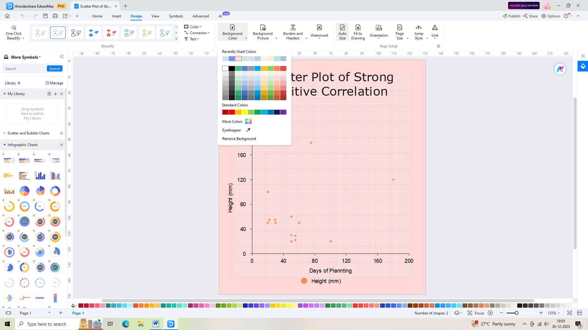
Step 4:
Now, you can modify the template to match your preferences. Customize the fonts, colors, and styles to achieve the desired look for your graph.
Step 5:
Once you are satisfied with the modifications, save your graph. Click on the "Save" button in the top toolbar. Provide a name for your graph and choose whether to save it on your computer or in cloud storage.

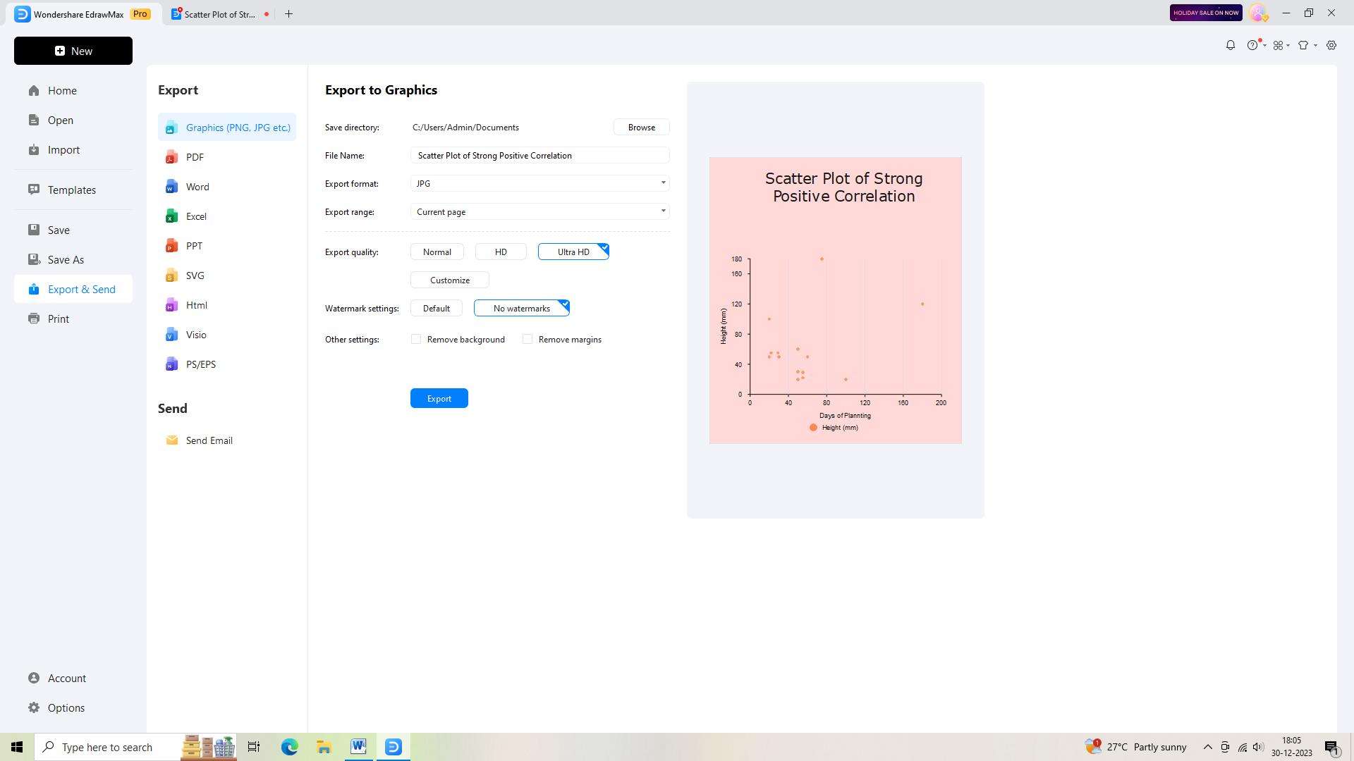
Step 6:
Finally, if you need to share or use the graph elsewhere, export it from EdrawMax. Click on the "Export" button in the top toolbar and select the desired file type for the export.
Conclusion
Scatter graphs provide a visual representation of the relationship between two variables, and the correlation coefficient quantifies the strength and direction of this relationship. Understanding the different types of correlation and how to analyze and interpret correlation coefficients is essential for making informed decisions in various fields.
AI Diagram Generator
Enter your prompt. Upload files if needed. Generate diagrams, charts, or slides instantly.


