
In today's data-driven landscape, the art of conveying information effectively is more critical than ever. One powerful tool at your disposal is the stacked column graph in Excel. This visual representation allows you to showcase multiple data sets, making it easier for your audience to grasp complex information at a glance.
In this step-by-step guide, we will walk you through the process of creating a stunning stacked column chart, offering valuable tips and customization techniques along the way. By the end, you'll possess a valuable skill set for presenting data with impact and clarity.
Contents of this article
What is a Column Graph?
A column graph is a visual tool that helps display information simply and clearly. It uses vertical bars to represent data. Each bar represents a category, like types of fruits or months of the year. The height of the bar shows the amount or quantity of something, like the number of apples sold in a month. The taller the bar, the more there is of that thing. Column graphs are handy for comparing different categories and understanding trends or patterns in data quickly and easily.
How to Create a Stacked Colum Graph in Excel
Here are the steps to create a stacked column graph in Excel:
Step 1: Launch Excel and open a new or existing spreadsheet. Enter your data into separate cells. For example, if you're comparing sales data for different months, list the months in one column and their corresponding sales figures in the next column.
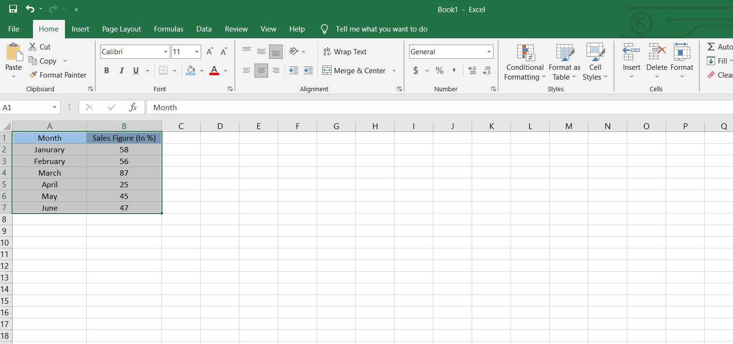
Step 2: Highlight the data you want to include in your graph. This selection will be used to generate the column chart.
Step 3: Navigate to the "Insert" tab on the Excel ribbon at the top of the window, and then choose the "Stacked Column Chart" option found in the Charts section.
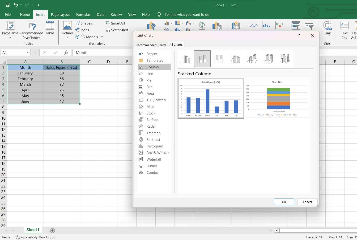
Step 4: Excel provides a range of column chart options. Feel free to pick the one that aligns most effectively with your data. As an example, you might opt for a stacked column chart to make side-by-side comparisons of different categories.
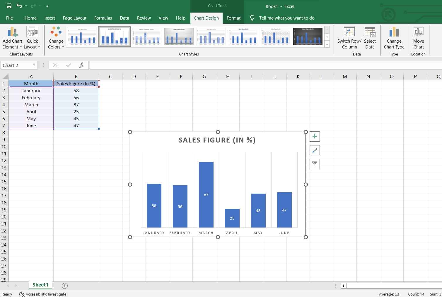
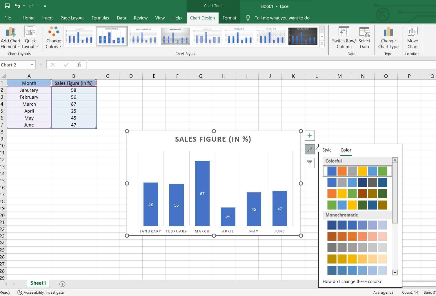
Step 5: To further customize, you can right-click on various elements of the chart (like the bars or axis labels) and choose options to format or change them.
Step 6: Once you're satisfied with the chart, it's a good practice to save your Excel file.
Remember, Excel offers a wide range of options for customizing charts, so feel free to experiment with colors, styles, and other settings to make your column graph visually appealing and informative.
Limitations of Using Excel to Create Colum Graph:
Despite its widespread use, Excel has its share of limitations when it comes to creating stacked column graphs.
- Limited Data Handling Capacity:
Excel may struggle with very large datasets, leading to slower performance and potential system crashes. This can be a significant limitation when dealing with extensive or complex data.
- Lack of Real-time Data Updates:
Excel does not update charts in real time. If your data changes frequently, you'll need to manually update the chart, which can be time-consuming and prone to errors.
- Difficulty with Advanced Chart Types:
Creating advanced or specialized chart types (like Gantt charts or heat maps) can be challenging in Excel, often requiring complex workarounds or the use of specialized software.
Create a Column Chart Easlily with EdrawMax
Wondershare EdrawMax offers a robust platform for chart creation, surpassing Excel in several key aspects. Firstly, EdrawMax provides a more intuitive and user-friendly interface, making it accessible to a wider range of users. Additionally, EdrawMax excels in handling large datasets with ease, ensuring smooth performance even with extensive information. Unlike Excel, EdrawMax allows for real-time data updates, eliminating the need for manual adjustments.
Moreover, EdrawMax offers a broader range of advanced chart types and enhanced interactivity features, providing a more comprehensive toolkit for data visualization. Overall, EdrawMax elevates the chart creation experience, offering a more efficient and versatile solution compared to Excel.
Here are the steps to create a stacked column graph using EdrawMax:
Step 1: Open the EdrawMax software on your computer. Navigate to New then Choose "Graphs and Charts" and then select "Column Chart."

Step 2: A blank column chart canvas will appear. Double-click on the chart to enter your data or click on the data table icon.
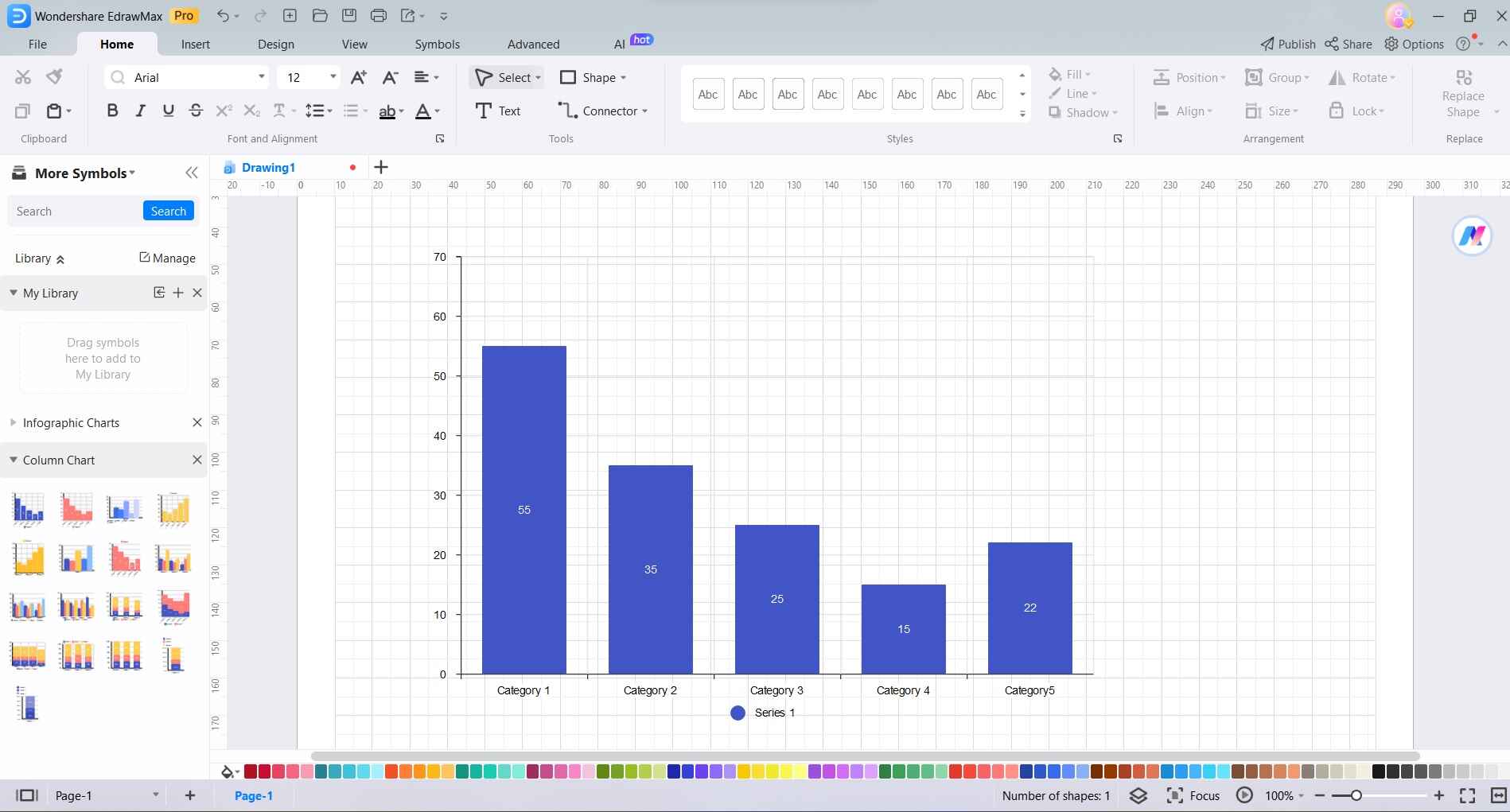
Step 3: In the data table that appears, input your dataset. The rows represent different categories, and the columns represent different series or sub-categories.

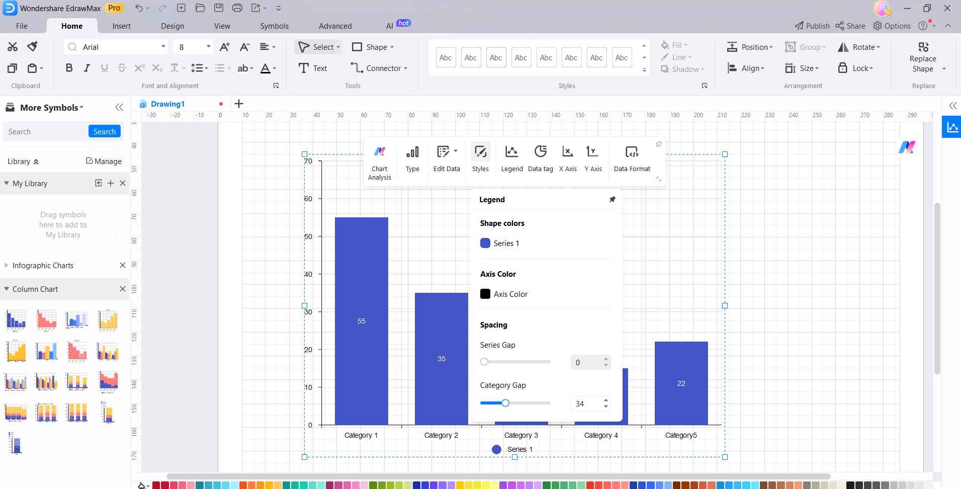
Step 4: Click on various elements of the chart to customize them, such as labels, axis titles, colors, and fonts.
Step 5: To format your stacked column graph, click on the chart and then select the “Styles" option in the toolbar at the top. Pick your desired formatting options from the menu to make your graph visually appealing.
Step 6: Once you're satisfied with the stacked column graph, head to File> Save to save your project in EdrawMax format or export it in a suitable file format (like PNG or PDF).
EdrawMax provides a user-friendly environment for creating various types of charts, including stacked column graphs, and offers a range of customization options for a polished final result.
Conclusion
Becoming proficient in crafting stacked column graphs in Excel is a valuable asset in data representation. While Excel is widely used, EdrawMax stands out as a superior tool. Its intuitive interface, robust handling of large datasets, real-time data updates, and diverse chart options make it a compelling choice. EdrawMax empowers users to communicate complex information clearly and effectively. By leveraging its capabilities, you enhance your ability to present data with impact, making it an invaluable resource for professionals across diverse industries.