


Let's be honest. You've got a pile of data. You need to show its distribution, and someone wise once mentioned the "box and whisker plot." It's the Swiss Army knife of stats graphics, able to whisper secrets about medians, quartiles, and outliers with an elegant, compact chart.
But then reality hits. How do you make one? Do you wrestle with the clunky charting wizard in the program you already own? Do you finally bite the bullet and learn to code, a journey that feels like packing for a trip to Mars? Or do you paste your precious data into a sketchy online tool that looks like it was a high school computer science project?
Fear not. We've been there. We've stared into the abyss of visualization software, downloaded the free trials, and have definitely cursed at more than a few cryptic error messages. We have returned from the data wilderness with answers.
After putting the top contenders through their paces with over 50 different datasets, we've sorted the true workhorses from the pretty-but-useless ponies. This is your no-nonsense, hands-on guide to the best box plot creators out there.
Our "Highly Scientific" Testing Methodology
To separate the contenders from the pretenders, we didn't just skim the feature lists. We got our hands dirty. Here's a peek behind the curtain:
- The Data Gauntlet: We threw everything we had at these tools—from clean, textbook-perfect numbers to messy, real-world CSVs that looked like they'd been through a paper shredder. We tried single-group plots and complex multi-group comparisons.
- The "It's 5 PM on a Friday" Test: We approached each tool as a tired, over-caffeinated user on a tight deadline. How fast could we get from a raw data file to a decent-looking plot without wanting to throw our laptop out the window?
- The "Make It Pop" Judgment: We dug into the aesthetic and customization options. Could we create a plot that was not only informative but also slick enough for a client presentation? Could we change colors, fonts, and axes without a degree in computer science?
- The Frustration Meter: We kept a careful log of every confusing interface, every unhelpful error message, and every moment we felt the urge to flip our desk. A purely subjective—but critical—metric.
The Top 5 Breakdown: The Good, The Bad, and The Boxy
After much deliberation and an unhealthy amount of coffee, we landed on five champions, each with its own personality.
1. Wondershare EdrawMax: The AI-Powered Jack-of-All-Trades
Quick Intro: A versatile, all-in-one diagramming tool with a familiar Office-like interface that has recently added a powerful AI generator for charts, including our beloved box plots.
Key Features:
- AI Box Plot Generator: Describe your data or prompt in plain English, and the AI creates the chart for you.
- All-in-one platform that supports over 280 diagram types (flowcharts, mind maps, floor plans, etc.).
- Intuitive, drag-and-drop interface that feels similar to Microsoft Office.
- Massive library of templates and customization options.
Pros:
- AI Does the Heavy Lifting: The AI generator is a massive shortcut. It lets you create plots from simple text prompts without needing to know the first thing about quartiles or whiskers.
- Incredibly Versatile: You can make your box plot, then a flowchart for your process, then a mind map for your next project, all without leaving the app. It's a great value if you do more than just statistical charting.
- Gentle Learning Curve: Thanks to the familiar interface, most users can jump in and start creating professional-looking diagrams with minimal fumbling.
Cons:
- Master of None? While it does everything, dedicated statistical tools might offer deeper analytical features. User reviews praise its general diagramming, but specific feedback on complex statistical plots is scarce.
- Confusing Pricing: The pricing structure is a bit of a maze. Between subscriptions, perpetual licenses, and "creative asset" add-ons, you might need a spreadsheet just to figure out the best deal for your needs.
- Data Handling Quirks: Some users report that while making diagrams is a breeze, fine-tuning the underlying data within the charts can sometimes be clunky.
Our Experience: We approached EdrawMax expecting to manually build a box plot out of rectangles and lines, which sounded as fun as assembling IKEA furniture in the dark. Then we found the AI prompt. We typed, "a box plot of user satisfaction scores for four software versions," and poof—a chart appeared. It felt like cheating in the best possible way. The danger, of course, is you'll get distracted and spend the next hour having it generate floor plans for your dream evil lair.
Ideal User Profile: The business professional, marketer, or educator who needs to create a wide variety of visuals and loves the idea of an AI assistant doing the hard work.
2. Microsoft Excel: The Old Faithful
Quick Intro: The spreadsheet software that’s installed on virtually every corporate computer on the planet. Since 2016, Excel has included a native box and whisker chart, making it the default choice for millions.
Key Features:
- Built-in chart template, no plugins needed.
- A familiar interface for anyone who's ever made a list or a budget.
- Basic styling using the standard Chart Design tools.
Pros:
- Convenience is King: If you have Excel, you have a box plot maker. No installs, no new software to learn. Your data probably already lives there anyway.
- Speed: You can churn out a basic chart in under a minute. Select data, insert chart, done.
Cons:
- Painful Customization: You have very little fine-grained control. Those clunky crossbars on the whiskers? You're stuck with them. Fine-tuning elements means clicking through a maze of formatting panes.
- Chokes on Big Data: Excel gets sluggish and can even crash with moderately large datasets. In our tests, it started to lag with just a few thousand data points.
- Rigid Data Formatting: You must arrange your data in a specific way—one column for a single plot, or adjacent columns for multiple plots. It's not smart enough to handle grouped data in a "long" format.
Our Experience: Trying to make an Excel box plot look exactly how you envision it is like trying to redecorate a hotel room. You can move the pillows around, but you’re stuck with the beige walls and the weird art. It’s functional for a quick internal email, but you wouldn't hang it in a gallery.
Ideal User Profile: The business professional, student, or analyst who needs a quick, no-frills chart for a report now and doesn't want to leave the cozy confines of their spreadsheet.
3. BoxPlotR: The Web-Based Wonder
Quick Intro: A free, open-source web tool that does one thing and does it shockingly well: make box plots. It’s a simple web form that secretly harnesses the power of the R programming language, giving you pro-level results without the pro-level learning curve.
Key Features:
- 100% web-based. No installation, just open your browser.
- Gives you advanced options like notches and jittered data points with simple checkboxes.
- Just copy and paste your data directly from a spreadsheet.
Pros:
- Free and Powerful: It offers statistical and aesthetic options that rival expensive software, for the unbeatable price of zero.
- Surprisingly Versatile: Easily create violin plots and dot plots, and layer them for a richer view. The output is a high-resolution image perfect for academic papers.
Cons:
- The Data Format is Ruthless: Your data must be formatted exactly like its sample. This means a "long" format (one column for values, one for groups). One misplaced comma, and it will simply refuse to work, staring back at you in silence.
- One-Trick Pony: It's a genius at box plots, but that's the entire show. Don't come here looking for a bar chart.
Our Experience: Getting your data into BoxPlotR is like trying to get past a bouncer at an exclusive club with a very, very specific dress code. We spent ten minutes fuming, wondering why our perfectly good CSV was rejected, only to find that a single extra header was the problem. Once you're in, though, the party is amazing.
Ideal User Profile: The researcher, student, or analyst who needs a high-quality, customized box plot right now for a publication or assignment and would rather do anything else than learn to code.
4. BioVinci: The User-Friendly Powerhouse
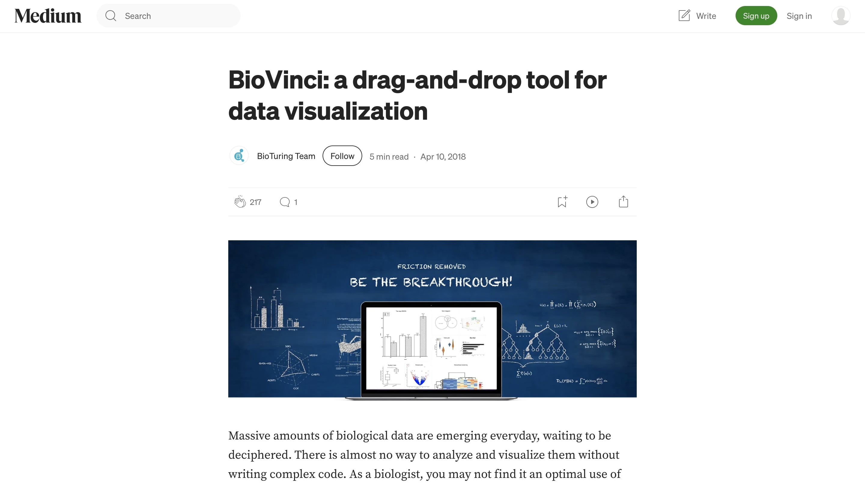
Quick Intro: A premium, drag-and-drop data visualization tool designed for scientists, but so intuitive anyone can master it in minutes. It's built to make stunning, publication-quality graphics an absolute breeze.
Key Features:
- Intuitive drag-and-drop interface. Literally drag your data columns onto the "X" and "Y" axis slots.
- Creates gorgeous, highly customizable plots right out of the box. The default color palettes are fantastic.
- It's smart enough to understand data in different layouts without needing you to reformat it first.
- Comes bundled with other statistical analyses (PCA, heatmaps, etc.).
Pros:
- Beautiful by Default: This is its superpower. The plots look professional from the first click, and the customization menu is a joy to use.
- Absurdly Easy to Use: The learning curve is basically flat. We went from launching the app to a finished, multi-group box plot in under five minutes, no instructions needed.
Cons:
- It Costs Money: This kind of quality isn't free. After the 15-day trial, you need a paid license, which is a real consideration for individuals or small teams.
Our Experience: Opening BioVinci after a session with Excel is like upgrading from a flip phone to the latest iPhone. It’s slick, powerful, and you immediately feel like a design wizard. It just works. You instantly want it... right up until the free trial ends. This is the tool you'll beg your boss or university to buy for you.
Ideal User Profile: The dedicated researcher, analyst, or marketer who makes charts often and is willing to pay for a tool that saves a ton of time and produces flawless results without code.
5. Python (with Matplotlib & Seaborn): The Coder's Canvas
Quick Intro: The go-to solution for data scientists and anyone who thinks in code. Python, a general-purpose language, becomes a viz powerhouse with libraries like Matplotlib and Seaborn.
Key Features:
- Ultimate Flexibility: If you can imagine it, you can code it. You control every pixel, from line thickness to weird annotations and complex multi-panel figures.
- Reproducibility: Your plot is just code. Need to rerun it with new data or tweak one color? Just run the script. No more clicking through 20 menu options.
- Seamless Integration: Lives inside your existing data analysis workflow, playing nicely with tools like pandas.
Pros:
- Free and Open-Source: A world-class toolkit that costs nothing but the time it takes to learn.
- Limitless Customization: Matplotlib is the engine that gives you deep control, while Seaborn is the beautiful chassis that makes sophisticated statistical plots (like the violin plot below) with very little code.
Cons:
- Steep Learning Curve: Let's be clear: you have to code. This is not a point-and-click tool. Getting a plot to look just right often involves a fair amount of searching Stack Overflow.
Our Experience: Your first Matplotlib plot will look like something from the 1990s. But then you import Seaborn, and with one extra line of code, everything is suddenly beautiful. Stick with it, and you'll go from making crayon drawings to crafting data masterpieces.
Ideal User Profile: The data scientist, developer, or quant analyst who needs total control, reproducibility and wants their visualizations to live alongside their analysis code.
6. R (with ggplot2): The Statistician's Standard
Quick Intro: R is the native language of statisticians, and its ggplot2 package is the undisputed king of academic and research graphics. It’s built on a "grammar of graphics" philosophy, letting you construct plots layer by logical layer.
Key Features:
- Designed for statistical visualization, with incredible support for showing data distributions and uncertainty.
- Chews through massive datasets that would make GUI programs weep.
- The ggplot2 syntax is incredibly powerful once the "aha!" moment strikes.
Pros:
- Statistical Rigor: It thinks like a statistician. It's unmatched in its ability to cleanly integrate statistical summaries into plots.
- Publication-Quality Aesthetics: ggplot2 creates beautiful, clean graphics that are the gold standard in many research fields. Its theming system is second to none.
- Free and Open-Source: A cornerstone of the academic and data science communities.
Cons:
- Serious Learning Curve: Like Python, this is code. The ggplot2 syntax, while brilliant, can feel totally alien if you're used to thinking in "chart types" instead of "graphic layers."
Our Experience: Learning R is a rite of passage. You'll wrestle with a weird arrow and question all your life choices. But the first time you successfully pipe a messy dataset into a gorgeous, multi-layered ggplot, you feel like you've discovered fire. It’s a moment of pure analytical bliss.
Ideal User Profile: The statistician, academic researcher, or data analyst who values statistical integrity and publication-ready aesthetics above all else.
Comparison Summary: At-a-Glance
| Feature | Excel | BoxPlotR | BioVinci | Python (Seaborn) | R (ggplot2) | Wondershare EdrawMax |
| Ease of Use | ✅ Very High | ✅ High | ✅✅ Very High | ❌ Low | ❌ Low | ✅✅ Very High |
| Customization | ❌ Low | ✅ High | ✅ Very High | ✅✅ Ultimate | ✅✅ Ultimate | ✅ High |
| Cost | Paid (in Office) | Free | Paid | Free | Free | Paid |
| Learning Curve | None | Minimal | Minimal | Steep | Steep | Minimal |
| Requires Code? | No | No | No | Yes | Yes | No |
The Final Verdict: Which Box Plot Creator Is for You?
So, which tool is the best? The profoundly unsatisfying answer is: it depends. But after all our testing, we can give you a straight answer based on who you are.
For the Business Analyst on a Deadline: Just use Excel. It's fast, it's there, and it's "good enough" for internal reports where speed beats polish.
For the Student Needing a Quick, Quality Plot: Go straight to BoxPlotR. It delivers the graphical power of R for free, with zero coding headaches. It's the ultimate "this is due tomorrow" tool.
For the Analyst Who Hates Code but Demands Perfection: Open your wallet for BioVinci. The sheer joy of use and the beautiful output justify the cost if you make charts for a living. It's the fastest path from raw data to "wow."
For the Data Scientist in a Python World: Stick with Python + Seaborn. It integrates perfectly into your workflow and offers infinite power and reproducibility.
For the Academic or Statistician: R + ggplot2 is still the undisputed champion. It was built for you. Its blend of statistical depth and graphical elegance is simply unmatched for serious data exploration.