Creating stacked bar charts could be a real challenge, especially when you have no diagram assistance. This is why you should go for diagram software like EdrawMax. These tools cut the time in half and help you make the stacks look simplistic yet appealing.
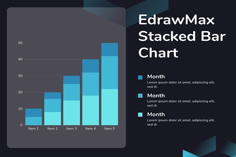
Stacked bar charts have revolutionized data visualization, from looking at one category to multiple category variables. This division of the bar graph allows you to compare and contrast multiple data series across discrete variables. So, whether it is showing a population increase over the years, product sales for an entire year, or revenue generated by a company over a decade, stacked bar charts are a great way to visualize.
But the question is, where to create stacked bar graphs? Whether it is a horizontal or vertical stacked bar chart, making one is a no-brainer with EdrawMax. Here is a complete guide on creating all sorts of stacked bar charts using EdrawMax templates and symbols. It also has valuable tips and tricks to make these charts visually appealing.
In this article
Part 1. What is a Stacked Bar Chart?
Stacked bar charts are the usual bar graphs with numerical data in stacks. Also known as stacked bar graphs, these graphs represent the comparison between variables. The stack bar technique is an effective way of breaking down the topic’s segments and representing their differences all in one diagram.
An average single-stacked bar chart looks like a standard bar chart with stacked bars. The only difference between a bar and a multiple-stacked bar chart is that the variables are shown in long bars, each having sub-sections or stacks. The stacks represent varying values. Users can create these charts in a vertical, horizontal, or group form.
Use Cases of Stacked Bar Charts
Here is a list of some typical applications for a stacked bar chart.
- The comparison of numerical values for surveys
- Research having more than two categorical variables
- Representing numeric values
- Identifying variance from variables
- Measuring objects using the Likert scale
Types of stacked charts
Commonly, stacked bar charts have two sub-categories, simple stacked and 100% stacked bar graphs. Here is a breakdown of each category and its purpose.
Simple stacked bar graphs
As the name suggests, a simple stacked chart shows the comparison of variables in multiple categories. They usually have a basic horizontal layout (left to right) to make it understandable. A simple bar graph is a great way to compare numeric data over time.
100% stacked bar graphs
A 100% stacked bar graph is a unique Excel bar chart type that represents the part-of-a-whole relationship. Such charts show the relative percentage of multiple numerical data series in stacked bars. They are widely used to show how the proportion of each category changes over some time. A basic 100% bar chart manages to plot multiple categorical data series within a small space.
Tools to create stacked charts
Don’t know where to kick-start your journey of creating stacked charts? Here are some popular tools you may consider trying.
| Stacked Bar Chart Maker | Key Highlights | Drawbacks |
| EdrawMax | AI-powered assitance, beginner-friendly UI, a wide array of templates | Free version lacks access to some features |
| Excel Stacked Bar Chart | Built-in templates, task-specific symbols, intuitive UI, color customization | Needs improvement in data visualization tools |
| Power BI Stacked Bar Chart | Cloud-based services, chart visualization tools, import large files of data | Tricky UI |
| Tableau Stacked Bar Chart | Advanced visualization, lengthy stacked chart templates, versatile data sources | Tricky interface |
Part 2. Stacked Bar Chart Templates
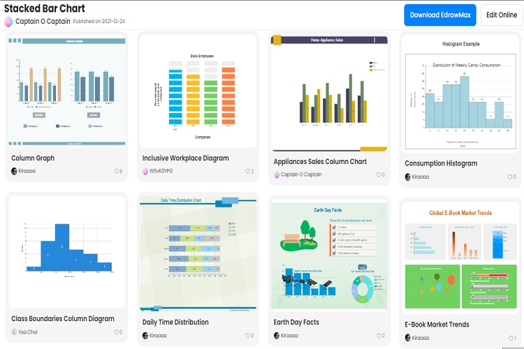
Now to further understand stacked bar charts, it would be better to look at some typical examples. Here are some free stacked bar chart examples from EdrawMax’s templates community.
Horizontal stacked bar chart
The horizontal stacked bar graph represents the numeric values of one categorical variable. It allows you to define part-of-whole relationships between the values of three series.

 below.
  below.
 Year sales report stacked bar chart
This is a horizontally stacked graph showing the product sales for the entire year. It contains twelve columns representing months and data series for aspects of sales. You can save time and use this template instead of making cluster columns from scratch.

Social media comparison stacked bar chart
This chart summarizes the advantages and characteristics of three popular social media platforms. It allows you to visualize how these three platforms have engaged the audiences. Similarly, the chart best describes the comparative advantages of using these social media sites.

Grouped stacked bar chart
The group bar chart allows you to visualize similar data sets among multiple categories in different layouts. This chart includes a vertical bar, horizontal bar, stacked horizontal, and stacked vertical bar for you to represent comparisons for discrete categories.

100% stacked bar chart
The 100% stacked bar chart shows part-of-the-whole relationships across multiple categorical values. Head-start your marketing journey with this template and reduce the hassle of building complicated stacked cluster columns from scratch.

Part 3. How to Make a Stacked Bar Chart with EdrawMax?
Creating a stacked bar graph on EdrawMax is easy and straightforward. And it is all thanks to its large template community and stacked graph-specific symbols. Overall, the entire process won’t take you more than ten minutes.
Here is a step-by-step guide on how you can create a stacked bar graph using EdrawMax.
Step1
Get started on the EdrawMax desktop or web-based version, you have to set up an account. It won’t take you more than two minutes. Register your email and set up a password.
Step2
Once done, select the diagram tab by clicking File > New > Charts and Graphs > Bar Graphs from the main menu.
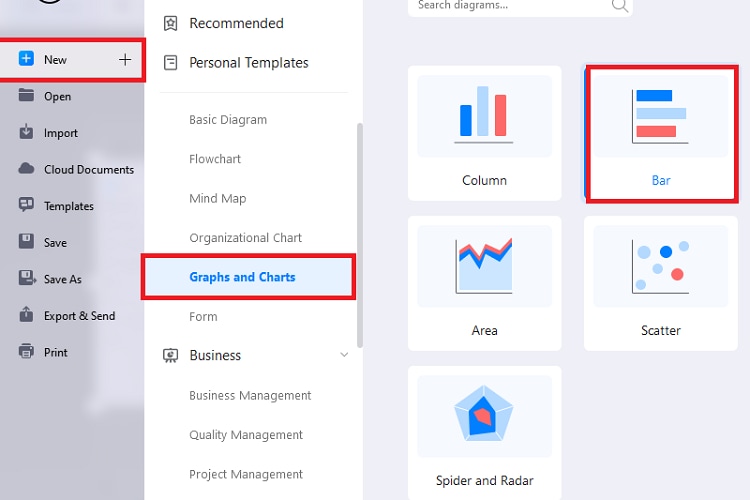
Doing so will open an editing panel on your screen. Drag the preferred stacked template you like and drop it on the canvas.
Step3
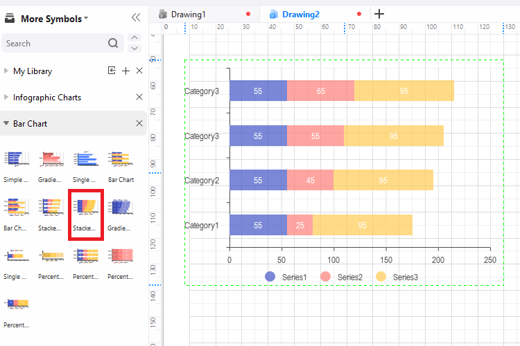
Or, you could start with a template. EdrawMax has a wide variety of horizontal, vertical, grouped, and percentage templates. Go to the template community and type “stacked bar graph” in the search box, and you will see a list of them.
Step4
Scroll down to find the one that matches your task and click Use Immediately. This will import all the components of the editing template on the canvas for you to make changes.
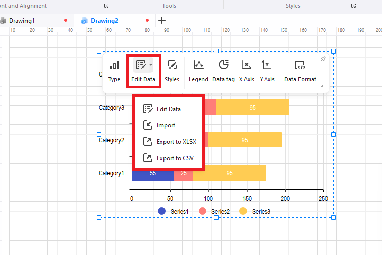
Step5
Import data from an Excel file or edit it manually. For this, click the category of data series you wish to add data for and insert the data. Revise the columns once they are filled with data in order to check everything is in place. And voila, your stacked bar chart is good to go.
Step6
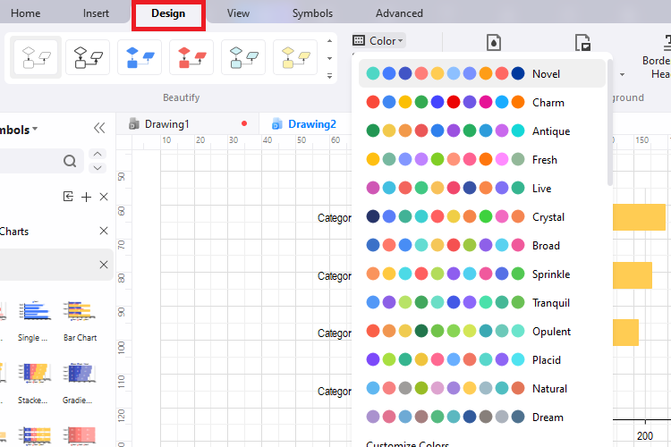
EdrawMax has a Design feature to help you personalize your diagrams. Once the stacked bar chart is done, you can change its theme and style options. It further allows you to change the font, style, and shape of individual elements.
Step7
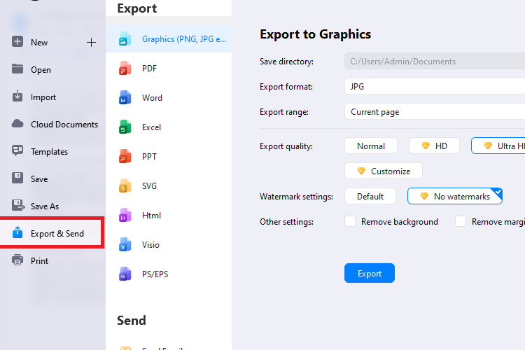
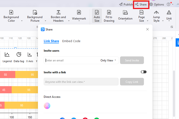
Download the chart on your laptop by clicking the Export and Send button from the File menu in the top-left corner. It supports multiple file formats, including PDF, PNG, Word, Excel, SVG, and Visio.
Similarly, share the chart with team members for feedback. The good thing is that you can set permission to who can view, edit, and leave a comment on your work.
Part 4: Tips for Creating Effective Stacked Bar Charts
Want to create stacked bar charts that attract attention and allow you to visualize the data? Follow these simple tricks and make effective charts.
- Keep it simple: The purpose of a stacked bar chart is to convey information. Having extra complicated, too-much-going-on charts will confuse the viewer at one point. And it definitely kills the purpose. So, it is always better to go for basic layouts with concise, to-the-point data series.
- Avoid 3D sorting: 3D is a big no for stacked bar chats. The effect may look fancy and intriguing, but it can easily puzzle the viewer. Hence, play safe and go for 2D data sorting.
- Go for templates: Online templates are a wise decision when it comes to making stacked charts. It is because they have an already crafted plan of how the data series will look, so you don’t have to put in extra time and effort.
- Avoid grids: Grids can add complexities to how the audience perceives data. Say no to them, and make sure everything looks clean.
Conclusion
Not having the right diagram tool can end up with you having messy and puzzling stacked bar charts. This is why you should turn toward ones that have intuitive UI and editable templates. Here, Excel and EdrawMax definitely have an advantage. For newbies, there is nothing better than EdrawMax. So, give it a try and make yourself fully-fledged stacked bar charts.