
Transform your data presentation game with our comprehensive guide on creating stacked column charts in Google Sheets. Visualizing complex information has never been easier. In this step-by-step tutorial, we'll walk you through the process, ensuring you gain a solid grasp of this powerful visualization tool. Elevate your spreadsheet skills and empower your decision-making with clear, dynamic charts. Let's dive in and unleash the full potential of Google Sheets!
Contents of this article
Part 1. What is a Stacked Column Chart?
A Stacked Column Chart is a powerful data visualization tool that displays multiple datasets in a single column, making it easy to compare their contributions to the whole. Each column is divided into segments, representing different categories or sub-groups. The segments are stacked on top of one another, emphasizing the total while showcasing individual proportions. This visual representation aids in identifying patterns, trends, and relative proportions within the data, providing valuable insights for informed decision-making and clear communication of complex information.
Part 2. Types of Stacked Column Charts:
1. Stacked Column Chart with Two Sets of Data:
A Stacked column chart with two sets of data displays two distinct datasets within each column, showcasing their contributions while illustrating their combined total. It's ideal for comparing the relationship and trends between two sets of data, providing a clear visual representation of their relative significance.
2. 100% Stacked Column Chart:
The 100% Stacked Column Chart expresses each column as a percentage of the total, making it excellent for showcasing the relative proportions of multiple datasets. It emphasizes the contribution of each category while maintaining a consistent scale, facilitating easy comparisons across different groups.
3. Clustered Stacked Column Chart:
This chart combines elements of both clustered and stacked charts, allowing for the comparison of multiple datasets across different categories. It groups columns by category and then stacks them to showcase the composition within each category. This type of chart provides a comprehensive view of both individual and collective contributions.
Part 3. How to Create a Stacked Column Chart in Google Sheets
Here are the steps to create a stacked column chart in Google Sheets:
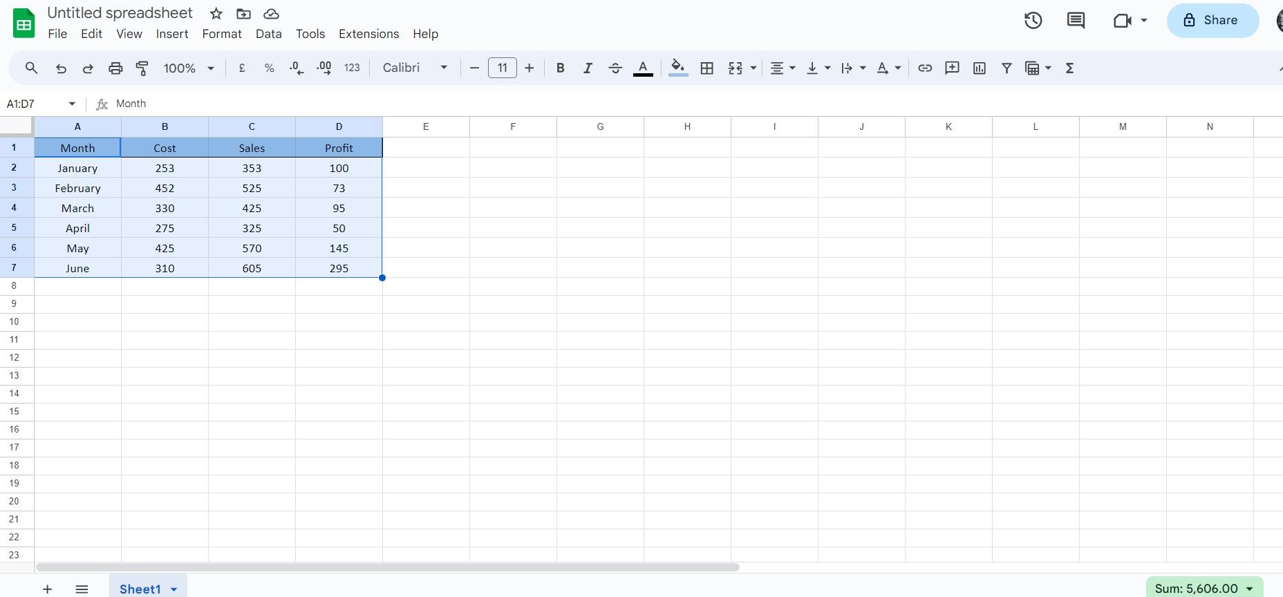
Step 1: Launch Google Sheets and open the spreadsheet containing the data you want to visualize.
Step 2: Highlight the data you want to include in the chart. This should include both the categories (usually in columns) and their corresponding values.
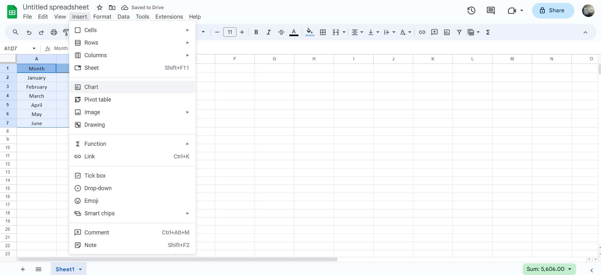
Step 3: Navigate to the menu and click on 'Insert' located in the top toolbar. From the dropdown menu, select 'Chart'.
Step 4: This will open the Chart Editor panel on the right side of the screen. In the Chart Editor, choose 'Stacked Column chart' as the chart type.
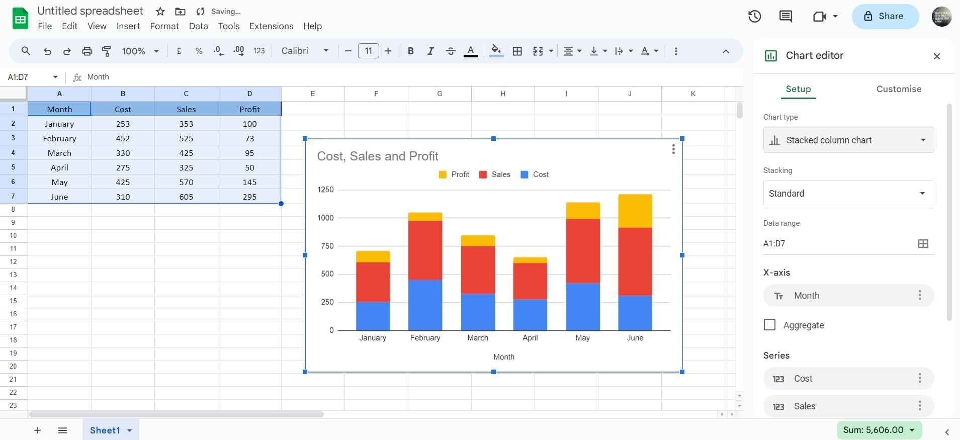
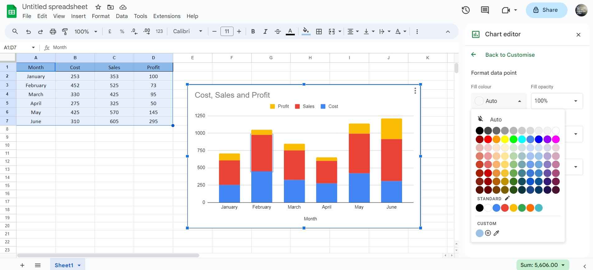
Step 5: You can further customize the chart by adjusting options like titles, labels, colors, and other settings in the Chart Editor. As you make changes, you'll see a preview of the chart in real time.
Step 6: You can click and drag the chart to reposition it within the sheet or use the corner handles to resize it.
And that’s it! You've successfully created a stacked column chart in Google Sheets. This visual representation will help you analyze and communicate your data effectively.
Limitations of using Google Sheets:
One limitation of using Google Sheets is its dependency on internet connectivity. Without a stable internet connection, users may experience difficulty accessing or editing their spreadsheets, which can be particularly problematic in environments with unreliable or no internet access. This reliance on connectivity can potentially disrupt work processes and limit accessibility in certain situations.
Part 4. Create a Stacked Column Chart Easily With EdrawMax
Agree or not, transitioning to Wondershare EdrawMax for chart creation offers a seamless solution to overcome the limitations of Google Sheets. EdrawMax provides a versatile platform for crafting visually appealing and customizable charts, irrespective of internet connectivity. Its extensive library of templates and intuitive interface streamline the chart-making process, allowing for enhanced creativity and precision.
Additionally, EdrawMax's offline functionality ensures uninterrupted workflow, making it an invaluable tool for professionals and students alike. With its robust features, EdrawMax elevates the charting experience, offering a reliable alternative to online-based applications like Google Sheets.
Here are the steps to create a stacked column chart using EdrawMax:
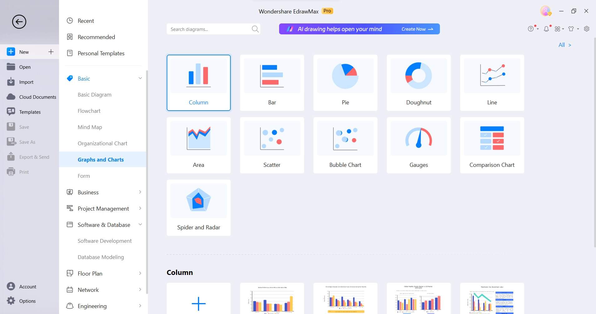
Step 1: Open the EdrawMax software on your computer. In the EdrawMax dashboard, click on the "Graph and Chart" category on the left-hand sidebar. Within the Chart category, select the "Stacked Column Chart" option from the available chart types.
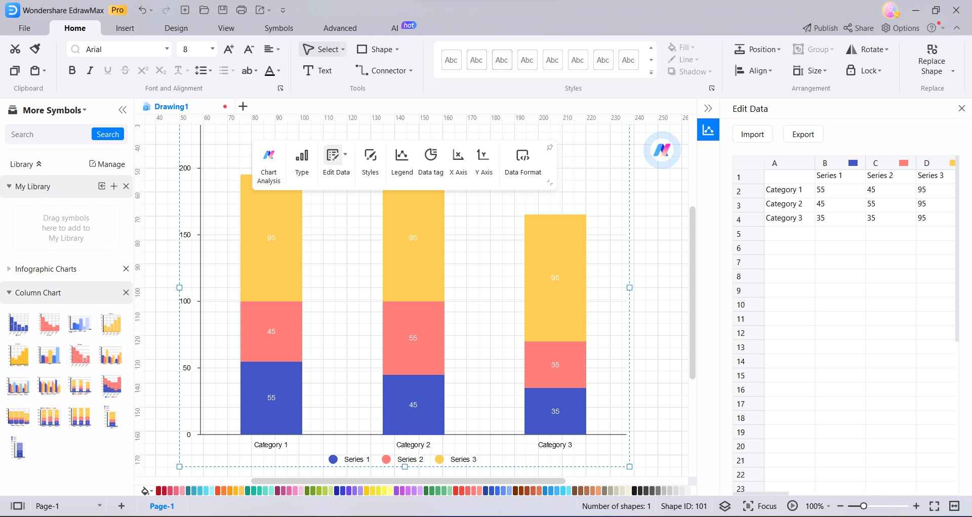
Step 2: A blank stacked column chart canvas will appear. Click on the data fields to input your own values or import data from an external source.
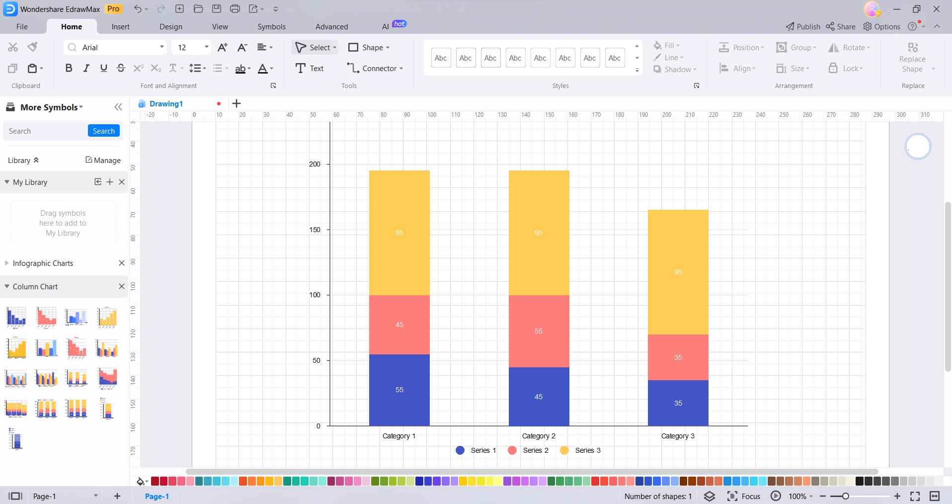
Step 3: Edit the categories (X-axis) and series (Y-axis) labels according to your specific data. You can also add or remove categories and series as needed.
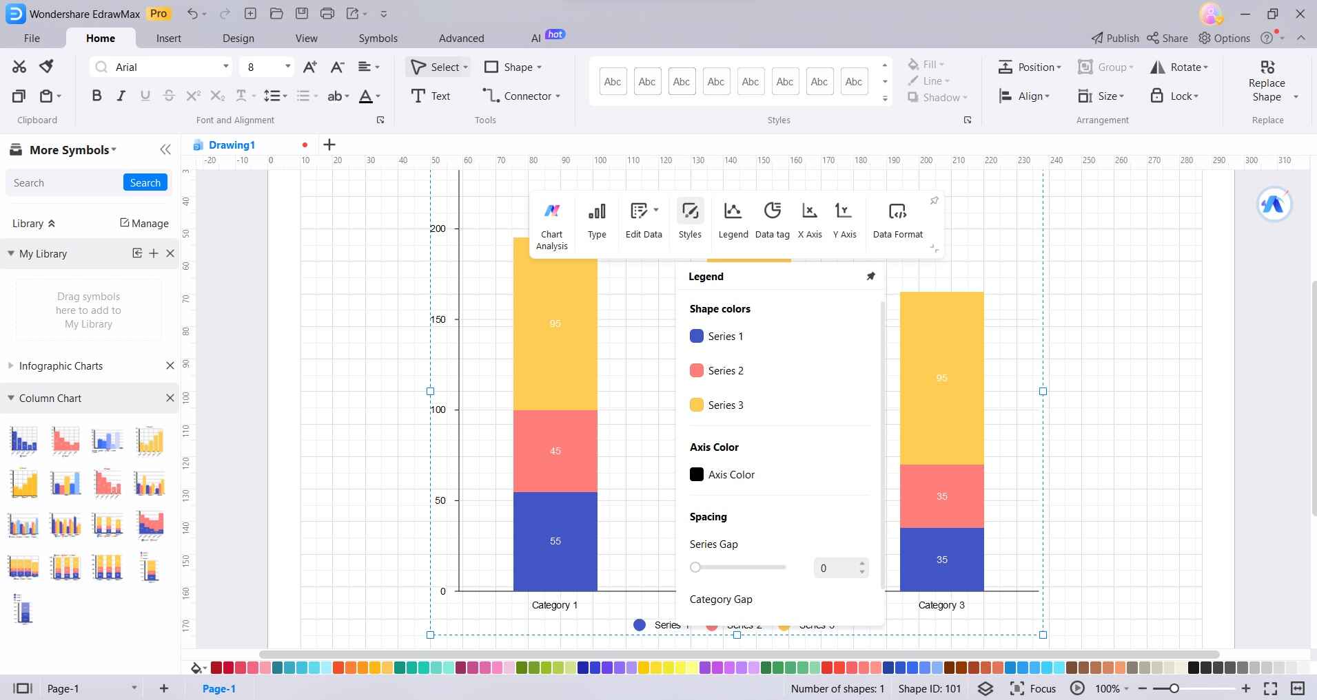
Step 4: Use the formatting options provided to adjust the appearance of your chart, including colors, fonts, gridlines, and more.
Step 5: Take a final look at your stacked column chart to ensure it meets your requirements. Once satisfied, save the chart to your desired location on your computer.
Step 6: Tap on File> Export and Save to export the chart in various formats such as image files or PDFs, or directly share it with others through email or cloud services.
By following these steps, you'll be able to create a professional-looking stacked column chart using EdrawMax, allowing you to effectively visualize and communicate your data.
Conclusion
In conclusion, becoming proficient in creating stacked column charts in Google Sheets is vital for impactful data communication. While Google Sheets offers a foundation, EdrawMax stands out as a versatile alternative with advanced customization and offline capabilities. Its intuitive interface and rich features make it an excellent choice for chart creation.
By utilizing EdrawMax, individuals can enhance their data visualization, leading to more effective presentations and well-informed decisions.