In the realm of data visualization, stacked bar charts are a powerful tool for presenting complex information in an easily digestible format. This comprehensive guide will take you on a journey through the creation of compelling stacked bar charts using RStudio, a versatile and widely used programming language.
From importing and preparing your data to customizing every detail of your chart, we'll walk you through each step, ensuring you not only master the technique but also learn the art of effective data storytelling.
In this article
Part 1. What is a Stacked Bar Chart?
A stacked bar chart is a visually intuitive way to represent and compare categorical data. Unlike a regular bar chart, a stacked bar chart displays multiple variables for each category, with each segment stacked on top of the others. This allows for a clear visualization of both the total and the composition of each category. Each segment's height corresponds to its value, making it easy to discern patterns, trends, and relative proportions within the data. Stacked bar charts are particularly useful for showcasing the relationship between different components within a whole dataset.
Part 2. Types of Bar charts:
- Grouped Stacked Bar Chart: This chart combines the benefits of both grouped and stacked bar charts. It allows you to display multiple groups of data categories, and within each group, the data is stacked to show the composition. This provides a clear view of the overall distribution as well as the breakdown within each group.
- Vertical Stacked Bar Chart: The vertical stacked bar chart is the classic representation where categories are displayed along the x-axis, and the stacked segments rise vertically. It's an effective way to compare the composition of different categories while also understanding the total value of each category.
- Single Stacked Bar Chart: This type of chart focuses on a single category and displays various components stacked on top of each other. It's ideal for illustrating the composition of a single entity or category, making it easy to grasp the relative contributions of different elements.
- Stacked Bar chart With Line: This advanced visualization incorporates a line chart overlaid onto a stacked bar chart. It's particularly useful when you want to represent two different types of data, such as categorical and continuous, in a single visual. This combination allows for a comprehensive understanding of the relationships between the variables.
Part 3. How to Create a Stacked Bar Chart in RStudio
Creating stacked bar charts in RStudio is a straightforward process, primarily facilitated by the ggplot2 package. Begin by organizing your dataset with categorical variables for the x-axis and numerical values for the y-axis.
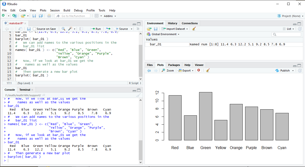
After loading the necessary packages, initiate the plot with ggplot() and map your data to aesthetics, specifying the x-axis, y-axis, and fill for stacking. Add geom_bar(stat = "identity") to create the stacked bars.
Customize labels, titles, and visual elements as needed. Execute the code to generate your stacked bar chart, refining aesthetics as necessary for optimal clarity and impact. The flexibility of ggplot2 allows for endless customization, empowering you to convey insights effectively through visually compelling charts.
Part 4. Create a Stacked Bar Chart Easily with EdrawMax
EdrawMax offers a user-friendly platform for creating visually appealing charts and diagrams, making it an excellent choice for those seeking intuitive data visualization solutions. Unlike R, which primarily caters to advanced users and requires coding skills, EdrawMax is accessible to a broader audience, including individuals with limited programming experience. Its drag-and-drop interface simplifies the process, allowing users to swiftly design a wide range of charts, including stacked bar charts, with minimal effort.
Additionally, EdrawMax provides a diverse library of pre-made templates and a plethora of customization options, making it a versatile tool for professionals across various industries. This ease of use and versatility positions EdrawMax as a powerful alternative for creating charts, especially for those who prefer a more intuitive approach over coding-intensive platforms like R.
Here are the steps to create a stacked bar chart using EdrawMax:
Step 1: Launch the EdrawMax software on your computer. From the template library, choose the "Bar Chart" category. Then, select the "Stacked Bar Chart" template.

Step 2: Double-click on the chart to enter the data. Input your categories and corresponding values for each segment of the stacked bars.
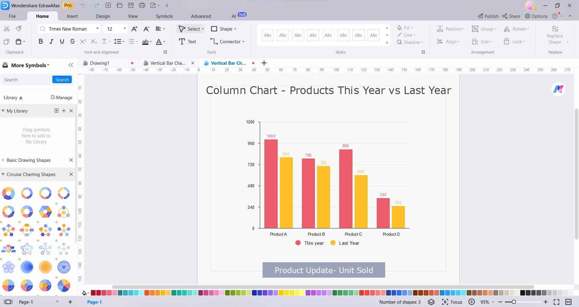
Step 3: Add a title to your chart and label the axes to provide context and clarity to viewers.
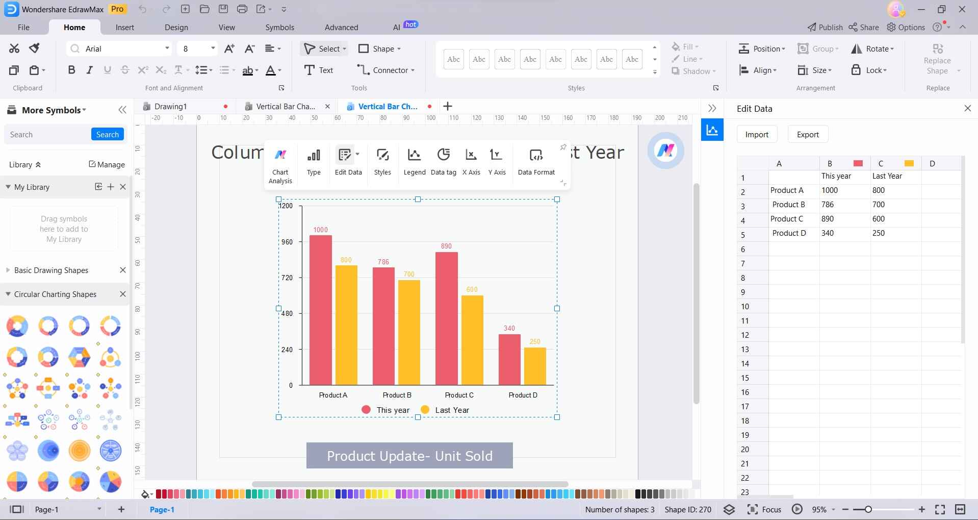
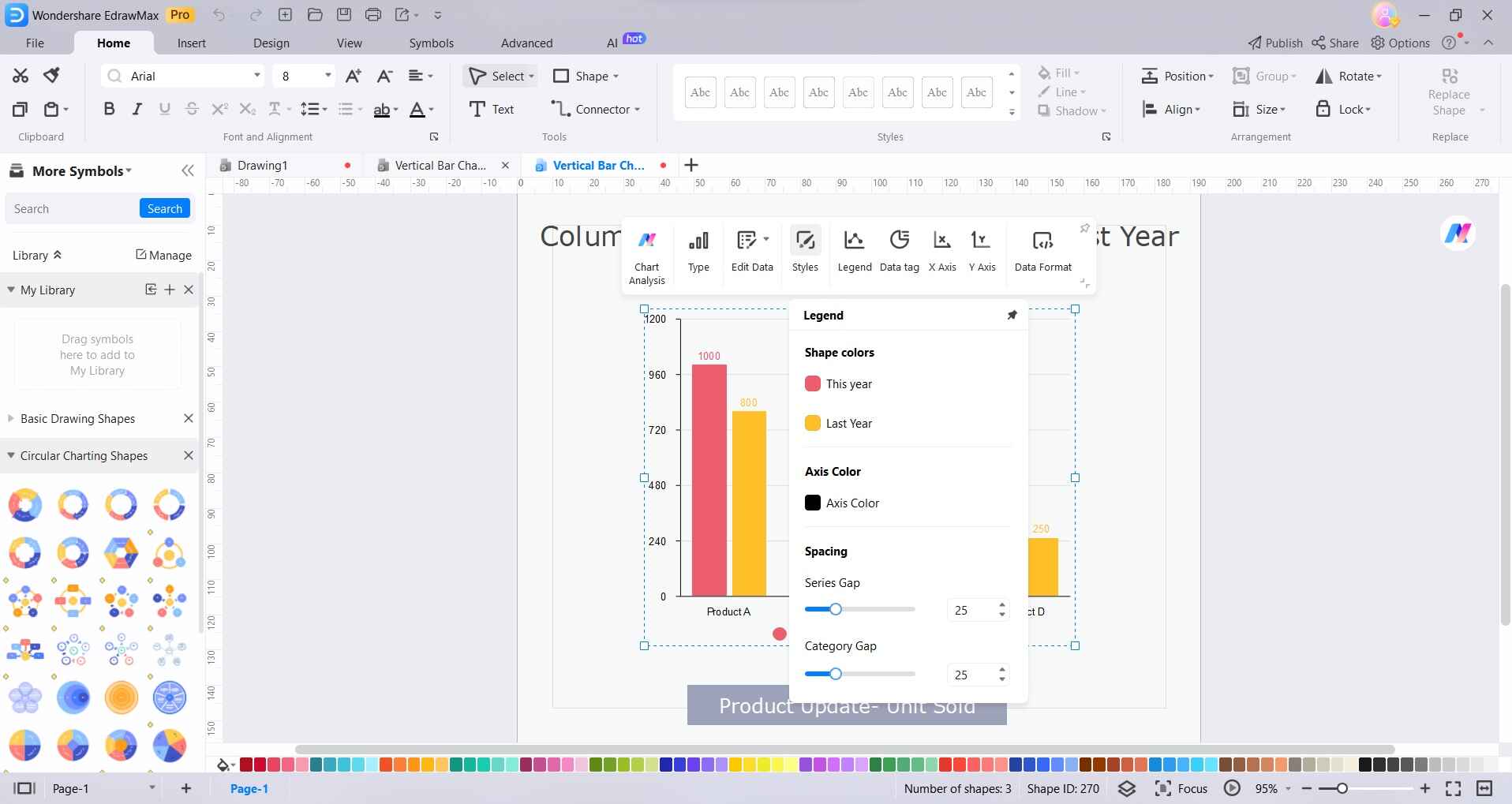
Step 4: Customize the chart further by changing colors, fonts, and styles. You can also adjust the axes, labels, and legends to suit your preferences.
Step 5: Once you're satisfied with the chart, save your work in a preferred format or export it for use in reports, presentations, or other documents. Tap on File> Export & Save to export the final chart as an image or PDF file for easy sharing or inclusion in your presentations or reports.
With these steps, you'll have successfully created a stacked bar chart using EdrawMax. The intuitive interface and customization options make it a powerful tool for visualizing data effectively.
Part 5. Benefits of Using a Stacked Bar Chart
Here are the benefits of using a stacked bar chart in bullet points:
- Clear Representation: Provides a clear view of both total and individual components within categories.
- Effective for Complex Data: Excels in illustrating complex datasets with multiple variables.
- Comparative Analysis: Facilitates easy comparisons between categories.
- Visualizing Proportions: Clearly shows the relative proportions and trends across variables.
- Identifying Dominant Elements: Enables easy identification of dominant and subordinate elements within the data.
- Enhanced Data Understanding: Enhances viewer's understanding of the data at a glance.
Conclusion
In conclusion, creating