Candlestick chart maker
Visualize, edit, and present candlestick data with EdrawMax. It is an intuitive candlestick chart maker with AI assistance and a built-in spreadsheet editor.
Why Use EdrawMax Candlestick Chart Maker?
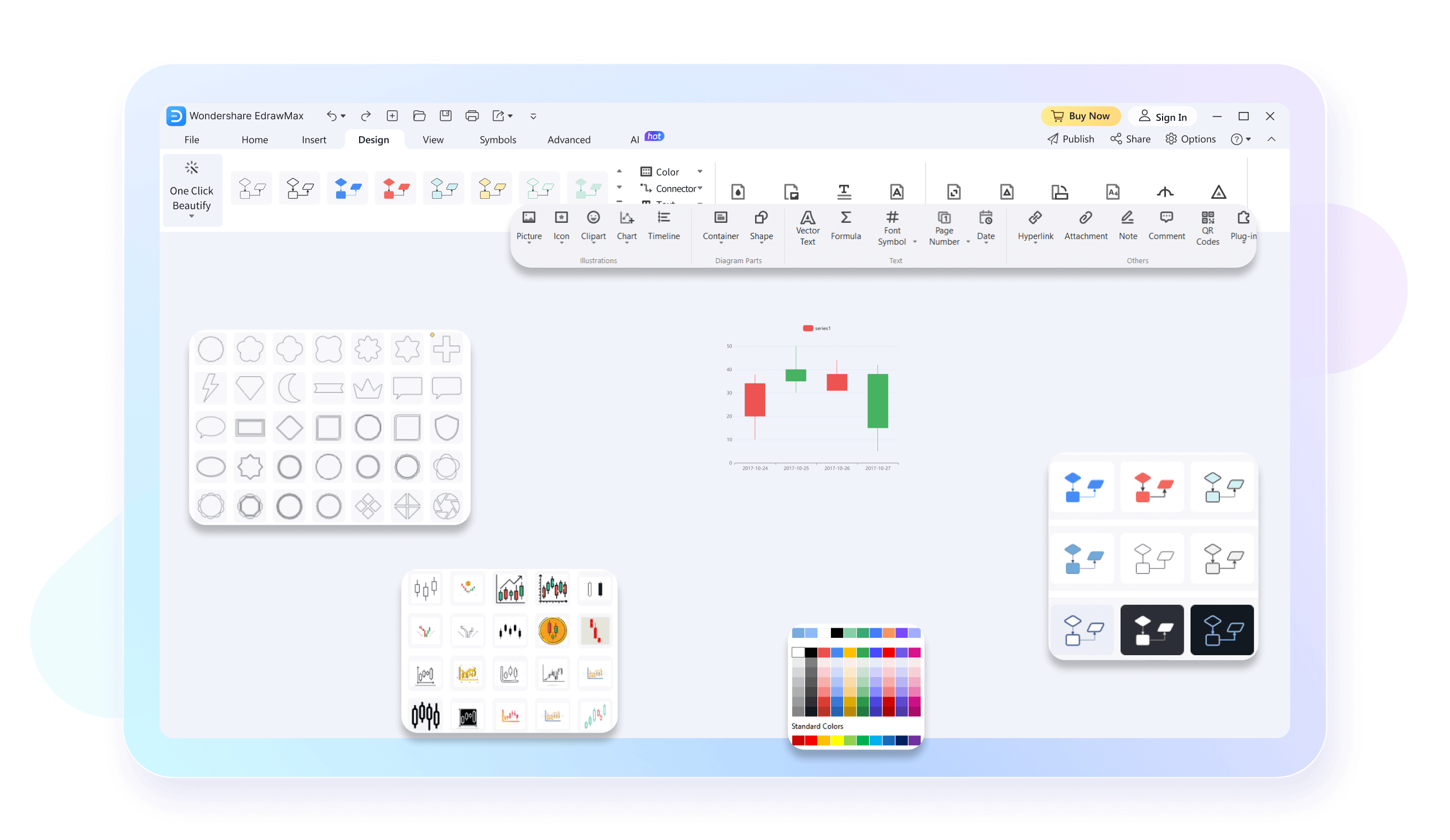
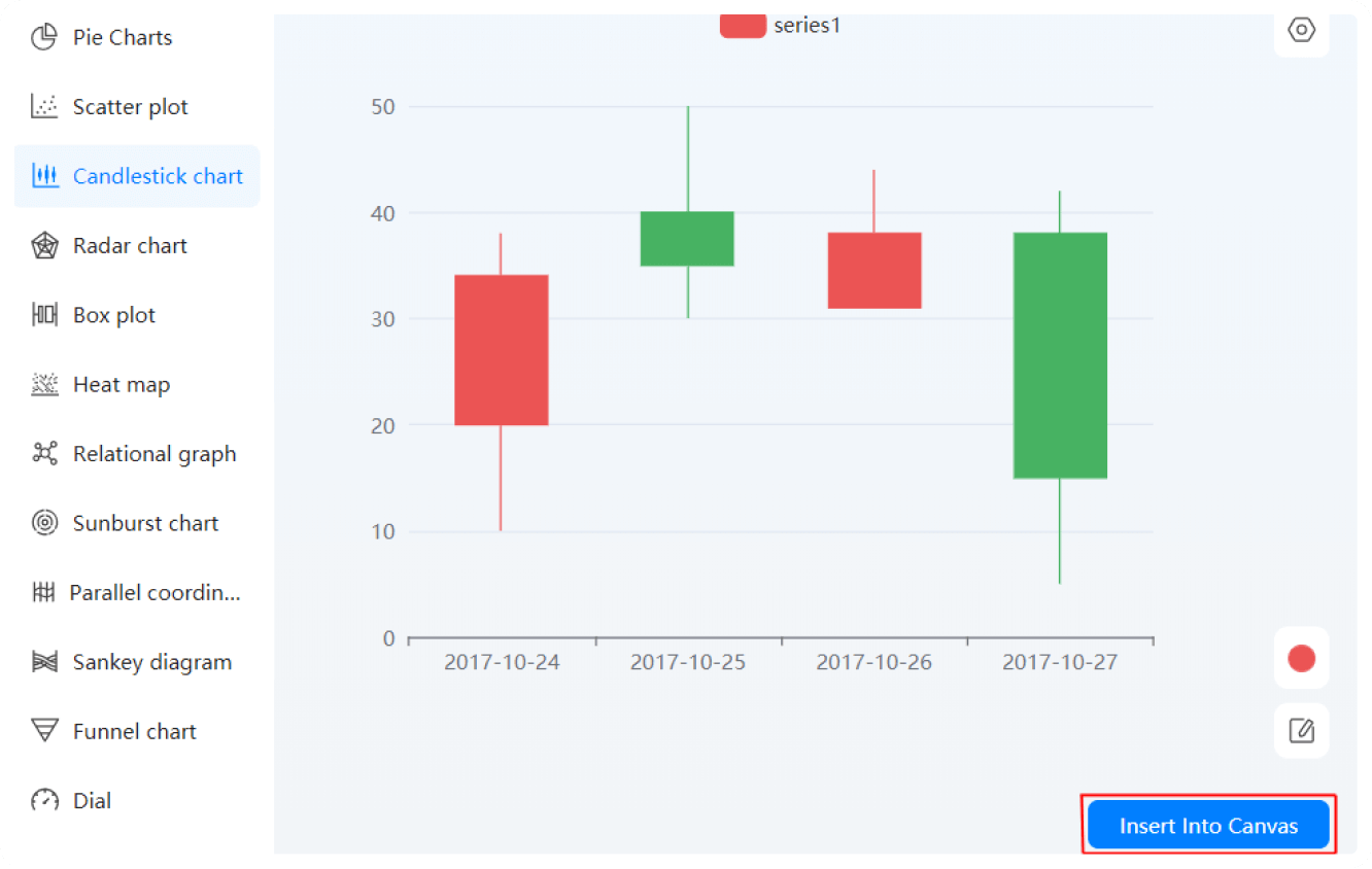
With EdrawMax, you can edit your chart data with a built-in spreadsheet editor. Enter your information, define series, and adjust data formats. Or, just copy the data from Excel and paste it directly into the spreadsheet. It even allows revision updates once the chart is complete.
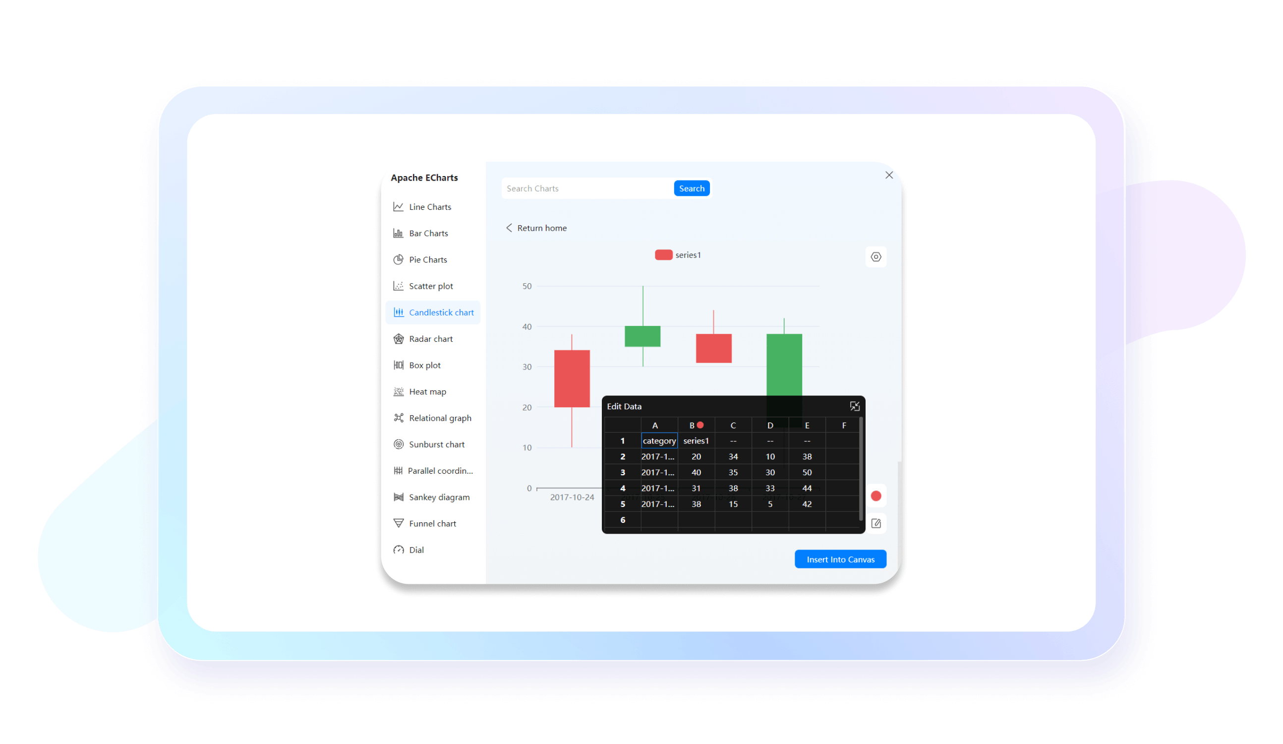
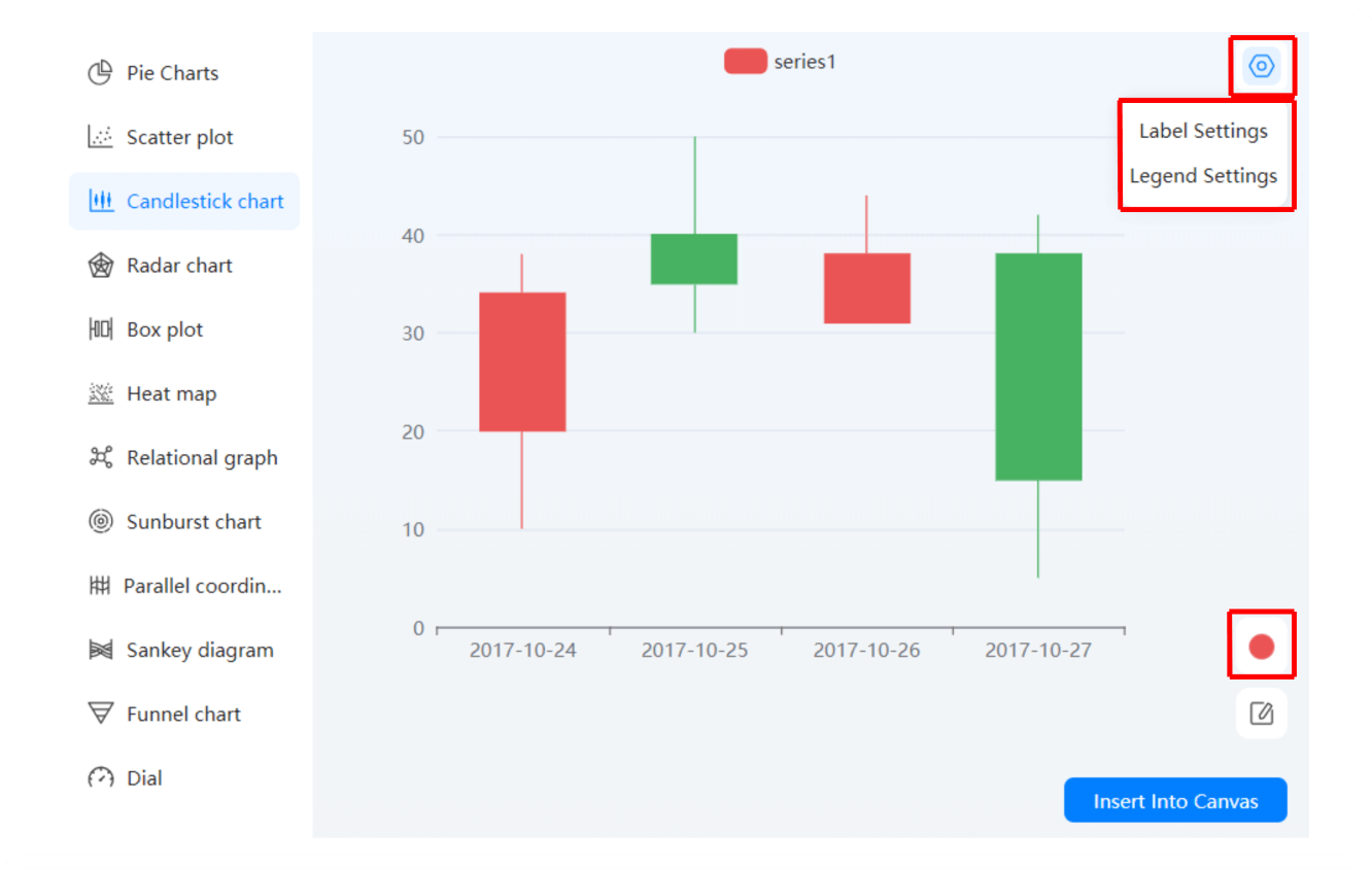
Transform your diagrams with a few clicks. Change labels, add legends, and change the color categories of your candlesticks. Plus, navigating our candlestick chart maker is easier. Spend some time on the canvas and you will get a hold of the already accessible toolkit.
Be it project managers, sales teams, or educators, Edraw AI chart analysis is beneficial for all. It can produce your diagram’s summaries in seconds. You are also free to do data comparisons, analysis, anomaly identification, and trend prediction with this feature.
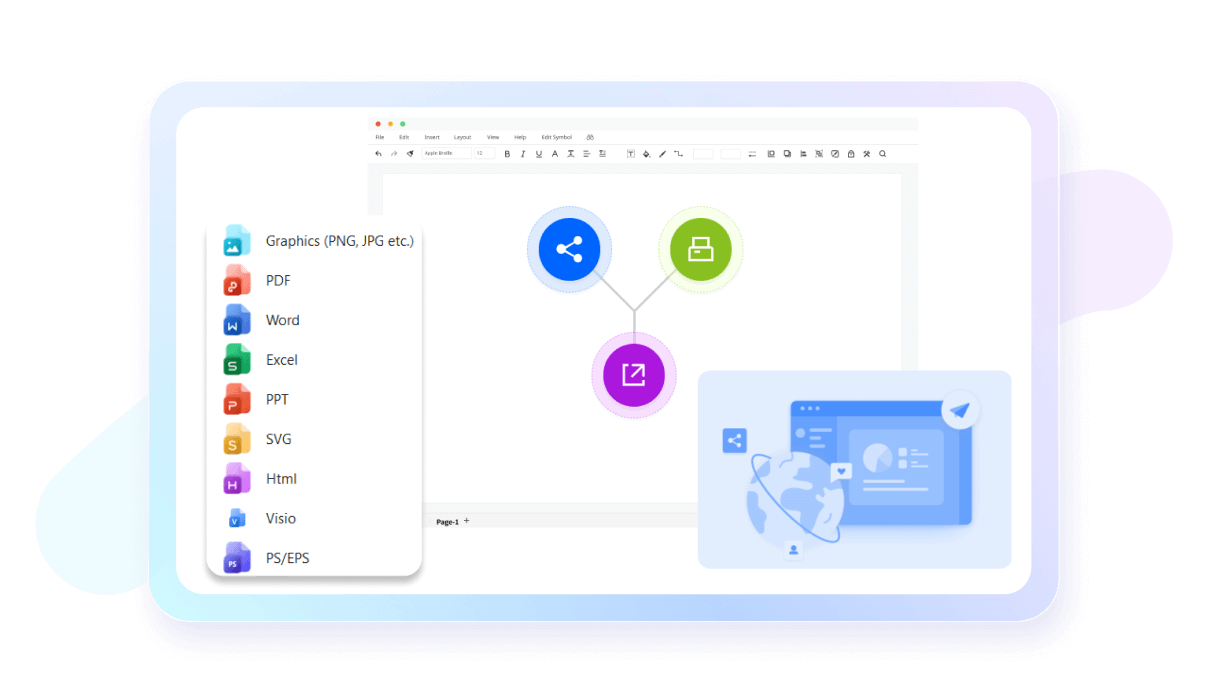
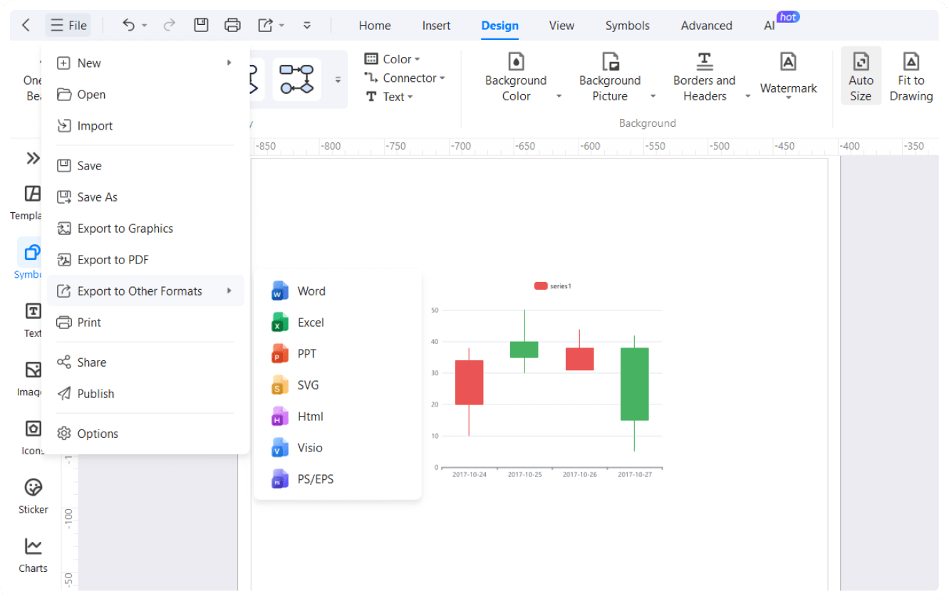
EdrawMax has made sharing easier with 10+ export format compatibility, including Visio, Graphics, and PPT. You can also publish your work on our template community. Not only this, but it even lets you share diagrams with non-EdrawMax users on social media and email.
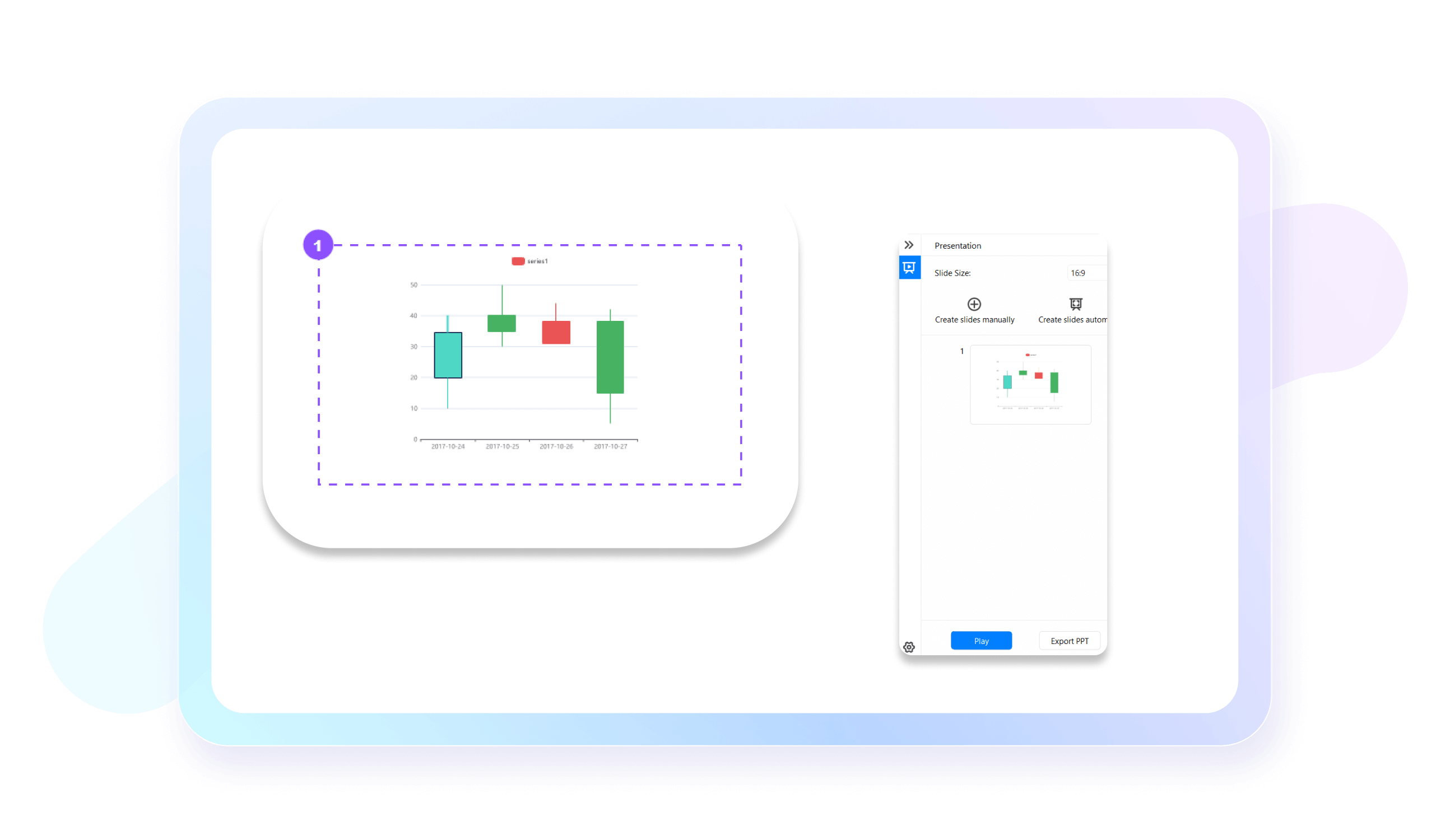
No need to turn to presentation tools. EdrawMax has made it easier to convert your diagrams into an extensive slideshow. It showcases significant details of your work. Plus, the generated slides can be exported in a PPT format for professional use.
How to Make a Candlestick Chart in 3 Simple Steps
What our users say
More Candlestick chart Tools
Discover more AI-powered diagram makers to boost your productivity.
FAQs About EdrawMax Candlestick Chart Tools
-
What is a candlestick chart?A candlestick chart is a popular financial visualization tool used to track price movements of assets like stocks or crypto. Each "candle" displays the high, low, open, and closing prices for a specific time period. Traders use them to identify patterns and predict future market trends based on historical data.
-
What do the colors on a candlestick represent?In a candlestick chart, colors indicate price direction. Typically, a green or white candle signifies a bullish move, meaning the closing price was higher than the opening price. Conversely, a red or black candle represents a bearish move, where the closing price ended lower than the opening price during that period.
-
What is the "wick" or "shadow" of a candle?The thin lines extending above and below the candle body are called wicks or shadows. The upper wick represents the highest price reached during the timeframe, while the lower wick shows the lowest price. These extensions provide crucial information about price volatility and the range of trading activity for that period.
-
How to read the candle's body?The thick part of the candle, known as the body, represents the range between the opening and closing prices. If the body is long, it indicates strong buying or selling pressure. A short body suggests little price movement, reflecting indecision in the market or a balance between buyers and sellers.
-
What is a Doji candlestick?A Doji occurs when an asset's open and close prices are virtually identical, resulting in a very small or nonexistent body with long wicks. This pattern signals market indecision and often suggests a potential trend reversal, as neither buyers nor sellers could gain control during the specific trading timeframe.
-
What does a "Hammer" pattern indicate?A Hammer is a bullish reversal pattern characterized by a small body at the top and a long lower wick. It usually appears at the bottom of a downtrend, suggesting that although sellers pushed prices lower, buyers stepped in strongly to drive the price back up near the opening level.
-
Can candlestick charts predict future price movements?Candlestick charts cannot predict the future with absolute certainty, but they help identify high-probability setups. By analyzing historical price action and repeating patterns, traders can make more informed guesses about potential market directions. They are best used alongside other technical indicators, like volume and moving averages, for better accuracy.
-
What is a "Bearish Engulfing" pattern?A Bearish Engulfing pattern consists of two candles: a small green one followed by a much larger red one that completely covers the previous candle's body. This suggests that sellers have overwhelmed buyers and often signals a reversal from an uptrend to a downtrend, indicating a shift in momentum.
Stop drawing. Start describing.
AI diagramming isn't just text-to-diagram.
AI now understands any input, fetches live data, adapts through dialogue, and works everywhere.