Free AI chart maker
Create clear charts, showcase infographics, presentations, and more with EdrawMax’s free AI chart maker. Turn raw data into sleek visualizations and experience precision like never before.
Why Use EdrawMax AI Chart Maker?
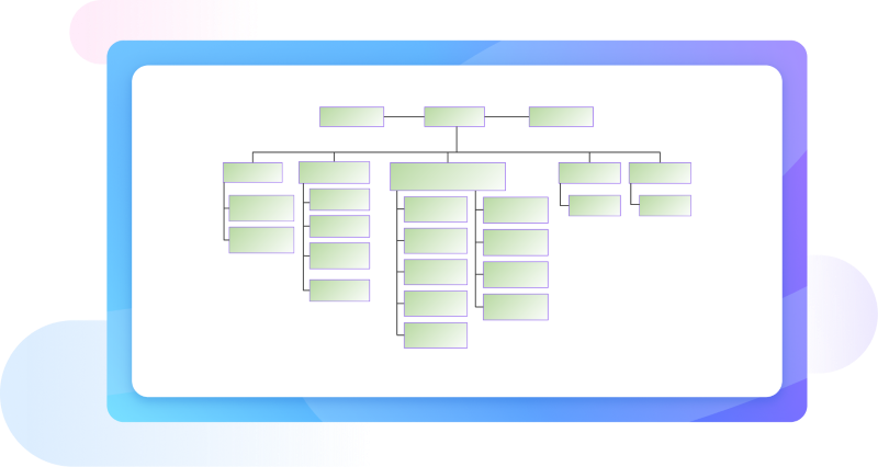
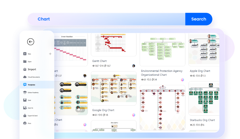
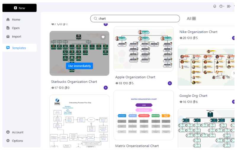
Get a headstart on your creation process with EdrawMax’s free templates library. Browse various templates and get your hands on the most professional and customizable chart templates. Whether you need an educational chart template or a corporate one, there’s a free chart template for every purpose.
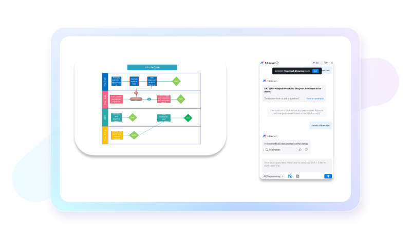
Visualize, accelerate, and simplify your creation process with Edraw AI. Input all your data in the AI chat box — including the chart type (bar chart, line chart, pie chart, etc.) and its parameters. Mention your data, percentages, and any other detail you’d like to add. Specify your preferred design elements and intended use and voila! Your chart generation is done.
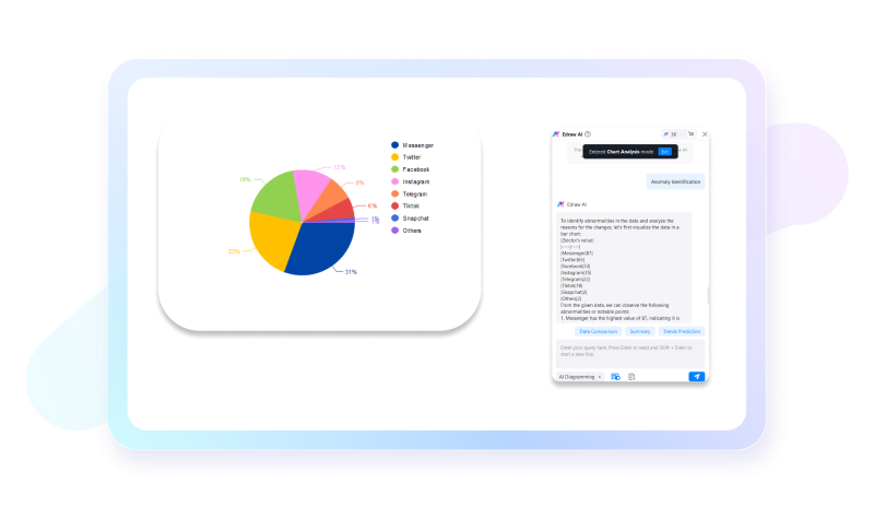
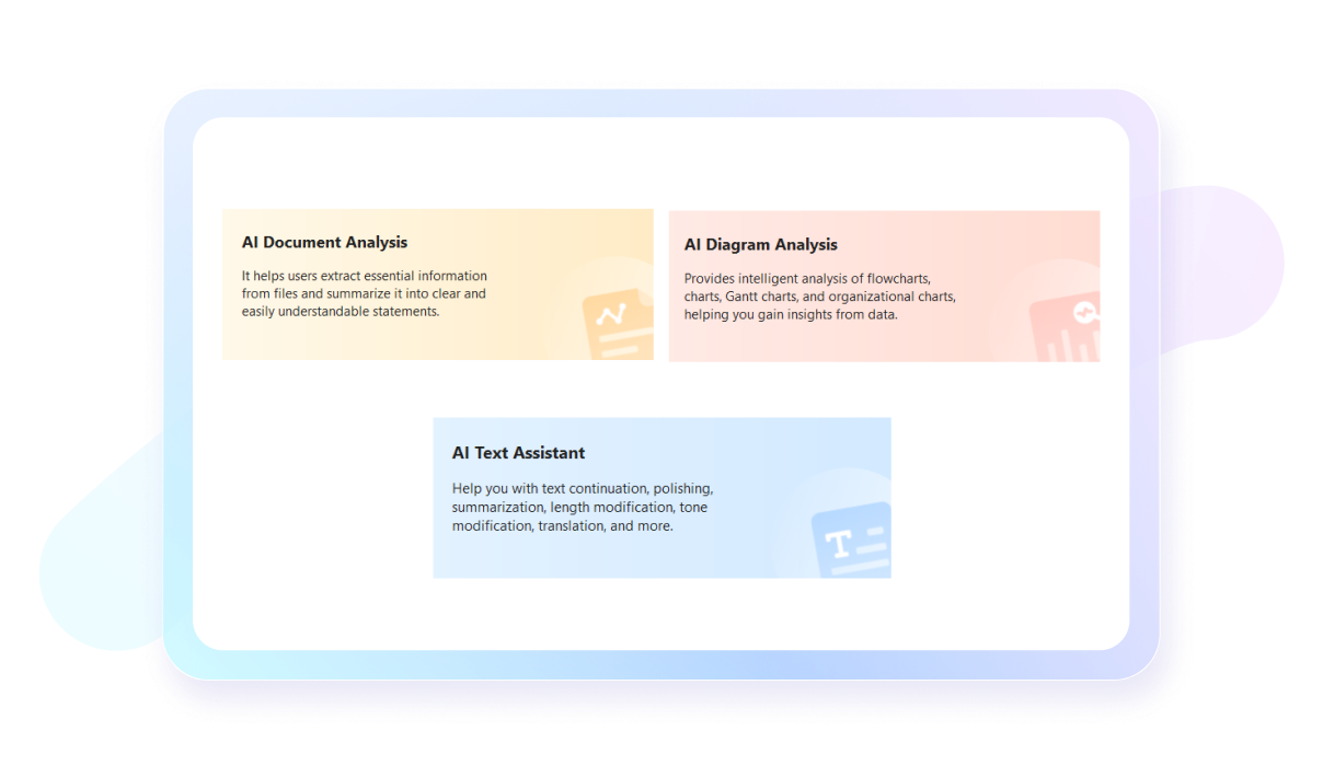
Understanding complex charts filled with lines and patterns can be tough. Our AI chart analysis is the best way to simplify those complex data by gaining intelligent and meaningful insights. Whether you want to analyze a market bar chart or an educational pie chart, all you have to do is give the instructions to Edraw AI and let it take care of the rest.
EdrawMax’s AI document analysis tool helps amplify your document comprehension process and make informed data-driven decisions whether you are creating charts, reports, or flowcharts. Extract useful data and insights from your documents, and summarize them, all using Edraw AI.
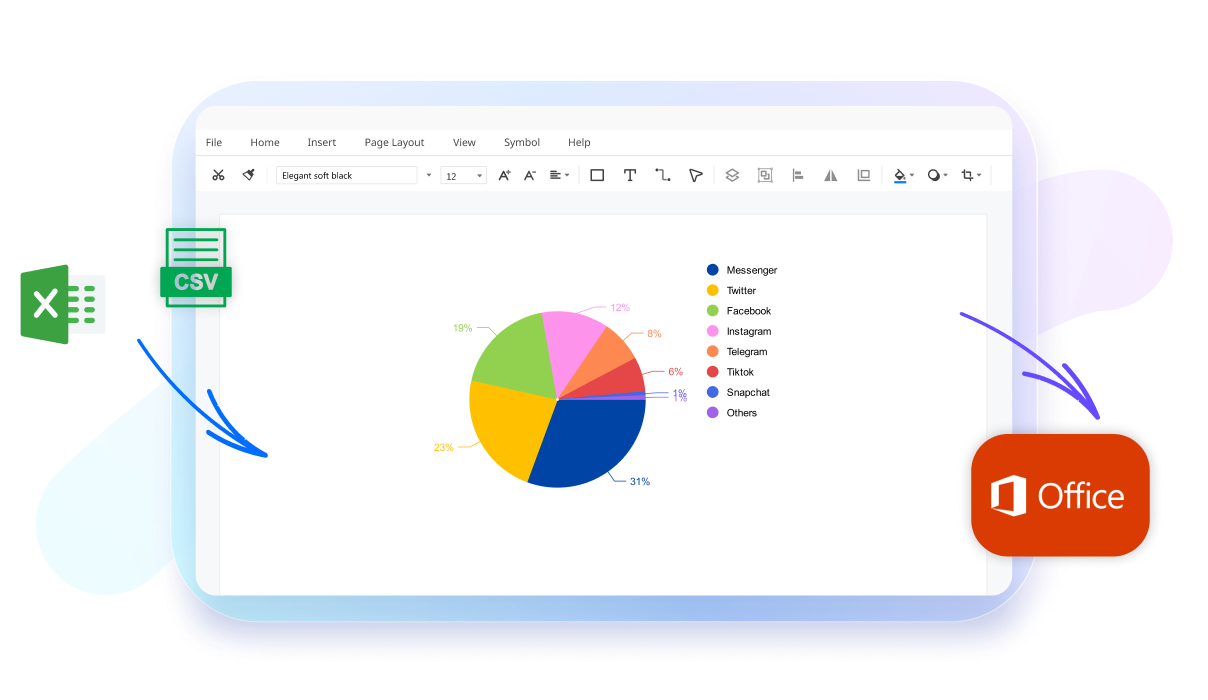
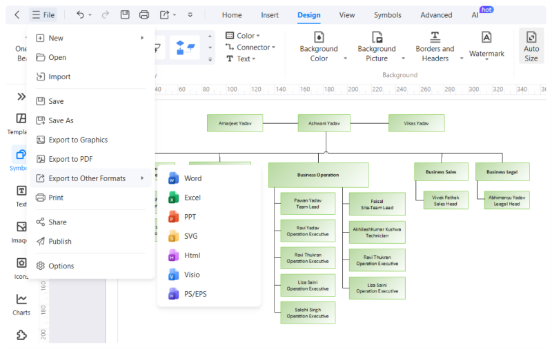
With EdrawMax you can seamlessly import data from your Excel files directly into your charts. Upload files in XLXS, or CSV formats, or simply copy and paste data from existing files. Once uploaded, the Anomaly Identification tool will ensure your data is accurate and run it for any discrepancies so you don't have to face any problems later.
How to create a chart using EdrawMax?
What our users say
More Chart Tools
Discover more AI-powered diagram makers to boost your productivity.
FAQs About EdrawMax AI Chart Tools
-
What is a chart?A chart is a graphical representation of data, designed to make complex information easier to understand and analyze. By using visual elements like bars, lines, or slices, charts help identify patterns, trends, and outliers that might be difficult to spot in raw numbers or text-based tables and spreadsheets.
-
What are the most common types of charts?The most common types include bar charts for comparing categories, line charts for showing trends over time, and pie charts for representing parts of a whole. Other popular options are scatter plots for showing relationships between variables and area charts, which emphasize the magnitude of change over a specific period.
-
What is the difference between a chart and a graph?While often used interchangeably, a chart is a broad term for any visual representation of data, including tables and diagrams. A graph is a specific type of chart that focuses on the mathematical relationship between sets of data points, typically plotted along horizontal and vertical axes like X and Y.
-
What are the key components of a professional chart?A professional chart should include a clear title, labeled axes with units of measurement, and a legend if multiple data series are present. Gridlines can improve readability, while data labels provide specific values. Keeping the design clean and avoiding unnecessary clutter ensures that the primary message remains the focus.
-
What is a Gantt chart?A Gantt chart is a specialized type of bar chart used primarily in project management. It illustrates a project schedule by showing the start and finish dates of various elements, such as tasks and milestones. This visual timeline helps teams track progress, manage dependencies, and ensure that deadlines are met.
Learn about Chart
Stop drawing. Start describing.
AI diagramming isn't just text-to-diagram.
AI now understands any input, fetches live data, adapts through dialogue, and works everywhere.
Free AI chart templates from EdrawMax