Online gauge chart maker
Simplify your data presentation with EdrawMax's online gauge chart creator. Make professional gauge charts in minutes from scratch or using EdrawMax’s customizable gauge chart examples.
Why Use EdrawMax Gauge Chart Maker?
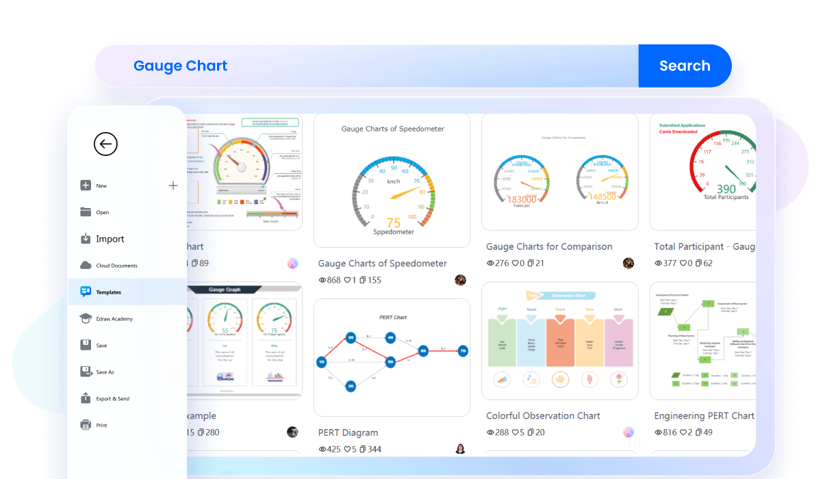
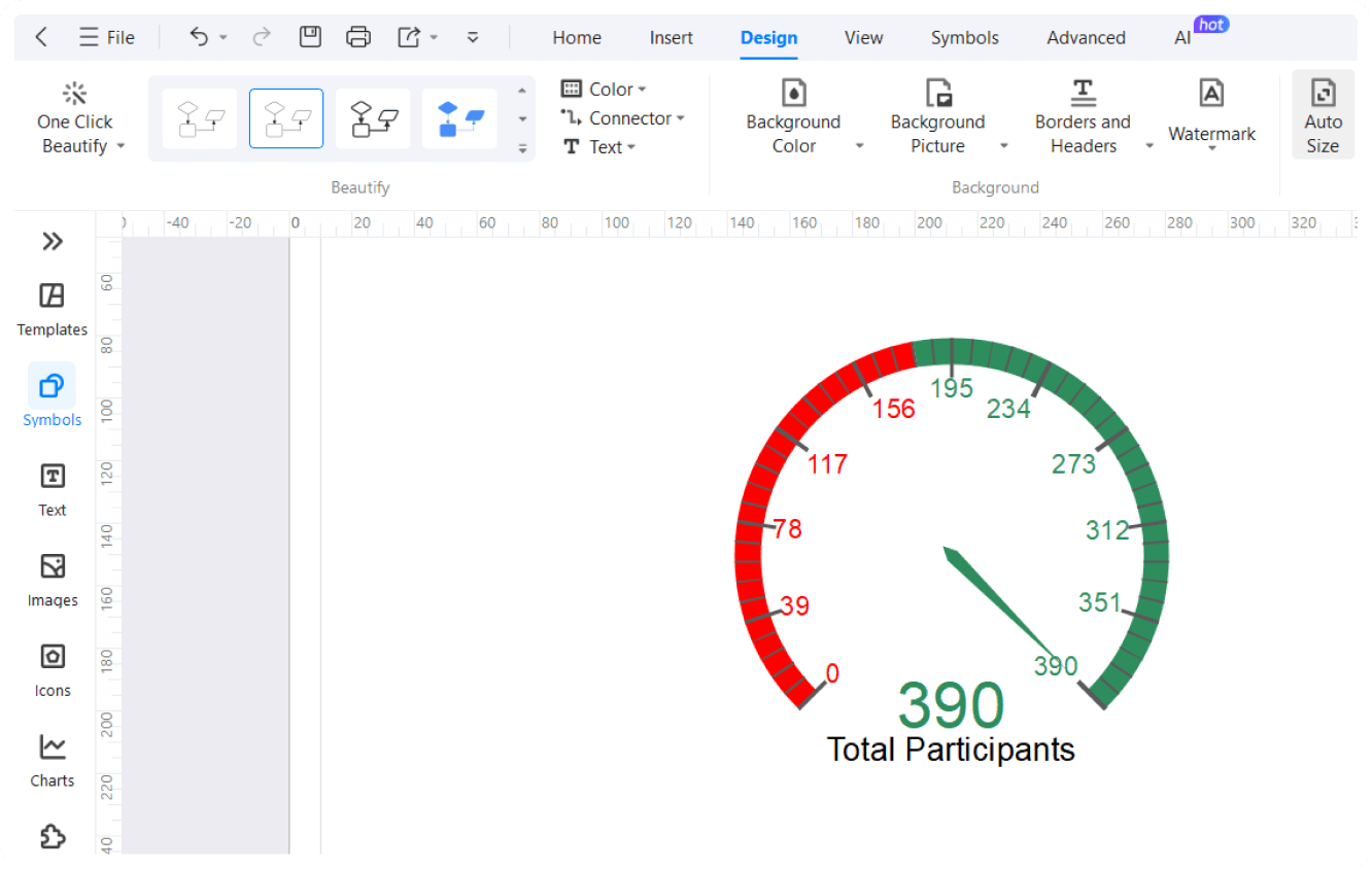
Starting a project on EdrawMax does not necessarily be from the scratch, we offer a wide range of ready-to-use templates for gauge charts, from classic speedometer designs to intricate circular dials. These examples are professionally designed to kickstart your visualization process, allowing you to focus on refining your data presentation.
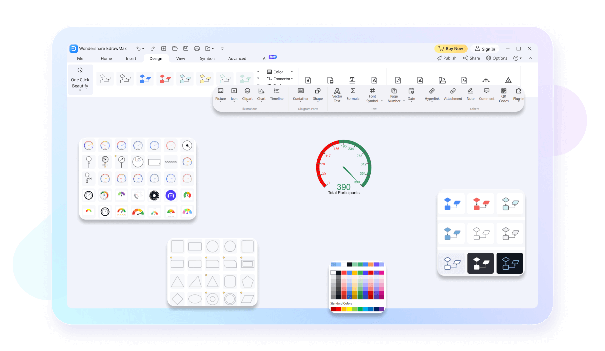
After selecting the example, you EdrawMax offers an infinite canvas for your gauge chart projects, allowing you to expand your visualizations without constraints. Whether you're designing a compact dashboard or a comprehensive project overview, enjoy the freedom to scale your charts seamlessly to fit your evolving needs.
Work on your gauge charts from any device with EdrawMax's cross-platform compatibility. Whether you're on Windows, Mac, or Linux, enjoy a seamless experience that keeps your projects accessible wherever you go. No more limits—take your work with you and stay productive anytime, anywhere.

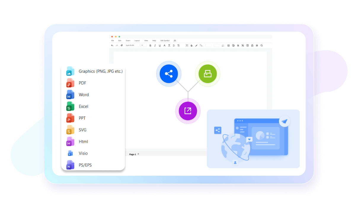
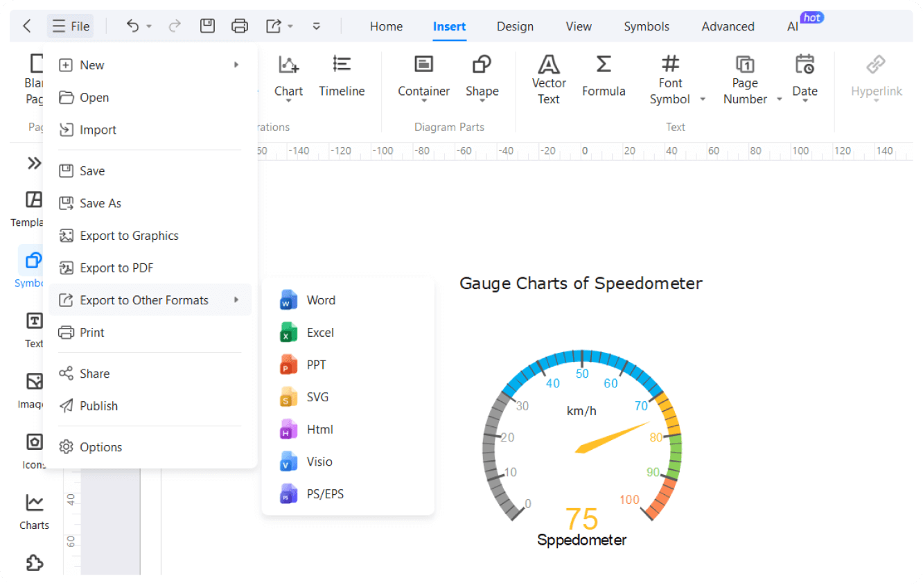
You can export and share your gauge charts easily with a variety of export options. Save your charts in multiple formats such as PNG, PDF, and SVG, or share them directly to platforms like PowerPoint and Word or social media. This flexibility ensures your visualizations are easily integrated into any presentation or document.
How to Make a Gauge Chart in 3 Simple Steps
What our users say
More Gauge Chart Tools
Discover more AI-powered diagram makers to boost your productivity.
FAQs About EdrawMax Gauge Chart Tools
-
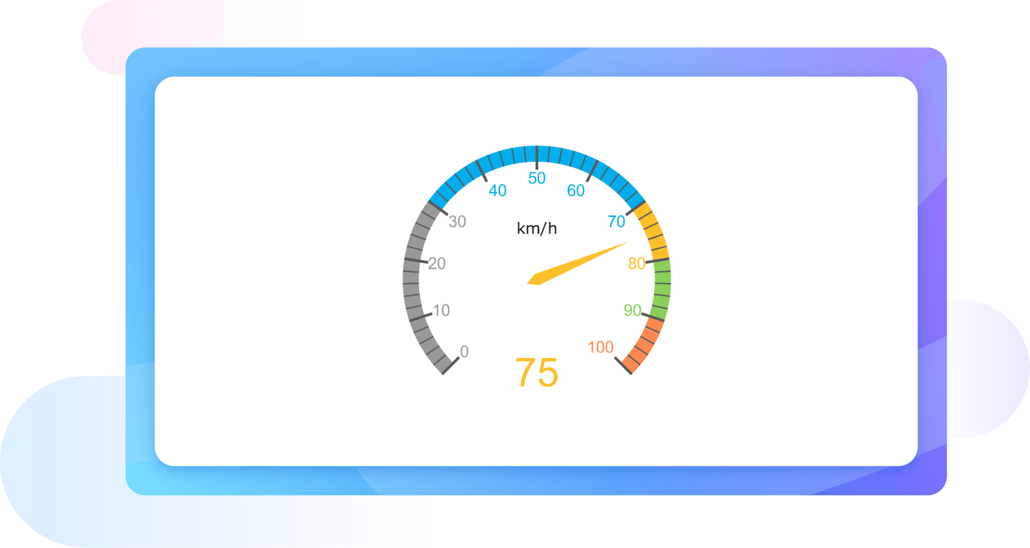
What is a gauge chart?A gauge chart, also known as a speedometer or dial chart, is a visual representation used to display a single value within a predefined range. It uses a needle to point to a specific data point along a curved scale, often divided into color-coded segments like red, yellow, and green.
-
What are the main components of a gauge chart?A standard gauge chart consists of several key elements: a circular or semi-circular scale representing the data range, a needle or pointer indicating the current value, and colored sectors that define specific performance levels. It also usually includes a central pivot point and clear labels for the minimum and maximum values.
-
How do I choose the right color segments for my gauge?Colors should be chosen based on the context of the data being measured. Typically, green represents positive or "safe" zones, yellow indicates caution or "mid-range" performance, and red signifies critical issues or danger. Ensure these colors align with your organization’s standard reporting conventions to maintain clarity and consistency for all viewers.
-
Can a gauge chart show multiple data points?Generally, a standard gauge chart is designed to represent a single metric. However, some advanced variations allow for multiple needles or nested arcs to compare a few related data points. While possible, this often makes the chart harder to read, so it is usually better to use separate, distinct gauge charts.
-
What is the difference between a gauge chart and a bullet chart?A gauge chart uses a circular dial to show progress, while a bullet chart uses a linear bar. Bullet charts are often considered superior for dashboards because they take up less space, are easier to read accurately, and can display additional context like historical averages or multiple specific target markers.
-
How do I determine the range for my gauge chart?The range should be based on realistic minimum and maximum values for the metric you are measuring. For example, if you are tracking a percentage, the range would typically be 0% to 100%. Setting appropriate boundaries ensures that the needle's position provides a meaningful, accurate, and helpful visual context for the viewer.
Stop drawing. Start describing.
AI diagramming isn't just text-to-diagram.
AI now understands any input, fetches live data, adapts through dialogue, and works everywhere.
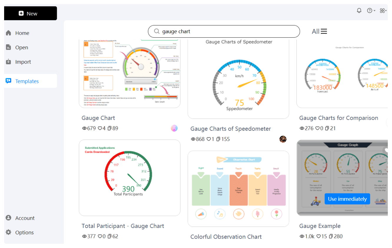
Free gauge chart templates from EdrawMax