Free online comparison chart maker
Easily visualize data and create customized comparison charts with our free comparison chart maker. Speed up your workflow with ready-made templates for quick and efficient chart creation.
Why Use EdrawMax Comparison Chart Maker?
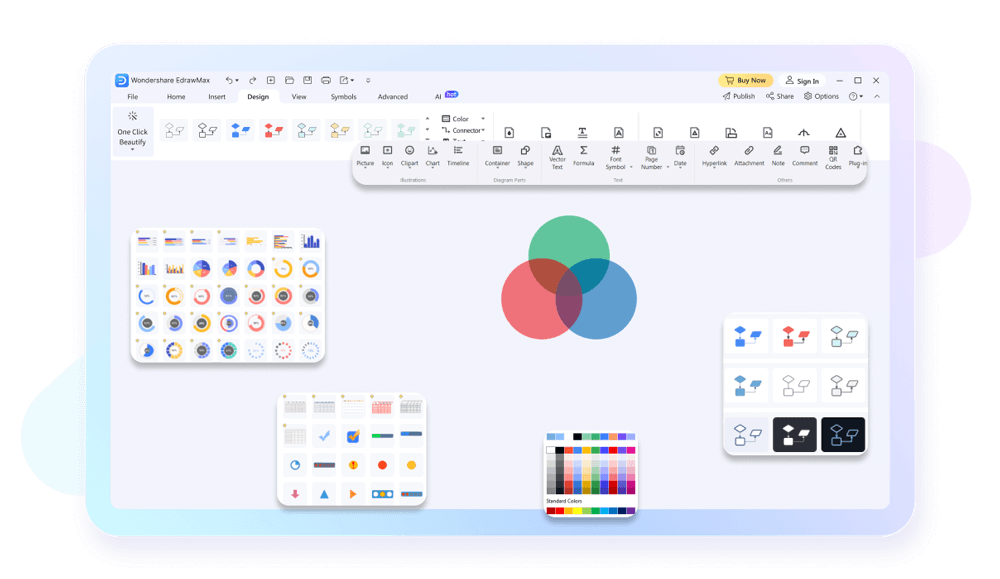
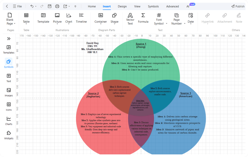
EdrawMax offers a comprehensive library of pre-designed templates, making it the ideal tool for comparison charts creation. These templates are designed to be easily editable, allowing you to adjust colors, shapes, and other elements to match your desired style and data presentation needs. Whether you need a bar graph comparison or a detailed comparison table, EdrawMax provides a template that fits your requirements perfectly.
One of the reasons why EdrawMax is the best free comparison chart maker is because of its user-friendly interface. The drag-and-drop functionality simplifies the chart creation process, allowing you to effortlessly create comparison charts like bar graphs. Its user friendly ensures that even first-time users can navigate the software with ease and create professional charts quickly.
With EdrawMax, you can collaborate seamlessly with your team. This allows multiple users to work on the same chart simultaneously. The collaboration feature, combined with commenting and feedback options, makes it easier to develop comprehensive charts. This functionality is invaluable for projects that require input from various stakeholders.

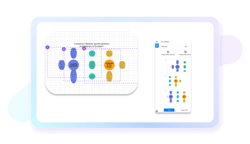
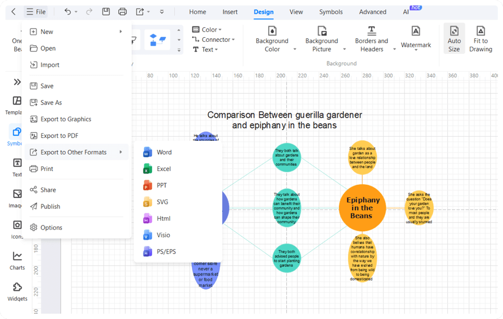
Once you've made your comparison chart on EdrawMax, you can use its presentation tools to impress your audience. Easily export your charts as PPTs and present them directly within the software. You can also add interactive features to make your presentations engaging. This ensures your comparison charts make a lasting impression in meetings, reports, or presentations.
How to Make a Comparison Chart in 3 Simple Steps
What our users say
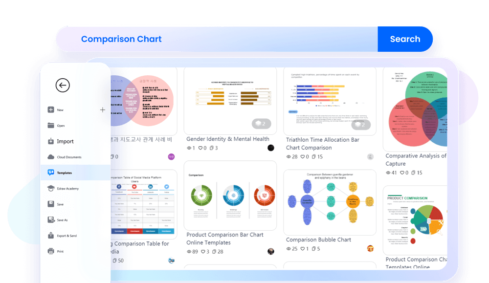
More Comparison Chart Tools
Discover more AI-powered diagram makers to boost your productivity.
FAQs About EdrawMax Comparison Chart Tools
-
What is a comparison chart?A comparison chart is a visual tool used to evaluate the similarities and differences between two or more items, such as products, services, or ideas. It organizes complex information into a clear, scannable format, helping users make informed decisions quickly without having to read through lengthy descriptions or technical specifications.
-
What are the common types of comparison charts?Common types include comparison tables, bar charts, and Venn diagrams. Tables are ideal for detailed feature lists, while bar charts effectively show numerical differences like price or performance. Venn diagrams illustrate overlapping qualities. Choosing the right type depends on whether you are comparing quantitative data, qualitative features, or conceptual relationships.
-
How many items should I include in a single comparison chart?To maintain readability, it is best to compare between three and five items at a time. Including too many options can lead to "choice paralysis" and overwhelm the reader. If you have many items, consider using a filterable table or grouping products into smaller, more relevant categories for better clarity.
-
Can comparison charts be used for qualitative data instead of just numbers?Yes, comparison charts are excellent for qualitative data. Instead of numerical values, you can use descriptive phrases, rating scales (like "Good," "Better," "Best"), or visual symbols to represent abstract qualities. This is particularly useful when comparing software features, service levels, or brand reputations where subjective experience is a key factor.
Learn about Comparison Chart
Stop drawing. Start describing.
AI diagramming isn't just text-to-diagram.
AI now understands any input, fetches live data, adapts through dialogue, and works everywhere.
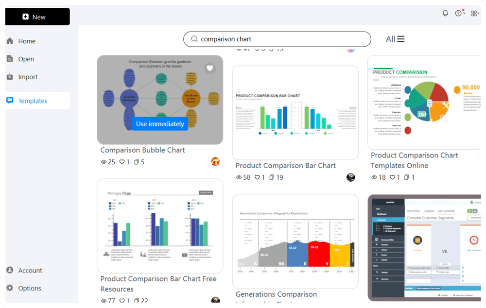
Free comparison chart templates from EdrawMax