Revamp your data presentation skills with our in-depth tutorial on creating compelling stacked bar charts in Power BI. Whether you're a novice or a seasoned pro, this guide will walk you through every step, from importing your data to customizing the chart's appearance.
Gain the confidence to transform raw information into visually impactful insights. Join us on this journey and explore the full potential of Power BI's visualization capabilities.
Contents of this article
Part 1. What is a Stacked Bar Chart?
A stacked bar chart is a visually intuitive way to represent and compare categorical data. Unlike a regular bar chart, a stacked bar chart displays multiple variables for each category, with each segment stacked on top of the others. This allows for a clear visualization of both the total and the composition of each category. Each segment's height corresponds to its value, making it easy to discern patterns, trends, and relative proportions within the data. Stacked bar charts are particularly useful for showcasing the relationship between different components within a whole dataset.
Part 2. Types of Bar charts:
In data visualization, choosing the right chart is crucial. Stacked bar charts find their strengths in various scenarios:
- Comparing Total and Sub-category Values: Stacked bar charts are ideal when you want to display both the total value and the breakdown of sub-categories.
- Tracking Changes Over Time: They are effective for tracking changes in data over multiple periods, highlighting trends and variations.
- Showing Composition: Stacked bar charts excel in displaying the composition of a whole, showcasing how different elements contribute to the overall total.
- Highlighting Relative Proportions: They help in emphasizing the relative proportions of sub-categories within different groups or categories.
Part 3. Stacked Bar Chart and Clustered Stacked Bar Chart
A stacked bar chart represents multiple data series stacked on top of each other, showing the total value as well as the composition of individual categories. In contrast, a clustered stacked bar chart groups different categories together, displaying them side by side, while still stacking data series within each category. This allows for easy comparison between different groups and their respective components.
Part 4. How to Create a Stacked Bar Chart in Power BI
Here are the steps to create a stacked bar chart in Power BI:
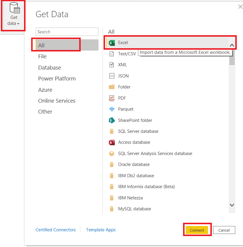
Step 1: Launch Power BI Desktop on your computer. Click on the "Home" tab in the ribbon. Select the data source you want to use (e.g., Excel, CSV, SQL Server, etc.). Connect to your data source and import the relevant dataset.
Step 2: Click on the "Report" view at the bottom of the Power BI window. In the Visualizations pane on the right, find the stacked bar chart icon (looks like two bars, one on top of the other) and click on it.
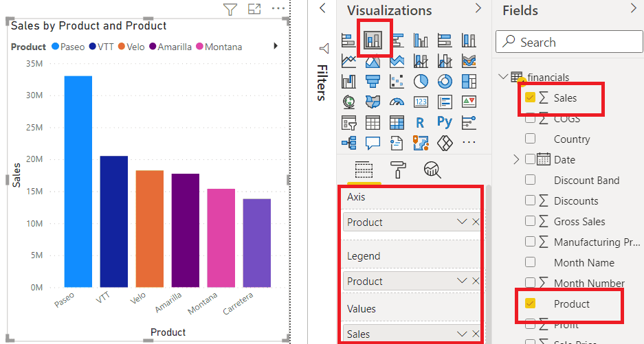
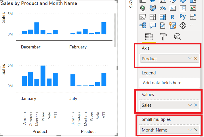
Step 3: In the Fields pane on the right, drag and drop the fields you want to use into the relevant areas.
Step 4: Drag another field into the "Values" area. This will stack the data in the chart. The first field you dragged will be the primary category, and the second field will be stacked on top of it.
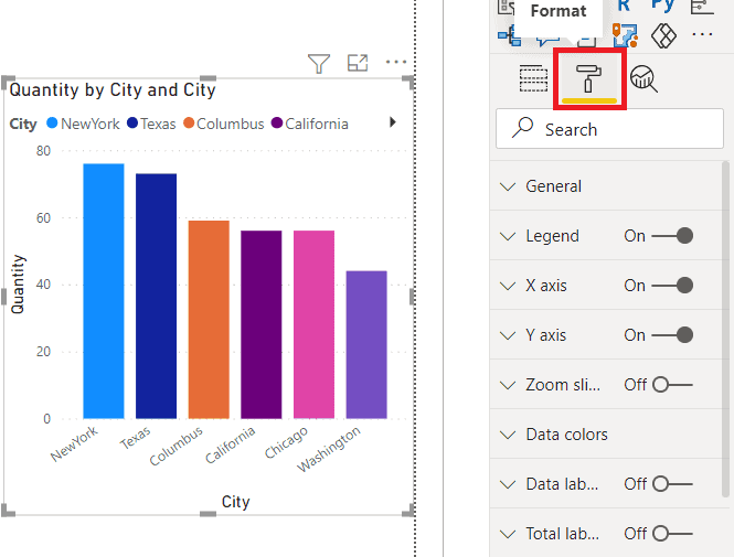
Step 5: Use the Visualizations pane to customize the appearance, labels, colors, and other settings of the chart.
Step 6: If you're using Power BI Service, save your report and publish it to your workspace.
That's it! You've now successfully created a stacked bar chart in Power BI. Remember, you can always go back and modify the chart or add more features as needed.
Part 5. Create a Stacked Bar Chart Easily With EdrawMax
Wondershare EdrawMax surpasses Excel in visual representation with its advanced tools, offering a wider array of customizable and professionally designed charts and diagrams. Its intuitive interface accommodates users of all levels, providing ease of use compared to Excel's charting tools. EdrawMax's multi-disciplinary functionality extends beyond data management, enabling the creation of various visual content, while its collaborative features enhance teamwork.
Additionally, EdrawMax's output is presentation-ready, ensuring a polished and professional look, making it a superior choice for creating impactful visualizations.
Here are the steps to create a stacked bar chart using EdrawMax:
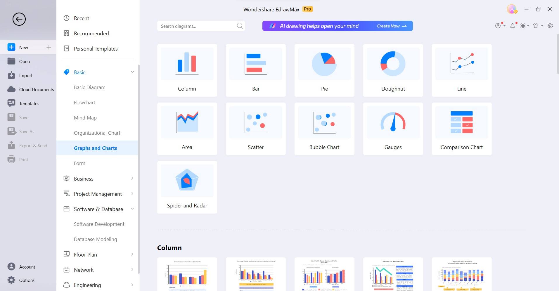
Step 1: Open the EdrawMax software on your computer. Click on the "File" menu and select "New" to start a new drawing. Choose "Graphs and Charts," then select "Bar Chart."
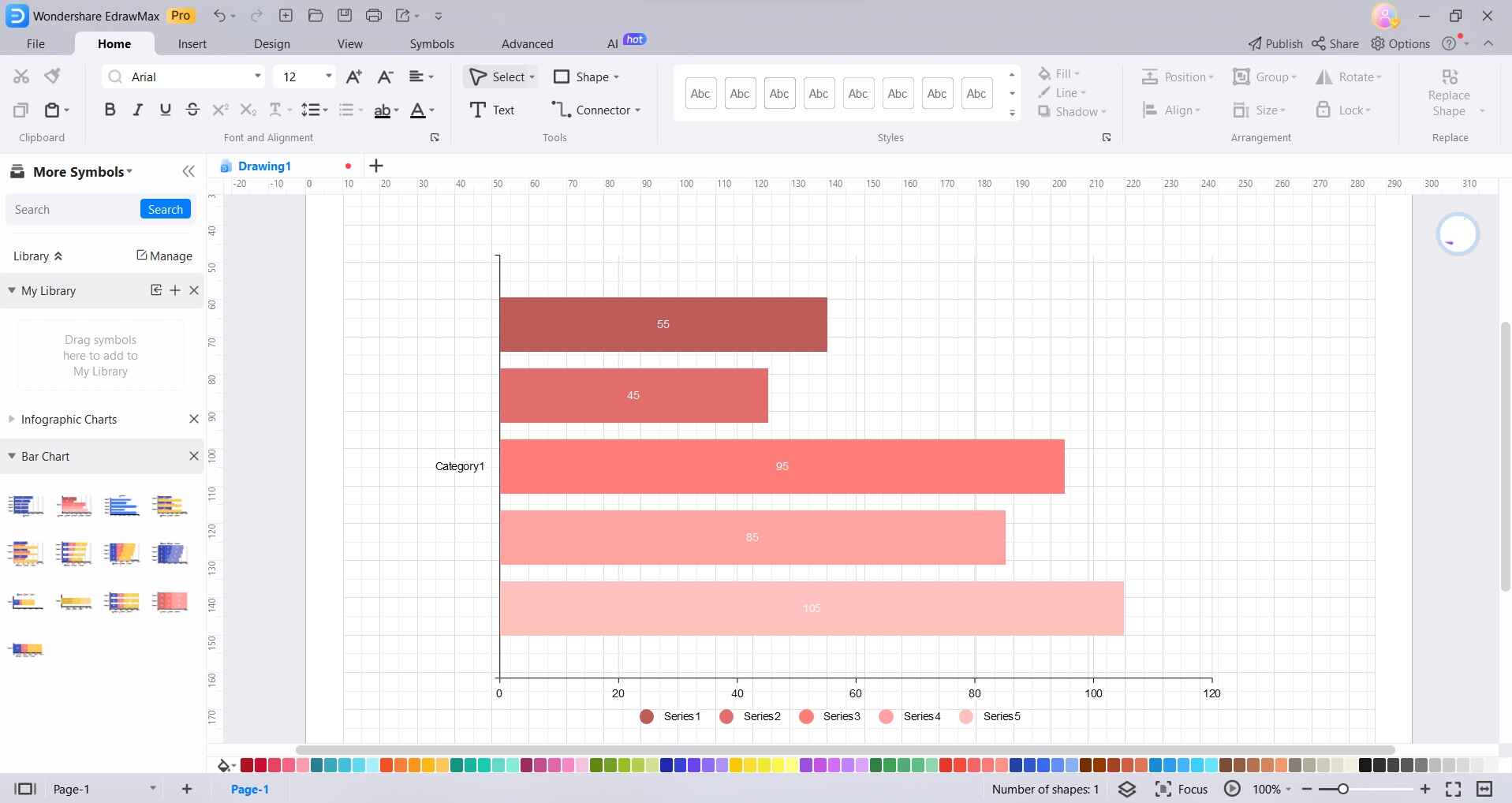
Step 2: On the blank canvas, start creating your chart. Drag and drop the stacked bar chart from the left menu pane.
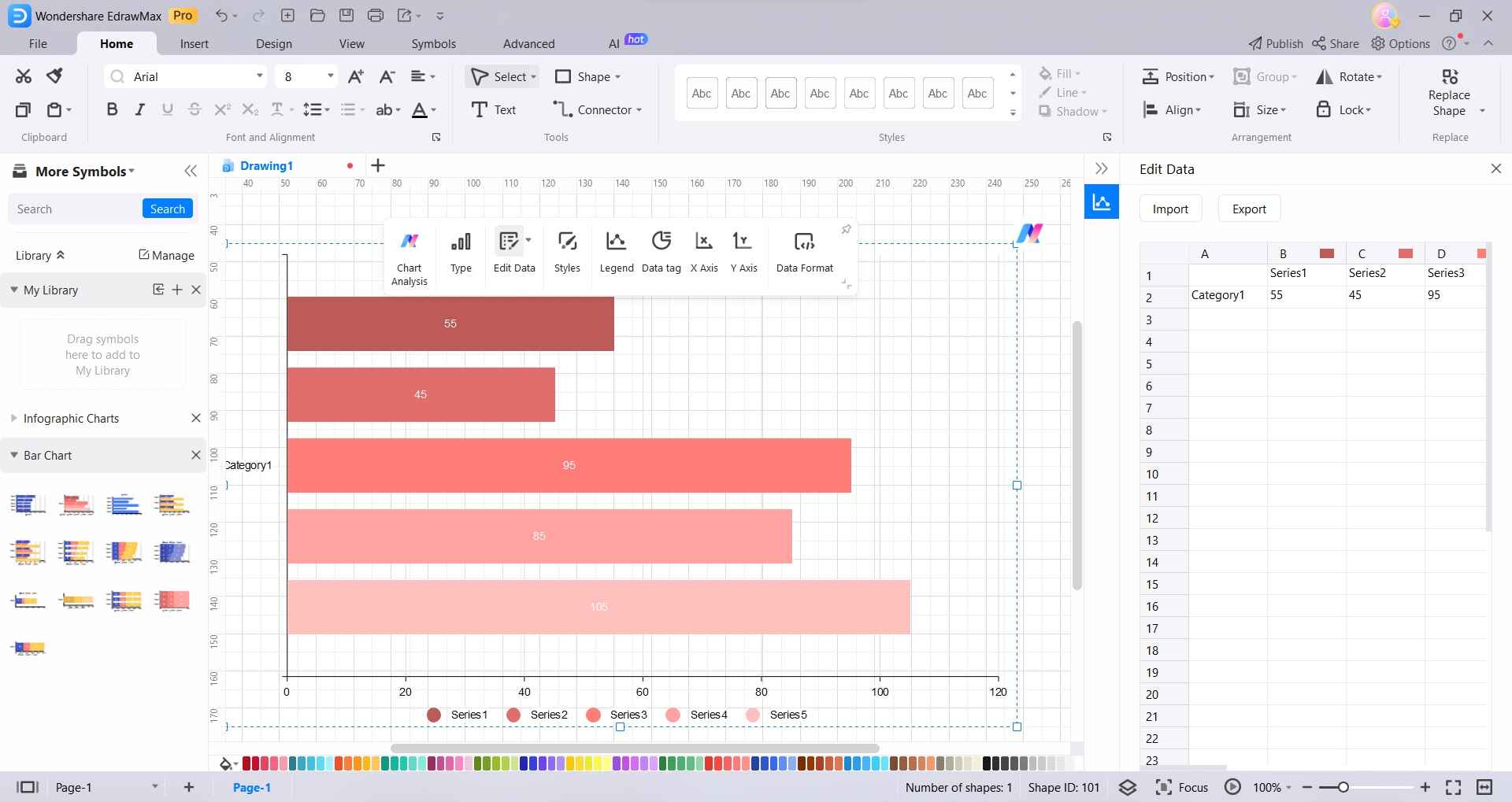
Step 3: Double-click on the chart and select “Edit Data”. A spreadsheet-like editor will appear. Input your data into the rows and columns provided. You can customize the data labels by right-clicking on them and selecting "Edit Data" to change the values.
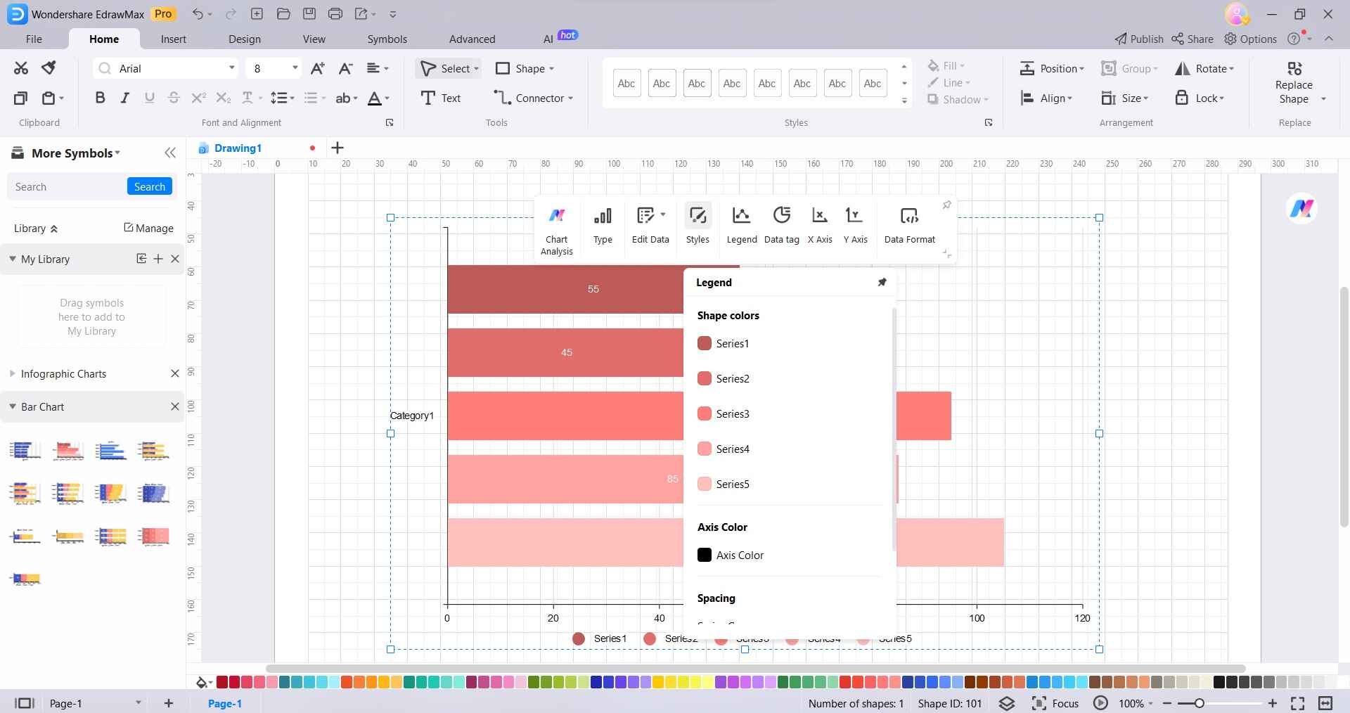
Step 4: Click on the chart to select it. Use the Format panel on the right to customize elements like colors, fonts, and styles.
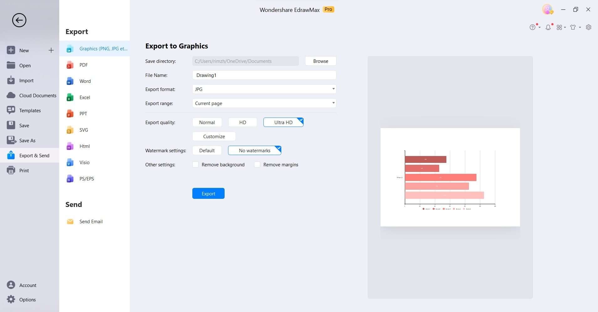
Step 5: Click on "File" and select "Save" to save your stacked bar chart project. Once you're satisfied with the chart, navigate to File> Export and Send to export it as an image or directly insert it into a document or presentation.
Part 6. Tips for Creating an Optimal Stacked Bar Chart
- Limit Categories: Keep the number of categories manageable to avoid cluttered charts.
- Clear Labeling: Ensure each category and segment is clearly labeled for easy interpretation.
- Consistent Color Scheme: Use consistent colors for similar categories across different charts for better comparison.
- Order Matters: Arrange categories strategically based on their significance or natural progression.
- Minimize Overlapping: Avoid overlapping bars to prevent visual confusion and ensure accurate data representation.
- Utilize Tooltips: Add tooltips for additional information or details when users hover over specific elements.
- Choose Appropriate Scale: Select the right scale to accurately represent data without distorting proportions.
Conclusion
In conclusion, creating stacked bar charts in RStudio or the user-friendly EdrawMax enables analysts and professionals to effectively communicate insights. While R caters to advanced users, EdrawMax offers a more accessible alternative. The stacked bar chart remains a vital asset, providing a comprehensive view of data and facilitating seamless comparisons. This expertise significantly enhances decision-making and communication across various industries and disciplines.