


A pie graph is a circular graph that divides a circle into sections, each representing a distinct group or category of data. Industries like finance, marketing, education, etc., benefit from its ability to transform complicated data into visually appealing representations. It is used to visualize spending plans in the finance realm and disclose market share in the marketing realm.
This article is meant to be a comprehensive resource for learning about pie charts. We'll go through everything from how to make one with a pie graph maker to a close look at some instances. Join us to learn the ins and outs of creating beautiful pie charts, whether you're a starting student or a seasoned professional looking to sharpen your abilities.
In this article
Part 1. History of Pie Charts
William Playfair, a Scottish engineer and economist, is credited with developing the first pie chart in the 18th century. Playfair is sometimes credited as the inventor of the pie chart, a crucial tool in data visualization.
The famous British nurse and statistician Florence Nightingale didn't start using pie charts in her writings until the 19th century, which is when they were well-known and used. Using pie charts, she showed how advancements in cleanliness and medicine had reduced deaths during the Crimean War.
With the development of new technologies and data processing methods, pie charts have since become a standard method of displaying information. Because of their long history of use and continued relevance, they are an essential component of today's data visualization techniques.
Part 2. Components of a Pie Chart
Familiarizing with a pie chart's components is essential for efficient data visualization and interpretation.
Basic Components
A pie chart consists of several essential components:
- Title: A pie chart's title is an informative phrase or two that puts the visual in perspective. It explains to readers what the chart is showing them.
- The Legend: The legend is essential to the pie chart since it describes the various sections. Labels for each section are color- or pattern-coded to facilitate comprehension.
- Data: Each pie slice in the whole, represents the data of the chart. The data is differentiated by using different colors.
- Data Label: The numbers or percentages corresponding to each pie slice representing the data are known as data label.
Part 3. Pros and Cons of Pie Charts
Following are some of the major pros and cons of pie charts:
Pros
- Complex Data: They simplify complex topics so that even readers with no background in data analysis can understand the material.
- Enhancing Visual Impact and Engagement: Pie charts' aesthetic attraction and interest are undeniable. Their round form and colorful sections make the information they present more engaging and easy to remember.
- Facilitating Easy Comparisons and Understanding: Pie charts make it easy to see how two groups measure against one another. In this way, viewers can rapidly understand how each subsection relates to the entire, improving their knowledge of the data's distribution.
Cons
- Data Limitations and Suitability: Pie charts can be the best for some datasets. However, their usefulness decreases when the number of categories increases or the data doesn't add up to 100%.
- Potential Distortions and Misrepresentations: Pie charts can occasionally skew the overall picture when dealing with little data. Misunderstandings can occur while trying to distinguish between similarly sized parts.
- Alternative Chart Types for Specific Scenarios: It's not always best to use a pie chart to display information. In some cases, such as when comparing data across numerous variables or displaying patterns over time, other chart formats, such as bar charts or scatterplots, can be preferable.
Part 4. Types of Pie Charts
The following are the well-known types of pie charts:
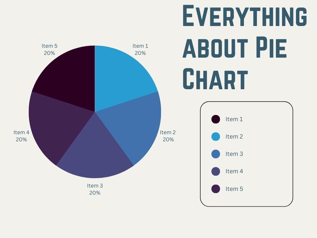
Simple Pie Chart (water usage pie chart)
A simple pie chart has a complete circle cut into sections, each representing a distinct feature or category.

 below.
  below.
 Doughnut Pie Chart
Doughnut charts are more space-efficient than regular pie charts. They work especially effectively when you need to draw attention to the connection between the whole and its component components while simultaneously drawing attention to the distribution within those portions.

Simple 3D Pie Charts
Each slice in a 3D pie chart is a different size and angle and stands out from the chart's surface, making for a more eye-catching image.

Pie of Pie Chart
The Pie of Pie chart is a unique variation on the common pie graph. It's used when there's a great disparity in the sizes of several data types. This chart is ideal to keep your data presentation clean and easy to understand.

Part 5. Use Cases and Examples
Many applications and examples of pie charts exist; we'll look at a few more common pie graph examples with an explanation below.
Business and Marketing Applications
Market share, spending, and revenue are just a few business and marketing metrics that benefit greatly from the visual representation provided by pie charts.
The percentage of total sales provided by each product category can be graphically represented, for instance, using a pie chart. Pie charts can show the demographic composition of a target audience, which is useful for marketing campaigns and fine-tuning advertising methods.
Educational and Research Purposes
Pie charts are a common tool for educators and scientists to display information visually. A pie chart, for instance, can illustrate the percentage of pupils from various ethnic groups attending a given school.
Pie charts are also useful in the sciences because they simplify the presentation of complicated data by illustrating at a glance how different parts contribute to the overall structure of a compound.
Healthcare Resource Allocation
Pie charts can be helpful in the healthcare industry for distributing scarce resources.
For instance, a hospital can use a pie chart to show how much money goes to various services like surgery, emergency care, and diagnostics. This depiction helps hospital managers choose where to put limited financial and material resources.
Part 6. Interpreting Pie Charts
Learning how to deconstruct and interpret pie charts can help people get new perspectives and make better decisions based on data presented graphically.
Analyzing Proportions and Percentage
Analysts can use pie charts to quickly and easily visualize the distribution of data points across many categories. Pay close attention to the individual slices' percentages and sizes to make sense of them.
Identifying Trends and Patterns
Pie charts can show more than relative sizes and percentages. Keep an eye out for trends, such as a disproportionately large or small slice, since they can indicate interesting outliers.
Preventing Frequent Misunderstandings
Avoid simple misunderstandings, such as thinking that a bigger piece must mean more money. Ensure the numbers add up to 100 percent, and don't cram too many categories onto the chart, which can confuse you.
Part 7. How to Create a Pie Chart
For effective data visualization, follow these simple steps to make a pie graph design. In the following, we'll look at making a pie graph, from gathering and organizing data to using various software and online resources.
Organization and Preparation of Data
You should perform the following to get the most useful information from a pie chart.
- Gather Information: The first step in making a pie chart is to collect the information that will go into it. Verify that your information is correct, exhaustive, and appropriate for the intended purpose.
- Sort Your Information: Sort your information into distinct groups. The pie chart will be divided into sections, one for each category. Make sure there is no overlap between the various classifications.
- Percentage Calculation: Determine the share that each group has in the whole. Multiplying the result by 100 can be considered dividing the value of each category by the sum of all values.
- Verify the Accuracy of Your Data: Check your numbers and data to ensure your pie chart is correct.
Popular Software and Tools for Pie Chart Creation
Several Pie graph generator programs and tools are available to make a pie chart. Some common choices are:
- Microsoft Excel: Making a pie graph in Excel is a common usage. It has an intuitive layout and convenient charting features, so it's simple to construct a pie chart from your data.
- Google Sheets: Making a pie chart in Google Sheets can be a group effort, and it's free! It can perform the same functions as Excel and can be accessed from anywhere in the world with an internet connection.
- Tableau: Pie charts are only one of the many chart types available in Tableau, a robust data visualization tool. Because of its adaptability and high-tech qualities, it is widely used in the business world.
- EdrawMax: EdrawMax is a flexible pie graph generator diagramming tool that makes making beautiful, high-quality pie charts easy. Its user-friendly layout and adaptability make it a great alternative for those who want to quickly and easily create professional-looking pie charts.
Part 8. Tips for Effective Pie Chart Usage
It's important to follow these guidelines to make sure your pie chart conveys your facts clearly:
Choosing the Right Chart for the Data
The optimum use of a pie chart is to illustrate a subset of a whole. So, choosing a suitable chart for data is essential! The following are the key points that must be considered when choosing the right chart.
Facilitating Understanding and Conciseness
Don't complicate things; a simple pie chart will do. Keep the number of categories to a minimum, name them clearly, and strive for an uncluttered layout to maximize readability.
Incorporating Accessibility and Inclusivity
Choose color schemes accessible to all visitors and provide alternate language for the visually impaired to increase your pie chart's reach.
Conclusion
Pie charts are an essential method of summarizing and presenting information. They make it easy to understand complicated data and spot patterns. To make decisions based on facts, you need to master their development and interpretation.
The visual link between data and comprehension is maintained through pie charts. If you put this knowledge to use, you can improve your data visualization skills and use them to communicate better, inform, and persuade.
AI Diagram Generator
Enter your prompt. Upload files if needed. Generate diagrams, charts, or slides instantly.


