
In the realm of data-driven decision-making, effective communication is key. Stacked graphs, a powerful visualization tool in Excel, offer a dynamic way to showcase complex data sets. This guide will walk you through the process of creating stunning stacked graphs step by step. Whether you're a seasoned Excel user or just beginning your data visualization journey, this tutorial will equip you with the skills to present information with clarity and impact. Get ready to transform your data into compelling visual narratives!
In this article
Part 1. What is a Stacked Graph?
A stacked graph Excel is a powerful tool that allows for the clear representation of multiple variables within a single data set. Unlike traditional graphs, which display individual data series side by side, a stacked graph presents them on top of one another. This enables viewers to not only observe the individual contributions of each category but also grasp the total value they collectively represent. This foundational understanding sets the stage for harnessing the full potential of stacked graphs in Excel.
Part 2. Types of Graphs in Excel
Before we dive into the world of Excel graphs, it's essential to understand the different types at your disposal and how they can best serve your data visualization needs."
#1 Stacked Graph Excel
Effortlessly organize and compare multiple datasets in Excel with Stacked Graphs. This visualization technique layers information for clear insights into individual and collective contributions.
#2 Combo Graph Excel
Combine different chart types seamlessly in Combo Graph Excel. This versatile approach provides a holistic view of diverse data sets, enhancing your ability to draw meaningful conclusions.
#3 Cluster Graph in Excel
Efficiently display distinct data series side by side using Cluster Graphs in Excel. This method facilitates easy comparisons and reveals important patterns within your dataset.
Part 3. How to Create a Stacked/Cluster Graph in Excel
Here are the steps to create a graph in Excel:
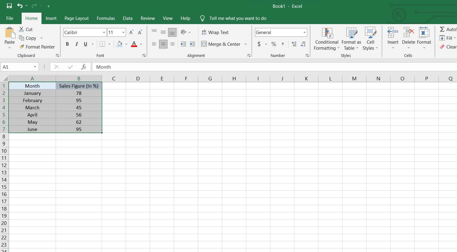
Step 1: Start by entering your data into an Excel spreadsheet. Ensure that it's well-organized, with clear labels for each column or row.
Step 2: Highlight the range of cells that you want to include in the graph.
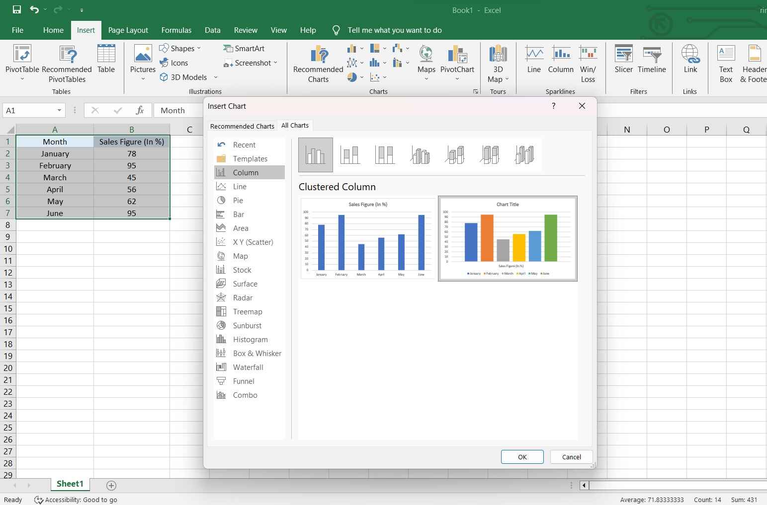
Step 3: Go to the "Insert" tab on the Excel ribbon. Click on the type of chart you want to create (e.g., Column, Line, Pie, etc.).
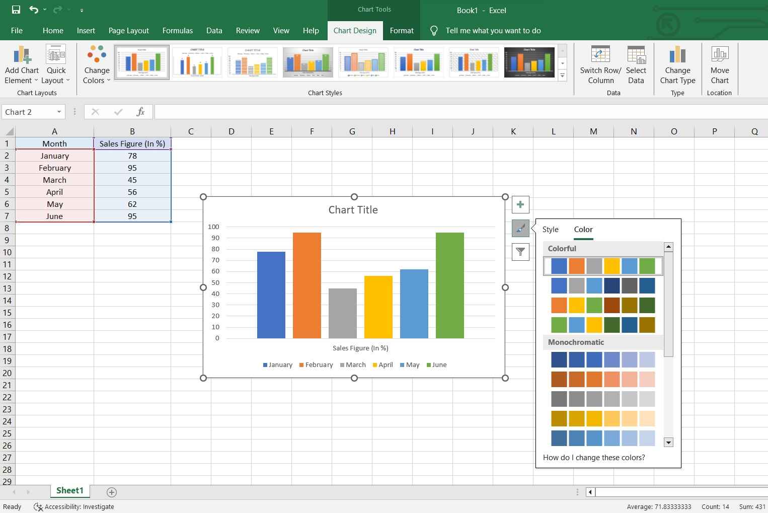
Step 4: Excel will generate a default chart. You can customize it further by:
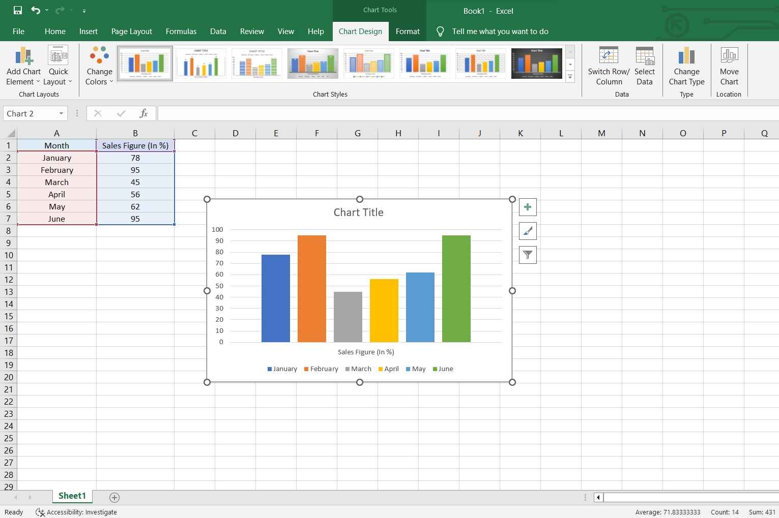
- Adding titles and labels.
- Changing the chart style and colors.
- Adjusting the axis scales and formatting.
Step 5: If you want to change the data included in the graph, right-click on the chart and select "Select Data." From there, you can modify the data range.
Step 6: Explore additional options in the Excel ribbon to fine-tune the appearance and behavior of the chart.
Step 7: If you want to share the chart, go to "File" > "Print" or save it as an image to include in reports or presentations.
That's it! You've successfully created a graph in Excel. Remember, practice and experimentation will help you become more proficient in creating and customizing charts to suit your specific needs.
Part 4. Create a Bar Graph Easily With EdrawMax
EdrawMax offers a distinct advantage over Excel when it comes to creating bar graphs and other visualizations. While Excel is primarily a spreadsheet software, EdrawMax is designed specifically for diagramming and visualization. This specialization results in a more intuitive and streamlined process for creating charts.
EdrawMax's user-friendly interface, vast template library, and drag-and-drop functionality simplify the graph creation process, making it accessible to users of all skill levels. It also provides a wider range of customization options and an extensive library of symbols, ensuring that users can effortlessly create professional-quality bar graphs and other visuals with precision and ease.
Here are the steps to create a bar graph using EdrawMax:
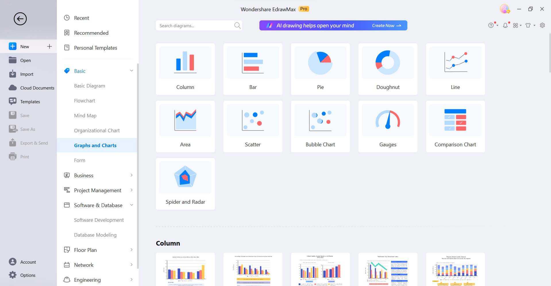
Step 1: Launch the EdrawMax software on your computer. Click on the "Graphs and Charts" category and choose a bar graph that suits your data.
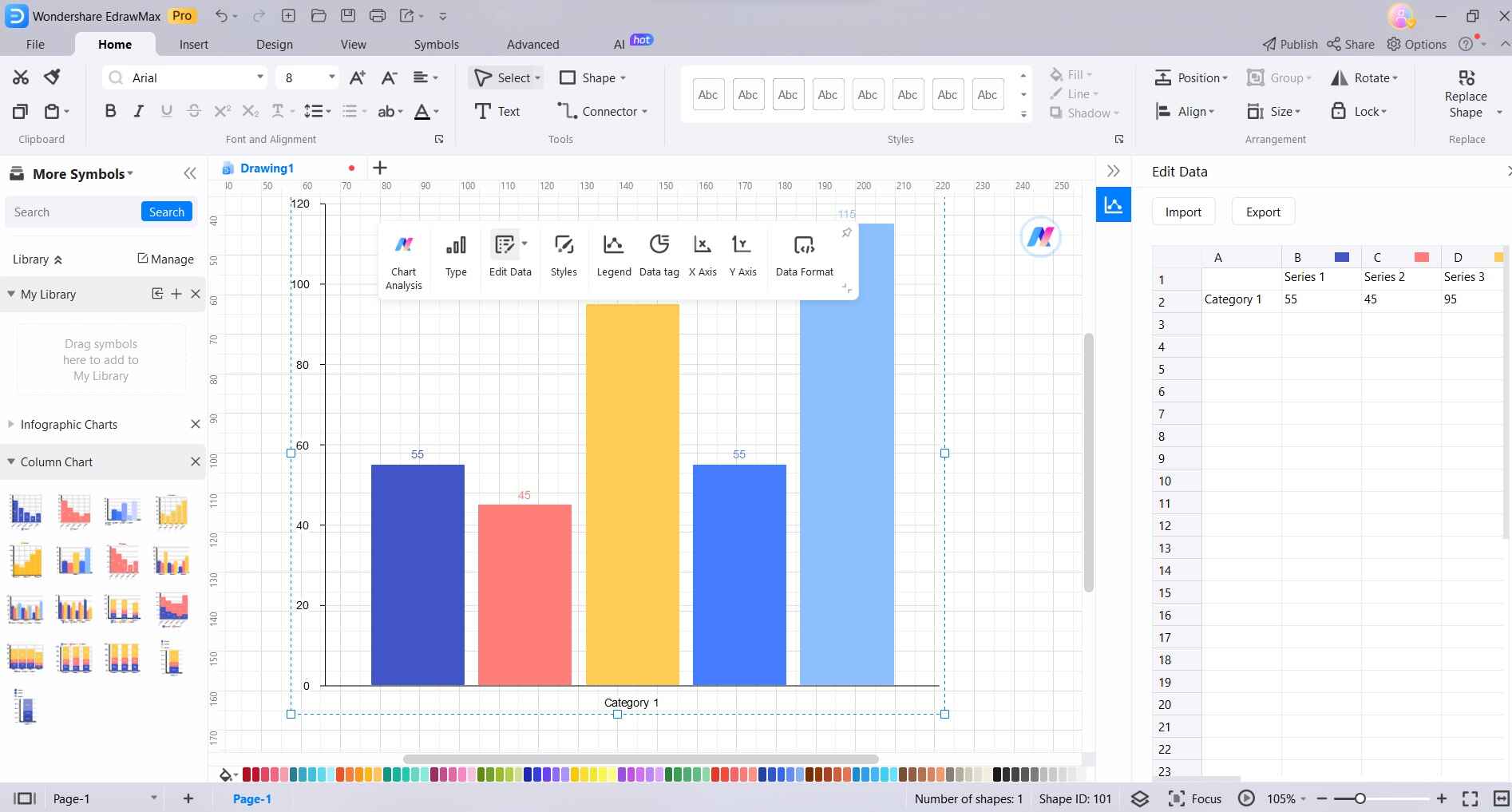
Step 2: Double-click on the bars or use the data table to input your own data values. EdrawMax will automatically update the graph.
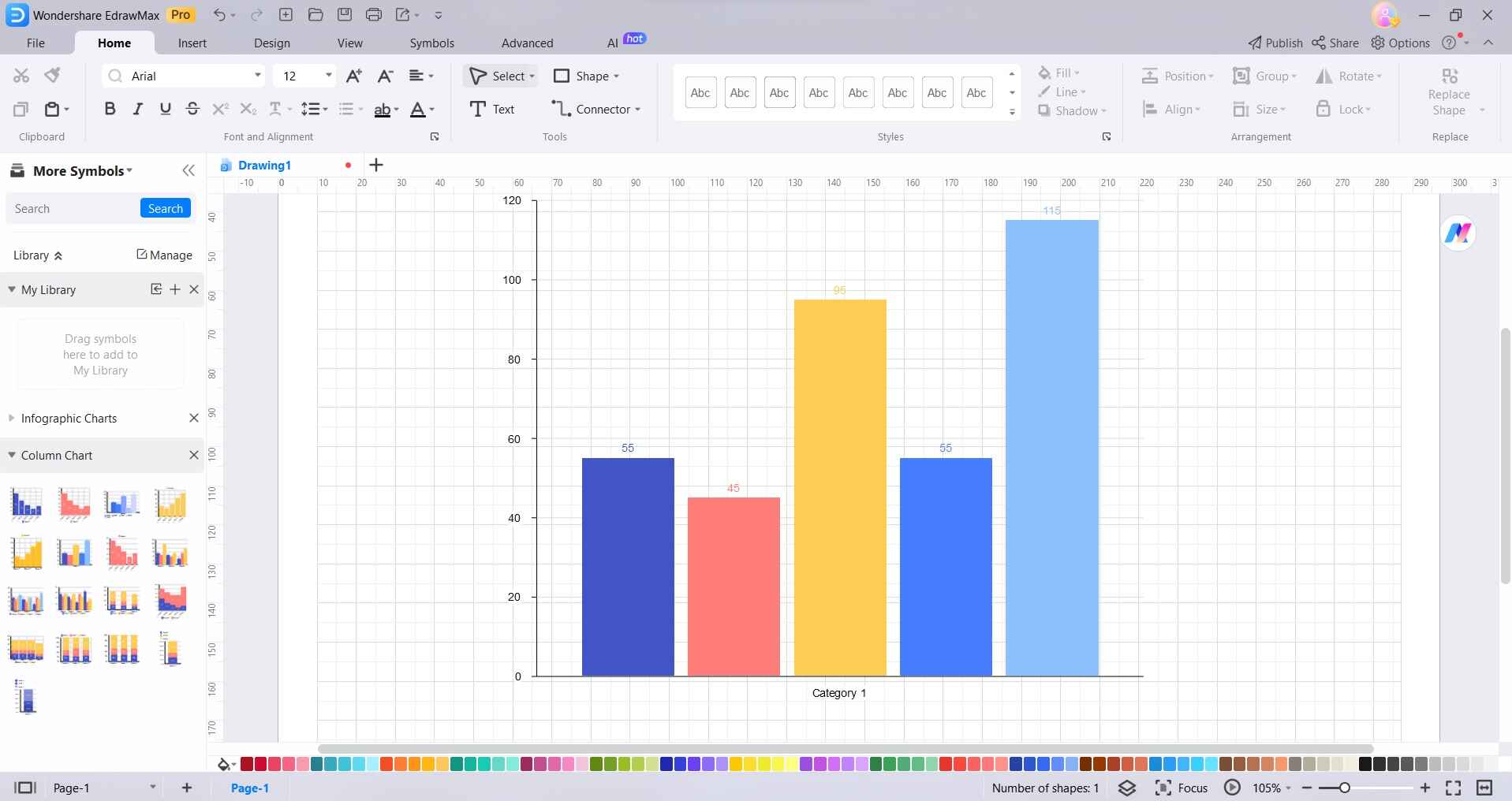
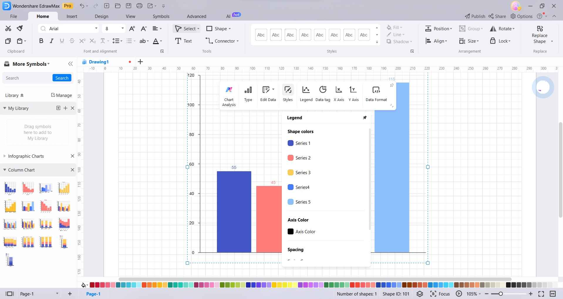
Step 3: Adjust the color, style, and thickness of the bars as per your preference. Modify the labels, titles, and axis names to reflect your specific data.
Step 4: EdrawMax offers various features like adding data points, trend lines, annotations, and more to enhance your bar graph.
Step 5: Click on the "File" menu and select "Save" to save your bar graph. You can export the graph in various formats (e.g., PNG, PDF, etc.) or directly share it with others.
EdrawMax streamlines the process of creating bar graphs with its intuitive interface and extensive customization options, ensuring that you can effortlessly generate professional-quality visualizations for your data presentations.
Part 5. Best Online Tools to Create Graph and Charts
Here are some of the best online tools to create graphs and charts

EdrawMax stands out as a top choice for creating a wide range of graphs and charts. Its intuitive interface, vast template library, and extensive customization options make it a go-to tool for professionals and beginners alike. With EdrawMax, users can effortlessly generate visually appealing and accurate visual representations of their data.
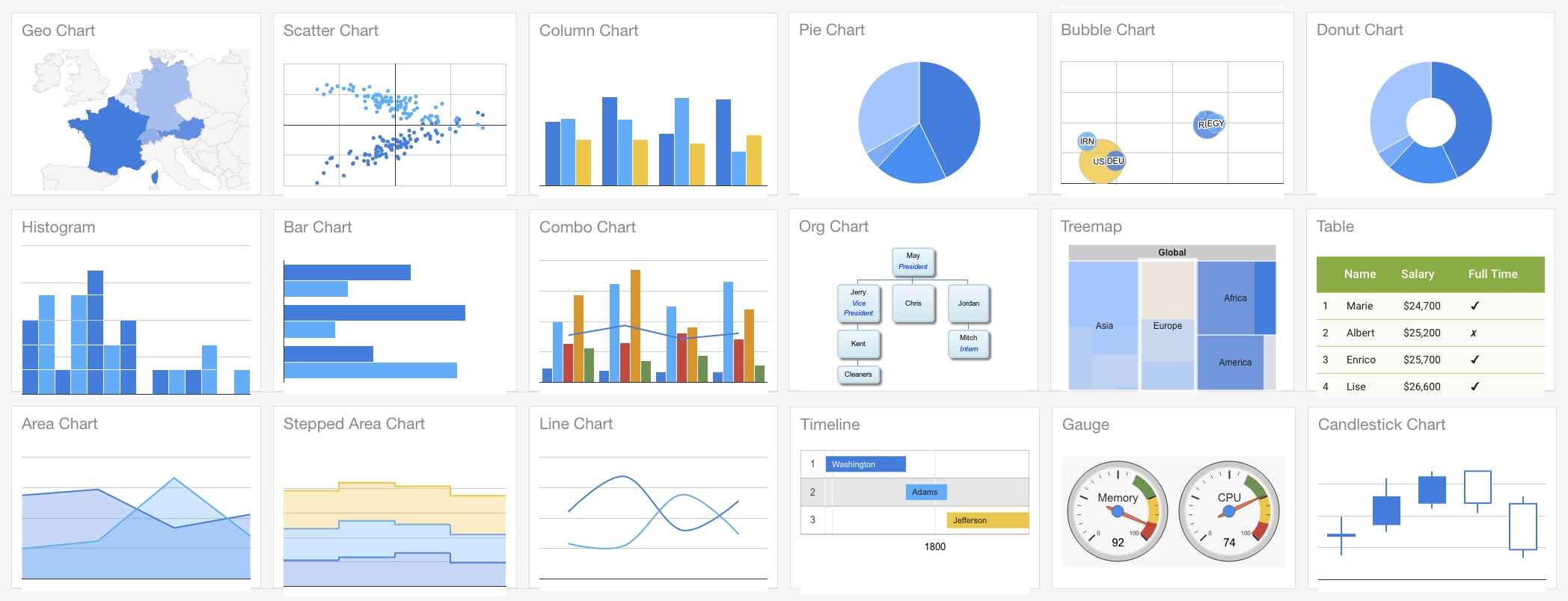
Google Charts provides a powerful and free toolset for creating dynamic and interactive charts. Integrated with Google Sheets, it allows for real-time data updates and easy sharing. With a variety of chart types available, Google Charts is an excellent choice for those looking for a reliable and collaborative online charting tool.
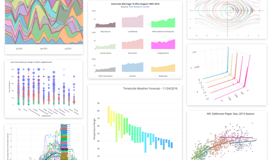
Plotly is a robust data visualization tool that caters to both individuals and teams. It offers a wide array of chart types and provides the flexibility to create static or interactive visuals. With features like cloud syncing and easy sharing options, Plotly is a solid choice for data-driven professionals.
Conclusion
In summary, mastering the art of creating graphs and charts is essential for effective data presentation. Wondershare EdrawMax takes the lead with its intuitive interface and robust customization features, making it a top choice for professionals and beginners alike. Its extensive template library ensures that a wide range of data can be beautifully visualized.
With EdrawMax, you have a powerful tool at your fingertips to convey complex information with clarity and precision, ultimately enhancing your ability to make informed decisions based on your data.