Free online histogram maker
Create stunning histograms easily with EdrawMax, the ultimate online histogram creator.
Why Use EdrawMax Histogram Maker?
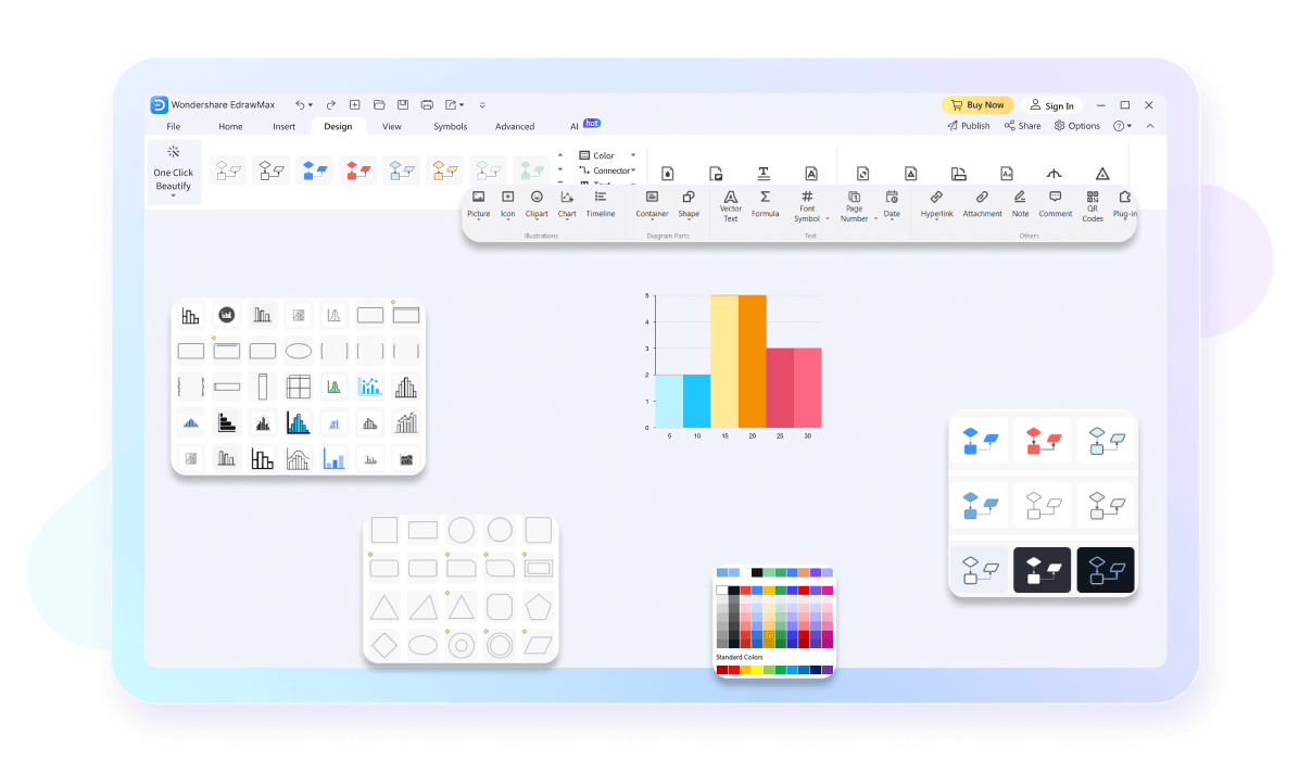
EdrawMax comes with professionally-designed histogram templates. Whether you’re visualizing sales data, survey results, or scientific measurements, we’ve got the right template uploaded for you. Our ready-made examples ensure a quick start to your projects, making it an excellent histogram generator for any need.

Customize every aspect of your histograms, from colors and fonts to labels and scales. EdrawMax provides the flexibility to create visually appealing and informative histograms. This flexibility makes EdrawMax a top choice for personalized histogram creation.
Keep your histogram data safe with EdrawMax’s super secure cloud storage. Our secure storage uses strong encryption and regular backups to protect your information from unauthorized access and loss. Enjoy peace of mind knowing your data is always secure, even if you forget to save.

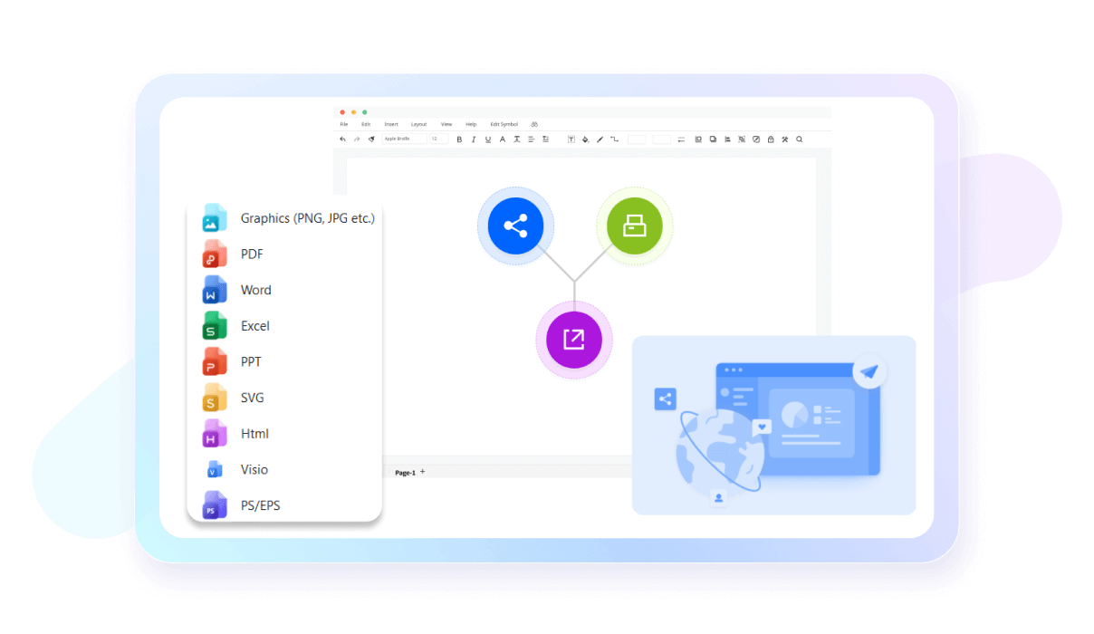
Export your histograms in multiple formats, including PNG, PDF, and SVG. EdrawMax makes sharing your histograms easy, whether you need to present them in a corporate meeting or include them in a report. All you need is choose a template, add your data, and export in more than 14 formats. This versatility enhances its practicality as a histogram chart maker.
How to Make a Histogram in 3 Simple Steps

What our users say
More Histogram Tools
Discover more AI-powered diagram makers to boost your productivity.
FAQs About EdrawMax Histogram Tools
-
What is the main difference between a bar chart and a histogram?Histograms are used to visualize the distribution of numerical data across continuous intervals, whereas bar charts compare discrete categories. Use a histogram when you need to see the frequency of data points within specific ranges, such as age groups or price brackets, to identify patterns or outliers.
-
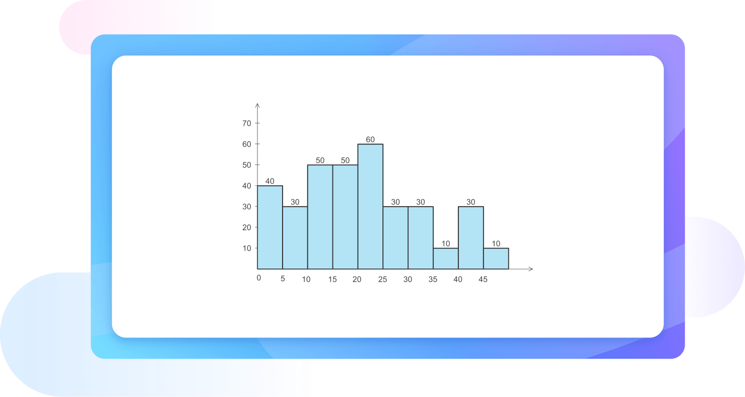
What exactly is a histogram?A histogram is a graphical representation used to show the frequency distribution of a continuous dataset. It organizes data into specific ranges, called bins, and uses adjacent bars to represent how many data points fall within each range. This helps you quickly visualize the underlying patterns and spread of your information.
-
How does a histogram differ from a standard bar chart?While they look similar, histograms represent continuous data, whereas bar charts show categorical data. In a histogram, the bars touch to signify a continuous range, while bar charts have spaces between categories. Histograms focus on the distribution of values, whereas bar charts compare specific, independent groups or individual items.
-
How to read a histogram?To read a histogram, look at the horizontal x-axis for the data ranges and the vertical y-axis for the frequency. The height of each bar indicates how many data points exist within that specific interval. Look for the peak to find the most common range and check the spread.
-
What are bins in a histogram and why do they matter?Bins are the consecutive, non-overlapping intervals used to group data points on the x-axis. They are crucial because their width determines how the data is summarized. If bins are too wide, you might lose important details; if they are too narrow, the chart may become cluttered and hard to read.
-
What does it mean when a histogram is described as "skewed"?Skewness refers to the asymmetry of the data distribution. A right-skewed histogram has a long tail pointing toward higher values, meaning most data is concentrated on the left. Conversely, a left-skewed histogram has a tail pointing toward lower values. This reveals whether your data leans heavily toward one extreme end.
-
What is a bimodal histogram?A bimodal histogram features two distinct peaks instead of one. This usually suggests that the dataset contains two different groups or populations with different characteristics. For example, a histogram of heights might be bimodal if it includes both children and adults, showing a separate peak for each distinct age group.
Stop drawing. Start describing.
AI diagramming isn't just text-to-diagram.
AI now understands any input, fetches live data, adapts through dialogue, and works everywhere.
Free Histogram templates from EdrawMax