Stacked bar charts are a widely used tool for visualizing data. They are one of the most popular forms of charts. They make it easy to see patterns and comparisons.
Power BI, a trusted data visualization tool, offers a straightforward way to generate these charts. Discover leveraging stacked bar charts in Power BI to enhance your data analysis skills. In this article, you'll explore how to create stacked bar charts with Power BI. These charts are great for showcasing data with multiple categories.
In this article
Part I. How To Make a Stacked Bar Chart on Power BI
Power BI is a game-changer when it comes to data analysis and stacked bar charts. Its user-friendly interface makes it easier for businesses to convert raw data into valuable insights. One of its many features is creating a stacked bar chart, a great way to visualize data clearly and concisely.
The process is straightforward. You can create a chart with a few clicks to help you make informed decisions. Whether you're a beginner or an experienced user, Power BI has something to offer everyone. Here's how you can create a stacked bar chart in Power BI, step by step:
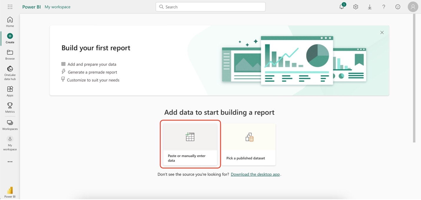
Step1
On the app's homepage, under Create, click Paste or manually enter data.
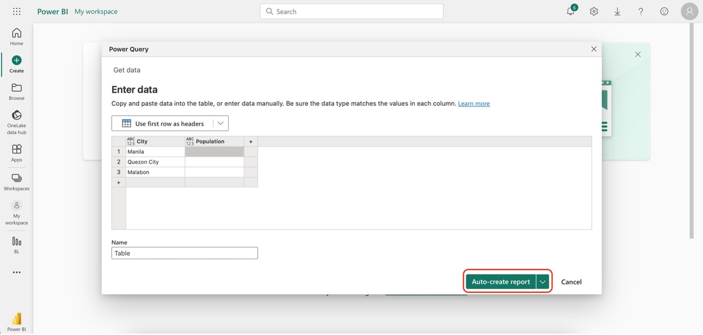
Step2
Type in your data. Once you're done, click Auto-create report.
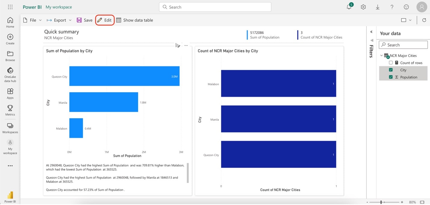
Step3
Once the app loads the data, you should see a stacked bar chart in the output. However, if there are no stacked bar charts, click Edit.
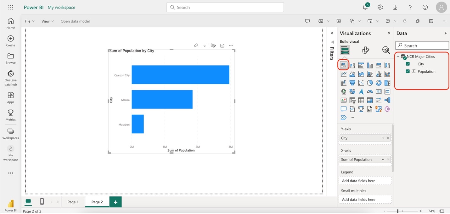
Step4
Click the Stacked bar chart button under Visualizations. Then, once it's on the canvas, tick all the boxes for your data under Data. It should now show you the same stacked bar chart in the previous screenshot.
Part II. Wondershare EdrawMax: A Simpler But More Powerful Alternative Tool
Wondershare EdrawMax is an excellent alternative for creating stacked bar charts over Power BI. It offers a range of features and advantages that make it a compelling choice:
- User-Friendly Interface. EdrawMax boasts an intuitive interface that allows users of all levels to create stacked bar charts easily.
- Customization. The tool provides extensive customization options, enabling you to tailor your stacked bar charts to suit specific needs.
- Vast Template Library. EdrawMax offers an extensive library of templates, including pre-designed stacked bar chart templates. You can start with a template and modify it as needed.
- Collaboration. Collaborate in real-time with team members on chart creation, ensuring everyone is on the same page.
- Cross-Platform Compatibility. EdrawMax works seamlessly on various platforms, including Windows, macOS, and Linux.
Why EdrawMax?
Wondershare EdrawMax offers distinct advantages over Power BI for creating stacked bar charts, making it an appealing choice for many users. Here are some key benefits:
Ease of Use
EdrawMax boasts a user-friendly interface that welcomes beginners and experienced users. Power BI, on the other hand, can be complex, especially for those not well-versed in data analytics and visualization. EdrawMax simplifies the chart creation process, making it easy to design stacked bar charts without a steep learning curve.
OS Flexibility
EdrawMax is compatible with various operating systems, including Windows, macOS, and Linux. In contrast, Power BI primarily caters to Windows users, limiting its accessibility to those on different platforms. EdrawMax's cross-platform compatibility ensures that users can access and work on their stacked bar charts from virtually anywhere, enhancing collaboration and flexibility.
Template Inspirations
EdrawMax offers an extensive library of templates, including pre-designed stacked bar chart templates. This feature saves users valuable time and effort in designing their charts from scratch. While Power BI does provide some templates, EdrawMax's library is more diverse and includes a wider range of diagramming options beyond just data visualization.
How To Create Stacked Bar Charts Using EdrawMax
You know all the advantages of using EdrawMax over Power BI for stacked bar charts. However, you should also experience it to assess for yourself. You'll see that EdrawMax is a powerful alternative to Power BI. Follow the steps below:
Step1
Download, install, and launch EdrawMax or try it online for free. Download with an account of Wondershare, Google, Facebook, or Twitter.
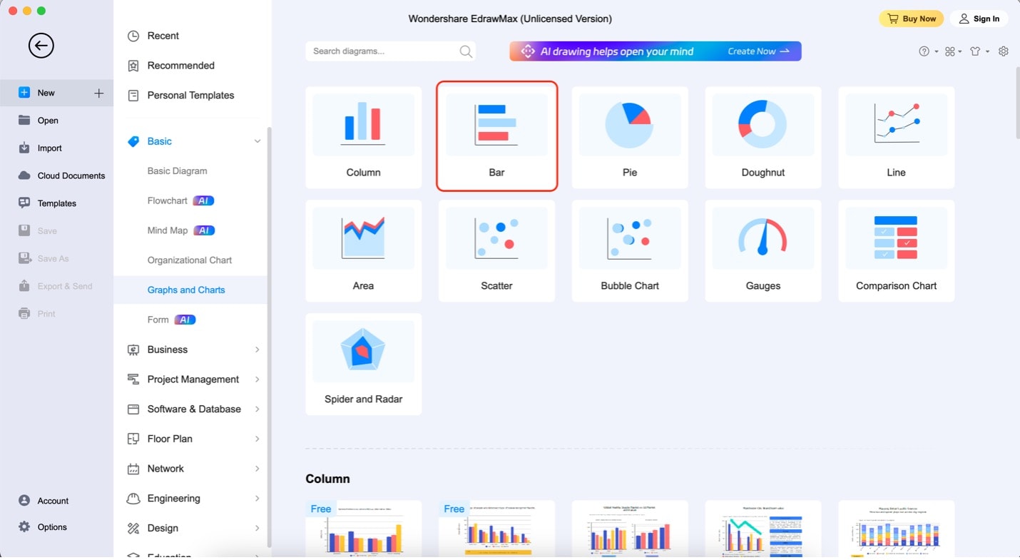
Step2
On the app's homepage, go to Basic. Then, click Graphs and Charts. Lastly, click Bar and then Create New.
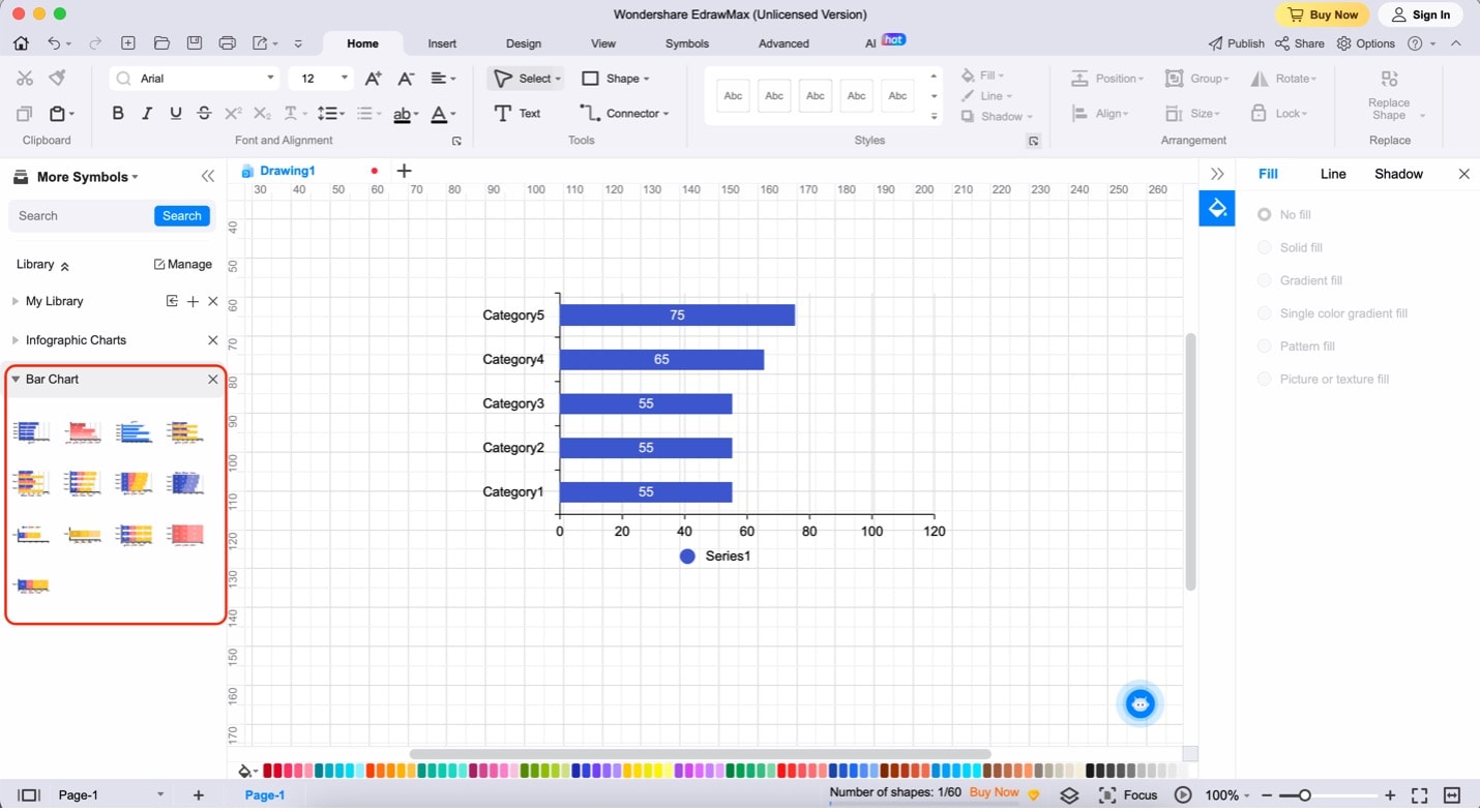
Step3
To add a stacked bar chart to the canvas, drag and drop any templates from the left panel. You can also add other elements, such as photos and shapes, from this panel.
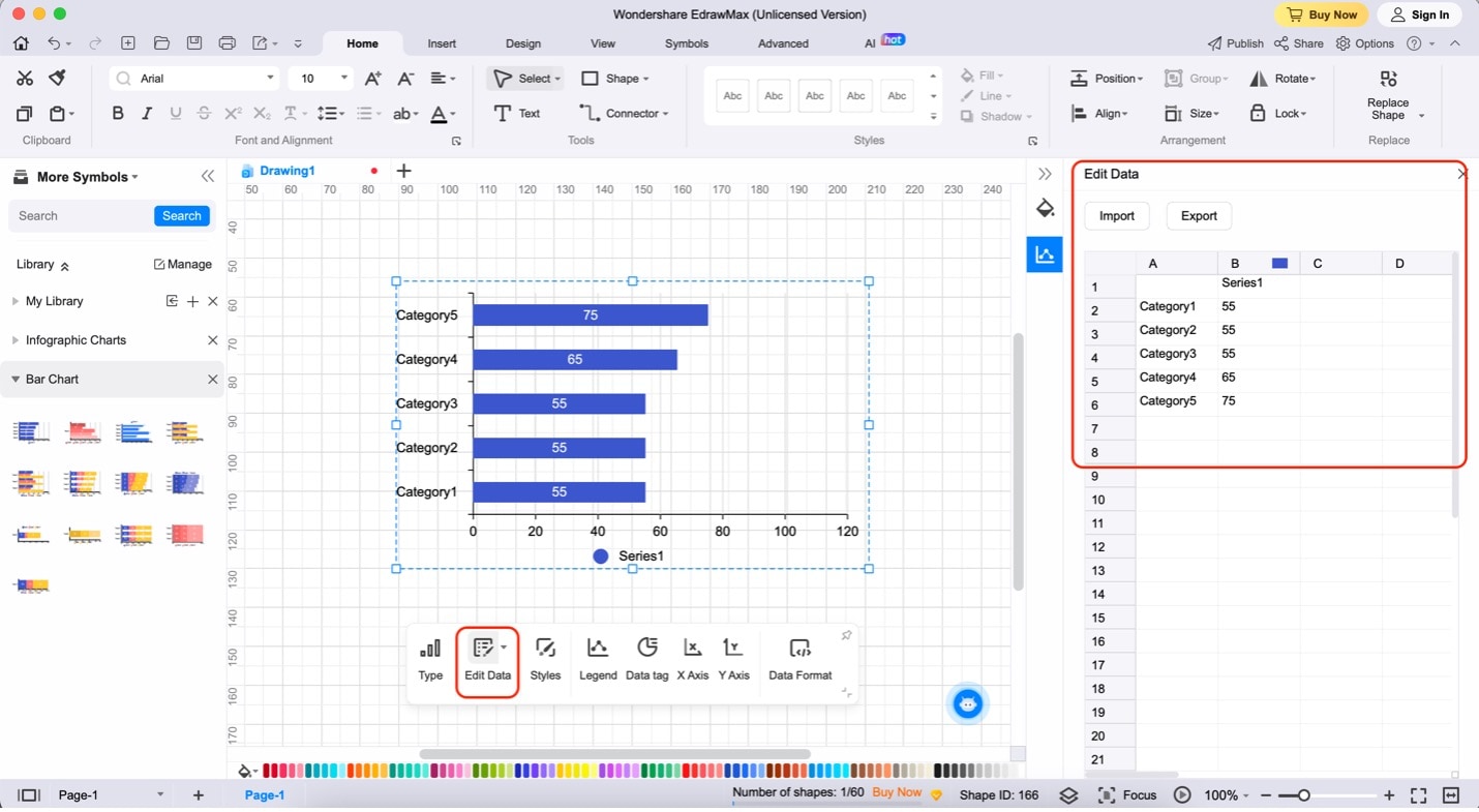
Step4
Click the chart. Then, click Edit Data on the appearing menu bar. To begin editing the content/data of the chart, use the appearing spreadsheet on the right.
Part III: Three Popular Stacked Bar Chart Templates from EdrawMax
In EdrawMax's Templates Community, users can easily kickstart their stacked bar chart projects with various pre-designed templates tailored to different applications. This resource-rich community offers convenience and versatility, making it an excellent starting point for your charting needs.
Explore EdrawMax's Templates Community to discover these and many more professionally crafted stacked bar chart templates that cater to various needs.
Minimalist Stacked Bar Chart
One popular choice is the "Minimalist Stacked Bar Chart." This versatile template suits almost any project with its straightforward design and customizable color scheme. Whether you're visualizing sales data or project timelines, this template adapts seamlessly to various data sets.

 below.
  below.
Stacked Bar Chart for Research Results
The template is a specialized gem for those diving into research analysis. It utilizes stacked bar charts to highlight key data and incorporates doughnut charts for in-depth representation. This template's spacious design allows users to add extra information or context, making it an ideal choice for research professionals.

Stacked Bar Chart for Sales Report
The template offers a tailored solution for dealing with sales data. Featuring a 3D stacked bar chart design, it provides a visually striking way to present sales figures. Additionally, this template includes text boxes, enabling you to provide further insights and explanations for your readers, making it an indispensable tool for sales-related reporting.

Part IV: FAQs About Stacked Bar Charts
Here are some frequently asked questions that can provide you with a better understanding of stacked bar charts. By going through them, you can gain more insights and learn how to use this type of chart effectively in your data presentations.
What Are Their Benefits?
Stacked bar charts offer several benefits. They effectively display data with multiple categories, making comparing parts of a whole easier. Stacking segments in the bars helps illustrate the composition of each category. This aids in data analysis and visualization.
How Are Stacked Bar Charts Commonly Used?
Stacked bar charts find applications in various fields, such as finance, marketing, and project management. They can show sales data for different product categories over time, track project expenses across departments, or display survey responses by demographic groups.
How To Choose the Right Tool/Software for Creating Bar Charts (Considerations)
When selecting a tool or software for creating stacked bar charts, consider factors like ease of use, customization options, and collaboration features. Of course, creating stacked bar charts in Power BI is a viable option. However, EdrawMax, a user-friendly diagramming tool, offers a broader range of chart templates. This includes stacked bar charts and more. Overall, it's an excellent choice for data visualization.
Conclusion
In conclusion, stacked bar charts are a powerful tool for visualizing data with multiple categories, offering clarity and insight into complex datasets. With its user-friendly interface, Power BI is a proven choice for creating these charts. However, for those seeking simplicity and versatility in chart creation, EdrawMax stands as a viable alternative.
Whether you're a data analyst, marketer, or project manager, mastering stacked bar charts can enhance your ability to communicate data effectively and make informed decisions. So, explore these tools and create compelling stacked bar charts with Power BI or EdrawMax.