


Consider the last time you had to explain a system without a visual aid. Odds are, you took more time telling than demonstrating. Architecture diagrams simplify complicated designs in seconds. Yet not all tools are the same. That is why most pros use the best architecture diagram generators to transform complex concepts into understandable and shareable images.
Nowadays, teams want the best architecture diagramming tools, but not merely those that draw shapes. The appropriate tool will ease cooperation and accelerate the planning of a project. It may be a challenge to find the right one out of the available options.
This is the reason why in this article, you will find a detailed discussion of the best architecture diagram generators. Moreover, you can assess tools in the comparison table discussed later. Let’s take a closer look at the tools that matter most.
In this article
What is an Architecture Diagram?
An architecture diagram is a visual map representing the interaction of the parts of a system. It could be a software application, a business process, or even a network setup. Imagine a city map, buildings are the components, and streets are the data paths. It simplifies complicated installations for users and designers.
Why It Matters
Projects get confusing without a clear diagram. Within teams, there is a risk of misunderstanding what is dependent on what. The clients might not get the idea behind the design solution. A good architecture diagram helps you solve these problems. It puts everyone on the same page and minimizes the chances of mistakes.
Any architecture diagram comprises three pieces.
- First, the services, databases, or servers.
- Second, the interconnections that demonstrate how these components communicate with one another.
- Third, the separation between the environments.
Together, these pieces build a complete picture.
Practical Value
Architecture diagrams have more than one purpose. They are also useful in training new team members, examining designs, or pinpointing vulnerable sectors before they turn into real concerns. They conserve time and enhance inter-technical and non-technical communication.
Criteria for Ranking the Best Generators
Each C4 deployment diagram comprises some building blocks. They all provide some detail that simplifies how the system is explained and handled. Let's break them down clearly.
Ease of Flow
The top priority is the feeling of simplicity that the tool gives you on opening. A generator must not bombard you with baffling menu lists or with obscure settings. Drag-and-drop and clear layouts are time-saving. Even when you're a beginner to architecture diagrams, a suitable tool will guide you in the right direction.
Visual Flexibility
You won't get two projects with identical requirements. Therefore, flexibility is needed. An effective generator gives you control over shapes, colors, text, and layout. Such customization makes sure that your diagrams are not only accurate but also easy to read. The stiff tool stops you from being creative, whereas an efficient one brings flexibility to your workflow.
Integration with Other Platforms
A generator must go well with the existing tools. Combination with add-ons such as cloud services or documentation systems eliminates redundant procedures. A good tool keeps the teams organized. It allows you to utilize your diagram on other platforms. This makes the process effective.
Smart Automation
Annotations bring a practical advantage to the diagram. They provide more context (such as IP addresses, software versions, or supported protocols). The absence of such notes can leave a diagram looking clean but with no data required to do real deployment work. A high-level sketch is annotated to form a guide for day-to-day operations.
Top 10 Best Architecture Diagram Generators
Now, you know why architecture diagrams are important. The next thing is to select a good tool. Your workflow depends on the generator you choose. The following are the top 10 architecture diagram generators that can take your creation process to the next level.
EdrawMax
EdrawMax takes first place, as it is not limited to operating systems and devices. Users can start an architecture diagram on a desktop, continue editing it on the web, and finalize it on mobile without losing functionality. Cloud sync is used to keep all versions updated.
What is even more powerful is the templates community. It speeds up the creation of detailed architecture diagrams. This way, teams can worry less about layout and more about refining their system design.
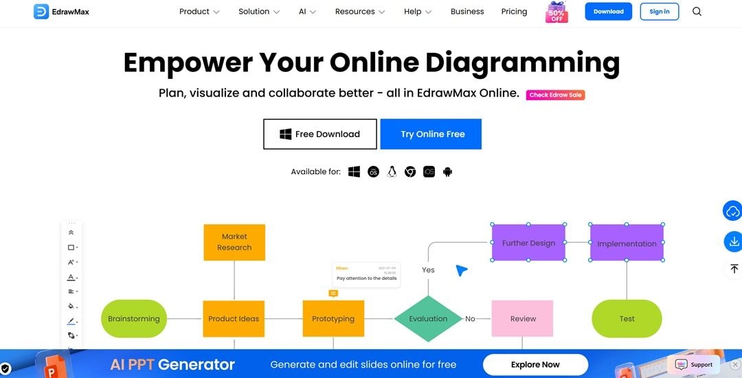
My Verdict
EdrawMax is a good option for architecture diagramming. AI acceleration and templates community give EdrawMax an edge over other tools. If speed and sharing matter, it's your pick; lighter users may skip the fee, but it owns the top rank for depth.
Draw.io
Draw.io directly integrates with Google Drive, OneDrive, and Confluence. This makes storing files and collaborating easy. It also offers offline editing by using the desktop client. You get advanced XML-based diagram importation. Its large shape libraries and its loose export formats assist teams in generating architecture diagrams that are directly integrable into the latest workflow.
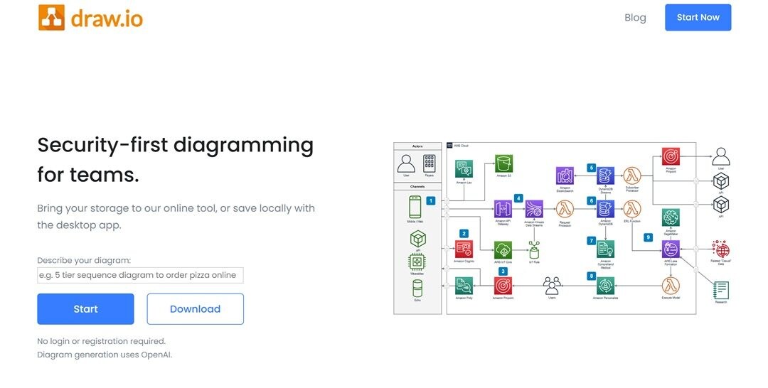
My Verdict
Draw.io is a treasure trove for a cost-conscious team that requires powerful architecture diagramming. It has everything, with free access and huge libraries. However, it lacks detailed templates and AI integration. It is a good choice if you don't mind the manual work.
Lucidchart
Lucidchart is a web-based diagram tool with open integration with Google Workspace, Microsoft Teams, and Slack. Your data is connected to the diagram. If you change the spreadsheet, the diagram gets updated automatically. It provides a drag-and-drop feature and real-time editing.
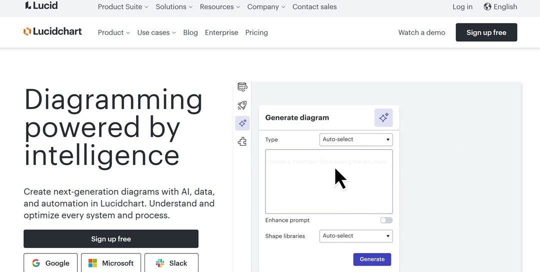
My Verdict
Lucidchart is ideal to use with teams who work in Google Workspace or Microsoft Teams. It can be slow and restrictive when using offline or pushing very large graphs. For browser-first collaboration, pick it; for heavy offline or gigantic systems, choose a desktop-first tool.
Miro
Miro is a team whiteboard software perfect for project work. It offers architecture-specific templates and dedicated AWS and Azure shape packs. The tool is linked with Jira, Confluence, and Slack to ensure the alignment of workflows. It has an infinite canvas, which makes it possible to map major systems.
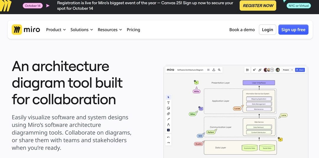
My Verdict
Miro works best where architecture planning and collaboration occur simultaneously. It is the tool that integrates diagramming and brainstorming. Nevertheless, it might not be good enough when you have to deal with precision-heavy diagrams or offline reliability.
IcePanel
IcePanel emphasizes the C4 model. Therefore, mapping the system on various levels is easier for it. You can zoom between the big picture and the smaller details. The platform also upholds role-based views, meaning that engineers can view a technical depth, whereas stakeholders and managers can view simplified diagrams. Such a balance enhances the team's clarity.
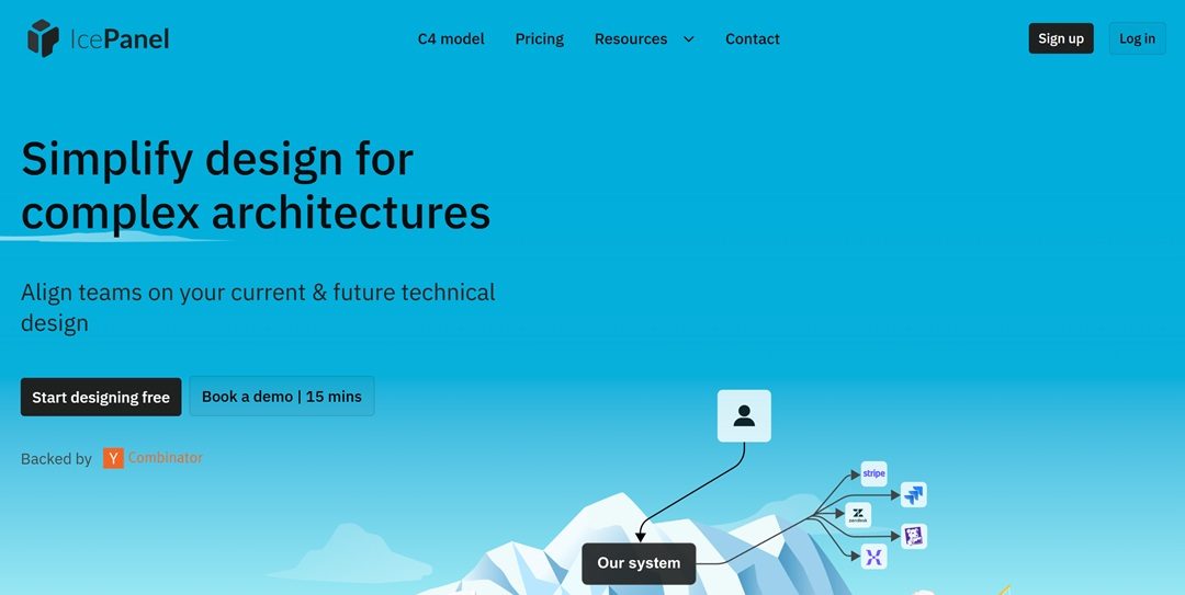
My Verdict
IcePanel is designed for teams that desire structure in their diagrams. Its greatest strength lies in its C4 model support. It is not the most flexible tool in terms of generic diagrams. However, if you aim for a layered view architecture diagram, IcePanel gets the job done.
Microsoft Visio
Microsoft Visio is a very popular tool for precise system mapping. It has specific stencils of Azure, AWS, and networking diagrams. With Layer mapping, it is simplified to decouple infrastructure from application flows. It provides Excel linkage. This enables diagrams to take on updated values as the data is refreshed in Excel. This maintains architecture maps in sync with time.

My Verdict
Microsoft Visio is more of an enterprise tool than a normal diagramming tool. It is bright when you want the exact Azure or network drawings that are connected with real data. However, it is only accessible to teams already within the Microsoft ecosystem. New users may find it distracting due to its steep dependencies and resources.
Gliffy
Gliffy is our seventh-best architecture diagram software. It is used amongst teams already using Atlas products. The drag-and-drop editor can run straight in the browser and does not require any installation. Your designs are saved within Confluence. This way, you get to keep documentation and architecture in the same place.

My Verdict
Gliffy is best used when your team is already within Confluence (or Jira). In pure standalone mode, it is somewhat limited. It lacks powerful collaborative capabilities and automation.
Creately
Creately concentrates on visual workspaces in which diagrams and notes coexist. It offers architecture templates and drag-in systems. Users can draw dependencies, place documentation directly on diagrams, and arrange it as a visual database. It has an infinite canvas that lets you plan architecture without the need to move to various tools.
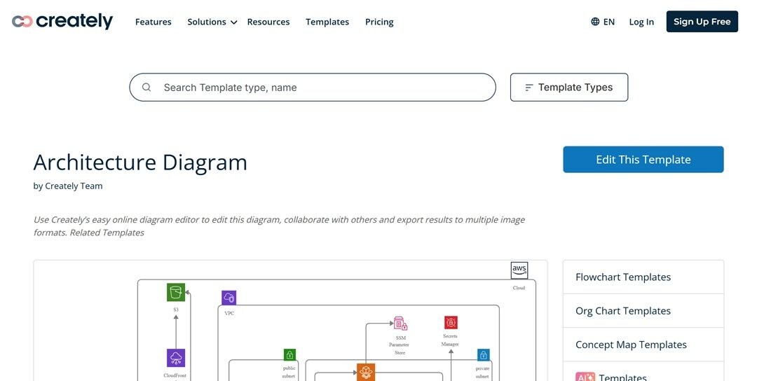
My Verdict
Pick Createley when architecture decisions have to co-exist with the diagram. It is weaker with cloud reference maps and notation work. For them, select a precision, stencil-laden tool.
PlantUML
PlantUML generates architecture diagrams out of plain text scripts. The user writes one-line code specifying components and relationships. It facilitates sequence, deployment, and C4 model diagrams. You can use PlantUML with Git, CI/CD pipelines, or documentation.
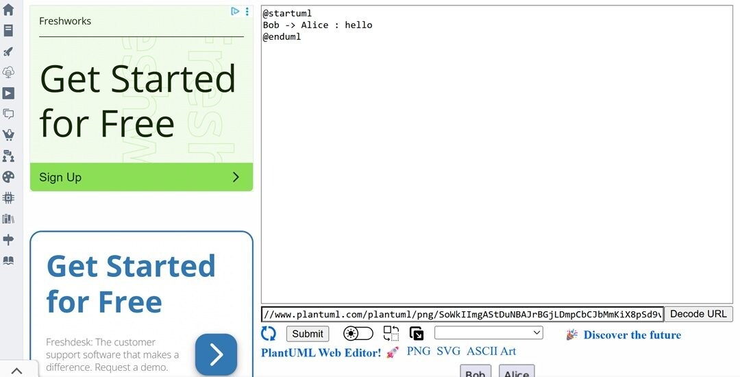
My Verdict
PlantUML is ideal for a developer-intensive group that uses diagrams as code. It is not user-friendly for non-technical users, and the styling options are limited. In code-centric environments, it is strong. In mixed groups, it generates more obstacles than advantages.
Mermaid
Mermaid accepts Markdown-like syntax to produce diagrams. It is one of the best architecture diagram tools for developers. It follows an architecture-friendly format such as flowcharts, sequence diagrams, and ER diagrams. Mermaid code is natively rendered in GitHub, GitLab, and Notion. This makes it useful within teams that architecturally manage documentation within these platforms.
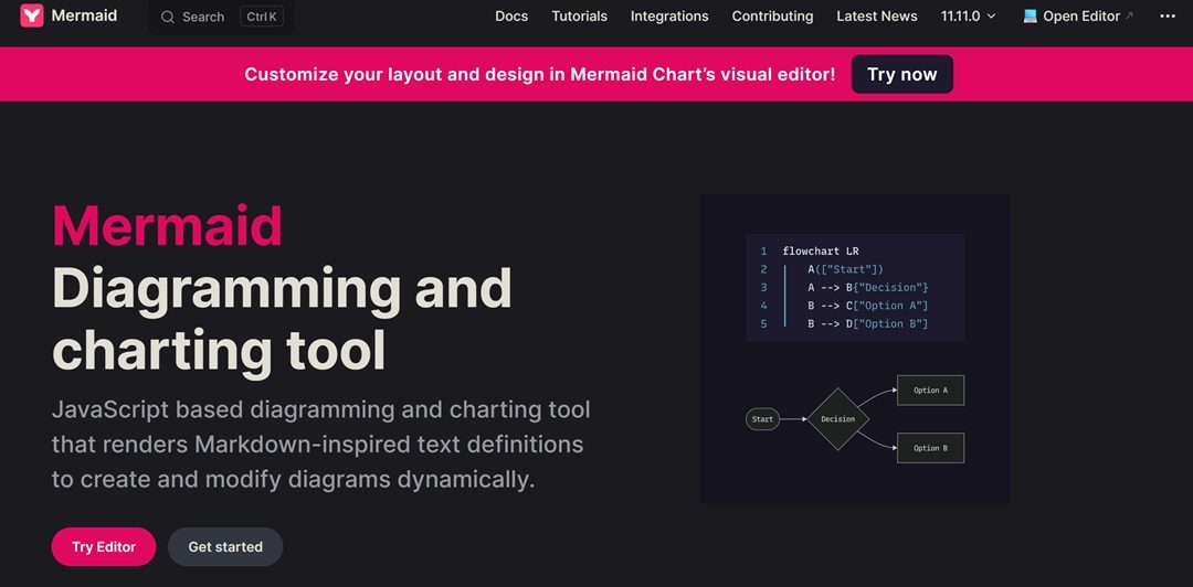
My Verdict
Mermaid is a good option when it comes to making diagrams with code. It is suitable for teams that work on Git-based workflows. Nevertheless, you don't get much visualisation with it. Mermaid lacks styling options as well. This makes it a shaky tool for a complicated design system.
Comparison Table of the Best Tools
| Tool | Strengths | Learning Curve | Output Quality |
|---|---|---|---|
| EdrawMax | Wide diagram coverage with AI features, custom symbols, and Visio support | Easy | 5/5 |
| Draw.io | Deep integration with Google Drive, Confluence, and Jira | Easy | 4/5 |
| Lucidchart | Data linking from spreadsheets, strong collaboration, rich templates | Moderate | 4/5 |
| Miro | Infinite canvas, AWS/Azure libraries, blends brainstorming with diagramming | Easy | 4/5 |
| IcePanel | Built around the C4 model with interactive zoom and role-based views | Moderate | 3/5 |
| Microsoft Visio | Azure and networking stencils | Hard | 3/5 |
| Gliffy | Native Confluence/Jira embedding, | Easy | 4/5 |
| Creately | Visual workspace with architecture templates and an infinite canvas | Moderate | 3/5 |
| PlantUML | Text-based scripting for C4, sequence, and deployment diagrams | Hard | 3/5 |
| Mermaid | Markdown-style syntax, supported in GitHub, GitLab, and Notion | Moderate | 4/5 |
The Bottom Line on Architecture Diagram Generators
Every tool in this list solves a different pain point. The real value comes when you match those strengths to the way your team works. The best architecture diagram generators not only polish diagrams, but they also bring value to them. From our list, EdrawMax deserves a mention because of its AI-powered functions. You generate complex diagrams without compromising clarity.
Picking a software from our list of top architecture diagramming tools will streamline your workflow. Some tools on our list deliver quick sketches, others handle layered technical models, and a few do both. Give every tool a try and see what works out for you!
AI Diagram Generator
Enter your prompt. Upload files if needed. Generate diagrams, charts, or slides instantly.


