Digital matrix diagram maker
Do SWOT analysis, visualize datasets, and compare information using EdrawMax digital matrix diagram creator. Use its pre-designed templates and vector symbols to build datasets in minutes.
Why Use EdrawMax Matrix Diagram Maker?
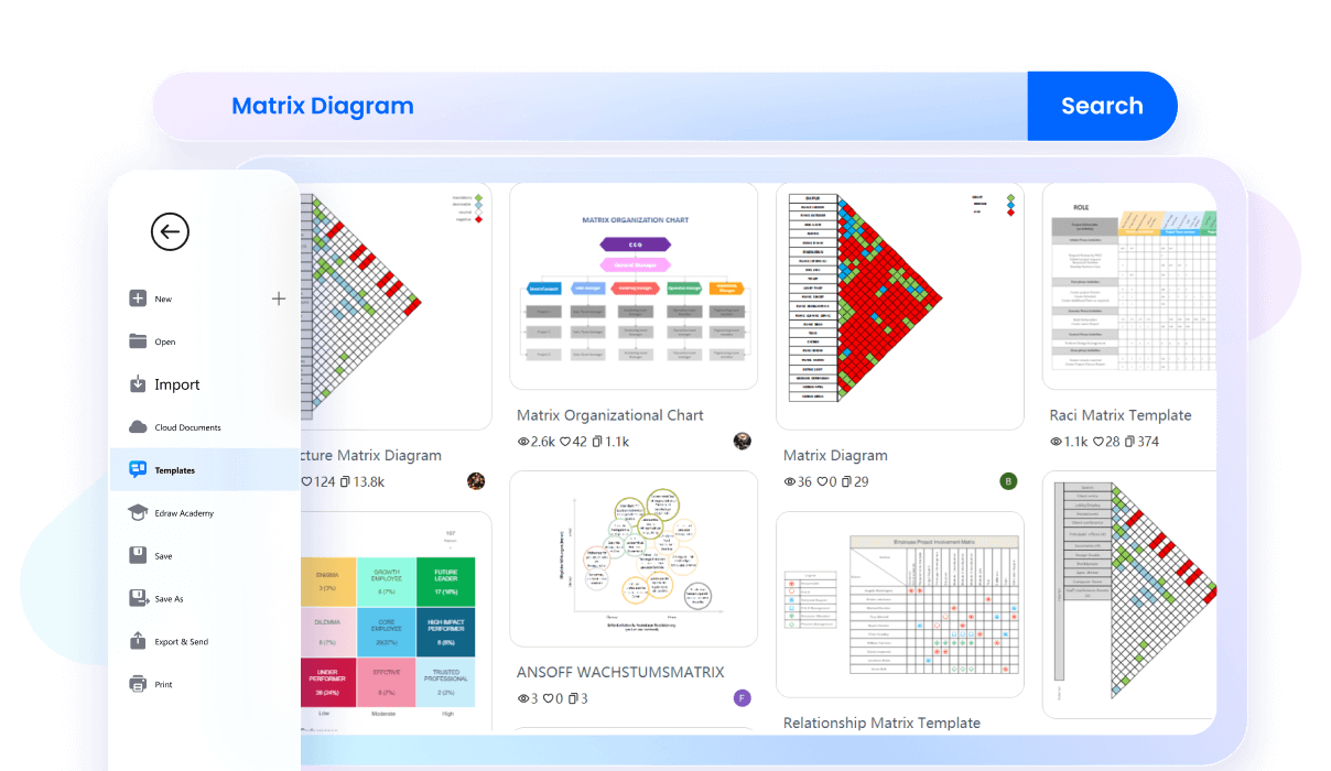
Say goodbye to the effort of building complex data sets from scratch. Switch to EdrawMax template community and get your hands on useful, eye-catching matrix diagrams. Find business growth matrix, architecture matrix, competitive strategy, and more to kickstart your journey.
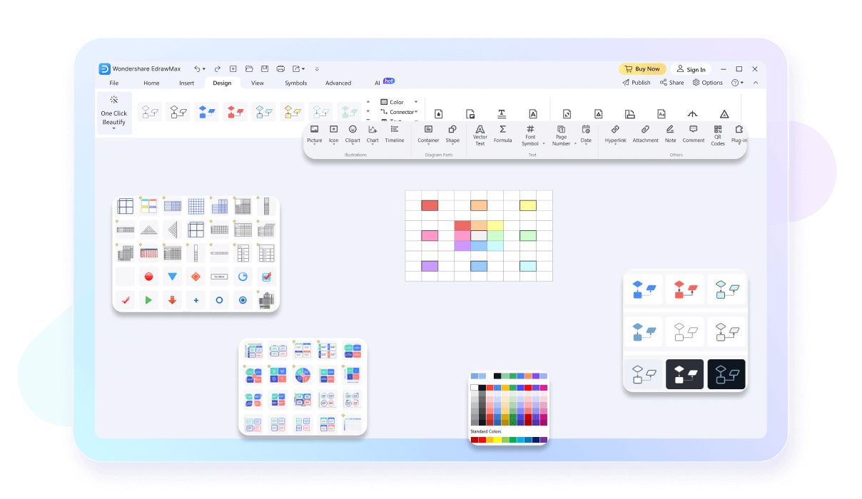
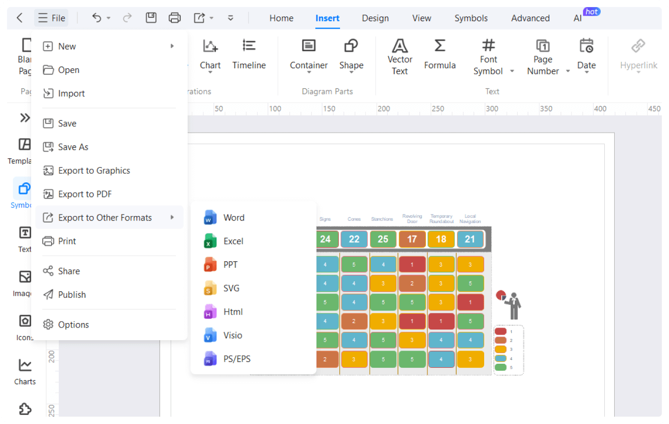
EdrawMax features a versatile symbol library with vector-enabled matrix shapes and icons. It allows you to drag and drop symbols onto the canvas to create a database. Plus, instead of building from scratch, you can also use its custom themes according to your company.
This matrix diagram creator has a presentation mode that showcases your work in full screen. It splits the diagram in extensive slides, so you can focus on high-priority datasets. So, create slides, press F5 to start the preview, and explain every detail of your matrix diagram in HD.

EdrawMax offers cross-platform support. It means you can access it from majority devices, be it Android, iOS, Linux, Windows, and MacOS. If it’s not enough. You are free to use its online version, which is accessible through any device with an internet connection.

How to Make a Matrix Diagram in 3 Simple Steps

What our users say
More Matrix Diagram Tools
Discover more AI-powered diagram makers to boost your productivity.
FAQs About EdrawMax Matrix Diagram Tools
-
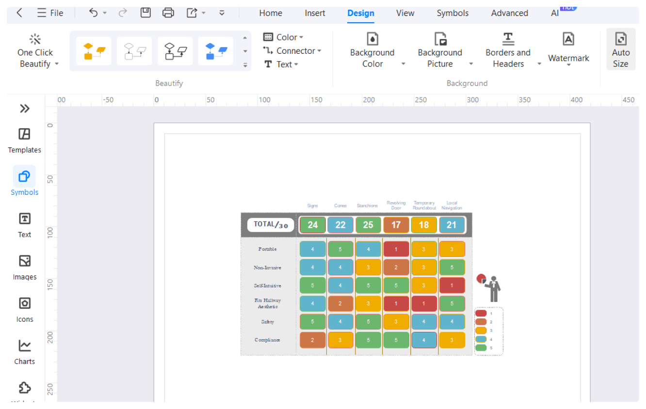
What is a matrix diagram?A matrix diagram is a project management and quality tool used to analyze and display the relationships between two or more sets of data. It uses a grid format to show how different elements interact, helping teams identify the strength and nature of connections between tasks, functions, or variables.
-
What are the most common types of matrix diagrams?The most common types include the L-shaped matrix, which compares two groups, and the T-shaped, Y-shaped, and X-shaped matrices for more complex data sets. Each type is chosen based on how many groups of information need to be cross-referenced and the specific relationship patterns you wish to visualize.
-
How to create an effective matrix diagram?To create one, first define your objective and identify the sets of data to compare. Arrange these sets along the axes of a grid. Then, evaluate each intersection and use symbols or numbers to indicate the strength of the relationship. Finally, review the completed matrix to draw meaningful conclusions.
-
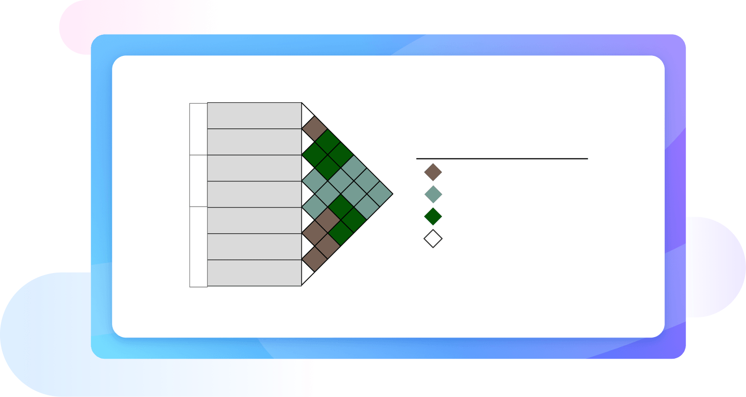
What do the symbols in a matrix diagram represent?Symbols are used at the intersections of the grid to define the relationship between items. Typically, a solid circle represents a strong relationship, an open circle indicates a medium connection, and a triangle shows a weak link. These visual cues allow stakeholders to quickly grasp the intensity of interactions.
-
What is an L-shaped matrix diagram used for?The L-shaped matrix is the most basic and widely used version, consisting of two lists arranged in rows and columns. It is ideal for comparing two sets of data, such as customer requirements versus product features or team members versus assigned tasks, to determine how well they align or correlate.
-
How does a matrix diagram differ from a standard table?While both use a grid format, a standard table usually lists data points independently. In contrast, a matrix diagram focuses specifically on the relationships between items in different sets. It uses a systematic approach to evaluate every possible intersection, providing a more analytical view of how different variables influence one another.
Learn about Matrix Diagram
Stop drawing. Start describing.
AI diagramming isn't just text-to-diagram.
AI now understands any input, fetches live data, adapts through dialogue, and works everywhere.
Free matrix diagram templates from EdrawMax