


Making a bar chart in PowerPoint (PPT) is easier than it seems. The tools are built-in, so you can add and adjust a chart to fit your data. Still, achieving the perfect look can require some extra effort.
This guide will walk you through how to make a bar chart in PowerPoint in easy steps. You’ll also see the different bar chart styles you can add to fit your data. If you want a faster, easier way, EdrawMax add-in, a tool that makes professional diagrams right in PowerPoint, is recommended.
In this article
Method 1: How To Make a Bar Chart in PowerPoint
A bar chart is a visual tool used to compare data across categories. It uses rectangular bars of different lengths to represent values. The longer the bar, the larger the value. In PowerPoint, bar charts help you present data clearly and make it easier for your audience to spot trends or differences.
You can make a bar chart right in PowerPoint or link it to an Excel file. If you’re working with a lot of data, it’s easier to build a bar chart in Excel first and paste it into PowerPoint. That way, any updates you make in Excel will automatically show in your presentation.
If you want to keep it simple and start from scratch, here are the steps to make a bar chart in a PowerPoint presentation.
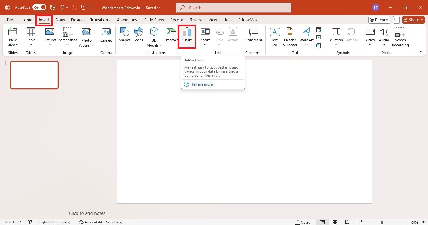
Step 1Insert a Chart in PowerPoint
Open your PowerPoint presentation. Go to the slide where you want to add the bar chart.
Go to the Insert tab at the top menu. Select Chart from the options.
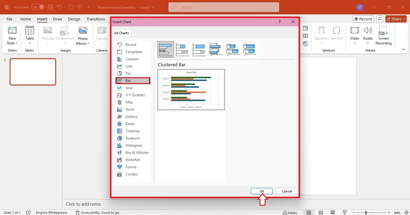
Step 2Choose a Bar Chart Type
- In the Insert Chart pop-up window, select Bar from the chart types on the left.
- Choose the style you prefer, such as Clustered Bar or Stacked Bar.
- Click OK to add it to your slide.
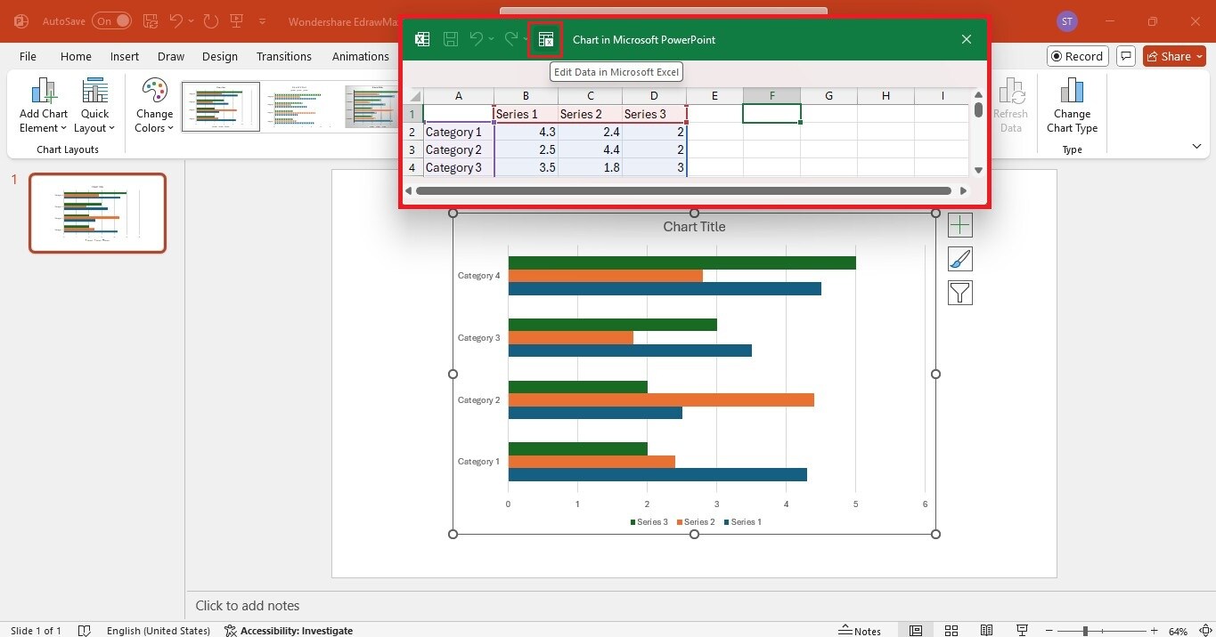
Step 3Enter or Import Data
- A sample Excel table will open with default data.
- Replace the placeholder values with your data.
- Select Edit Data in Microsoft Excel to add the values in Excel. The updates will automatically show in the bar chart in PowerPoint.
- Close the Excel table window.
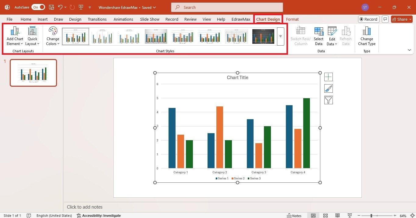
Step 4Customize the Bart Chart
- Select the bar chart on your slide.
- Go to the Chart Design tab to change the bar chart layout, colors, and styles.
- Add bar chart elements like titles, labels, and legends.
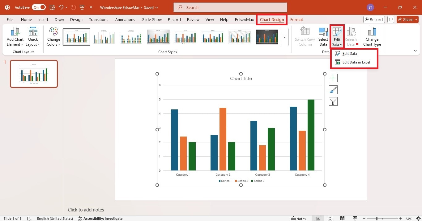
Step 5Update Bar Chart Data
- To update the data, go to the Chart Design tab.
- In the Data group, click the Edit Data dropdown menu. Select Edit Data or Edit Data in Excel.
- Copy the data from your Excel file and paste it into the PowerPoint table.
That’s it! You now have a simple and professional bar chart in PowerPoint.
Types of Bar Charts You Can Make in PowerPoint
PowerPoint gives you different bar chart styles so you can pick the best one for your data. Some are great for side-by-side comparisons, while others show how parts add up to a whole. Here’s what you can use and when to use them.
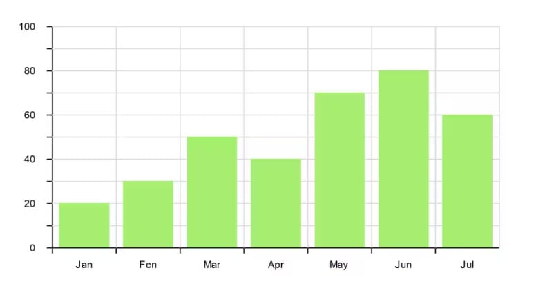
Vertical Bar Chart
A vertical bar chart shows data using bars that go up and down. Use it for data like monthly expenses, test scores, or product sales.
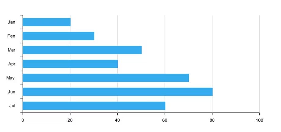
Horizontal Bar Chart
A horizontal bar chart displays bars from left to right. It’s a good choice when your category names are long or you have many items to show. It works well for rankings, survey results, or task lists.
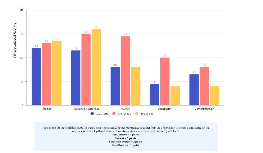
Group (Clustered) Bar Chart
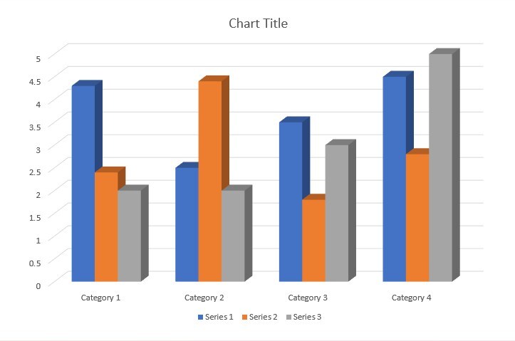
The clustered bar chart places bars next to each other so you can easily compare different categories. It works well for sales reports, survey results, or data with multiple groups.
Stacked Bar Chart
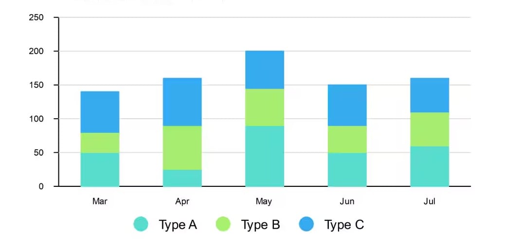
A stacked bar chart combines data into a single bar, with sections showing the parts of the whole. It helps you see both the overall value and how each section contributes. You can use this to display income sources, product sales by category, or team performance.
100% Stacked Bar Chart
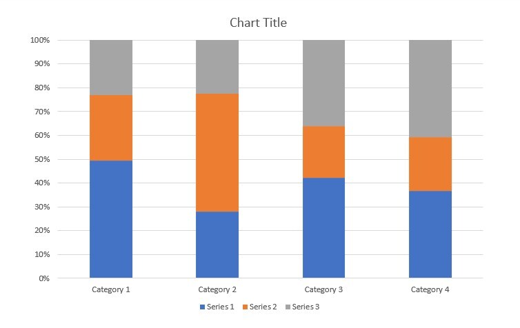
This is similar to the stacked chart, but scales all bars to 100%. It’s best for showing proportions, like market share, budget distribution, or survey responses.
3D Bar Chart
This style adds depth, giving the chart a more eye-catching look. It works well for simple comparisons, like product sales or yearly growth, but may be harder to read with detailed data.
Clustered Horizontal Bar Chart
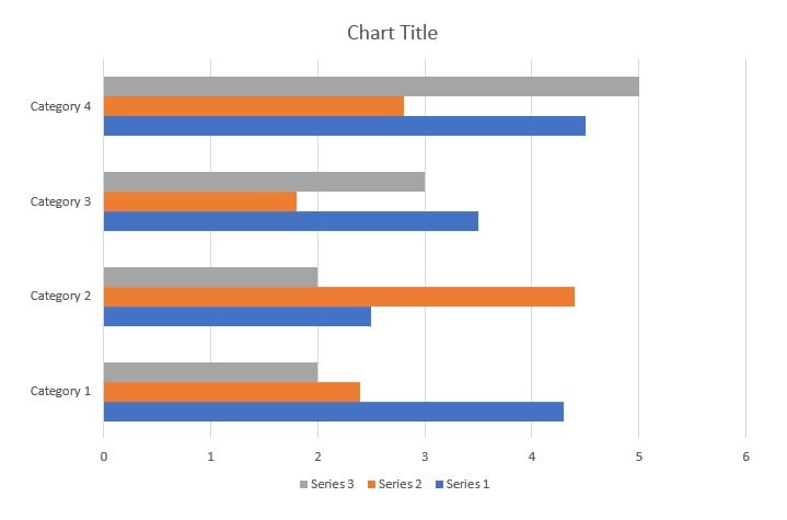
This version combines the clustered and horizontal styles. It places bars side by side but runs them from left to right. It’s helpful when you want to compare groups of data with longer labels. You can use it for employee performance, customer ratings, or service usage.
Method 2: Make a Bar Chart in PowerPoint With Add-Ins
Instead of making a bar chart from scratch and entering data manually in PowerPoint, you can use a diagramming add-in. One of the best options is Wondershare EdrawMax. It is a one-stop diagram and chart maker for your reports and data visualization.
It also has AI tools that can analyze your bar chart, compare data, identify patterns, and predict trends. You can also edit data directly in EdrawMax or import an Excel file to convert it into a bar chart instantly.
Since you’re working in PowerPoint, the EdrawMax add-in is built into the software. No need to switch between apps; you can create bar charts right inside your slides. Here’s more of what you can do with it:
- EdrawMax AI: Enter a prompt, and AI will generate a diagram with ready-made content. You can insert it into your slides instantly.
- Text to Slide: Highlight any text in your presentation, and AI will turn it into a diagram. Choose from different styles, colors, and layouts, including numbered or image-based designs.
- Pre-Designed Templates: Access a wide range of templates, including bar charts, so you don’t have to start from scratch.
Now, go over the steps to make a bar chart in PowerPoint using the EdrawMax add-in.
Step 1Install and Enable the Add-In
Download and install the latest EdrawMax version. The PowerPoint add-in is included.
Open a PowerPoint presentation or start with a blank slide. You should see the EdrawMax add-in on the top navigation pane.
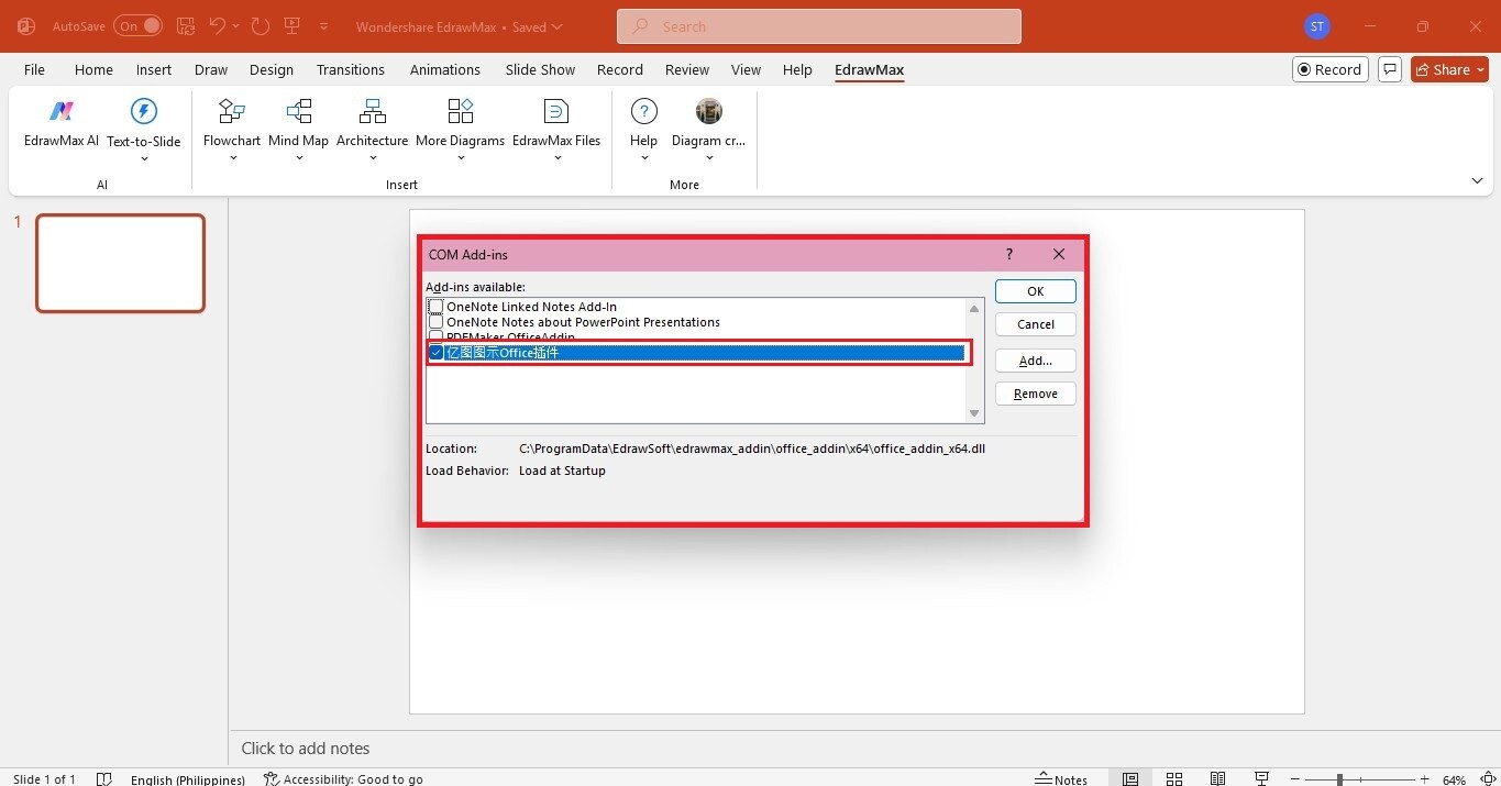
Otherwise, head to File > Options at the top. In the window that appears, select Add-ins on the left. From the Manage dropdown, pick COM Add-ins and click Go.
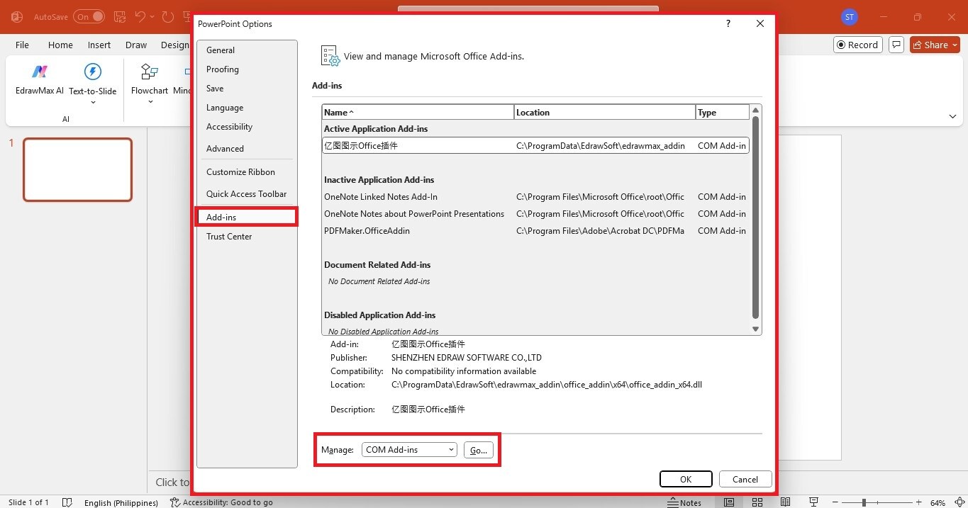
Select the checkbox for EdrawMax Office add-in and click OK to enable it. Restart PowerPoint.
Step 2Open the EdrawMax Add-In
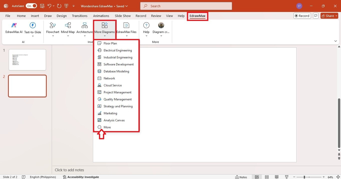
Go to the EdrawMax tab in the top navigation pane.
Click the More Diagrams dropdown menu and choose More from the available options.
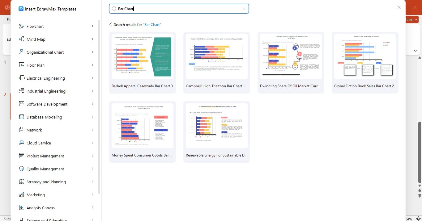
Step 3Select a Template
Enter the Bar Chart in the search bar.
Select a template to add to the PowerPoint slide.
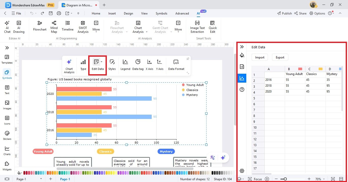
Step 4Add Your Data
Double-click on the bar chart in the slide. This will open the EdrawMax window.
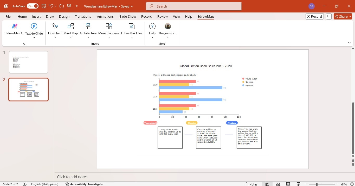
Select the bar chart on the canvas and click Edit Data on the floating toolbar.
Manually enter data or import an Excel file.
If importing, select your file, and EdrawMax will automatically generate a bar chart.
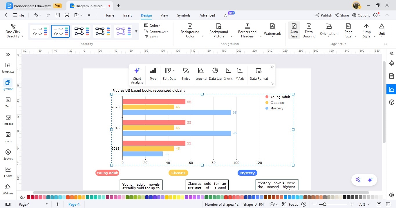
Step 5Customize the Chart
Go to the Design tab in the upper navigation pane in the EdrawMax window to change the theme color with one click.
Adjust labels, data tags, legends, and more from the floating toolbar.
Close the EdrawMax window, and the slide will automatically display the updated bar chart.
Conclusion
Making a bar chart in PowerPoint is easy and simple. You can add a chart, enter your data, and tweak the design right there. It works well for most basic presentations.
But if you want your charts to look more polished or need to handle a lot of data, Wondershare EdrawMax is recommended. It lets you easily customize charts, spot trends with AI, and use professional templates without leaving PowerPoint. It’s a good alternative to make your presentation stand out and get your message across to your audience.
AI Diagram Generator
Enter your prompt. Upload files if needed. Generate diagrams, charts, or slides instantly.


