


Using pie charts in Figma to display data is a popular choice for many creatives. Figma's prominence stems from its accessible interface and collaborative capabilities. It stands as a platform tailored for product teams working in unison. Born in the digital realm, creating pie or donut charts in Figma is seamless with heightened efficiency.
On the other hand, Wondershare EdrawMax offers a compelling choice. Its accessibility makes it an advantageous alternative for designing pie and donut charts in minutes. This page delves into both platforms for you to prepare compelling presentations without worries. Read on below to learn more.
In this article
Part I. How To Make a Pie Chart on Figma
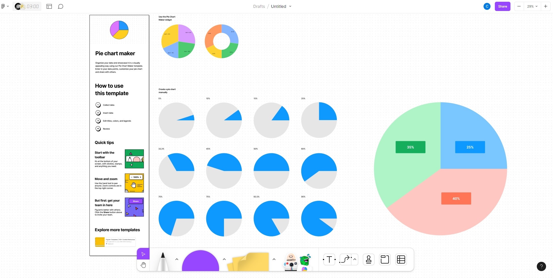
Crafting pie charts in Figma is a breeze. With its intuitive interface, you can customize segments with ease. Figma streamlines the process, enabling quick and visually appealing pie chart creation. Follow the steps below to create a pie or donut chart on Figma.
Step1
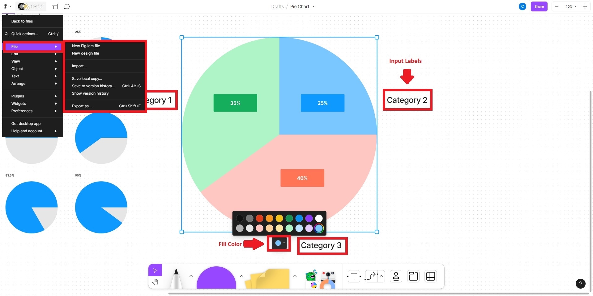
Launch Figma. Open an existing project or click the + Design file button to create a new Frame to design your donut or pie chart.
Step2
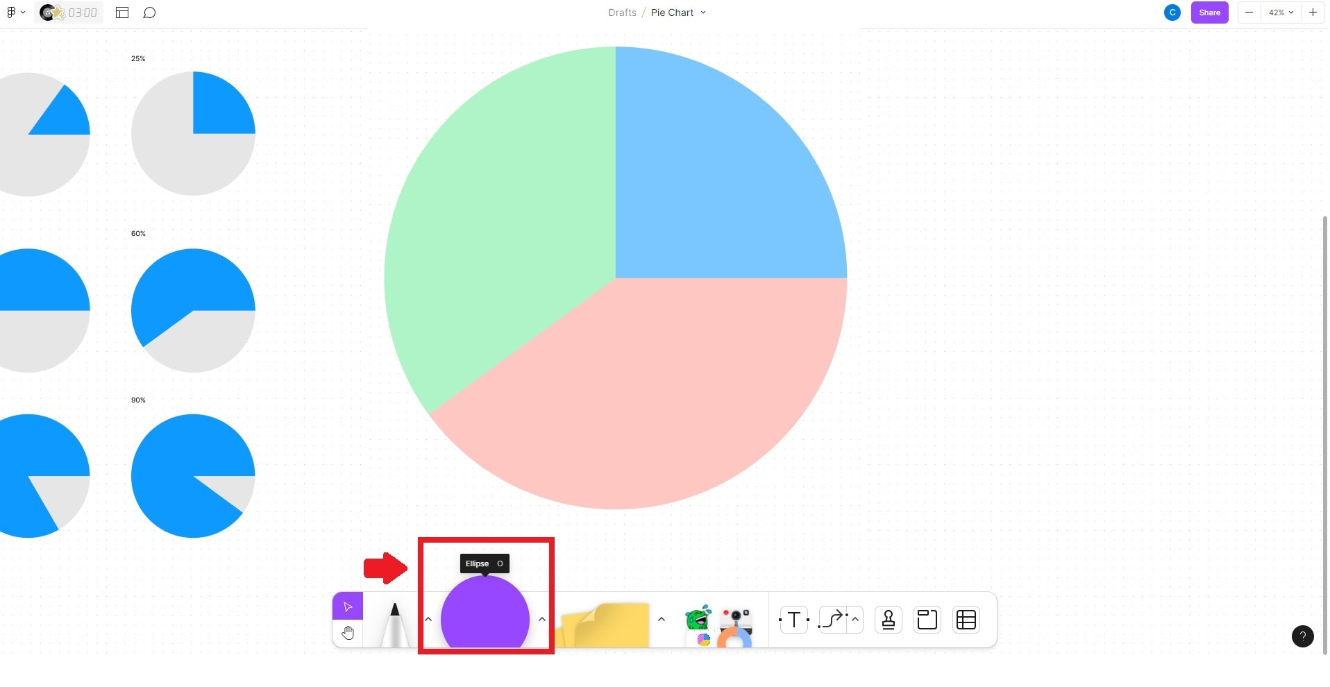
Create a circle within the frame by choosing the Ellipse tool from the toolbar. Click and drag to establish the circular shape. This will serve as the container for your pie chart.
Step3
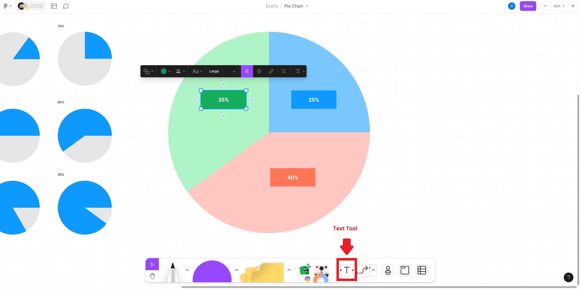
Next, integrate data into the circle. Use the Text tool on the toolbar, then click within the circle. Input data entries like "35%", "25%", "40%", and others as needed.
Step4
Customize the pie chart's appearance with data in place. Select the circle and access the Fill Color option in the toolbar. Assign distinct colors to each pie chart segment. Next, choose the Text tool and click outside the circle. Input labels for each pie chart section, like "Category 1," "Category 2," and so on. Refine your project further and save your creation once done.
Part II. Make a Pie Chart With Wondershare EdrawMax – Easier and Faster
Much like Figma, EdrawMax is a versatile tool that simplifies crafting pie and donut charts. From flowcharts and mind maps to org charts and floor plans, EdrawMax empowers users to design various diagrams catering to diverse visual communication needs. The platform provides a wide range of resources for diagram creation at your disposal, all in one tool.
Key Features
EdrawMax is equipped with all the features you need to create pie charts or donut charts from scratch. Below are its key features.
- Professional Diagram Creations. EdrawMax's robust suite of tools enables the seamless creation of intricate diagrams. You can tailor segments and adjust attributes to craft compelling representations with just a few clicks.
- Drag-and-Drop Interface. The intuitive drag-and-drop interface enables you to assemble complex diagrams and charts. This approach streamlines the design process, empowering even those with limited experience.
- Versatile Template Selection. EdrawMax boasts an extensive library of templates. It serves as a starting point for various visualizations, saving time and effort while maintaining consistency in design.
- Online and Offline App. EdrawMax offers both online and offline versions. This caters to diverse user preferences and needs. The online app enables collaborative work and easy access from different devices. The offline version, meanwhile, provides a reliable solution when working without a stable internet connection.
Advantages of Using EdrawMax for Chart Creation
Below are some of the advantages of using EdrawMax during chart creation.
- Faster Chart Creation. EdrawMax allows you to create charts faster. Its intuitive drag-and-drop interface and pre-designed templates expedite chart development.
- Drag-and-Drop Interface. The intuitive drag-and-drop interface enables you to assemble complex diagrams and charts. This approach streamlines the design process, empowering even those with limited experience.
- Various Export Options. EdrawMax supports a wide array of file export formats like Excel, Word, PowerPoint, PDF, or JPG. It facilitates seamless sharing and collaboration. The platform ensures your pie and donut charts remain accessible and adaptable across various platforms.
- Customization Options. EdrawMax is equipped with an array of customization options to tailor pie and donut charts to specific needs. Users can fine-tune every aspect of their visualizations, from adjusting colors and labels to modifying segment sizes and styles.
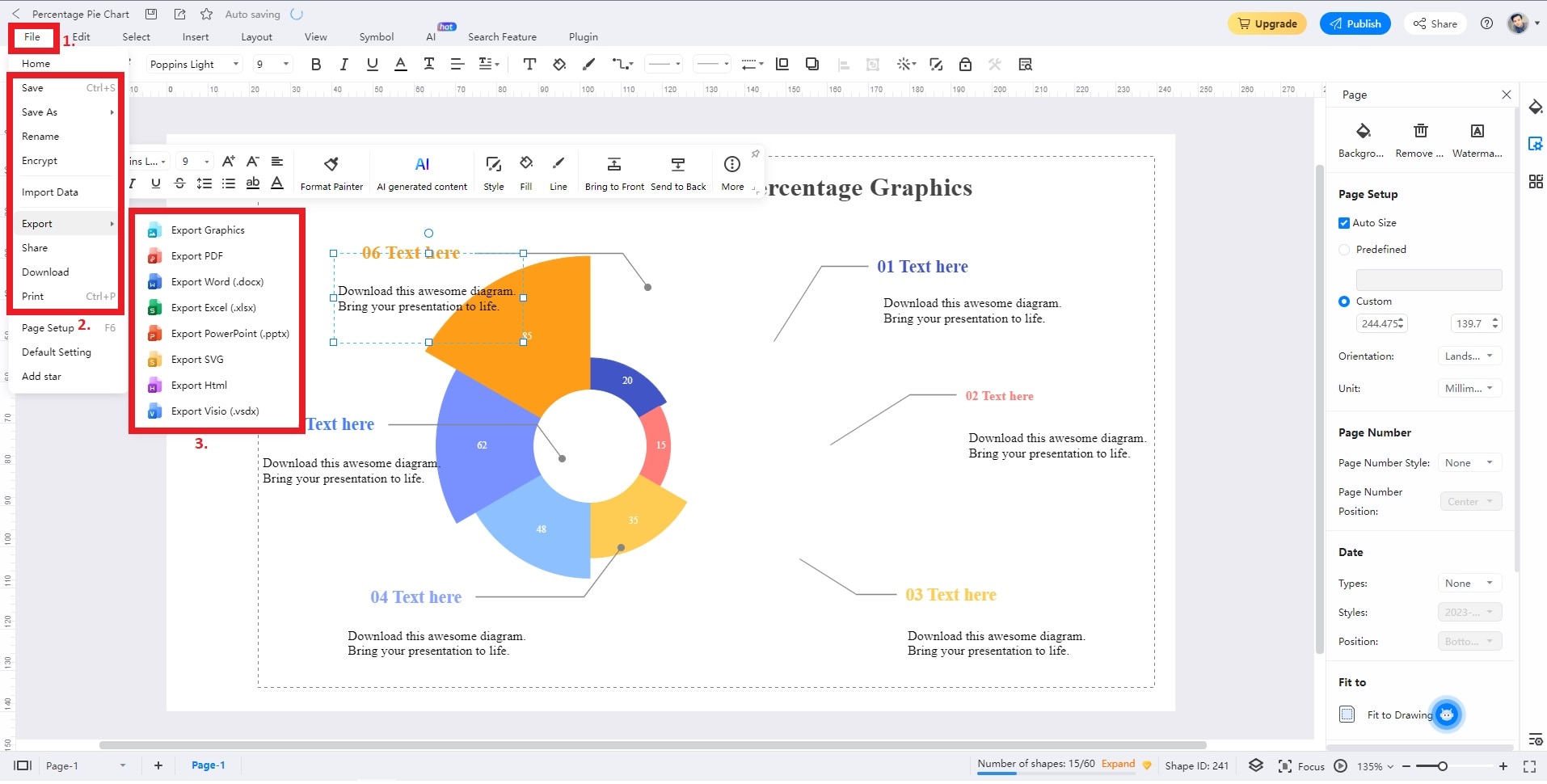
Part III: How To Create a Pie Chart in EdrawMax
Follow the steps outlined below to create pie or donut charts in EdrawMax.
Step1
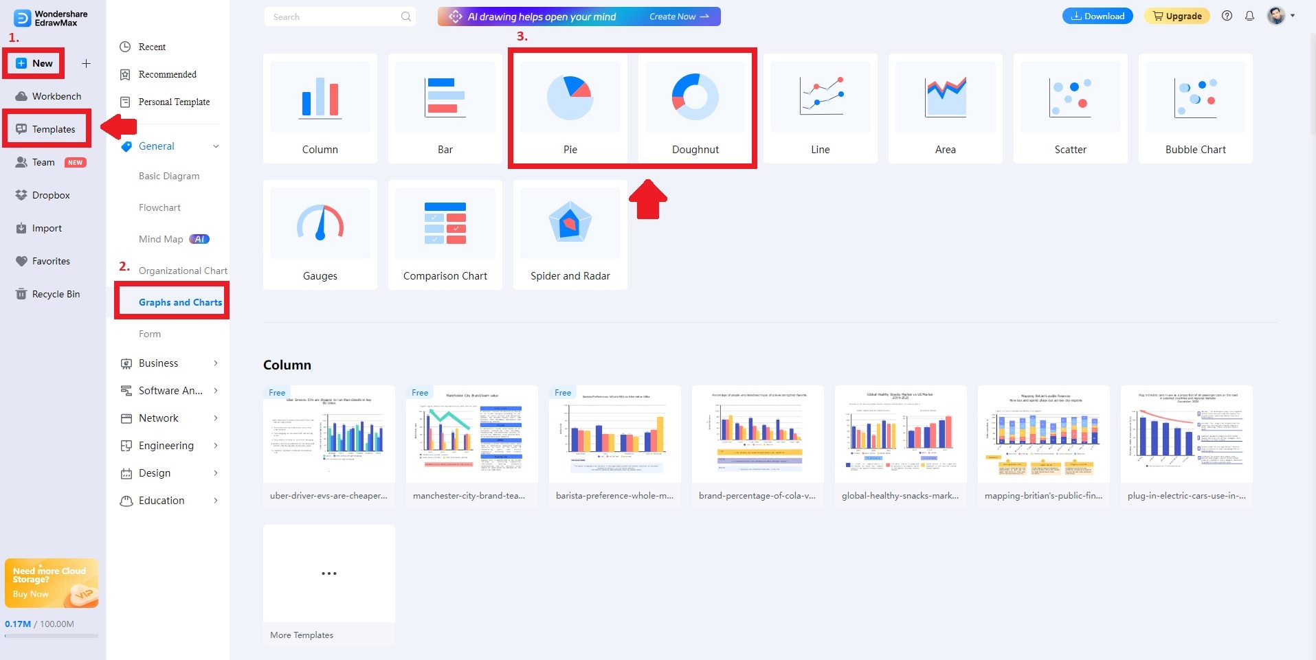
Go to EdrawMax Online. Sign up or log in with an existing account. Click New > Graphs and Charts. Choose Pie or Doughnut, depending on your preference. Alternatively, click the Templates button and use the Search bar at the top to generate a pie or donut chart in seconds.
Step2
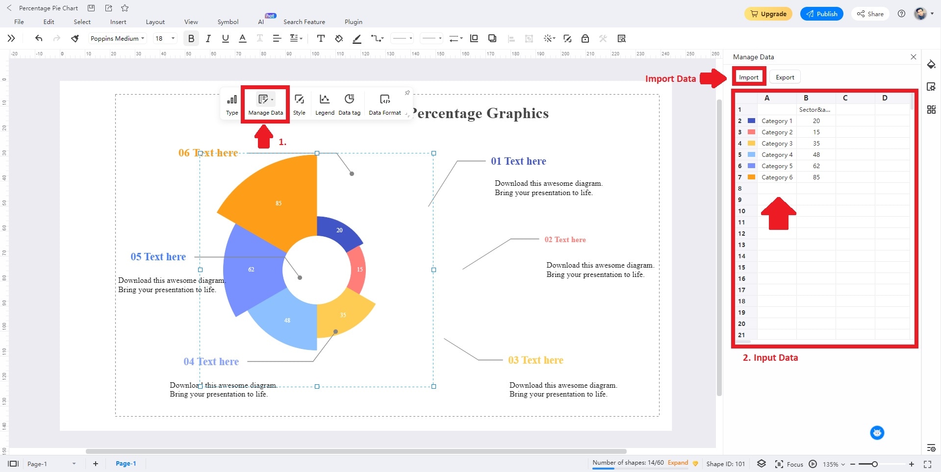
Double-click on your chart and choose Manage Data to input information. You can also click the Import button to import a data file from your local storage.
Step3
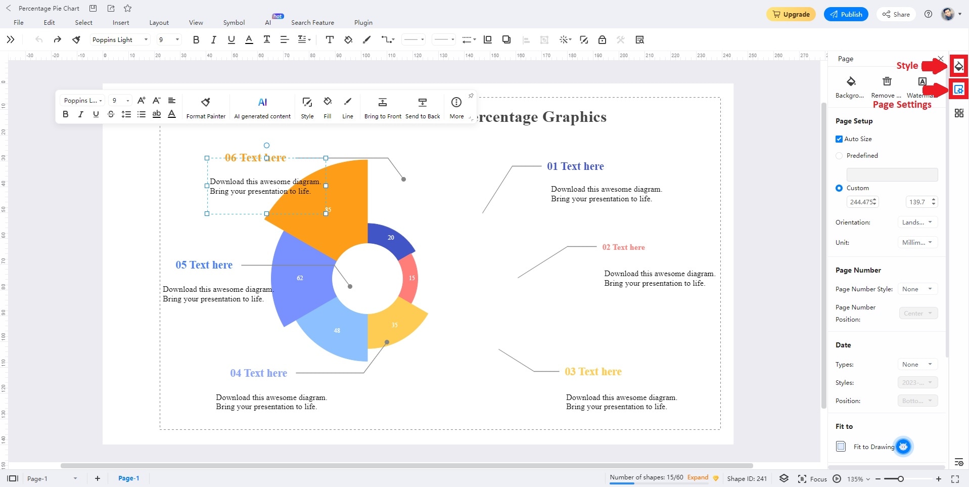
Click the Style and Page Settings button to beautify your chart to match your branding or preference. Change the Background Color, Picture, Borders, and Headers, depending on your style.
Step4
Customize your project until you're satisfied. Once done, Save or Export your chart for easy sharing.
Part IV: 3 Popular Pie Charts From EdrawMax's Template Community
This section explores captivating pie charts sourced from EdrawMax's dynamic Templates Community. Each template illustrates diverse data interpretations with creativity and precision.
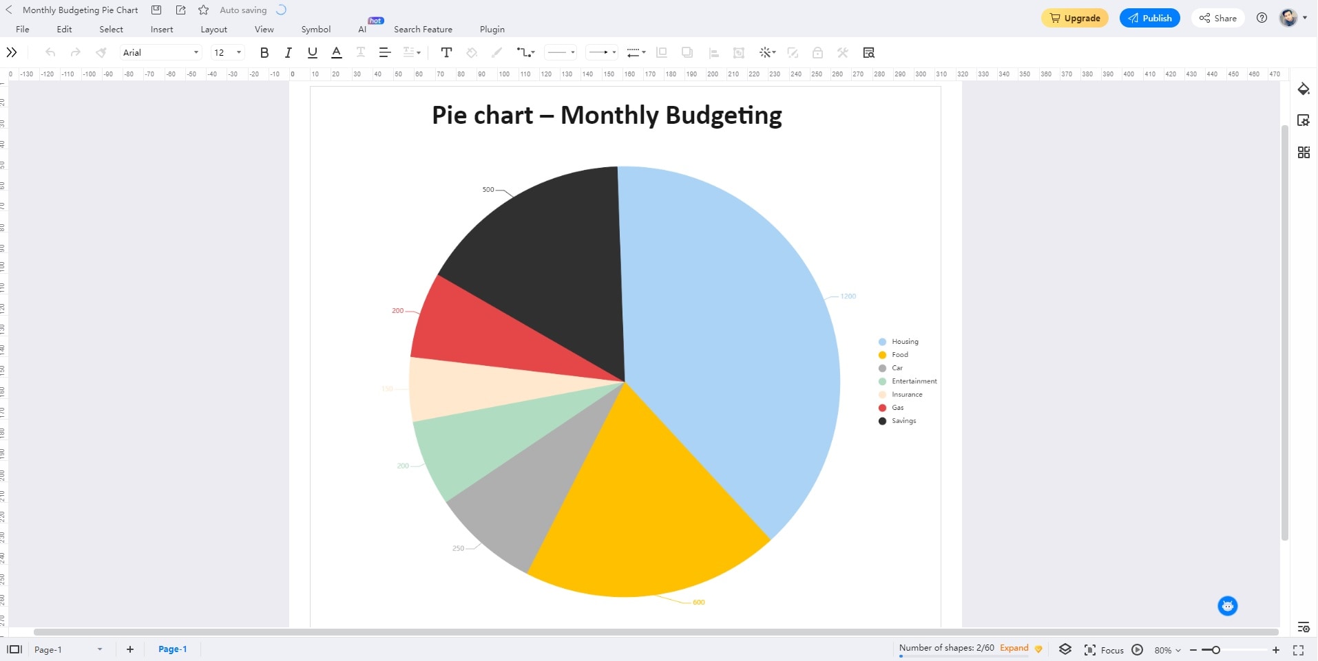
Pie Chart for Monthly Budgeting
This pie chart visualizes a monthly budget breakdown. On the right side, a legend labels categories such as housing, food, car, entertainment, insurance, gas, and savings. The pie chart's segments are colored uniquely to represent these categories. The value of each category is indicated outside the pie chart. It provides a clear view of each expense's proportion within the budget.
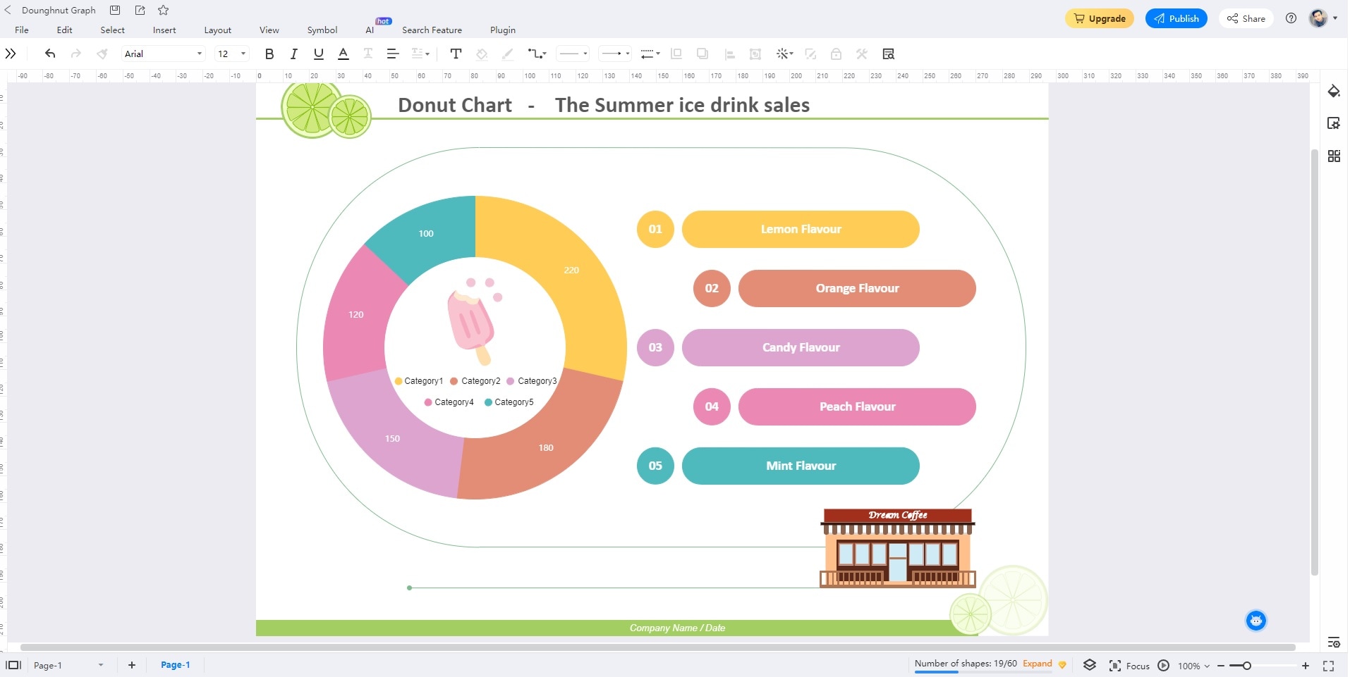
Donut Chart for Ice Drink Sale Report
This donut chart illustrates summer ice drink sales. It highlights flavors like lemon, orange, candy, peach, and mint. Lemon stands out as the highest-selling flavor, evident in the chart. The design is organized, featuring the donut chart on the left and flavor labels on the right for straightforward interpretation.
Pie Chart for Student Preference Research
The pie graph depicts student preferences across four subjects: English, Economics, History, and Psychology. The graph looks professionally designed. Each subject segment is accompanied by a descriptive label, enhancing clarity. It aids in better comprehension of the data distribution among students' preferences for different subjects.

Conclusion
Creating pie and donut charts in Figma for data visualization shows the platform's prowess through its collaborative platform. Its online accessibility also ensures its popularity among creatives. Like Figma, EdrawMax exhibits all the features you need for designing pie charts or donut charts. It offers a versatile solution for crafting a variety of diagrams.
Trying both platforms won't strain your budget, as Figma and EdrawMax offer free access for you to explore. However, EdrawMax's comprehensive features and advantages warrant a second look. Its cost-effective price plans are also reasonable if you're looking for a dedicated app for diagramming.
AI Diagram Generator
Enter your prompt. Upload files if needed. Generate diagrams, charts, or slides instantly.


FAQ
-
How Can I Make My Pie Chart Better?
To enhance your pie chart's impact, ensure clear labeling. A concise legend is better to aid in understanding your chart. Using a limited color palette and maintaining proportionate segments for accurate representation is best. It would help if you also consider grouping smaller segments into an "Others" category for improved readability. -
What Kind of Data Are Best for Pie Charts?
Pie charts excel in displaying categorical data with distinct segments. Opt for data where the portions are distinguishable and add to a meaningful whole. Ideally, use pie charts when showcasing a limited number of categories to prevent clutter. -
Can Figma Create Graphs Other Than Pie Charts?
Figma offers a range of graph types beyond pie charts. It supports bar graphs, line graphs, scatter plots, and more. Figma allows you to convey trends, comparisons, and relationships within your data. Taking advantage of all these tools can enhance the depth of your visualizations. EdrawMax can also do all of the diagramming needs you're looking for, making both tools an ideal choice for creatives.
