


Scatter plots are like magic wands that help us understand relationships between variables in the world of data and numbers. They're simple yet powerful tools for spotting patterns and trends. Imagine plotting points on a graph, and suddenly, data starts to speak its story.
Now, why would you need an online creator for a scatter plot? Because not everyone is a data whiz with advanced software at their fingertips. Making the diagrams should be as easy as pie, and that's where this article about online scatter plot creators comes in. It simplifies the process, making it accessible to everyone, even if you're not a data scientist.
Whether you're a student exploring correlations for a project, a small business owner tracking sales, or anyone who wants to visualize data, a free scatter plot generator is your go-to tool. Say goodbye to complex charts and spreadsheets. With just a few clicks, you can create clear, insightful scatter plots that tell your data's story.
It's the key to unlocking the potential hidden within your numbers, and it's never been more accessible. So, let's dive into the world of scatter plots and unleash the power of your data!
In this article
Part 1. How To Draw Scatter Plot Online on Wondershare EdrawMax
Are you ready to dive into the world of scatter plots and discover how easy it can be to create them online? This part will introduce you to the user-friendly EdrawMax platform, your go-to tool for drawing scatter plots effortlessly. Whether you're a student, a researcher, or a business owner, EdrawMax makes data visualization a breeze, even if you're not a tech guru.
Step-by-Step Guide
EdrawMax is here to make your life easier and your data clearer. So, let's get started on your journey to becoming a scatter plot pro. Get ready to create charts that tell your data's story with ease, thanks to EdrawMax!
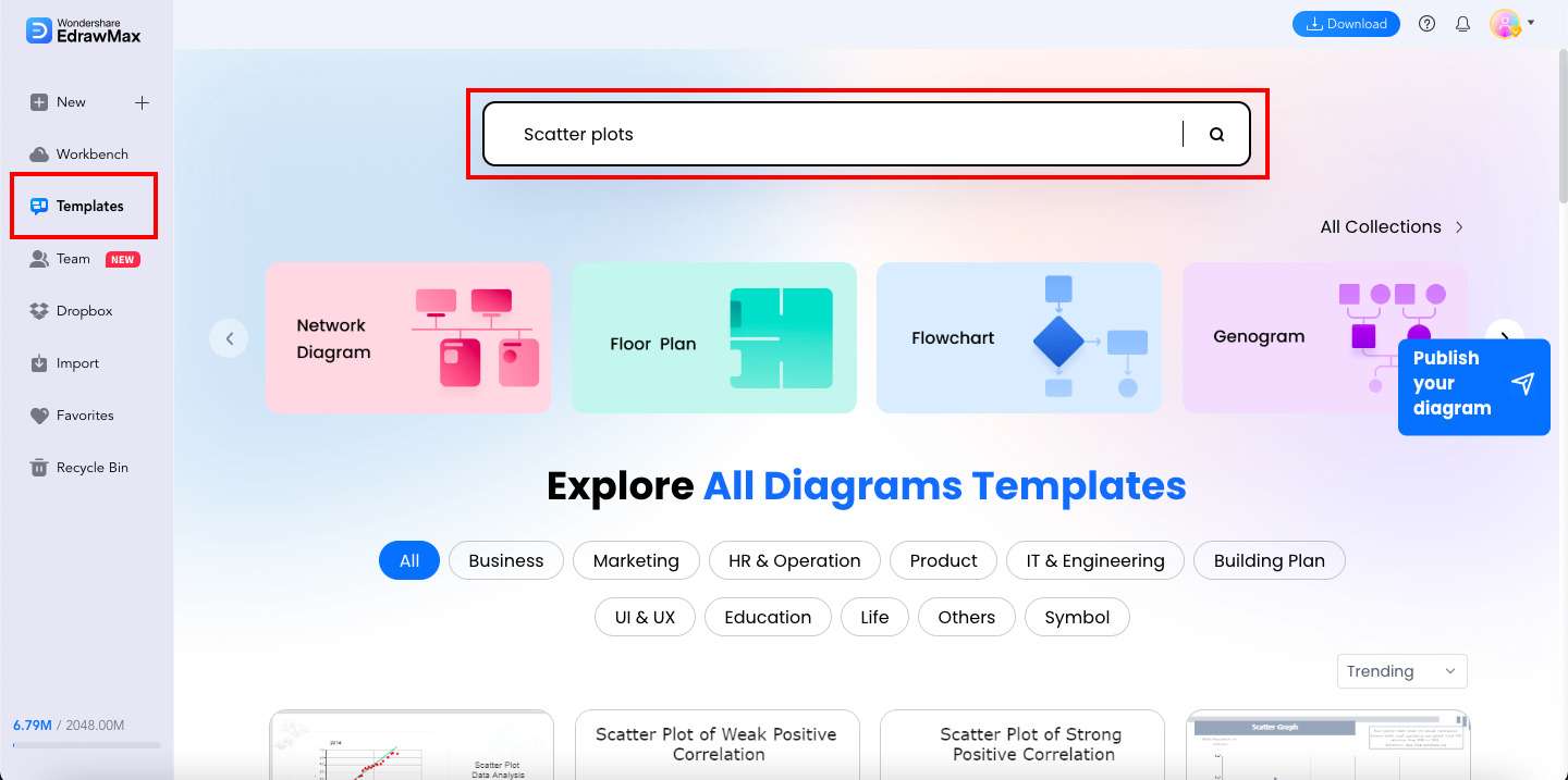
Step 1: Access EdrawMax Online start a new project by clicking WORKPLACE button.
Step 2: You may create a scatter plot from scratch or choose a template from EdrawMax's Template Community. Templates with predefined structures and elements might serve as a useful jumping-off point. You can start by clicking the Templates button and typing what kind of chart you need in the search box.
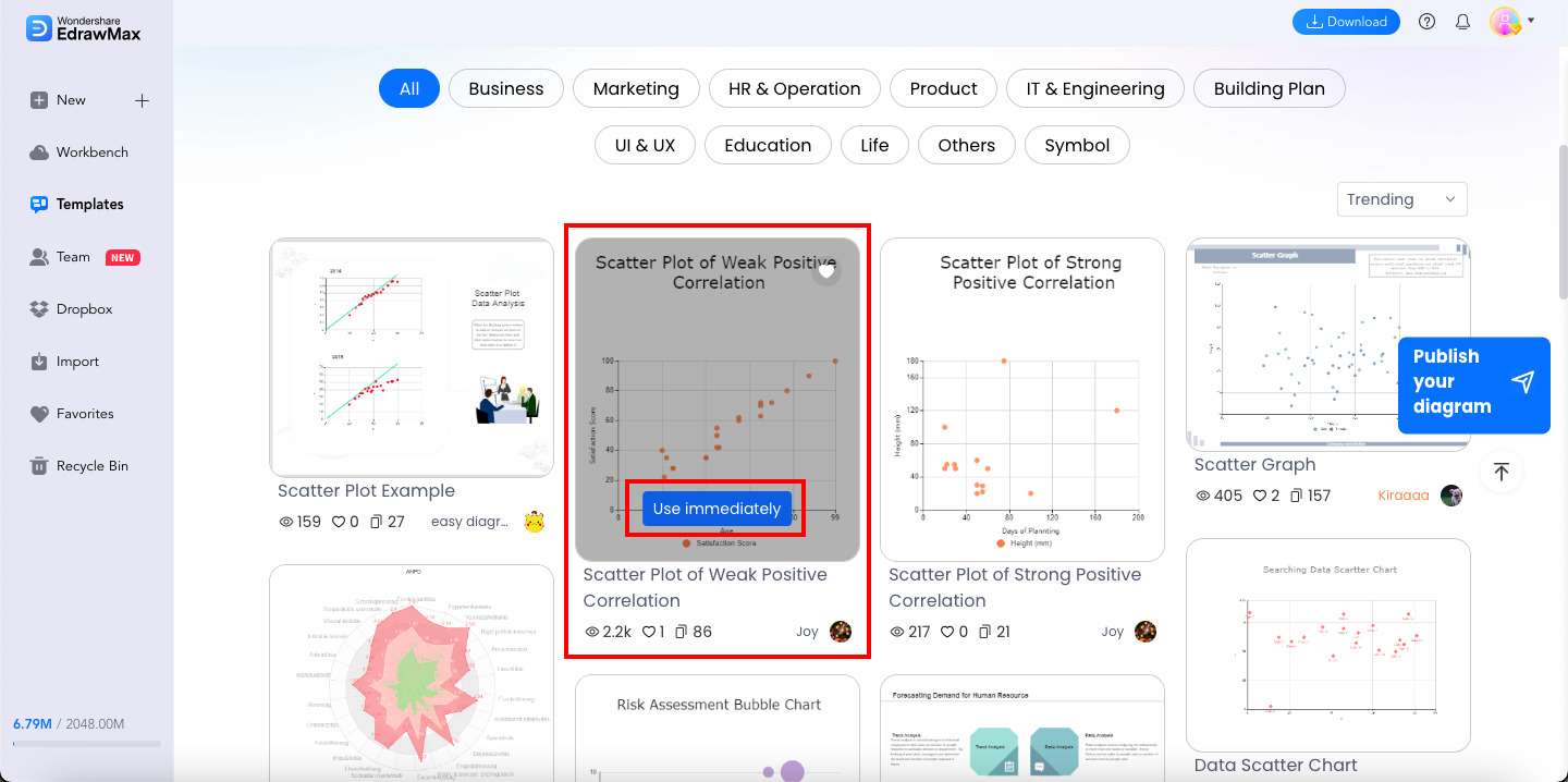
Step 3: Scroll down and choose a template to your liking. Once you've chosen one, click the Use immediately button.
Step 4: Customize your chosen template. Check out some of the amazing customization features that EdrawMax has to offer:
- Add and remove shapes. To illustrate various network devices and components, you can use the Shapes library to add, remove, or alter shapes within the diagram.
- Change text and labels. Double-click on the relevant text element in your diagram to edit labels, descriptions, or any other textual information. You can also modify its format, font, size, and color.
- Customize colors and styles. Different line widths, styles, and color gradients denote separate network zones.
- Incorporate icons and images. To make your diagram more understandable and interesting, you can import photos from your PC or choose from the extensive library of icons provided by EdrawMax.
- Group and align elements. This feature will help you create a well-structured diagram. Align components and cluster-related information for a polished final product.
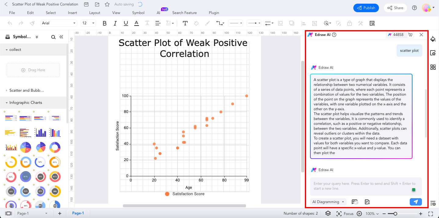
- AI chat. The Edraw AI conversation tool in EdrawMax can help if you get stuck or need ideas. It helps get answers, develop layout ideas, and ensure the food on the menu looks great.
Step 5: You can now Save and Export your scatter plot after making any necessary adjustments.
Part 2. Three Templates From EdrawMax's Templates Community
This part will introduce you to the treasure trove of scatter plot templates available in EdrawMax's Templates Community. These templates are your secret weapon for quick and easy data visualization—no need to start from scratch. EdrawMax has your back with a wide variety of scatter plot templates ready for your data. Whether you're tracking sales, analyzing trends, or working on research projects, these templates are your time-saving solution.
Scatter Diagram for Drinking Crime Stat
Crime rates and drinking hotspots in Tyne and Wear are depicted graphically in the Scatter Diagram for Drinking Hotspot Tyne and Wear Crime Stat. The diagram shows a scatter plot, with the number of drinking hotspots on the x-axis and the incidence of crime on the y-axis. Each dot symbolizes a different place, and the larger the dot, the more crimes have been reported there.

 below.
  below.
 Scatter Plot of Weak Positive Correlation
Dots on a graph or chart called a scatter plot reflect data from multiple quantitative variables. There is a modest positive correlation between the two variables, as the value of Y rises as X rises.

Scatter Plot of Strong Positive Correlation
A scatter plot is a graphical representation of data that employs Cartesian coordinates to show the relationship between two or more variables. To indicate a significant positive association, Y's value increases as X's value increases.

Part 3. Why EdrawMax as Your Tool?
Now, let's uncover why EdrawMax is the perfect choice for your online scatter plot maker. In this part, you'll be able to explore its key features and how it simplifies data visualization, making it accessible to all. One standout feature is the AI Chart Analysis, which takes your data understanding to a new level. Plus, you'll see how many templates can save you time and effort.
Key Features
- User-Friendly Interface. EdrawMax is designed with simplicity in mind. You don't need to be a tech expert to create scatter plots. Its intuitive interface guides you through the process.
- AI Chart Analysis. This game-changing feature analyzes your data and suggests the best chart type. No more guesswork; let AI do the heavy lifting.
- Abundance of Templates. EdrawMax offers a vast collection of templates. Whether you're a student, researcher, or business owner, you'll find templates tailored to your needs.
What You Also Might Find Useful – File Recovery
Beyond scatter plots, EdrawMax offers a handy file recovery feature. Accidents happen, and with EdrawMax, you can retrieve your work if it gets lost or corrupted. It's a lifeline for your important projects.
EdrawMax is your all-in-one solution for data visualization, providing a hassle-free scatter plot creation process and handy features like AI Chart Analysis and file recovery. It's the tool that simplifies your data journey so you can focus on what matters most – interpreting your data and making informed decisions. Say hello to an easier way of creating scatter plots and managing your Insert the download button here.
Part 4. Tips For Making Scatter Plots
Creating scatter plots is easy with EdrawMax, but mastering them takes a little know-how. Here are some simple tips to help you make the most of your scatter plots:

- Choose the right variables. Select the variables that you want to compare. Make sure they are relevant to your analysis.
- Label your axes clearly. Give your scatter plot a clear title and label the x and y-axes with meaningful names. This helps your audience understand what the chart represents.
- Use the right symbols. Use distinct symbols for each data point, making it easier to differentiate between categories.
- Include a trendline. If you spot a trend in your data, adding a trendline can help highlight it and make your scatter plot more informative.
- Scale your axes appropriately. Ensure that your axes are scaled correctly. It means that each increment on the axes should represent the same amount of change in the data.
- Add context. Briefly explain your scatter plot's purpose and what the data represents. This context helps your audience understand the significance of the chart.
- Use color wisely. If you're working with multiple datasets, use different colors to distinguish them. But be mindful not to overwhelm the plot with too many colors.
- Keep it simple. Remember, the goal is to make the data easy to understand. Avoid clutter and unnecessary decorations.
By following these tips, you'll create visually appealing scatter plots and effectively convey your data's story. With EdrawMax's user-friendly interface and templates, you can implement these tips and make stunning scatter plots.
Conclusion
Creating scatter plots can be a breeze with EdrawMax. Whether you're a student, a researcher, or a business owner, this online scatter plot creator is your trusted companion. Its user-friendly interface, AI Chart Analysis, and abundance of templates make data visualization a walk in the park.
Plus, the bonus file recovery feature ensures your work is safe. With these tools at your fingertips, you can transform your data into meaningful scatter plots and unlock the stories hidden within. Start your journey with EdrawMax today and make data analysis easier than ever before.
AI Diagram Generator
Enter your prompt. Upload files if needed. Generate diagrams, charts, or slides instantly.


