


In an era dominated by data, the ability to convey information effectively is invaluable. One powerful tool at your disposal is the clustered column chart, which allows you to visually represent complex data sets with ease.
Whether you're analyzing sales figures, survey results, or any other type of quantitative information, mastering this chart type will elevate your data presentations to a whole new level. In this guide, we'll walk you through the process, ensuring you can create impressive clustered column charts effortlessly.
Contents of this article
What is a Clustered Column Chart?
A clustered column chart is a way to show information using vertical bars. These bars are grouped together, making it easy to compare different things. For example, you can use it to compare sales figures for different products. By the end of this guide, you'll be a pro at creating and using clustered column charts to make your data clear and understandable.
Creating a Clustered Column Chart in Excel
Looking to visually represent your data for better insights? Excel offers a user-friendly way to do just that with clustered column charts. These charts are perfect for comparing different categories or series within your dataset.
Follow these simple steps to create an Excel clustered column chart effortlessly.
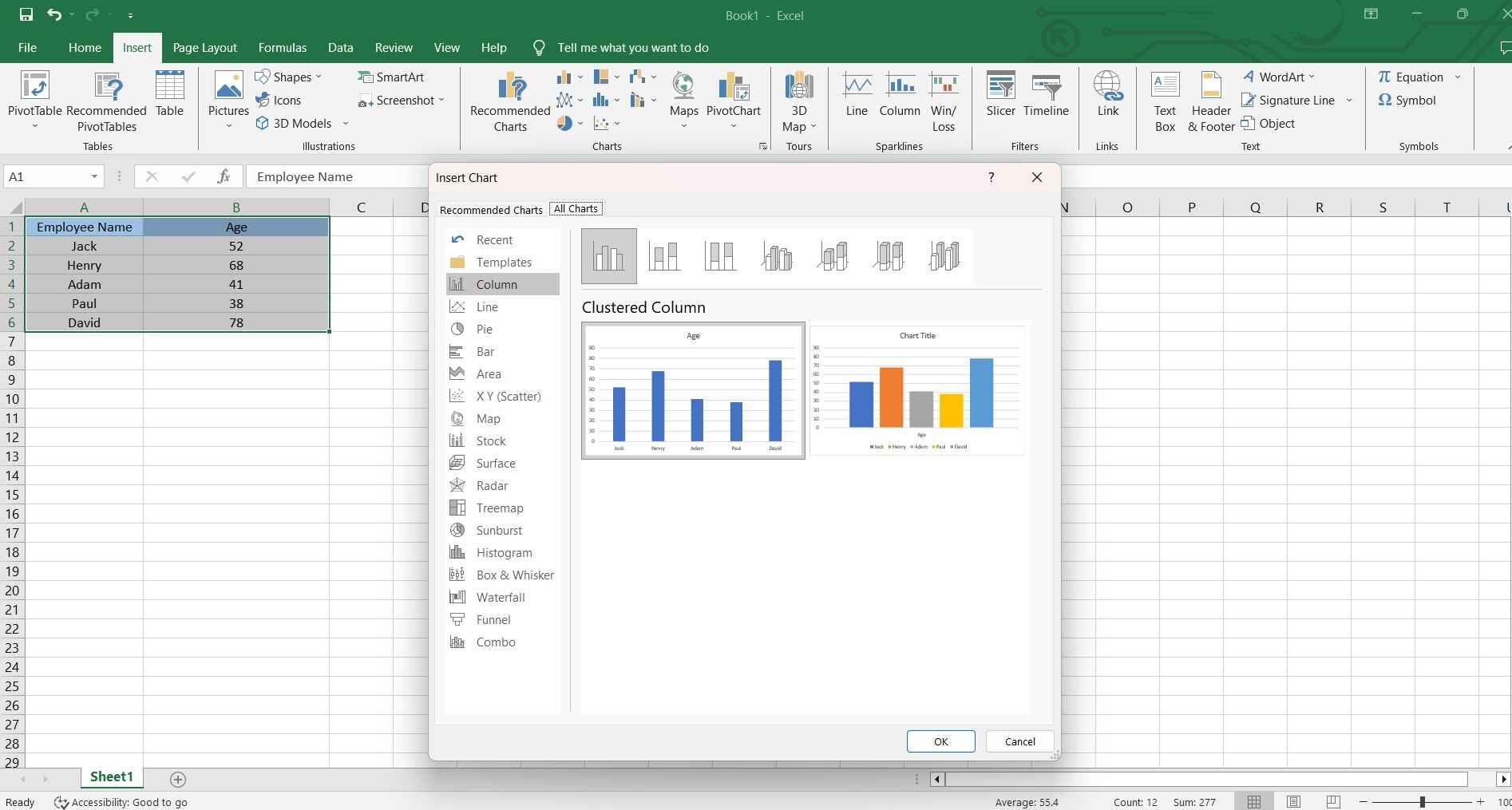
Step 1: Launch Excel and open the spreadsheet with the data you want to visualize.
Step 2: Highlight the data you want to include in your chart.
Step 3: In Excel, go to the "Insert" tab and select "Column Chart" from the Charts group. Choose the "Clustered Column Chart" option.
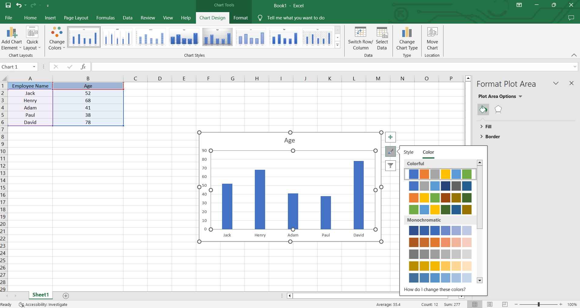
Step 4: You can further customize your chart by right-clicking on various elements (like bars, axis labels, etc.) and accessing the formatting options.
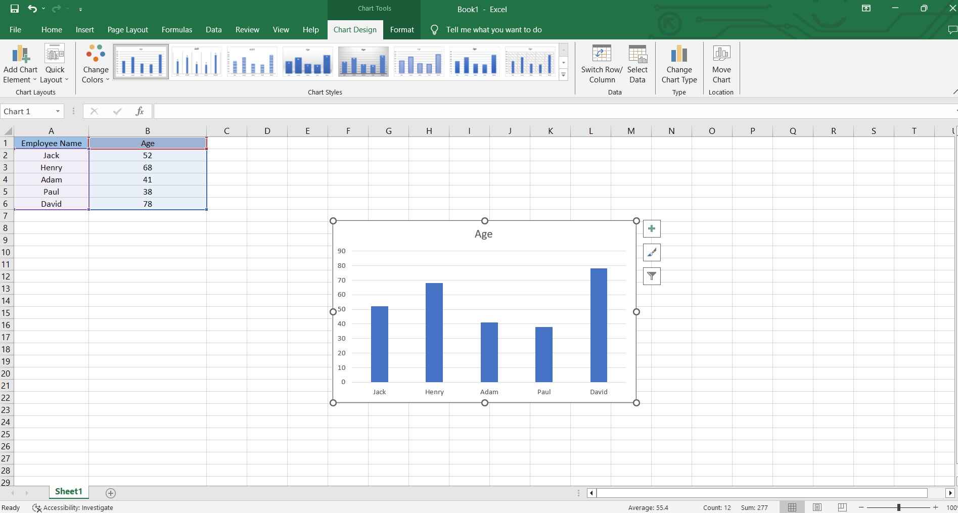
Step 5: Add a title and labels to your chart for clarity.
And that’s it! Save your work when done!
Step for Creating Power Bi Clustered Column Chart
Creating a clustered column chart in Power BI is a breeze. Follow these steps to turn your data into insightful visuals:
Step 1: Launch Power BI and open your existing report or create a new one.
Step 2: On the right-hand side, click on the "Visualizations" icon (it looks like a chart) to open the Visualizations pane. From the Visualizations pane, find and select the Clustered Column Chart icon.
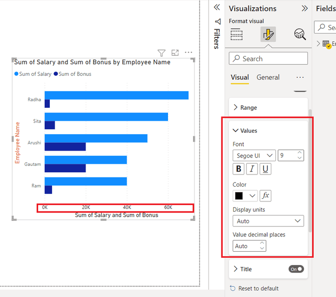
Step 3: Drag and drop the relevant fields from your dataset into the appropriate areas of the chart (e.g., Axis, Legend, and Values).
Step 4: Use the formatting options in the Visualizations pane to adjust colors, labels, and other aspects of your chart.
Step 5: Once you're satisfied with your chart, save your report and, if needed, publish it to your Power BI service.
By following these steps, you'll have a clear, visually appealing Power Bi Clustered Column Chart ready to convey your data's insights effectively.
Best Online Tools to Create Clustered Column Chart
#1 Wondershare EdrawMax
EdrawMax is a powerful online tool tailored for creating professional-quality clustered column charts. With its intuitive interface and dedicated data visualization features, it offers a seamless experience for crafting visually compelling charts.
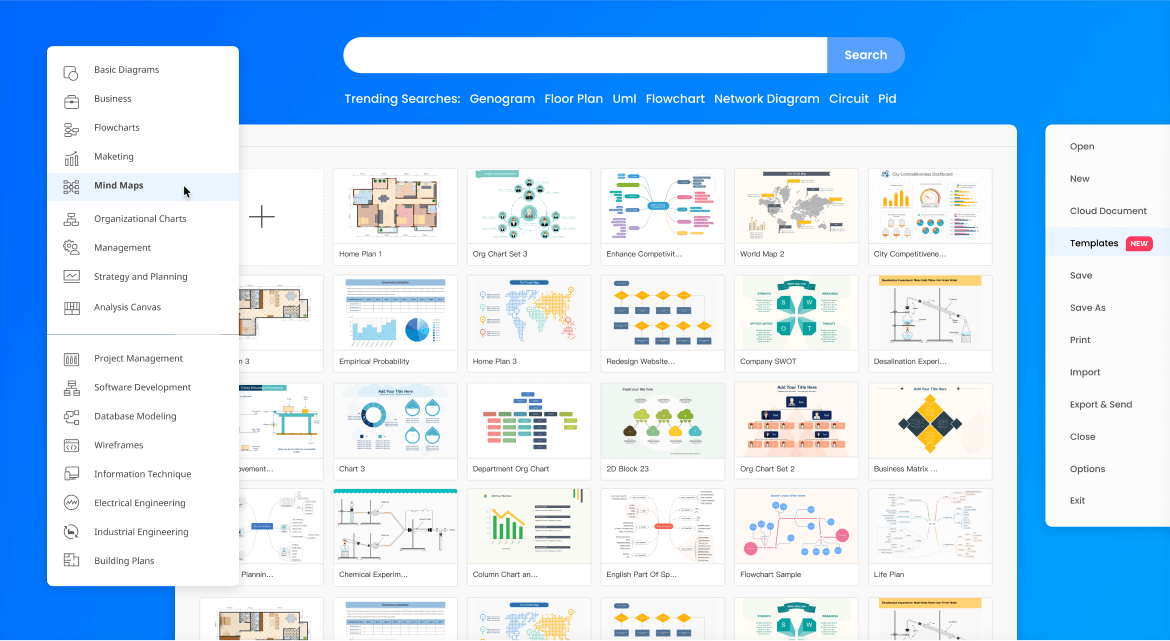
#2 DesignCap

DesignCap is a user-friendly online platform that empowers users to design a variety of visual content, including clustered column charts. It provides an extensive library of templates and customization options, making it a convenient choice for both beginners and experienced designers.
#3 Canva
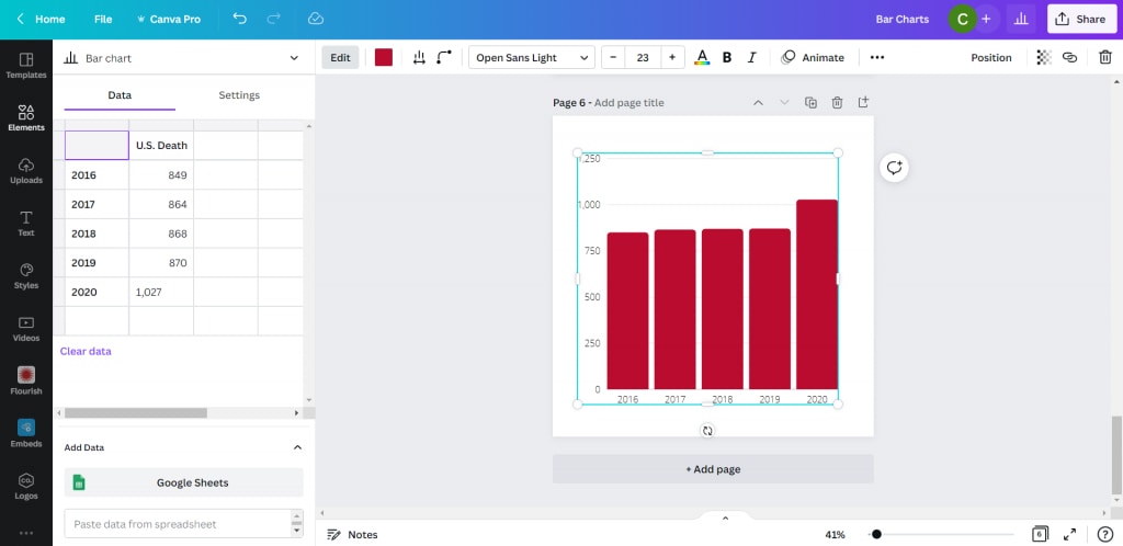
Canva is a widely popular online design tool known for its versatility. It offers a range of templates and design elements, making it suitable for creating various types of visual content, including clustered column charts. Canva's intuitive drag-and-drop interface makes chart creation accessible to users of all skill levels.
How to create a Clustered Bar Chart Easily with EdrawMax
EdrawMax offers a distinct advantage over Excel and Power BI when it comes to creating clustered column charts due to its specialized focus on data visualization. Unlike Excel, which is a versatile tool for spreadsheet management, EdrawMax is tailored specifically for creating charts and diagrams. It offers a comprehensive set of tools and features dedicated to crafting visually appealing and informative charts, ensuring a higher level of customization and control over the chart's appearance.
Here are the steps to create a clustered column chart using EdrawMax:
Step 1: Launch EdrawMax on your computer. In the EdrawMax interface, click on "New" to start a new project. Then, choose the "Graphs and Chart" option. Select “Column Chart”.
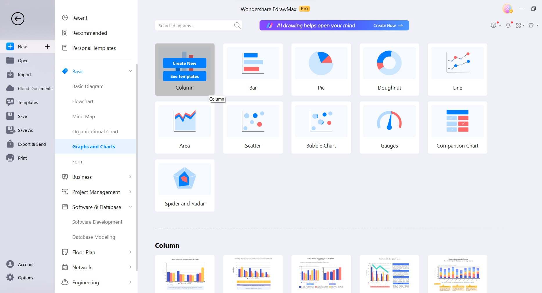
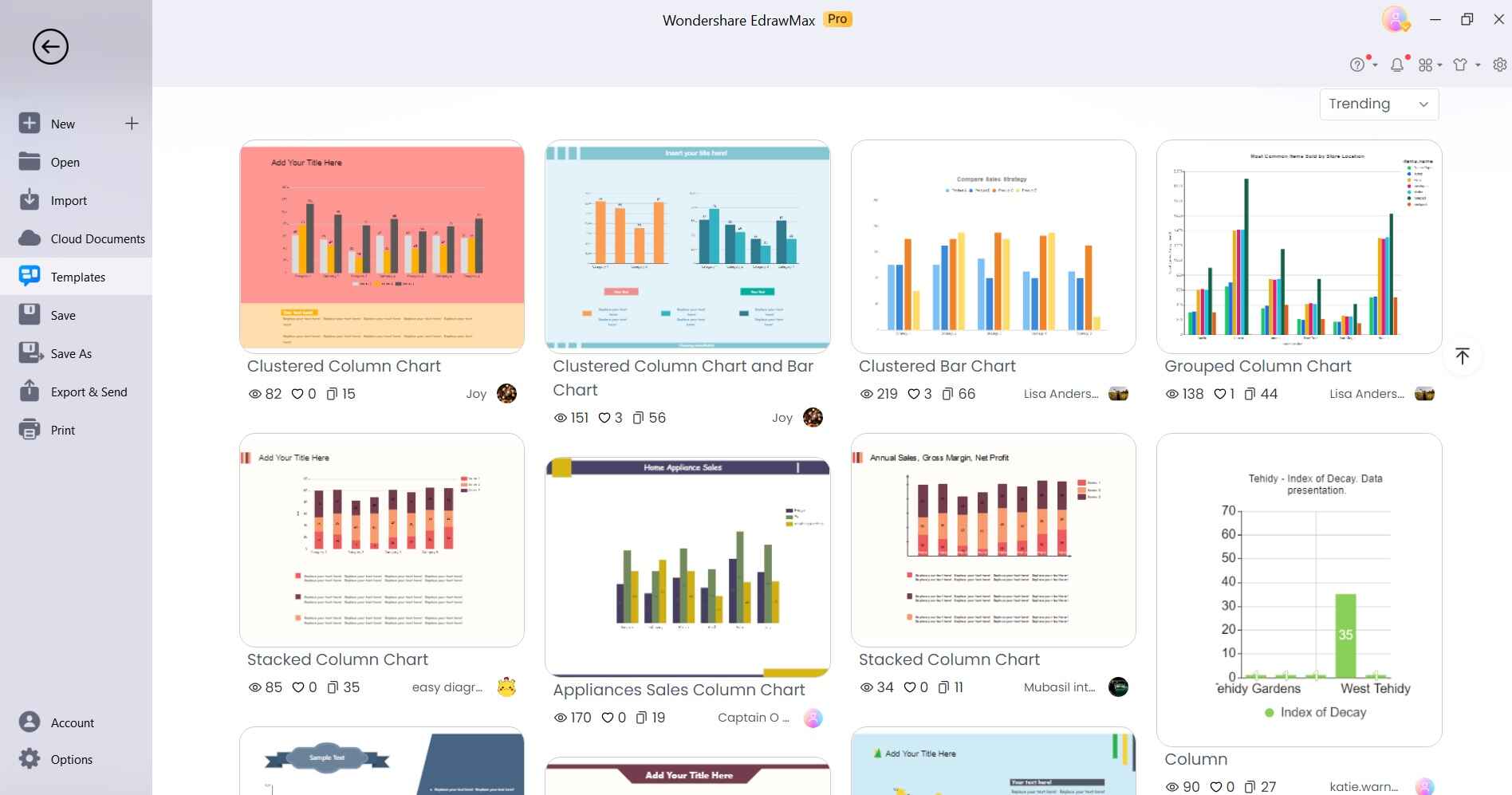
Step 2: If you prefer not to start a drawing from scratch, you have the option to utilize a pre-designed template. Simply navigate to the homepage and click on 'Templates' in the left menu. Now, search for “Clustered Column Charts”. Afterward, pick the pre-designed drawing that best suits your needs and customize it to your preference. Upon selecting a template, a preview will appear, and you can click 'Use Immediately' to import it onto the drawing board.
Step 3: A spreadsheet-like editor will open. Input or import your data into the editor. Each column represents a data category, and each row represents a data point.

Step 4: Once your data is in place, you can customize the chart by changing colors, labels, and other visual elements. Use the formatting options available in the EdrawMax interface to fine-tune the appearance of your clustered column chart.
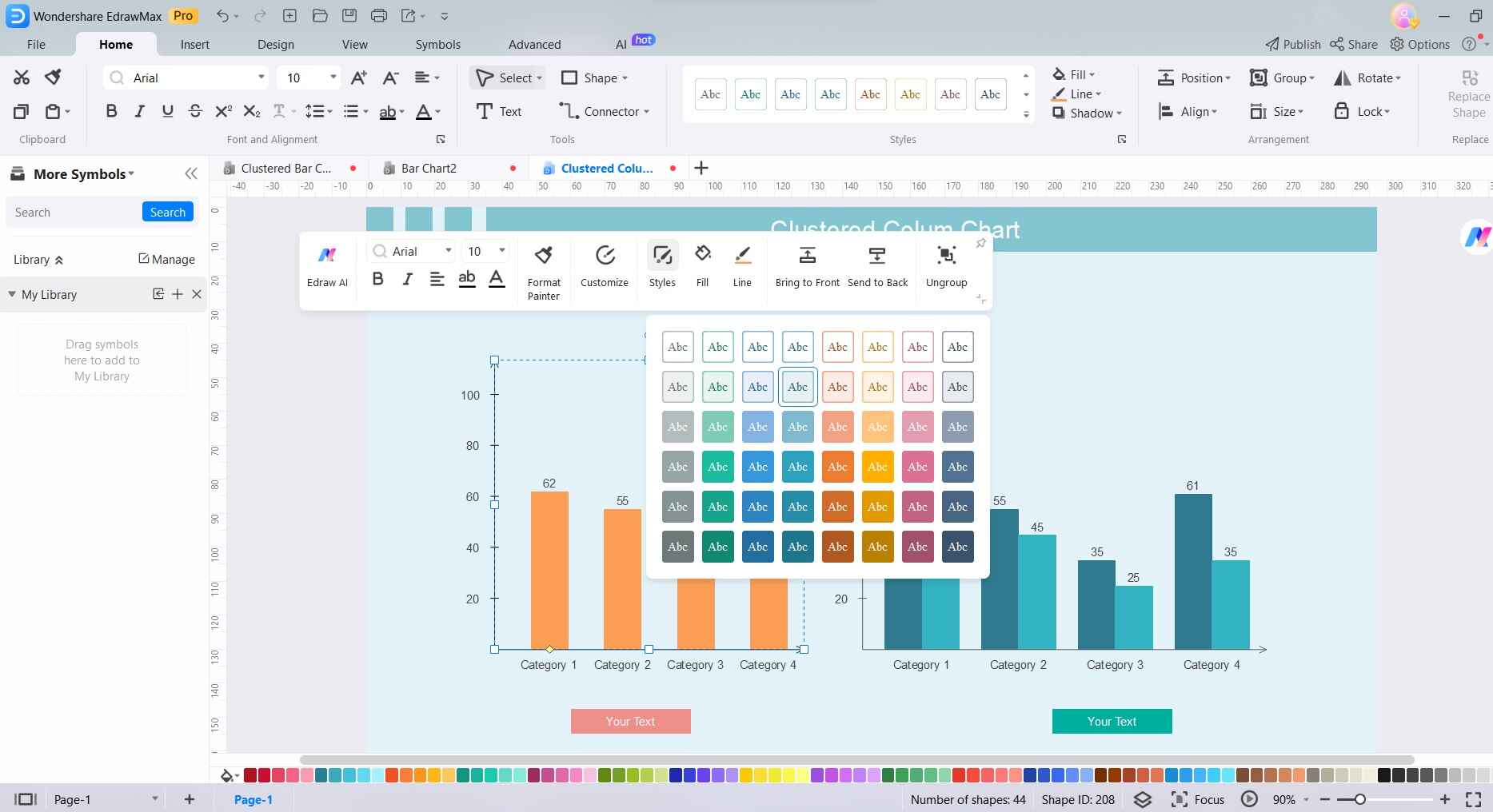
Step 5: When you're satisfied with your chart, click on the "Save" button to save your project. You can export your chart in various formats (e.g., PNG, JPEG, PDF) or directly share it with others.
By following these steps, you'll have successfully created a clustered column chart using EdrawMax, taking advantage of its specialized charting capabilities.
Conclusion
Learning the process creating clustered column charts is a valuable skill in today's data-driven landscape. Whether using Excel, Power BI, or specialized tools like EdrawMax, DesignCap, or Canva, the ability to convey information visually empowers effective communication.
Each platform offers its unique strengths, from Excel's versatility to EdrawMax's specialized focus. Choose the tool that aligns best with your needs and preferences. By following the steps outlined, you'll unlock the potential of clustered column charts, transforming complex data into clear, compelling visual representations for informed decision-making.
AI Diagram Generator
Enter your prompt. Upload files if needed. Generate diagrams, charts, or slides instantly.


