


Google Forms is a great tool to create online surveys. Your participants can easily access it anywhere and have a built-in summary tool. If you want to customize the pie charts in Google Forms, you'll need to export them to Google Sheets. But using Google Sheets can be challenging. The interface is slow to load when editing and has limited functionality. But don't worry, there's another way.
In this article
Part I. How To Create a Google Forms Pie Chart in 6 Steps?
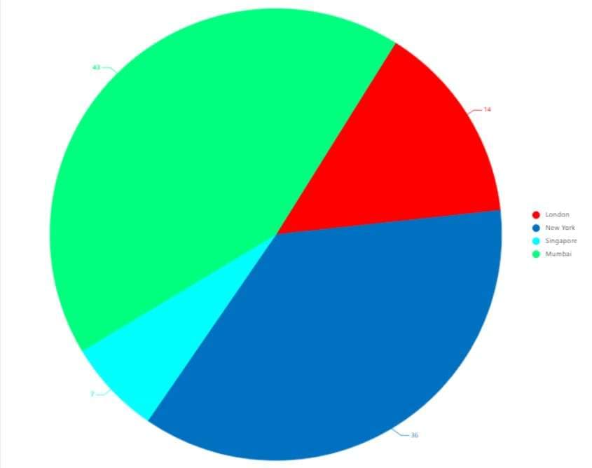
Pie charts are a great way to visualize data proportions for easier comparison, and they are advantageous for surveys with a limited number of answer options. If you want to visualize the results of your Google Forms survey, here's how to create a Google Forms pie chart in Google Sheets in just a few steps:
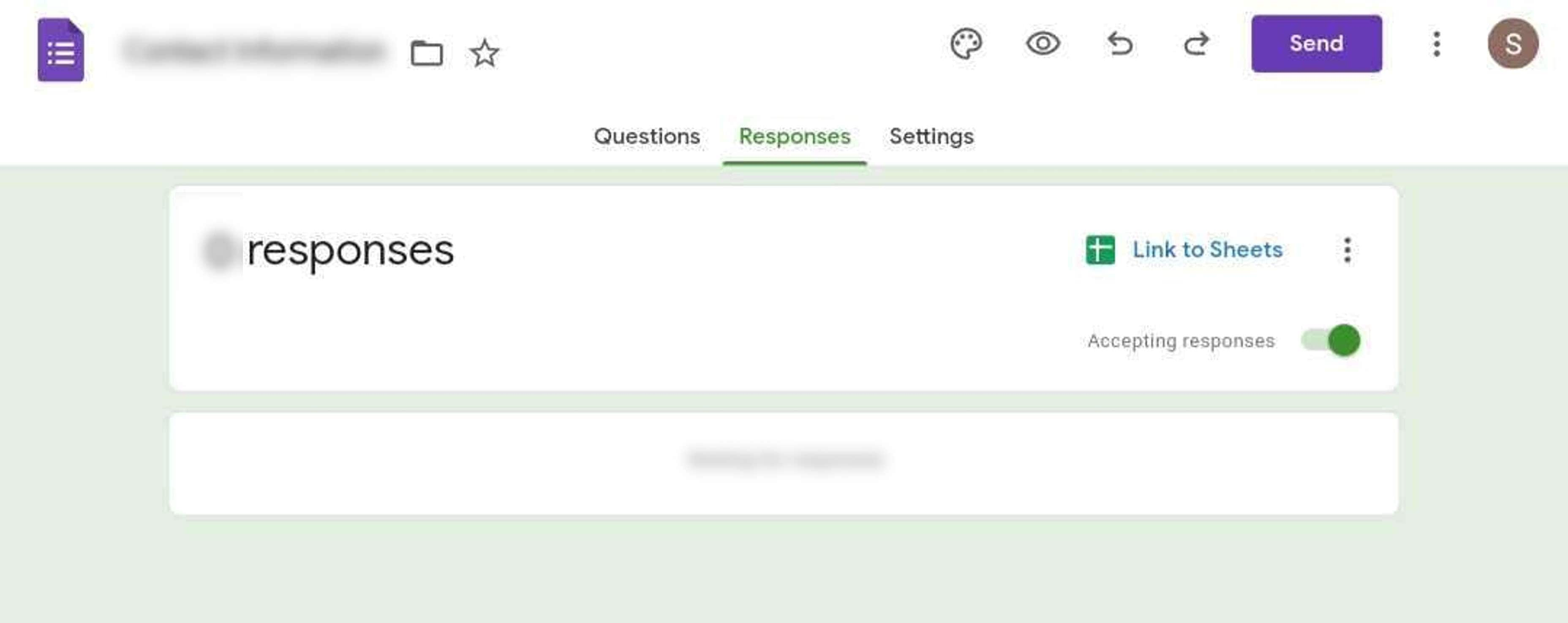
Step 1: Once you've collected enough responses, go to the Responses tab of your form in the upper navigation pane and click Link to Sheets.
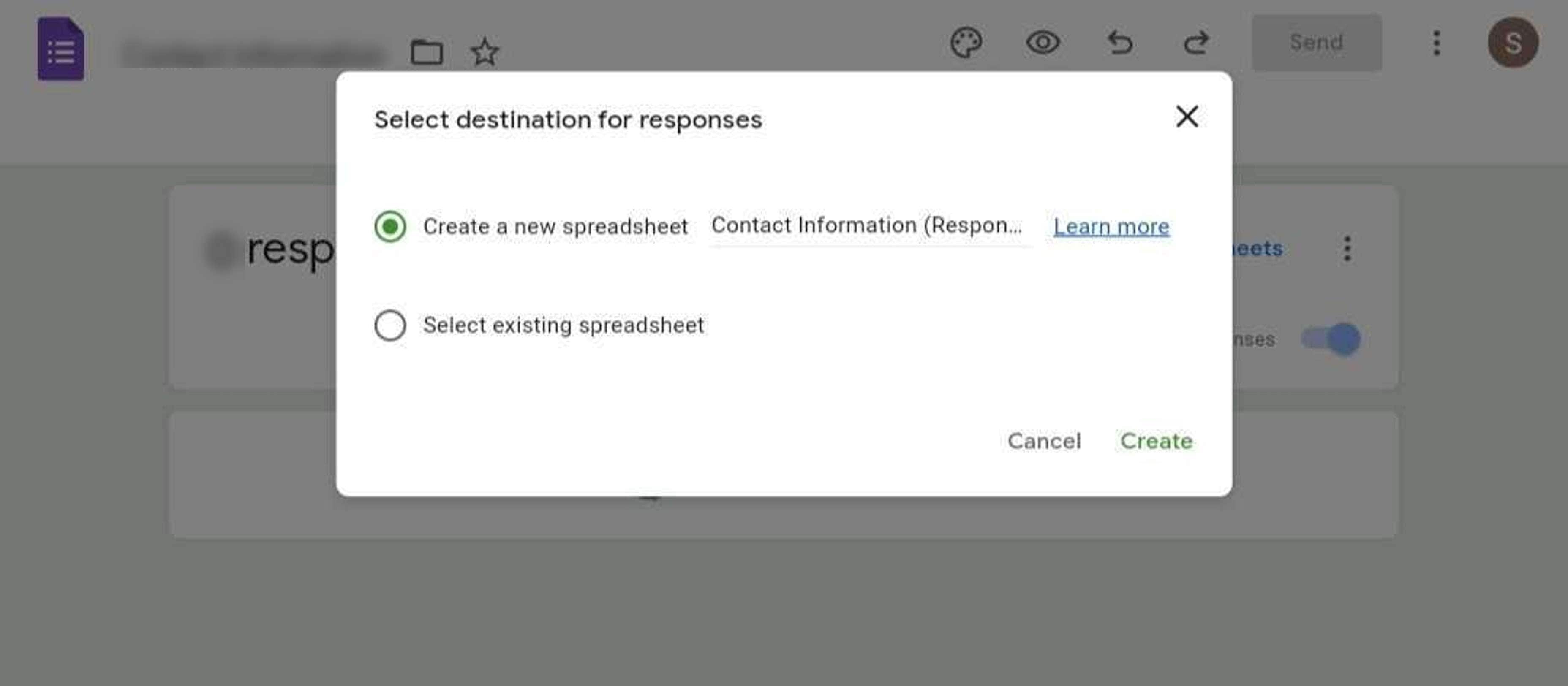
Step 2: Select an option in the "Select destination for responses" pop-up window and click Create. It will open the Google Sheets that contain the data from your form.
Step 3: Select the data you want to represent in the pie chart. Next, click the Insert tab in the upper navigation pane and select Chart.
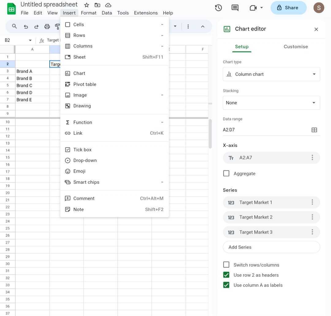
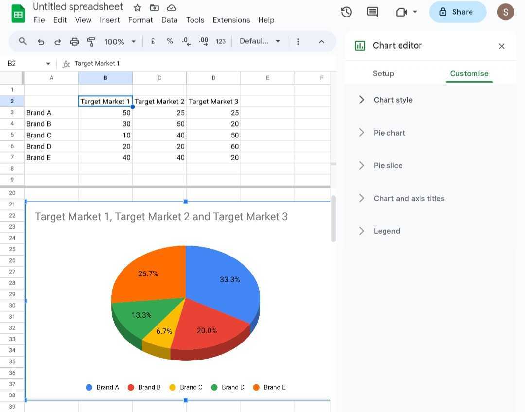
Step 4: In the Chart editor panel, click the Setup tab bar. Then, select an option in the Pie section from the Chart type drop-down menu.
Step 5: Go to the Customise tab bar in the Chart editor panel. Here, modify the customization settings for the Chart Style, Pie chart, Pie slice, Chart and axis titles, and Legend.
Step 6: Once satisfied with your pie chart, go to the File tab in the upper navigation pane. Select whether to import, download, or share the Google Forms pie chart.
Part II. Pie Chart Templates for Google Forms
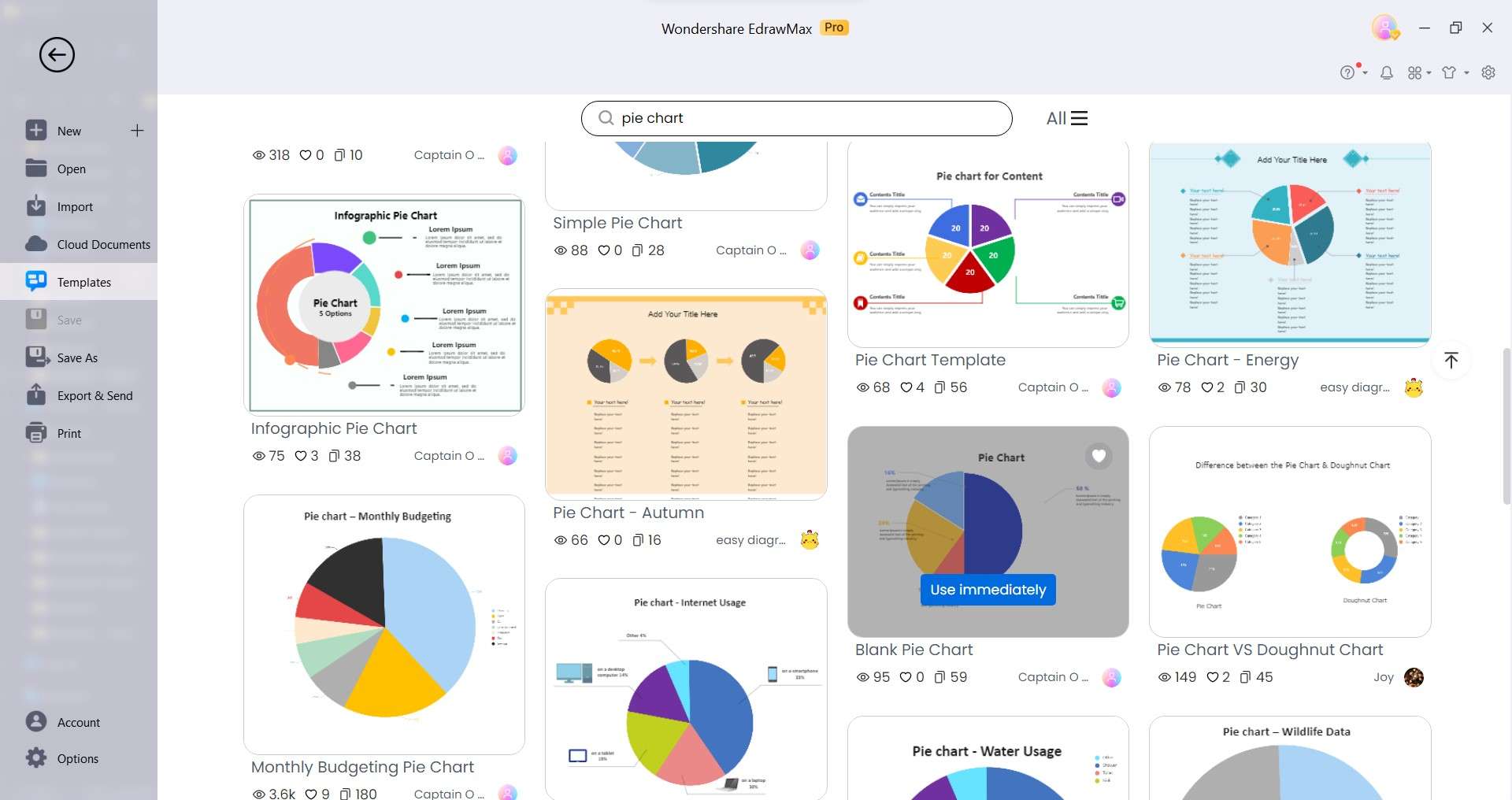
Google Forms pie charts linked to Google Sheets are easy to edit. But if you want to make your data visualizations pop and save yourself time, try pie chart templates from EdrawMax's Templates Community. These templates are customizable, aesthetically pleasing, and versatile. Here are some popular pie chart templates, many of which are perfect for project management.
Market Trends - Donut Pie Chart Template

 below.
  below.
 Easily represent market share, customer preferences, or product sales using this donut pie chart template. Customize the segments to reflect your data. The donut design offers a unique twist on traditional pie charts, making it ideal for showcasing market trends and comparisons. Compared to Google Forms pie charts, this template offers more control over design and data presentation.
Who Can Use It: Marketing professionals, business analysts, and sales teams.
Energy Consumption - Rose Pie Chart Template

Track and analyze energy consumption patterns or renewable energy sources. The rose design allows you to display data over time, making it an excellent choice for visualizing seasonal energy fluctuations or resource allocation. It presents data in a unique radial pattern, making it easier to identify high and low-consumption areas. This level of detail is challenging to achieve from pie charts in Google Forms.
Who Can Use It: Energy analysts, sustainability managers, and environmentalists
Exploded Pie Chart Template

The exploded pie chart is your go-to when you need to emphasize specific data points within a category. It's perfect for illustrating budget breakdowns, project milestones, or data outliers. Customize the explosion degree for added impact.
Who Can Use It: Project managers, financial analysts, and data scientists.
Blank 2D Pie Chart

The 2D pie chart template is a classic for a reason. It's easy to understand, versatile, and can fit any need. It's suitable for data visualization, presenting survey results, or conveying insights to clients. Customize labels, colors, and sizes to fit your needs.
Who Can Use It: Educators, researchers, and consultants.
Creating professional-looking pie charts can be time-consuming and difficult, especially if you're not an expert. But with EdrawMax templates, you can create stunning visuals beyond what Google Forms survey pie charts offer. Best of all, these pie chart examples are easy to use. Just add your data, customize it, and you're done! With these templates, you can take your data visualization to the next level in minutes.
Part III: Making Pie Charts in EdrawMax: Easier, Faster
EdrawMax has some compelling advantages over Google Forms pie charts created on Google Sheets. Here's why EdrawMax is an intelligent diagramming tool that might be a better choice:
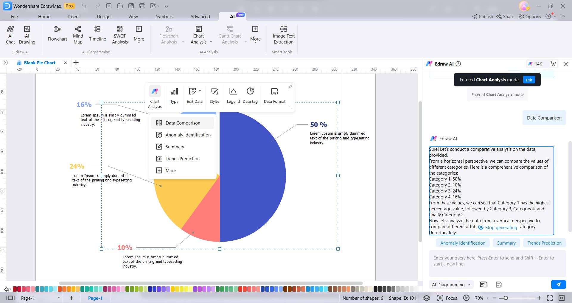
- AI Chart Analysis
You can use EdrawMax AI to analyze your data and gain insights faster.
- Rich Template Library
EdrawMax offers professionally designed pie chart templates for various purposes. Creating Google Forms pie charts from scratch saves you time and effort.
- Extensive Customization
You can customize every aspect of your pie chart, from the data values and labels to the colors and fonts. It means you can create a pie chart tailored to your needs and communicate your message effectively.
- User-Friendly and Intuitive
It's designed with simplicity in mind, which makes it accessible to users of all levels, from beginners to experts.
- Versatile Export Options
EdrawMax supports multiple file formats, enabling you to export your pie charts in various ways, such as images, PDFs, Excel, Word, and more.
- Online and Offline Use
With EdrawMax, you can work online or offline across multiple operating systems. It means you can create your diagrams and Google Forms pie chart charts wherever you are and on whatever device you have available.
Part IV. How To Make a Professional Pie Chart in Minutes?
Want to create stunning pie charts from your Google Forms surveys? You might have seen the pie charts people posted on TikTok from Google Forms. But do you know how to create them even if you're not a data visualization expert? Follow these steps to create a pie chart using one of EdrawMax's templates.
Step 1: Visit the official website of Wondershare EdrawMax and click Free Download. Next, install and launch the software on your desktop.
Step 2: Click Templates on the left-side navigation pane and enter a keyword in the search field. Then, select a pie chart template from the available options. Alternatively, if you have downloaded one of the templates above, click Open in the left-side navigation pane and upload it.
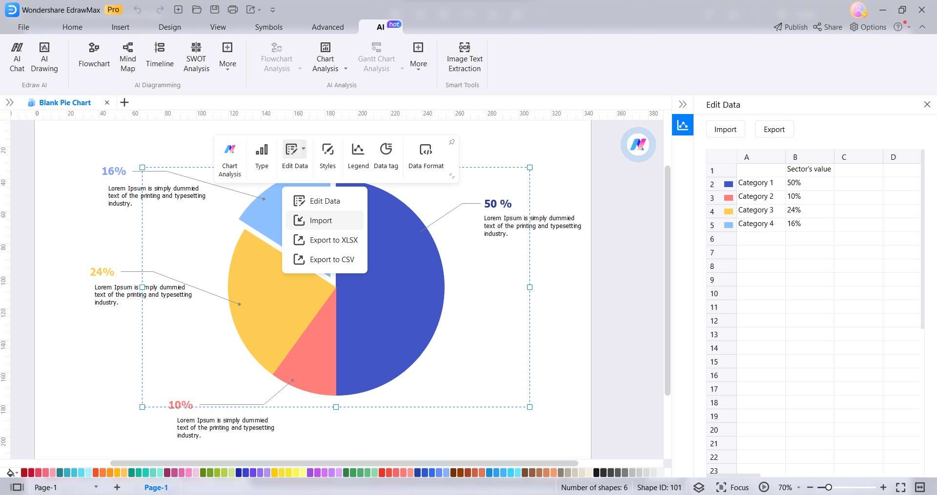
Step 3: Select the chart and click Edit Data drop-down list in the floating toolbar. Choose Edit Data to open the Edit Data panel on the right and input the data. Alternatively, choose Import and upload the Google Forms survey results in CSV format.
Step 4: There are several ways to customize the pie chart:
- Select the pie chart, go to the Design tab in the upper navigation pane, and select One Click Beautify in the One Click Beautify drop-down list.
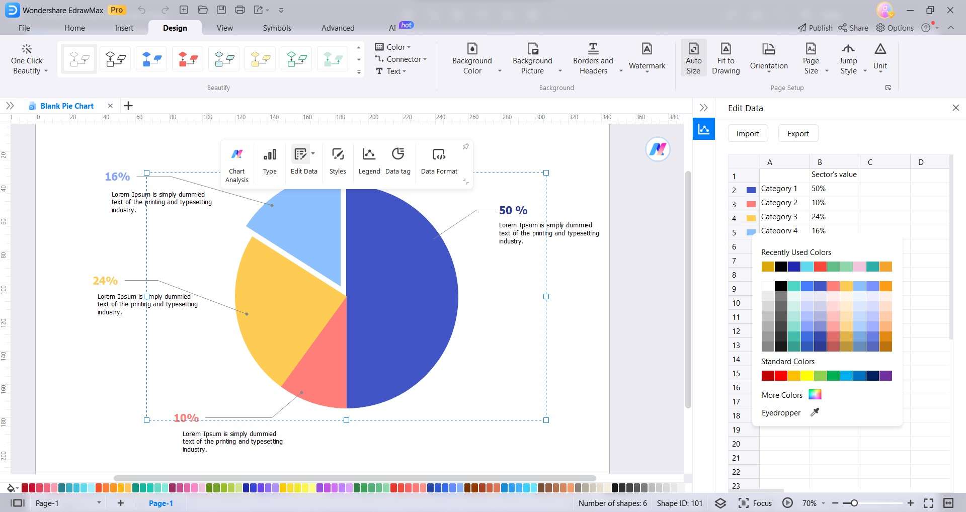
- Click the color legends in the Edit Data pane and select a color from the palette.
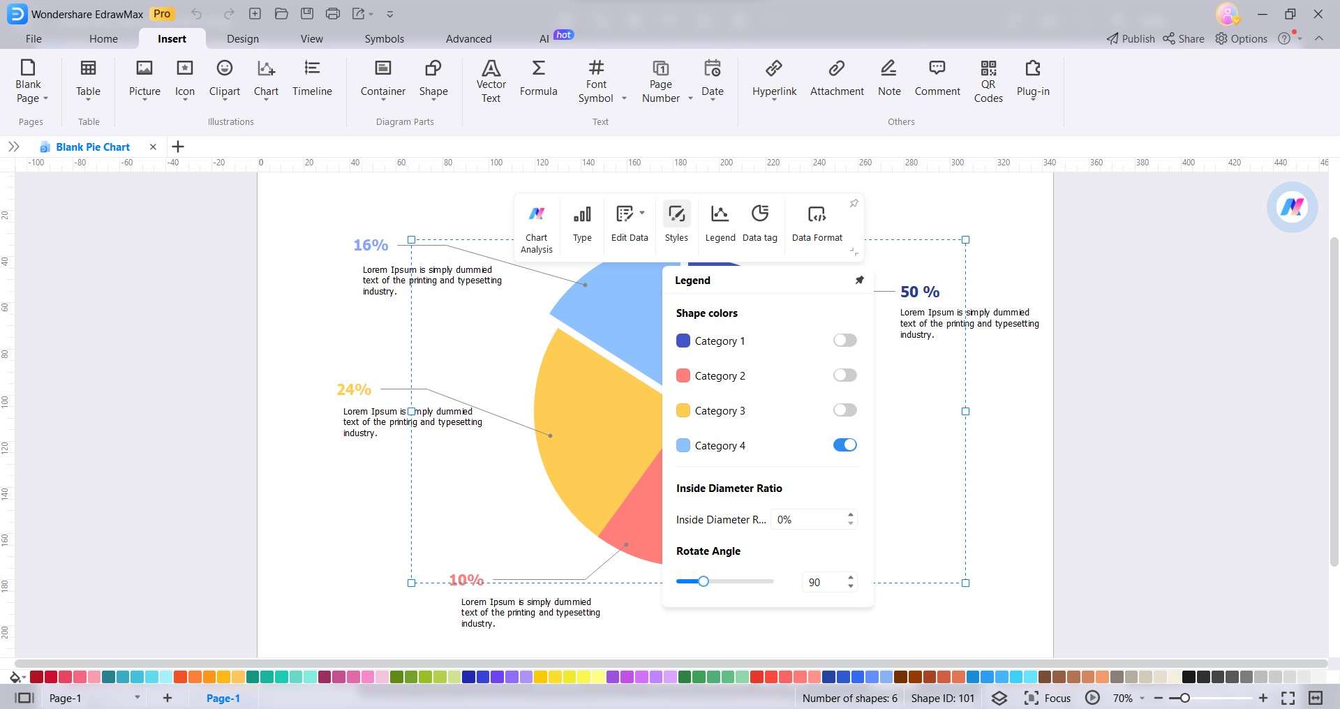
- Explore the floating toolbar to change Styles, Legend, Data tag, and Data Format. For example, click Styles in the floating toolbar to create an exploded pie chart. Then select the pie chart slice you want to separate in the pie chart from the Legend
Step 5: Once satisfied with your customized pie chart, go to the File tab in the upper navigation pane. Save a copy to your computer or the cloud for easy access and sharing. You can also export your chart in various formats.
Conclusion
Google Sheets is an accessible tool for turning Google Forms survey data into a pie chart. But it can be limiting since it only offers a few pie chart options. Aside from that, a Google Forms pie chart created using it can be challenging for beginners to analyze the given data, even in a visual format. That said, an AI-powered diagramming tool can be a valuable alternative.
Step up your data visualization game with EdrawMax and impress your audience. Try it today and take your charts to the next level. Your data deserves it. Don't miss out; transform your Google Forms survey data into compelling visuals anytime!
Frequently Asked Questions (FAQs)
Are you curious if Google Forms can handle data analysis? Or do you have some questions about Google Forms and its results? This section has the answers you need. Check out these FAQs to learn more about Google Forms.
Does Google Form Do Data Analysis?
No, Google Forms does not have built-in data analysis capabilities. But Google Forms allows you to export the data from your form to a Google Sheet. This makes it easy to analyze the data using the various features of Google Sheets, such as pivot tables, charts, and formulas. You can also use an AI-powered diagramming tool like EdrawMax for more sophisticated data analysis and visualization.
Can Everyone See Google Form Results?
The visibility of Google Form results depends on the form owner's sharing settings. When you share a Google Form with a collaborator, you also share the linked spreadsheet. It means that they will be able to see all the responses submitted. You can also check the general settings on what the respondents can edit or see.
How Do You Share a Graph in Google Forms?
When you create a survey in Google Forms, you will see the chart results in the Responses section of the form. You can copy the Google Forms pie chart and paste it into other files, such as Google Docs, Google Slides, or Microsoft Word. It allows you to share the results of your survey or poll with others or use the chart in other presentations or documents.
AI Diagram Generator
Enter your prompt. Upload files if needed. Generate diagrams, charts, or slides instantly.


