


Scatter charts are graphical representations that display data points as individual dots on a graph. They are used to show the relationship between two variables. The position of each dot on the chart indicates the values of the variables being compared. Here, we will discuss the importance of scatter charts in data visualization, non-linear scatter charts, and more.
In this article
Part 1: The Importance of Scatter Charts in Data Visualization
Scatter charts are a critical tool for data visualization as they allow for the representation of relationships between two variables. This visual representation enables analysts and decision-makers to identify patterns, correlations, and outliers within the data, providing valuable insights for decision-making and problem-solving.

Scatter plot charts are particularly useful in displaying large datasets, as they can effectively reveal trends and clusters that may not be apparent when looking at raw data. This makes them an essential tool for understanding complex data sets and identifying potential areas for further analysis.
Part 2: Explaining Non-linear Scatter Plots
Non-linear scatter plots are graphs that depict relationships between variables that do not follow a straight line. Instead, the data points form a curve or other non-linear pattern, indicating a more complex relationship between the variables.
Non-linear scatter plots are essential for capturing relationships that cannot be adequately represented by linear models. They are particularly useful when analyzing data that exhibits exponential growth, logarithmic relationships, or other non-linear patterns.
Part 3: Different Types of Scatter Plot Graphs
There are several different types of scatter plot graphs. Each has its unique characteristics and applications.
- Simple Scatter Plot: This is the most basic form of a scatter plot, where each data point is represented by a single marker on the graph. It is used to visualize the relationship between two continuous variables.
- Grouped Scatter Plot: In this type of scatter plot, data points are grouped or clustered based on a categorical variable. This allows for the visualization of how the relationship between two continuous variables varies across different groups.
- Bubble Scatter Plot: Bubble scatter plots add a third variable to the visualization by varying the size of the markers based on a third continuous variable, and this type of scatter plot is popular in scatter plots. This allows for the representation of three variables on a two-dimensional graph.
- 3D Scatter Plot: 3D scatter plots extend the concept of a simple scatter plot into three dimensions, allowing for the visualization of the relationship between three continuous variables.
- Matrix Scatter Plot: Matrix scatter plots are used to visualize relationships between multiple variables by creating a grid of scatter plots, with each cell representing the relationship between two variables.
Part 4: Analyzing Positive Scatter Plots
Positive scatter plots are graphs that depict a positive relationship between two variables, meaning that as one variable increases, the other variable also tends to increase. Analyzing positive scatter plots involves several key considerations.
- Strength of the Relationship: Positive scatter plots can vary in the strength of the relationship between the variables. By assessing the clustering and dispersion of data points, analysts can gauge the degree of correlation between the variables.
- Outliers and Anomalies: Identifying outliers or anomalies within a positive scatter plot is crucial for understanding the full scope of the relationship. Outliers may indicate unique cases or influential data points that have a significant impact on the overall pattern.
- Trend Analysis: Positive scatter plots can be used to identify trends and patterns within the data, providing valuable insights for forecasting or decision-making. Analysts can use various statistical methods to model and predict the relationship between variables based on the positive scatter plot.
- Comparison with Other Variables: Analyzing positive scatter plots may also involve comparing the relationship with other variables or across different groups. This comparative analysis can reveal important insights into the nature and significance of the positive relationship.
Part 5: Make a Scatter Chart Easily with Wondershare EdrawMax
When it comes to data visualization, scatter charts are one of the most effective tools for analyzing and interpreting data relationships. These charts allow us to display two variables on a graph, making it easier to identify any patterns and trends. Wondershare EdrawMax is the best choice for making a scatter chart. Make a scatter chart utilizing the tool by following these steps:
Step 1:
Open Wondershare EdrawMax and log in. To make sure, enter your password and email address carefully.

Step 2:
You now need to start a fresh document. To start a new chart for this purpose, click the 'New' button in the upper left corner of the screen.
Step 3:
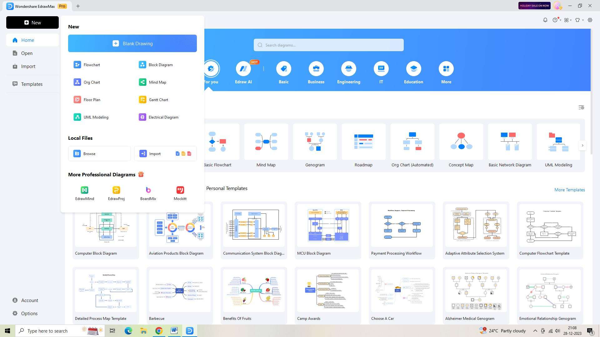
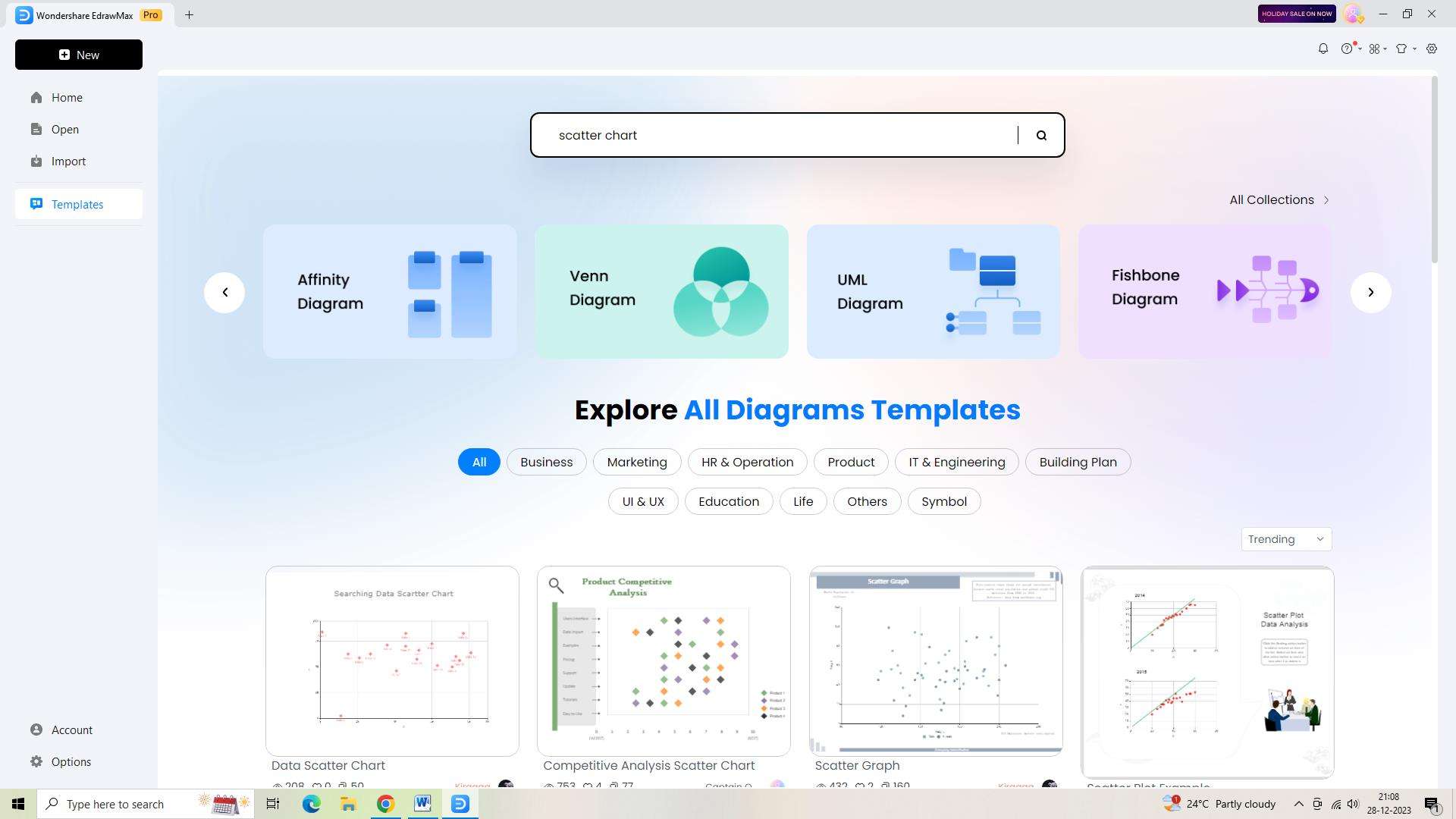
To access the template library, click the "Templates" button located on the screen's left side. Find and pick the "Scatter Chart" template.
Step 4:
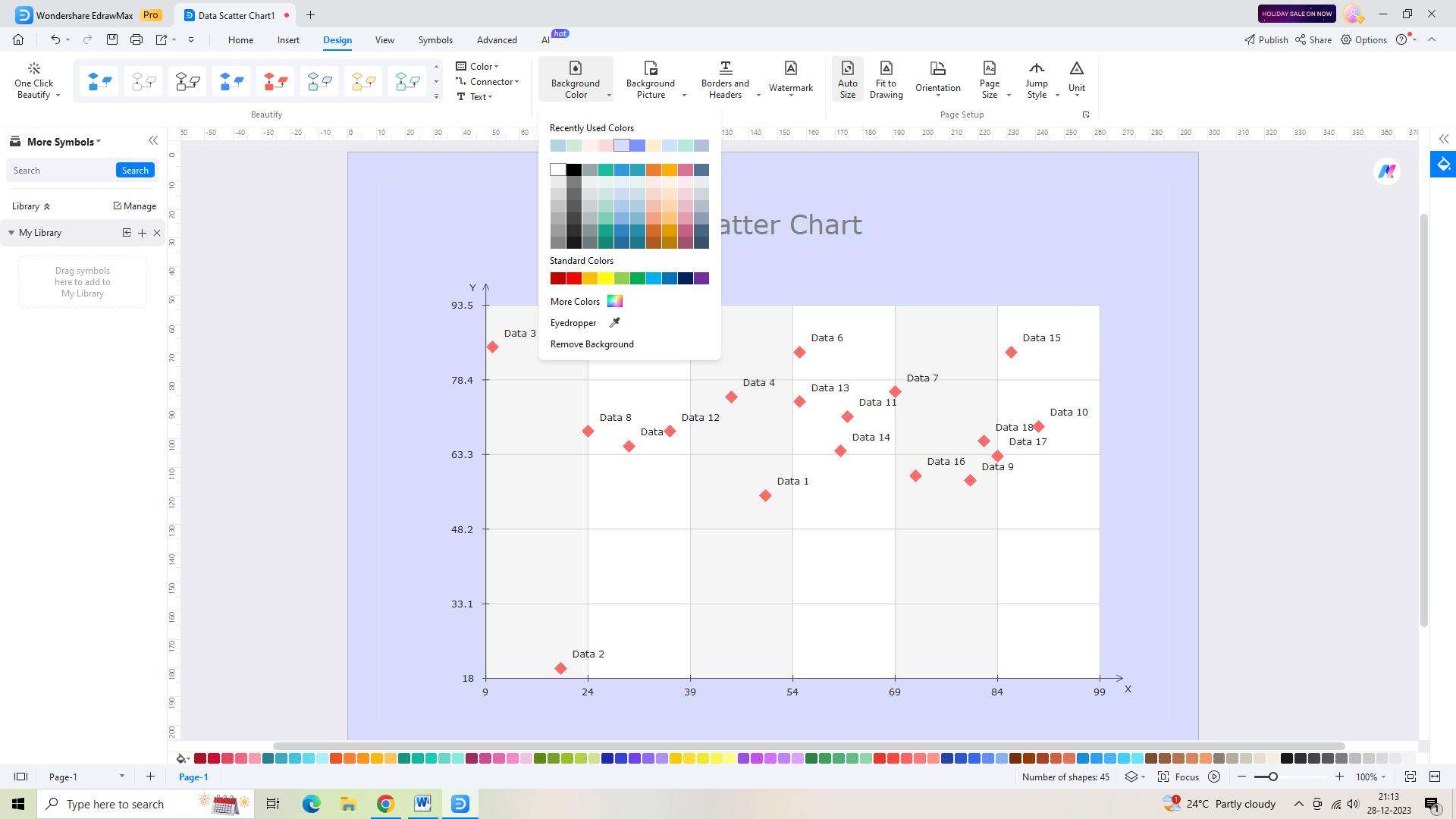
Adapt the chart to your own preferences. Adapt the pre-made connections, shapes, and icons in the template to your own requirements.
Step 5:
You should now save your chart. Click "Save As" in the left navigation bar to save your scatter chart.

Step 6:
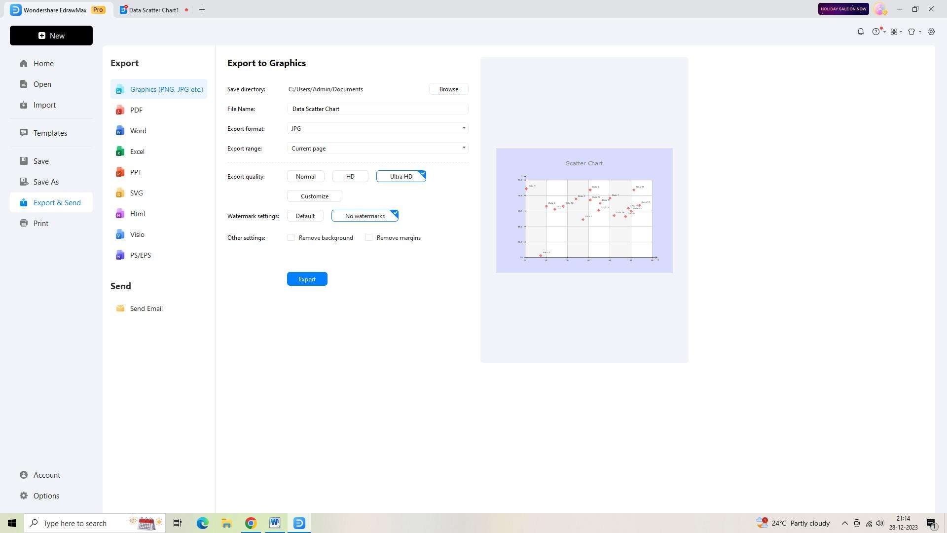
Export the chart in many file formats so that you can quickly share it with your stakeholders or team. To accomplish this, select "Export and Send" from the menu on the left.
Conclusion
Plot Scatter plot charts are a vital tool for data visualization, enabling analysts to uncover patterns, relationships, and anomalies within complex datasets. Non-linear scatter plots provide a means of capturing more complex relationships. Analyzing positive scatter plots involves assessing the strength of the relationship, identifying outliers, conducting trend analysis, and comparing the relationship with other variables.
AI Diagram Generator
Enter your prompt. Upload files if needed. Generate diagrams, charts, or slides instantly.


