


In today's data-driven world, effective visualization is key to extracting meaningful insights. This guide is your gateway to mastering Clustered Column Chart in Power BI, a powerful tool for presenting and analyzing data. We'll walk you through every step, from importing your data to customizing the appearance of your chart. Whether you're a seasoned Power BI user or just starting, this comprehensive tutorial will equip you with the skills to create stunning visual representations of your data, bringing clarity and depth to your analyses.
Contents of this article
What is a Clustered Column Chart?
A Clustered Column Chart is a widely used data visualization technique. It presents information in vertical columns, where each column represents a distinct category. The height of the column is proportional to the value it represents. What distinguishes it is its capacity to cluster multiple columns together, facilitating straightforward comparison between categories. This chart type proves invaluable for visualizing trends, patterns, and variations within datasets. It is an indispensable tool for individuals aiming to extract meaningful insights from their data, enabling clearer understanding and informed decision-making.
How to Create a Line and Clustered Column Chart In Power Bi
Here are the steps to create a Line and Clustered Column Chart Power BI:
Step 1: Open Power BI Desktop and load the dataset you want to work with.
Step 2: On the right-hand side, locate and click on the "Visualizations" pane. In the Visualizations pane, find the Line and Clustered Column Chart icon (it looks like a line graph combined with columns) and click on it.
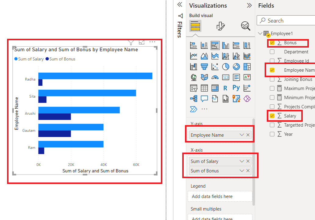
Step 3: In the Fields pane on the right, choose the data fields you want to use. Drag and drop the relevant fields into the respective areas: For the Axis (Categories), use a categorical variable like dates or categories. For the Values, select the numerical data you want to visualize.
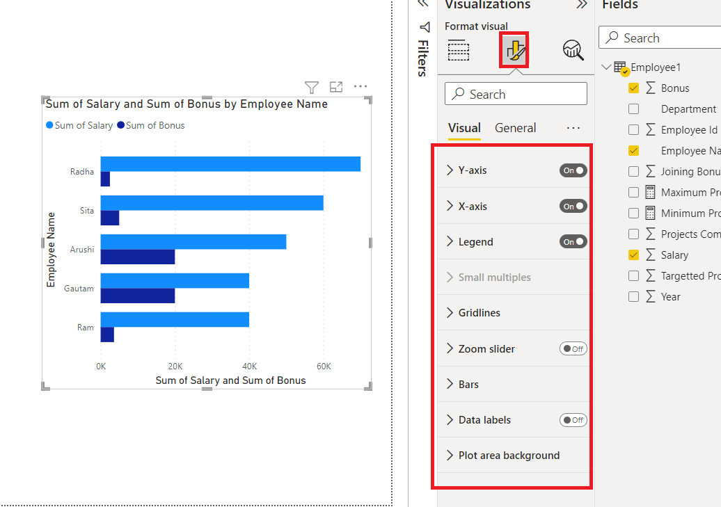
Step 4: Adjust the formatting, colors, and other visual aspects to suit your preferences. In the Visualizations pane, you can further fine-tune the chart by customizing the axis labels, legends, and other settings.

Step 5: Once you're satisfied with the chart, save your Power BI file. If necessary, publish it to your Power BI service or export it for sharing.
And that’s it! Here are the simple steps to create a Line and Clustered Column Chart in Power BI. This dynamic visualization will help you gain valuable insights from your data.
Limitations of Using Microsoft Power BI:
While Power BI is a powerful tool for data visualization, it does have its limitations. Here are some major limitations of using Power BI for creating charts:
- Complex Data Preparation: Power BI requires well-structured data for effective visualization. If your data is messy, incomplete, or requires extensive cleaning, it can be challenging to create accurate and meaningful charts. Users may need to invest significant time in data wrangling and transformation before creating visualizations.
- Limited Customization Options: While Power BI offers a wide range of customization features, certain advanced customization options may not be readily available. Users with very specific design requirements may find it challenging to implement highly specialized visualizations or achieve extremely detailed formatting.
How to Create a Clustered Column Chart with EdrawMax
Wondershare EdrawMax is a versatile diagramming tool that excels at creating complex charts, offering several advantages over Power BI in certain scenarios. Well, first, EdrawMax features an intuitive and user-friendly interface, making it accessible to users of all levels of expertise. Its drag-and-drop functionality simplifies the process of creating complex charts, allowing for quick and efficient chart development.
Unlike Power BI, which primarily operates online or in the cloud, EdrawMax can be used offline. This is crucial for users who require a stable, local environment for sensitive or proprietary data that may not be suitable for cloud-based solutions.
Here are the steps to create a clustered column chart with EdrawMax:
Step 1: Open EdrawMax on your computer. Navigate to New> Graph and Charts> Column Chart.

Step 2: From the left-hand side panel, select and drag rectangular shapes to represent the columns of your chart. Arrange them side by side to create the clustered effect. Add text labels above or below each column to represent the categories.
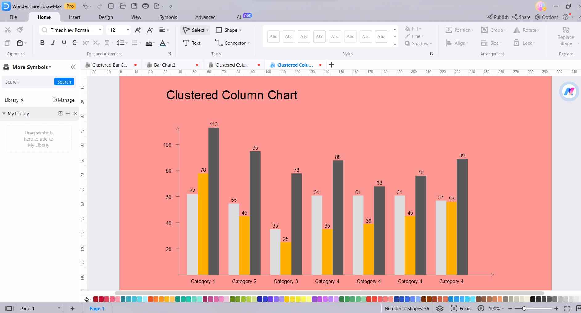
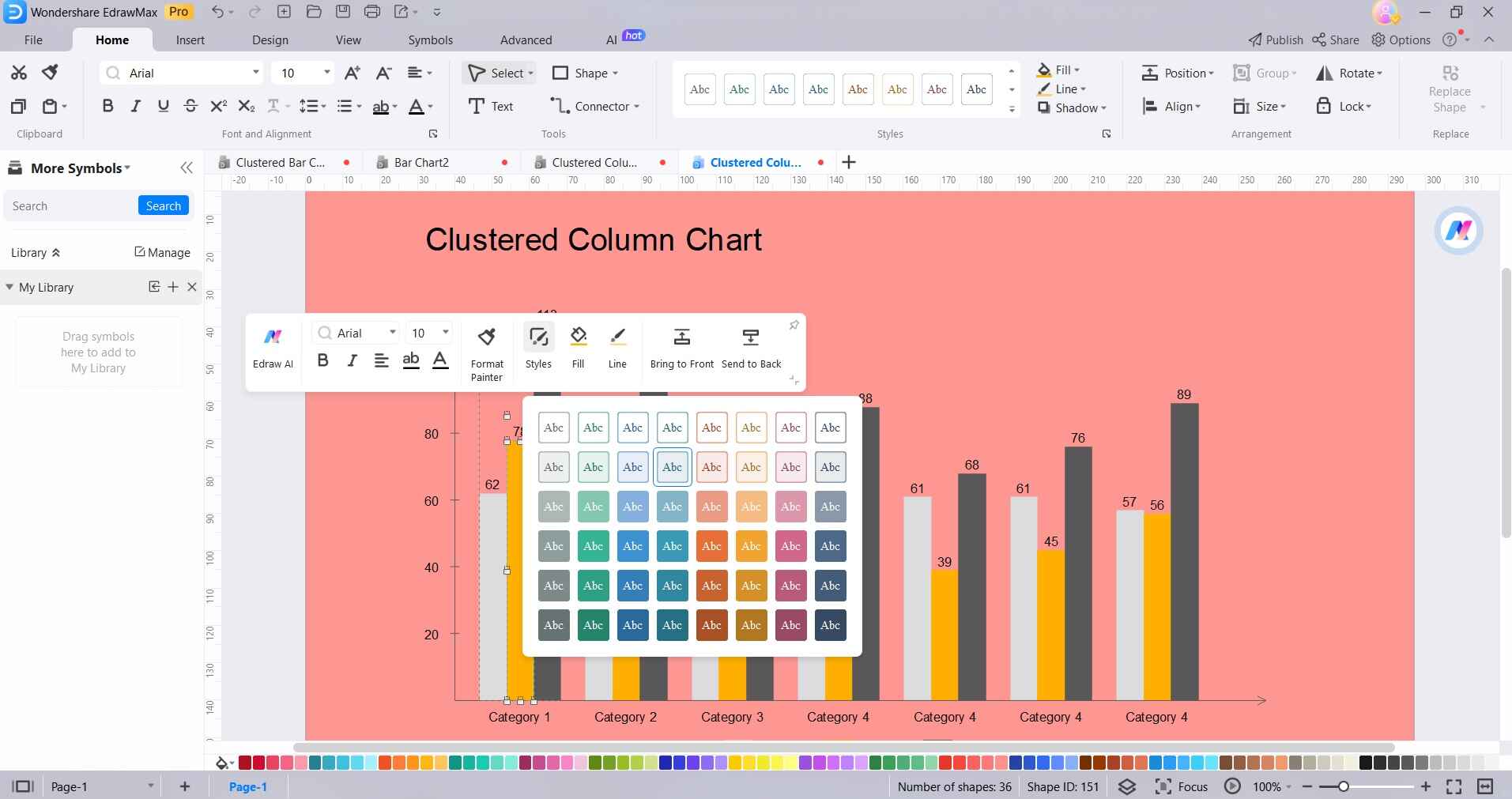
Step 3: Customize the appearance of the chart, including colors, fonts, and styles, to make it visually appealing and informative. Include a title for the chart and labels for the axes to provide context and clarity.
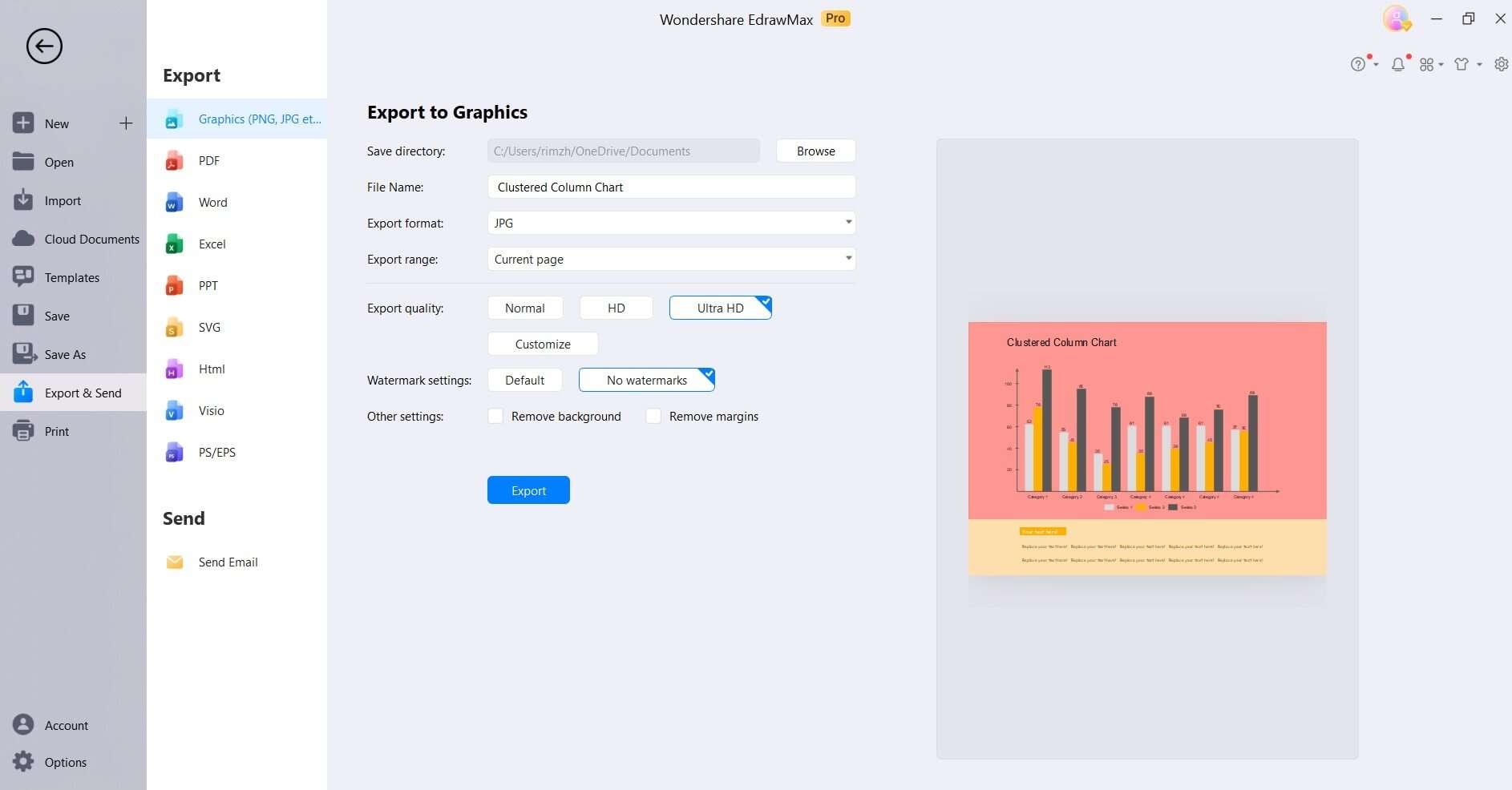
Step 4: Once you're satisfied with the chart, save it in your preferred format (e.g., PNG, JPEG, etc.) for sharing or further use.
Key Takeaway: The key takeaway of using EdrawMax is its versatility in creating various types of diagrams and charts with an intuitive interface. While it may not have advanced data-driven capabilities like some specialized tools, it excels in scenarios where manual creation of static visualizations is needed.
EdrawMax's offline functionality and extensive library of shapes and templates make it a valuable tool for a wide range of industries and projects. Its user-friendly interface empowers users of all skill levels to quickly and efficiently create professional-quality diagrams and charts.
Conclusion
To sum up, becoming proficient in creating Clustered Column Charts in Power BI serves as a valuable proficiency for dynamic data representation. This tutorial has equipped you with the essential knowledge to harness this tool effectively. Remember, a well-crafted chart has the power to transform raw data into actionable insights. Whether you're tracking business metrics or analyzing trends, Clustered Column Charts in Power BI provide a dynamic visual narrative.
Keep experimenting, fine-tuning, and exploring the diverse possibilities.
AI Diagram Generator
Enter your prompt. Upload files if needed. Generate diagrams, charts, or slides instantly.


