


Are you familiar with doughnut charts? These circular visuals might remind you of pie charts, but with an intriguing twist – they feature a hole in the center. Like their pie chart counterparts, doughnut charts effectively present data clearly and concisely. Whether allocating budgets or giving survey results, doughnut charts offer a valuable tool for conveying information.
In this article, you'll be delving deep into the realm of doughnut graphs. You'll also learn their features and uses, and provide you with ready-to-use templates. A versatile tool that simplifies creating doughnut charts will also be presented. So, if you're ready to explore the world of data visualization through doughnut diagrams, dive into this article.
In this article
Part 1. What Are Doughnut Charts?
Imagine doughnut charts as the cousins of pie charts but with a unique twist. They're like pies missing their centers. These circular visuals are like the superheroes of data representation, adding creativity to the information display. They're the visual storytellers that turn numbers and facts into eye-catching graphics.
Benefits of Doughnut Charts
Doughnut charts are more than just eye candy. They're like multitaskers of the chart world, doing a lot with their circular shape. Not only do they show how things are divided, just like slices of a delicious dessert, but they're also skilled at demonstrating connections and changes over time. They're like the ultimate visual all-rounder.
The secret sauce of doughnut charts? They bring clarity in a snap. Slicing information into colorful sections provides a visual breakdown of proportions. This means you can understand complex data faster and see patterns more clearly. Think of them as your data tour guide – they ensure you don't get lost in the numbers.
Doughnut Charts in the Real World
Don't let their fun appearance fool you; doughnut charts are serious players in various fields. Here are some examples of where they work their magic:
- Business. Imagine you're a store owner and want to know which product categories are selling, like hotcakes, and which ones need a boost. A doughnut chart can give you a visual snapshot of your sales distribution.
- Science. Say you're a biologist studying different animal populations in a forest. A doughnut chart can showcase the percentage of various species, helping you understand the ecosystem at a glance.
- Education. In a classroom, doughnut charts can turn math lessons into engaging experiences. Imagine learning about fractions by visually representing how much your lunch comprises different foods.
As you journey deeper into doughnut charts, remember they're not just pretty pictures. They're powerful tools that make complex information tasty and digestible.
Part 2. Doughnut Graph Examples
As you continue your adventure into the realm of doughnut charts, get ready to discover a treasure trove of templates that bring data to life. These templates aren't just for show. They give you a taste of applying doughnut charts in real-world scenarios. Here are a couple of delectable options that await you.
All these examples are from the templates community of EdrawMax – a powerful drawing tool that lets you create doughnut charts. Keep reading to learn more about this powerful application. For now, focus on these stunning templates.
Skincare Market Trends Doughnut Chart
Have you ever wondered about the popular trends in the skincare market? This template sheds light on the latest trends in skincare products, showcasing percentages and proportions. Dive into the beauty world and analyze market preferences with this chart template.

 below.
  below.
 Budgeting Doughnut Diagram
This blank template below works best to create a visual for your estimated expenses. This works for both businesses and individuals. You can easily change the symbol in the hole of the chart depending on your currency. Edit the texts to signify what they are. These can be rent, going out money, or more.

Summer Sales Doughnut Diagram
If you need a doughnut chart to visualize which flavor of your summer products sells best, this one is for you. It can help you budget ingredients for each flavor, leading to lesser wasted product. You can easily replace this with any product with different tastes. Be sure to note your sales down to utilize this chart fully.

Screen Time/User Usage Doughnut Graph
For this template, you'll have to be creative. It features different social apps. Use this to track your screen time or visualize the user's usage time of every app. You can even quickly exchange the apps' logos with another one depending on what you're studying. It can be used for other purposes like tracking which social media application has the most users or more.

Protruding Slice Doughnut Chart Template
This template, on the other hand, emphasizes one slice. It is excellent to emphasize the statistics of one subject of the chart.
For example, say you're making a study for a particular social media app's usage statistics. Then, when you create a pie chart comparing it with other apps, it has to be protruded. This is great for presentations as people can easily see where the specific slice stands.

Part 3. How To Create Doughnut Charts in Simple Steps Online
Now that we have explored further doughnut charts with some examples, if you are considering making one yourself or customizing the examples for personalized needs, follow these simple steps below:
Step1
Download, install and open EdrawMax. Sign in with your Wondershare ID or an account of Google, Facebook, or Twitter.
Step2
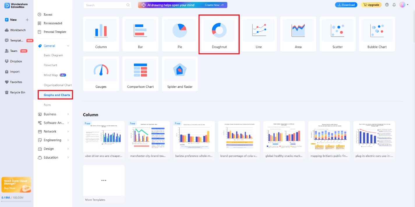
On the main page, click Graphs and Charts under the General tab. Then, click Doughnut.
Step3
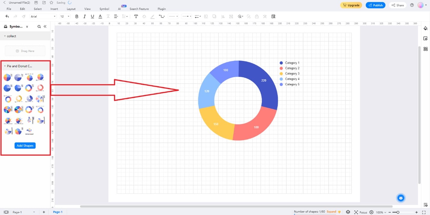
Drag and drop any doughnut chart template from the Pie and Doughnut Chart Templates toolbar. You can also add other elements from the different menus of this toolbar.
Step4
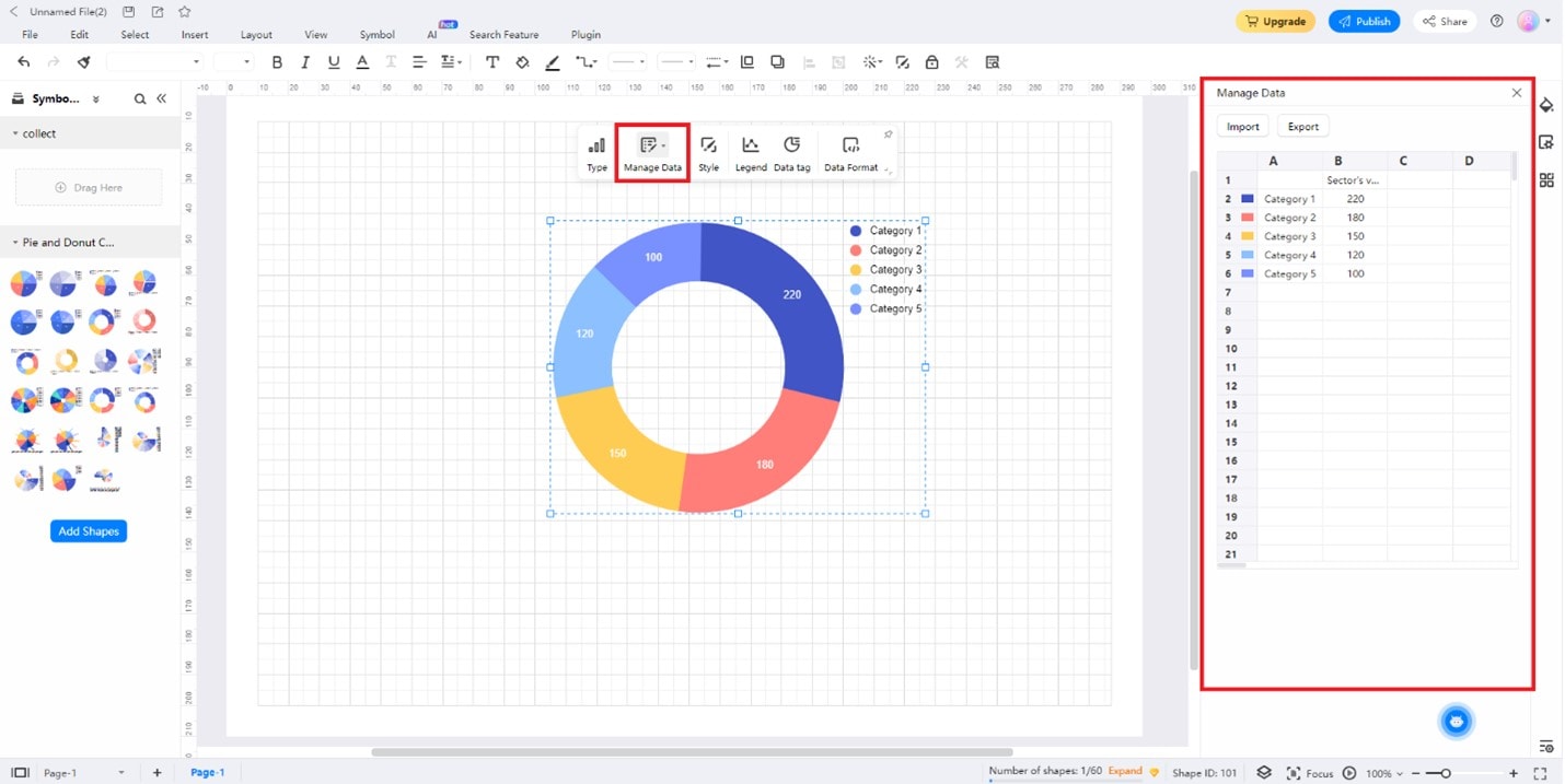
Begin editing your data by clicking on the chart. Then, click Manage Data. On the appearing data sheet, input them accordingly. Edit the Category X texts to label your data, then add their values on the cell next to them. To change the chart's colors, click the color boxes on the left of each label cell.
Tips for Crafting Doughnut Charts
Creating remarkable doughnut charts isn't just about the tool – it's about design, too. Here are a few tips to ensure your charts stand out:
- Keep it Simple. Don't overwhelm your chart with too much information. Keep the design clean and focus on conveying the main points.
- Strategic Colors. Choose colors that enhance clarity. Opt for contrasting shades to make different sections stand out.
- Minimal Text. Let the chart speak for itself. Use minimal text to label sections, keeping the visual impact intact.
Part 4. EdrawMax: Creating Stunning Doughnut Graphs Easily
EdrawMax is a user-friendly and powerful drawing tool that lets you easily create doughnut charts. But it isn't just a doughnut graph maker – it's your partner in turning data into visual magic. When compared to PowerPoint or Excel, it has a slew of advantages that will make you rethink the way you create graphs:
- Abundant Resources. EdrawMax offers various resources to make your doughnut charts pop, from templates to symbols. Whether you're a design newbie or a seasoned pro, these resources elevate your charts.
- Professional Diagramming Software. Bid farewell to cookie-cutter visuals. EdrawMax allows you to create professional-grade doughnut charts that capture attention and convey insights effectively.
- Free Version. EdrawMax provides a free version that lets you dip your toes into the waters of visual storytelling. You can explore its features and discover its potential before deciding to dive in.
- Intuitive Interface. Creating visually stunning doughnut charts becomes a breeze, even if you're not a design whiz.
- Vast Template Collection. EdrawMax offers many templates for various industries, ensuring your doughnut charts suit your context perfectly.
- Many Export Options. Seamlessly integrate your doughnut charts into pictures or PDF documents, or reports with a click.
Conclusion
As this exploration of doughnut charts ends, remember that these circular wonders are more than just visual treats. They're the bridge that transforms complex data into engaging visuals, making understanding a piece of cake. Doughnut graph finds their place in various fields, from business to education. These charts offer a dynamic way to communicate information effectively.
EdrawMax emerges as the show's star, offering an unparalleled platform to craft doughnut diagrams that shine. Its extensive resources, professional-grade features, and user-friendly interface redefine how you visualize data. Don't miss out on the power of EdrawMax – try it for yourself and witness the transformation of data into captivating visuals.
AI Diagram Generator
Enter your prompt. Upload files if needed. Generate diagrams, charts, or slides instantly.


