


Bar charts, with their intuitive visual representation, stand as a cornerstone of effective data communication. This comprehensive guide is your gateway to mastering the art of creating a bar chart in power bi a powerful tool in the data analyst's arsenal.
Follow along step-by-step as we walk you through the process, equipping you with the expertise to present information persuasively and make well-informed decisions. Elevate your reporting and analytical capabilities with this essential skillset.
Contents of this article
What Is Power BI?
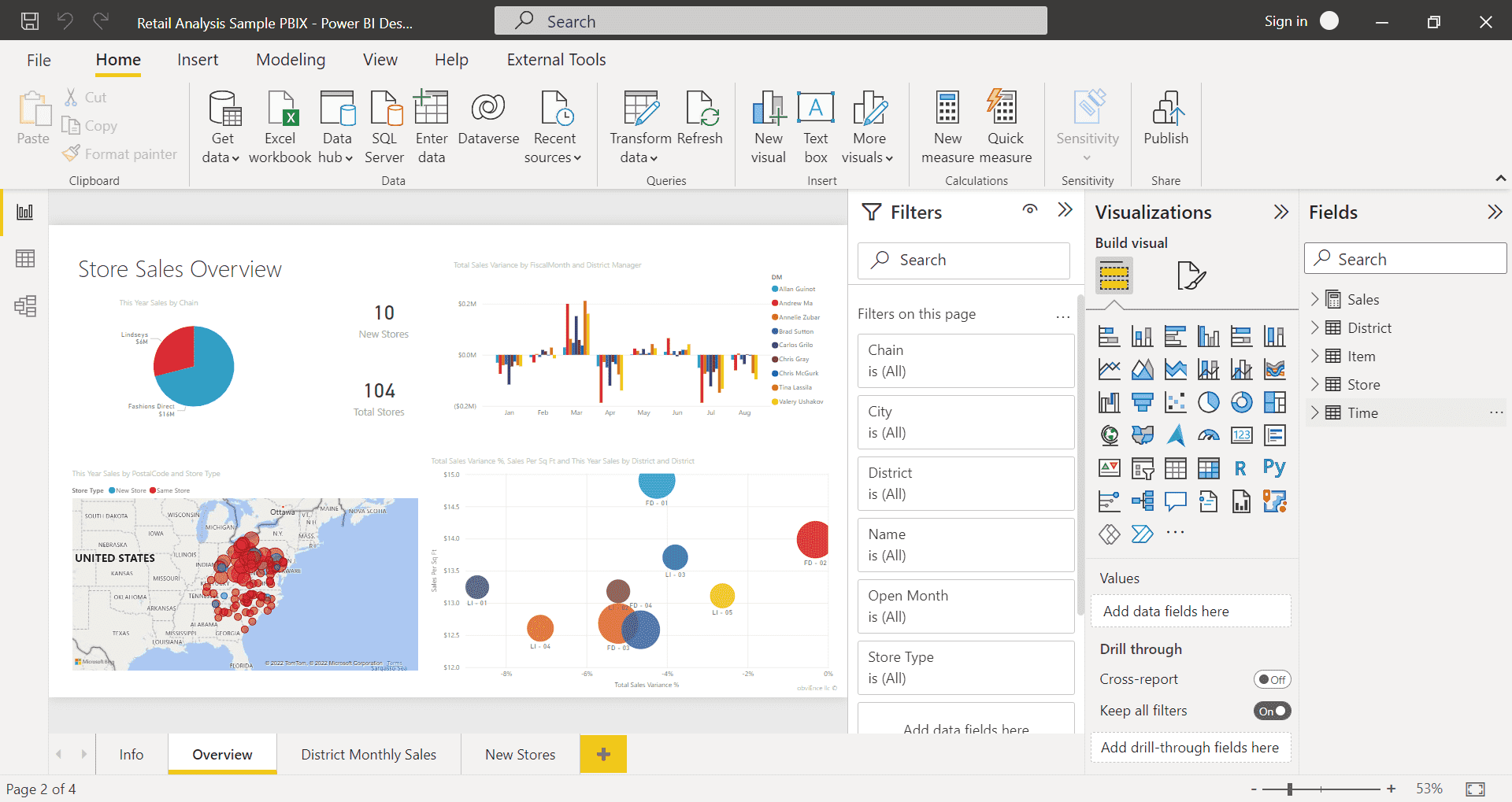
Power BI is a dynamic business analytics tool developed by Microsoft, designed to empower individuals and organizations to extract valuable insights from their data. It serves as a comprehensive suite for data preparation, visualization, and sharing, enabling users to transform complex datasets into compelling visual narratives.
This robust platform integrates seamlessly with a wide range of data sources, including Excel spreadsheets, databases, and cloud services. By utilizing Power BI's capabilities, professionals can create interactive reports and dashboards, facilitating informed decision-making processes across various industries and sectors.
Understanding Bar Charts: An Overview!
Bar charts are a fundamental data visualization tool that represents information in a visually intuitive manner. They use horizontal or vertical bars to compare different categories or display trends over a period. Each bar's length or height corresponds to the value it represents.
In this section, we'll explore major types of bar charts, and when to effectively use them for optimal data communication and analysis.
- Horizontal Bar: Bars extend horizontally, comparing categories effectively.
- Grouped Bar: Multiple bars per category for easy comparison.
- Stacked Bar: Bars show the total and parts' composition.
- Clustered BarCharts: Groups bars by category for comparison.
How to Create a Bar Chart in Power Bi?
Here are the steps to create a clustered bar chart in Power BI:
Step 1: Launch the Power BI application on your computer.
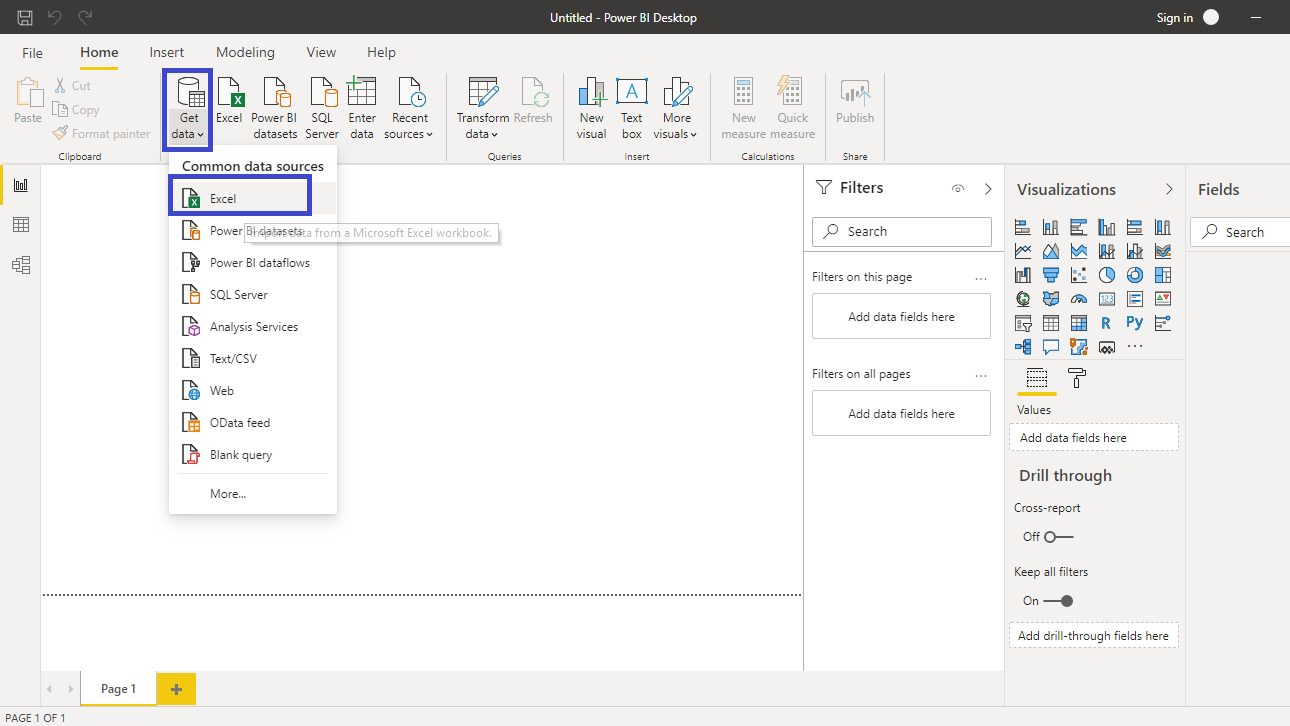
Step 2: Click on the "Get Data" button to import your dataset. Choose the appropriate data source (e.g., Excel, CSV, Database, etc.) and select the specific file or database table.
Step 3: Once your data is loaded and transformed, click on the "Report" view in Power BI.
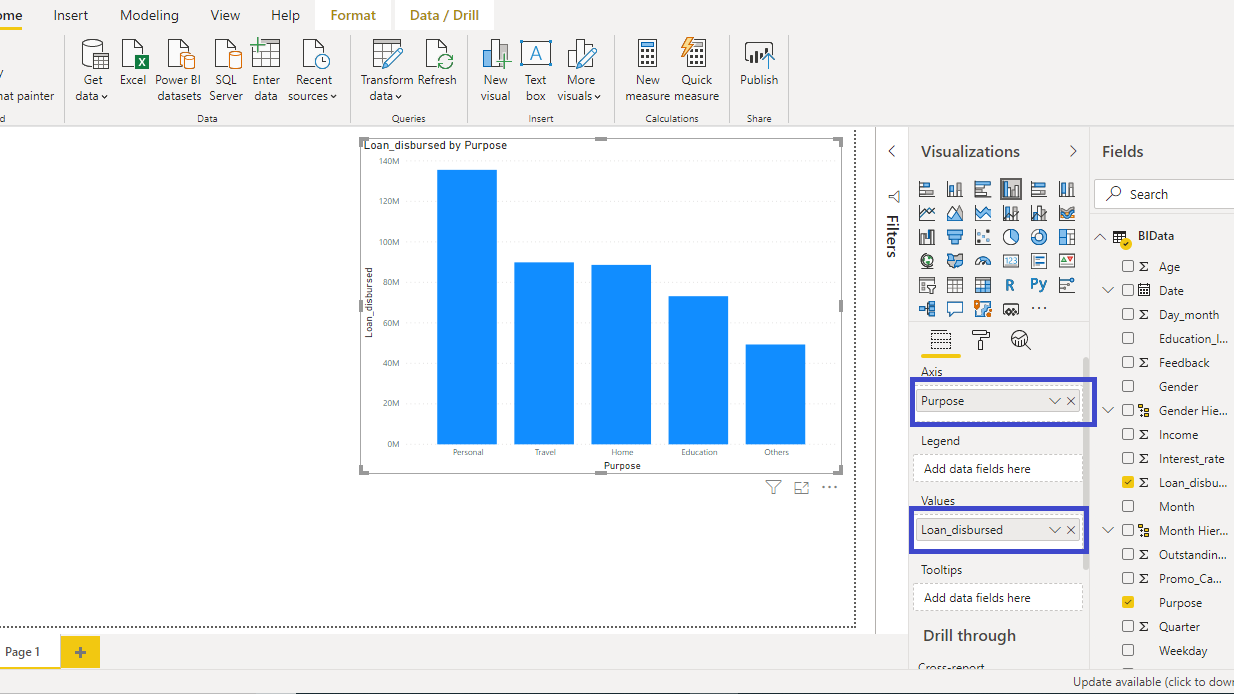
Step 4: On the right-hand side of the screen, you'll see a panel with various visualization options. Click on the "Clustered Bar Chart" icon to add a new bar chart to your report canvas.
Step 5: In the Fields pane on the right, choose the appropriate fields for your chart. Drag and drop the desired field(s) into the "Axis" and "Values" wells. For instance, you might put categories (e.g., Product Names) in the "Axis" well and numerical values (e.g., Sales Amount) in the "Values" well.
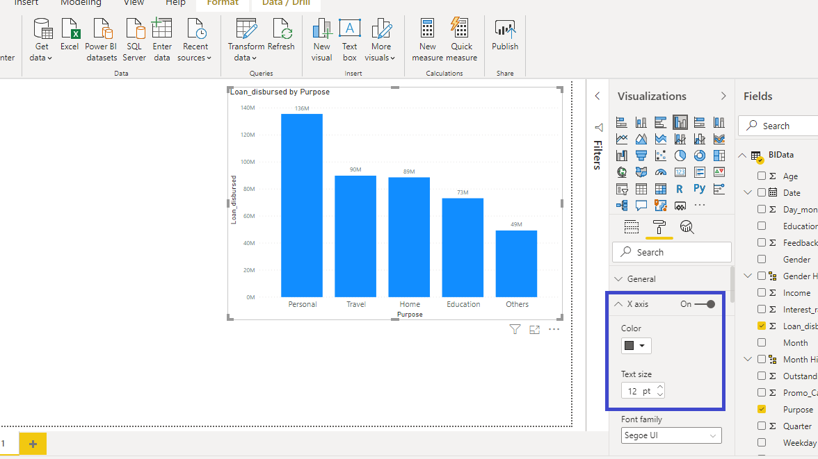
Step 6: With the chart selected, you can customize it in several ways. You can adjust the formatting, colors, labels, and more from the Visualization pane on the right.
Step 7: Once you're satisfied with your bar chart, save your Power BI file. If you want to share your clustered bar chart in Power BI with others, you can publish it to the Power BI service or export it in a suitable format.
Limitations of Using Power BI to Create Bar Charts:
Here are some limitations that you may face while creating a bar chart in Power BI:
- Limited Customization: Power BI's native bar chart options may have constraints when it comes to highly specialized or intricate visualizations, potentially requiring additional customization through DAX expressions or other workarounds.
- Data Volume Considerations: Handling extremely large datasets in Power BI can lead to performance issues, particularly with intricate bar charts that involve complex calculations, necessitating careful data optimization.
- Steeper Learning Curve: Creating advanced bar charts in Power BI may require a deeper understanding of the tool's features and functions, which can pose a challenge for beginners or those less familiar with data visualization concepts.
Create a Bar Chart Easily Using EdrawMax
Wondershare EdrawMax plays a pivotal role in enhancing data visualization capabilities. Its user-friendly interface and extensive library of customizable templates and symbols expedite the creation of intricate charts, including bar charts.
With EdrawMax, users can effortlessly design visually appealing and informative visuals, significantly improving the clarity and impact of data presentations. This tool's versatility and intuitive features make it an indispensable asset for professionals seeking to elevate their data communication and analysis.
Here are the steps to create bar charts using EdrawMax:
Step 1: To create a bar chart in EdrawMax, start by launching the application.
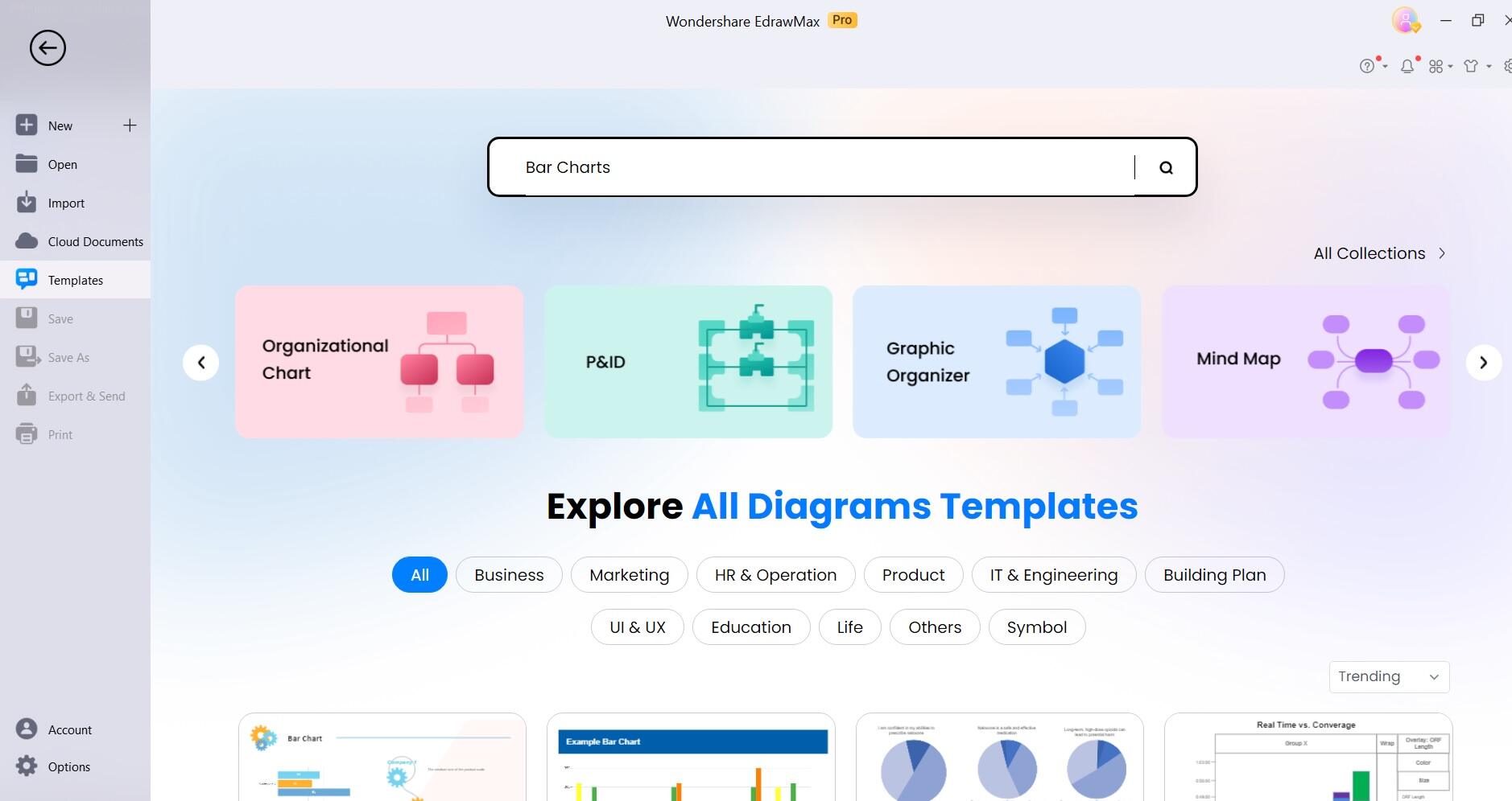
Step 2: Switch to the “Template” section of EdrawMax. Search for "Bar Chart" templates.
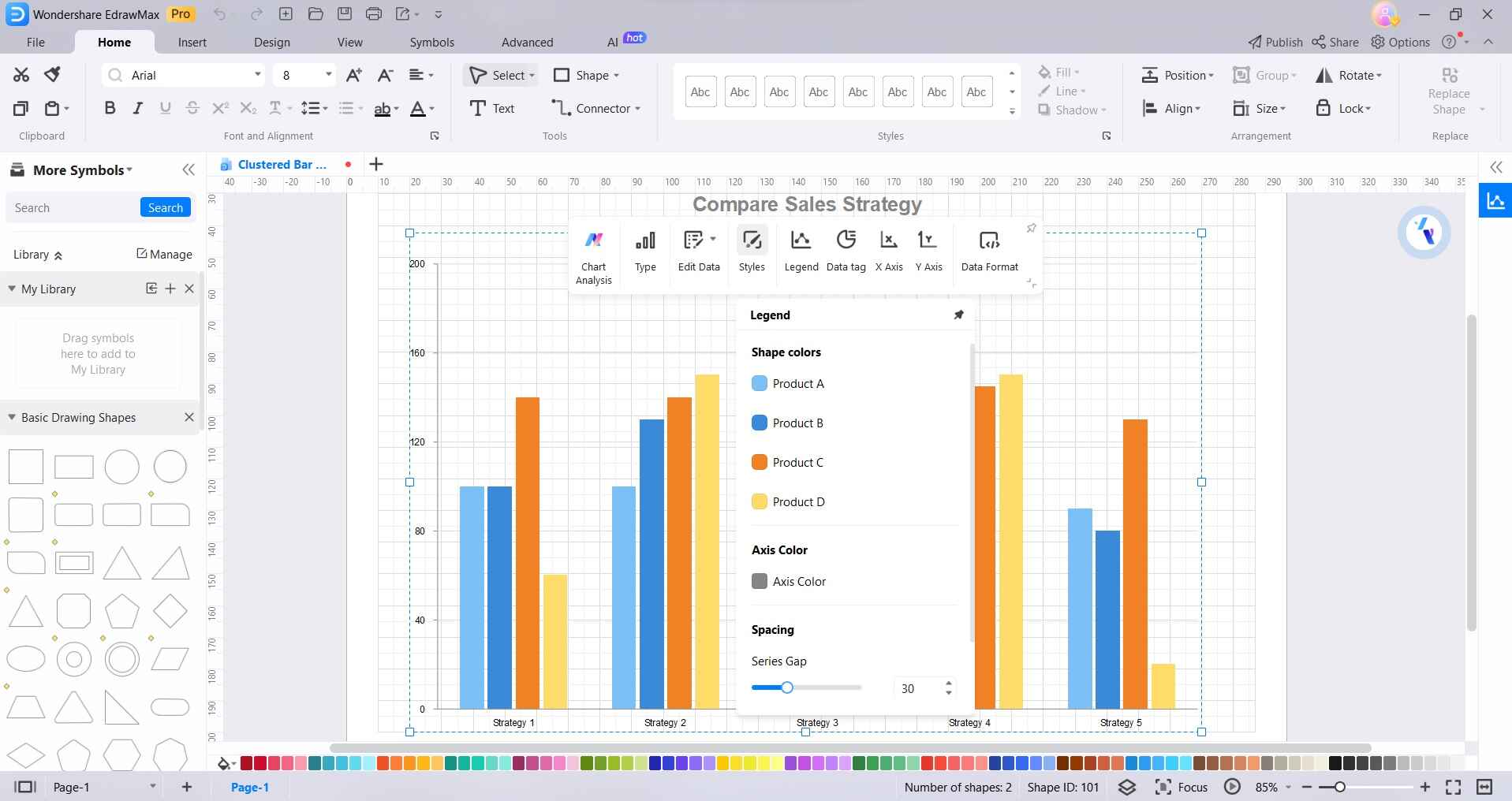
Step 3: Input your data directly or import it from Excel. Customize the chart with ease by adjusting labels, colors, and axis settings.
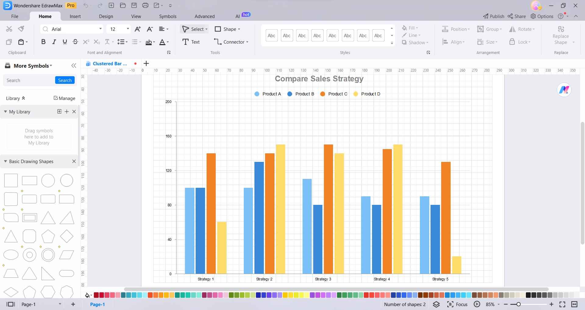
Step 4: Format the bars to your preference, altering their width or spacing if needed.
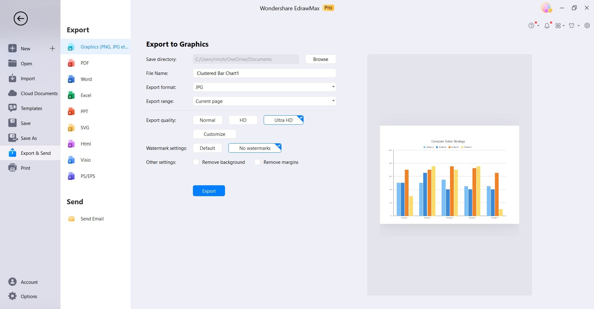
Step 5: Export the chart for inclusion in reports, presentations, or other documents, or directly share it through EdrawMax's sharing options.
This intuitive process empowers users to effortlessly craft visually engaging and informative bar charts for effective data communication.
Advantages of Using EdrawMax to Create Bar Chart
Compared to Power BI, here are some perks of choosing EdrawMax to streamline the process of bar chart creation:
- Intuitive Interface: EdrawMax offers a user-friendly platform with a vast library of customizable templates and symbols, streamlining the creation of intricate bar charts.
- Extensive Customization: The tool provides extensive options for formatting, labeling, and styling, enabling users to fine-tune every aspect of their bar charts to suit specific data visualization needs.
- Time-Efficient: EdrawMax expedites the chart creation process, allowing users to swiftly generate visually appealing and informative bar charts, ultimately enhancing the efficiency of data communication.
Conclusion
This wraps up our guide on how to create bar chart in Power BI. Power BI's robust capabilities empower users to extract valuable insights from complex datasets, while EdrawMax offers an intuitive platform for crafting visually appealing and informative bar charts. Together, they equip professionals with the skills and resources needed to elevate data communication and analysis.
By harnessing the potential of these tools, individuals and organizations can make informed decisions and drive success in an increasingly competitive and data-centric world.
AI Diagram Generator
Enter your prompt. Upload files if needed. Generate diagrams, charts, or slides instantly.


