


Are you new to bar charts and data visualization? Chances are that you may have heard of Plotly. In simple words, it is a Python library based on JavaScript. Many consider it the ultimate solution to visualize data efficiently due to its simplicity. But is it really easy to draw? And if so, how can you create it?
The short answer is yes; the diagram is easy if you choose a robust application like EdrawMax. This guide will provide all the information you need about the plotly bar chart.
In this article
Part 1. What is Plotly and a Bar Plot?
Plotly is the JavaScript-based data visualization library available with Python. It is used for creating interactive diagrams, like graphs and bar charts. These are common for data analysis in various fields of work.
A bar chart, commonly known as a barplot, consists of different elements. Generally, the large rectangular shapes represent the data frames. You might see them in different colors, distinguishing their representation and meaning. Moreover, a set of specific values show the input data in these bar charts.
A bar chart depicts different data sets and their variations. This diagram's two most common applications are in the following two sectors: finance and business. It illustrates the dynamics and distribution of real-world changing situations. However, you might also see this diagram in everyday applications.
Part 2. How to Make a Bar Chart in Plotly?
Step1Install Plotly.
If you haven't already, install the Plotly library in your Python environment by running pip install plotly.
Step2Import the necessary libraries.
Import the required libraries, including Plotly, as well as any other libraries you may need for data manipulation or analysis.
Step3Prepare your data.
Create or load the data you want to visualize in the bar chart. Ensure that your data is in a suitable format, such as a Pandas DataFrame or a list of values.
Step4Define the bar chart layout.
Create a layout object to define the appearance and configuration of the bar chart, such as axis labels, titles, and color options.
Step5Create the bar chart trace.
Use the data and layout to create a bar chart trace object. Specify the necessary attributes, such as x and y values, bar colors, and other optional parameters.
Step6Create the figure and plot.
Combine the data and layout objects to create a figure, and then plot the figure using the plot function.
Part 3. Tips for Creating Best Plotly Bar Charts
1. Grouped or Stacked Bars: You can create grouped or stacked bar charts by providing multiple sets of data for the y parameter. Use the barmode attribute in the layout to specify the mode ("group" for grouped bars or "stack" for stacked bars).
2. Customizing Bar Colors: Customize the colors of your bars by specifying the marker attribute within the go.Bar() object. You can use a single color, an array of colors corresponding to each bar, or a color scale.
3. Hover Text: Add informative hover text to the bars using the text attribute within the go.Bar() object. This allows you to display additional information when hovering over the bars.
4. Bar Width: Adjust the width of the bars using the width attribute within the go.Bar() object. Experiment with different values to achieve the desired visual effect.
5. Bar Labels: Display the values of each bar using the text attribute within the go.Bar() object. This can be useful for showing exact values or percentages on top of the bars.
6. Sorting Bars: Sort the bars in ascending or descending order using the sort() function on the data before plotting. You can sort by the x values or the y values depending on your requirements.
7. Axis Formatting: Customize the formatting of the x and y axes using the xaxis and yaxis attributes within the layout. You can modify labels, tick values, tick format, and more.Part 6. 5 bar chart templates
Part 4. Creating a Bar Chart with EdrawMax: Easier and Faster
Although Plotly is a favorite many, EdrawMax might be a better choice for others. Thanks to its extensive collection of templates and intuitive UI, even newbies can use this application easily. Follow these simple steps below to create your diagram.
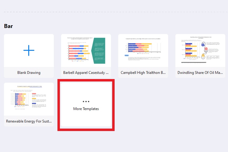
Step1
Click File > New > Basic, and select Graphs and Charts from its extended menu. Now, you will see different diagrams on the main screen. Click Bar to create a plotly JS bar chart.

Step2
Scroll down and click More Templates (with three horizontal dots).
Step3
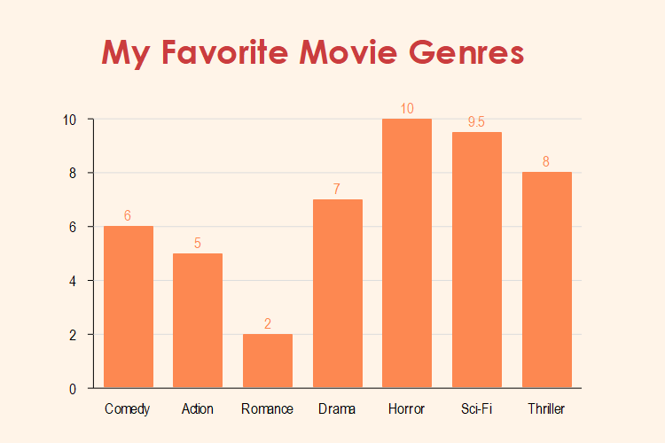
Next, scroll down until you find the right templates to start working. We will use the Favorite Type of Movie Bar Chart for this tutorial. So, hover your mouse over it and click Use Immediately.
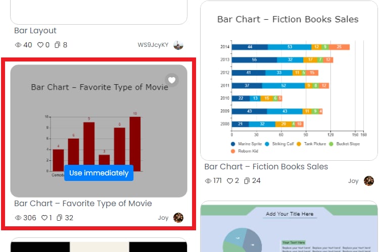
You can also search for a specific bar chart on the Search Bar available at the top screen.
Step4
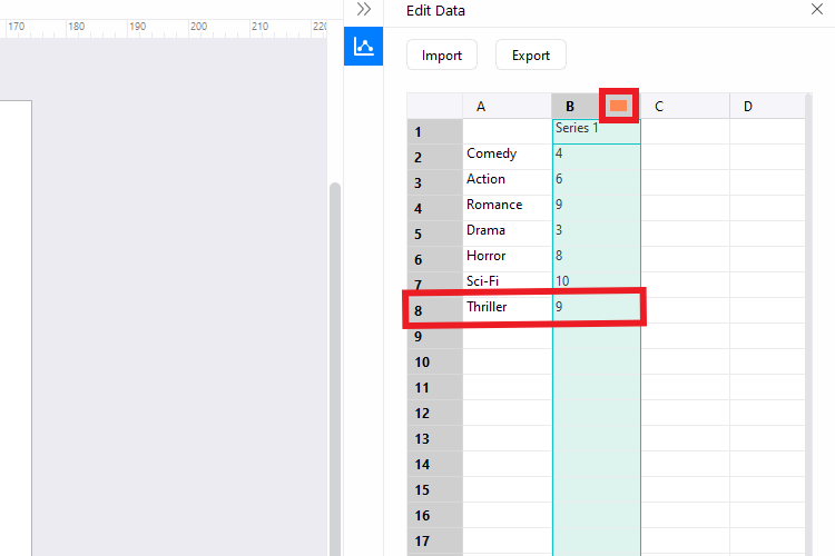
Once opened, select the central part of the diagram and click Edit Data from the hovering menu. You will now see a toolbar pop up from the right side.
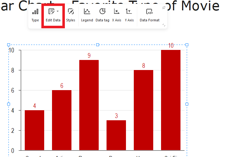
Step5
Let's add the Thriller genre to this bar chart and give it a rating of 9. You will see it added to the diagram. Similarly, you can change the color by clicking the rectangle next to B.
Step6
Finalize the bar chart by changing the title. You can double-click that section to change its text, font, size, color, etc. Like that, you can make endless customizations to the diagram.
Step7
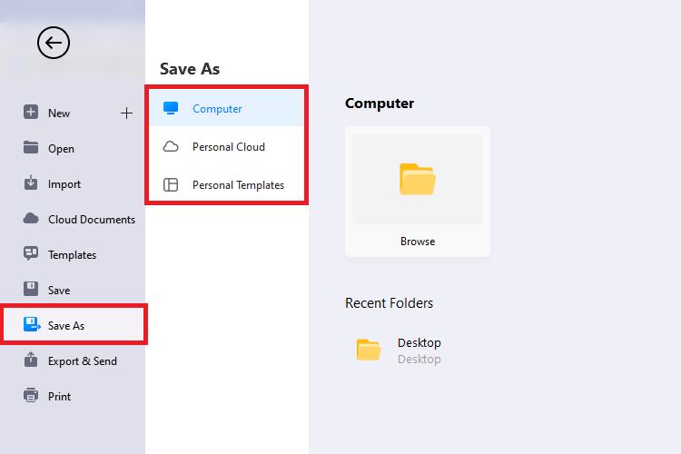
Finally, navigate to the File button on the top menu bar and save the file on your device or the cloud.
Part 5. Why EdrawMax to Build a Plotly Bar Chart?
EdrawMax simplifies the drawing process for every drawing, including the plotly bar chart. It is a feature-rich application with many customization options. Here’s why you should use it:
- The application has various templates, ranging from basic to grouped and clustered bar charts.
- You will find hundreds of infographic charts, basic drawing shapes, and symbols to add to your diagram.
- EdrawMax works with a simple drag-and-drop mechanism, making it user-friendly for new and experienced individuals.
- This application has a wide range of design themes with vibrant colors to make your plotly bar chart more attractive.
- EdrawMax supports various formats for exporting, including SVG, PPT, Excel, Word, PDF, HTML, and Visio.
- You can import your pre-made diagrams into a new bar chart using EdrawMax.
- Last but not least, EdrawMax now offers AI-driven functions. You can prompt the required bar chart by entering your requirements.
Part 6. Five Bar Chart Templates to Start With
As a newbie, you will find drawing plotly bar charts extremely difficult. That is why we recommend using templates. You can quickly change these diagrams according to your requirements with a few modifications.
EdrawMax offers a vast library of free and ready-to-use template diagrams. Here are five of the best available right now!
1. Product update bar chart
One of the most straightforward templates is this product update vertical chart. It depicts the units sold this year and last year. Thus, it can be used for comparison in a business. Its simplistic nature and two colors to distinguish each year make this bar chart a must-have.

 below.
  below.
2. Stock bar chart
The next plotly bar chart is for the stock market. It highlights the names of some of the biggest tech companies and their stock performance. Each color in these horizontal bars represents a unique factor in the overall chart.

3. Vegetable sales bar chart
Are you a vendor? Then, this chart can work as an all-in-one solution to track your sales. It showcases different veggies, along with their sales performances. In a few minutes, you can change the elements in this diagram according to your needs.

4. Sales strategy comparison bar chart
This bar chart can be a bit complex at first view. It is a detailed diagram showing the sales strategies for Products A, B, C, and D. This chart compares their performances from 0 to 200 values. You can use it in any company with a sales department to monitor their performance.

5. Daily time distribution bar chart
Do you need help to set a schedule for your everyday tasks? This little problem can lead to a lack of productivity and increased procrastination. If so, this simple daily time chart can help you. It enlists different individuals with bars representing the time spent working, resting, studying, and planning.

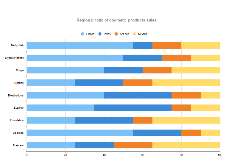
EdrawMax is the complete package for all plot bar chart needs. It has tons of templates for different types of diagrams. You will find horizontal and vertical bar charts in its editable examples. Moreover, the app has more detailed templates, like grouped and percentage charts. These are ideal for complex problems within an entity.
EdrawMax also offers diverse templates, with bar charts, graphs, and infographics, all in one diagram. These stacked bar charts are suitable for large-scale projects, like an in-depth stock market comparison.
Conclusion
A bar chart is a valuable graphical representation for data analytics in different fields, including business, finance, education, and social. The best part is that this diagram is easy to draw if you use the right tool. You can easily create detailed bar charts with visually appealing elements using a powerful application.
[没有发现file]AI Diagram Generator
Enter your prompt. Upload files if needed. Generate diagrams, charts, or slides instantly.


