


In the realm of presentations, a well-designed bar graph can be a powerful tool for conveying complex information in a digestible format. Whether you're reporting on financial trends, survey results, or any data-driven insights, mastering the art of creating a bar graph in PowerPoint is a skill worth honing.
In this guide, we'll walk you through the step-by-step process, ensuring you have the expertise to craft visually appealing and informative bar charts that leave a lasting impression on your audience.
Contents of this article
What is a Bar Graph?
A bar graph is a visual way to show and compare information. It uses rectangular bars to represent different categories or groups. The length of each bar corresponds to the amount or value it represents. For example, if you're comparing the heights of different trees, each tree would have a bar, and the taller trees would have longer bars. This makes it easy to see which category is the biggest or smallest at a glance. Bar graphs help present data in a clear and organized way.
Types of Bar Graph
Bar graphs find their application in a wide range of scenarios, each designed to cater to specific data presentation needs.
- Vertical Bar Graph: Columns are drawn vertically, making it easy to compare different categories side by side.
- Horizontal Bar Graph (Horizontal Bar Chart or Bar Chart): Bars extend horizontally, useful when you have long category names or want to emphasize the magnitude of each category.
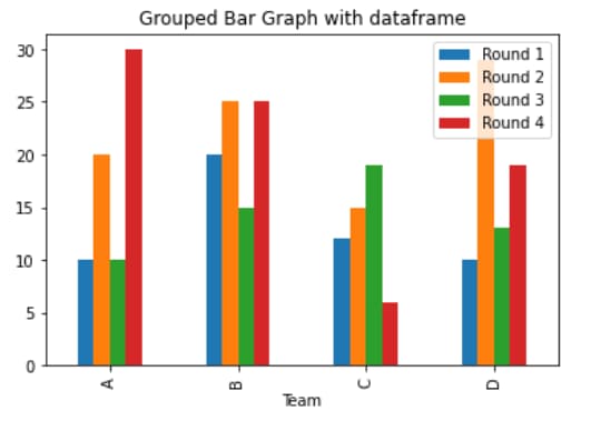
- Grouped Bar Graph: Compares multiple sets of data within each category, with grouped bars representing each dataset.
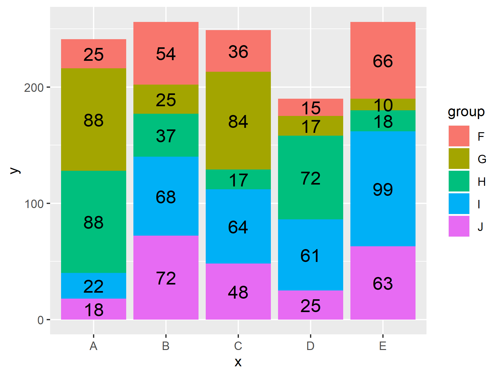
- Clustered Bar Graph: Groups different categories together, with separate bars for each category within a group. Clustered bar graphs allow for easy comparison between different groups.
- Bar Graph in R GGplot2: GGplot2 is a popular data visualization package in R. It allows for the creation of various types of graphs, including bar graphs, with a high degree of customization and aesthetics.
How to Create a Bar Graph in PowerPoint
Follow these steps to create a bar graph in PowerPoint:
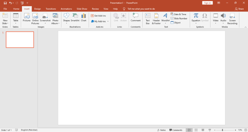
Step 1: Launch PowerPoint and open the presentation where you want to insert the bar graph.
Step 2: Click on the "New Slide" button to create a new slide where you'll add the bar graph. In the PowerPoint menu, click on "Insert" at the top.
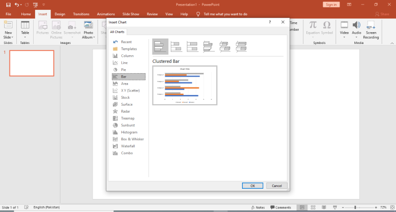
Step 3: From the dropdown menu, select "Chart" to open the Chart dialog box. In the Chart dialog box, select "Clustered Bar Chart" from the list of chart types on the left.
Step 4: A sample bar chart will appear on your slide. Click on the spreadsheet icon to the right to input your data.
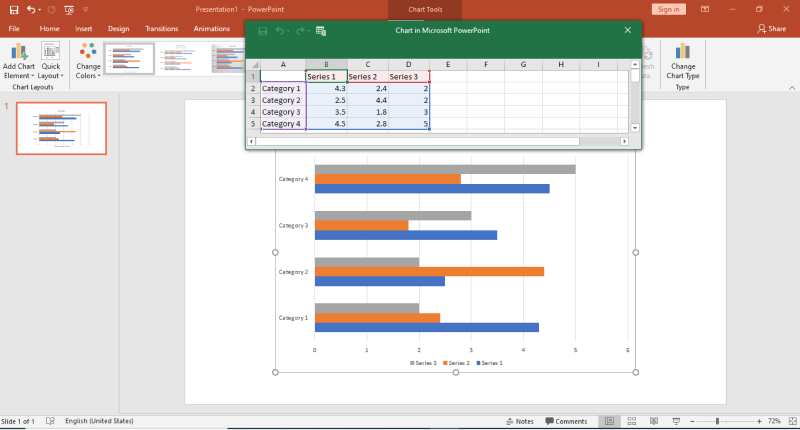
Step 5: An Excel sheet will pop up. Enter your data into the cells provided. Close Excel once you're done.
Step 6: Back in PowerPoint, you can customize the chart by clicking on elements and using the Chart Tools in the ribbon.
Step 7 (Optional): Fine-tune the appearance by changing colors, styles, and fonts to match your presentation's theme. Save your work when done!
With these steps, you'll have a professional-looking bar graph seamlessly integrated into your PowerPoint presentation.
Limitations of PowerPoint:
Despite its many strengths, there are a few limitations when it comes to creating intricate bar graphs in PowerPoint:
- Basic Data Handling: PowerPoint's data capabilities are limited compared to specialized tools, making complex data manipulation challenging.
- Limited Customization: Customizing intricate chart details like axis scaling or data formatting can be more difficult in PowerPoint.
- Few Advanced Chart Options: Specialized data visualization tools offer a wider range of advanced chart types not available in PowerPoint.
Create Bar Graph Easily Using EdrawMax
Wondershare EdrawMax emerges as a valuable solution, offering a user-friendly interface and robust features that streamline the process of creating bar graphs. Its intuitive design tools and extensive template library empower users to craft visually appealing and informative charts effortlessly.
Here are the steps to create a bar graph with multiple variables using EdrawMax:
Step 1: Open the EdrawMax software on your computer. In the EdrawMax interface, click on "Graphs and Charts".
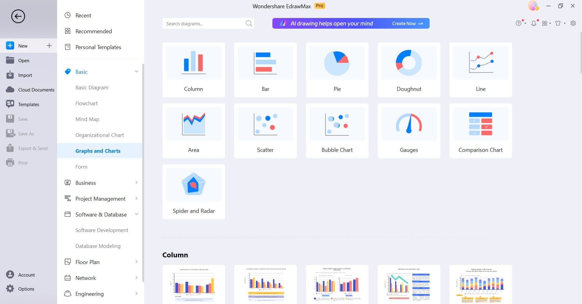
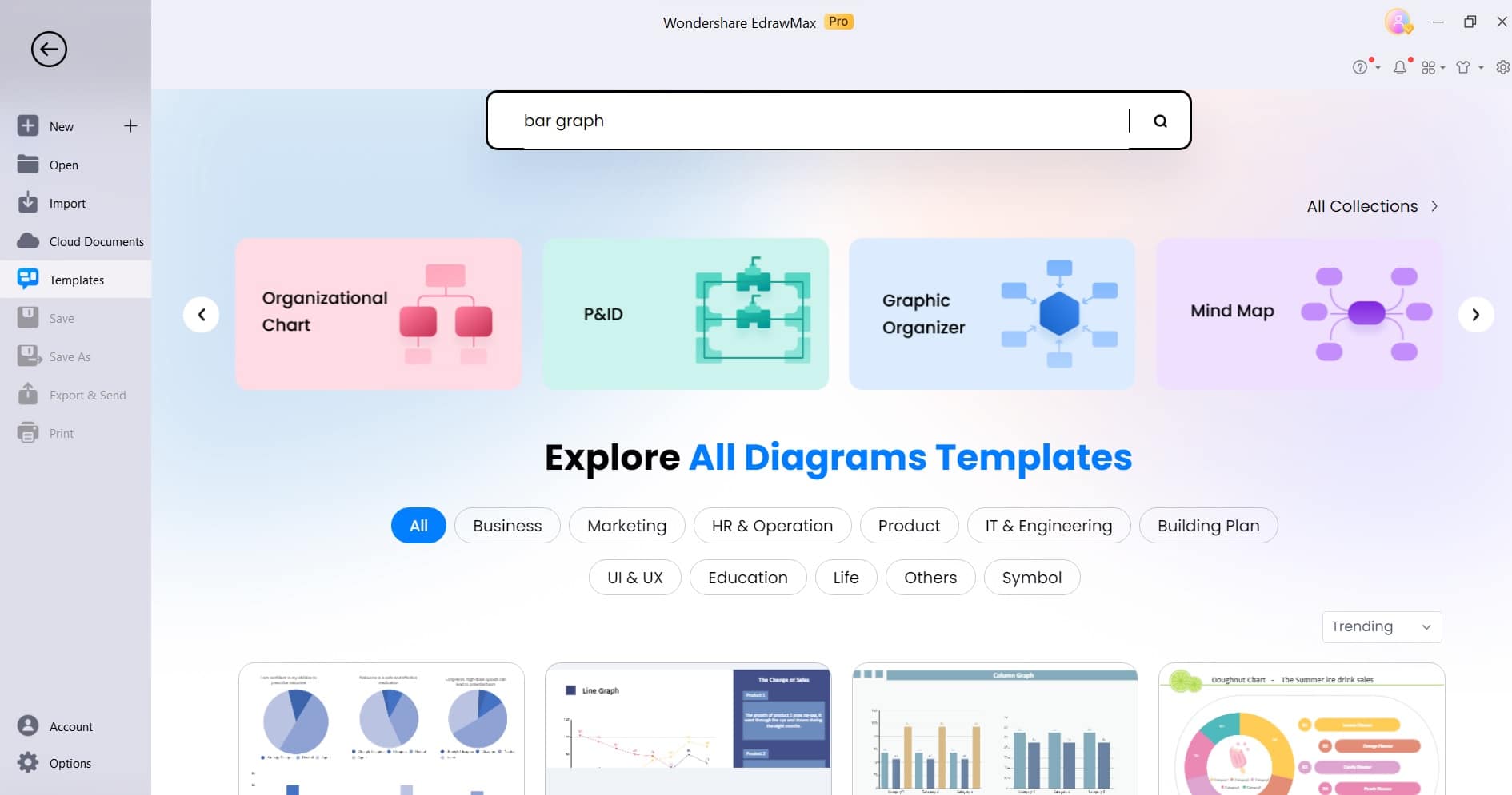
Step 2: Alternatively, you can switch to the “Template” section. From the template categories, choose the "Bar Chart" option. Browse through the available chart templates and choose the one that suits your requirements.
Step 3: A sample bar chart will appear on the canvas. Click on the data cells to input your data or use the integrated spreadsheet tool for easy data entry.
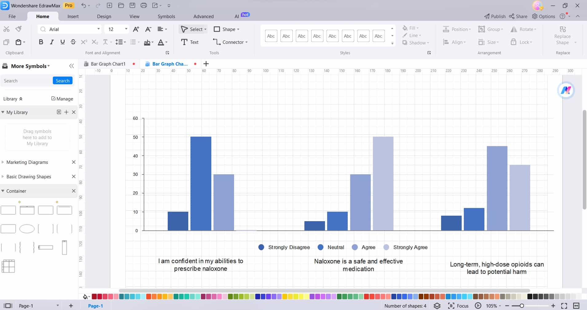
Step 4: Include a title and labels for the x-axis and y-axis to provide context and clarity to your chart.
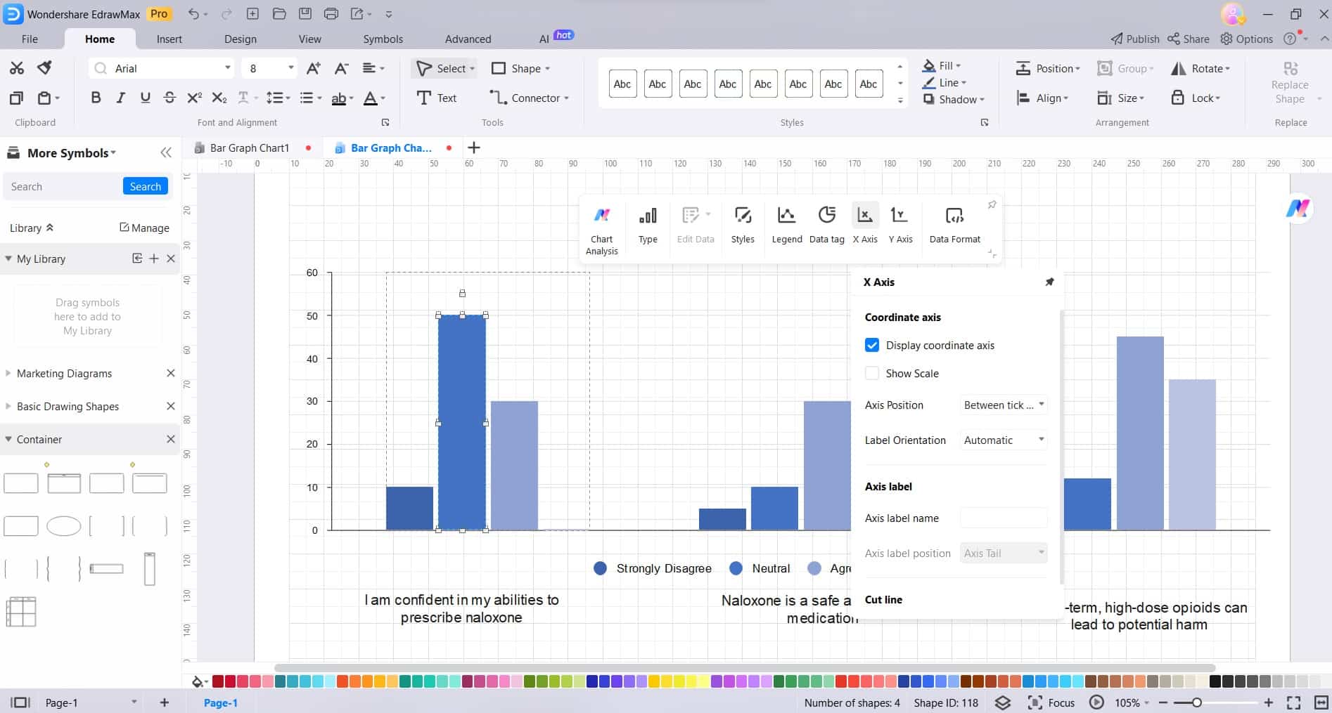
Step 5: EdrawMax offers a wide range of customization options. Click on elements of the chart to change colors, styles, labels, and more.

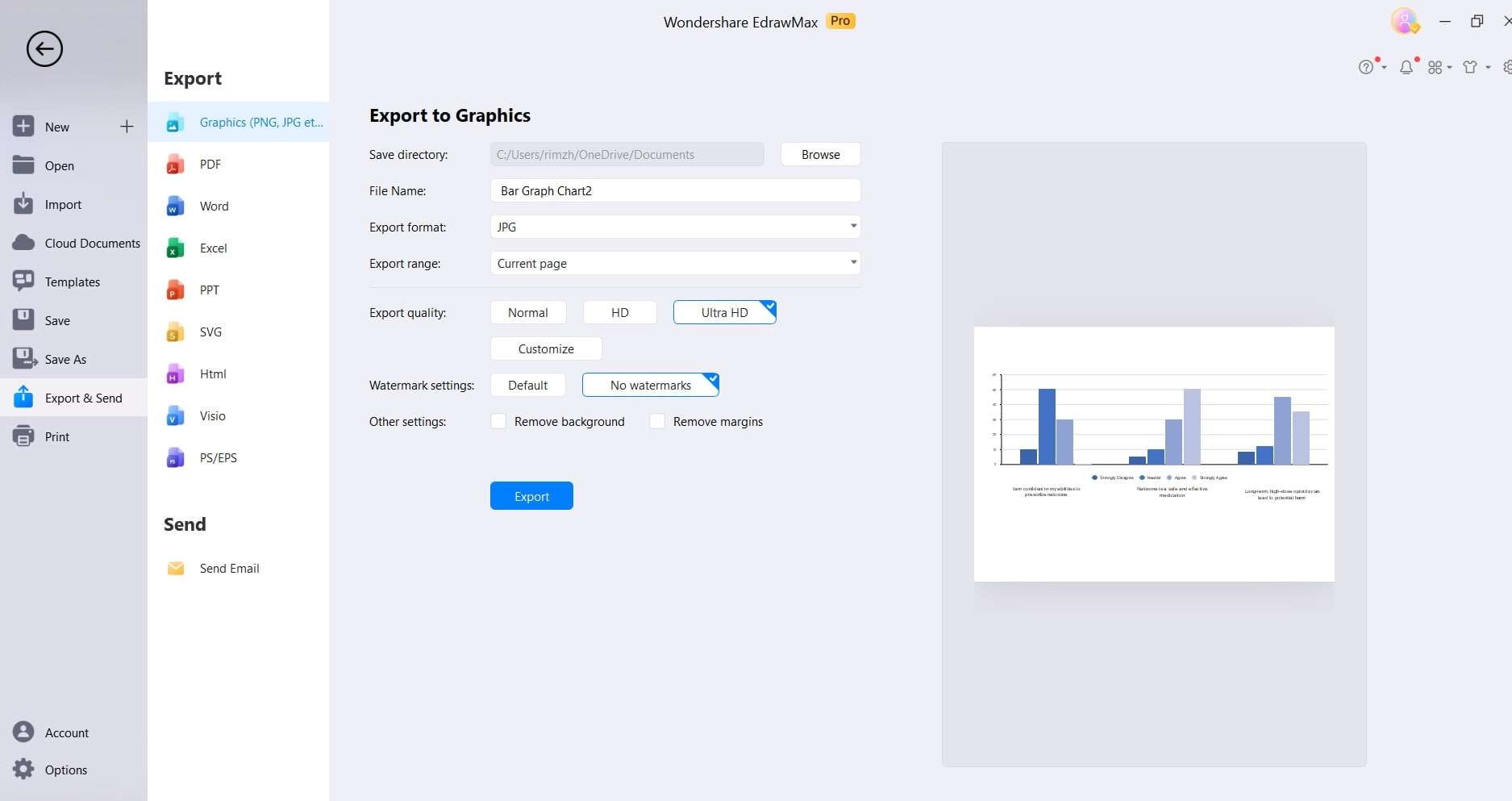
Step 6: Once you're satisfied with the chart, click on File> Save and Export to save your work in your preferred format.
EdrawMax simplifies the process of creating bar graphs, providing a user-friendly platform with robust customization options.
Why Choose EdrawMax for Creating Bar Graphs?
Here are the three top reasons for choosing EdrawMax for creating bar graphs:
- Intuitive Interface: EdrawMax offers a user-friendly interface that makes creating bar graphs straightforward and accessible, even for beginners.
- Extensive Template Library: EdrawMax provides a rich collection of pre-designed templates, including a variety of bar chart templates. This extensive library not only saves time but also serves as a valuable resource for creating informative bar graphs.
- Robust Customization Options: With EdrawMax, users have a wide range of customization options at their fingertips. From adjusting colors, styles, and labels to fine-tuning chart details.
Conclusion
Learning the art of creating a bar graph in PowerPoint is a valuable skill for effective data presentation. This guide has equipped you with step-by-step instructions, enabling you to seamlessly integrate visually engaging charts into your presentations.
Also, EdrawMax stands out as the go-to tool for crafting powerful bar graphs. Its intuitive interface and drag-and-drop functionality make it accessible to users of all levels. By leveraging the power of bar graphs, you can effectively convey complex information to captivate your audience. Now, armed with this knowledge, you're ready to elevate your presentations and make a lasting impression.
AI Diagram Generator
Enter your prompt. Upload files if needed. Generate diagrams, charts, or slides instantly.


