


In an era where data reigns supreme, the ability to convey information effectively is paramount. Whether you're a seasoned data scientist or a beginner taking your first steps into the world of data visualization, understanding the nuances of ggplot bar plots, column bars, and stacked bar Excel charts is essential.
Join us on this informative journey as we explore the art of visualizing data, exploring these versatile tools that bring numbers to life and empower you to tell compelling stories with your data.
In this article
What is a Bar Graph?
A bar graph is a visual representation of data that uses rectangular bars to compare and display information. Each bar corresponds to a category or group, and its length is proportional to the quantity or value it represents. The horizontal axis typically represents the categories, while the vertical axis denotes the numerical scale.
This type of graph is ideal for showcasing categorical data or making comparisons between different groups. It provides a clear and concise way to interpret information, making it a valuable tool for conveying trends, patterns, and relationships within a dataset, making complex data more accessible and understandable.
Components of Bar Graph
A bar graph consists of several key components:
- Title: This provides an overall description or summary of what the bar graph represents.
- Axes: The graph has two axes - the horizontal (x-axis) and the vertical (y-axis). The x-axis represents the categories or groups being compared, while the y-axis represents the numerical values.
- Bars: These are the rectangular columns that visually represent the data. Each bar corresponds to a specific category or group, and its length is proportional to the value it represents.
- Data Points: These are the specific numerical values or data points that are plotted on the graph. They are used to determine the length of each bar.
- Axis Labels: These labels provide information about what is being measured on each axis. The x-axis label describes the categories, while the y-axis label indicates the scale of measurement.
By understanding these components, you can effectively interpret and create bar graphs to represent data visually.
When to Use Bar Graphs?
Bar graphs are particularly useful in the following scenarios:
- Comparing Categories: When you want to compare different categories or groups against each other, bar graphs are highly effective. They allow for a clear visual representation of the differences or trends.
- Categorical Data: Bar graphs are excellent for displaying categorical data, where the information falls into distinct groups or categories. This could be anything from types of fruits to customer satisfaction ratings.
- Showing Changes Over Time: While line graphs are typically used for time series data, bar graphs can still be employed to demonstrate changes over time if the time intervals are discrete and not continuous.
- Highlighting Differences: Bar graphs make it easy to emphasize discrepancies between data points, making them ideal for showcasing outliers or highlighting specific trends.
- Visual Impact: When you want to create a visually impactful representation of data for presentations, reports, or publications, bar graphs are a popular choice due to their clarity and simplicity.
- Avoiding Misleading Representations: Bar graphs can help prevent misleading interpretations of data, as they clearly represent the quantities involved without the potential for misinterpretation that can occur with other types of graphs.
By understanding the strengths and applications of bar graphs, you can choose them as a powerful tool to effectively communicate your data.
Popular Types of Bar Graph
Bar graphs come in various types to suit different data presentation needs:
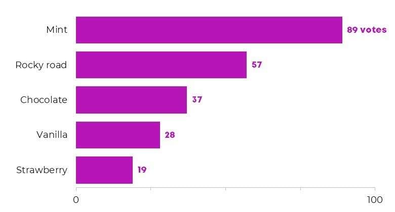
- Horizontal Bar Graphs: In this type, categories are represented on the vertical axis, while the numerical values extend horizontally. They're useful for displaying long category names or making comparisons between a large number of groups.
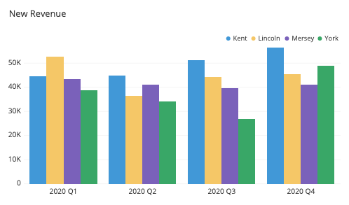
- Grouped Bar Graphs: These column bar graphs display multiple bars for each category, allowing direct comparison between different data sets. Each category has its own set of bars representing distinct data points.
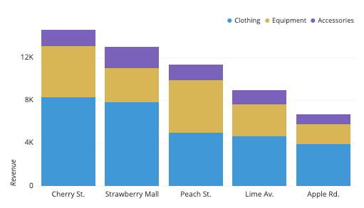
- Stacked Bar Graphs: Stacked bar graphs show multiple data sets as stacked segments within each bar. This allows for a visual representation of both individual data points and their cumulative total for each category. It's effective for showcasing the total as well as the composition of different categories.
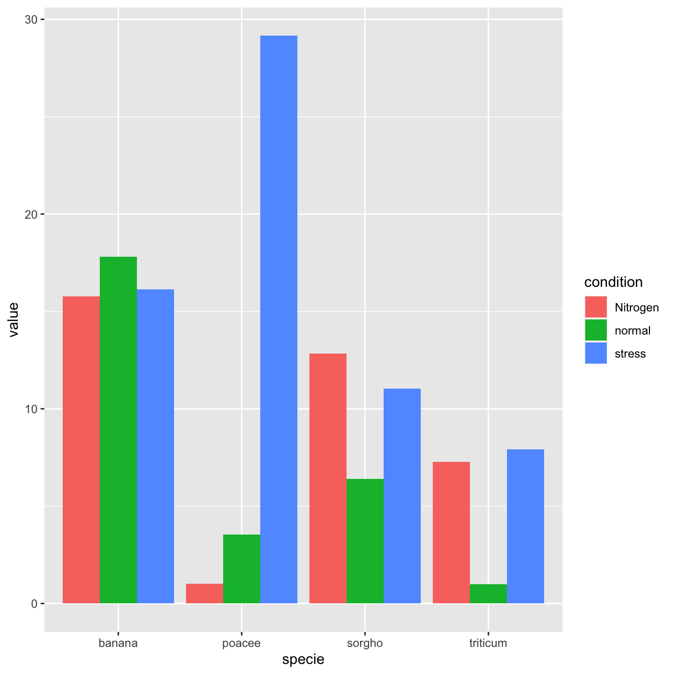
- GGplot Bar Graphs: GGplot, a data visualization package in R, offers a flexible and powerful way to create bar graphs. It allows for customization and intricate detailing, making it a popular choice for advanced data analysts and researchers. A ggplot bar plot, created using the ggplot2 package in the R programming language, is a data visualization that represents categorical data using rectangular bars.
How to Make a Bar Graph Easily Using EdrawMax?
Here are the steps to create a bar graph easily using Wondershare EdrawMax:
Step 1: Launch the EdrawMax software on your computer. If you don’t have it installed yet then you can head to Wondershare EdrawMax’s official website. Hit on the “Free Download” button, and follow the on-screen instructions to complete the installation.
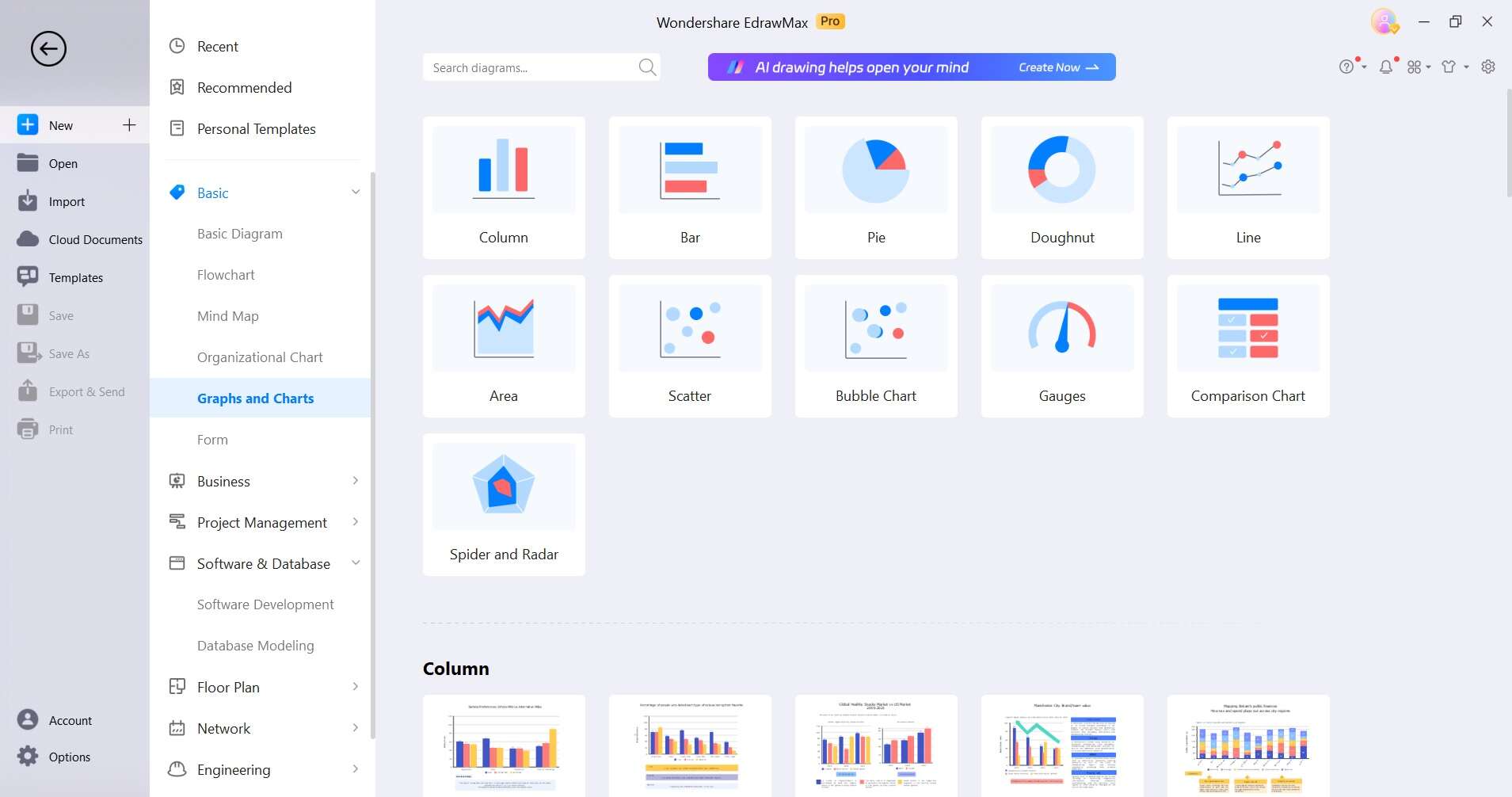
Step 2: In EdrawMax, navigate to the template categories and select "Graphs and Charts" from the available options. Browse through the available bar graph templates and select the one that best suits your data and presentation style.
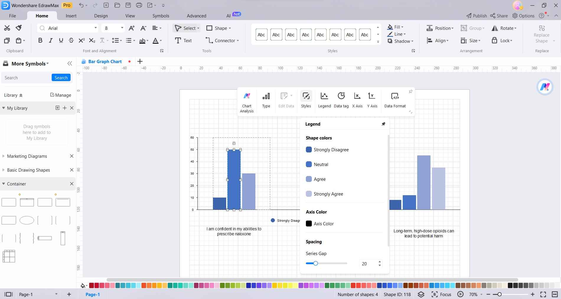
Step 3: Double-click on the bars to enter your data directly into the graph. You can also adjust the labels, axis titles, and so on.

Step 4: EdrawMax offers a range of customization options. Adjust the colors and styles to fit your specific needs.
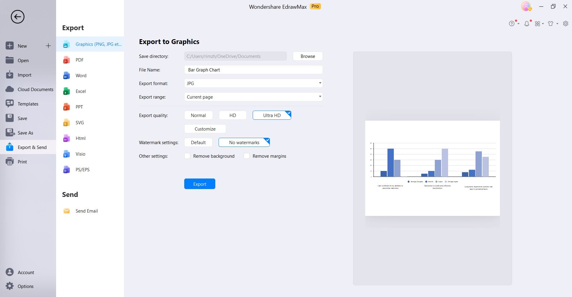
Step 5: Once satisfied with the design, preview the bar graph to ensure it accurately represents your data. Then, save the file in your preferred format. EdrawMax allows you to export your bar graph in various formats like PDF, PNG, or even directly share it on social media platforms.
With EdrawMax's user-friendly interface and intuitive tools, creating professional-looking bar graphs becomes a straightforward process, even for those without extensive design or data visualization experience.
Conclusion
In conclusion, mastering the art of data visualization is crucial in today's information-driven world. Whether you opt for a ggplot bar plot in R, a column bar in Excel, or explore the intricacies of stacked bar charts, EdrawMax equips you with a versatile toolkit. With its intuitive interface, creating impactful bar and column charts becomes an effortless endeavor.
So, use this comprehensive guide and turn numbers into compelling narratives!
AI Diagram Generator
Enter your prompt. Upload files if needed. Generate diagrams, charts, or slides instantly.


