


3D scatter charts are used for a lot of purposes. They are useful for visualizing relationships and patterns in multidimensional data. It allows for a more comprehensive analysis by showing the distribution and clustering of data points in three-dimensional space. Here, we will discuss 3D scatter charts, how to choose the right data for a 3D scatter chart, and more.
In this article
Part 1: What Is a 3D Scatter Chart?
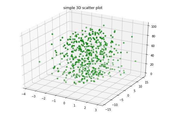
A 3D scatter chart, also known as a 3D scatter plot, is a type of data visualization that represents three variables in a three-dimensional space.
It is a powerful tool for visualizing the relationships between three quantitative variables and identifying patterns or trends within the data. In a 3D scatter chart, each data point is represented by a marker in the 3D space, with its position determined by the values of the three variables.
A Quick Q&A: Which should I choose, a regular scatter chart or a 3D scatter chart?
This really depends on the context and the needs of your data.
When you need to display a dataset with 3 variables, a 3D scatter plot is your NO.1 choice. And if there are only two variables, a 2D scatter chart is enough. Also, a 2D one takes less effort and time to create.
Part 2: How to Choose the Right Data for a 3D Scatter Chart
When choosing the right data for a 3D scatter chart, it is essential to consider the nature of the variables and the research question or hypothesis being investigated.
- Identify the Variables: Determine the three quantitative variables that you want to analyze in the 3D scatter chart. These variables should be relevant to the research question and have a clear relationship that you want to explore.
- Data Quality: Ensure that the data for the three variables is of high quality, accurate, and reliable. Any errors or inconsistencies in the data can lead to misleading interpretations in the 3D scatter chart.
- Data Range: Consider the range and distribution of the data for each variable. It is important to have a diverse range of values for each variable to capture the full spectrum of relationships in the 3D scatter chart.
Part 3: Tips to Customize a 3D Scatter Chart in Excel
We can create scatter charts in Excel. It provides a user-friendly platform for customizing 3D scatter charts. By following some essential tips, you can easily customize your 3D scatter chart in Excel.
- Data Input: Input the three variables into separate columns in an Excel worksheet. Ensure that the data is organized and labeled correctly to facilitate the creation of the 3D scatter chart.
- Create the Chart: Select the data range for the three variables and navigate to the "Insert" tab in Excel. Choose the "Scatter" chart type and select the 3D scatter Excel chart option to create the initial chart.
- Customize Axes: Right-click on the chart and select "Format Chart Area" to access the formatting options. Adjust the scale, labels, and titles for the X, Y, and Z axes to represent the variables in the 3D scatter chart accurately.
- Marker Customization: Modify the appearance of the data markers in the 3D scatter plot Excel, such as size, shape, and color, to differentiate between different groups or categories within the data.
Part 4: Ways to Analyze and Interpret a 3D Scatter Chart
Analyzing and interpreting a 3D scatter chart requires careful consideration of the relationships between the three variables and the patterns or trends that emerge from the data.
- Visual Inspection: Start by visually inspecting the 3D scatter chart to identify any apparent clusters, trends, or outliers in the data. Pay attention to the distribution of the data points in the 3D space and any discernible patterns that may emerge.
- Correlation Analysis: Calculate the correlation coefficients between the three variables to assess the strength and direction of the relationships. Positive correlations indicate that the variables move in the same direction, while negative correlations suggest an inverse relationship.
- Regression Analysis: Perform regression analysis to fit a regression plane or curve to the data points in the 3D scatter chart. This can help identify the overall trend or relationship between the variables and make predictions based on the model.
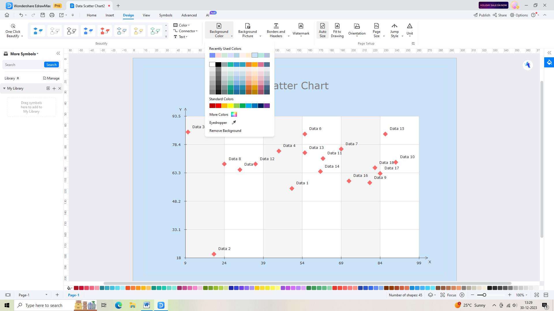
Part 5: Make a scatter chart using EdrawMax
EdrawMax is an easy-to-use, powerful visual solution for making scatter charts.
With the tool, users can create a scatter chart with simple clicks and stylish graphics. The scatter plot maker also offers abundant chart templates, and users can customize and make the chart interactive. Finally, it's fast and easy to share and export your chart.
Follow these steps to make your chart using the tool:
Step 1:
Begin by logging into your EdrawMax account. Once logged in, you will be taken to the EdrawMax dashboard.

Step 2:
Open a new document in EdrawMax by clicking on the "New" button. This will give you a blank canvas to work with for your scatter chart.

Step 3:
Search for a suitable chart template by typing "Scatter Chart" in the search bar. When the template appears, select it.

Step 4:
Customize the selected template to meet your specific requirements using the various tools and features available in EdrawMax's user-friendly interface.
Step 5:
Save your work regularly to avoid losing any progress. Use the "Save As" icon on the top toolbar to save your scatter chart.

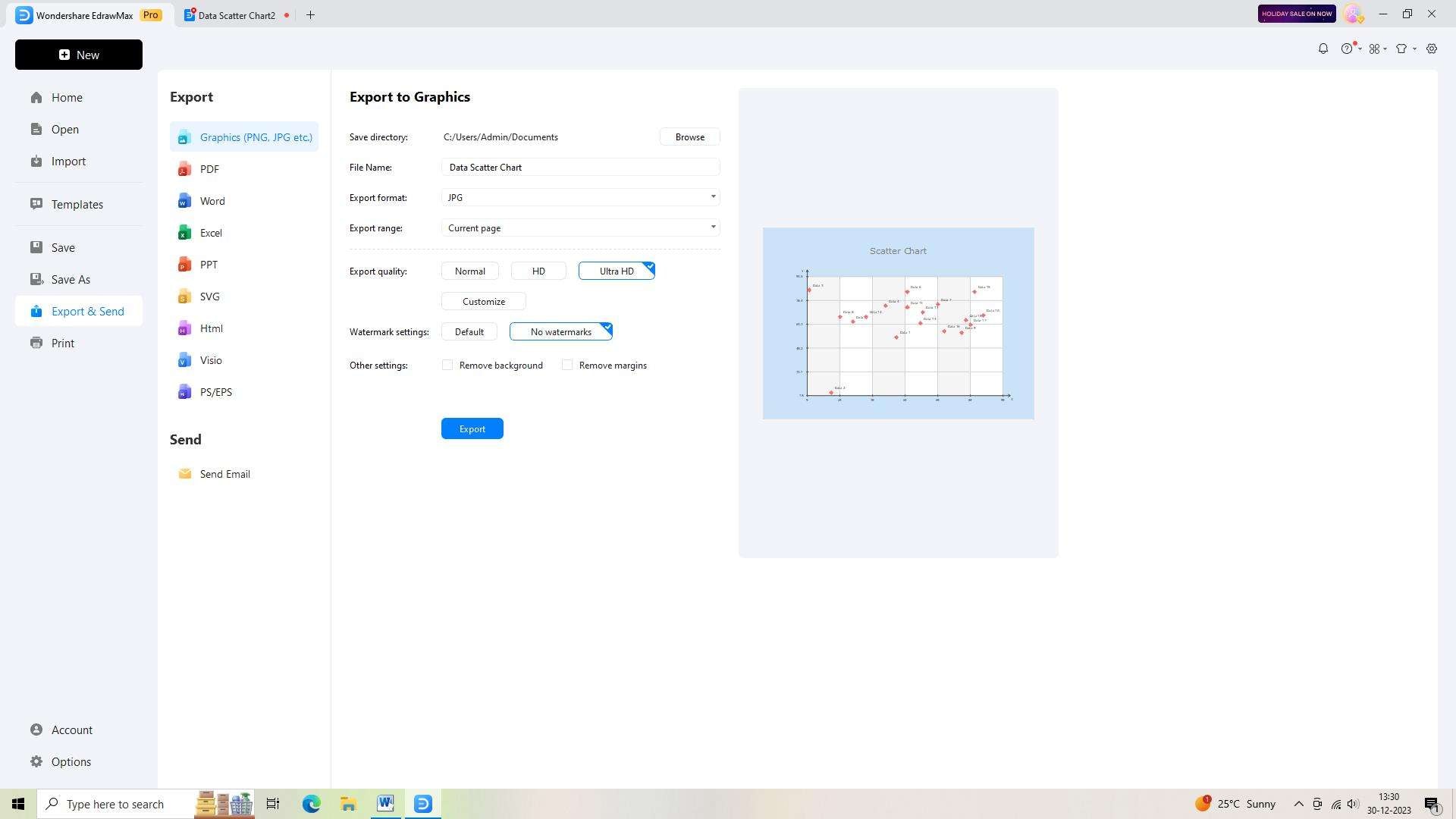
Step 6:
When you're finished with your diagram, you can export it in different formats, such as PDF, PNG, or JPEG. Simply click on the "Export" icon on the top toolbar and choose your desired file format.
Conclusion
A 3D scatter chart is a valuable tool for visualizing and analyzing the relationships between three quantitative variables. By carefully selecting the right data, customizing the chart in Excel, and employing various analytical techniques, researchers can gain valuable insights into complex data sets and make informed decisions based on the findings.
AI Diagram Generator
Enter your prompt. Upload files if needed. Generate diagrams, charts, or slides instantly.


