


I once spent an hour trying to fix a single pie chart in PowerPoint—only for it to still look like a toddler’s art project. If you’ve been through the same struggle, you know how tricky it can be to get the slices, labels, and colors just right.
That’s why I took the time to master creating pie charts in PowerPoint. In this guide, I’ll break it down step by step—no messy labels, no confusing slices. Plus, I’ll share an even easier alternative for those who want to skip the hassle. Let’s dive in.
In this article
What Is a Pie Chart?
A pie chart is a visual that reveals how different parts contribute to a total sum. It turns numbers into slices of a circle, showing a category’s proportion of the total.
Types of Pie Charts
- Standard Pie Chart: A single circle with all slices displayed together.
- Doughnut Chart: Similar, but with a hollow center, helpful in emphasizing content inside.
- Exploded Pie Chart: Highlights specific data by pulling slices away from the rest.
- 3D Pie Chart: A visually enhanced version with depth for a stronger presentation.
- Nested Pie Chart (Sunburst Chart): A multi-level chart that breaks down complex data.
Pie Charts Work Best For
- Market Share Analysis: Comparing a company’s share in an industry.
- Budget Breakdown: Tracking expenses by category.
- Survey Results: Displaying responses like customer satisfaction levels.
- Demographic Data: Showing distributions of age, gender, or location.
To add a pie chart to a PowerPoint slide, we have 4 methods. All are helpful and free. Let's check them out.
Method 1: How to Create a Pie Chart in PowerPoint?
We can make use of PowerPoint's built-in chart tool. Let's check the steps.
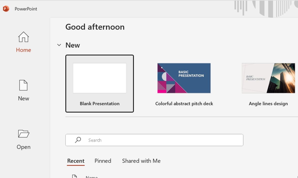
Step 1 Get Started on a Slide
Open PowerPoint and go to the slide where the chart should appear.
You can also create a new slide by clicking Blank Presentation on your home screen.
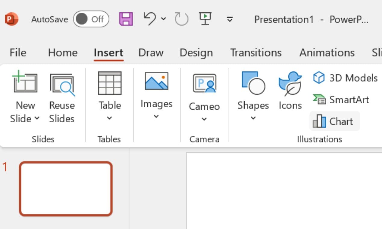
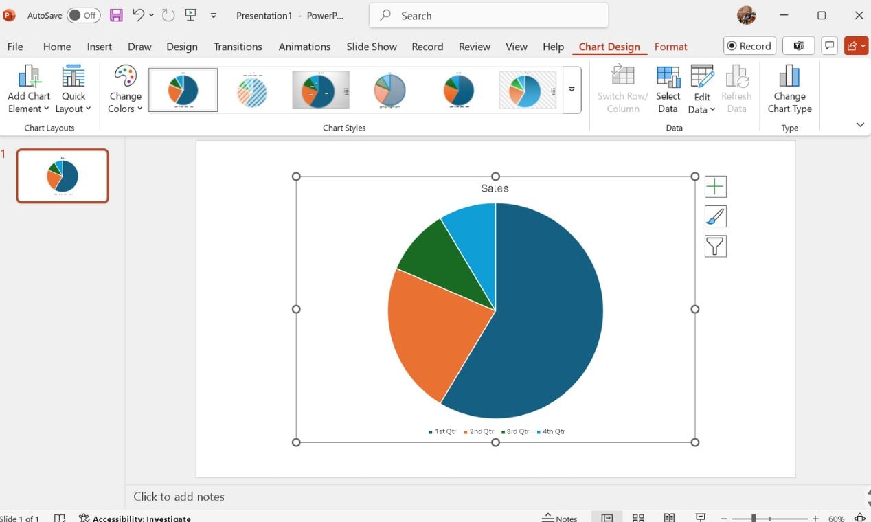
Step 2 Add a Pie Chart
Click the Insert tab, then select Chart right below SmartArt.
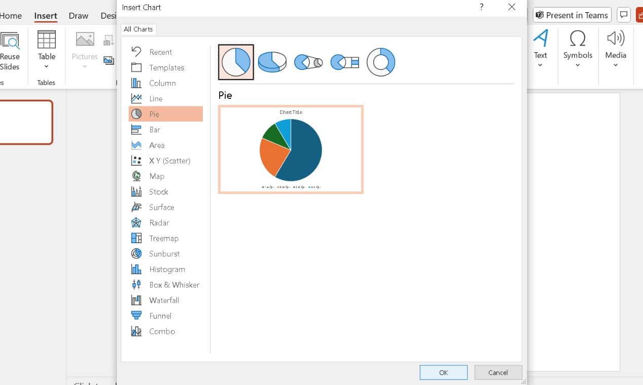
In the pop-up window, choose Pie from the list on the left. Pick a style—standard, 3D, or any other—and click OK. PowerPoint will drop a default pie chart onto your slide.
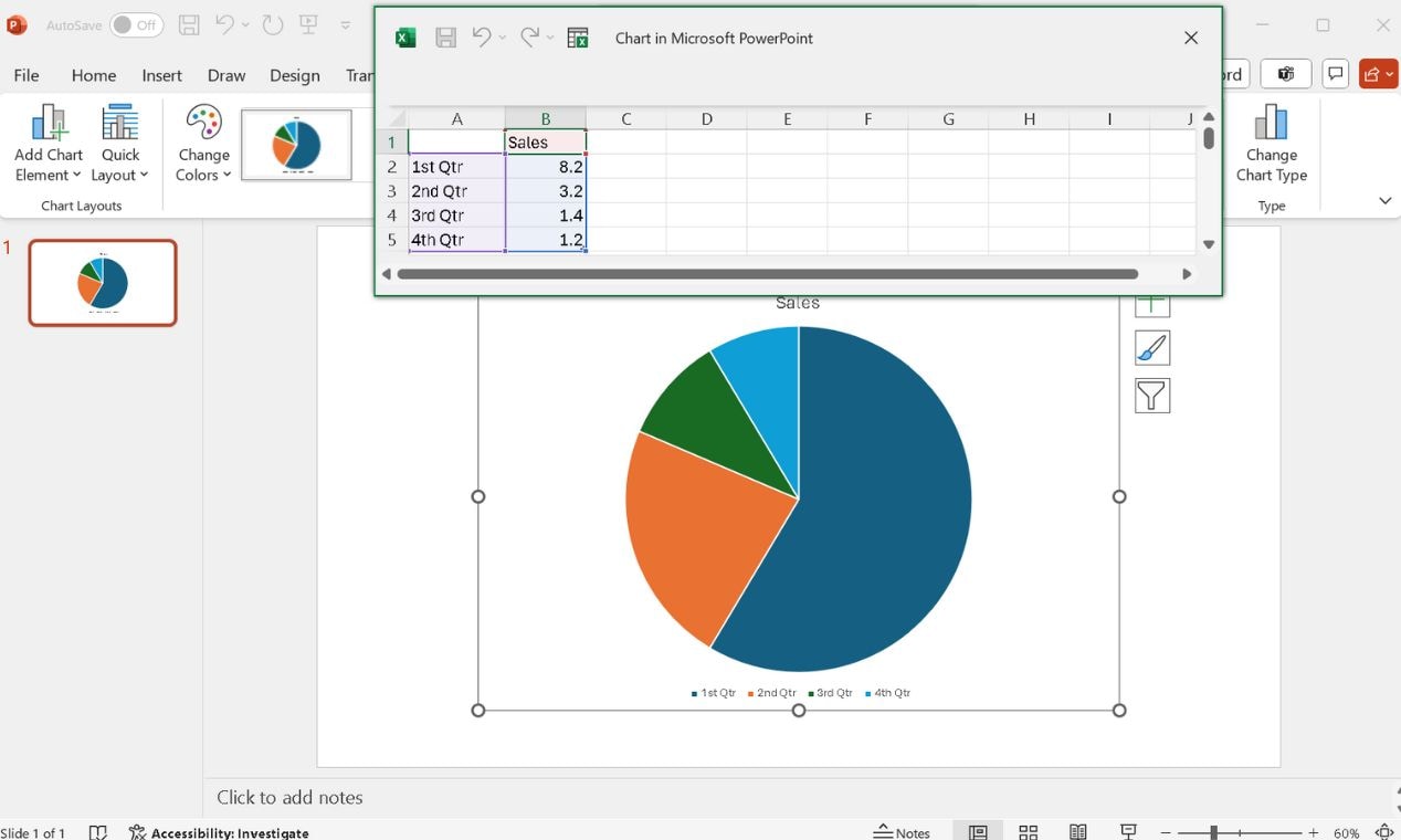
Step 3 Input Your Data
PowerPoint will open a small spreadsheet. Replace the placeholder values with your data.
Enter category names and numerical values. The chart will update automatically.
When done, close the spreadsheet.
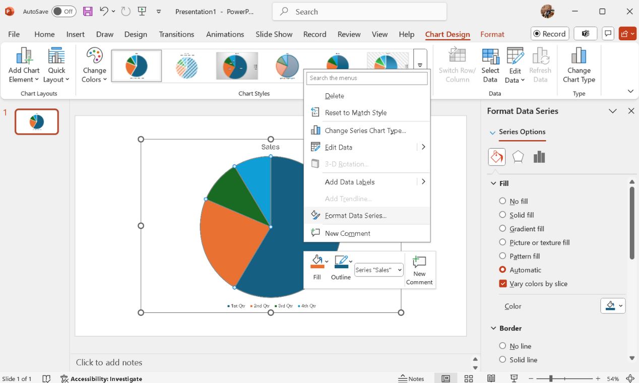
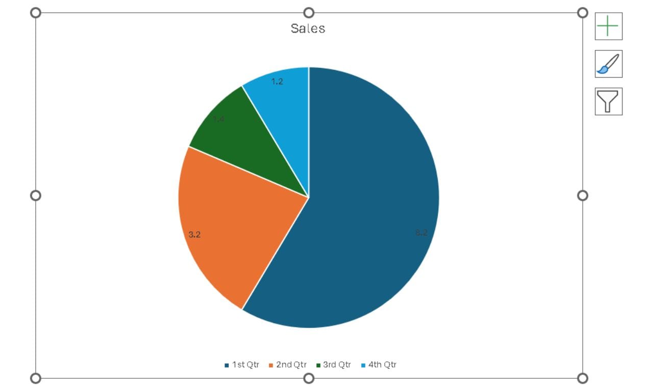
Step 4 Customize the Chart to Personalize It
Click the chart and open the Chart Design tab. Select a preferred Style, Color, and Layout.
Right-click any slice, choose Format Data Series, and pick the required Fill and Border color (if needed).
Select the chart and click the Chart Elements button (+ icon at the upper right corner) to enable Data Labels.
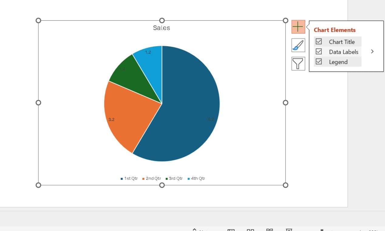
Tap any data label and drag it to adjust its placement where it suits.
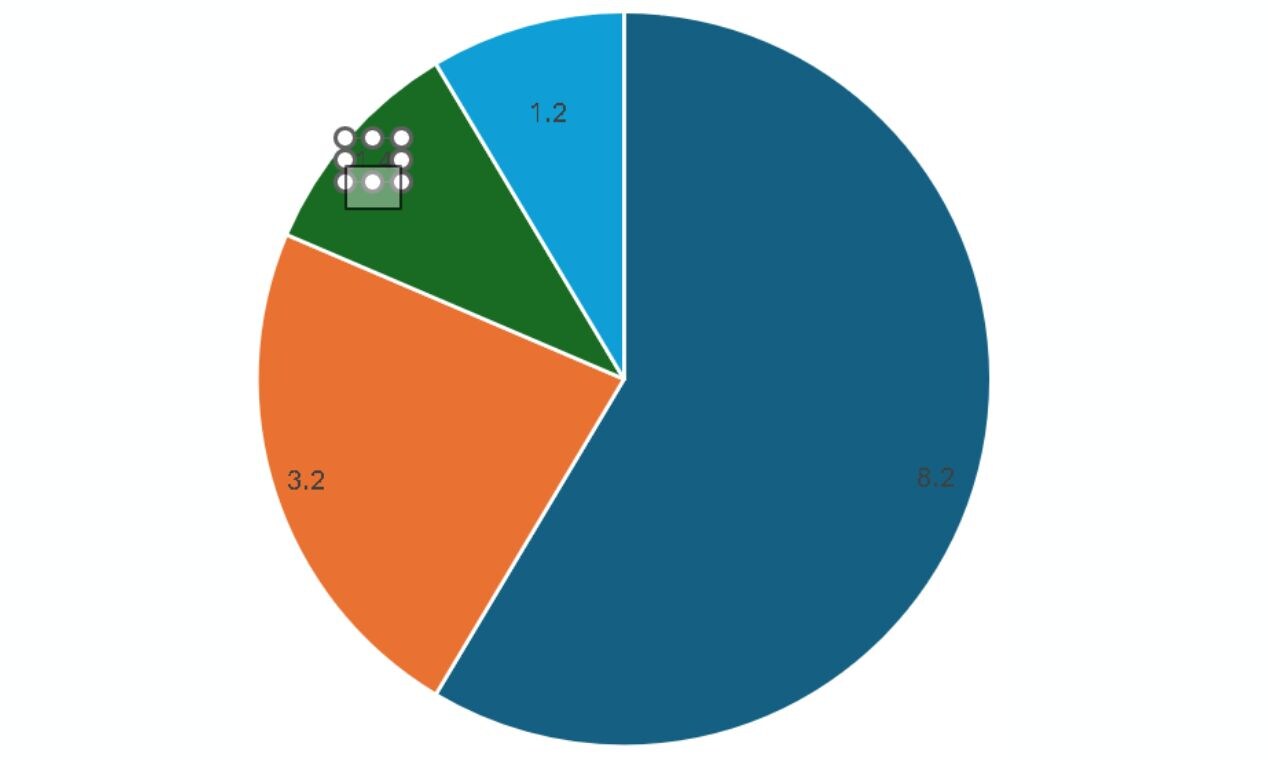
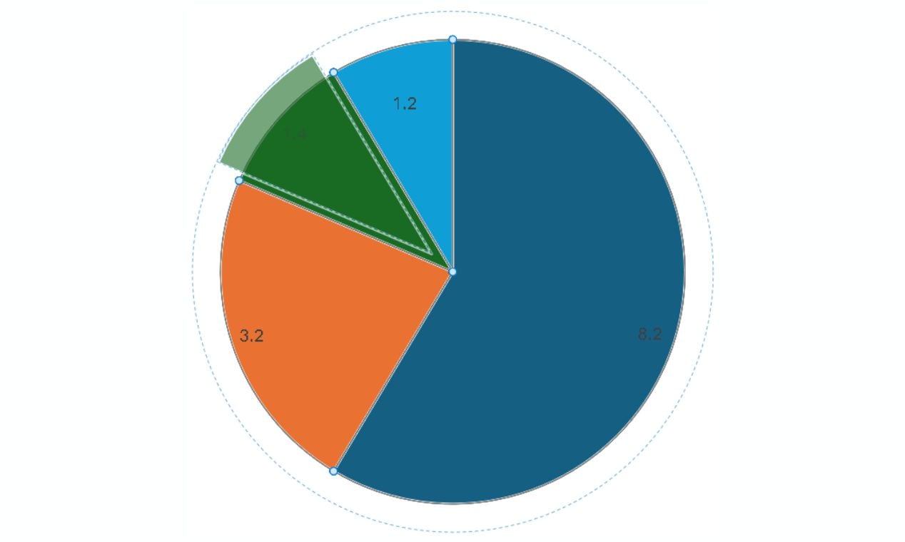
To highlight a vital category, click a slice and gently drag it outward. This separation effect helps draw attention to specific data points.
Select the chart and drag its edges to resize it.
Drag and drop the chart to move it around until it fits well within the slide.
Step 5 Review and Export Your Final Chart
Ensure chart accuracy, clarity (distinct colors), and concise labeling before presentation.
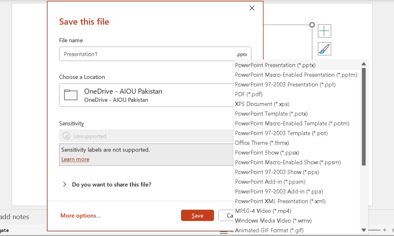
Hit CTRL+S. Choose your desired name and location, and click the Save button to export the chart.
Method 2: How to Make a Pie Chart in PowerPoint by Linking Excel Data
We can apply to Excel, another Microsoft program, to make a pie chart first. Then, we can add the chart to a PowerPoint Slide. This will also work. But this requires you to have data ready.
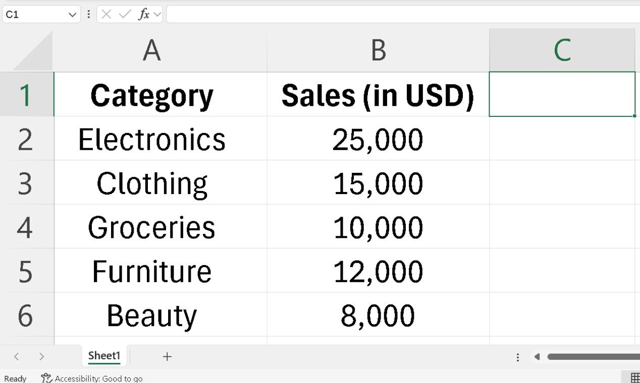
Step 1Set Up Your Data in Excel
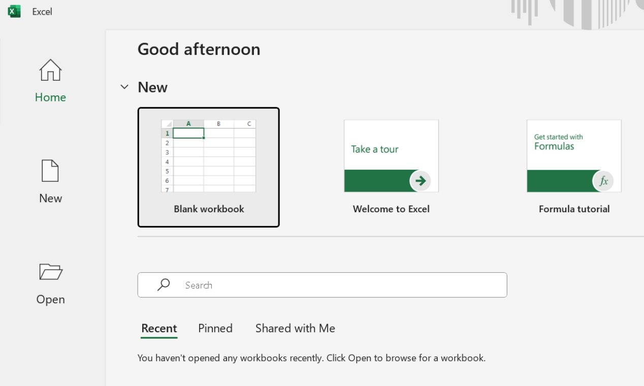
Launch Excel. Open a new spreadsheet in Microsoft Excel by clicking the Blank workbook on the home screen.
Label the first column with categories. Enter corresponding values in the second column.
Avoid blank cells, rows, or columns to keep the data clean.
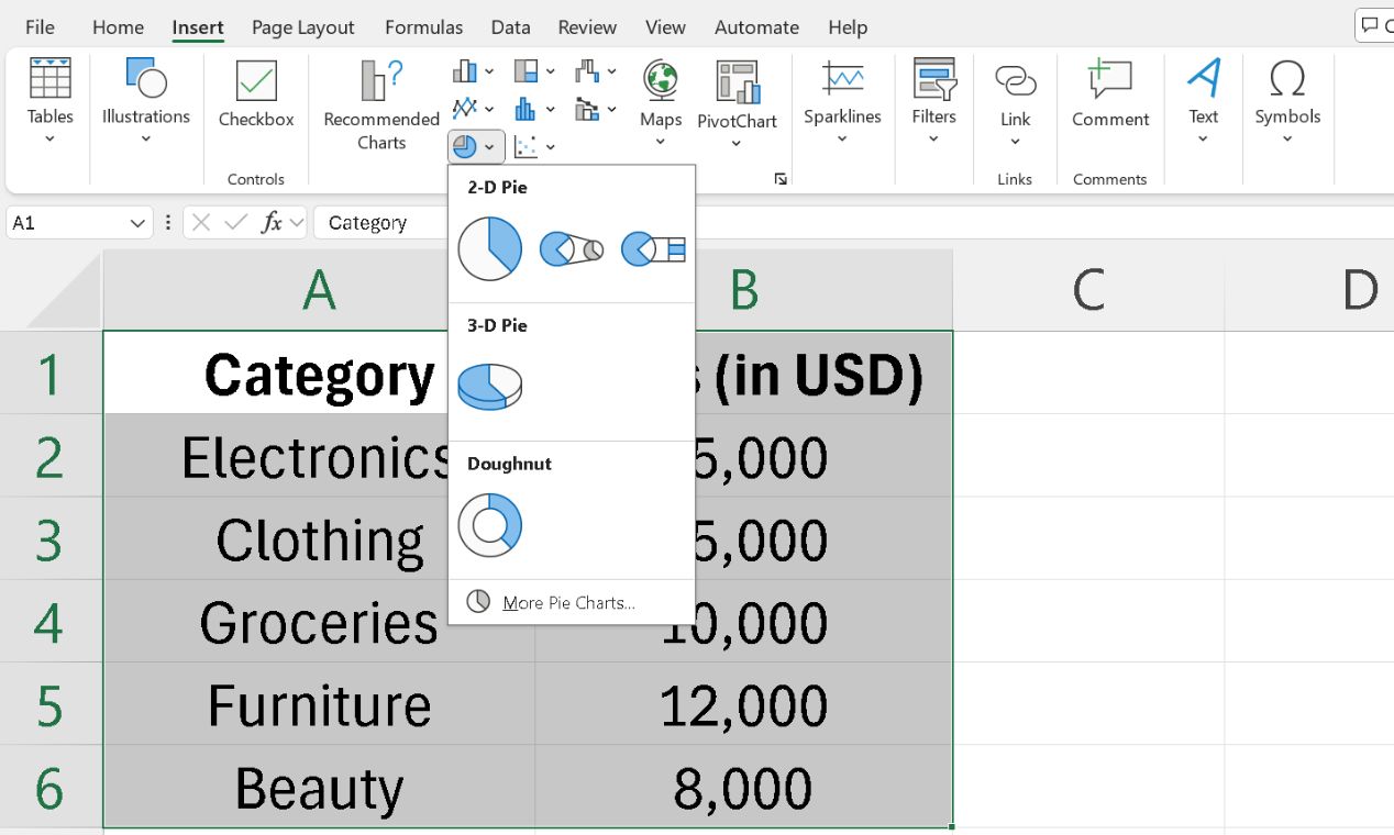
Step 2 Generate a Pie Chart in Excel
With your data ready, you can create the pie chart easily.
Select both category names and values.
Click the Insert tab and choose the preferred Pie Chart type.
Pick a style (2D, 3D, or Doughnut).
Step 3 Move the Chart to PowerPoint
Once created, click on the pie chart in Excel and press Ctrl + C to copy.
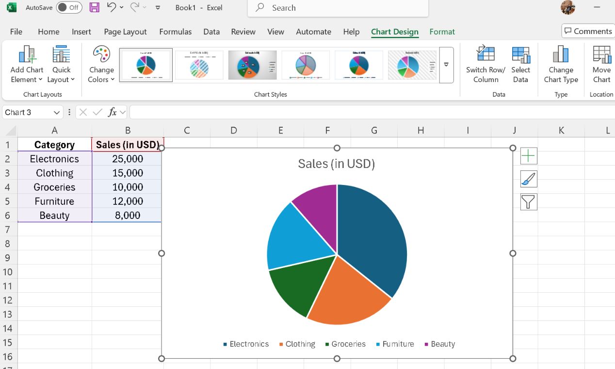
Open PowerPoint, go to the desired slide, and tap Ctrl + V to paste it.
Choose a paste option:
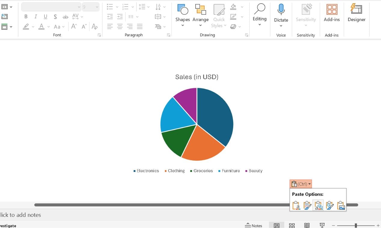
Step 4 Fine-Tune the Chart in PowerPoint
Select the chart and resize it. Modify the colors, add Data Labels, and make other enhancements as described in the previous method.
After finalizing, don’t forget to save it for later use.
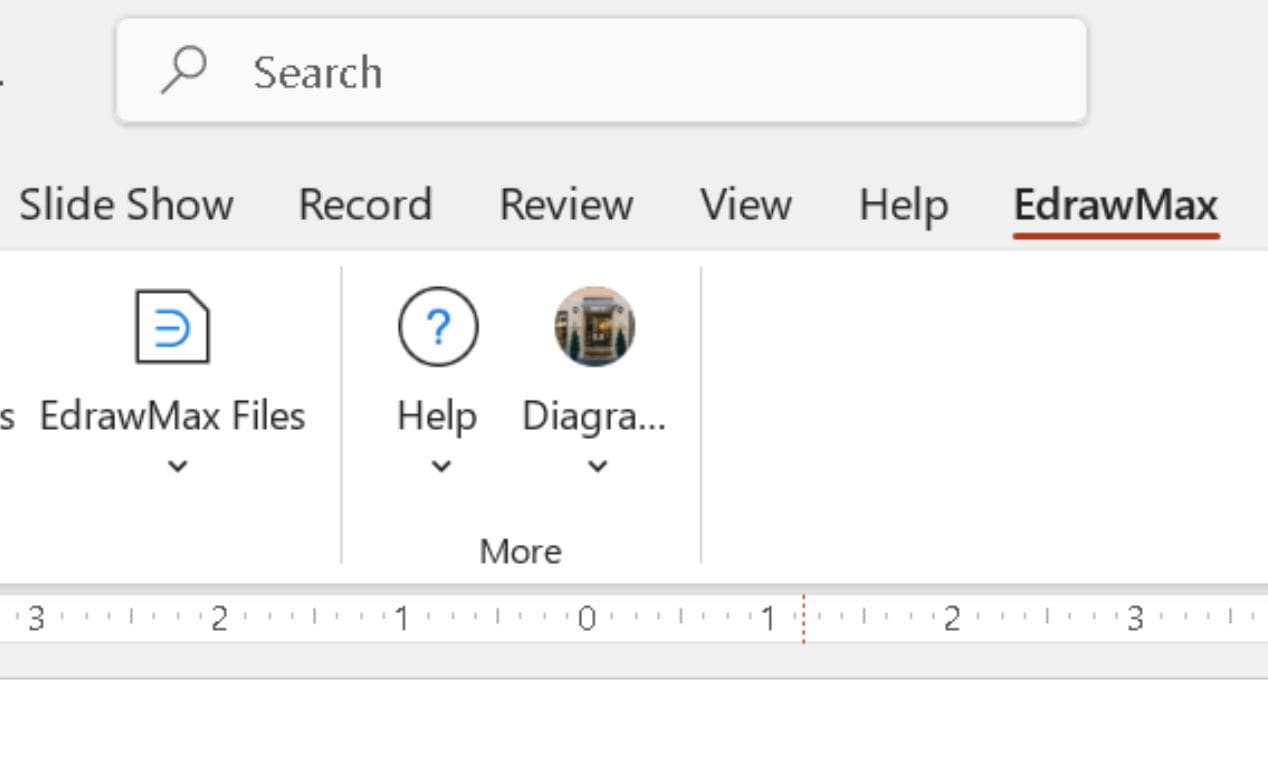
Method 3: Add Pie Charts and More on PowerPoint with Add-ins
PowerPoint is great for creating basic pie charts, but formatting everything manually can eat up valuable time. If you want a faster, more precise way to insert and edit diagrams without leaving PowerPoint, the EdrawMax PowerPoint Add-in is the perfect solution.
This add-in integrates directly into PowerPoint, letting you:
- Insert ready-made charts & diagrams in one click
- Customize visuals with AI-powered adjustments
- Modify diagrams without switching to another software
- Ensure alignment, color consistency, and professional formatting instantly
Here's how you can install and use the EdrawMax Add-in in PowerPoint:
Step 1Install & Activate the Add-in
Download EdrawMax on your computer.
Open PowerPoint. The EdrawMax tab should appear in the top menu bar.
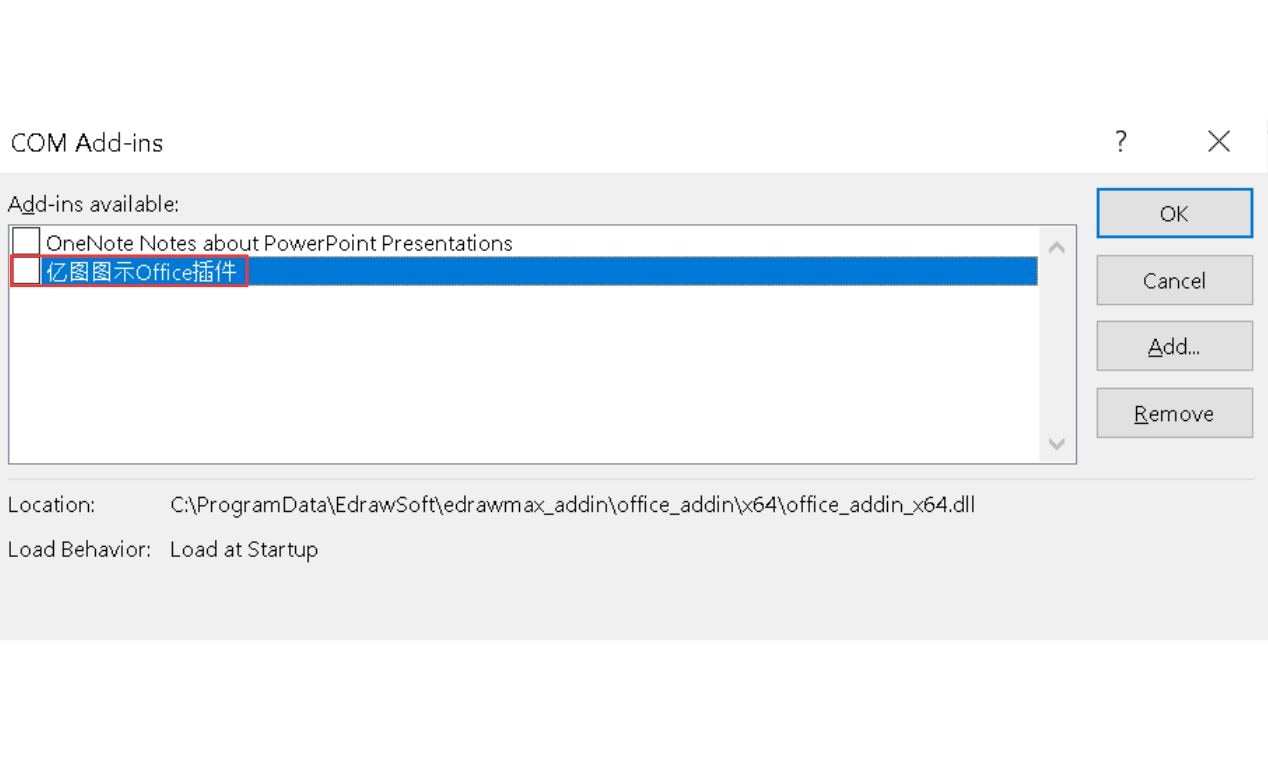
If it doesn’t appear, enable it from File > Options > Add-ins > Manage > COM Add-ins > Go.
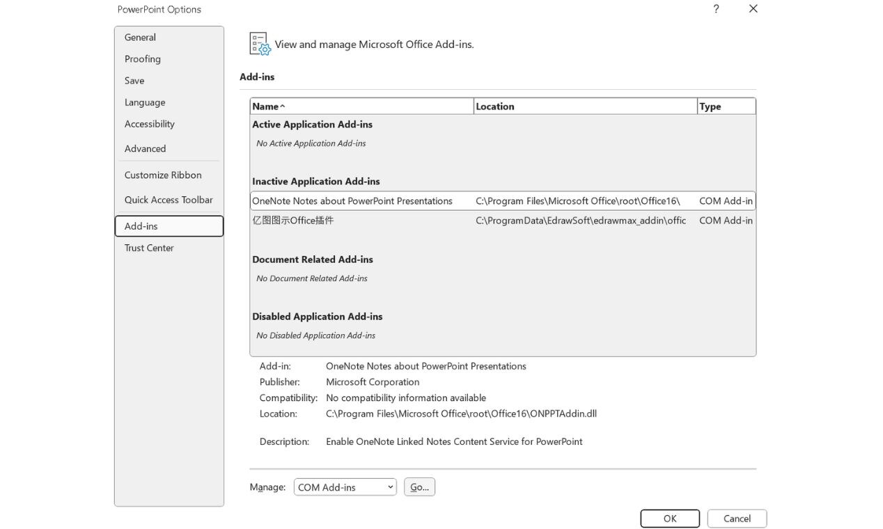
Enable the EdrawMax Office Add-in and hit OK. Now, close and restart PowerPoint.
Step 2 Insert a Pie Chart or Any Other Diagram
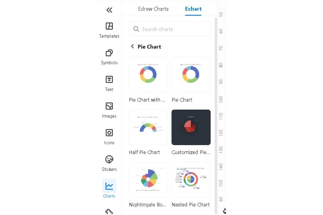
Click the EdrawMax tab and then go to More Diagram>More.
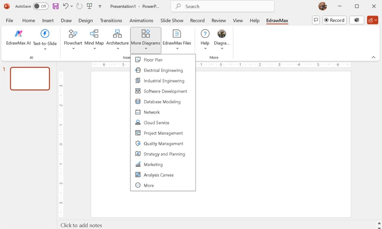
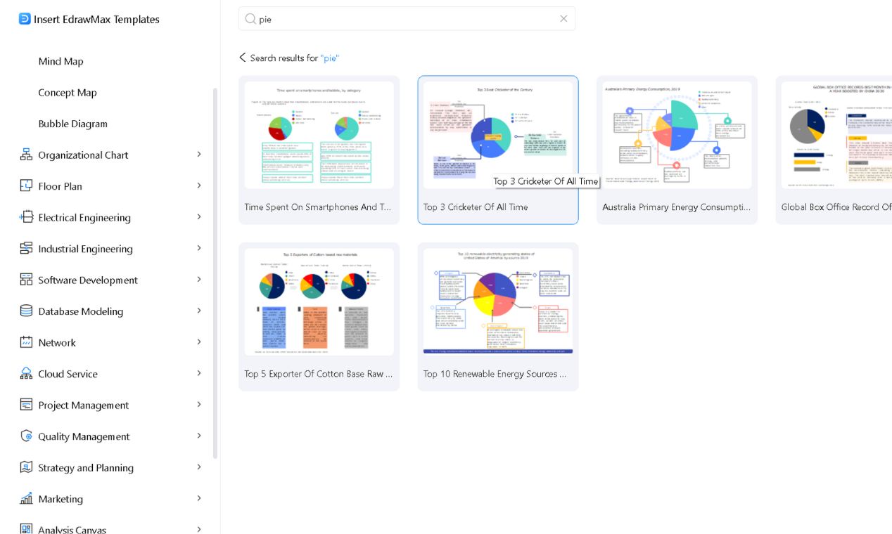
Use the search bar to find specific options and choose a pie chart template.
Click the preferred one to add it instantly to your PowerPoint slide.
Step 3: Customize with AI-Powered Editing
Resize it from the edges and reposition it by dragging it anywhere you need.
Double-click the inserted diagram to open EdrawMax’s editing panel.
Modify the data, adjust labels, resize elements, change colors, and refine details.
Once done, hit CTRL+S and the updated diagram automatically syncs in PowerPoint.
Step 4: Save & Present Like a Pro
Review your final chart, ensuring clear labels and balanced colors.
Save your PowerPoint file as usual—your polished chart is ready to go.
If PowerPoint’s default tools feel restrictive, this add-in is a serious productivity booster for anyone working with charts and diagrams regularly.
Method 4: How to Make a Pie Chart with a Chart Drawing Tool
If you're not tied to the Microsoft Suite exclusively, consider using EdrawMax Pie Chart Maker instead for faster and better results.
It eliminates these frustrations and streamlines the process without cutting corners.
Its intuitive tools, advanced customization features, and export flexibility let you design charts without frustration.
From corporate reports to school projects and marketing visuals, it always delivers professional results.

Why EdrawMax Outperforms PowerPoint for Pie Charts?
- Enhanced Customization: Easily adjust every aspect, including colors, fonts, and labels.
- Built-In Templates: Choose from over 15k professional templates to speed up the process.
- Seamless Data Import: Add Excel data directly for more accurate visualization.
- Flexible Export Options: Save in PNG, PDF, SVG, and more without compromising quality.
- Works Across Devices: Accessible on Windows, macOS, and the web.
- Fast & Intuitive Editing: Modify charts quickly using drag-and-drop controls.
Steps to Make a Pie Chart with EdrawMax
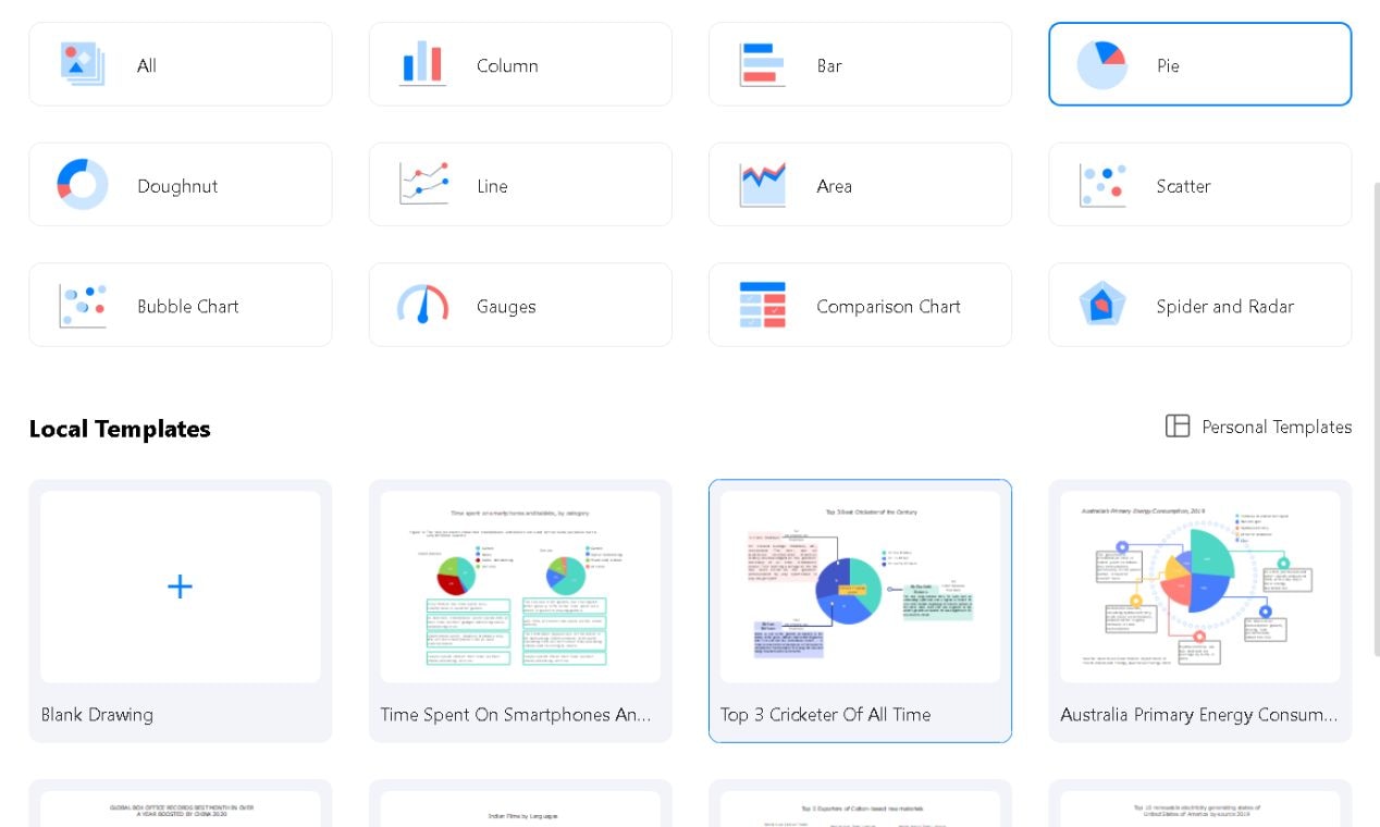
Step 1: Choose a Template
Begin with a pre-designed template for a quick and professional pie chart.
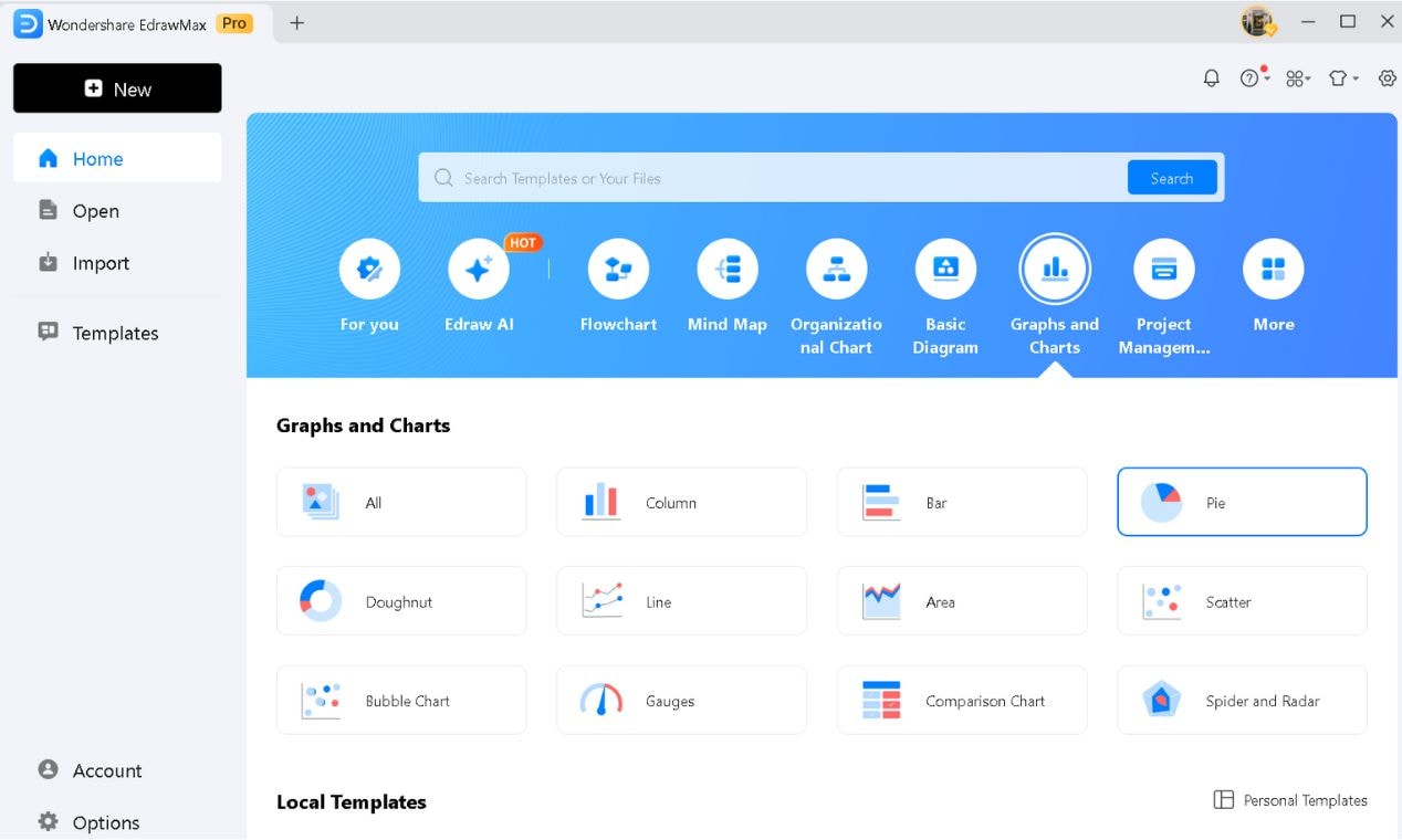
Open EdrawMax and go to Graphs & Charts.
Select Pie from the graphs and charts list.
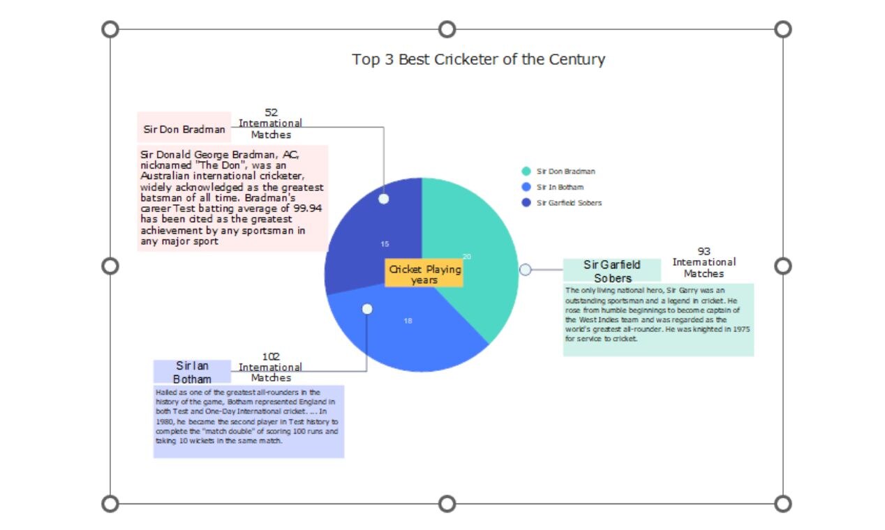
Scroll down to pick a suitable template and click it to modify it based on your requirements.
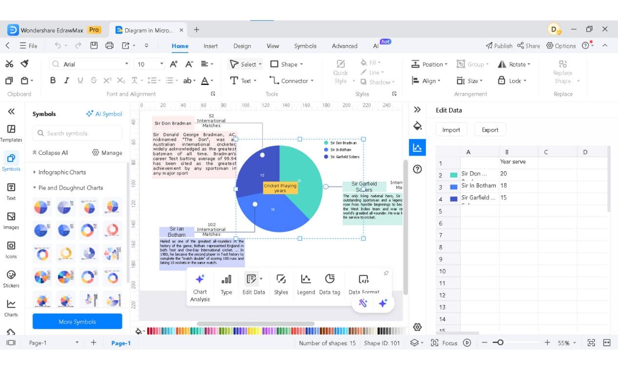
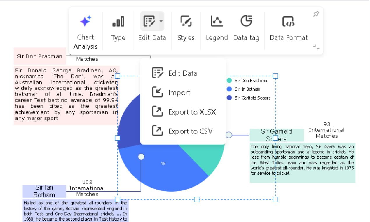
Step 2: Customize Your Chart
Now, input your data and update the visuals as you need them.
Right-click the chart to modify it.
Click Edit Data, and from the drop-down menu, add your data.
Modify the Legend, Data tag, and more from the same right-click menu.
Type your categories and values in the appeared sheet or export from the Excel sheet.
The chart updates in real-time.
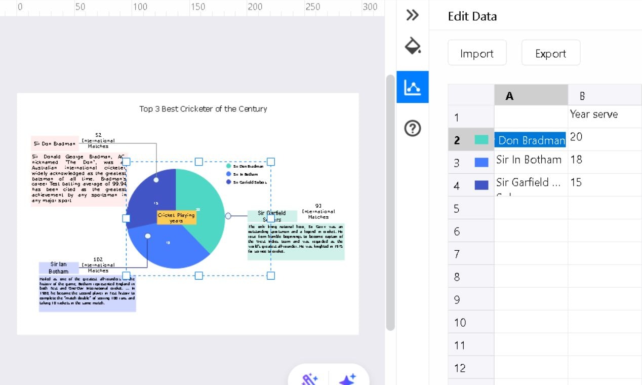
Change the slice color from within the appeared sheet.
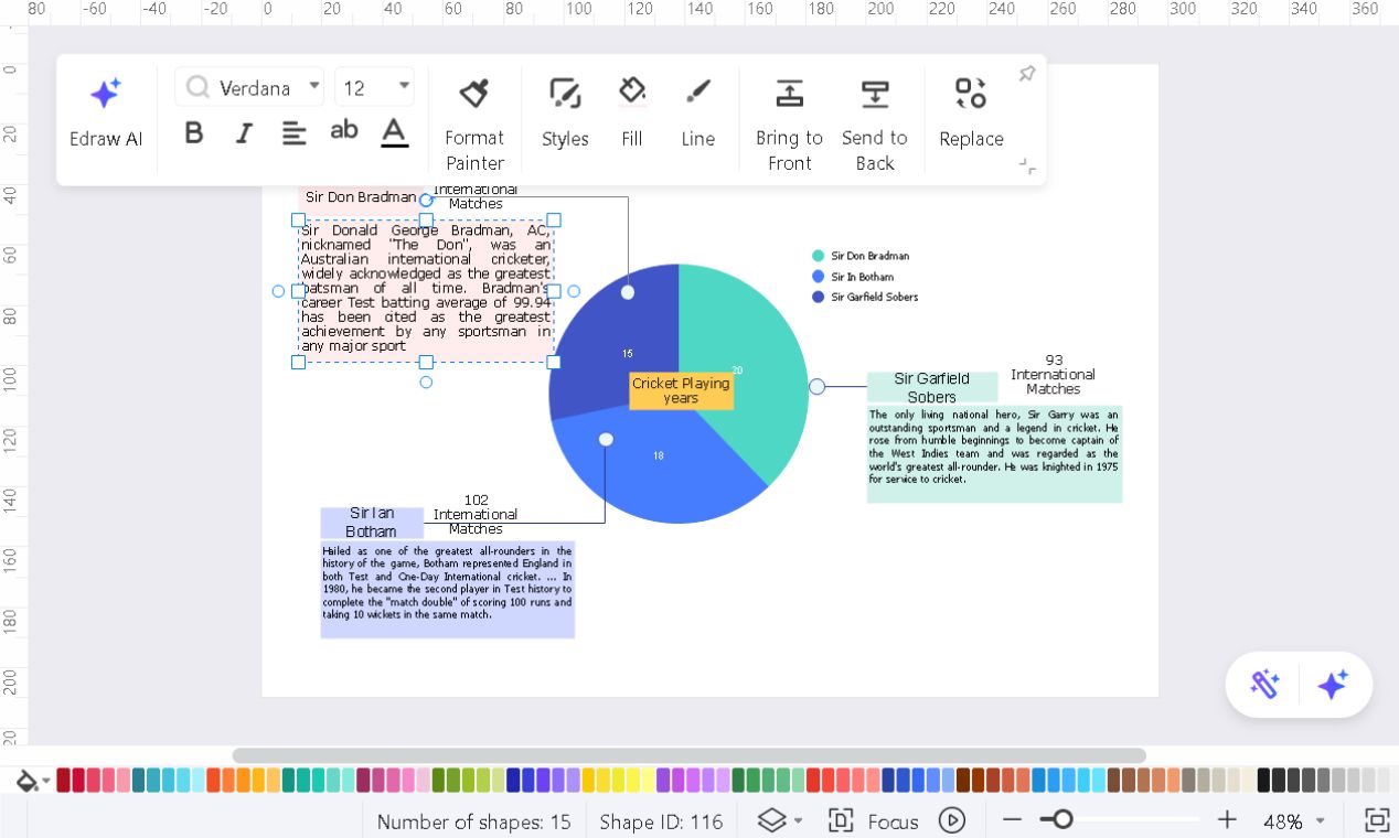
Select and delete anything extra (like the text box).
Double-click any text box to edit and adjust text, style, font size, and colors for a professional touch.
Step 3: Save and Export Your Chart
Once your chart looks perfect, export it in the format you need.
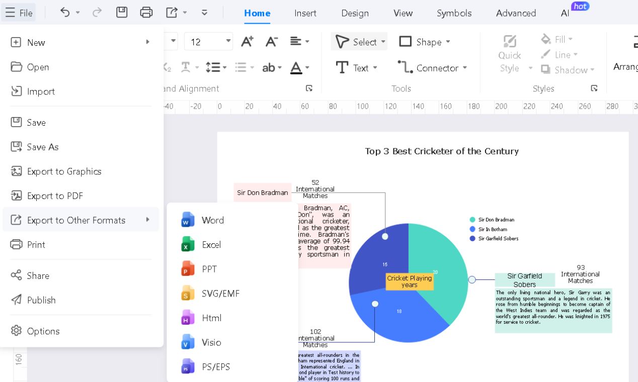
Click File > Export to Graphics, PDF, or Other Formats, then pick a format:
- PNG/JPEG: Great for slides and reports.
- PDF: High-quality for printing.
- Excel/CSV: Keeps data accessible for edits.
Adjust the resolution and file size as required.
Besides this method, EdrawMax features two other proven ways of creating a pie chart. These alternatives offer different levels of customization and ease, making them worth a try.
Best Practices for Pie Chart Creation
- Limit Slices to Five: Too many slices make a chart hard to read. Group smaller ones together, or consider a bar chart if you have more than five categories.
- Sort Slices by Size: Order slices from largest to smallest. It helps people process data quickly. Start at the top and move downward for a natural flow.
- Label Clearly: Use direct labels inside the chart so people don't have to guess what each slice represents.
- Write a Descriptive Title: Your chart's title should be clear and concise. For example, instead of "Survey Data," say "Employee Satisfaction Ratings, 2025."
- Know When to Use a Different Chart: Pie charts are best for understanding 'part of the whole,' not for comparing things. Consider using a bar graph to show slight differences or multiple categories.
- Keep Spacing Even: Unequal gaps between slices can skew perception. If you separate a section for emphasis, don't make it too dramatic.
- Use Colors Wisely: Each slice should stand out, but don't go overboard. Stick to a simple color palette with enough contrast to tell slices apart.
Conclusion
While PowerPoint lets you make pie charts, it lacks advanced customization. Overlapping labels, weak contrast, and misleading percentages can ruin clarity.
EdrawMax makes things even smoother. It streamlines the process with advanced features and auto-formatting templates.
Clarity is key, no matter the software. PowerPoint works fine for occasional charts. But if you want efficiency and professional visuals, try EdrawMax or its add-in for PowerPoint for free now.
AI Diagram Generator
Enter your prompt. Upload files if needed. Generate diagrams, charts, or slides instantly.


