A Gantt chart is a diagram designed to illustrate the project’s schedule. Project managers and other responsible team members use this chart to monitor whether or not the project delivery will meet the deadline.
Simply put, a Gantt chart presents different activities against time to show the progress of a project. MS PowerPoint can assist you in making these charts and a range of other similar diagrams.
If you are wondering how to create a Gantt chart in PowerPoint, you are at the right place. This article provides a step-by-step guide to making an attractive and easy-to-read Gantt chart PPT. Let’s get into further details.
In this article
Part 1. How to Make a Gantt Chart in PowerPoint?
This section explains how you can create a Gantt chart in PowerPoint. The steps included in the entire process are given below.
Step 1
Open the PowerPoint application on your computer or laptop.
Step 2
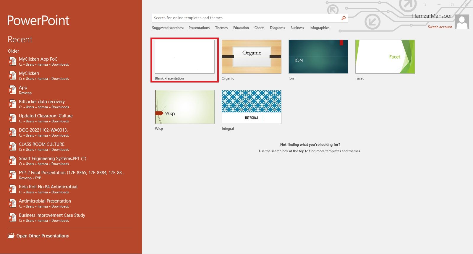
Open a Blank document.
Step 3
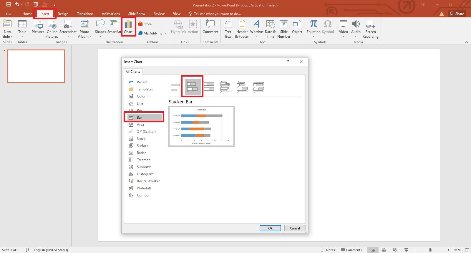
Click on the Insert tab and hit the Chart option. A new window will appear on your computer’s screen. Enter the Bar option and select the Stacked Bar for your Gantt chart, as shown below.
Step 4
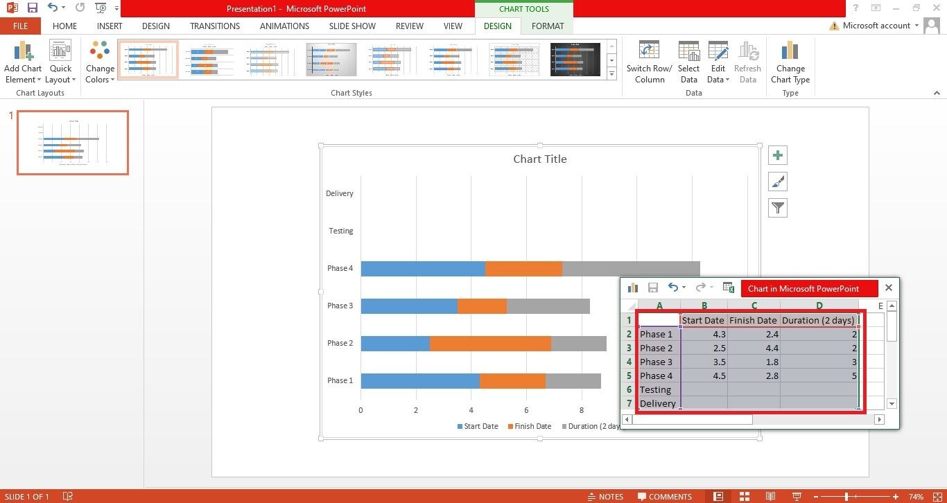
Now, you will see a stacked bar chart layout with an Excel sheet, as shown below. Replace the information in the Excel file with the data against which you want to create a Gantt chart. With the brush symbol on the right side, you can change the color scheme and style of your Gantt chart.

Remember, you should break down the whole project into different phases. Once you define different phases, assign them the duration with the start and end dates. The duration can be in days, weeks, or months, depending on what type of project you are working on.
Write the project phases in the left-most column, then the start date, the end date, and the duration in the following columns, as shown below.
Step 5
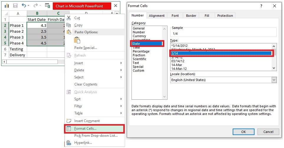
To display the dates in the right format, you may need to set the date format. To do this, select the columns with the start and end dates, right-click on them, and tap on Format Cells. Then, enter the Date tab and select the right format. Once done, press OK.
Step 6
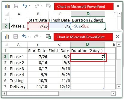
It is time to enter the start and end dates of each phase. Then, simply apply the subtraction formula to calculate the duration of each phase automatically. All you need to do is subtract the column for the start date from the column for the end date. The formula for the second cell would be $C2-$B2.
Step 7
Now, click the Filter symbol on the right side of your graphic. In the Values tab, uncheck the Finish Date box and hit the Apply button in the bottom-left corner, as shown below. Unchecking this box will make some space for Duration to appear clearly.
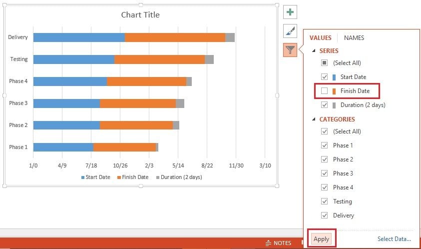
Since you have removed the Finish Date from the graphic, the new appearance of the chart will be like the image shown below.

Step 8
Right-click on any blue bar, open the Fill menu, and choose No Fill, as shown below.
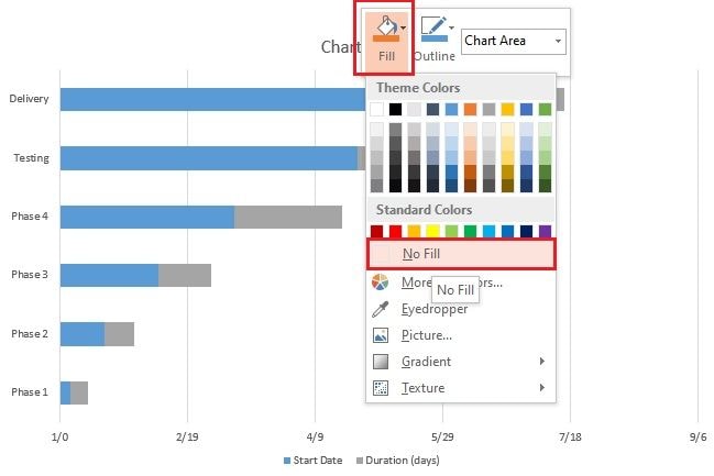
As soon as you do this, your chart will show the Duration bars only. Your chart is now ready.

Step 9
If you want to make your Gantt chart more appealing, you can customize it the way you want. For instance, you can change the colors of the bars, font styles, font size, effects, and other similar parameters. A customized Gantt chart is shown in the image below. For a more personalized chart, you can visit the Format tab in PowerPoint from the top ribbon.

Part 2. Make a Professional Gantt Chart in EdrawMax for Free
Are you looking for a third-party tool that can help you make a professional Gantt chart for free? If yes, try Wondershare EdrawMax. This tool provides you with an unmatched diagramming experience.
Along with Gantt charts, EdrawMax can help you create hundreds of other diagrams. It is compatible with Android, iOS, Linux, Windows, and Mac.
Here is how you can make a professional Gantt chart in this tool.
Step 1
Ensure you have EdrawMax installed on your device. If not, do it right away.
Step 2
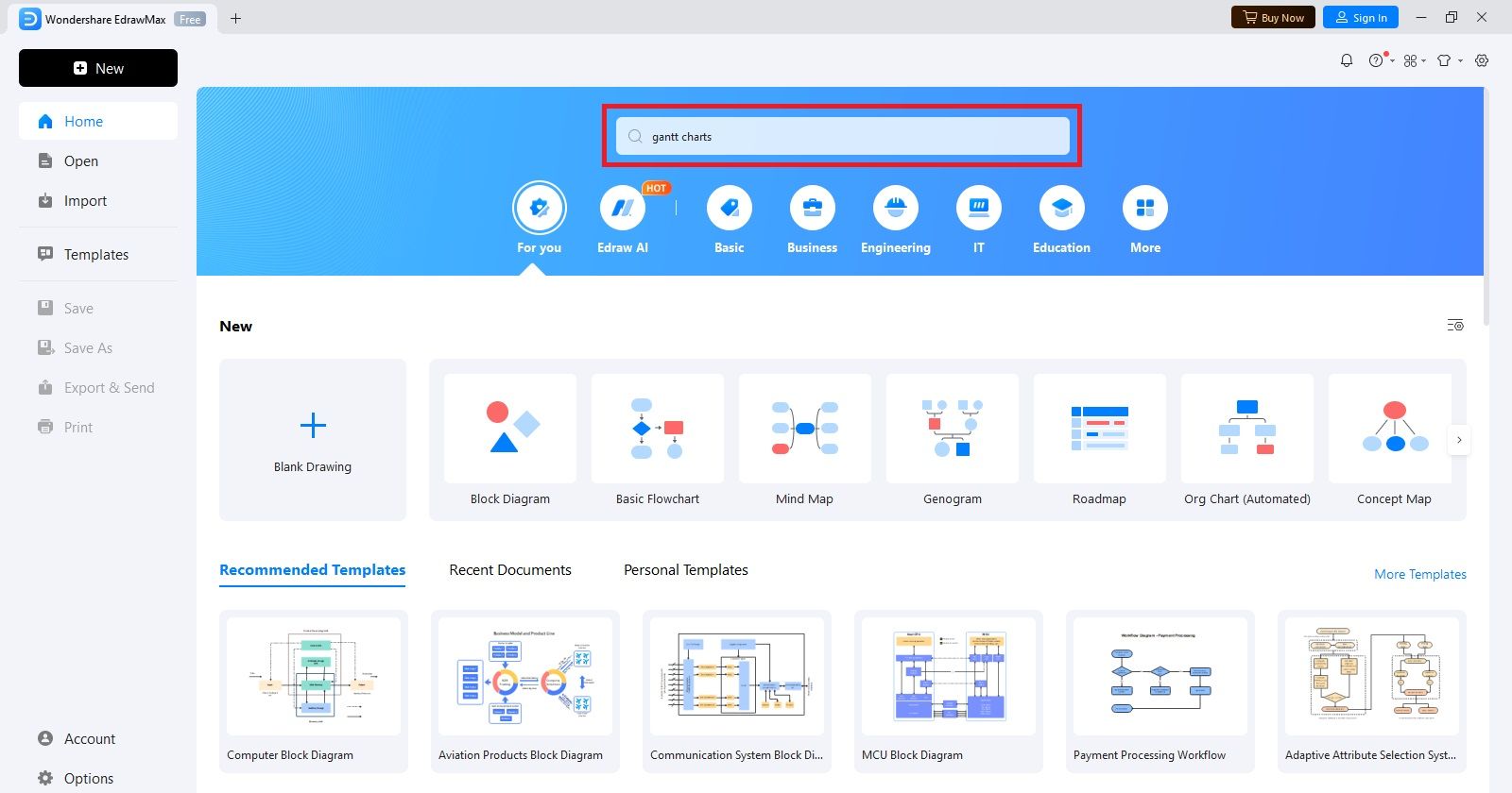
Open the tool and enter “gantt charts” in the search bar, as shown below.
Step 3
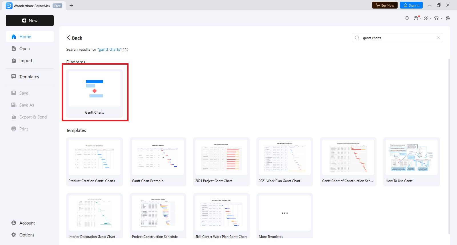
Now, click on Gantt Charts.
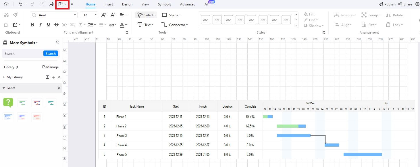
You will see a new window on your screen, as shown below. Here, you will see different columns for the task name, the start date, the finish date, the duration, and the percentage of completion.

Step 4
Enter your data to customize the chart layout.

Step 5
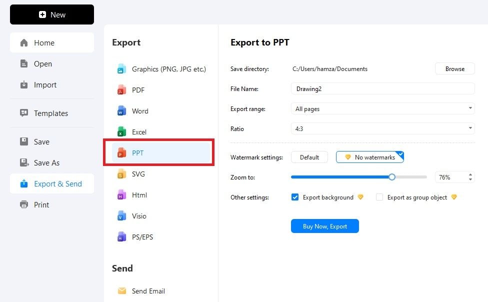
Once you enter the data, the Gantt chart will be updated automatically. You can then export the chart in PowerPoint. To do this, click the Export icon in the top ribbon.
Then, choose PPT from the list of available formats, as shown below. It allows you to set the file name, export range, ratio, and watermark settings. Once you adjust all these things, hit the Export button and save the chart on your preferred location on your device.
If you have the paid EdrawMax version, the watermark will not appear on the Gantt chart you export in PowerPoint format.
Part 3. Best 5 Practices for Making Gantt Charts
Now that you know how to make a Gantt chart in PowerPoint and EdrawMax. It is time to explore some of the best practices you should follow when creating these charts.
Break Down the Project into Small Phases
While working on a project, it is always preferred to break it down into different phases or tasks. Doing this greatly reduces the complexity of the project. As a result, the project becomes more approachable and more manageable.
Break the Larger Tasks into Sub-Tasks
Highlight the larger tasks in your project and further break them down into various sub-tasks. It further reduces the complexity and makes everything easy for project managers to manage.
Define Dependencies
Dependencies display the relationship between different tasks. You can use dependencies to show when a specific task should start and finish in relation to the other tasks.
Determine Project Goals
Before creating a Gantt chart, always make sure you and your team members understand all the goals clearly.
Use Differentiating Colors
When representing the duration of different tasks or phases, use eye-catching colors to make them easily differentiable. Using contrast color schemes can make your charts more appealing.
Final Words
A visual representation of different tasks of your project is commonly called a Gantt chart. Simply put, a Gantt chart shows the progress of a project in the form of start dates, finish dates, and duration of each phase or task. When it comes to making a Gantt chart, PowerPoint becomes your go-to partner.
If you are looking for a complete guide to creating a Gantt chart in PowerPoint, read the discussion above. It has covered everything, from building a chart to customizing it as per your requirements. If you need a great PPT alternative to make an eye-catching Gantt chart, try Wondershare EdrawMax. It works well on all devices: Mac, Linux, Windows, iOS, and Android. Give it a try.
 AI PowerPoint
 AI Infographic

