


Scatter charts, also known as scatter plots or scatter diagrams, are a valuable tool in data visualization and analysis. They are used to display the relationship between two variables and identify patterns and trends within the data. Here, we will explore the benefits of scatter charts, how they aid in identifying patterns and trends, scatter diagram examples and scatter plot graphs, and more.
In this article
- Part 1: How Scatter Charts Aid In Identifying Patterns and Trends
- Part 2: Benefits for Designing Clear and Informative Scatter Charts
- Part 3: Examples of Scatter Diagram and Scatter Plot Graph
- Part 4: Common Mistakes to Avoid When Creating Scatter Charts
- Part 5: EdrawMax is the best tool to create a Scatter Chart
- Conclusion
Part 1: How Scatter Charts Aid In Identifying Patterns and Trends
Scatter charts help immensely in identifying patterns and trends. They provide a visual representation of data points, making it easier to analyze and draw meaningful insights.
- Identifying patterns: Scatter charts aid in identifying patterns by visually displaying the relationship between two variables. Each data point on the chart represents the values of the two variables, allowing for a quick and intuitive understanding of their relationship.
- Identifying correlations, clusters, and outliers: They help in identifying correlations, clusters, and outliers within the data. By examining the distribution of the data points on the scatter chart, patterns, and trends can be identified, such as positive or negative correlations, linear or non-linear relationships, and the presence of clusters or outliers.
- Identifying trends over time or across different conditions: Scatter charts allow for the identification of trends over time or across different conditions. By plotting the data points on the chart, trends, and patterns can be observed, such as increasing or decreasing trends, seasonal variations, or differences across different groups or categories.
Part 2: Benefits of Designing Clear and Informative Scatter Charts
Designing clear and informative scatter charts is important. There are plenty of benefits of interpreting clear and informative scatter charts.
Enhanced data interpretation:
Clear and informative scatter charts provide a visual representation of the relationship between two variables, making it easier for the audience to understand and interpret the data.
Effective Communication of Data Relationships:
They allow for effective communication of complex data relationships.
Improved Decision-Making Support:
Well-designed scatter charts enhance decision-making by providing a clear visualization of the data.
Part 3: Examples of Scatter Diagram and Scatter Plot Graph
Looking at scatter diagrams and scatter plot graph examples can prove beneficial. They help in understanding scatter diagrams and scatter plot graphs better.
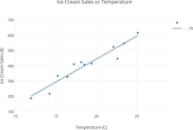
Temperature and Ice Cream Sales Relationship:
In a study on the relationship between temperature and ice cream sales, a scatter plot graph was used to display the daily temperature and the corresponding daily ice cream sales. This among the most popular scatter plot real-life examples, revealed a positive correlation between temperature and ice cream sales, indicating that higher temperatures were associated with increased ice cream sales.
Advertising Expenditure and Sales Revenue Relationship:
In a financial analysis, a scatter diagram was used to examine the relationship between the company's advertising expenditure and its sales revenue, and this is a popular scatter chart example. The scatter diagram showed a cluster of data points indicating that higher advertising expenditure was associated with higher sales revenue, suggesting a positive relationship between the two variables.
Part 4: Common Mistakes to Avoid When Creating Scatter Charts
There are some common mistakes that should be avoided when creating scatter charts. This helps in ensuring that effective scatter charts are created.
Avoid Overcrowding of Data Points:
Overcrowding the chart with too many data points can make it difficult to interpret the relationship between the variables. It is important to strike a balance between including enough data points to show the overall pattern and avoiding overcrowding that obscures the trends.
Accurate Scaling of Axes:
Ignoring the scales of the axes can distort the representation of the data. It is crucial to ensure that the scales of the axes accurately represent the range of the data, as using inappropriate scales can mislead the audience about the true nature of the relationship between the variables.
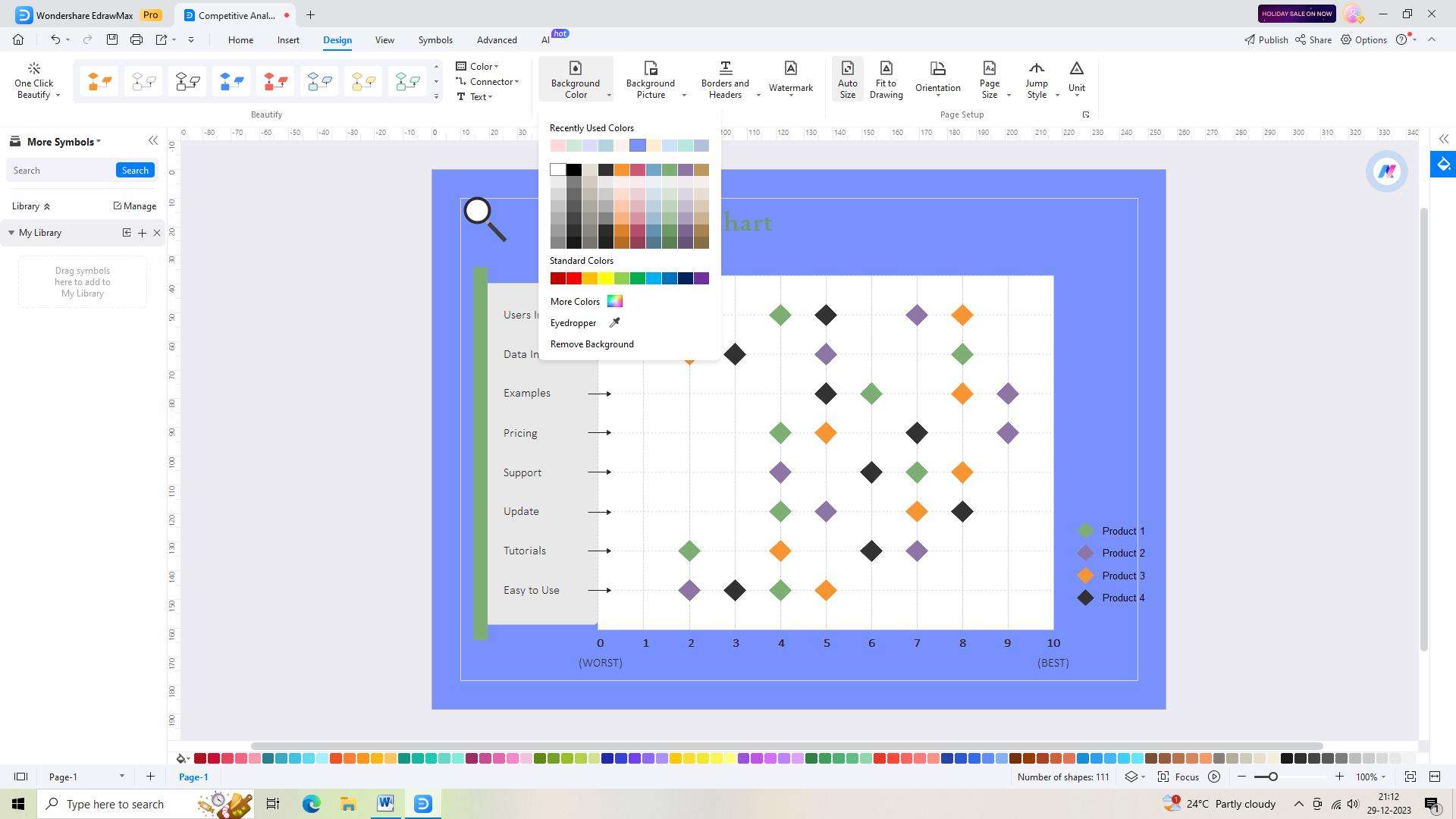
Part 5: EdrawMax is the best tool to create a Scatter Chart
The best tool available for making scatter charts is Wondershare EdrawMax. With its user-friendly interface, a wide range of customization options, and numerous templates to choose from, it stands out as the best tool for creating this type of chart. Its powerful features like data import, drag-and-drop functionality, and real-time collaboration make it a top choice for professionals and beginners alike.
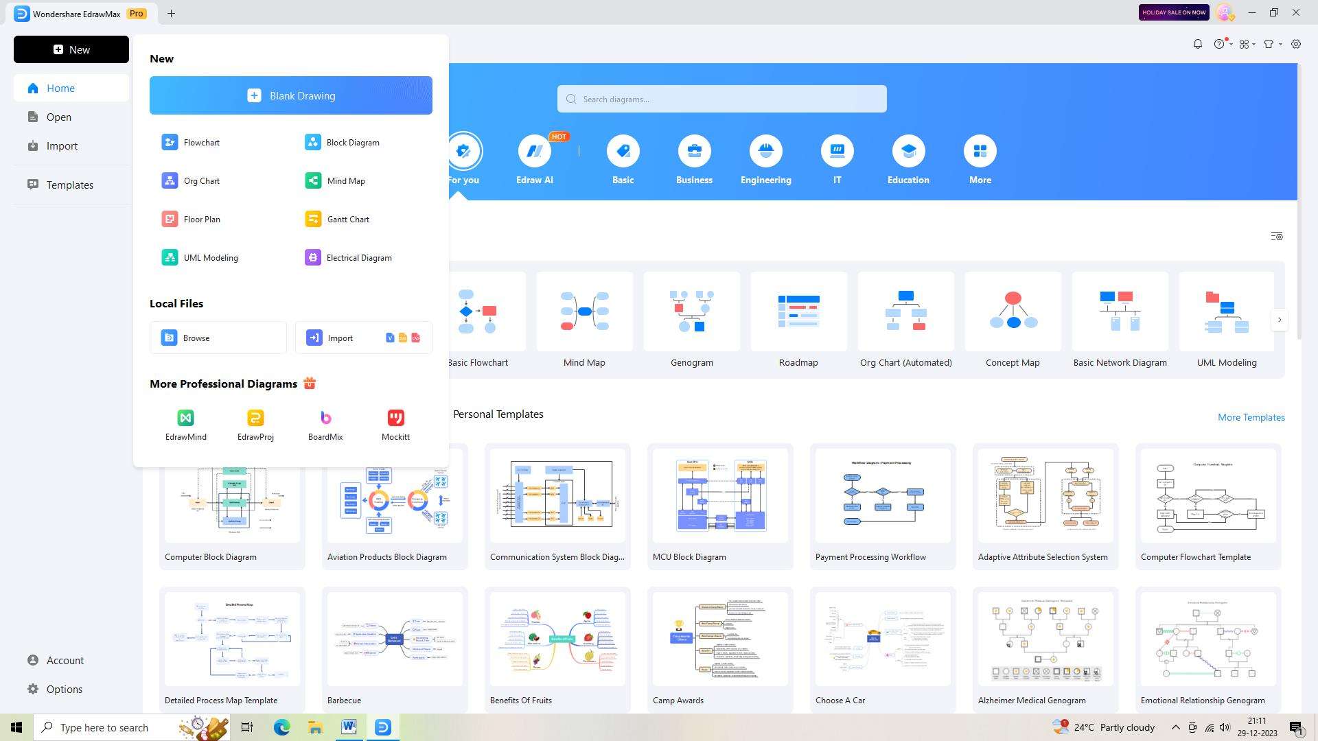
Step 1:
Begin by logging in to your EdrawMax account or signing up if you're new to the platform. This will grant you access to all the advanced features of EdrawMax.
Step 2:
Once you're logged in, open a new document in EdrawMax. Click on the plus sign beside the “New” button to do this.
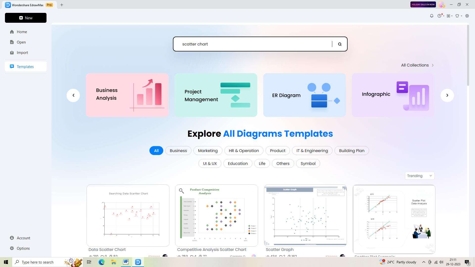
Step 3:
Now it's time to explore EdrawMax's extensive template library and search for a scatter chart template. You'll find a range of professionally designed templates to start your chart creation journey.
Step 4:
After selecting a suitable template, it's time to make it your own. Customize the components, adjust the layout, and add relevant information.
Step 5:
As you make progress with your chart, remember to save your work regularly. Click on the "Save" button or use the keyboard shortcut to ensure that your chart is safely stored in your EdrawMax account.
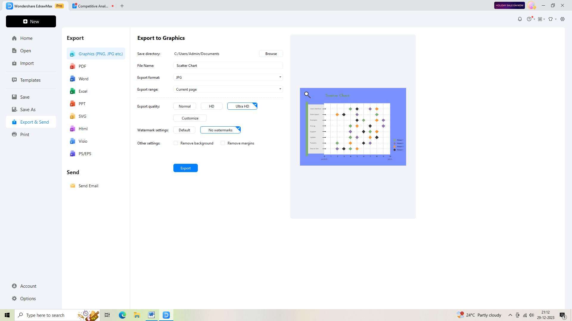
Step 6:
Once you're satisfied with your scatter chart, it's time to share it with others. Export your chart in a preferred format, such as PNG, JPEG, or PDF, depending on your needs.
Conclusion
Scatter charts are a valuable tool for identifying patterns and trends, designing clear and informative visualizations, and avoiding common mistakes in data presentation. By understanding the benefits of scatter charts and scatter graph examples and scatter plot graphs, individuals and organizations can effectively utilize scatter charts for data analysis and communication.
