


Beginning the process of creating a bar chart in Excel opens up a world of possibilities for dynamic data representation. Excel provides a range of options, including grouped and clustered bar charts, to effectively showcase comparisons and trends. In this guide, we'll walk you through the steps of making a bar chart in Excel, catering to users of all levels.
Whether you're a beginner or an experienced Excel user, this tutorial will equip you with essential skills to enhance your data presentation.
Let's get started!
Contents of this article
What is a Bar Chart?
A bar chart is a visual tool that simplifies complex data. It uses rectangular bars to represent information, making it easy to compare quantities or track changes over time. Each bar's length corresponds to the value it represents, creating a visual hierarchy. This straightforward graph is especially handy for presenting categorical data, like sales figures for different products or the performance of various teams.
In the world of data, a bar chart is your trusty guide, turning numbers into a compelling narrative that anyone can understand at a glance.
Types of Bar Charts in Excel
From grouped and clustered charts for categorical comparisons to dynamic floating charts, each type serves specific data visualization needs
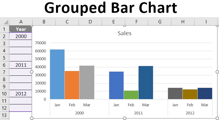
- Grouped Bar Chart Excel: Grouped Bar Charts in Excel categorize data, presenting multiple sets within distinct groups for straightforward comparisons, making them ideal for visualizing various data points within specific categories.
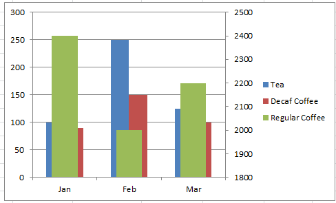
- Clustered Bar Chart Excel: Clustered Bar Charts in Excel represent categories with individual bars, and within each bar, different data sets are displayed using various colors or patterns, allowing for precise comparisons and trend identification within each category.
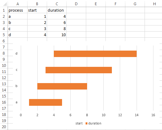
- Floating Bar Chart Excel: Floating Bar Charts in Excel dynamically position bars based on specific start and end values, offering a clear overview of durations and overlapping events, making them invaluable for visualizing tasks, projects, or processes with defined timelines.
- Overlapping Bar Chart Excel: Overlapping Bar Charts in Excel present data with bars that partially overlay, effectively highlighting relationships between data points and emphasizing similarities or differences between different categories.
- Diverging Bar Chart: Diverging Bar Charts in Excel display data with a central baseline, showcasing positive and negative values in opposite directions, providing a clear visualization of trends and disparities in various data points.
- Range Bar Chart Excel: Range Bar Charts in Excel represent data with bars denoting a range or duration, making them particularly valuable for projects or tasks with defined start and end times, offering a visual representation of the time taken for each activity.
How to Create a Bar Chart in Excel
Here are the simple steps to create a bar chart in Excel:
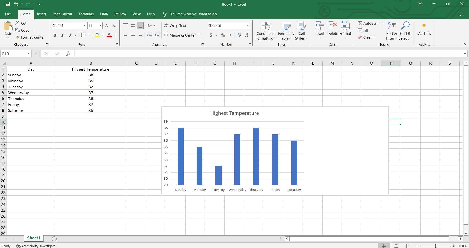
Step 1: Launch Excel and input the data you want to visualize in the chart.
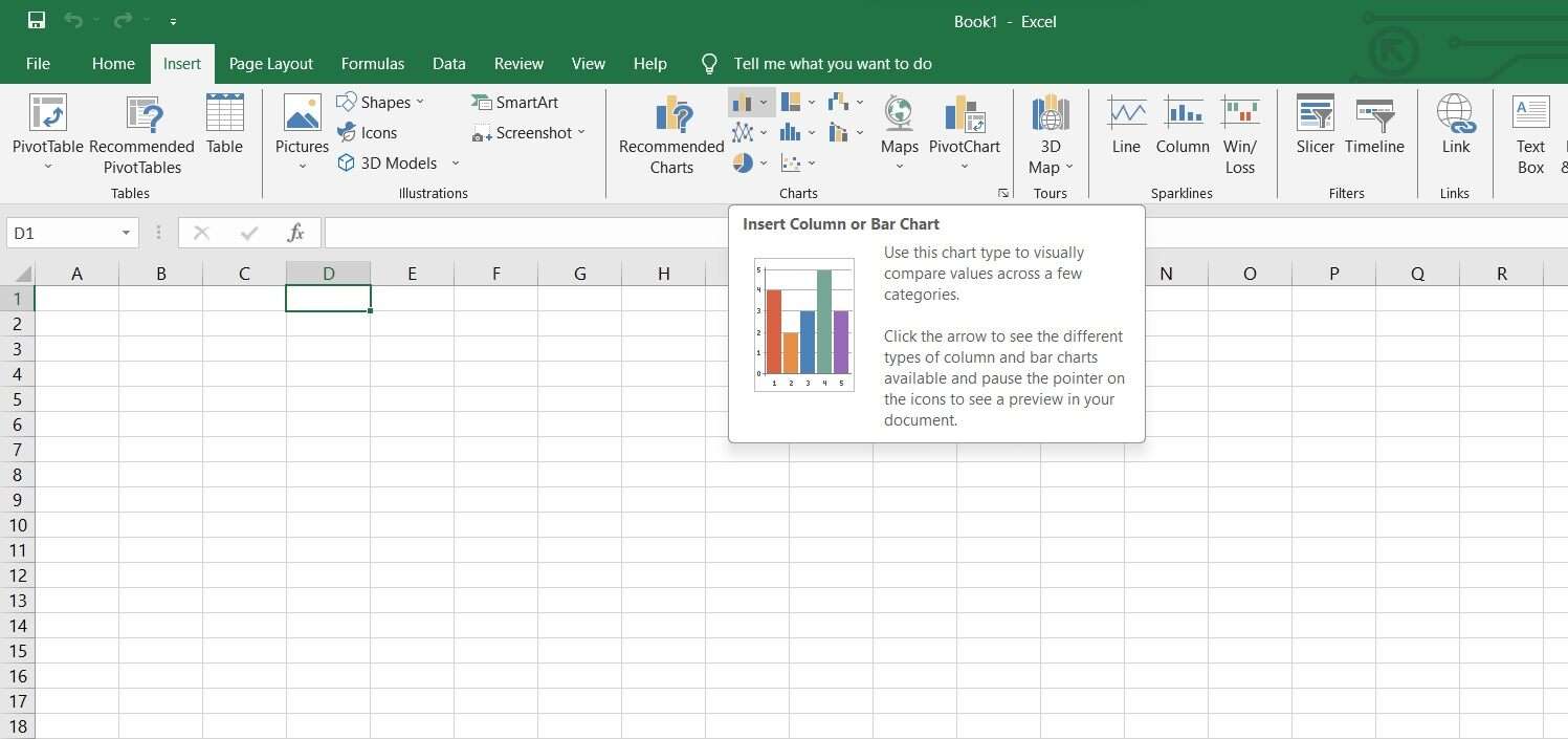
Step 2: Now, Go to the "Insert" tab on the Excel ribbon, then click on the "Bar Chart" icon.
Step 3: Highlight the data range you wish to include in the chart. Select the specific type of bar chart you want (e.g., grouped, clustered).
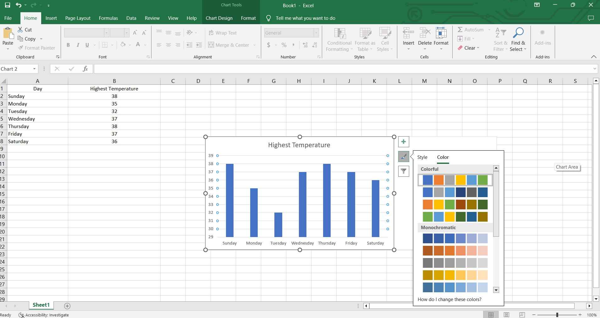
Step 4: Modify labels, titles, and other elements using the Chart Tools in Excel. Navigate to the Design tab, where you'll discover your preferred options for customization either through the Quick Layout button or within the Chart Styles list for your bar graph.
Step 5: Review the chart for accuracy, then save your Excel file.
And that’s it! By following these steps, you'll be able to create a bar chart to effectively visualize your data.
Create a Bar Chart Easily Using EdrawMax
Well, here comes another alternative that you can use for creating bar charts apart from Excel. Also, using Wondershare EdrawMax over Excel for creating bar charts offers distinct advantages.
EdrawMax provides a user-friendly interface with a wide array of customizable templates, enabling quicker and more visually appealing chart creation. Its intuitive drag-and-drop features streamline the process, ensuring even complex data sets are presented with clarity. Additionally, EdrawMax offers a diverse range of design options, allowing for more creative and impactful chart representations compared to Excel's standard offerings.
Here are the steps for making a bar chart using EdrawMax:
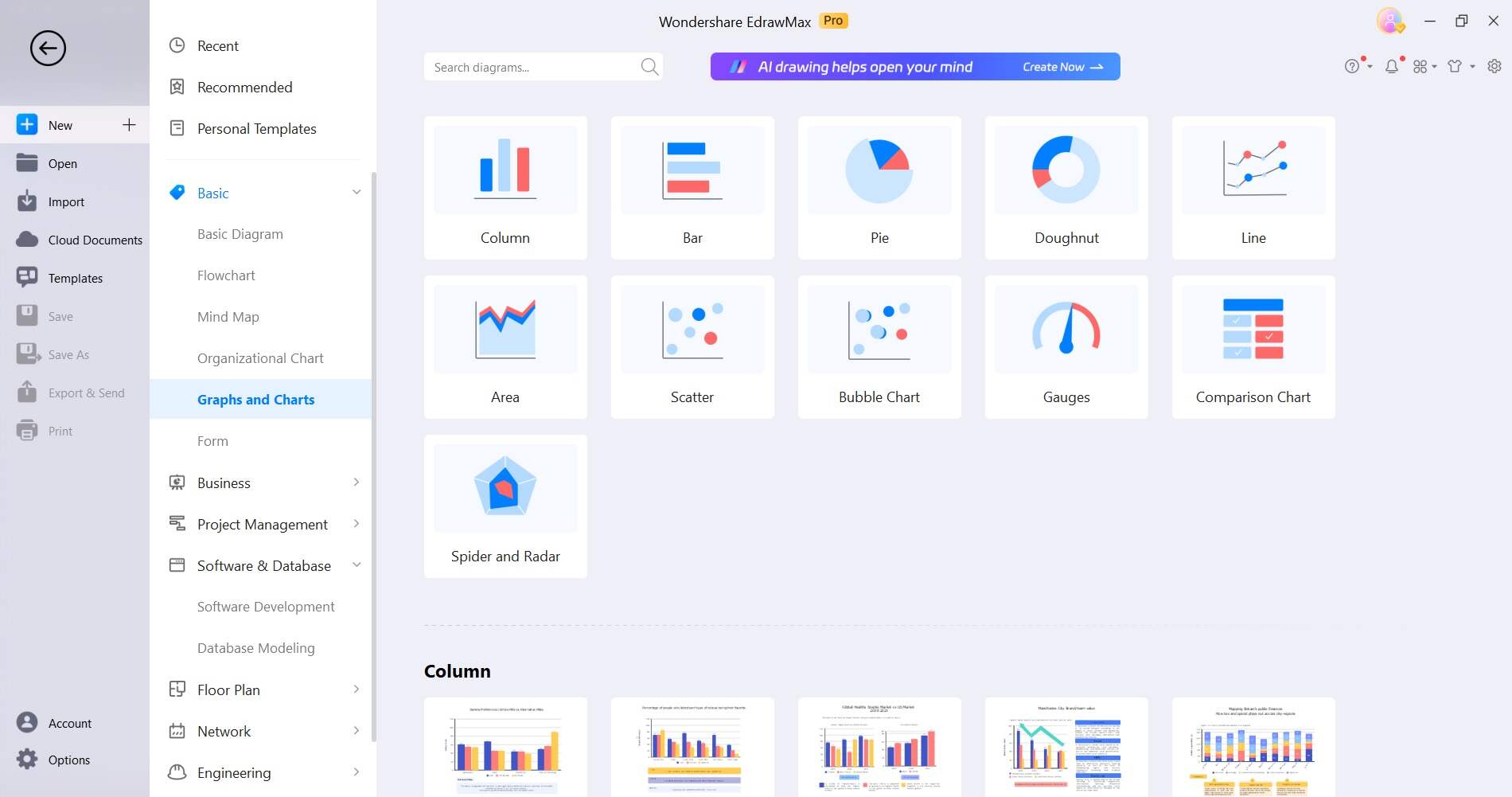
Step 1: Launch EdrawMax and select the 'Bar Chart' template from the template gallery to begin your chart creation process.
Step 2: Input your data directly into the spreadsheet within EdrawMax.
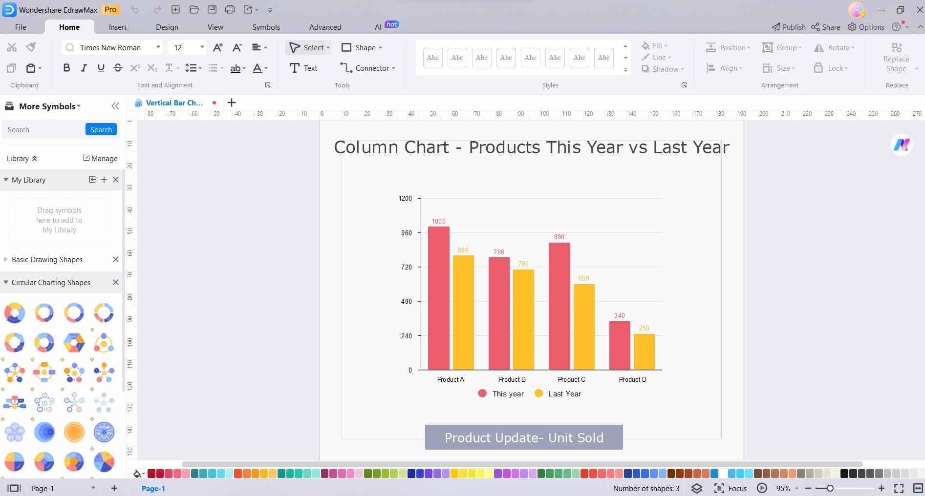
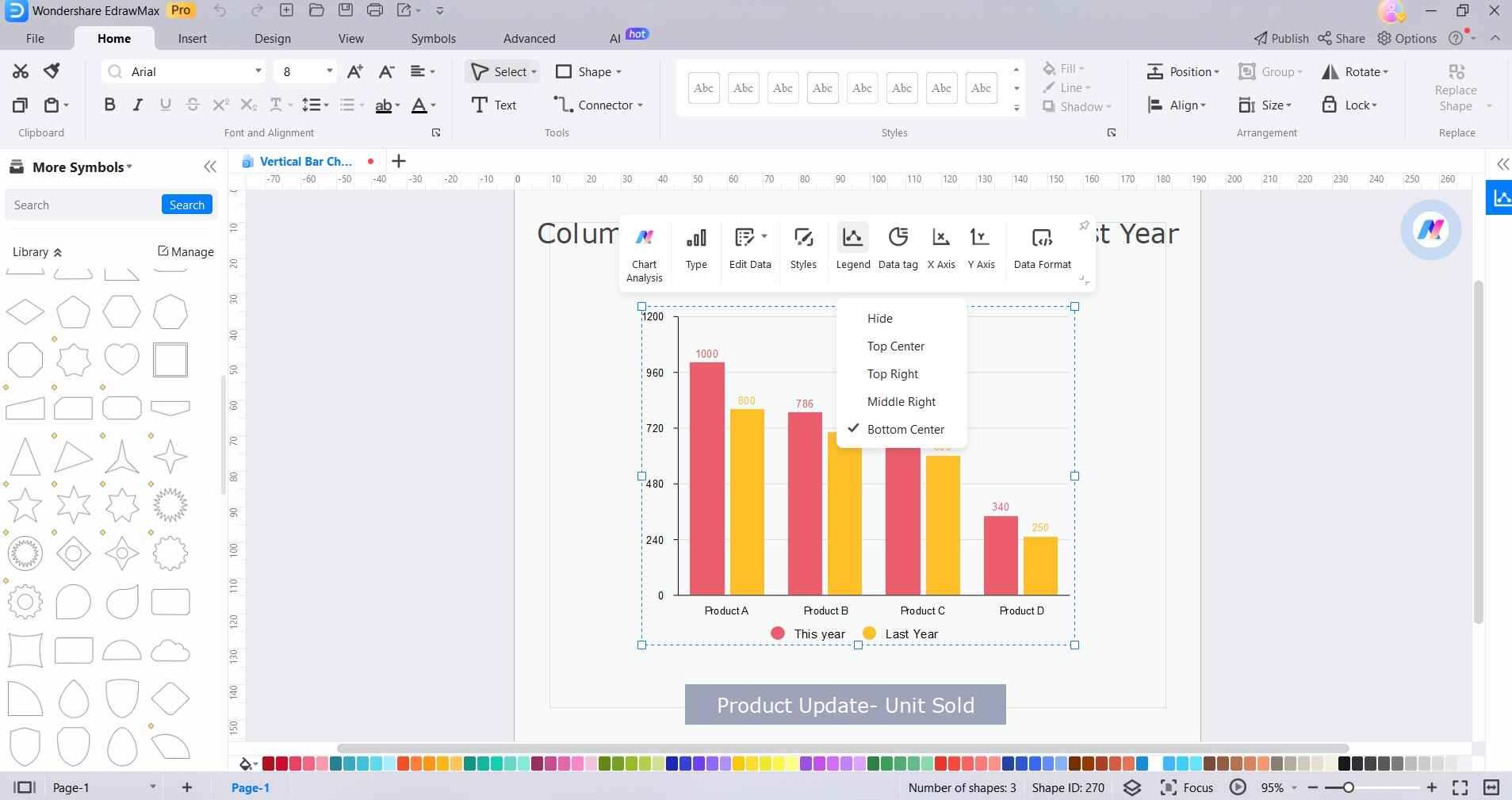
Step 3: Customize your bar chart by adjusting labels, titles, colors, and styles using the intuitive editing tools provided.
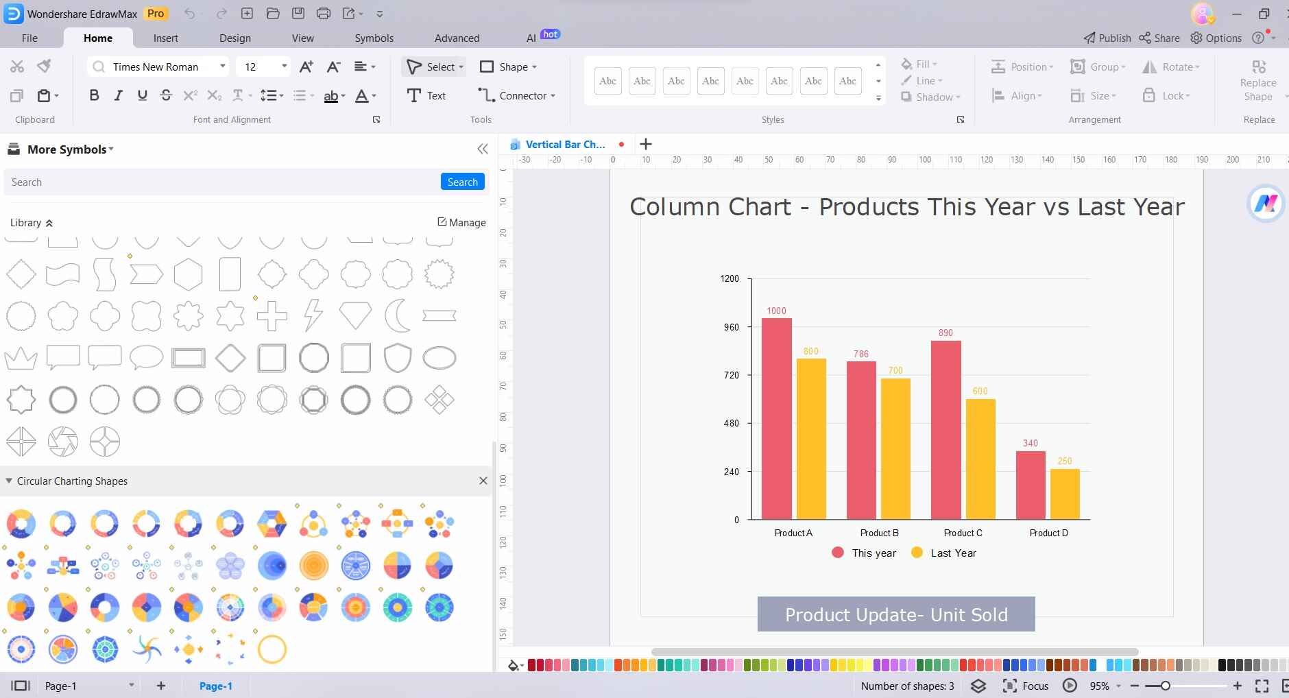
Step 4: Explore additional features like annotations, legends, and trendlines to enhance the clarity and depth of your bar chart representation.
Step 5: Once satisfied with the final design, export your bar chart in various formats for easy sharing and integration into presentations or reports.
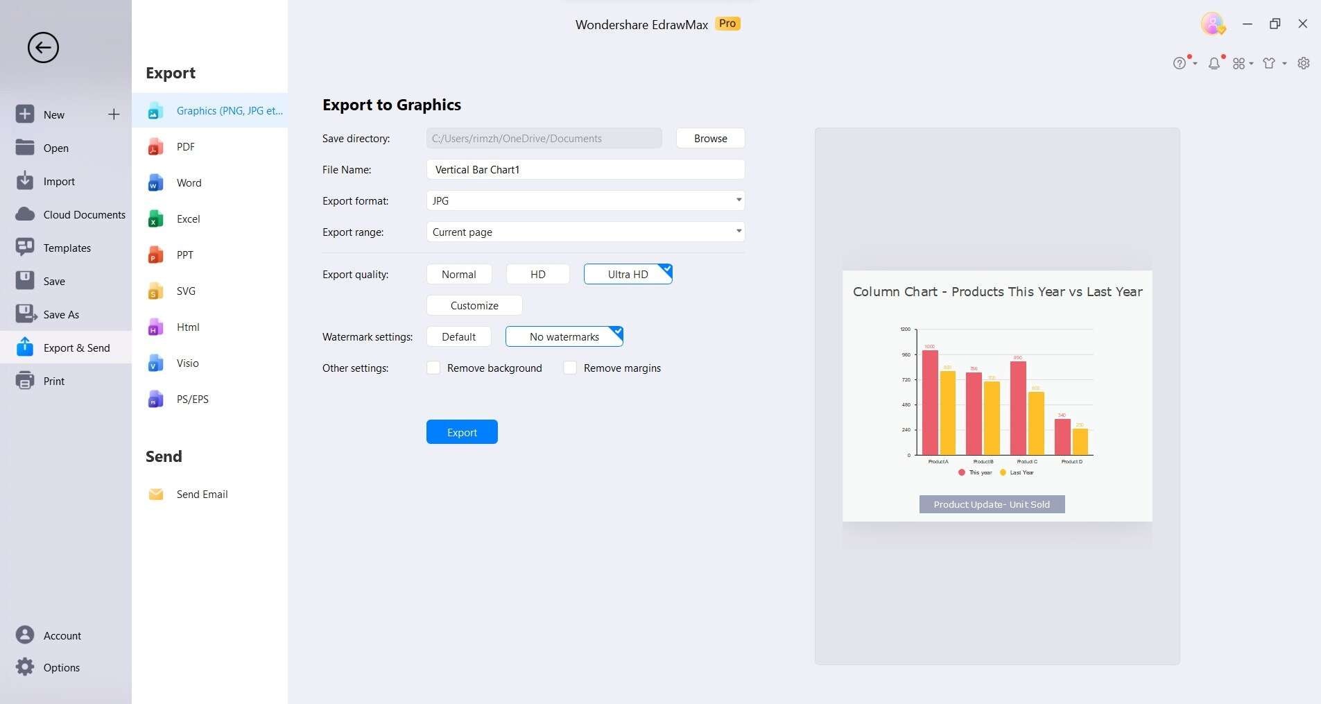
How to Export an EdrawMax Graph as an Excel File
By utilizing EdrawMax, you'll experience a smoother process of creating and sharing bar graphs. This means you can effortlessly collaborate with colleagues or friends who may not be EdrawMax users, allowing them to freely edit and modify the exported bar graph directly in Microsoft Excel.
Step 1: After completing your bar graph in EdrawMax Online, go to the File tab.
Step 2: Click on Export and Send, then select Export to Excel.

Step 3: EdrawMax will automatically save and download the created bar graph as an Excel file, providing you with a versatile Excel format.
Step 4: All Microsoft Office files exported from EdrawMax are fully editable, ensuring easy modifications in programs like Excel (2013 version or above).
Conclusion
With this step-by-step tutorial, you've gained the skills to effortlessly represent complex information with clarity and precision. You can refer to this guide for effortlessly creating bar chart in Excel. Whether it's grouped, clustered, or any other variant, Excel provides a versatile platform for dynamic data visualization.
Remember to explore customization options and consider employing specialized software like EdrawMax for added flexibility. Now, armed with this knowledge, you're poised to transform raw data into compelling visual narratives.
AI Diagram Generator
Enter your prompt. Upload files if needed. Generate diagrams, charts, or slides instantly.


