


In the contemporary data-centric era, effectively communicating information holds the utmost importance. Excel, a versatile tool, offers a powerful arsenal for visual representation. In this comprehensive guide, we'll delve into the art of creating Bar and Line charts in Excel, turning raw data into compelling insights.
From the basics to advanced techniques, you'll gain the skills needed to craft visually stunning and informative charts. Whether you're a seasoned Excel user or just starting, this guide will empower you to present data with clarity and impact.
Contents of this article
What is a Line Chart?
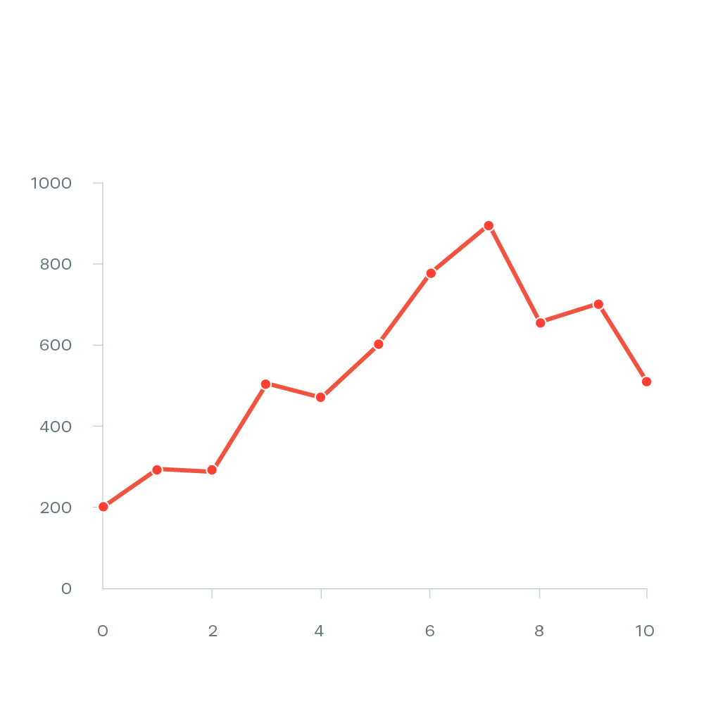
A line chart is like connecting dots on a graph. Each dot shows a piece of information. When you connect them, you see a line that helps you understand how things change over time or in order. It's great for spotting trends or patterns in data. For example, you can use it to track how temperatures change throughout the year. Line charts are super helpful for making data easy to understand!
Types of Line Chart:
There are several types of bar and line charts commonly used for different purposes:
- Basic Line Chart: This is the standard line chart where data points are connected with straight lines. It's great for showing trends over time.
- Smooth Line Chart: Also known as a spline chart, it uses curves instead of straight lines to connect data points. This provides a smoother visual representation of the trend.
- Stacked Line Chart: It shows multiple lines, each representing a category, stacked on top of each other. This is useful for comparing the total trend as well as individual contributions.
- 100% Stacked Line Chart: Similar to the stacked line chart, but the values are represented as percentages, making it easy to compare the relative proportions of different categories.
- Area Chart: This is like a line chart, but the area beneath the line is filled with color. It's useful for showing cumulative totals or proportions.
- Step Line Chart: In this chart, the line jumps directly from one data point to the next, without a continuous line. It's great for data with distinct, non-continuous intervals.
How to Make a Line Chart With Microsoft Excel
Now that we understand the significance of line charts, let's dive into the practical aspect. Microsoft Excel offers a user-friendly platform to create powerful visualizations. In this section, we'll walk you through the step-by-step process of crafting bar and line graphs in Excel.
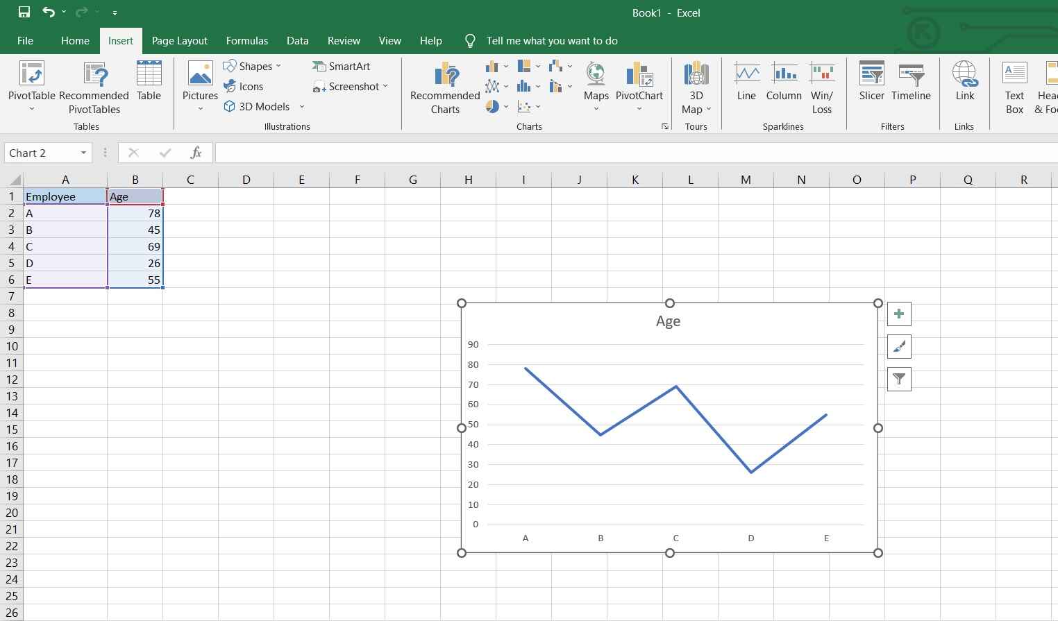
Step 1: Launch Microsoft Excel and open your spreadsheet. Enter the data you want to visualize. Make sure it's organized with categories in one column and corresponding values in another.
Step 2: Highlight the data you've entered. This includes both the category labels and the corresponding values.
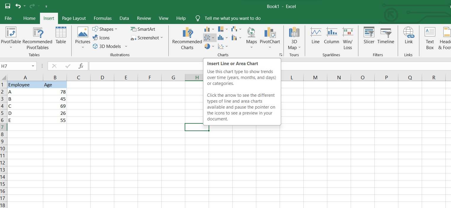
Step 3: Navigate to the "Insert" tab within Excel. Next, locate and click on the "Insert Line and Area Chart" option. From the dropdown menu, opt for the "Line Chart" category, then select the subtype that aligns best with your dataset.
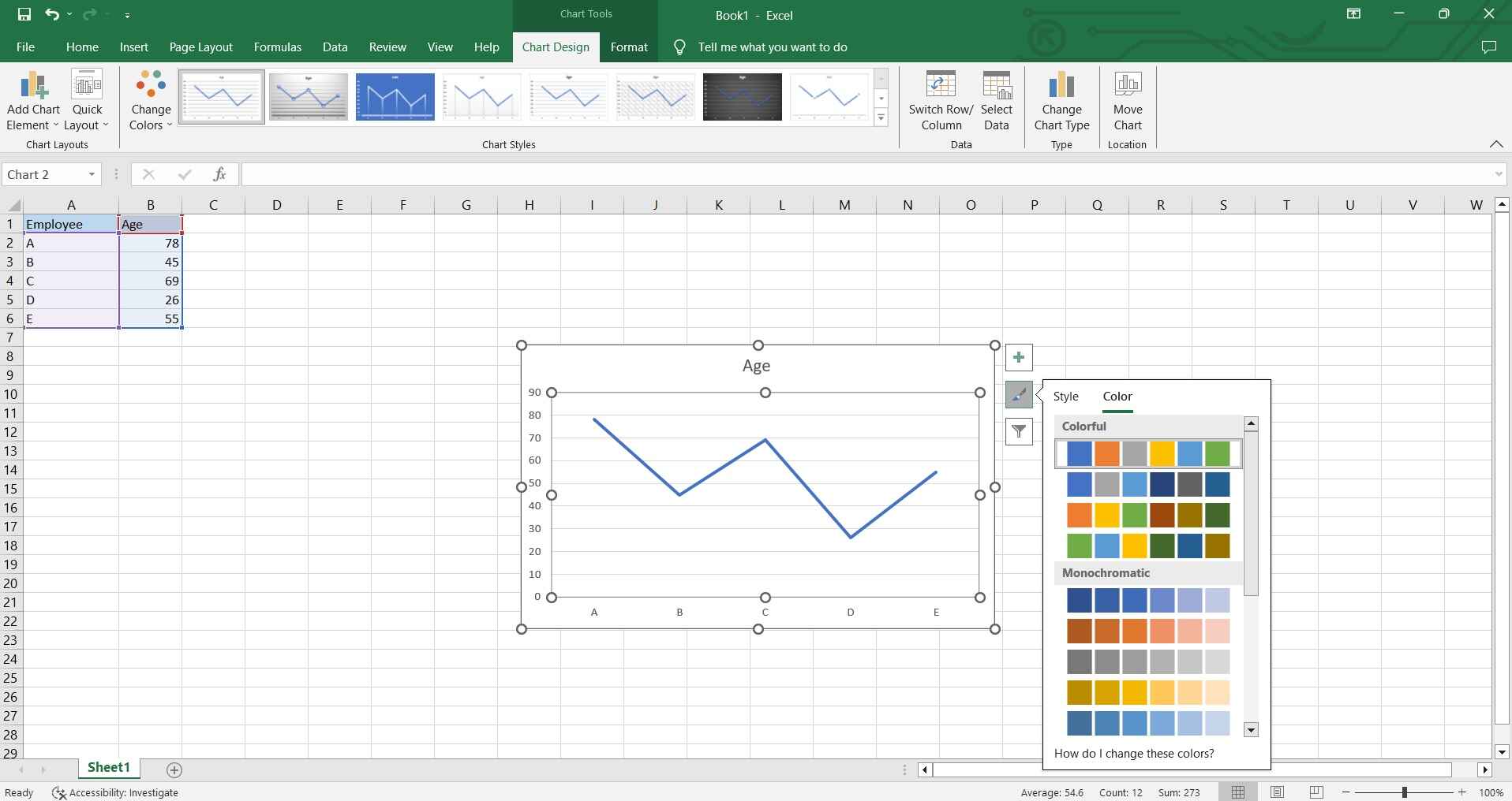
Step 4: Excel will generate a basic line chart. You can further customize it by right-clicking on different elements (like axis labels, data series, etc..)
Step 5: Click on the chart elements (like titles, and axis labels) and enter your text. This helps clarify what the chart is showing.
Step 6: Once you're satisfied with the chart, save your Excel file to retain the chart for future use.
And that’s it!
Create a Bar and Line Graph Combined Using EdrawMax
Wondershare EdrawMax is a versatile diagramming tool that provides a range of features and templates for creating various types of charts, including bar and line charts. Additionally, this nifty tool provides a wide selection of pre-designed templates for different types of charts, including bar and line charts. These templates serve as a starting point, saving time and effort in designing charts from scratch.
Here are the steps to create a bar and line chart using EdrawMax:
Step 1: Launch the EdrawMax software on your computer. Select New> Graphs and Charts. On the right side of the interface, select “Line Charts”.
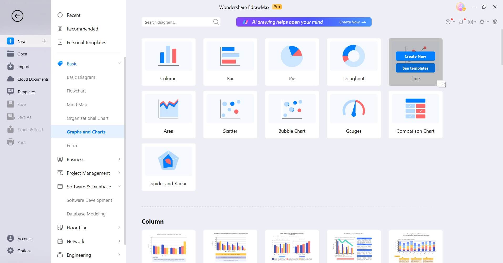
Step 2: Alternatively, you can also switch to the Template gallery. Type "Bar and Line Chart" in the search box and hit Enter. Browse through the results and then choose the template to simplify the process.

Step 3: Once the bar and line chart combined are exported to the canvas, click on the data fields in the template to edit them. Enter your own data points and labels.
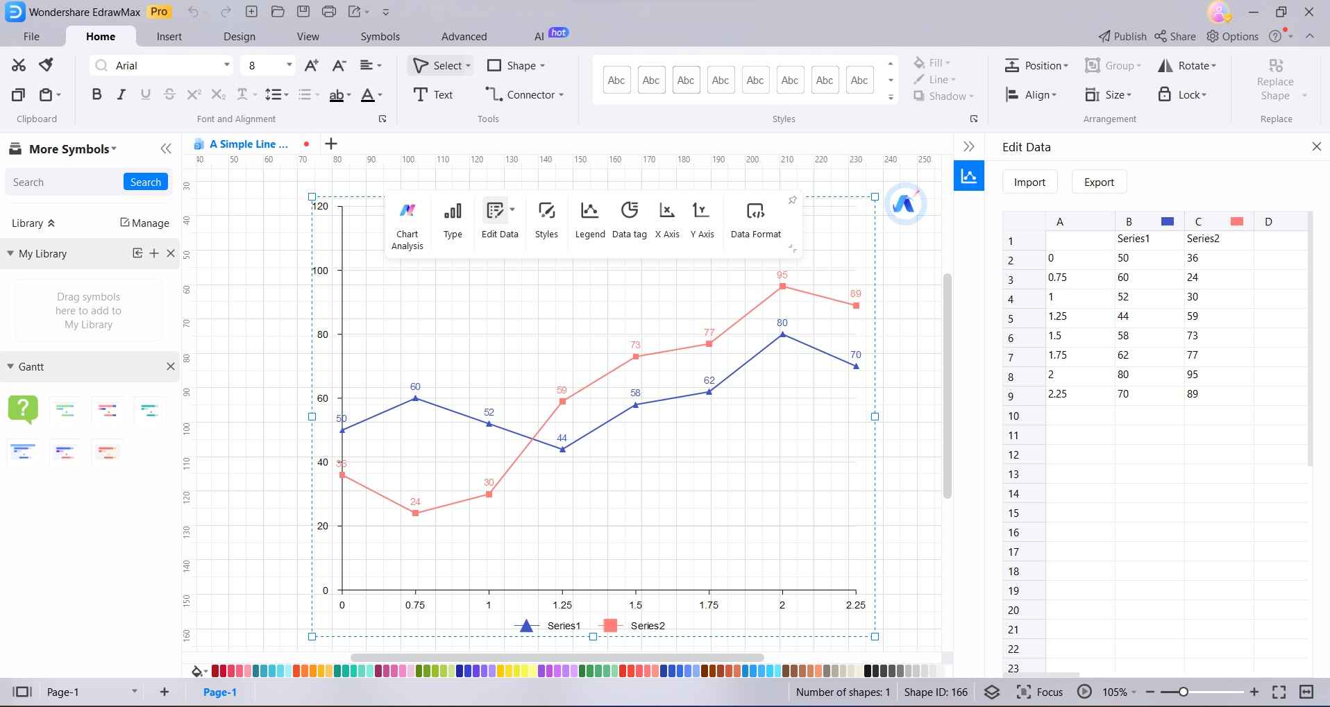
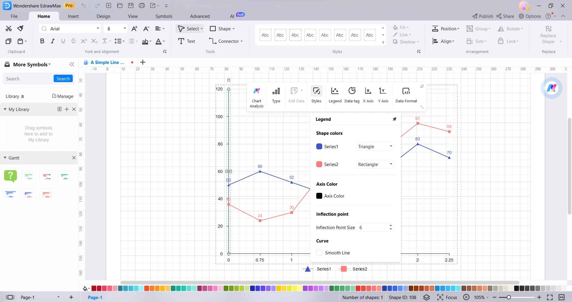
Step 4: You can customize various elements of the chart, such as titles, axis labels, colors, and styles. Simply click on the element you want to customize and use the formatting options provided.
Step 5: Once you're satisfied with your chart, click on "File" in the top left corner and select "Export and Send" to save your work. EdrawMax allows you to export your chart in various formats, such as PNG, JPG, PDF, etc. You can also directly insert it into other documents.
Tips to Make an Optimal Line Chart
Here are some tips for creating an optimal line chart:
- Choose the Right Data: Ensure your data is relevant and well-organized, with clear categories and corresponding values.
- Select Appropriate Chart Type: Decide between a basic line chart or other variants like smoothed or stacked lines, based on the nature of your data.
- Label Axes Effectively: Clearly label both the x-axis and y-axis to provide context and make the chart easier to understand.
- Use Legible Fonts and Colors: Opt for clear, easily readable fonts and colors to enhance chart clarity.
- Avoid Overcrowding: Don't clutter the chart with too many data points; prioritize key information.
Remember, a well-crafted line chart effectively communicates trends and patterns in your data, making it a valuable tool for analysis and presentation.
Conclusion
Understanding the significance of bar and line charts in data visualization is essential in today's information-driven landscape. Excel proves to be a versatile tool, offering a straightforward process to craft these visual representations. Additionally, platforms like EdrawMax provide a user-friendly alternative, further enhancing chart customization. By following best practices and considering data relevance, labeling, and aesthetics, you can ensure your charts effectively convey insights.
