


Creating an organizational chart can be a valuable skill for professional growth as it can help you visualize team structures, improve communication, and enhance project management. By streamlining workflows, you can make more efficient decisions and advance your career.
Excel makes it easy to create basic organizational charts, but for more complex needs, Wondershare EdrawMax provides advanced features. Explore our step-by-step guide to master both methods and boost your visualization skills!
In this article
How to Make an Organizational Chart in Excel
Here’s our step-by-step guide to help you create and customize an org chart in Excel:
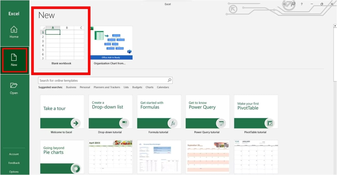
Step 1
Open Excel and start a new or existing worksheet with a clear workspace. Go to File > New, choose the "Organization Chart" category, and click “"Create”."
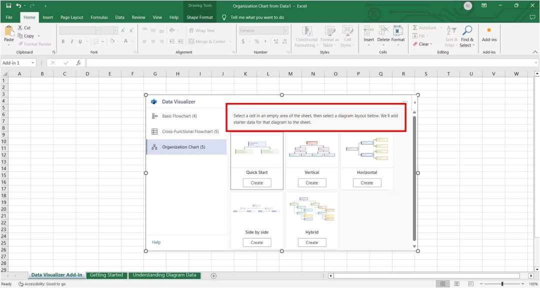
Step 2
Select the chart type you like when prompted by the wizard.
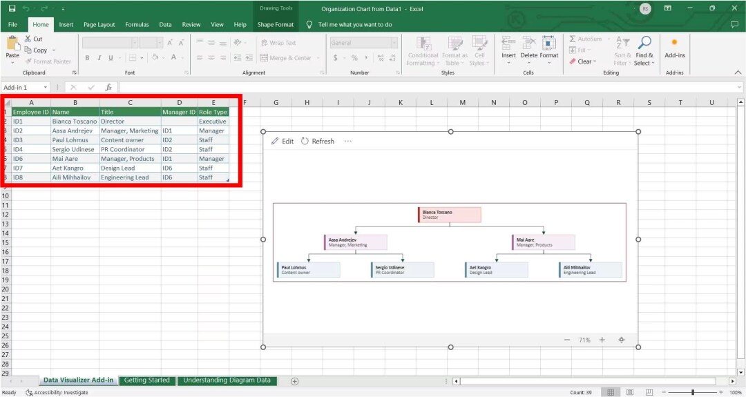
Step 3
Import your organizational data by selecting an Excel file, or you can enter data manually.
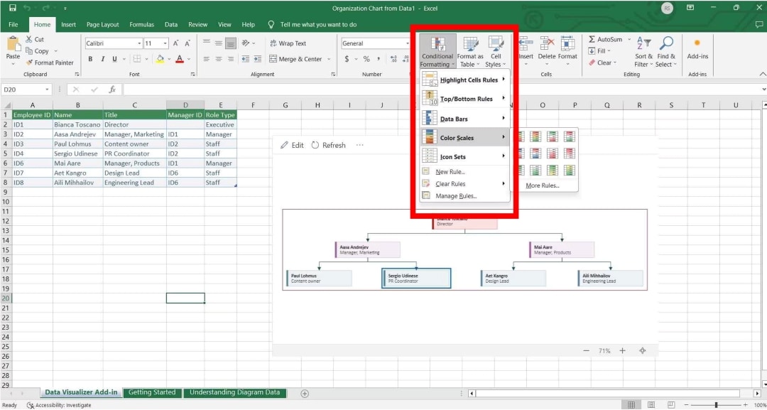
Step 4
You can customize your chart with options like layout, style, and additional details.
Step 5
Please review the chart preview to ensure the accuracy of all details, then click "Finish" or "Create" to create the org chart.
Easily Make a More Professional Organizational Chart in EdrawMax
While Excel is handy, Wondershare EdrawMax is a more powerful and efficient tool for creating org charts. With its extensive templates, shapes, and customization options, you can effortlessly design professional charts. Plus, features like automated layouts and easy data import make it even easier. Follow our step-by-step guide to get started with EdrawMax!
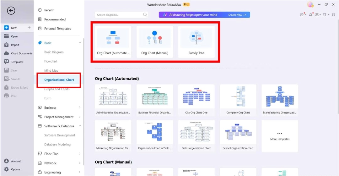
Step 1
First, open EdrawMax and go to File > New > Organizational Chart. The software provides a rich template library, but you can also start with a blank canvas and enjoy the freedom of mapping out your ideas.
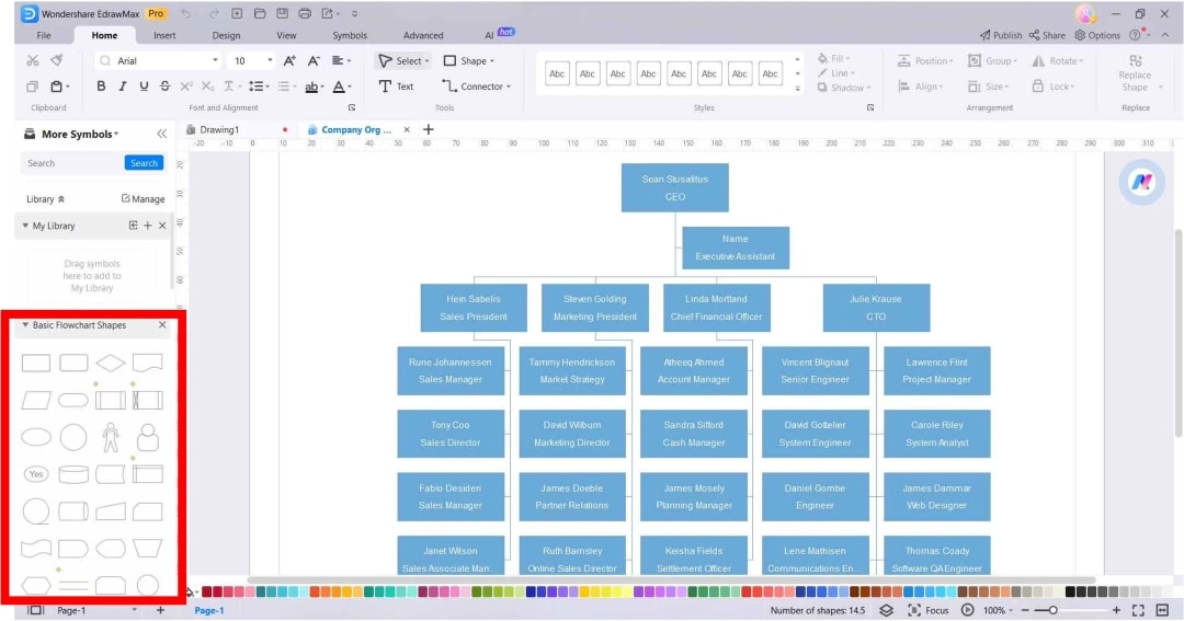
Step 2
To present different positions in the organization, just drag and drop shapes from the library onto the canvas. To add the employee's name and title, double-click on the shape.
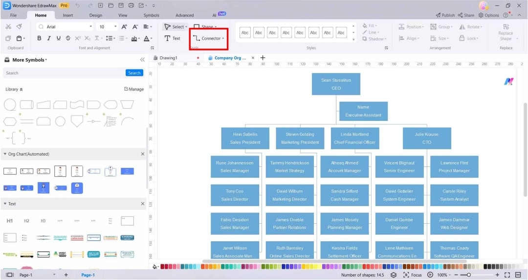
Step 3
You can use connectors from the menu pane to weave the shapes together and illustrate the reporting relationships between them. EdrawMax also offers a wide range of styles for differentiation and clear visualization.
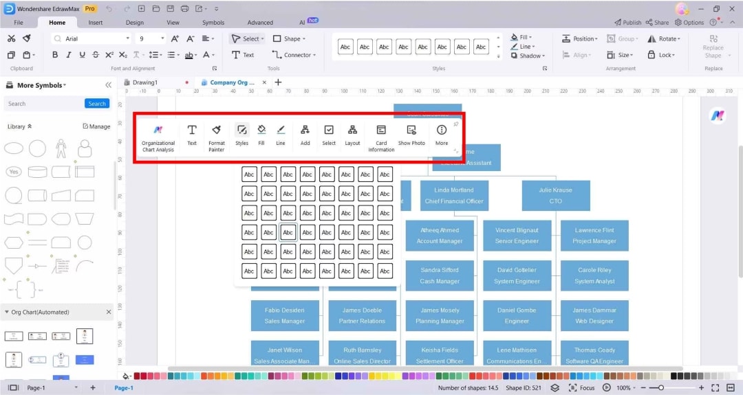
Step 4
You can also click on the shape and select "Styles" to tailor the colors, fonts, and layout to align with your personal preference or requirement of the brand.
Step 5
After completing and double-checking your org chart, you can choose from the variety of formats supported by EdrawMax, export it, and easily share it with your colleague.
Learn More about Wondershare EdrawMax
Wondershare EdrawMax is not just a tool for creating org charts, but also a versatile platform that offers a wide range of features to meet all your diagramming needs.
Key Features
- Simple, User-friendly Interface: You’ll feel right at home with a clean, intuitive interface that looks similar to MS Office.
- Extensive Templates: Get access to over 23,000 templates and 26,000 symbols and enjoy everything you need to create professional diagrams.
- AI-Powered Tools: Let AI do the heavy lifting—generate and analyze diagrams with smart tools that simplify your workflow.
- Easy Collaboration: You can save, share, and export your diagrams in various formats with just a few clicks.
- Cross-Platform Support: Whether you’re using Mac, Windows, or Android, EdrawMind works seamlessly across all platforms.
- Top-Notch Security: EdrawMind protects your work with 256-bit SSL encryption and GDPR compliance.
- Auto-Save and Recovery: With automatic saving and easy recovery, you never have to worry about losing your work.
Reasons to Try
Wondershare EdrawMax is a platform trusted by industry leaders and professionals worldwide. It can provide the tools you need to excel in your work, regardless of your industry.
Best Practices for Making Organizational Charts
Here are some final tips you might want to look out for when creating a powerful organizational chart:
Put your chart on one page. If it’s too big, split it into smaller charts. You can also mix horizontal and vertical boxes to maximize space.
Keep it consistent. Ensure you use the same shapes for different staff levels and colors for each department. This helps everyone understand the structure at a glance. Ensure all boxes are the same size and evenly spaced for a clean look.
Be informative and add useful details. Include contact info, locations, or specialties in your chart so people know who to contact and where. Consider adding hyperlinks for easy access to emails and documents if using a digital chart.
Update the chart regularly. Since people come and go and departments change, keeping the chart current is important. Collaborating with someone from the HR department could be helpful, as they might have such information.
AI Diagram Generator
Enter your prompt. Upload files if needed. Generate diagrams, charts, or slides instantly.


