


Many companies rely on spreadsheets to consolidate data. Although they might be not the most ideal approach for data presentation, they excel at gathering vast information in one location. However, presenting performance data to others is where tools like Google Sheets fall short.
This is why charts and graphs are crucial in transforming numbers into visuals. Making a bar graph in Google Sheets is essential to present your data in an easy-to-digest manner. If creating a bar graph in Google Sheets is difficult, then using a diagram tool such as EdrawMax is an option. Read on below to learn more.
In this article
Part I: How To Make a Bar Graph on Google Sheets
Here's how to create bar graphs on Google Sheets. Following the steps below allows you to simplify complex information and convey insights.
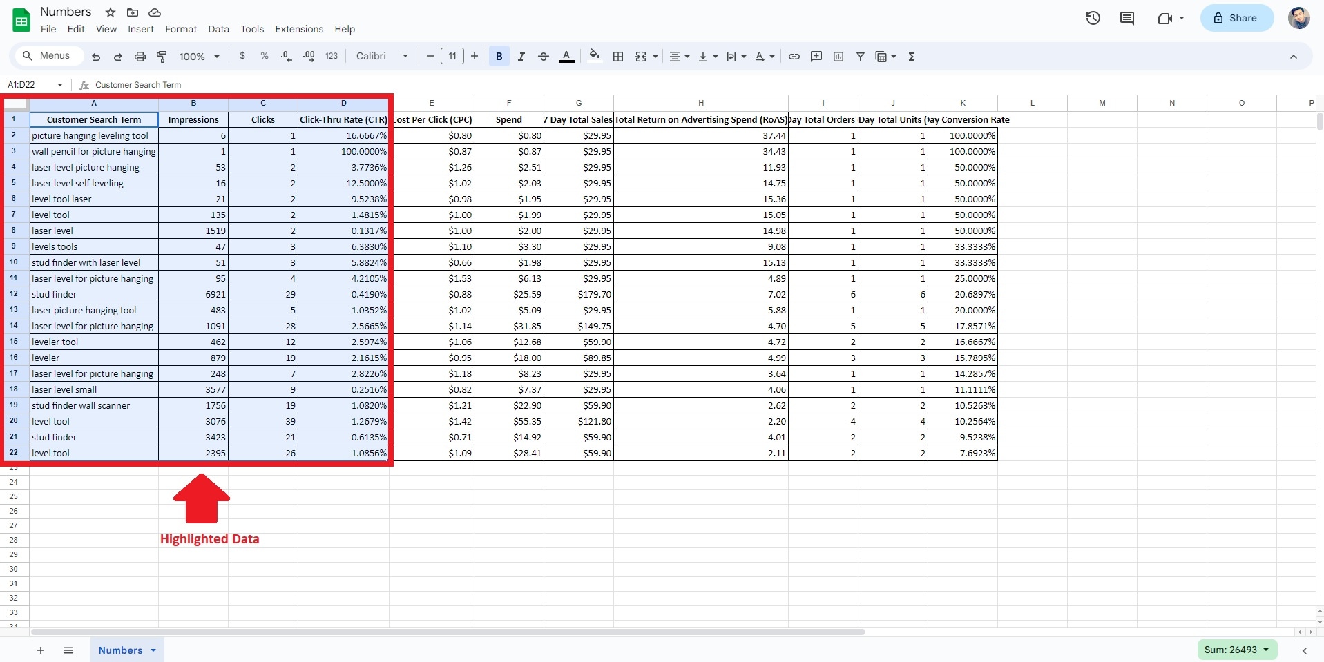
Step 1: Launch Google Sheets. Next, highlight the data you wish to turn into a bar graph. Even if you include unnecessary data, it can be edited later.
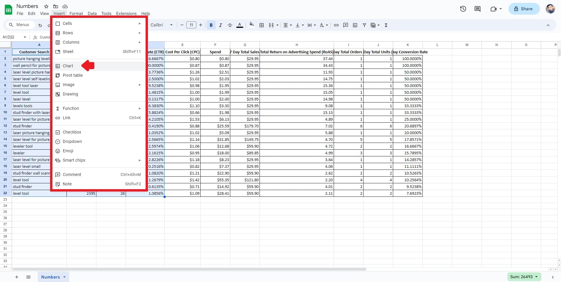
Step 2: Go to the Insert menu at the top toolbar. From the dropdown list, click Chart. This action will open a dialog box where you can configure various chart settings.
Step 3: You'll find different chart types within the chart dialog box. Click the Bar chart type since you aim to create a bar graph. Take advantage of customization options to tailor the appearance of your bar graph. You can set labels, titles, colors, and more to suit your presentation style. Enhance the clarity of your data representation.
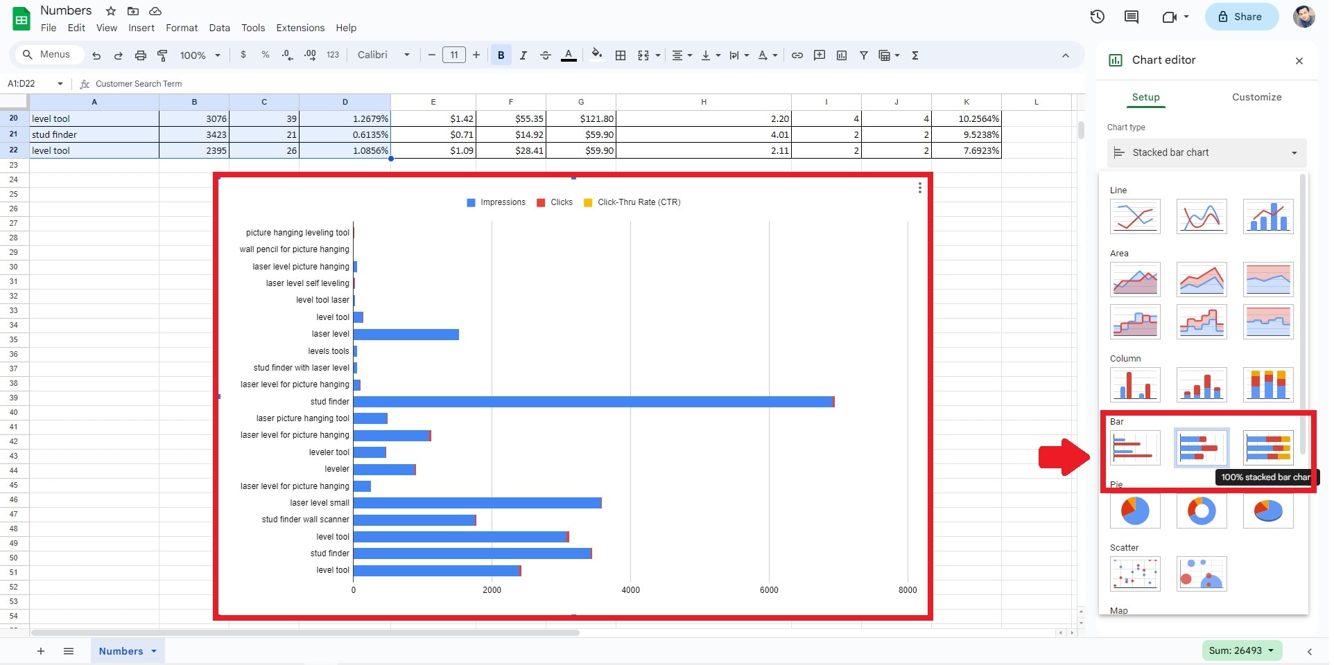
Step 4: Refine and enhance the graph by clicking on it and utilizing the chart editor options. Modify labels, adjust data ranges, or fine-tune other elements to ensure your graph effectively communicates your data insights. Save your file once done.

Part II: Create a Professional Bar Graph With Wondershare EdrawMax: Better and Faster
Although Google Sheets is a widely used tool, if you are in need of a tool to make visually appealing bar charts effortlessly, consider EdrawMax, which is a versatile solution for making bar graphs and charts. The platform offers an extensive array of diagramming resources available for your diagramming needs.

Key Features
While EdrawMax provides excellent bar chart creation, the tool can do more than just that. Below are some of the key features of why EdrawMax is a trusted platform by many.
- Edraw AI. Elevate diagrams with AI-driven organization, connections, and design tips for impactful visuals. Edraw AI streamlines your communication and enhances your diagramming process.
- 210+ Diagram Types. Generate diverse charts, maps, and plans easily across 210+ diagram types. The varied diagrams cater to your specific visualization needs and enhance your creative options.
- Auto Layout. Streamline alignment and arrangement through one-click auto layout and intuitive guidelines. This saves you time and ensures a polished look, even for complex diagrams.
- Advanced Toolbox. Craft slides seamlessly, merge shapes, and employ containers for efficient, grouped organization, enhancing your diagramming flexibility and clarity while simplifying your presentation creation.
Advantages of Using EdrawMax for Bar Chart Creation
If you're used to Google Sheets when presenting data, below are some advantages of using EdrawMax for diagram creation.
- Flexible Access. Craft bar charts regardless of your connectivity. EdrawMax is available online and offline, so you can work on your diagrams anytime and
- Seamless Collaboration. Transform your bar chart into a collaborative workspace, facilitating effortless brainstorming with colleagues through its interactive features.
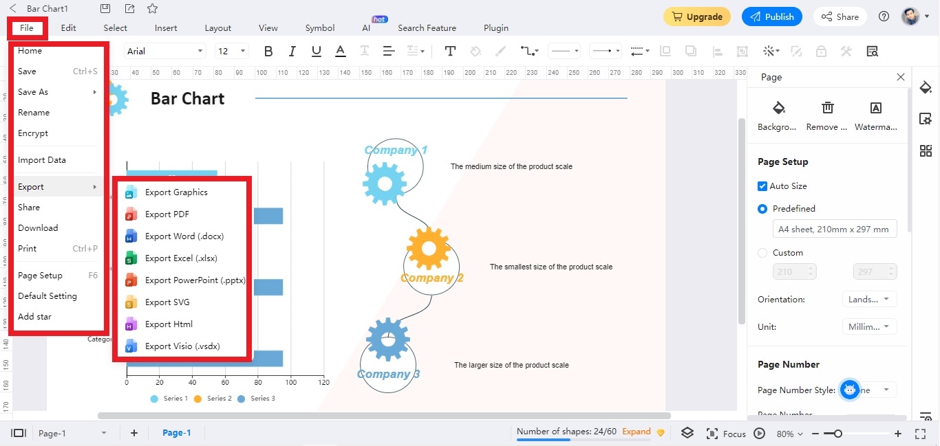
- Diverse File Export Options. Effortlessly export your work in various formats such as Office, PDF, Visio, HTML, SVG, and Graphics with just a single click, thanks to EdrawMax's versatile compatibility.
Create a Bar Graph With EdrawMax
To start crafting professional-looking bar graphs, follow the steps below.
Step 1: Download EdrawMax or try it online for free. Log in with your Wondershare ID or an account of Google, Facebook, or Twitter.
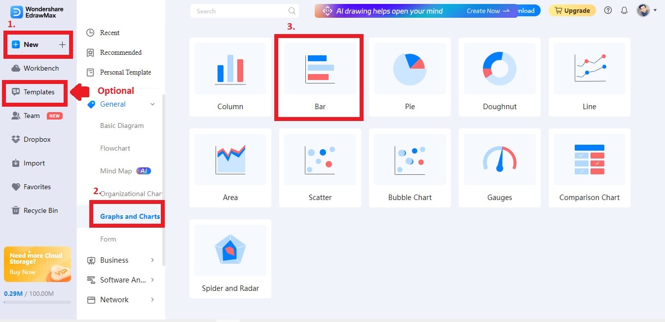
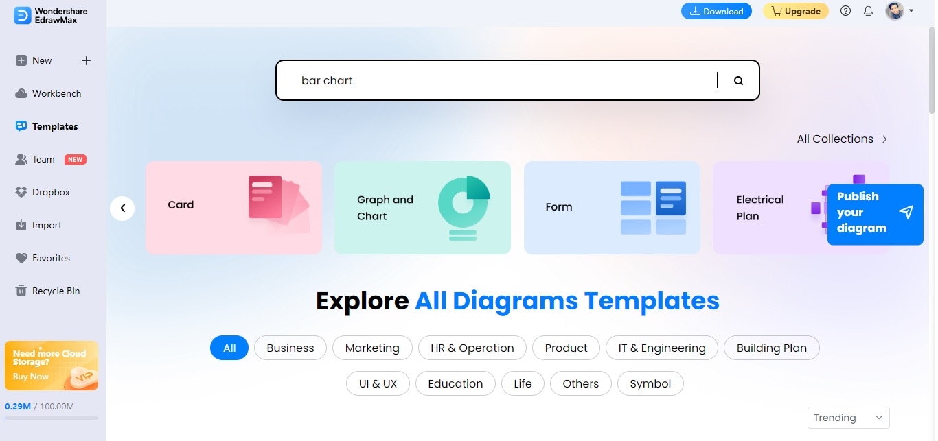
Step 2: Click on New > Graphs and Charts. Choose the Bar diagram selection. Alternatively, click on the Templates feature and utilize the Search Bar. Input "bar graph" or "bar chart" to generate a bar graph within seconds.
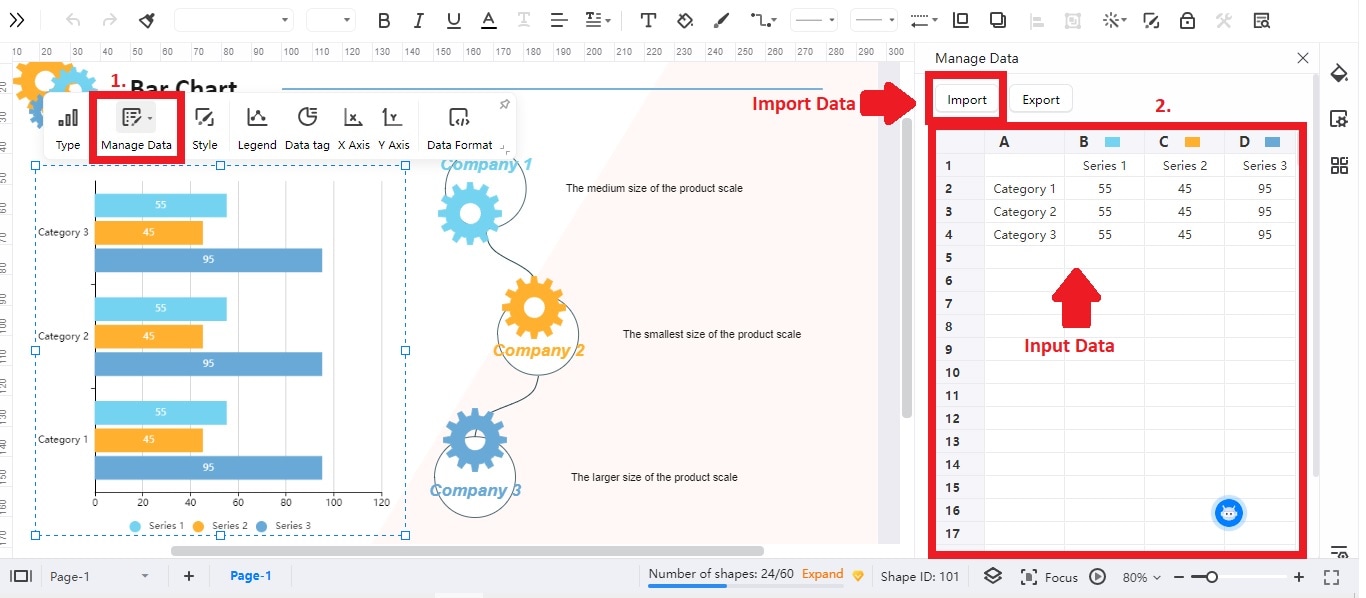
Step 3: Click your bar chart. Click Edit Data to input your information. Alternatively, you can click the Import button to bring a data file from your local storage.
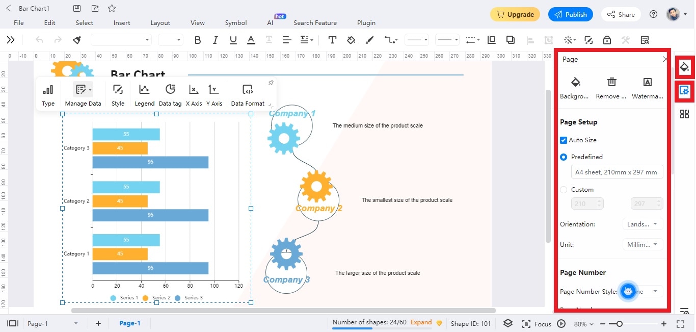
Step 4: Utilize the Style and Page Settings option to enhance the aesthetic appeal of your bar chart. Align it with your brand or personal taste. Modify elements such as Background Color, Images, Borders, and Headers to match your chosen style.
Step 4: Tailor your bar chart until you achieve the desired result. When you're content, Save or Export your chart for effortless sharing.
Part III: Popular Bar Graph Templates to Help You Get Started
Things would be much easier if you choose to start with a template. So below are some templates from EdrawMax's Templates Community, where there are tons of ready-made templates. You can explore and access more templates by clicking the Templates button in EdrawMax's main interface.
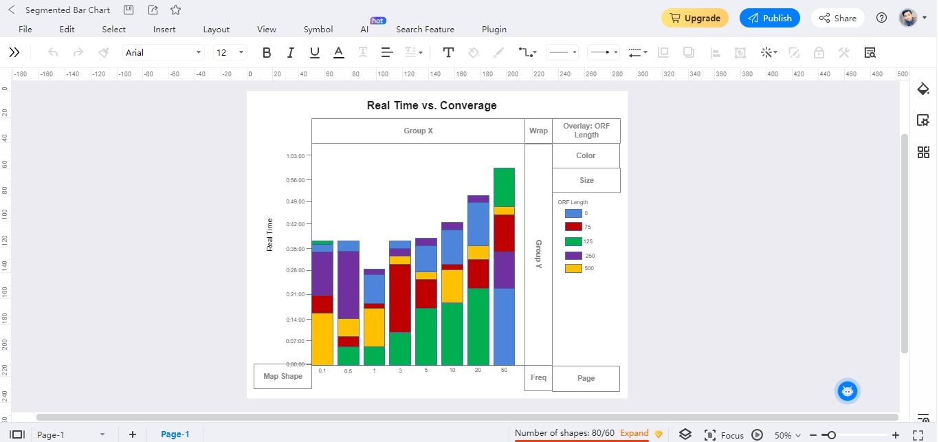
Segmented Bar Chart
This segmented bar chart illustrates the comparison between real-time and coverage data. The data presented pertains to Open Reading Frames (ORFs) length. The depicted ranges span from 0, 75, 125, 250, to 500. The bar chart has been meticulously designed, incorporating distinct color codes to facilitate clear comprehension.
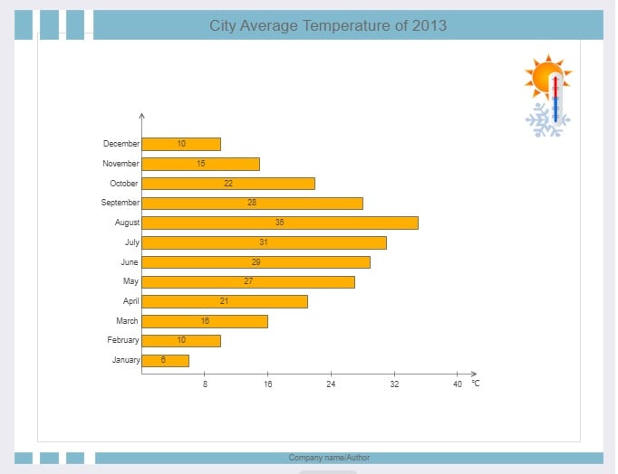
Horizontal Bar Chart
This horizontal bar chart displays a city's average monthly temperatures from January to December. August records the highest while January the lowest temperature. A visual element in the top right confirms the chart's focus on temperature representation.
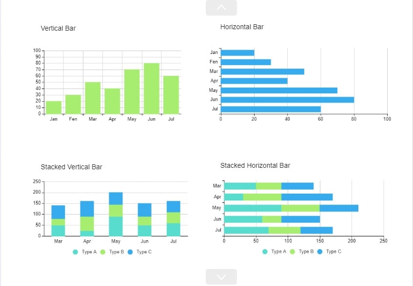
Group Bar Chart
This group bar chart showcases four variations. The chart depicts a vertical bar, stacked vertical bar, horizontal bar, and stacked horizontal bar. Each example demonstrates distinct data presentation techniques. This highlights diverse visualization options.
Conclusion
Crafting informative bar graphs in Google Sheets can enhance data comprehension. Despite its benefits, limitations in data presentation may arise. Oftentimes, using a dedicated visualization tool is your best bet. EdrawMax is a versatile alternative, offering superior customization and professional designs.
Elevate your data storytelling by transitioning beyond conventional tools. EdrawMax empowers your presentations to resonate with your audience. The platform offers free access for you to experience creating an effective bar graph in an impactful way to convey insights. Aside from making basic bar graphs in Google Sheets, try EdrawMax and unlock the potential of your visual data representation.
FAQs on Bar Graphs
Below are commonly asked questions regarding bar graphs for quick insights.
What Are the Purpose of Bar Graphs?
Bar graphs are used to represent and compare categorical data visually. They display discrete data points as bars along one axis. This is typically the x-axis, and their lengths correspond to the values they represent. Bar graphs make analyzing and interpreting patterns, trends, and relationships among different categories easy.
What To Avoid When Using Bar Charts?
When using bar charts, avoid overcrowding the graph with too many bars. This can make the visualization cluttered and difficult to interpret. Also, ensure that the scale on the y-axis is labeled and doesn't distort the data's representation. Don't mislead viewers by altering the scale or omitting relevant information. It might skew the interpretation of the data.
Why Use Bar Graphs Instead of Pie Charts?
Bar graphs are preferred over pie charts when comparing multiple categories or showing changes over time. Bar graphs display data as discrete bars, making it easier to compare values directly. In contrast, pie charts are more suitable for displaying the proportions of a whole. They can become harder to interpret when representing multiple categories or changes in data.
AI Diagram Generator
Enter your prompt. Upload files if needed. Generate diagrams, charts, or slides instantly.


