


Visualizing and comparing data becomes much easier with a comparison chart in Excel. As someone who has tested countless tools, I find Excel reliable for its simplicity and robust features.
Basic charts are its strength, though it doesn't offer much for advanced templates. Even so, built-in options like bar and pie charts are a good starting point for many tasks.
For more complex or visually appealing charts, I often turn to EdrawMax. Its AI features and templates make chart creation faster and more efficient.
So, in this guide, I’ll explain how to make a comparison chart in Excel and EdrawMax. Plus, I'll show their strengths and help you choose the right tool.
In this article
What is a Comparison Chart
A comparison chart is a simple visual way to break down complicated data into something clear and easy to follow. By comparing datasets side by side, you can immediately spot connections and differences. This approach is helpful when making decisions, as it transforms raw numbers into visual insights.
I rely on these charts often, especially when reviewing software. They save time by summarizing features and revealing strengths and weaknesses at a glance. Presenting data this way makes it accessible for those unfamiliar with technical details.

What Are the Types of Comparison Charts/Graphs?
Comparison charts come in many forms—bar graphs, pie charts, line charts, or tables. The choice of which to use depends on your comparison needs and how you wish to present the information.
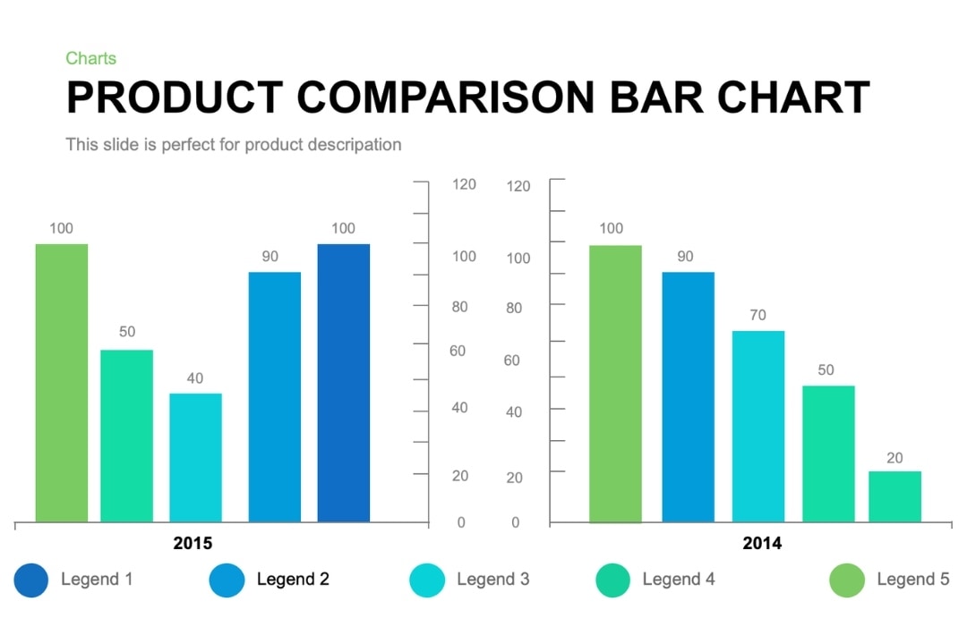
Bar Charts
Bar charts work well when comparing values across categories. The length of each bar indicates the value for that category.
For instance, they can be used to compare the performance of productivity software across various timespans. Depending on what fits your space, you can choose between vertical or horizontal bars.
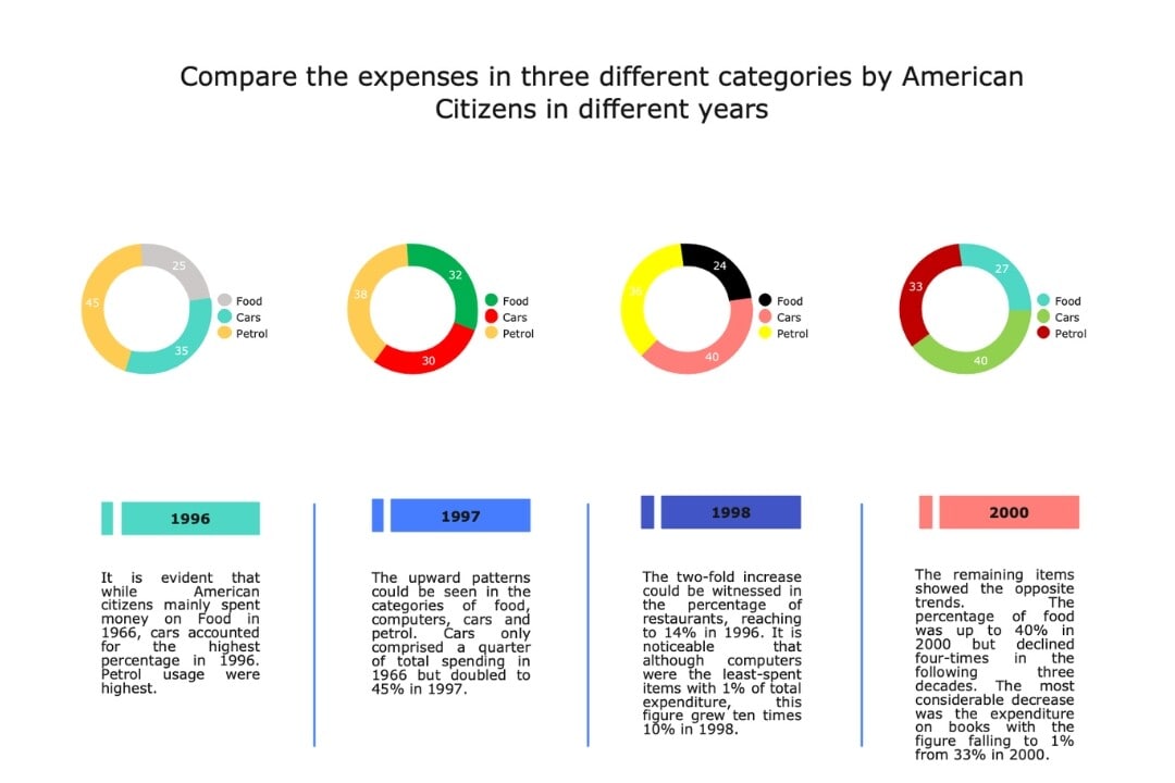
Pie Charts
Pie charts highlight proportions by displaying how data is divided. They work well for showing market share or budget allocations but can become cluttered with too many sections.
Line Charts
Line charts work well for tracking progress over time. For example, you can use them to compare traffic trends on your blog. It helps you notice any growth, declines, or patterns in performance.
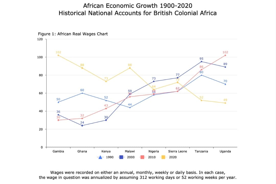
Table Charts
Tables are great for comparing multiple features in detail. I use this approach for testing diagramming tools by listing their features, pricing, and supported platforms in a table. It gives a clearer, more complete picture than a graphical chart.

Part 2: How to Create a Comparison Chart in Excel?
Building a comparison chart in Excel is simple and effective, great for quickly comparing data points. It’s flexible and if you are familiar with MS Products, it doesn’t require advanced skills to use successfully.
Here’s how you can create a comparison chart:
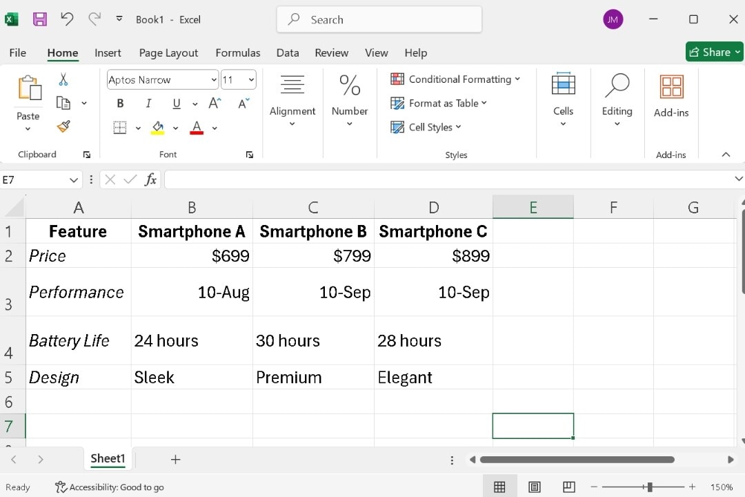
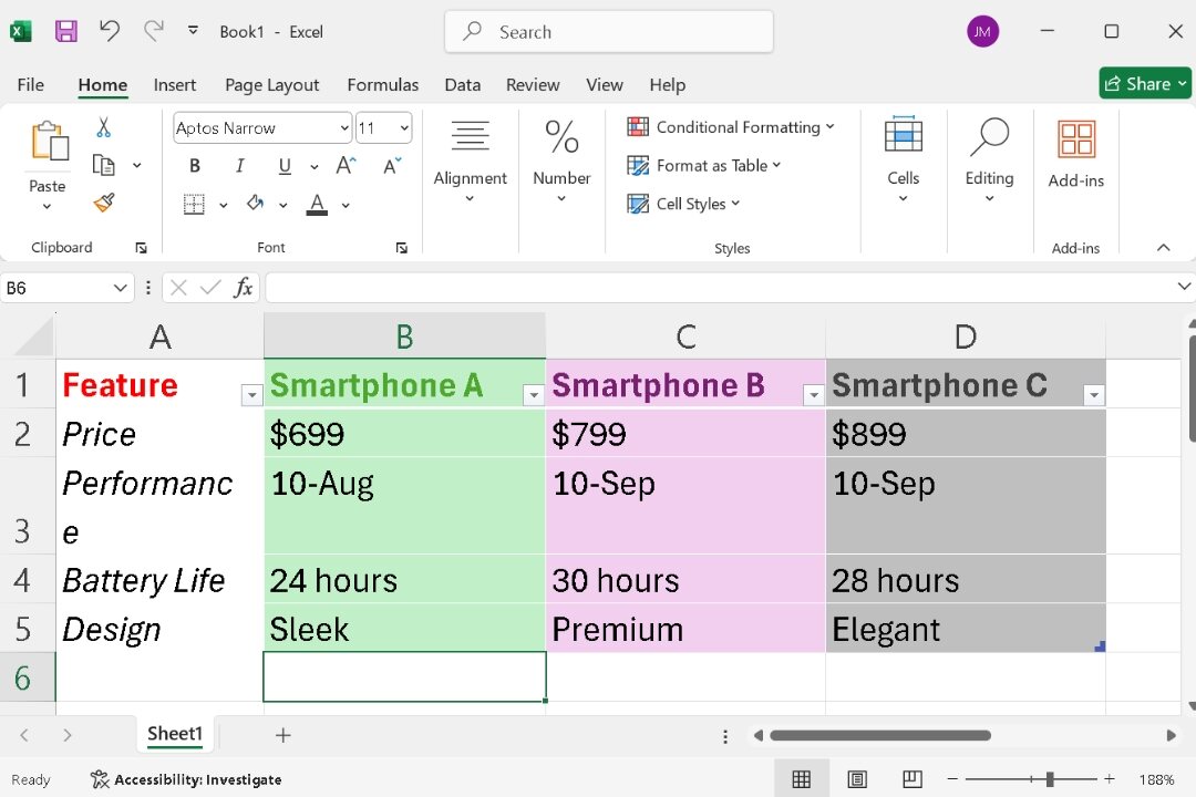
Step 1 Enter Your Data
To compare data, first set it up in Excel. For something like a smartphone comparison, place the items (smartphones A, B, C) in the rows.
Set the criteria (Price, Performance, Battery Life, Design) in the columns.
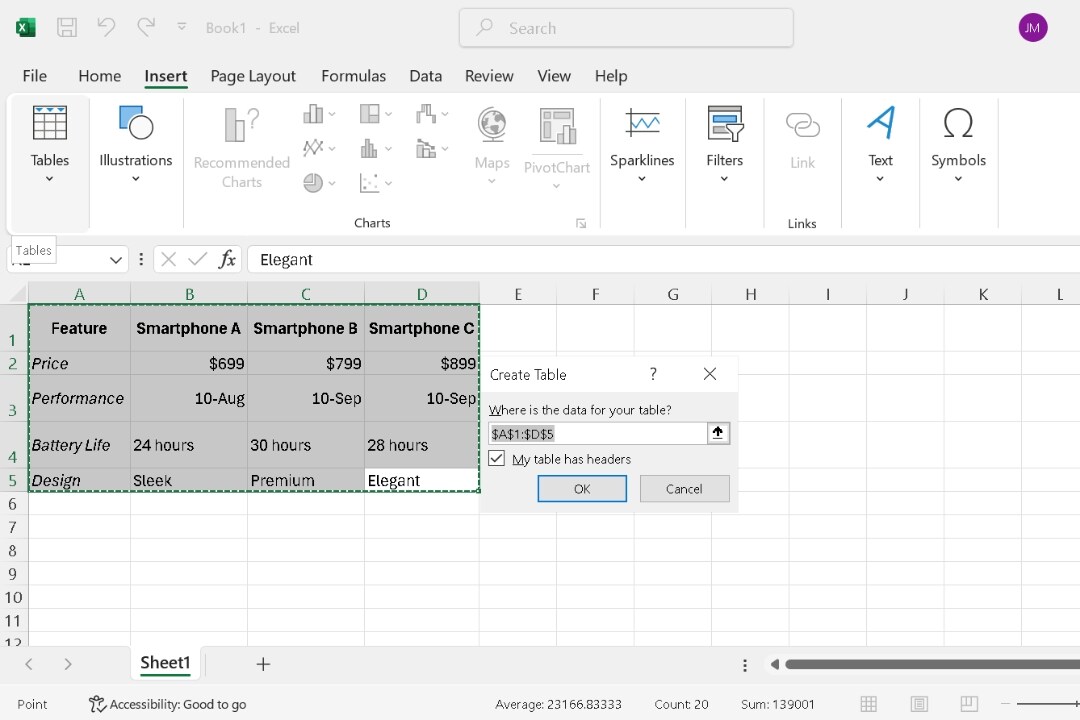
Step 2 Convert the Data into a Table
Since there isn’t a dedicated comparison chart template in Excel, convert your dataset into a table. This adds sorting and filtering capabilities.
Select your data, tap Insert, and then hit Table.
Step 3 Customize and Edit the Table
Now, fine-tune it by adjusting column sizes, choosing a table style, and ensuring readability.
Go to the Table Design menu and select a suitable style from Format as Table.
Use contrasting colors to highlight the differences when comparing products.
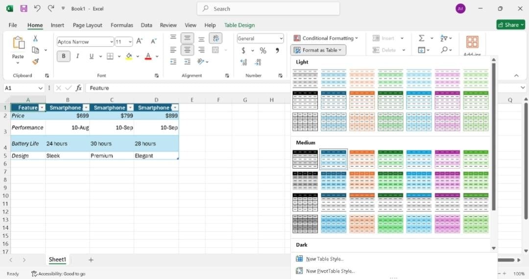
If the data is large, change the column widths so no entries are hidden. A clean table helps make comparisons clearer.
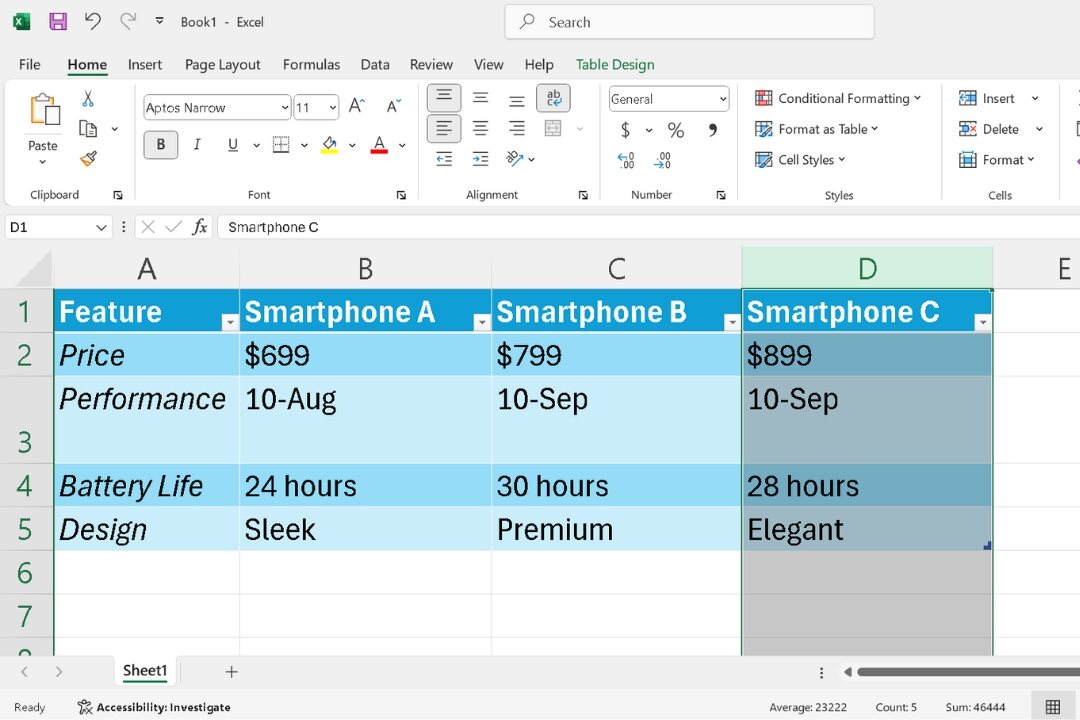
You can make your comparison chart more readable using Excel’s formatting tools.
Adjust fonts, sizes, colors, and alignment on the Home tab.
This makes it easier to interpret and draws attention to key data.
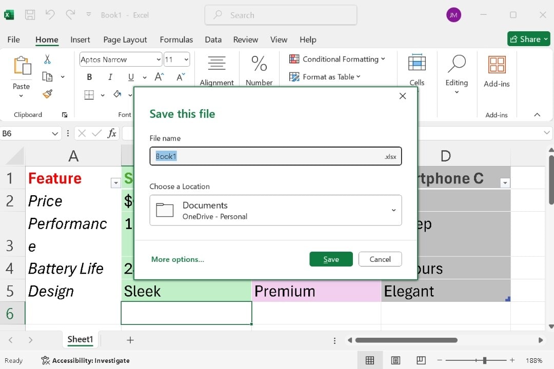
Step 4 Save Your Excel Comparison Chart
Once your comparison chart is complete, hit CTRL + s to save it.
Simply, select the location on your Computer or Onedrive and tap Save.
Part 3: How to Make a Comparison Chart with EdrawMax?
Excel is sufficient for quick, basic graphs and charts. But, when creativity or complexity is required, EdrawMax offers unmatched capabilities.
Plus, creating a comparison chart using it is refreshingly easy. Let me walk you through how you can do it:
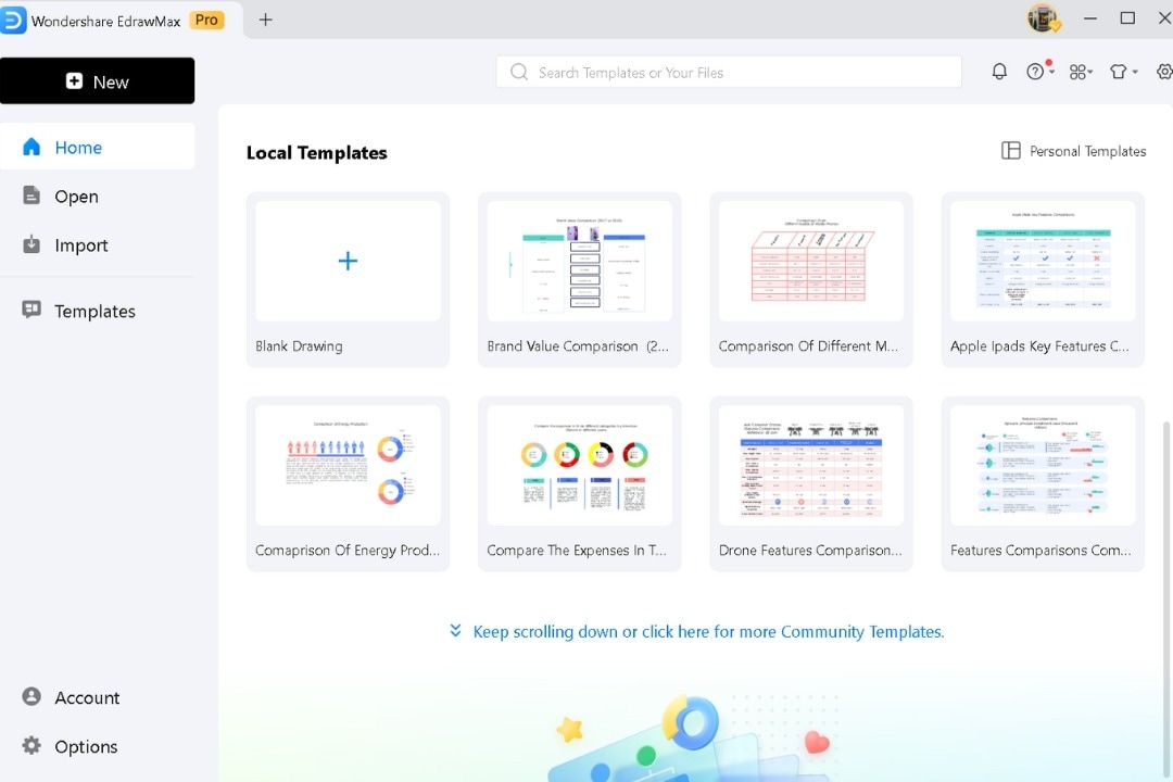
Step 1 Open EdrawMax
From the EdrawMax Desktop Home screen, navigate to Graphs & Charts > Comparison Chart.
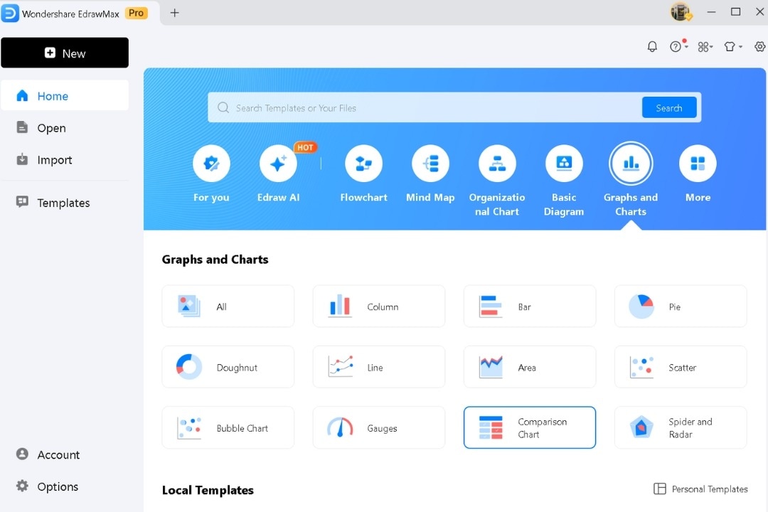
Scroll down and browse templates. Pick one or begin with a blank layout for full customization.
For more templates, go to Community Templates or use the search bar.
Step 2 Input Data
Double-click on any text box to add your data directly into the template, replacing placeholders.
Modify the selected text format, style, and font from the pop-up menu.
Use the Symbol library to add any shapes or symbols.
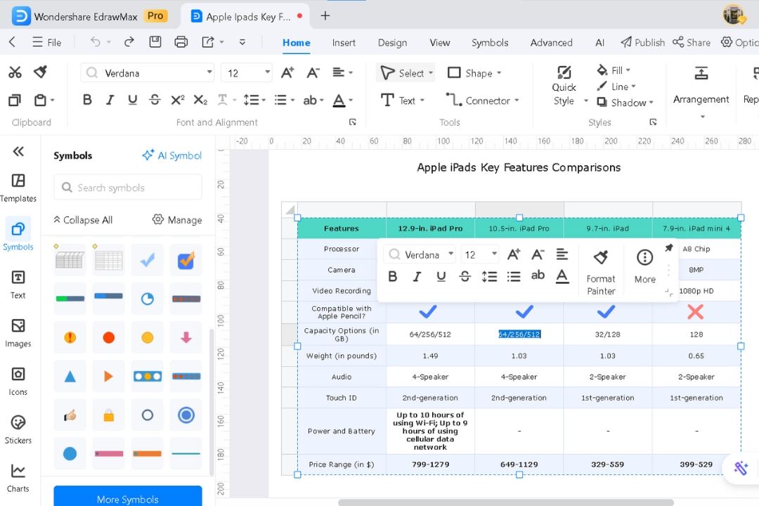
Access the pop-up menu by selecting the comparison chart.
Modify style, fill, and line as per your requirements.
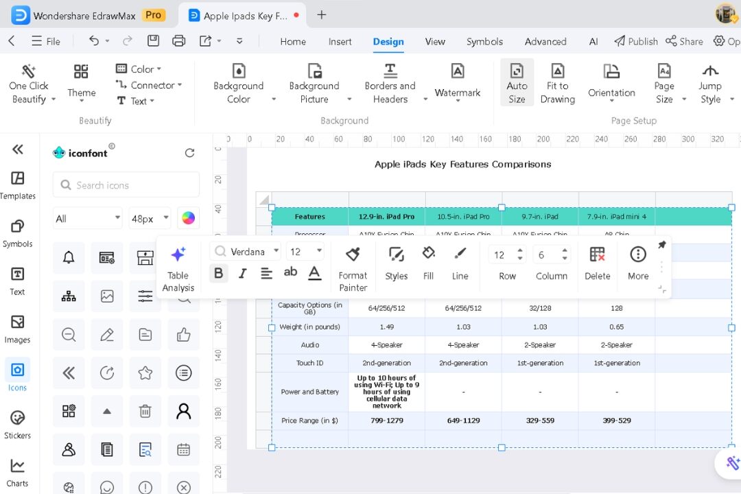
Adjust rows or columns as needed with a few clicks. There’s no need for tedious manual formatting.
Access the Design tab to tweak your chart. Customize its theme and background, and add icons from the left side library to enhance clarity.
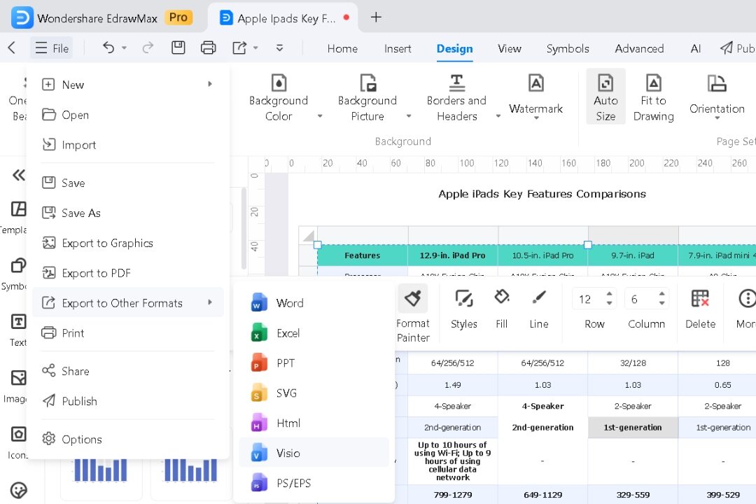
Step 3 Export Your Comparison Chart
Export the final comparison chart in PNG, PDF, or Excel format as needed.
For presentations, save it as an image to ensure compatibility.
Why Choose EdrawMax for Comparison Charts?
Excel is a great tool for basic comparison charts. However, EdrawMax stands out when customization, creativity, or professional design is required. It simplifies the creation process by eliminating the manual effort typically compulsory in Excel.
- Rich Templates: Over 32 thousand pre-designed templates to fit any use case.
- Custom Design Options: Modify design, fonts, colors, layouts, and more, effortlessly.
- Export Flexibility: Save your charts as images, PDFs, Excel, or various other formats.
Whether you’re handling a simple comparison or a detailed analysis, it adapts to your needs seamlessly. In my experience, EdrawMax is particularly useful for projects requiring multiple design iterations.

Conclusion
Learning to create comparison charts is key to displaying data. Excel makes basic charts easy if you are already a Microsoft tools user. But, EdrawMax takes it a step further, giving you advanced design options with less effort.
EdrawMax shines with its template library, customizable features, and effortless exporting options. It simplifies the process, allowing you to focus on delivering impactful visuals. Whether you’re explaining data trends or building a presentation, it keeps your work sharp and efficient.
Mastering these tools helps you turn complex information into visuals that make sense. With time, you’ll craft visuals that effectively highlight your key insights.
FAQs
-
What chart is best for comparison?
Your data dictates the right chart. Select the chart that makes your data clear and emphasizes what matters.
For comparing categories, bar charts are your go-to. Pie charts are best for proportions. When tracking time-based changes, line charts work great. If you're comparing specific details, tables can be useful.
-
What is a comparative chart?
A comparative chart lets you view two or more datasets next to each other. It helps highlight differences, similarities, and trends, making it simpler to analyze complex data. -
How to compare two charts?
While comparing two charts, look closely at the variables or metrics. Make sure the scale matches, such as using the same axis range for bar or line charts. Identify patterns, trends, and important values that stand out across both. -
What is the purpose of a bar graph?
The goal of a bar graph is to compare different groups or items. Using bars of various lengths clearly shows differences in values like size or quantity.
AI Diagram Generator
Enter your prompt. Upload files if needed. Generate diagrams, charts, or slides instantly.


