


Google Sheets is a versatile tool that allows users to create scatter plots easily and efficiently. With its intuitive interface and wide range of customization options, Google Sheets is a great choice for visualizing and analyzing data using scatter plots. Here, we will discuss the process of making a Google Sheet scatter plot, advanced features available on Google Sheets to make scatter plots, and more.
In this article
Part 1: Google Sheets as a Tool for Creating Scatter Plots
Google Sheets is a powerful and versatile tool for data analysis and visualization.
One of the key features of Google Sheets is its ability to create scatter plots, which are essential for visualizing relationships between two variables in a dataset. Scatter plot Google Sheets allows users to plot data points on a Cartesian plane, with one variable represented on the x-axis and the other variable represented on the y-axis.
Part 2: Making a Scatter Plot on Google Sheets
The process of making a scatter plot on Google Sheets involves some key steps. Following these steps, we can create a scatter plot on Google Sheets easily.
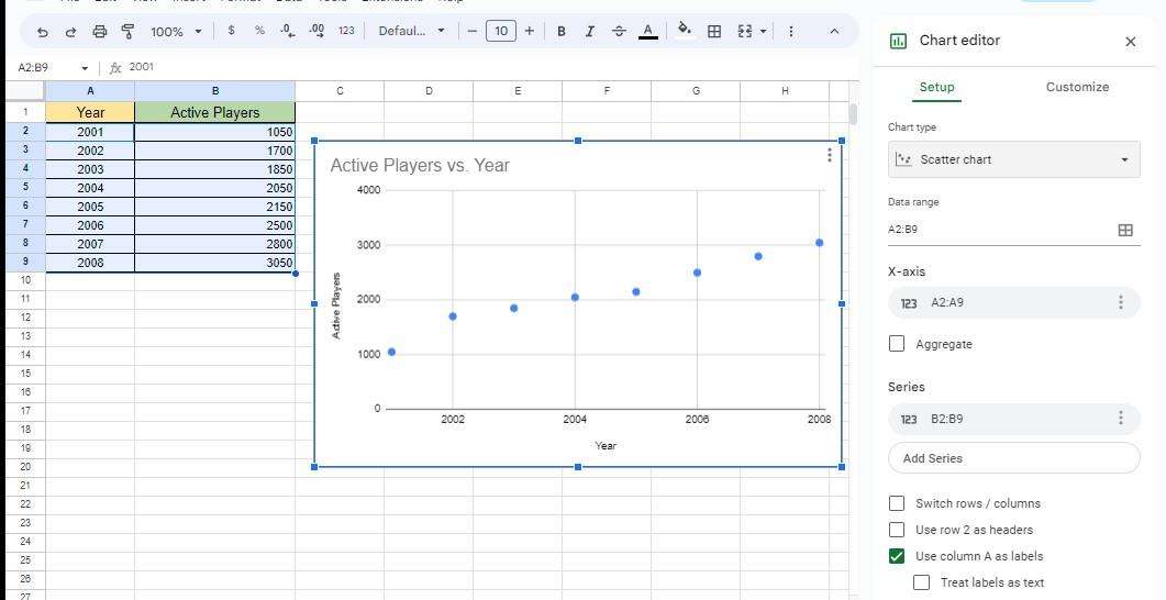
- Open Google Sheets: Open Google Sheets and create a new spreadsheet or open an existing one containing the dataset you want to visualize.
- Select data: Select the two columns of data that you want to use for the scatter plot. For example, if you want to visualize the relationship between the variables X and Y, select the column containing the X values and the column containing the Y values.
- Insert chart: Once the data is selected, click on the "Insert" menu at the top of the Google Sheets interface and select "Chart" from the dropdown menu.
- Choose scatter chart: In the Chart editor that appears on the right-hand side of the screen, select "Chart type" and choose "Scatter chart" from the list of options.
- Customize appearance: Customize the appearance of the scatter plot by adjusting the various options available in the Chart editor, such as the title, axis labels, and data points.
Part 3: Analyzing Data with Scatter Plots on Google Sheets
Scatter plots on Google Sheets help to analyze data efficiently. Scatter plots on Google Sheets help in many ways for data analysis.
- Identify patterns and trends: By visualizing the data using a scatter plot, you can easily identify any patterns or trends in the relationship between the two variables. For example, you can determine if there is a positive or negative correlation between the variables or if there is a nonlinear relationship.
- Outlier detection: Scatter plots can also be used to identify any outliers in the data. Outliers are data points that deviate significantly from the overall pattern of the data, and they can have a significant impact on the results of statistical analyses.
- Correlation analysis: Scatter plots can be used to calculate the correlation coefficient, which measures the strength and direction of the relationship between the two variables. This can provide valuable insights into the nature of the relationship and help in making informed decisions.
Part 4: Advanced Features for Scatter Plots on Google Sheets
There are many advanced features for making a scatter plot in Google Sheets. They help in creating effective scatter plots.
- Adding trendlines: Google Sheets allows you to add trendlines to scatter plots, which can help to visualize the overall trend in the data. Trendlines can be linear, polynomial, exponential, or logarithmic, and they can provide additional insights into the relationship between the variables.
- Data point customization: Google Sheets provides options for customizing the appearance of data points in a scatter plot, such as changing the shape, size, and color of the points. This can help to highlight specific data points or groups within the dataset.
- Multiple series: Google Sheets allows you to create scatter plots with multiple series, which can be useful for comparing the relationships between different sets of variables. This can be particularly valuable in complex datasets with multiple variables.
Part 5: Making a Scatter Plot Utilizing Wondershare EdrawMax
When it comes to creating a scatter plot, Wondershare EdrawMax stands out as the best tool for the job. With its user-friendly interface and extensive features, it allows for easy and efficient creation of accurate and visually appealing scatter plots. Its customizable templates and diverse data visualization options make it a top choice for professionals and beginners alike. These are the steps to create a scatter plot using the tool:
Step 1:
Begin by logging into your EdrawMax account using your email address and password or by utilizing a Google or social network account.

Step 2:
Once logged in, open a new document by clicking on the "+" sign located to the right of the "New" button.

Step 3:
Navigate to the "Templates" section and locate the "Scatter Plot" template. Select and open it.

Step 4:
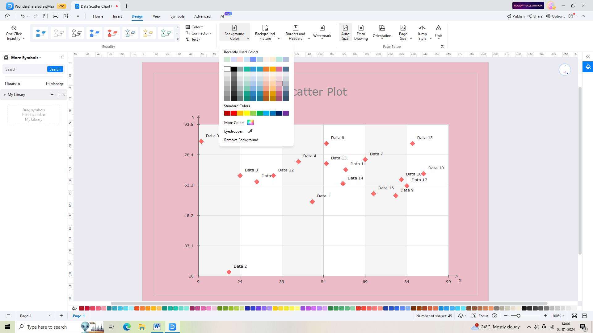
Customize the template by adding colors and other visuals. Simply drag and drop items onto the canvas to create your desired diagram.
Step 5:
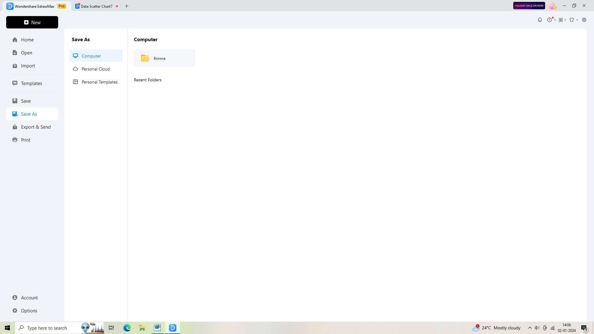
Once you have made the necessary modifications, save the document by clicking on "Save As" in the top toolbar.
Step 6:
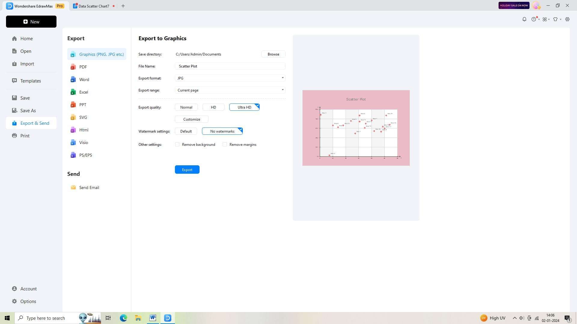
Finally, export the diagram by clicking on "Export" in the top toolbar. Choose your preferred format and save the file to your device.
Conclusion
Google Sheets is a valuable tool for creating and analyzing scatter plots, and it offers a range of features and options for customizing the visualizations to suit your specific needs. By following the steps outlined here, you can effectively use Google Sheets to create, analyze, and customize scatter graph Google Sheets for your data analysis projects.
AI Diagram Generator
Enter your prompt. Upload files if needed. Generate diagrams, charts, or slides instantly.


